Text
Third Artist Response
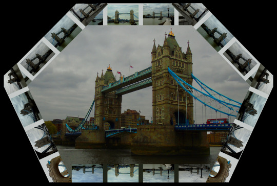
For the third artist response I wanted to change the shape of the border. I decided to make it in the style of a hexagon. Making the image was the same as the other two artist responses however instead of creating a grid from the contact sheet, I copied each level and angled it to create the hexagon shape. Overall i think its an interesting image and the different shape for the contact sheet helped to make the image different and to show more of the original photograph, instead of taking a small snippet, which happened in the second artist response.
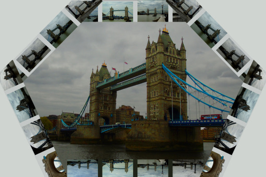
Before I started to do experiments I decided to change the colour of the background. The reason for that was due to the black being a large part of the image and took away from the image. To try help with the problem I used the “Eyedropper” tool which let me select the colour between the contact sheet images and then use the bucket tool to cover the black in the new colour. This helped to blend in with the image in a better way.
Experimentation:
To start the experimentation I wanted to keep the image subtle, however interesting. This led me to use the sepia filter where I thought would help to achieve the quietness which I thought would improve the image.
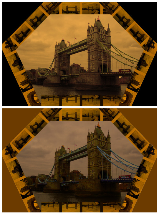
After doing the silhouette idea for the “Second Artist Response” I thought including the background as well would help to make the image more intriguing. As a result I started from the centre of the image where I highlighted everywhere inside the contact sheet and used the sepia filter at around the 75%. Next I highlighted the contact sheet only and used the sepia filter at 100%, after that I used the “Eyedropper” tool to collect the same colour as the contact sheet sepia filter. I then selected what was the black background and used the colour which i selected to fill the background with, which to finish the image of I edited the brightness to make the block colour darker than the rest of the image to make sure it adds to the image however doesn’t take away.
finish
0 notes
Text
Second Artist Response
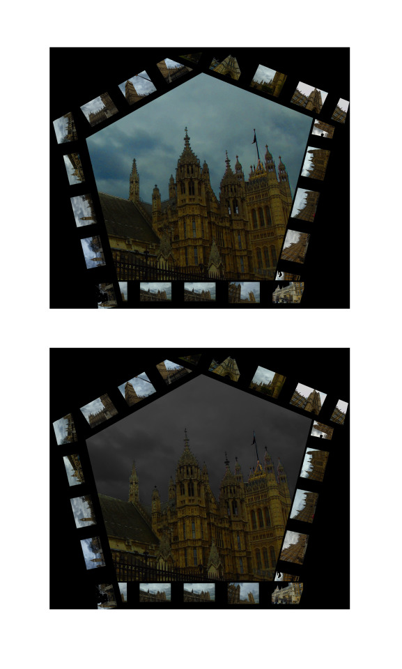
The very top image of this post is the original image. This was made the same way which the first artist response was made, however instead of creating a grid made up of the contact sheet, I copied enough levels to create a pentagon shape around part of the building. The problem with the shape is the fact that I had to crop most of the image which meant most of the detail in the original photograph was lost. Overall the shape and the main image did not work well together and instead I should had tried to match them better. Another issue I have is on the right side of the image the contact sheets does not line up properly and instead overlap which ruins the effect, Id try to make sure I fix that issue when I go ahead to do the experiments.
When creating the image I was trying to enhance the sky colour, however because the image quality wasn't the best for the image the sky didnt look very good once I used the levels tool. This led to me making the sky black & white and I have to admit it made the image worse in my opinion because it makes the overall image seem darker and the sky alone doesnt look very intriguing and lost most of its shape.
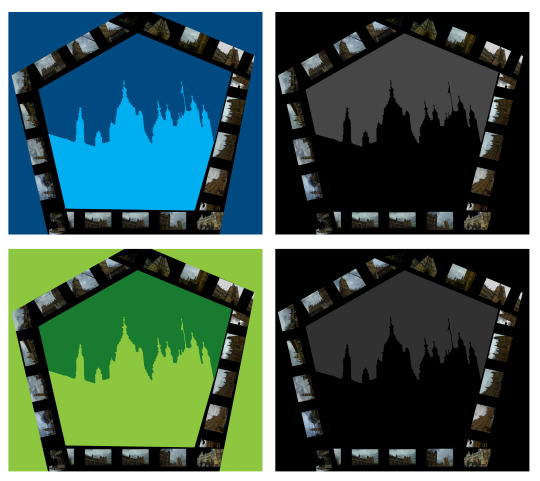
The idea to make the image made up of a silhouette came about because I wanted to try and make the image simple. Sometimes simplicity can be the most effective in an image so I decided to basically delete all of the detail on the main image and make it a block colour. I made the sky a darker shade of the same colour because it showed the outline of the building but also helped to create a sense of depth because it looks like the sky colour is the background and the buildings silhouette is placed on top.
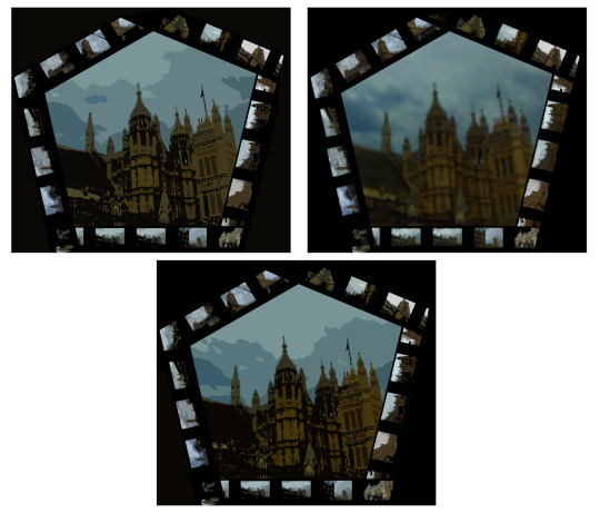
For the final experiment I wanted to use the filter gallery, I was going through different filters and mixing them, when I came across the “Cutout” and “Glass” filters. They worked effectively together because the cutout filter gave the image a drawn texture with the correct colours, whilst the glass helped to polish the image and make the colours more clearer and the vibrant. I left the cutout settings the same as I felt it was effective enough with the default settings. However the glass filter I changed to help make the image as good as it could be. This meant the “Distortion” slider was changed to 3, “Smoothness” was left at 4. I changed the texture to “Frosted” and left the “Scaling” to 100%
0 notes
Text
First Artist Response
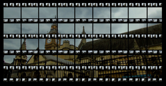
The image above is my first response to my artist and is more of a direct response. To begin with I wanted to almost copy the artists idea because that will allow me to understand how to edit in the same style and then use the skills to create other images which respond to the artist in a more indirect way.
To create the image was fairly straight forward and more time consuming. I opened up the bottom image and copied it to make the first layer which allowed me to cover the “Background layer" in black which creates the black border. I then opened the contact sheet for the photo shoot, resized it and covered “Layer one” it, by copying and pasting it to ensure it doesn’t look stretched. Next I used the selective tool to select the top two rows where I pasted it to create all the bars. Once the contact sheet rows where in place I created black bars around the contact sheets to give an order to the images instead of them looking like they are floating around. I then used created he black lines going vertically which took a while to complete. The pattern of the line, is every three small images there will be a vertical line between the third and fourth image. After adding the lines the main image was complete and all that was left to do was little tweaks such as ensuring the black borders covered what was supposed to be covered.
Overall the image came out very well in my opinion, especially for a first attempt, I think the gap which shows the bottom layer (the main image) is big enough and the right amount of the image has been exposed. However I can’t see many disadvantages to the image apart from the issue of the thickness of the lines. The horizontal lines are too thick and I should had focused on matching the vertical lines and horizontal lines to the same width so it looks more neat.
Experimentation:
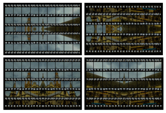
The first experiment I wanted to try with the image was symmetry. I tried four different ways which include; Top(Copied, pasted then flipped to cover the bottom half), Bottom(Copied, pasted then flipped to cover the top half), Left side(Copied, pasted then flipped to cover the right) and the right side(Copied, pasted then flipped to cover the left).
The top left image is made from when I copied and flipped the top half of the original image. Overall the image has interesting features such as the symmetry side of Big Ben and how its connected with its double and the sky helps to make the clock part the vocal point of the image. However the right side of the image where the building starts as its largest point in the image isn’t effective and I think it ruins the image overall because it hasn’t got a interesting texture and takes some of the focus away from the clock of Big Ben. Another issue I have with the image is the fact that some of the floating building parts are very small and therefore don’t bring anything to the image, so perhaps what I should had done was use the “Clone Stamp Tool” to erase the small parts and replace it with more sky.
The top right image is made from the bottom half which was copied and flipped to cover the top half. The image overall isn’t very effective and looks more like a mess then something which was planned and executed properly. Although I like how the corner of the building meets with its other side, Big Ben doesn’t meet effectively and instead looks very squished on both sides. However I do also think that the way the main structure of the building is flipped and shown along the top of the image works well because it doesn’t look out of place even though its upside down and it and helps to cover the top side to ensure it doesn’t look plain.
The bottom left image is made from the left side of the original image flipped over. This is arguably the best image from the symmetry experiments because there is a good balance of building and sky with neither of them being the dominant part of the structure of the image. The symmetry effect really helped enhance the image partly because the meeting point (Where the mirrored line would be), was directly down the middle of the pillar towards the centre of the image. The image is also my favourite because its one of the most natural looking, because nothing is floating about and there isn’t too much change.
The bottom right image is made from the right side being flipped over. Overall its another image which worked well with the symmetry idea. One of the reasons it worked so well was because of how the angle was changed through the symmetry, when you look closer you can notice the building is almost coming out of the frame as oppose to the normal version where the image looks like its going deeper into the background. However one issue I have is the vocal point of the image which is the direct centre of the image and that ruins it because I prefer my vocal points to apply to the rule of thirds which in my opinion would had helped to make the image a lot more effective.
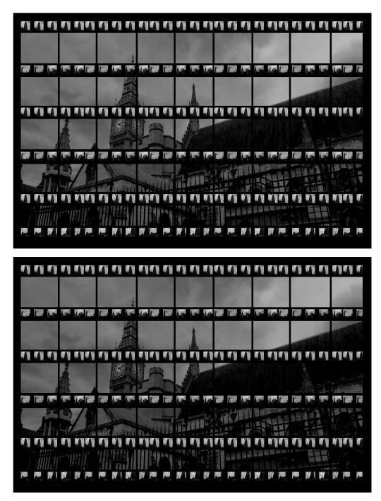
Next I decided to use black & white to try and make the image more subtle. This helped in that way however overall was not very effective, perhaps if I make the main image in colour and just select the contact sheet and make those images in black & white. This would allow the main image to be easily viewed and become more of the vocal point. However I think the clouds in black & white are effective and helped to create the subtle atmosphere and makes the building look like an abandoned building.
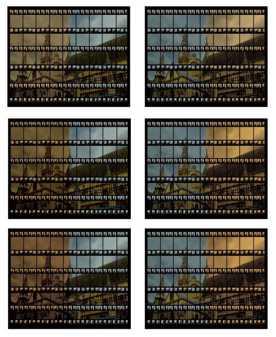
I then wanted to try and use the photo filter tool to make the image have a sepia effect. However I wanted to make it different to the way I’ve used the sepia filter before because I tend to use it a lot where the whole image is covered in the filter. As you can see the way I changed it was by covering only half of the image in the sepia filter. I covered it three times using the same filter because I wasn’t satisfied with the colour when I did it once or twice. I tried it for both sides of the image which I think came out “okay”, I describe it as that because I should had tried to blend the colours in much better, instead of it just being half and half perhaps I should had shown the change in the middle from sepia to normal colour.
0 notes
Text
Basic Editing:
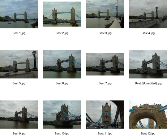
First Contact Sheet (Edited Version):
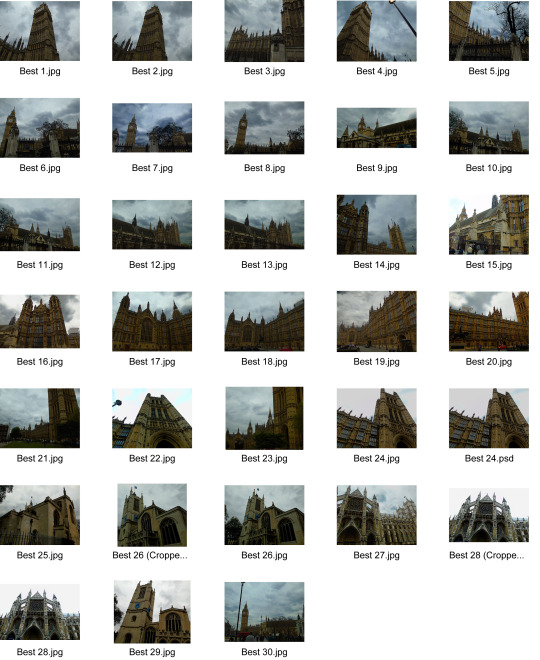
The way I edited the images was fairly simple, I would first use the selective tool to highlight the sky and then use “Levels”
Most of the images above have benefited from the basic editing, especially the few images which is mainly down to the sky, because when I edited the sky I decided to first change the “levels” to make them a little bit more dark so the cloud shapes and texture is more visible and then I went on to alter the “Saturation” which gave the clouds a very slight blue tint because it bought out the colour of the sky. I also tried to make a contrast between the dark sky and the bright buildings so they stand out more, it worked for the majority of the images however some of them I perhaps over edited them and the colour of the buildings has been over saturated and looks wrong, for example “Best 20.jpg” the colour of parliament is too yellow.
Second Contact Sheet (Edited Version):
0 notes
Text
Thomas Kellner’s Images
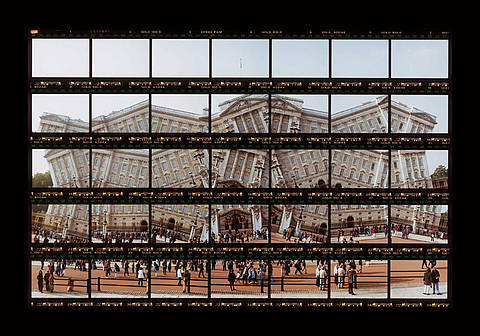
(London, Buckingham Palace, 1999)
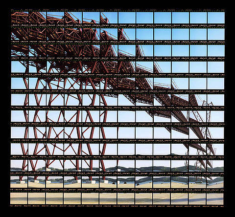
(Lissabon, Ponte 25 de Abril, 1999)
Both of the images are very intriguing and share something in common, the overlapping contact sheet. What Kellner has done is taken a photo, changed some parts of the image, too keep the structure however change the angle of areas of the bridge or the buildings in either image which results in very effective piece, because its like a completely new image. Another thing which Kellner kept the same throughout his images was the contact sheet, he experimented by using the film of his images and placed it along the original images. Which gives the pattern of every something centimetres the next line of film is added whilst in between two lines of film is the background image and the vocal point of the image.
The image “London, Buckingham Palace, 1999″ is interesting to me because of the way the structure of Buckingham Palace has been transformed with the building almost falling in a pattern, where from left to right the roof sinks then goes diagonally higher and so fourth which creates a simple but interesting pattern which helps to make the image more intriguing. I also think something about the crowds of people in front of the Palace helps to build the image because without the crowd the foreground would look very simple and slightly boring. The film lines are much thicker than the “Lissabon” image film lines and I believe that has helped to enhance the image overall because without the film lines the image would look fairly simple.
Lissabon, “Ponte 25 de Abril, 1999″ is fascinating because of multiple reasons. The first place I look is towards the poles which hold up the bridge, I believe that’s the vocal point in my opinion because of the complexity, the lines have been changed from looking straight and connected by two crossing poles to the middle poles being the connector where it looks very similar to cob webs because of the circle in the middle and lines coming out from a few different angles, and then the poles on the edges are going down quite independently and aren’t connected to any of the middle poles. However you can see lines trying to connect the edge and middle together which perhaps ruins the effect of the image. One issue I have with the image is the top part of the bridge, I don’t think its very effective because its possibly over complicated and perhaps takes too much of the structure away from the bridge.
0 notes
Text
Thomas Kellner
Thomas Kellner, born in Bonn, Germany 1966. During his education he studied art, sociology, politics and economy at the University of Siegen, Germany. Kodak Germany awarded Kellner the Young Professionals Prize which led to Kellner becoming a full time artist and photographer. By 1997 Kellner was working as a visual artist in Siegen. In 2003, he received a phone call for his membership to the German Association for Photography (DGPh). By 2005 Kellner has been regularly invited to various countries across the globe to go to festivals such as the ones in Beijing, Houston and Brasil.
Kellner has always had a basic interest in experimental and conceptual photography. This led to him attempting a pinhole series, photogram work and other styles such as cyanotype and saltpaper. Kellner’s wanted to combine layers of content with strong visual language which led to “deconstructing architecture as a visual language” with the contact sheet method. Since 2003, Kellner has been working on exteriors and interiors of various famous buildings across the world and people have described his images as “Buildings seem to be broken apart, dancing and remind us of the vulnerability of our values and creations”
0 notes
Text
Mission Statement
I will be looking at “Structure” and specifically the structure of various landmarks such as “The houses of Parliament”, “Tower Bridge” and perhaps adventure outside of London and look at different Beaches with “Birling Gap” in mind. I will search for different artists and photographers who also looked at the same idea and see if I can be inspired by the other artists.
0 notes
Text
Nikon Workshop
On the 15th of February my school set up a trip at Nikon school along Margret street, during that time I and the class were taught various different ways of using a camera. We first spoke about the simple stuff such as how to hold a camera and what each button does.
We then started to talk about using the camera manually which was out main focus today, with the first tool altering the shutter speed. Increasing the shutter speed will allows more light to enter the image. When increasing the speed to max the camera will mostly capture stationary or slow moving objects because the fast moving objects will leave the frame very quickly however if its a car for example the lights on it will streak across the image. We then took the information and practised it, by going to the road and tracking cars. In order to get a good image we had to altered the speed to 1/30, I would take the image when the car is near straight forward of my sight and then I would keep the camera aimed towards the car and follow it as it drives away, this would make the background blurry however the vehicle will be in focus. (Below are a few examples)
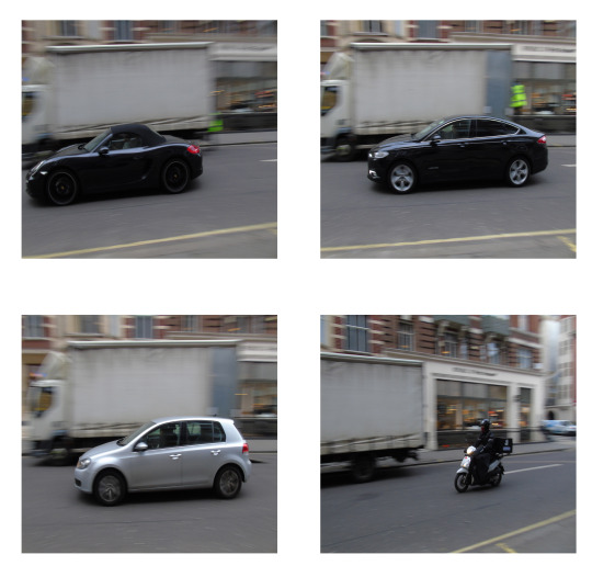
The images which are above are some of the best ones which came out with shutter speed 1/30 and 1/15, the best one would be between the top right and bottom left because the vehicles are near enough in the centre of the frame with the whole car also in focus and the background blurred out. The bike is probably the worst out of the four because its too far the the right and the background isn’t as blurred as I wanted it too be. The top left image is okay however the issue is how close the car is to leaving the frame, otherwise the focus on the car came out quite well. Furthermore the bottom left image had the shutter speed set at 1/15 which makes it a more difficult to blur the background whilst keeping the camera in focus.
After altering the shutter speed we next spoke about the aperture how it is recorded in something called F stop, with F/1,2 making the image more over exposed because the lens is open to its biggest so it brings in as much light as possible, however when a lens is set to F/22 the image will be much more under exposed because the lens will be a lot more closed so not much light is being attracted. We then went back out to the road again where we took images of the same building however each time we manually changed the aperture to over expose, under expose and then to get the lighting set properly. (Below are my images)
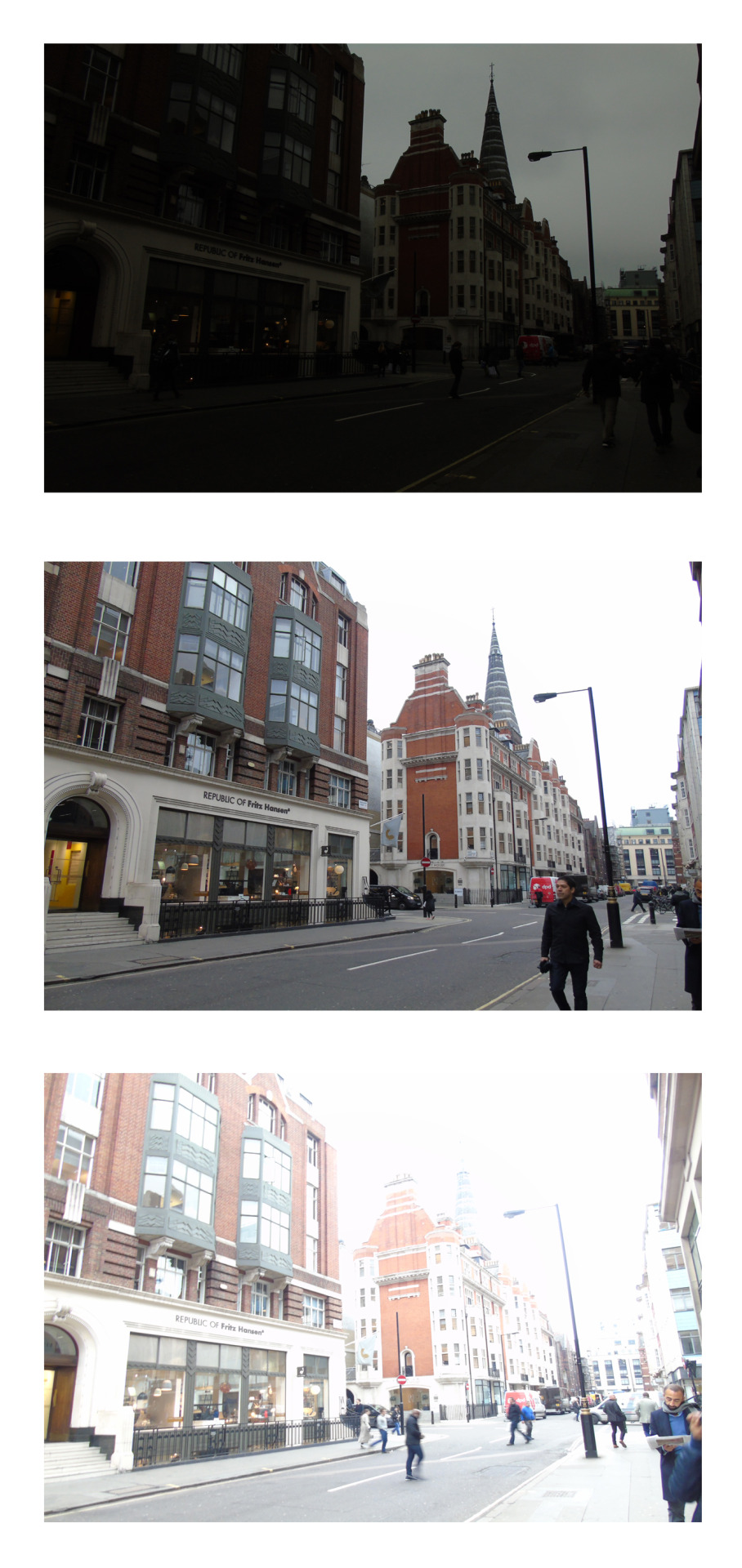
The top image had the settings; F/8.1 and the shutter speed was - 1/100 This allowed the image to be under exposed so nothing was really visible. The middle image I set to F/3.4 and the shutter speed was set to - 1/100 this came out almost perfectly because nothing seemed to dark and nothing was too bright, this showed that I am able to manually change the settings on the camera and get a good outcome.
We then had to take all the information which we have learn’t and put it into practise by photographing objects which represent letters to complete the word, “Nikon School”.
- Manual
Shutter speed
ISO
Aperture
- Lighting:
Soft box
Portraits
Light graffiti
0 notes
Text
Final Outcome
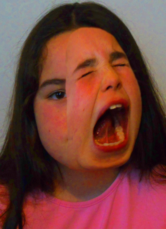
The image above is the original version of the final outcome. It was made the same way in which the two other images were made and I felt using only one addition face would be most effective because as you noticed when I used two addition faces it didn’t work out well. Overall the image came out more effective then the second morph image, however there is still a lot of room for improvement. One way I could had improved the image is the edge of the addition face on the inside where you can clearly see the blurred line, which shows how I over used the blur tool and I should had changed the size of the blur tool so it doesn’t make a massive line like it did. However one thing that I struggled to do in the second morph was trying to line up the face so the chin of the main face lines up and I believe I was able to achieve that on the image above. But the top of the face wasn’t as effective because i should had used the hair so it covers the top and makes it look much more natural then what it is at the moment.
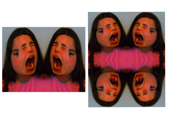
The image above is my first experimentation for the final outcome. I decided to try and use symmetry to see if it would make the image more or less effective. The left image was very simple to create, all I did was slice a blank page into 2 halves and then copy the original morph edit on to the blank page, line it up so it fits on one half and then copy it, flip it and then connect them in the center. The right image was just as simple, once i did the two faces (left image) i simply divided the page again so its has four squares as appose to two squares, and then copied the image, flipped it and placed it underneath.
The image on the right is the better image out of the two because the was the four individual shoulders are connected is more intriguing to the viewer because of the ripple effect which is made in the top because of where the creases meet. I also overall just think its more visually interesting because there is four different faces with one eye each looking towards the viewer. However one issue I have with the image is how badly the face has been stretched because you can see that the heads look longer than the image with just two heads.
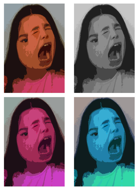
The four image above are all the same idea which was sing the cutout filter in Photoshop and then changing the colour by using the hue & saturation tool. Overall I think they are very effective because it got rid of the main issues which were visible such as blurry line near the center of the image, and the top of the addition face looks a lot more natural. Some of the colours were more effective then others and I think grey scale one is the most effective because its basic colouring which allows the edit more effective and helps more compared to the other coloured images because some of the colours take away the vocal point of the edit and makes the images idea less effective. However saying that I still think the images are all still effective in there own way, with the different colours being effective because just under the bottom lip and around the chin area its darker on all the images and that tone makes it stand out and I think that is very effective in all the different variants of the hue & saturation idea.
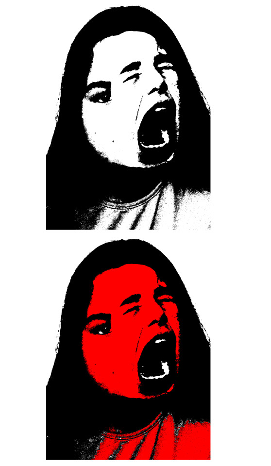
Threshold
0 notes
Text
Experimentation For The Second Morph Edit
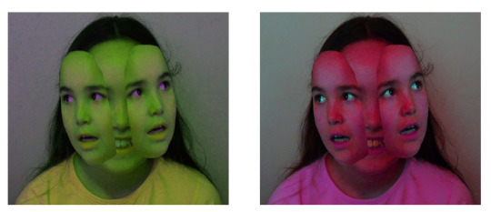
The images above are the first ideas which I wanted to try because I tried to find ways in which could help to enhance the image overall. However changing the hue & saturation wasn’t that effective on its own and perhaps it would be much better whilst with other ways of trying to enhance the image. I made the image the same way which I made the other hue & saturation for the other experiment, however I noticed the images above have tinted eyes however the tint was very low and hardly changed the colour of the eye but the other experiment has been effected much better by the alteration of hue & saturation.
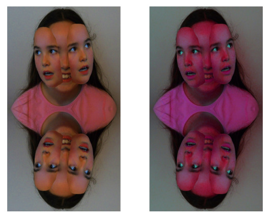
I wanted to use symmetry because it would perhaps move some of the attention away from the detail of how poorly it was put together. However I don’t think it took all the attention away and you can still notice that it was done weirdly and the way it was placed and edited together wasn’t effective. I then decided after doing the symmetry that continuing the use of hue & saturation perhaps could be more effective then what it was whilst just the solo morph picture, however I still think changing the colour didn’t really help to make the image and idea of symmetry more effective. However I still want symmetry to work so i’ll continue to try and make it work much better.
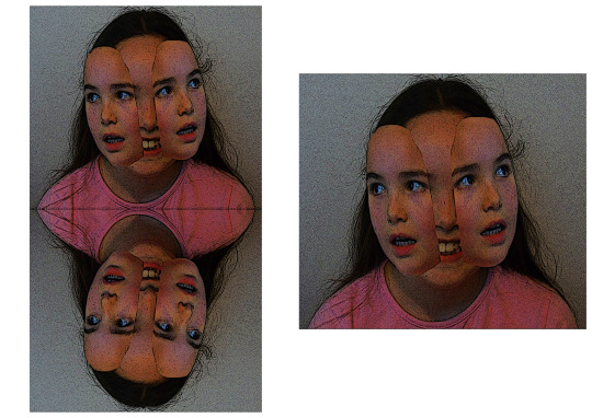
The two images above were my last ideas for experimentation and I decided to try and use different filters which I found in the filters gallery. I used one called “Poster Edges” which made it look a lot more like a poster. Overall I think it helped in certain parts because it made the top stand out a bit more because of the lines which stand out. However it didn’t make a massive difference to the addition face which meant the overall idea wasn’t a success because I didn’t make the edges of the addition faces smoother or make it seem like it fits the whole purpose of the image.
The filter poster edges gave me three different sliders to change, the first was “Edge thickness” which I moved to 10, and then I changed the “Edge Intensity” to 1. The last slider was “Posterization” which I set to 6 and that was used the filter poster edges the way which I thought would enhance the image both symmetry and solo face.
0 notes
Text
Experimentation For The First Morph Edit
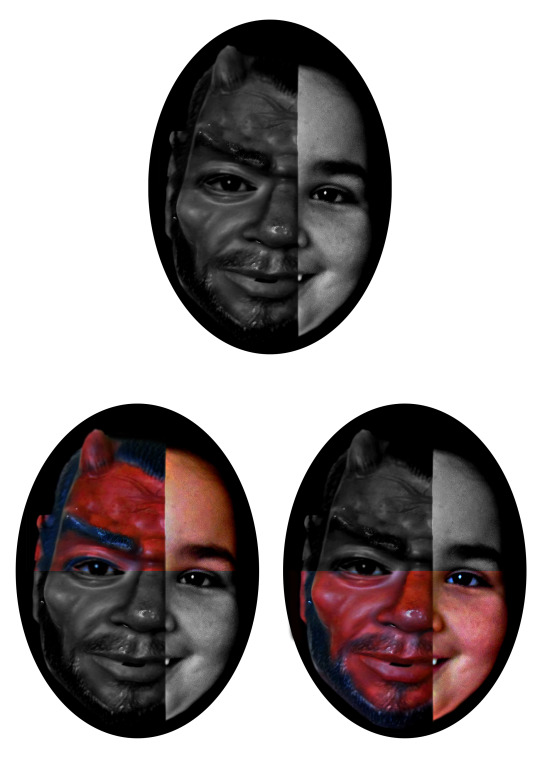
For the first experiment idea I wanted to make it simple, and the best way in doing that is by editing the colours. So I decided the first thing I wanted to do was make it black & white, firstly I made the whole face black & white and that was effective in a couple ways. The main way it was effective was the right side of the face, because in colour it looks slightly grainy and the quality isn’t the best therefore when its changed to black & white it helps make the face look smoother and the graininess isn’t as bad. The full face black & white image also comes out quite well because it shows two different tones, left side (mask) being more darker than the right side (human).
The bottom two images on the above sheet are different variations of the black & white idea, I decided to do this so the idea isn’t as plain as it was because although it is still a very simple idea it has some sort of variation to it and perhaps could look interesting. In my opinion the top half looks better whilst coloured however when its black and white the rough edges between the mask and human are slightly less visible. However when the top side isn’t coloured the mask is too dark and perhaps I should had made it a bit more brighter, but at the same time maybe it isn’t too dark but the human side is a little too bright therefore the contrast isn’t as effective. So to improve the top side I should had selected each side separately in order to get the contrast as I would like it.
When the bottom half of the image is much better in black & white because with colour the graininess is very obvious however when its been changed into black & white the face looks more smoother and overall works well when the colours have been reduced, however when I change it to black & white I need to select the mask and human face separately because the contrast is too different.
Overall I think the images with half colour, half black & white work well because there are four different sections all with different shades, which creates a contrast between the colours used and the brightness per section.
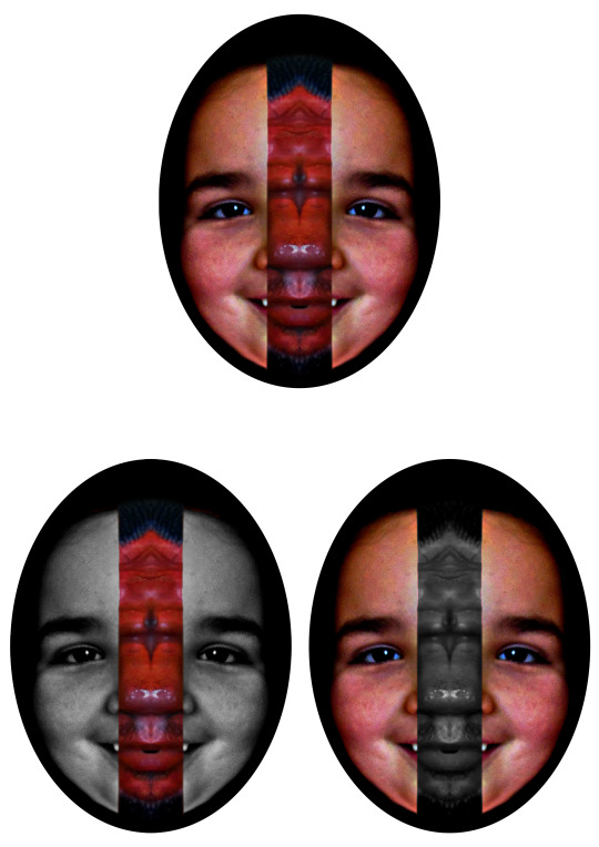
Above is another couple images for my experimentation where I decided to try and reverse the sides. So for the top image of the three is the original design without further manipulation, I was trying to reverse each side so it would end up having the human side on the left whilst the mask was on the right although as I was copying each quarter, (I sliced the image in 4 before hand) I started to play about and hide some layers which ended up with the image above, I thought it looked quite interesting because of the symmetry on either side however the mask section breaks the symmetry line.
To try and further edit the idea I tried to reverse it although it proved to be difficult because the human face is smaller than the mask side and because of that it wouldn’t fit in the middle like the mask did so I decided to leave the idea for now and instead try something else, and start of as you can see I changed each section separately into black & white and then reverse that. Overall out of the two versions I think it was most effective when the mask is in colour because it created a simple and only one focus point whereas when I reversed it and made the mask black & white it seemed too much in a way because the human face is the focus point however both sides are and it makes the mask seem slightly useless. Maybe a way to further edit it even more would be to show a slow change from the mask to human face by change the opacity of certain sections.
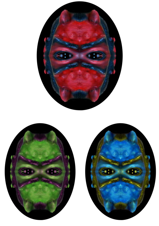
Above is the next three images I made, the top one is the original experimentation where I copied the top left quarter and covered the other quarters with the top left one. Once I saved the image I started to try different things such as blacking out the eyes and unfortunately it didn’t look effective so I deleted that and left the eyes in. I then went to hue & saturation and I was messing about with the different settings seeing how I could make it most effective, at first I kept putting the lightness low so it looked quite dark and colourless however as you can see I didn’t like that dull effect so I recreated the image making it more vibrant which you can see in the two images below the original one.
The left image where the mask is dominantly green I think worked well because the green suits the mask and the black parts (Eyebrows, hair around the face) looks more effective when it has a purple tint on it however I think the image could easily be improved by changing the hue & saturation of the eye separately therefore the pupil doesn’t have the tint as well because if it stays white I think it would be much better and the eye would look a lot more effective instead of having the purple tint on the pupil as well.
The right image isn’t as effective as the green version because of the yellow part, the yellow is way too bright and it would only had worked well with the tint so its predominately black instead of yellow, the blue perhaps could had been darker because the brighter blue takes away the effectiveness of the mask. However I think the eyes look good with the yellow tint and perhaps I should had the mask and eyes separately. The hue was -148 with saturation +22, this made the light blue, so if I lowered the hue to -130 it would had produced a darker blue which would of worked much better.
Overall the hue & saturation worked quite well because the mask colour was mainly red therefore changing it didn’t add loads of different colours and make it look awful instead I was able to pick and choose any colour I wanted the only problem was the saturation, I couldn’t make the number too high because then the random colours would start appearing however I think I was able to find a good combination of hue & saturation especially for the green coloured image.
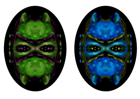
After doing the analysis I loaded the images up onto Photoshop again and thought that changing the levels should enhance the image a lot more, which in my opinion it worked well. The colour is more vibrant and I think it adds to the image and also the blue on the right image looks much better because the colour has become darker and shows good, effective contrast with the yellow on the eyebrows. I also think the tint on the eyes for both images worked really well, because as you know the purple tint on the left image I didn’t think was effective however when I altered the levels to make it darker it look more natural and works much better because it adds to the mysterious feel.
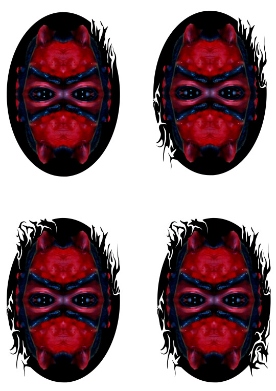
I tried to do something a bit different by making the circled frame more intriguing instead of being a blank black background, so I decided to use the “Liquify” tool, this allowed me to either drag the white background into the frame and curve it whilst it gets smaller or use the black frame and drag it into the white background. (As shown in the images above)
The top left image shows just one side being liquidated, which when placed next to the other images makes it look very basic however at the time I thought it good and exciting, perhaps to make it more interesting it would had been better if I curved some of the black parts and also if they had more of a varied direction because most of them are looking upwards or more to the left instead of the right.
The top right image shows two sides which have been affected by the “Liquify” tool. The sides being opposite of each other, with the bottom left side being a lot more curvy which I think works a bit better. The left side also doesn’t have as many parts sticking out as I wanted to try and get more white parts inside so it didn’t have all four sides looking very similar. The top right is basically the same as the first image however I added a little bit more where the white goes into the background and perhaps didn’t make too much of a difference however I think it helps to make the top right seem a little more varied. These two sides will stay the same throughout the evolution of the image.
The bottom left image shows three sides after the “Liquify” tool has been used with the top left side of the frame being the addition to the image, and I think is arguably the best corner because there are a few lines going in towards the image and where they are positioned in a way so they look like roots for the lines which come out, which worked very well in my opinion because although most are looking in the same direction they are different lines with certain areas being much thicker than others especially the curves, when it starts to curve its thick but by the end of the curve its coming out thin.
The bottom right image shows the image after I used the “Liquify” tool on all four corners, with the bottom right side being the newest addition and the only difference between the bottom two images.
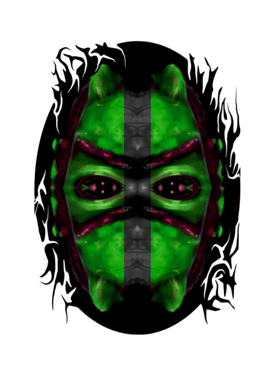
For the final experiment on the first morph edit I wanted to try to add all of the experiments together. To do that I could do it in two different ways, the first would be just copying various parts of images where they show the experiment idea and then place them on top of each other. The other way I could complete the idea is by re doing all of the ideas my self and try to improve it whilst also adding it to the other sections. I’ll re do all of the sections myself however I decided to use the completed “Liquify” image because that was the image I was most happy with.
Overall the image is quite interesting because the colouring stands out on either side compared to the centre where its purposely in black & white which I think works interestingly well because it joins up with the black circled frame which as a result makes the two sides look more like alone segments which I think worked neatly, however to improve it I think I should had made it gradually turn into black & white instead of it being a sudden change. Another way of improving the image is by using the “Liquify” tool to re do the frame instead of copying the image which I did before.
0 notes
Text
Morph Edit
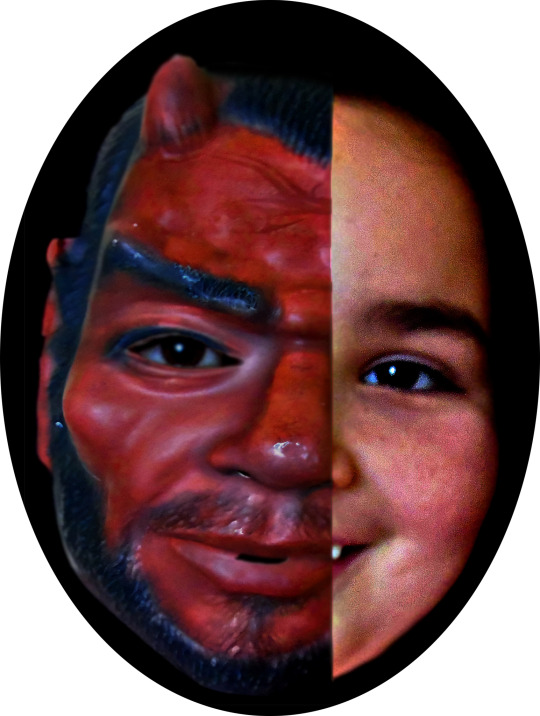
The top image is my first attempt of therianthropy, where I tried to use one of the mask photos to cover half the face, because I didn’t want to completely copy Ulric’s work so I interpreted it and decided to show half the face in human form and the other half in animal/ monster form.
The image overall came out okay, and there is a lot of room for improvement, however one of the reasons the image isn’t that good is because of the images are over sharpened, so I will need to try and find the balance so the images aren’t blurred or over sharpened. A part from the separate images being the issue overall the image has noticeable blur, if you look towards the middle on the humans face you will notice the skin is a different shade from the rest of the face and that’s because when I used the blur tool i enlarged the size of the brush too much instead of zooming into the image and keeping the blur tool very small to be more precise, this shows that laziness isn’t going to work and I need to be patient whilst taking photos and editing. because a lot of time is required in order to get the image to work well. Furthermore I tried to edit the levels on the completed version however it didn’t improve the image in fact it made it look a lot more grainy.
The way I created the image wasn’t straight forward, and to start with I needed to open up the two separate images on Photoshop. I then applied the “Surface Blur”, (Filter - Blur - Surface Blur) this allowed me to try and make the skin softer and help to minimise the graininess, next I placed both images on to the same blank page and started to resize the images, matching them so they are the same height and width. Then I made sure the mask image was the top layer, and whilst I had it highlighted I used the “Wrap” tool, (Edit - Transform - Wrap) which allowed me to essentially wrap the mask around the face, it took a long time to get it to where I wanted it, partly because the angle of the two images where different. However after spending a long time trying to get it to look realistic I accepted the way it looked, where I then used the eraser tool to delete half the face so one side is covered by the mask whilst the other side isn’t. I then used the blur tool to blur the middle section to make it look as good as I could, and then I used the “Levels” tool to adjust the lighting, although it didn’t help with the graininess unfortunately. After I proceeded to use the “Exposure” tool (Image - Adjustments - Exposure), this tool allowed me to edit the gamma and exposure more specifically and try and reduce the noise in the image.
I also explored this image further by resizing the two halves of the face however it was near enough impossible to enlarge it but still have the faces line up, (The chin, the top of the head and the nose all line up) because of the angle of the two sides, so when I take the second Photoshoot I will try to re do it so I have more then one version to edit further through experiments
The next image is my second outcome based on the research. The image was more inspired by the “Facade”
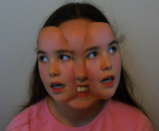
Unfortunately I started to run out of time whilst making this image above which meant that the image isn’t very good. If I had used my time more effectively I would had been able to perhaps smooth the rough edges out and then also make the bottom part of the addition faces should had been moved so it lines up with the bottom main face and perhaps would look a lot more effective.
0 notes
Text
Basic Edit
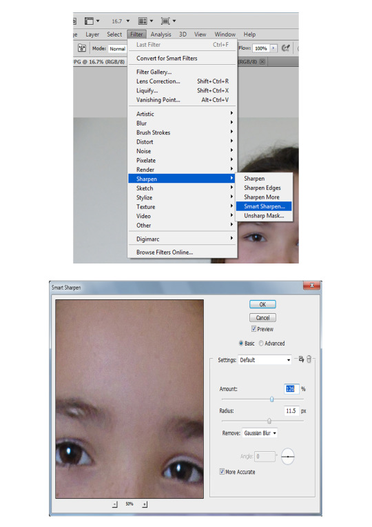
Like all basic edits, the images from my contact sheets has had the levels edited to make the colours seem more natural, because I made the image darker although the grey slider was moved slightly towards the black slider to make it have the more natural effect. However because my images came out blurry I needed to try and reduce the blurriness by going to filter - sharpen - smart sharpen, this bought a pop up box (In the image above) where I edited the “Amount” slider to 126% and then the “Radius” slider was altered to 11.5px. The blurriness was reduced and the image looks a bit better, although taking another photo shoot is something I need to be doing.
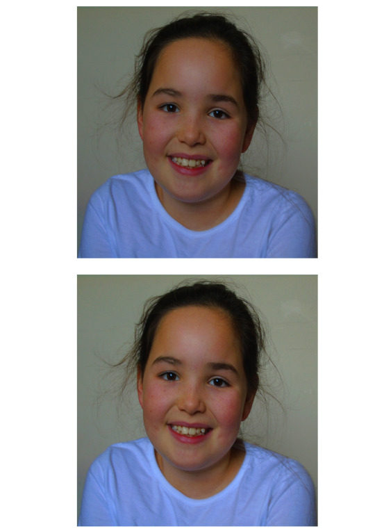
Above are two different versions of the same image where the top image has only the hue & saturation edited because the colour of the image needed to be edited because the image overall looked washed out and colour was much needed. Whilst using the hue & saturation tool I didn’t move the hue slider because I didn’t want to tint the image, however the saturation was changed with the average number being about +40, with the image above being +41. The lightness was altered to +4 to improve the image further however on the top image I think it was still too dark so I decided to create the second image, which is where I focused on altering the brightness, so to do that I used the “Levels” tool where I moved the white slider to the left slightly and then moved the grey slider closer to the white slider, this helped to make the image a bit more natural.
I then realised that the images looked stretched because the computer screen resolution wasn’t set correctly so I had to re edit the images by opening a new page and copy the edited image (Second image from the two above(For the example)) on to the blank page, I then dragged a corner to shrink it and then dragged the sides to make it slightly larger and look less stretched and more natural. (Below is the non stretched version)
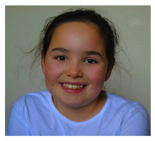
Overall the finished image which had been produced looks much better from what it originally looked like. When you look at the second photoshoot contact sheet and find image “DSC00322.JPG” you can see a massive difference because the original version looks dull because of the lack of saturation, but when I did the basic edit you can see the colour of the skin changes especially after the levels has been altered as well as the saturation. However I think the background could be a bit brighter because the background has a massive impact on the overall image and it seems to keep it feeling slightly dull, however if the background was too bright it would change the vocal point and be no where near as effective, whilst it will also make it harder too visualise the face.
0 notes


