Text
Sound and Animation WEEK 12
The animation used was to create a sense of 3d in the forest. Every one of my illustrations is done on different layers. This allowed me to add animation and parallax effects that could be customized to each interaction.
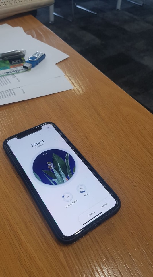
These were critical to the impact the illustration would have on the user. The user wanted to feel immersed; the forest needed to feel like a new world that is slowly growing. This effect was accomplished by creating a "portal" using a circle. The circle made the user feel like they were looking through a window.

The portal was made to feel 3d using particles effects in after effects. The background would slowly move to mock up the feeling of a night sky. On top of this, bird noises were added to make the user feel more relaxed. This idea was inspired by user feedback. People associate bird noises with peace and nature. By recreating this noise, the user becomes even more immersed in the app.
0 notes
Text
Illustrations WEEK 12
When it came to the illustration, the idea was to create a surreal fantasy world inside the app. I wanted the feeling of it growing, and it to feel 3d. I Believe that illustration was the best option. If I were to use photos, there wouldn't be as much control, and it wouldn't have the unique feeling of escaping to another world. The history of scientific drawings strongly inspired the illustration. When settlers came to New Zealand, there were no cameras to capture the unique birds. Therefore, scientists drew them. Some of these illustrations are the only image we have of some extinct bird species. This is what inspired me to do this project.
All my illustration were created it procreate, using an Ipad.


0 notes
Text
Design Sizing WEEK 12
I needed to make sure that my design was able to be replicated on different types of phones and still look good. To do this I did tests on different phone sizes, the main phone I design for was an iPhone 8. Since my design was simple and clean this was quite an easy tasks.

also created rules for my design. These rules were critical when designing for different phones. These rules where type size (Roboto min 17 max 35) and distance between edges. These rules were tested and created by using different phones and finding the right spacing for my

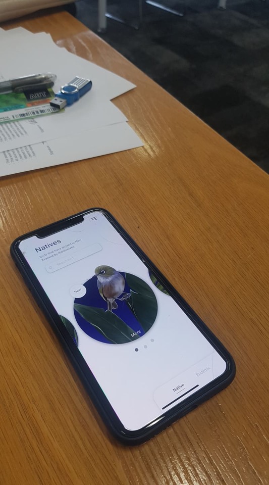
The main thing I struggled with in my designer was my bottoms and type size. Some of my main user feedback was around identifying buttons, as well as the sizing of the type. At the start, I wanted to create symbols for my bottoms. I quickly learned this would clash with the consistency of my app, as some buttons couldn't be symbols like Native and Endemic. This problem leads me to have a type only for buttons, with the appearance of symbols only appearing with type beside it.


0 notes
Text
Research Tasks WEEK 11
When going into creating task for the user to do, I needed them to be simple. People had expressed there interested in helping but didn't want to go out of there way nor put down traps. therefore I needed them to be simple and something the user could do in an hour or to the max a day.
these are some of the articles I read.
https://www.crewcut.co.nz/articles/backyard/encourage-native-birds-to-your-backyard
https://www.backyardbirds.co.nz/bird_feeding.htm
https://www.doc.govt.nz/get-involved/conservation-activities/attract-birds-to-your-garden/
https://learn.eartheasy.com/articles/15-ways-to-make-your-yard-more-bird-friendly/
I decided to go with four tasks. If there was a real app there would be way more, but for user testing and time I decided to test 4 simple ones.
Tasks
Create a birdbath, you can do this by just putting a dish of water out each day. Birds love to clean their feathers and remove parasites, using water.
Placing leaves on the ground will attack bugs which this bird loves to eat. Instead of cleaning your leaves up just leave them there!
Plant, plants with nectar-like Kowhai, Flax, Pohutukawa and Rewarewa. This bird likes to eat the nectar in them. You can find these at your local plant shops.
Put a collar on your cat. This will help alert the birds when you furry friend is approaching. If you have a dog be aware of where you walk them, always stay on the path and always keep them on a leash.

0 notes
Text
Prototype four WEEK 11
I did this technique where I created a personified version of my app. To do this, you act as though your app is a person, and your partner will ask you question to navigate through your personified app. This process helped me identify why I felt like I was tip towing around my issue. I realized there was no motivation to create bird-friendly areas on the app. Therefore, I decided to do this for my next prototype.
The fourth prototype was my final design; and focused on user motivation to create bird-friendly backyards. From my previous insights, the user wanted to take action, but couldn't see the connection between catching a bird and helping birds. Therefore decided to split the app into two flows.
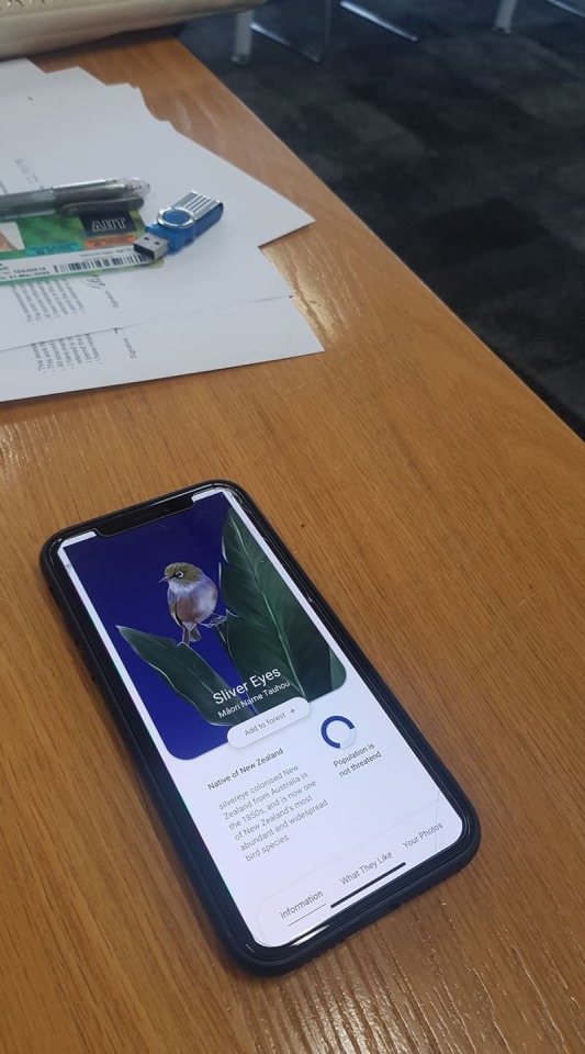
The first flow was taking a photo of the bird and educating the user on this bird. It would then be added to the forest, and the forest would grow. The object of this flow was to encourage the user to care and notice the birds around them.

The second flow: I decided to pair the "bird library" with the "how to attract birds library". This design would be easier to organize and provide a more natural view to the user. It would also have tasks for the user to complete that would involve tasks that would create bird-friendly areas. After the user completes this task, their forest would grow, and they would be a step further to completing their forest. When testing this flow, the feedback was terrific. However, there was still uncertainty surrounding what buttons to push.

0 notes
Text
Research WEEK 10
For the app to accomplish my goal, I needed to make sure it was realistic. Therefore I researched other apps. I discovered that there were lots of bird recognizing apps, with the main one being "Merlin." As well as plant ones like "Plant snaps." Through this research, I concluded there needs to be a process in taking a photo. This process would allow for the best result and the technology to work
Merlin

Manu

0 notes
Text
Onboarding WEEK 10
One of the biggest problems I had when user testing was onboarding. with the main feedback it didn't make sense, why is this app useful and it doesn't bring you in. this is why in my previous prototype I left out the onboarding and starting just by introducing the app myself, as I was lost on what to do for it.
my original onboarding would look like this.

It was a simple 4 steps of what to do. I had planned to illustrate each slide to add more of a visual element to it. But through user testing I discovered it wasn’t just the lack of visuals that made it hard to understand, it was the disconnected to the app itself. each page would explain a key feature mostly on the first page. This goes me thinking that it would be more useful to have an overlay onboarding experiences. therefore I got to this prototype

It was a simple overlay pointing out each feature on the page, as well it gave you a look into what your forest could look like.
0 notes
Text
FEEDBACK WEEK 9

Some primary quotes were; "I feel like there is no connection between the "how to attract library" and the "bird library, I want to know what I'm attracting." "I feel like the information is summarised and I don't know what is important, it doesn't make me feel anything." "The opening page is confusing, and you just go straight into the forest." "when capturing, I want more satisfaction, like notification or animation."
0 notes
Text
Prototype 3 WEEK 9
In my third prototype, I decided to take a closer look at my HMW question. In the user feedback, It seemed like I was straying too far from the problem. The map was useful, but it wasn't able to predict where the birds would be, as they often migrate and move around. It also encouraged users to seek out already bird-friendly areas instead of creating one of their own. I decided to test a new feature: A how-to attract birds library. The idea being the user is provided information on activities they can do to attract birds, therefore growing their digital forest. On top of this, I focused on organizing the bird library, making it more transparent and easier to use.

next was working on the layout of the bird library, the user was questioning how they could know what bird they were catching if it was rare or not. this is why I add 3 different sections of birds. this made the design itself cleaner as well as easier to navigate for the user.

Next was finding a way to fit all the information of each bird into one card. this was requested from lots of users, they wanted to know what they were looking at straight away. I also add a notification system to add excitement as well as help direct the user back to the forest to view the effect of the capture.

The User tests were still similar, except the first task changed to: Where can you find information about the bird you want to see? I also started to ask more questions about my HMW question. Checking the project was on track. The question; would this encouraged you to make your yard safer? Why? How does this make you feel about our native bird population?
0 notes
Text
FEEDBACK WEEK 8

Insight 1: The user is unsure of how accurate the map is, as they don't feel like it guaranteed that there would be a bird there. Insight 2: The user found the experience didn't flow well, due to the various paths required to obtain the information, which didn't connect in a logical progression.
This prototype was a fail. I got similar information to the last prototype. At this point, I decided to take a step back; I was questioning if this was solving the problem. Am I encouraging people to create bird-friendly areas, Or am I tip towing around the problem?
0 notes
Text
Prototype 2 WEEK 8
The second aim was to test the feeling of the forest. The insight stated the app lacked empathy and information. Taking into consideration the feedback around taking photos, I added in a sound identifier. Every bird has an induvial song. This feature would enable the user to upload a sound clip and identify the bird. I then add to the forest, trying to give the feel of growth when the user finds a bird.
I decided to focus on these two objectives in this prototype. These changes were then applied to my script. Not much changed in terms of the task given, but I added a few new questions; how did the growth of the forest make you feel? How would you go about finding directions?
Map
making the map easy to understand. make it usable and helpful to the user. making it easy to know where the birds are.
for this, I looked at a website like
https://uxplanet.org/maps-ux-case-study-e7a3f58dd034
I decided to go with a google maps look, I don't know id the read marks would let the user know there are birds there.

Forest
in the forest, I want to test the feeling of it growing, therefore, I planned on adding my illustrations. this was a hard choice as the prototype is meant to be low fidelity, but to test the users feeling towards it felt necessary.

The scripted didn't change too much as I still needed to know their feelings towards the app and wanted more insight into those things. but I added some more question around the task of looking at the map. examples;
where would you go to find where the birds are?
what would you do to get directions?
what are your feelings towards the map?
0 notes