Visual Communication student at Birmingham City University. Check out my website - My Little Eye Design. mylittleeyedesign.com
Don't wanna be here? Send us removal request.
Photo

My 'Pretty Offensive' screen printed cards are now available to purchase online! Head to mylittleeye.com and click on shop to order yours now! 😸 . . . . . . #dickhead #yourmum #fuckyou #greetingscard #typography #graphic #graphicdesign #illustration #design #art #screenprint #traditionalprint #colourful #funny #offensive #mylittleeye (at Birmingham, United Kingdom)
#fuckyou#dickhead#graphic#illustration#offensive#mylittleeye#traditionalprint#graphicdesign#screenprint#funny#typography#yourmum#art#design#colourful#greetingscard
3 notes
·
View notes
Photo

Playing around with string this Sunday afternoon! . . . . . . #string #stringy #stringtype #typography #inspiration #typeinspiration #letters #surreal #art #design #graphics #graphicdesign #fun #mylittleeye (at Birmingham, United Kingdom)
#graphics#fun#stringy#string#typeinspiration#art#surreal#letters#graphicdesign#stringtype#mylittleeye#design#inspiration#typography
1 note
·
View note
Photo

Stall is up and ready! Come down to 4th floor at The Parkside Building @ Birmingham City University this evening from 6pm for our private view and tons of booze! . . . . . . #bcu #brum #brumcreative #shop #catalyst #viscom #cards #birmingham (at Birmingham City University Parkside Building)
0 notes
Photo

Love graphic design? Love free booze? Come down to the BCU Graphic Design showcase: Catalyst. Private viewing on Weds 14th June from 6pm @ Birmingham City University - Parkside building. The show will be open until 23rd June. Hope to see your lovely faces there! 🤗 . . . . . #catalyst #bcu #viscom #visualcommunication #graphicdesign #booze #design #art #digital #uni #designspiration #inspiration #inspiredfestival #event #june #mylittleeye (at Birmingham City University Parkside Building)
#digital#design#visualcommunication#viscom#uni#inspiredfestival#event#bcu#june#inspiration#art#catalyst#designspiration#booze#mylittleeye#graphicdesign
1 note
·
View note
Photo

Cake toppers! Currently in the process of painting these bad boys. These will be available to buy at the Catalyst private view @ Birmingham City University this Wednesday at 6pm! Hope to see your faces there! . . . . . . #happybirthdaybitch #bitch #happybirthday #caketopper #painting #catalyst #privateview #bcu #design #funny #typography #type #mylittleeye (at Birmingham, United Kingdom)
#catalyst#funny#design#happybirthday#bcu#painting#typography#type#privateview#bitch#mylittleeye#happybirthdaybitch#caketopper
0 notes
Video
instagram
Laser cutting some birthday cake toppers! Stay tuned! . . . . . . #caketoppers #type #laser #lasercutting #wood #bcu #birthday #creative #creativity #art #design #graphics #happybirthday #inspiration #mylittleeye (at Birmingham City University Parkside Building)
#inspiration#mylittleeye#bcu#graphics#creativity#design#happybirthday#birthday#lasercutting#art#type#laser#caketoppers#wood#creative
0 notes
Text
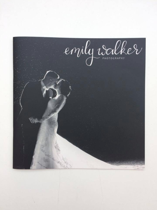
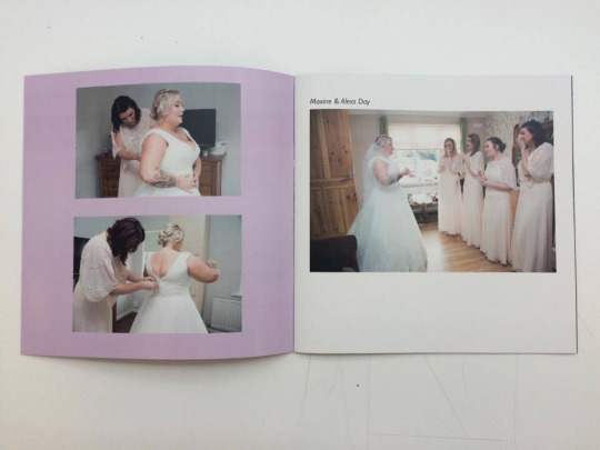
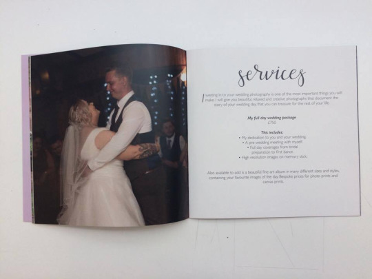
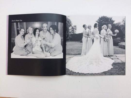
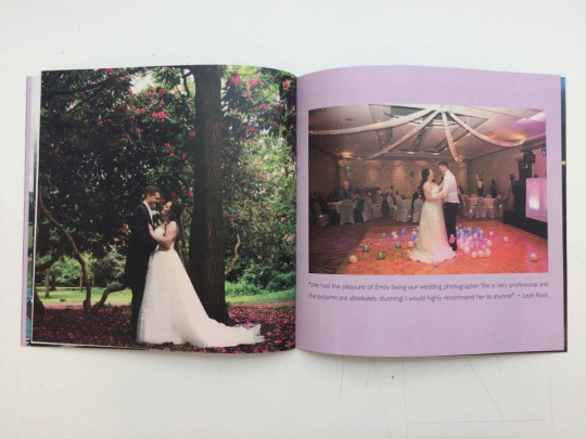
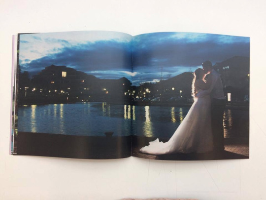
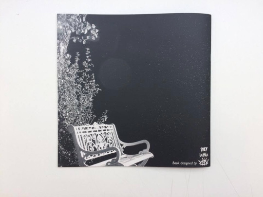
So my book has arrived! It is so good to see it in person, considering I’ve been staring at it on screen for a long time! Overall I am happy with how everything has turned out!
0 notes
Photo

Pretty Offensive Cards! 🙈 Designed and screen printed by yours truly! I'll be selling these bad boys at the private viewing of our grad show - Catalyst, happening at Birmingham City University on June 14th! Hope to see your lovely faces around! 🤗 . . . . . . #prettyoffensivecards #calligraphy #typography #screenprint #cards #fuckyou #dickhead #yourmum #funny #design #designspiration #graphicdesign #illustration #art #colour #bcu #viscom #catalyst #gradshow #work #uni #mylittleeye (at Birmingham City University Parkside Building)
#screenprint#prettyoffensivecards#designspiration#typography#illustration#uni#graphicdesign#viscom#dickhead#gradshow#bcu#design#colour#calligraphy#art#work#mylittleeye#funny#catalyst#cards#yourmum#fuckyou
0 notes
Text
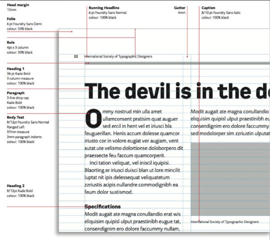
A visual guide to page furniture.
I used this guide to help me lay out the type in the wedding lookbook.
0 notes
Text
Breathless Paper
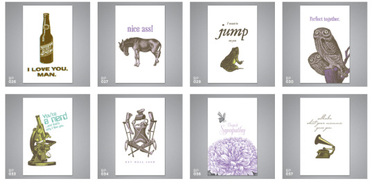
Breathless paper create a range of different greetings cards. Their range entitled ‘breathless’ contain a bunch of cards which say every day quotes which seem quite rude at first, however they are backed up with illustrations of objects which relate to the quote. This reminds me similarly of my card designs.
0 notes
Text
Emily Walker Look Book
As part of the Emily Walker project, I have decided to make a book which she can give out to her clients when she is meeting with them. The book will include services, prices, testimonials and a variety of her photography which will help entice customers to use her services.
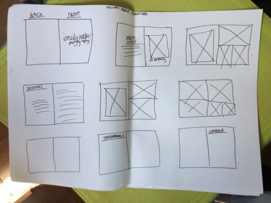
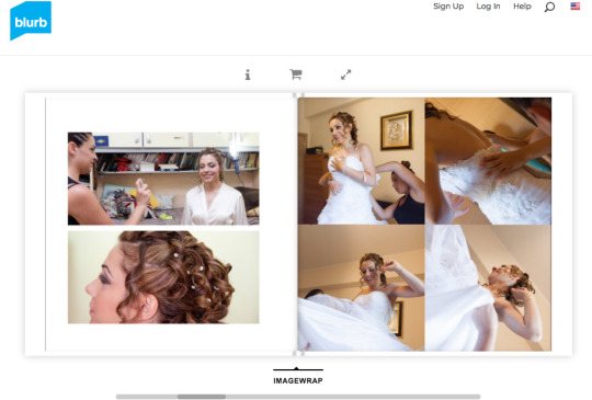
I planned some of the pages of the book before designing anything. I had a look at some wedding books on blurb.com to help decide on some of the compositions.
When I got the images of the couples that Emily had shot, I decided to order them in the book as the couples days had gone on, so that the book tells more of a story rather than a variety of photos. I have also used coloured backgrounds to break up some of the photos from looking too flat.
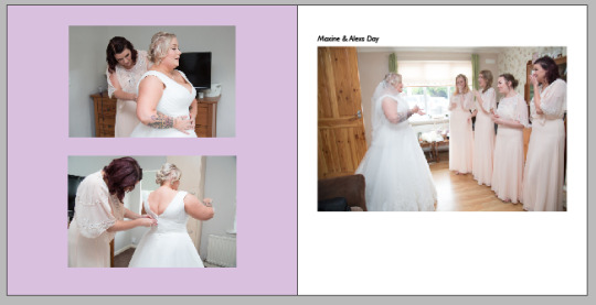
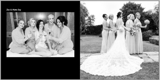
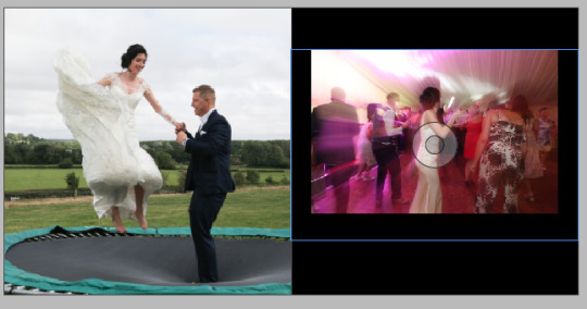
I had a tutorial with Kingsley who mentioned that instead of having a testimonial page, I combine the reviews below the photography.
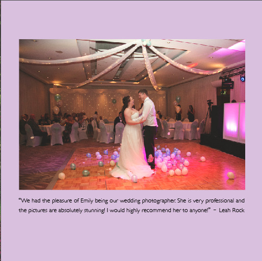
This way it is easier to see that the bride has made a review.
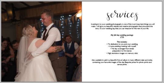
With the titles of each section of the book, I used my calligraphy to represent the titles. I drew out the calligraphy in my book and vectorized it in illustrator.
Collaborating with Emily has been great. We have kept in constant contact whilst working on this project, and she has always told me if there is something that needs changing.
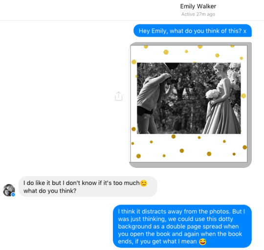
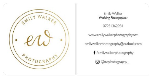
As well as the book, I have also helped by designing her business cards
and I have also designed an Invoice for her to send to her clients.
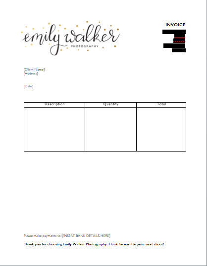
To create the invoice, I found example templates online and used that as a structure to create my own invoice.
0 notes
Video
tumblr
Spreegold animation.
Another animation I created in photoshop to experiment with moving image.
0 notes
Photo
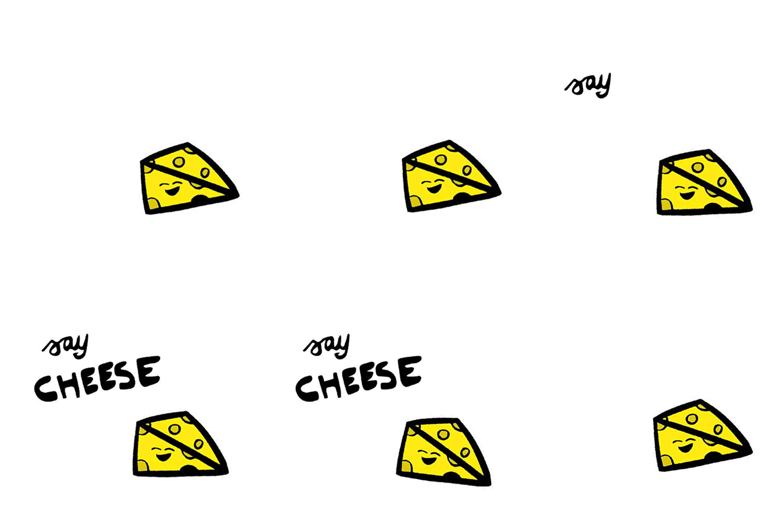
Spreegold animations
Although the spreegold project was a while ago, it felt a shame to leave it as it was. I created 2 animations as I have never really played with moving image in my work. I created the animation using photoshop to create a simple gif. I have previously used animation in photoshop in the past, so I used what I knew from that to create this. In my opinion, it’s not the greatest thing I have ever done but it still shows that I am capable of creating moving image work,
0 notes
Photo
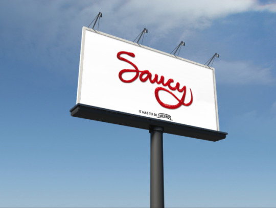

Mock ups of the ketchup posters which I am using for my a2 boards.
0 notes
Text
Cyprus Kitchen Stall
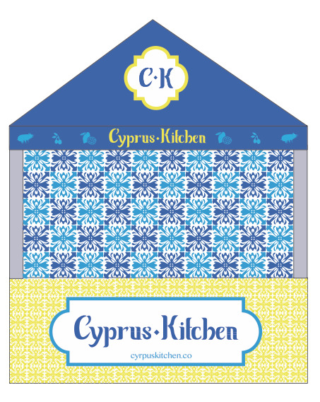
I have mocked up a different stall design for my Cyprus Kitchen project. Below is the original design I made, however I felt that it doesn’t help visualise the idea properly and is too flat.
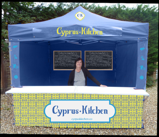
Below is the new version of the stall I have designed. The stall now looks more realistic and viewers will now have more of an understanding of how they see my ideas. I did slightly change a few things, such as the patterned back wall as when I mocked this up, the stall looked too patterned.
0 notes
Text
My Little Eye rebrand
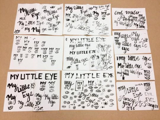
I wanted to rebrand my presence as the current one does not match my identity. I bought a new ink brush pen which has enabled me to reach out to my drawing side. I tired out a variation of different letters and styles to match my identity. I tired out illustrations of eyes too to match with it.
To keep the branding quick, I spent a few days rebranding myself. Above are all the ideas I came up with. I took all these ideas into illustrator and vectorised them to see how they would turn out.
I took a selection of the eyes I drew and sorted them into piles into which ones would work with the branding.
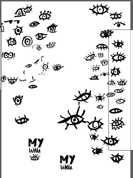
From this, I looked at the text I drew and found a type that would match the eyes well.
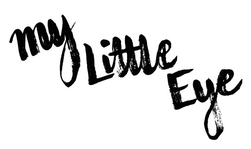
I did try out a different logo variation and this was the outcome.
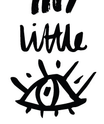
This logo is more fun and reminds me of the Paul Rand IBM logo.
I found a few colours which I thought would represent me well and tried them out with the logo.
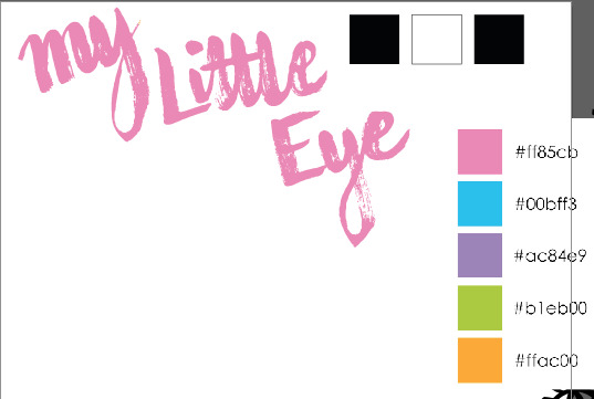
In the end I decided to use the orange, as I felt it was more playful and describes more of the work I produce.
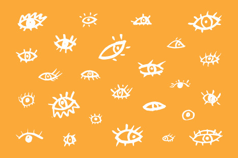
Above is a selection of the eye illustrations. I feel that this design would look good on business cards or even as the cover for my portfolio.
0 notes
