Don't wanna be here? Send us removal request.
Photo


My final mockups and review
Here is my mockup of my final nursery book, the last page is not in mock ups because the file for it wasn't the right one/working.
I am happy with the outcome, and how consistent it looks.
Course Review
Overall using fundamentals I learnt a lot, before the course I had only ever used photoshop and now I have a better understanding of photoshop and can now confidently use illustrator and In Design. One of the hardest thing during this course was starting from scratch on all the software, especially using the pen tool for the first time but I can now use it very well as you can see by all the vector images I made for my book. I want to take these skills with me and I will definitely find them valuable in the future with the rest of my course and my design career.
Mockups resource link
Created using a4-brochure-mockup-free-800x526pxfrom ZippyPixels.com
0 notes
Photo


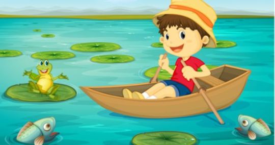


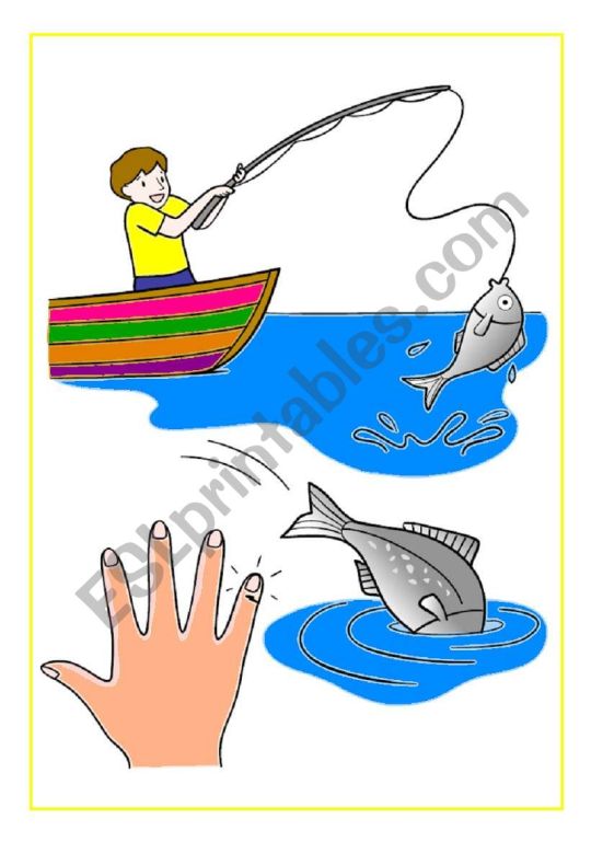

For most of my pages I found inspiration images, and traced them, either the whole image or parts, then I opened the vector drawing in In Design and added them into my spreads. I arranged them nicely and added headings and paragraphs using my paragraph styles to add consistency throughout my book.
For my end papers I made a pattern, I did this by making my shape and then dragging it into the swatches panel and letting go once the blue vertical line appears, then by double clicking on the swatch you can edit it and how the pattern appears.
0 notes
Text
12-page nursery rhyme book
5 chosen nurseries
1. Twinkle Little Star
Twinkle, twinkle, little star How I wonder what you are Up above the world so high Like a diamond in the sky Twinkle, twinkle little star How I wonder what you are
When the blazing sun is gone When he nothing shines upon Then you show your little light Twinkle, twinkle, all the night Twinkle, twinkle, little star How I wonder what you are
2. Row, Row, Row Your Boat
Row, row, row your boat Gently down the stream Merrily, merrily, merrily, merrily Life is but a dream
Row, row, row your boat Gently up the creek If you see a little mouse Don’t forget to squeak!
Row, row, row your boat Gently down the stream If you see a crocodile Don’t forget to scream!
Row, row, row your boat Gently to the shore If you see a lion Don’t forget to roar!
3. Humpty Dumpty
Humpty Dumpty sat on a wall. Humpty Dumpty had a great fall. All the king’s horses and all the king’s men couldn’t put Humpty together again.
Humpty Dumpty sat on a wall. Humpty Dumpty had a great fall. All the king’s horses and all the king’s men couldn’t put Humpty together again.
Humpty Dumpty sat on a wall. Humpty Dumpty had a great fall. All the king’s horses and all the king’s men couldn’t put Humpty together again.
4. One, Two, Three, Four, Five
One, two, three, four, five, Once I caught a fish alive, Six, seven, eight, nine, ten, Then I let it go again.
Why did you let it go? Because it bit my finger so. Which finger did it bite? This little finger on the right.
5. Incy, Wincy Spider
Incy Wincy spider climbed up the water spout Down came the rain and washed the spider out Out came the sunshine and dried up all the rain And Incy Wincy spider climbed up the spout again
Incy Wincy spider climbed up the water spout Down came the rain and washed the spider out Out came the sunshine and dried up all the rain And Incy Wincy spider climbed up the spout again
0 notes
Photo


Today we did another lesson on In design, the first image is a basic drawing I did of the pages layout in In Design.
Parent pages make changes to all the pages with the corresponding parent on the page, as seen with all the Parent A’s in the corner of each page.
Parent and master page also mean the same thing
Grids are pretty useful and important to make things are aligned, as you can see with the 12 column gird I created above to align boxes. You can also break free from the grid you don’t have to stick to it 100% but having some kind of structure/form of grid is pretty important.
In Design keyboard shortcuts and tips
shift + option + command + v = paste in place after you have first copied what you want first (command c)
the none page removes any parent from a page
To change the page number to the corresponding page with an A parent go to special characters and change the number to A - look at screen shot above
To fill a box with placeholder text - type > fill with placeholder text
to make the same changes to multiple pages shift click both of them to make sure they are both selected at once
0 notes
Photo


Today we learnt the basics of in design
Paragraphs are a blocks of text that end in a shorter last sentence and begin again by pressing the return key. An example is shown above, selected in black
Paragraph styles
To make/access the styles tab you go to window- styles - paragraph styles
Are styles that can be applied to a whole paragraphs or characters, making things a lot easier and consistent because the changes can be made with the push of a button once a style has been made.
You can create a character style in two ways - either style some text and then press the + button to create (and then name) a new character style, or simply press the + button and then set the style from within the menu. To edit an existing character style from the menu, double click it to open the style settings.
Character styles
Character styles are for changing characters, words or or collections of words within a paragraph. The difference is important because if you want to make a word italic and apply a paragraph style of italic, it will change the whole paragraph. Character styles just change the characters you apply them to.
Bullet points
To set up some bullet points, put a carriage return after each piece of text you want to be a bullet point. Then make a new paragraph style...
Bullet points to a piece of text is done via paragraph styles and can be found in the properties list to the left of the main information panel in paragraph styles.
Shortcuts/helpful tips and reminders
T = type
To leave a text box/type mode command + click outside of the text box then push v
The two A ‘s with lines and a vertical arrow is leading and it changes the amount of space between lines of text.
To add columns click the arrows for the column looking tool in the top right hand corner of the tool bar
w- toggles you in and out of preview mode, great for seeing what your work looks like without lines/margins and is also handy for screenshooting your work.
When you make changes to a linked image, you save it and then on the link file in your document there should be a yellow warning to say there is changes, to apply the changes you push the arrows that are like in a circle shape and the image will update with the new linked changes.
to move an image and its frame press v
to move an image within the frame press a or use the hand tool on the circle in the middle of the image
hold down alt/option to scale the frame size from the middle
hold alt/option + shift to keep the proportion while changing the scale of the image frame
command + x = cut
shift + command is to scale the whole image (frame + image together)
To wrap text around an image go to properties in window, click on the image you want to wrap text around push the second icon near text wrap in properties and change the offsets to the desired amount of space you would like around the image. If the image is circular or an odd shape, select the third text wrap option and change the offset, it will create a gap around the whole image where text can never go.
To copy an image hold down option on the image and drag
paste into- allow you to paste a copied object into a shape
I have also attached the final layout that we made, which looks pretty cool, I feel like overall I learnt quite a lot in this lesson.
0 notes
Photo


Last class on illustration
My first image I tried to make illustrator is a silhouette/shape image of Saul bass. I chose this image because I thought it was a good time to put my skills to use that I have learnt in this class for my design book as I am doing it on Saul Bass and a black silhouette fits both briefs/styles for each class. First I printed an image of something similar i wanted to make and then I printed off. Realising the first mistake I made was that I forgot to flip the image so that when I traced it it would be the right way. So then I flipped it horizontally and printed it again. Next I traced it, and drew on all the anchor points. Not only was this a bit tedious because of how small some of the shapes were but it also made me recap and fully understand the difference between broken points and corner points, as a drew a lot of the corner points as broken ones. Then later realised that broken ones are when two curved lines join at a sharp corner. I feel like drawing on the anchor points will really help me when I start in illustrator because I now know where all the points need to go before even start and Iv’e got a guideline that I can pretty much follow really easily.
I was right and it made it super easy as I just followed were my points were on top of the drawing and didn't have to think/do much apart from a few small changes of points. For the most part they were all in the general area so it was really easy to follow the guide and adjust as I went. I then filled each shape with black until I had a completed image of Saul Bass.
Overall I found the process helpful and fairly straightforward, because of drawing and anchor points but also because of everything I have learnt and I can now say that I am confident using the pen tool. If I were to do this again though I would definitely make the drawing bigger as the anchor points and shapes were a bit hard to see at some points because it was so condensed/small but other than that it went well.
For my next illustrator vector I chose a photo of 3 flowers because who doesn't love flowers, I also I thought it would work well and be a bit of a challenge for the shading aspect.
First I traced over the image on my computer screen, then shaded in the different shapes so that they were more clear as some of them are quite long and thin, then I drew on all the anchor points again. I placed the drawing in illustrator and followed it with the pen tool and filled in the shapes. This time I felt like I didn't really use the drawing to guide exactly as much as because the petals are not very perfect anyway. To make things easier I also made one flower and then duplicated it twice rather than doing the flower shape three times are they are all pretty similar.
To finish it off I added a shadow/shading in a darker colour around the edges of the flowers using the path finder tool like Toby showed us in class. The process was a bit fiddly and harder than the first vector as I did it in parts after deciding to change to doing around all the flowers rather than just one side of them. But in the end I got there and i’m happy with the finished look.
0 notes
Photo


Continuing on from class today I did more touch ups around the hair. I did this by selecting the areas that needed improvements with the polygonal tool. Then I used the black brush to paint away the areas I didn't like on the main layer of the guy. On the grayscale mask layer that we made in class I then I added the missing parts back in using the white brush. For the rest of the image I used combination of the polygonal selection tool and the brush tool, resulting in a pretty neat cut out of the guy.
Next I added a subway surfers background and a spray effect using the brush tool. It looks cool and the jumping guy reminded me of the subway surfers game so I thought it was fitting.
I also added a coin vector image which I made using the pen too to trace a photo of one that I found. I did this instead of making an illustrator smart object because its small and I also don’t have access to illustrator at home.
To finish it off I added another cutout of the subway surfers guy, which I did mostly with the object selection tool and then did a few touchups with the brush on the mask layer, especially around the dog.
Overall I enjoyed learning and practicing multiple skills to create a cool creative scene. Creating an image was a cool way to practice these skills and I feel like I have a pretty good understanding now of what we have learnt over the past few weeks with masks and selections.
1 note
·
View note
Photo


Shortcuts
command n = new file
command D to drop a selection
command e = merge/flatten layers
remember to click option for broken points on sharp corners
To stop automatic selections of other layers turn off auto select on the top tab in the corner so that there is no tick in the box.
When wanting to apply an adjustment to the only the layer below push the arrow in the bottom of the properties tab as seen in my first screenshot above.
To make a selection using the pen tool, go window and turn on path, then click on the path you want while holding down command
option click on a layer mask to see the black and white version
for masks - black = transparent, white = solid
option delete to fill a layer
To clean up the hair we made a grey scale copy of the guy and copied it into a layer mask then we used the the polygonal tool and mask to clean up the cut out of the jumping person
when u have a linked file added in photoshop any changes u save in the linked file will then save where the file is. We did this with the s shape to change the colour and I changed my from black to blue.
0 notes
Photo
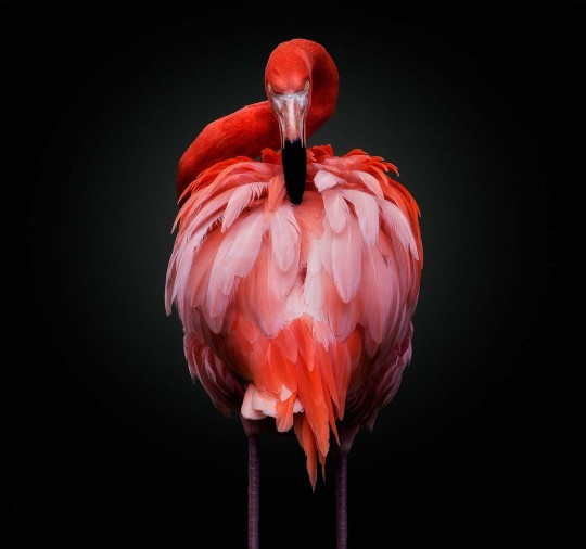
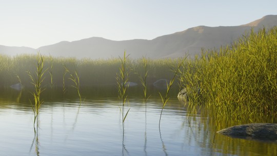

Week 5 activity.
As instructed I chose two images, the flamingo and the background. As you can see from the image above the flamingo had a black background, to remove it I basically did what we had learnt in class. I selected the layer using the object selection tool, then I made a layer mask of it, coloured in the edges a bit to get rid of the weird outline, finally I applied the mask and copied the flamingo into the background layer. I then realised the legs were a bit cut off/short so I went back and used the clone tool to extend them a bit and then placed the whole flamingo into the background.
0 notes
Photo
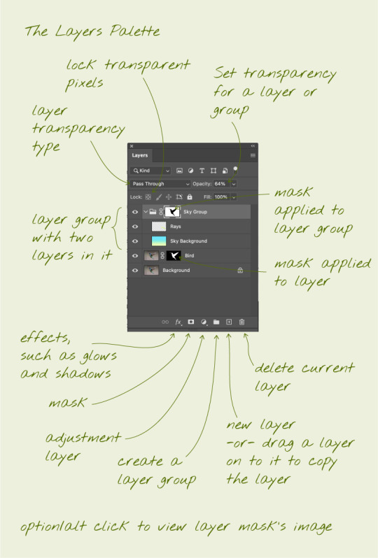
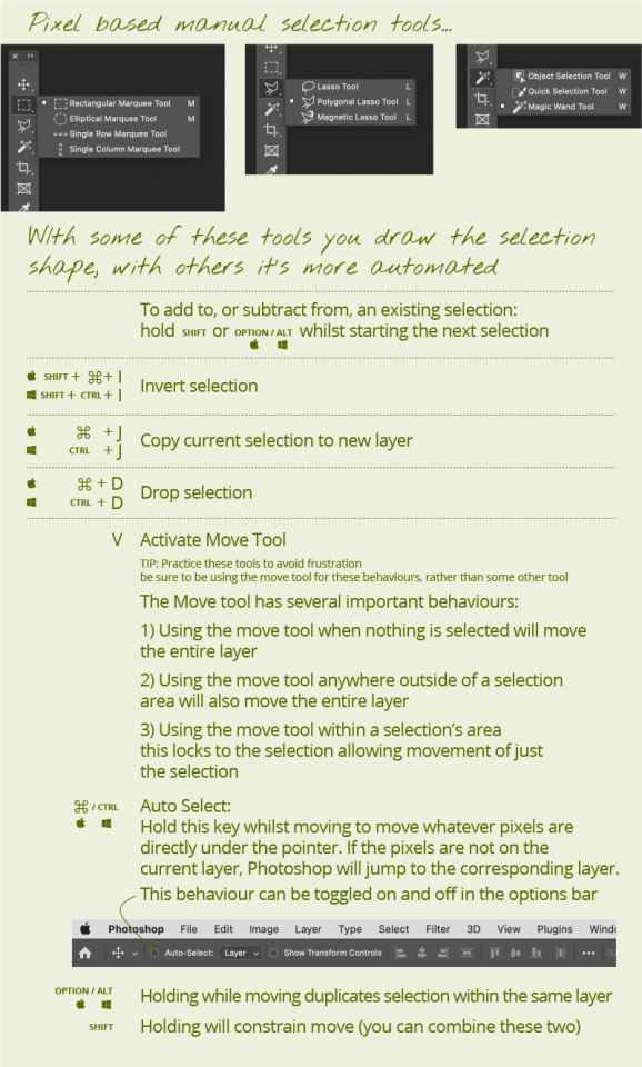


Above is a good diagram about the layers pallet and different types of selection tools. And also examples of how we used the selection tools and layer mask to move things around and change colours.
We also cut out a bird, edited the edges a bit to make them more natural using the layer mask and then we moved into into a background image, the result turned out quite well.
If your adjustment layer is being applied to everything click on the bottom right icon in the properties panel so it only applies to the layer directly below it and shows an arrow pointing down.
When using the marquee tool, click inside inside the selected are to move just the selected part otherwise if you click outside the selection it will move the whole layer still.
Shortcuts
v = move
Move with option = duplicate selection
move with shift = constrain
m = marquee
once a selection is created: shift = add to selection- option = subtract from selection
command j with marquee selection will duplicate the selection and put in n a new layer
command puts you in auto select mode and anything you try and move will regardless of what layer it is on as it will jump to the layer its on if you aren't already on it.
when creating a selection hold space to position it
l = lasso too
too get inside the mask layer option click on it
option delete = fill layer
0 notes
Photo


The photo on the left has very bad lighting in the foreground and you could hardly see the main subject of the people. Again I went in and used the curves to bring the brightness right up. I also increased the saturation and lightness too. Out of all the images this is one is probably the one that clearly needed editing and was probably the easiest to edit as I knew exactly what needed to be improved just by looking at it. The edited photo on the right also looks quite different and much better than before
0 notes
Photo


I chose the photo on the left because it was a bit bright/over exposed in the sky. Because of this it was quite hard to edit, but I still managed to make it a little better by changing the colour tones a bit more. First I used the curves and brought the center of the curve down a bit to make the overall image a bit darker. Then I bought the saturation down a bit and made the hue more blue. The edited photo is still over exposed right in the lightest point of the sky but I am happy with it as it looks much better than before.
0 notes
Photo


I chose the black and white photo on the left because I thought that the hair and back was a bit dark. I lightened it up a bit, pretty much the same way as before, using the curves and then hue, saturation and brightness. Although the changes are subtle they definitely make the photo look a lot better.
0 notes
Photo


For my first black and white image I chose the image on the left that I took because the foreground is quite dark and brightened it up.
To do this I first went into curves and brought the triangle on the input into the left a bit because the lightest tone in the image was not white enough. Then I put a point in the middle and bought the the point up a little to make the image a bit brighter and then adjusted the hue saturation and brightness a little bit to bring a bit more detail back into the sky.
0 notes
Photo


Today we learnt about image adjustments and how to use curves to change the brightness in an image.
Above you can see how we have corrected a few images using the curves to add or takeaway brightness and contrast.
Next we learnt about colours and the colour wheel basics as well as hue and saturation. And how to use those things to edit photos as-well, examples we did are above.
Opposite colours on the colour wheel cancel each other out, leading to grey.
When we applied a sepia photo filter to the image it made the blue colour grey because orange and blue tones are opposites on the colour wheel.
Lastly we did some more vector drawings with the pen tool. I didn’t manage to finish all 6 of the drawings because it takes quite a lot of focus and I wasn't in the right head space to have that level of focus at the time, but I tried my best and got at least a few of them done.
Overall I felt like I did learn quite a bit about how to use the adjustments and curves correctly, I still don’t fully understand it but I have a much better understanding that I did before, one that will allow me to improve my photos with editing to some extent.
Photoshop shortcuts
b= brush
e = eraser
option = colour dropper
[ ] = brush and eraser size
z = zoom
command w = close window
0 notes
Photo


Today we made a penguin which was quite fun, overall I found it quite easy to follow along. This was probably because I wasn't at class and was watching the recording which was helpful because it enabled me to go back and rewatch what Toby did at any time so I could go at mine own pace, but usually I managed ok in class anyway. I am pretty happy with how my penguin turned out except for the fact that there is no outline. I’m not sure what happened but I did something wrong near the end and I think it got deleted or I added a fill on to the outline layer. I tried to fix it but couldn’t see a way with out redoing it.
Next time I will save my work more often because in this case I did save the outline of the body but I had since tweaked it so it didn’t match the size and have exact shape, but if had saved it I could've copied the outline from the previous stage or just gone back a few steps if I mucked up the whole thing too much. During this task I definitely learnt about the importance of saving often, so if something does happen to go wrong you haven’t lost your whole project.
Below I have also taken note of some of the important shortcuts.
The image above shows how to flip something, but you can also click on the other point rather than dragging
To toggle smart guides ( pink lines) on and off = command u
Command a to select everything
command x = cut
command v = paste
select with a and a box then command j = join points
command a and box select and then move the arrow keys moves the selection a little bit, hold down shift to move a lot.
+ = adds a point
command y makes things easier to see
to join two points select them and push control j
Command G on selected layers to group them and shift command g to ungroup
to make the end of a point or a corner round use stroke (can be turned on in window drop down) and select the middle options for caps and corner.
0 notes
Photo


Vector drawing swap
I started by reading the task sheet through and chose two vector drawings from the noun project. Then I traced them and sent them to Emma.
She then she sent me hers and I made vectors of them.
When it came to sending our finished vector files back to each other for improvements it was a struggle. For some reason teams was sharing the files as cloud document links rather than the actual files.
I eventually managed to get Emma’s files through email but she still cant access mine when I did the same and I’m not sure if the issue is on her end or mine, or both.
After finally receiving hers I made improvements, firstly I changed the line thickness to 4 points and made the drawings bigger. I then deleted a random line that wasn't part of the space man drawing and added some more details to get them more exact to the drawings I sent Emma. I also corrected the shapes and angles a bit to make them more accurate. This was quite hard to do as some of the lines were made in a way that, wasn’t easy to manipulate/change unless I redid the whole thing completely which would defeat the purpose of the activity.
Because Emma wasn’t able to open my files, Toby made improvements to the dog one. I now know the problem was not on my end because Toby was able to open them on his computer, the problem was most likely her trying to open them on her iPad. I thought that I had made a pretty good attempt on my vector drawings but after Toby managed to edit them you could really see the difference with the finer details that I missed. I’m sure that I will get better with practice and so will my attention to the finer details.
Because of this process I have now learnt that you can’t really open files on an iPad and that and that if you want to send them through teams they need to be a zip file.
0 notes