Don't wanna be here? Send us removal request.
Text
Map feature reflection
obviously this late into development its not viable to change this feature. but its obvious that the map in game is a flaw and definitely underdeveloped.
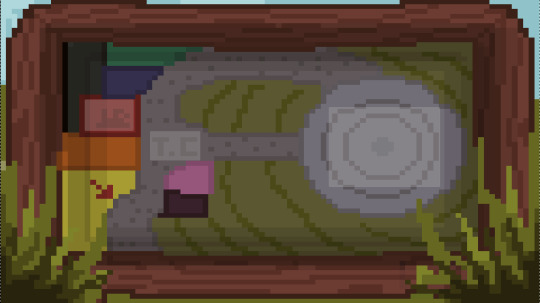
this is partially due to not getting the map asset until the latest part of development. that way I wasn't going to integrate any features that wouldn't make sense. personally I wanted an information board on the side of the screen, that when you hovered over each location it would give a text description of the location, telling you what that place was. instead of having to just infer.
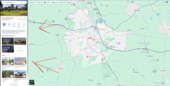
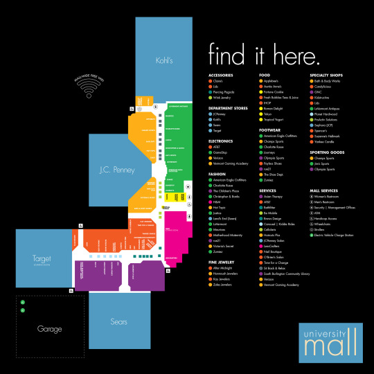
something like this, where you can see information about the location you have selected. as you cant tell what you are selecting to begin with.
0 notes
Text
Typewriter text reasoning
when adding the typewriting text feature i mainly wanted to have the dialogue system replicate what Undertale and other games have done, where the text appears gradually like the character is speaking those words.
youtube
Also I thought that it would make the game more engaging and animated feeling.
The speaking aspect of the text boxes was initially planned and I wanted to integrate different voices for different characters, very reminiscent of Undertale.
0 notes
Text
Phone Research
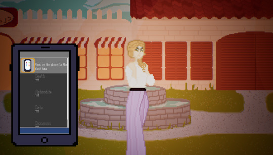
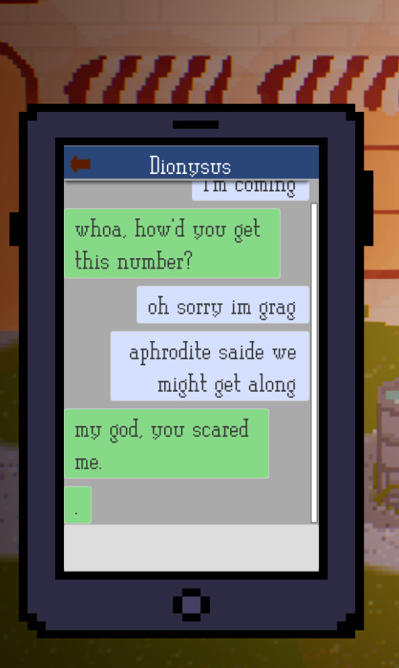
Josh asked me to add a phone to the game, due to him wanting a text messenger section of the game. so I started looking at messengers in real life and games,
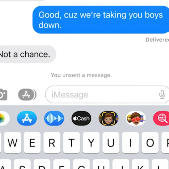
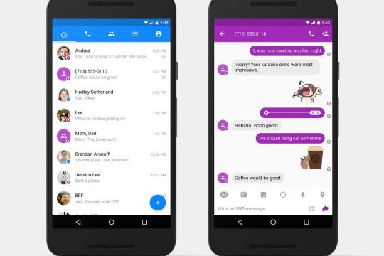
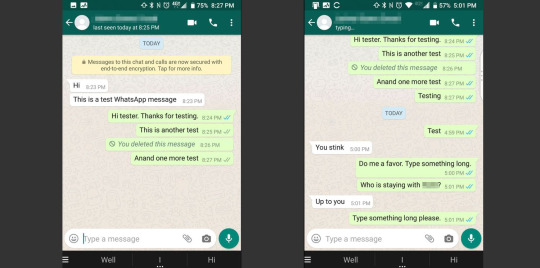
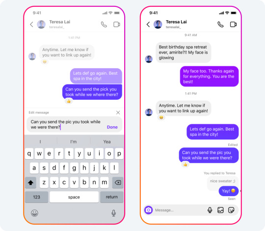
In games they tend to follow the same basic messenger formats. of text bubbles going back and forth.
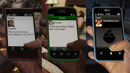
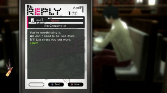
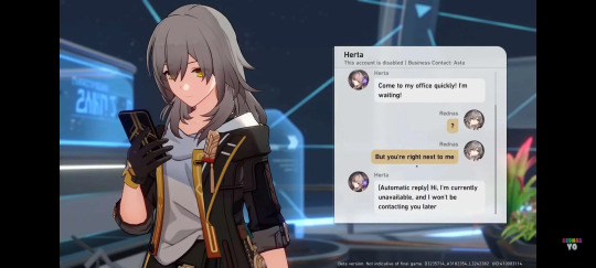
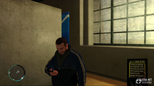
all of this seems quite boring to me though, so I'm thinking of how i could make messaging more interesting, something i immediately thought of is gifs. and maybe using gifs in the messages to make it look more interesting. but that's a gimmick and not really interesting. maybe there could be a minigame that dictates your messages, a text typing game where you have to actually type the message without making typo's and the better the spelling and grammar, the better the score / result. or perhaps the IMessage games like 8 ball pool or cup pong, where you might have to beat the other person in a messenger minigame to progress.
0 notes
Text
Working collaboratively : Overview
Working collaboratively on this project was interesting to say the least whereas last term I did a lot of the work unfortunately and could actually do all the work. the art (which is a major component of a visual novel) was left to josh, now he definitely didn't do a bad job of it in the end, he took ages to complete and send the art to me. leaving most of my art importing to have to be done in the last week, which caused problems. as I had to cram all the importing into the last week, meaning inevitably there were errors in my work due to rush, such as typos in the script, wrong assets in certain spots. or worst of all, certain features which required assets for me to properly make, such as the achievements and map, I didn't get to finish the map because I had no idea what it would look like until the end, and I didn't want to add text boxes to the map screen where art would be or something.

this Monday was at a point when the project was supposed to be completed.
I will say again that there were certainly faults from me as well, I made mistakes during importing his script, and I could of gave him more direction on what I wanted done on things like the map, so I could have space for better UI features.
aside from that working with another person gave my work some more quality control and he also gave me some really good ideas. I wouldn't have been pushed as much as I was if not for josh. the phone in game was something he came up with, I said : 'that's insane do you know how long that could take'. but he didn't care and wanted the feature. so I had to do it and its now a pretty standout feature of the game and development.
0 notes
Text
Evaluation:
AO1:
I chose to do this project as I wanted to better specialise in the UI development and Data Management aspects of game design, i had previously explored those avenues of game design in my witch game i did last term.
My specialist considerations were probably first and foremost out of everything, Data management and UI design is something that I recently found out I was not only good at but also find fun (somehow). I wanted to use this term to better explore methods and techniques in those fields.
As far as the ethics of dating simulator games go, it's socially questionable, although the fictional setting of Greek gods makes it far removed from reality or human ethics, aside from that it was just josh's use of swearing in some dialogue options, though it was certainly not excessive or offensive.
Being a game about Greek mythology it is an inherently rooted culture. I had no hand in the artistic choices, though i made sure josh properly researched and explored the source material we were basing this on, as to not be culturally incentive about the source material
I don't know if our game relates whatsoever to sustainability. outside of the plot where you are saving the world from the gods, by romancing them.
Blog Post
AO2:
We chose the subject of dating sim because it would allow me to better specialise in data management and UI work, and when josh said he could do all the art that sounded like a perfect combo, i do all the coding stuff then add all his art and script
I was mostly putting into practice things that I learnt last term. But I also learnt a lot about UI, making the cell phone in game was a challenge and a half considering how many different moving parts it involved
The original intention was to make a Greek god dating simulator. To begin we had much grander expectations of what was possible for us to accomplish, but otherwise it mostly stuck to plan. There was a period where Josh wanted me to make a minigame to go along with Dionysus but that fell through, given time constraints.
My speciality is in the code/ data bits of the final outcome which is the game
Proposal Bog
Previous projects
A03:
Initial research played a crucial role in this project. I hadn’t really played visual novels until this project but having a play through and picking up on standards of the genre, interesting ways the genre has been combined with others. My game would probably be lacking a lot if not for this research.
Further research of methods and ideas came in the form of UI design inspiration, structuring inspiration and much more.
These ideas supported the planning, idea generation and polish of the game. I wouldn't have storyboarded the UI flow if not for researching Specialists in the field I was interested in or the UI design.
This is all demonstrated by the research I also did for a concept of an idle/ rng game that I was going to make before coming up with the idea for the dating sim.
I had also done some brief research into the project i wanted to do previously, before pivoting to do the dating sim.
Complete Idea generation blog post
Initial investigation of theme
AO4:
I used a variety of techniques, (using child widgets, data tables in conjunction with physical actors and UI widgets), making the entire cell phone system was a chore on its own, let alone integrating a messenger system, achievement system, options and more into it, adapting my crossroad dialogue branch technique to work across the normal dialogue and the text messenger. Messenger Dev, More messenger Dev.
I was most interested in using data tables as a method of automating different aspects of the game. That's why initially I wanted to make an RNG/ Idle game. Instead i used the processes in a similar way to how i did the game for last term which i continued work on to submit for a bafta this term
Considering I had the core systems working within a week or two, then spent weeks adding all the content into the data table structures I had done a pretty good job of getting the system to ‘work for itself’ (where it was just processing the information I fed it). The only slip ups i made were on the UX front which i admittedly didn't leave too much time for
AO5:
Key aspects of my work were probably the core dialogue system, where I incorporated all the text that displayed names, dialogue. The character sprite system to get the characters sprites to show up (blog post), and be able to pick the locations of them, as well as change all of that from one sentence to the next. Then add the animations to the UI and Sprites. Failures were more in the creation of the cell phone, and more specifically the messenger. That took me a week to figure out, in between adapting the crossroad system to work in the phone, Getting the UI to properly display itself in the Text message format (which was way harder than it should be and took multiple iterations and methods to finally settle on one that worked). Contacts Dev, ,,
The factors that most influenced my ability to problem solve would probably be the basic yet easily applicable nature of widgets, a lot of it is managing information that is stored. Making most things possible as long as I found a way to input the data I wanted, and output it to where it needed to go. I would probably say that a big culprit for my data table habits, are my knowledge of SQL coding that I learnt a few years back, the logic and theory behind SQL carries over pretty well to UE Data tables
AO6:
My thought processes on creating this game was that I wanted to demonstrate what is possible with data tables, to the fullest extent, which ment using them to display a 4000 word script, dozens of drawn character variations and backgrounds, and UI. it was truly something for me and josh to perfectly work hand in hand on something. When putting those ideas into practice it certainly ended up much more finicky on my end, matched with josh's last minute work ethic it meant that i had to add all his work he had done in much less time than i would've liked but it worked out.
When conceptualising this project, it was actually mainly the fault of my friends. I knew I wanted to better hone my abilities in UI and Data management, then at night my friend Olivia joked that we should make a dating sim. So from the very get go this project was being made with an audience in mind. She has been a pretty key component of developing with being able to pitch ideas, or get feedback from her.
AO7:
I chose to present my project and final outcome in a manner that would demonstrate primarily my coding and planning abilities, i tried to focus heavily on thinking ahead on this project and establishing early on what the necessary features, methods and precautions should be. So I looked to industry specialists in my chosen field. One of my faults with the endless runner project was that I didn't plan ahead whatsoever to account for UI. So when it came to incorporating, it was a mess. Planning ahead slightly with the UI flow chart (even if it is quite primitive) as well as the trello board, gave me structure and direction to my work. This methodology will help with my professional practice. As to their effectiveness in communication of ideas, the drawn plans show my initial ideas and concepts before I followed through with R&D giving not only my blog work structure and professional merit but also the resulting work.
AO8:
The aim at the start of this project was much more ambitious than possible (as per usual), with the plan being a few dates, each date having a dedicated (‘feat of-’) minigame. Whilst it ended being an intro segment with barely one date. Given it has a lot of branching possibilities but one central win ending. It probably equals about 15 minutes of playtime, which isn't bad, and from my perspective, it's not how much content it's what that content is. I could have spent 10X more time just adding more dialogue, art and whatnot that Josh did. And it would probably be the same game, but 10X longer. What I was focused on demonstrating is the core systems I had to plan out, design and adapt. I couldn't have done much more work on this aside from finishing touches and minigames for the dates.
0 notes
Text
Looking back
Just had that thought, I could have probably saved a lot of time had I better organized the systems I spent so long on. because i spent a decent amount of time looking back on the systems i had made and having to re-decipher what I had previously done in order to adapt upon it properly. The comment and annotation feature in Unreal is something i need to learn to use
0 notes
Text
Playtest
Just when i thought i was done, chris came over and poked a million holes in the game. a few basic bugs that were easily fixable. but mostly UX stuff, Fonts, color choices, Grammar, structure, spelling of the script. honestly speaking im not going to be able to go back through the entire script and correct all the grammar and spelling, that would probably take me days at this rate, but ill change the easier UX, especially as i was planning on finally getting to the written part of the game
0 notes
Text
Finally after an hour of work this Tuesday morning, I got the game finished
Aside from sound which i cannot be asked to do, i can now start the evaluation process for the game. it now in a presentable state
0 notes
Text
Finishing
Josh finally finished drawing all the characters so i just have to spend a bit doing that then the main core gameplay is done.
other tasks that I'm gonna do are sound and achievements though, as josh is currently drawing the achievements
This should all be doable in an hour or twos more work tomorrow, quickly make the achievement gain function to make them unlock able, then add sound and make ill have a day or two to work on the blog work side of the project.
Im also going to be able to do blog/ written work at home and on Thursday which i will probably choose to go in on, meaning i can hopefully finish the game project. Then knuckle down on the blog work. Because currently it hard for me to do written work when theres practical work that’s doable, more fun to do and would benefit the written
0 notes
Text
Final Tweaks : Phone colours
My main thought process behind this was looking back at the thematic ways games like DDLR (Doki Doki literature club) , and GTA V have background and theme settings for their digital devices that are used in game.
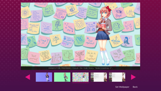
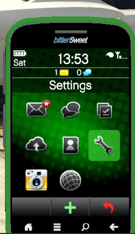
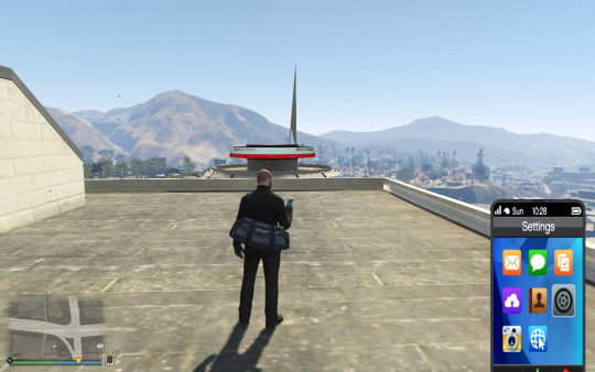
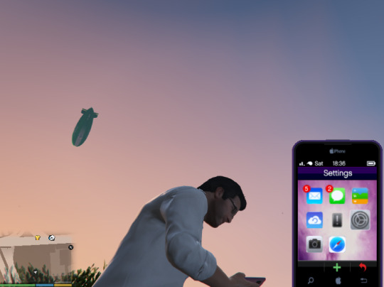
so i added options to the colors you can have your phone
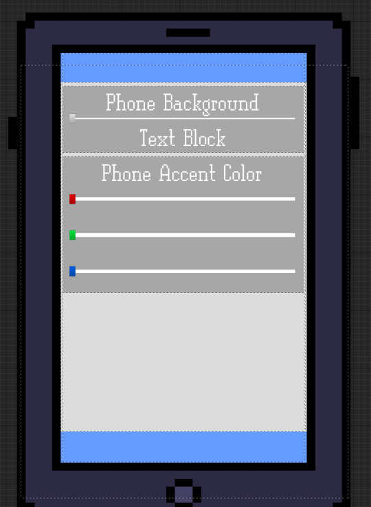
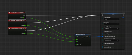
the sliders control values on a variable that all the selected boxes use as a color,
then i also i added the phone background slider to change the image for the phone background.
0 notes
Text
List of improvements
I don’t know if ill manage to get the time to fulfil this list, but regardless
Class/ skill point selection system, currently the skill points are there. But they are predetermined values. This kinda makes them obsolete as the player has no choices to make on the matter
Sounds, no game sound makes the game feel awkward.
Finish integrating all of joshes assets. I have no clue how actually close he is, but i should be able to add his assests
All of this is slightly difficult as my pc isn’t letting me do it, so either i keep trying and hopefully it magically starts working, or i get some spare time at college
0 notes
Text
Technical issues
Ive been trying to do work from home to finish some small polishing details.
Yet i have been struggling due to my pc crashing specifically when i go to save my project, I’ve been able to do some work without crashes, but honestly nothing is more demotivating than pressing the save button only to have all that progress wiped, i could only compare it to Sisyphus at this point. Ill see how much more work i can get done. But I might just have to settle for having got all of the core aspects of the game completed, and abandon doing the smaller finishing touches I said I would do.
0 notes
Text
Sounds
Wanted to add sounds in the end, but due to time it simply isn’t important enough to warrant spending time i could be using to do blog work or presenting my work
0 notes
Text
Phone apps
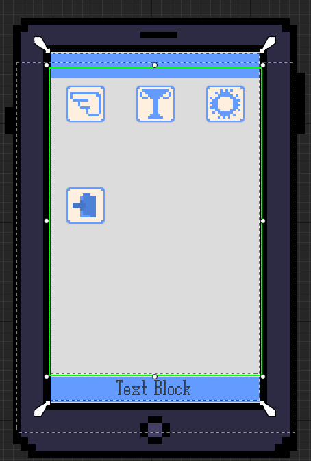
following through with all of the phone inspiration, i wanted a basic phone home screen to return to to select your basic apps.
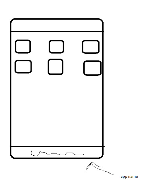
planned out the general shape of the app screens, obviously nothing special. but achieving the grid list of apps will be something to work on with my current knowledge of lists in unreal. so far I know horizontal and vertical lists as well as their scrolling variations but grid, and how to get apps to stack properly in grid will be a problem
youtube
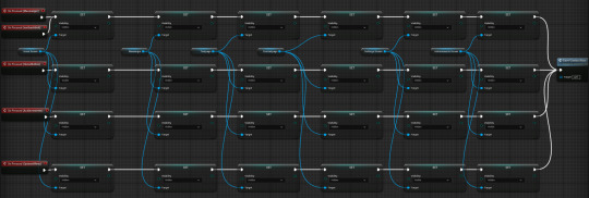
The phone works by just enabling different screens, you start on the home screen, select an app then that screen gets enabled josh recently finished all the icons for the apps.
0 notes
Text
Achievement system
Something i wanted to add from the start of this project, regardless of the game type, was a working achievement system, because ever since I learned how to use data tables and widgets in the ways I do, my mind opened up to all the different things in games that I would be able to make now.
so first I had a look at achievement screens from games I know and noticed a theme I liked, just stacks of achievements with an icon, name and description. I don't know how possible a progress bar would be, or the point of rewards in my game, since there isn't a currency or items.
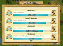
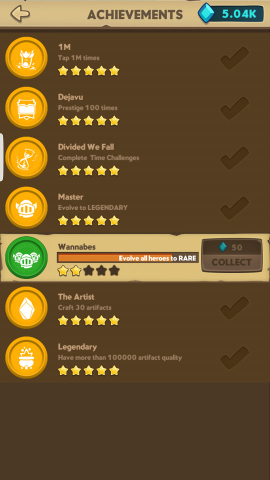
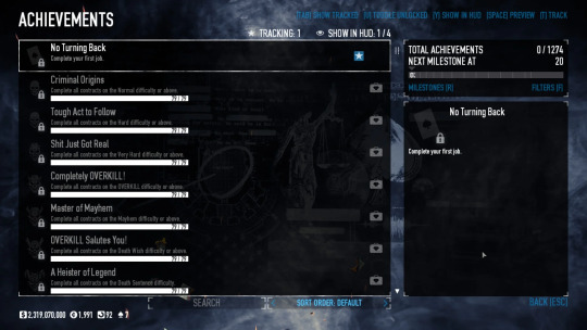
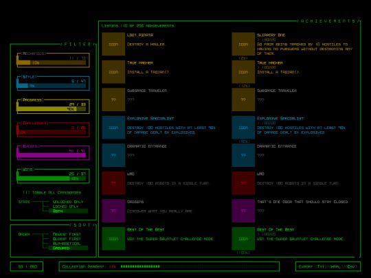
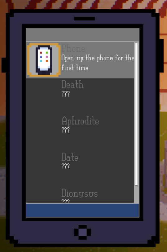
So far i have just gutted the templatey aspects of past widget stack systems, this time it was the the ‘contact’s’ page. This was the logical course of action as the contacts page is a stack of boxes displaying a name and image, what i want to display with the achievements system is stacks of the individual achievement, with each achievement being a box with a name, description and image. And then the ability to check it off as completed.

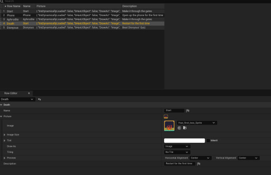
So i just had to attach variables to the individual achievements. Fill a data table with all of the necessary info for each achievement. Then make a function that makes it so that i can trigger the completion of an achievement.

Outcome
0 notes
