Don't wanna be here? Send us removal request.
Text
CAGD202 journal
CAGD202 WEEK 1 –
- Went through the subject outline and through the assessments extensively
- Chose our site to redo
- Council library site
- Looked at ways to arrange sites, and what would be the most fluent and accustomed to the users expectations
- Hierarchies and taxonomies
- Ways to chunk information
CAGD202 WEEK 2 –
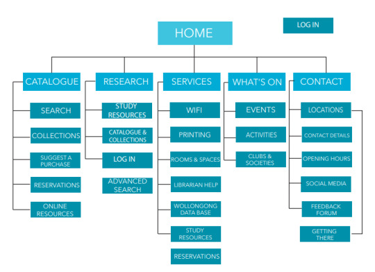
- Addressed Kiara’s list of website pages and drew a big map of the site and the 3 levels the site has.
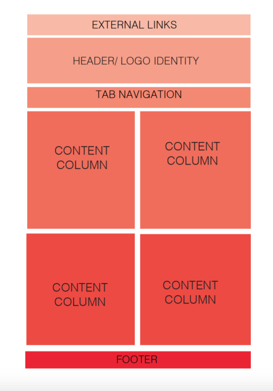
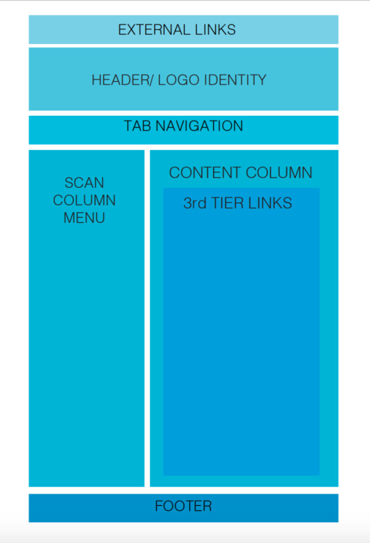
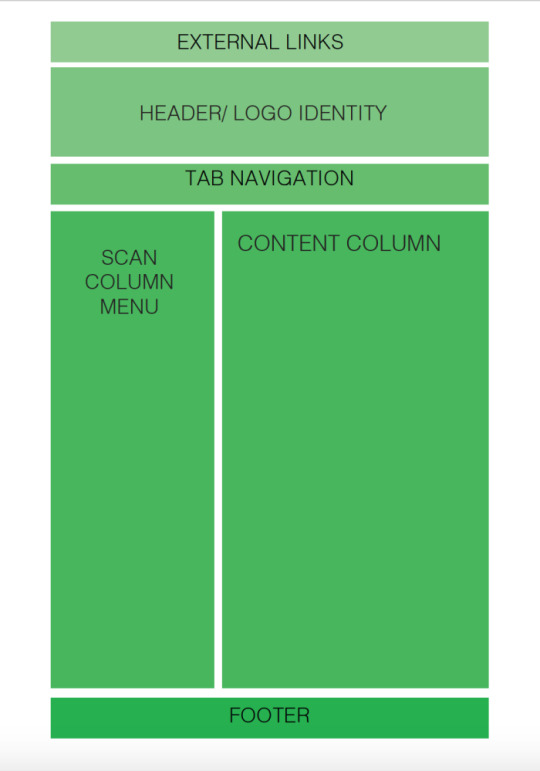
- Took screen shots of the sites different pages and drew a wire frame of the sites layout
- A basic idea of how were going to improve the site
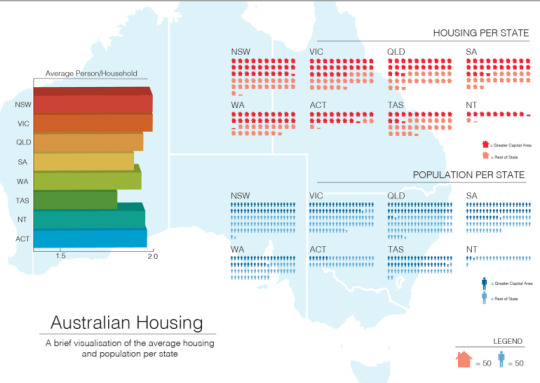
- Jos lecture: data visualization and information design
- WHERE: text books, newspapers, charts, polls, ads, anywhere that data needs to be represented, visualized and delivered to a user or a reader
- WHY: helps to interpret the information given, in a commercial it could be used to persuade a viewer to act or change behavior, in a newspaper it could be used to inform the general public of statistics and educate them on the goings on.
It’s useful in revealing hidden information and may point to various problems that weren’t so obvious before.
- HOW: when a human is given a large number they struggle to visualize the number in relation to the object in question, this is when the number is associated with an object the person is familiar with and they get a greater sense of magnitude.
The data can be skewed though due to the relative denseness i.e. Plastic will take a lot more space than concrete per kg
CAGD202 WEEK 3 –
- Made a start on the data visualization poster, making key decisions of what graphs to put where and what visualization methods would best show the data and the relationships between the data.
- Also made a start on the graphics to incorporate into our poster.
CAGD202 WEEK 4 –
- Drew up the library site architecture and assessed how this can be changed in order to better display the information a library has to offer and what functionality could be implemented.
CAGD202 WEEK 5 –
- Public holiday
CAGD202 WEEK 6 –
- Absent
- Chose and confirmed what sections of the presentation im talking and writing about.
CAGD202 WEEK 7 –
- Presentation went well, hit the 10 minute mark on the dot
- Went through the strengths and weaknesses of the data visualization posters, drawing the line between data visualization and information design, compared our poster to the other students and assessed the techniques used, if we were to do it again there would be some changes made in the overall design of the poster.
- I feel as though there were a lot of conflicting ideas and everyone was sort of set on their own interpretation of the outcome and this conflict created a result that was sort of half way between each of our ideas. This mixed with the fact that we worked in a sort of bubble and didn’t look for inspiration anywhere created a mish mash of ideas that didn’t really come together. this being said, it was a learning experience and I’m glad we had this to learn from and develop our creative process.
CAGD202 week 8 –
- Non-teaching week, though did have a meeting with group and decided on the process we were going to take with the library website redesign
- Ultimately decided to each do a rough redesign and we would bring them all together and pick the best bits of each, giving us all a set task and guaranteeing we get the best parts of ach of our contribution to put into the final product
CAGD202 week 9 –
- Brought all our works together and made a plan of how the new website would look, the information architecture we would choose and the over all style and process we were going to undertake,
- We scrapped a lot of useless filler information that cluttered the website and came up with a web of the site we would create, and also decided on making an app to go along with the website.
- Made a 3 tier phone app mock up using ADOBE xd, a lot easier than muse.
CAGD202 week 10 –
- Presented the work we have done so far and received feedback and directional advice from class
- Going to keep both the light and dark themes with a selection button to switch.
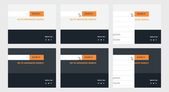
- Incorporate a proper search functionality showing how it would look if someone was to use the search bar
- flesh out all the text on the pages
- sync up all the colours and style throughout the sites so they are more received as a whole matching package
CAGD202 week 11 –
- planned the active states we were going to make
- got an idea of what our finished site would look like and what path through the sit we would make work


CAGD202 week 12 –
- worked through both versions and synced up graphics and fonts
- realized we need a proper search func
- decided on a light and dark functionality that we were to implement with buttons to go back and forth.
- Kiara showed us her progress with the booklet and everything seems to be on track!! Just worried about work load because I’m pretty sure the final booklet is a lot of writing.
CAGD week 13 –
- Finalized all the details for final hand in
- Taken on the active states section of the final booklet and helped with the working links section, while also offering any help where it’s needed
- Finished all the transitions, which I think… completes my xd document for hand in
- Everything seems almost ready to hand in, just need to finalize and print !
CAGD FINAL POST -
- Design definition statement
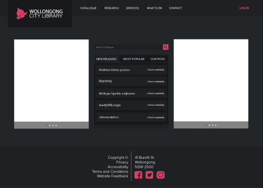
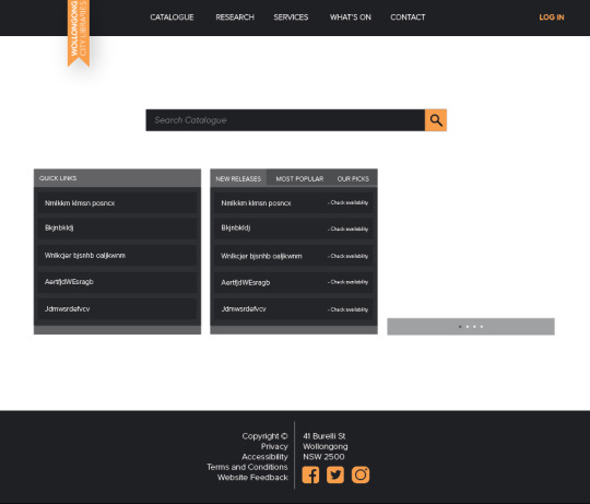
The design task we were set with was to redesign and rebrand a website of our choosing, to meet user readability and functionality issues and to overall make a more pleasing user experience. For the task a few websites were in mind, one, Premier Illawarra bus timetables. This website has its flaws with buggy bars and content columns (especially when resizing) and outdated content but the redesign was focused more on the user experience of the website and the journey TO the content, rather than the content itself that’s why we opted to go for the Wollongong city libraries website.
With each of us having used and struggled with its user interface at some point it was a clear candidate, being a library website it featured a plethora of information, half of it useless and/or repeated somewhere else in the website, the second and third pages looking identical and a maze of dead links scattered throughout the first design task was to chop out the un needed information and make the information architecture more legible for us and give us something to design around, rather than the pool of useless pages and dead ends the site currently features.
The site also displayed an inconsistent branding throughout, with one logo being featured in a few pages where as what seemed to be a new revised logo on some others deeper in the site, this prompted us that the website needed a complete rebranding as well, as we felt neither of the brands gave the feel and look of a library.
- Research: Identify your primary references and outline their relevance (include minimum of 3, with at least 1 theoretical and 1 design artefact reference)
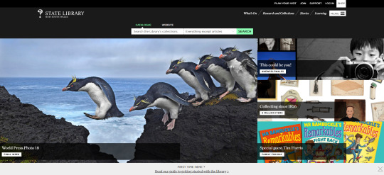
There were many references and outside facets that had a creative influence on the development of our website, one being grants lectures, they helped really wrap my head around the process and all the elements needed for a website redesign, and what was expected of us. The Ambrose and Harris 7 stage design process was one underpinning our development process that, I was aware of... but didn’t quiet grasp how much it reflected the steps we took until after I looked back on what we had done and realised that these really seemed to be embedded in our process, another major influence on our work, and that you can see more evidently in our earlier iterations is the NSW state library website, we found this website to be really aesthetically pleasing and its plethora of information was really neatly organised into the separate menu options this and various other library websites have giving us a good reference for how other people have tackled this problem before.
- Identify 2 successful and 2 unsuccessful outcomes of your major project and explain why. How might these observations inform your approach to projects in the future?
One successful outcome of the design project was our ability to work as a group towards the end, and the synergy between the group members only improved throughout the process, it was a bit rocky in the beginning, with us struggling to spread workload and some members not doing their share effectively and on time, leaving us no time to print or review before we presented. These issues were quickly resolved though with the trading of a member about half way through, after this the work became much easier, with us being able to get work done so we could review iterate and improve on the results we got, leading to a much better work flow and an overall better finished product that we could take pride in.
Another success in the design of the website was our ability to successfully adapt to new situations, with muse becoming redundant, it was a much better option to design the project in xd, even though we had already completed some of the project in muse and learned our way around, it was an overall better decision to change over to xd and though it was daunting having to migrate programs this swap saved use immense time and effort in the long run, with us not needing a functional site, the mock up capabilities of xd served us well enough and helped us to focus on the design and aesthetic aspects of the site rather than the functionality and having to learn muse and all its quirks. Not to mention the knowledge of xd gained will be invaluable going forward in my study and professional career.
An unsuccessful outcome would be the synchronicity between the site and mobile version, with 3 people, 3 different machines and 4 different versions, it was a difficult task to synchronize all the aesthetic details of the sites, we did come together a few times and make sure fonts and basic design elements were the same, even going to far as to sync out creative cloud libraries so we were able to use each other’s graphics and symbols. But with one team member living in Sydney, and us being eager and excited to physically make the mock ups it was hard for us to keep our designs exactly the same, especially towards the end while we were crating the research and account pages, we had less and less time/opportunities to synchronize and edit our designs. I feel as though this problem would be less apparent in a professional environment though with everyone being in the same workplace, it would be easy to walk over and check what other people are doing, throw usbs at each other and collaborate infinitely more effectively. Even so, its something to keep in mind that I hadn’t thought about until it was an issue.
Though xd was a successful outcome as a whole, it did have its drawbacks, the inability to implement a proper search function in the website, yes the task was to create a mock up, but it would have been nice to implement this functionality to get a grasp of how it would work and the kind of design choices that would come along with such a functionality, this combined with the inability to create rollover states on buttons was fairly disappointing, though it didn’t matter as much on the mobile app, the website would have looked a lot more real with these implemented, giving a more tactile sense of usability to the experience and a more realistic and believable finished product. Without these implemented the finished product felt more akin to a fancy slideshow than a finished website. I hope that adobe implements these functionalities in the future, because the program as a whole right now is very good, and they seem committed to updating and improving the application in the future.
- Identify and describe 3 things you have learned from your design project discuss how you could apply this learning to design projects in the future
Throughout the design process I have learned to work as a team much more effectively that I did before, this task has given be the opportunity to see the benefit and in working with someone that has the same work ethic and goal as you, the value in discovering a common goal as a team, earlier on rather than later. The task of working with someone that is difficult to work with is one that I expect to encounter again, and I feel as though creating a mutual understanding between each party member early on could be an invaluable thing to do.
taking more charge and being more assertive in the organization of the group could prove to be invaluable in the outcome of the assessment, as I found out toward the end of the assessment, where as at the beginning of the semester I sort of sat back and let other people make decisions. This input helped to create a final product I was proud to put work into and refine rather than an assessment that I merely did work for to get a passing grade and finish the semester.
Also presenting was something I have never enjoyed until now, the thought of presenting something to a class has never been a good one, it’s something that I can do, but its never been something I enjoy, I’ve discovered the worth in making something that I’m proud of can have to presentation. Showing something I’m happy with and receiving feedback from other people as enthusiastic as me is indispensable and overall enjoyable, which is something I never thought presenting could be.
- Identify an area of the design industry you would like to work. How might this project help you achieve this outcome?
When starting last year I wanted to do something in television production though, changing over to graphic design I found a passion for brand design and this assignment has given an opportunity to get a greater scale of the amount of specific industries that graphic design can be applied to, this subject has definitely given me a passion for website design and helped me to attain the skills to articulate the design decisions through the various programs available to me and the steps that need to be taken to execute a website redesign and re brand. It has also has given me an interest in really exploring all of the possibilities this degree could be applied to, whether it be information design like in assessment 1, or website design like in the final project, I enjoyed all of them thoroughly and am excited to explore the upcoming possibilities.
0 notes
Text
Cava 102&103 Journal
- Marc Newson
Australian born designer Marc Newson is an all-around well versed designer, making things from furniture, through to bicycles, he also spends his time creating commissioned pieces for clients wishing for a unique design piece.

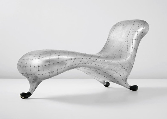
As a student Newson experimented with furniture design and after graduating showcased the “Lockheed lounge” in his first exhibition, this piece set three successive world records at auction over the years selling for millions at a time.
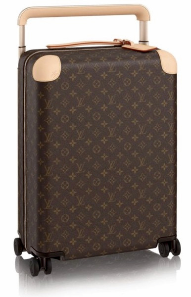
Newson has moved and worked in Tokyo, Paris and London where he now resides and predominantly works. His clients consist of leading fashion and pop culture brands, as the Hennessey and Louie pieces seen before, most of his design pieces are seen as design icons and this status has achieved him positions in companies such as Quantas airways where he is the creative director of the company.
Newson was assigned royal designer for the united kingdom, earned an honorary doctorate from Sydney university, holds multiple Professorships at Sydney College of the Arts and Hong Kong Polytechnic University AND was created CBE by Queen Elizabeth II, due to these achievements he appeared in time magazine’s 100 most influential people in the world.
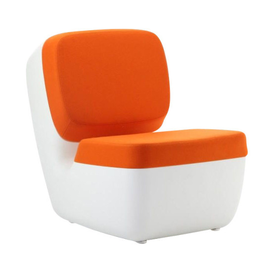
With Newsons wide range of making practices, this includes working with plastic as seen in his “Nimrod chair” that uses a plastic blowing method, that blows the plastic into a mold and leaves one hold where the air was blown, and finishes the chair with a fabric material this method is commonly used with water bottles and mass manufacturing products, because of its quick production time and reusability of the molds.
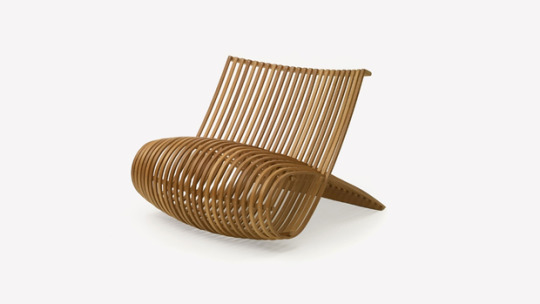
Newsons “wood chair” consists of a single series of interwoven wooden strips, extending down past the back rest and folded back on itself to form the supports and seat, this material directly relates to our final project, being of wood and shows the flexibility and freedom that comes with wood working. I feel as though if we picked another aspect of the item we chose or another item entirely we could have experimented with various other making techniques like this one.
Marc Newson redesigned the mundane through his 2000 work with Nike. Newson worked with the shoe brand to create a shoe that was completely out of the ordinary, simultaneously combining some of Nike’s unique design elements with his own design style. Redesigning what is typically a fairly mundane object (shoe), Newson was able to put his own unique spin on the shoe industry, using both Nike’s ‘Air Max’ technology and ‘Flyknit’ as the basis for his shoe. Through this Newson created a shoe that is at the same time functional but also art. Newson redesigned the classic Nike Air Max by adding a full-grained vegetable tanned leather chassis, velcro strap and mudguard, while also stitching and glueing on the Flyknit and Air Max technology respectively. Newson’s work with Apple also shows his skill in designing the mundane shown through the creation of the chair he created for the Mega-Company. Composed in an almost J like shape, the chair Newson made redesigned the mundane by turning a simple chair into a piece of art, however still allowing for functionality and comfort. The design and creation of the actual seat section allows for slight suspension improving comfort. This relates to our work as we also used plastic to create part of our object, however is different in that the chair was able to be mass produced, which is dissimilar to the project we created as it was all hand made and molded. The material Newson used also plays into his redesign of the mundane as it is a plastic that is sensitive to UV light, meaning it shines differently in different settings. This is a stark difference from the plastic people usually are around in their day to day life and shows Newson’s creativity and artistic flair.
- Research into mundane object
Chainsaw The origin of the chainsaw is often debated since chainsaw like objects were created for medical uses previous to their modern uses. These ‘chainsaws' were handle operated with links of chain carrying small cutting teeth wrapped around a guiding blade. The idea for the modern chainsaw was developed by two Scottish doctors in the 18th century and were used for the excision of diseased bone. The chain hand saw, which had a fine serrated link, was invented around 1783-1785 The first known patent of the endless chain saw was granted to Samuel J Bens in January 1905. His saw was composed of a chain of links bearing saw teeth that ran through a guide from and was propelled by a small motor. Bens created this with the intent to fell giant redwoods. Other notable contributions to the creation of the modern chainsaw were: James Shand who patent and developed the portable chainsaw, however after he allowed his rights to lapse, this idea was further developed by German company Fetso in 1930. Andreas Stihl later patented and developed an electrical chainsaw in 1926 and a gasoline powered chainsaw in 1929. He then went on to create a company in order to mass produce both of these products The chainsaw has a few major components to it, being; an engine, drive mechanism, guide bar, cutting chain and tensioning mechanism. Chainsaws are typically either two stroke gasoline combustion engine or have an electric motor driven by a battery or power cord. The drive mechanism involves a centrifugal clutch and a sprocket which help regulate any kick with the chainsaw and helps protect the motor if the chain gets stuck in the wood. The guide bar allows for the teethed chain link to run smoothly without risk of flailing. Modern uses for chainsaws have stayed fairly close to traditional uses, with a few recent developments such as diamond tipped teeth to allow for stone cutting. Some of the uses of a chainsaw are tree felling, which involves a three cut system in order to cut down a large tree. Sizing up, which involves clearing any dangerous branches or other pieces of the tree that could interfere with felling. Freeing which is the removing of one tree from another. Limbing which is the removal of smaller branches, and finally bucking, which is a method for discontinuing tree growth involving cross hatched cuts across the stump of a tree.
- Chosen designs
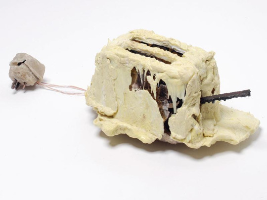
An object that interests me is the toaster created by Thomas Thwaites. The object its self is not initially appealing to the viewer due to the discontinuity in form and structure. However once context is provided through Thwaites backstory the piece becomes instantly more attractive. By explaining his artistic practice and struggles faced when creating the work, the audience becomes more involved in the work and as Thwaites’ presentation furthers it causes the viewer to want to see the whole process plus the finished product again.
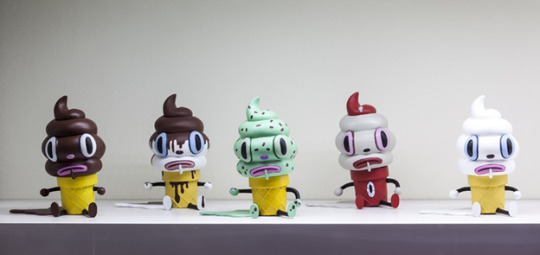
Garry baseman is an American born artist who works primarily in paint and drawing though has branched off into sculpture with some of his more popular paintings, his style is reminiscent of 1930s cartoons with exaggerated features and Disney style eyeballs on inanimate objects his design works are created by sculpting and then molding out of vinyl, and the “creamy toy” sculptures above were mass produced and made available for sale to the general public.
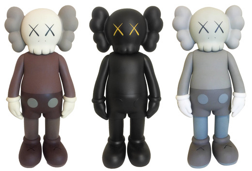
KAWS, or Brian Donnelly is a new jersey born artist who works in the same medium as baseman and has a lot of similarities with his style, with the Micky mouse inspired clothing on some of his works, but adds his own personality and modernizes the characters to a degree.
- Reflection and process
Throughout the module we have been given a greater understanding on what it means to be an object designer and the skills needed to create interesting object and the elements that help to make an item effective as a whole.
I would have liked to experiment with the metal casting techniques shown in week 1 and look into the other metal making techniques the overall goal to create an object with these constraints has given us an opportunity to experiment with a few making techniques and given more time I feel as though we could have explored a whole plethora of other methods and given the item many more iterations and continue to evolve our idea.
The final object came out a lot more refined than we planned, with the rounded edges and the paint was a very good method to adding a lot more refinement and taking it to that next level. The plastic handle came out a lot better than I thought it would as well, with the plastimake plastic granules being a lot easier to work with than a lot of other people’s plastic attempts. Given another week I feel like we could have incorporated a mechanism of some sort to make the blade of the toy spin using a button or something but as an early prototype I think it came out better than expected.


- References
- http://marc-newson.com/micarta-chair/ website, viewed 3rd Oct, 2017
- http://marc-newson.com/ website, viewed 1st Oct, 2017
- https://gigaom.com/2014/09/05/celebrity-designer-marc-newson-makes-the-jump-to-apple/ micarta_chair_001/ website, viewed 3rd Oct, 2017
- http://www.artnet.com/artists/kaws/biography/ Website, viewed 4th Oct, 2017
- http://garybaseman.com/ Website, viewed 4th Oct, 2017
0 notes
Text
Meda102 - Assessment 2: Digital Coding
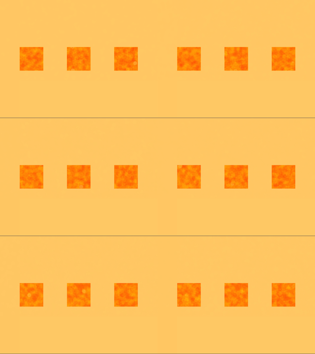
Following on from assignment 1, I’ve tried to replicate my original idea but improve upon the overall concept. The idea from assignment 1 was a texture, or an organic pattern contained within a geometric constraint, and this was achieved in assignment 1 using graphite shavings and a second piece of paper, with this assignment iv’e used lots of ellipses randomly on the page, with low opacity and varying colour to simulate an organic texture, this is this contained within the orange border laid over the top of the texture. The main regret when executing assignment 1 was that I didn’t evolve enough on the idea and that I only had one square, where a series of 3 would have been much more engaging. If I was to do this assignment again, I would do the same concept though I would use a perlin noise texture in the background so you can see the texture in the 3 windows connecting and have the pattern flow from one to the other.
void setup() { background(255, 255, 255); size(1000, 750); //noLoop(); }
// This section is calling upon the functions listed below
void draw(){ lava(1000, 500); lava(1000, 500); lava(1000, 500); lava(1000, 500); border(); }
//This function creates a texture that resembles lava using random transparent circles
void lava(int x, int y) {
noStroke(); for (int i = 0; i < 2000; i = i + 40) {
ellipse( random(x), random(y), (25), (25)); fill((255), random(255), 0, 20); ellipse( random(x), random(y), (25), (25)); fill((255), random(255), 0, 20); ellipse( random(x), random(y), (25), (25)); fill((255), random(255), 0, 20); ellipse( random(x), random(y), (25), (25)); fill((255), random(255), 0, 20); } }
// this function creates a soft orange border, or frame of 3 sections in the window
void border() {
noStroke(); for (int i = 0; i < 2000; i = i + 40) {
rect( (0), (0), (125), (1050)); fill(255, 200, 100, 100); rect( (0), (0), (1000), (300)); fill(255, 200, 100, 100);
rect( (275), (0), (150), (1050)); fill(255, 200, 100, 100); rect( (575), (0), (150), (1050)); fill(255, 200, 100, 100); rect( (875), (0), (150), (1050)); fill(255, 200, 100, 100);
rect( (0), (450), (1000), (1000)); fill(255, 200, 100, 100);
} }
0 notes
Text
Cava103 Typography journal and reflection
- 15th aug
Today we tore up magazines and newspapers to create a ransom poster of sort, I started today, I started out with the plan to write “hand over the dough buster brown” but when I found the letters to make “mula” with a fancy ‘m’ it turned into “hand over the mula man”.
- 16th aug
I cut the letters out with a sort of jagged outlines to add to the, mismatch crazy style of the ransom poster, I experimented with various backgrounds to the letters aswell but everything seemed too busy so I just stuck with the red squares to sort of gently guide the eye through the poster

The goal of today was to finish up the ransom poster and scan it into photoshop, touching it up and creating lots of variations, that I eventually ended up using for backgrounds in my booklet.


- 22nd aug
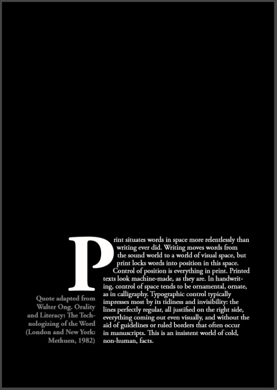
Today was a pretty heavy lecture that was like choc full of information, I experimented with letter forms and the techniques like the drop cap and stuff, and did a quick print before class ended
- 23rd aug
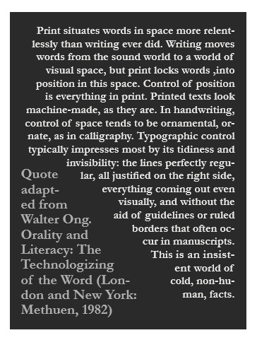
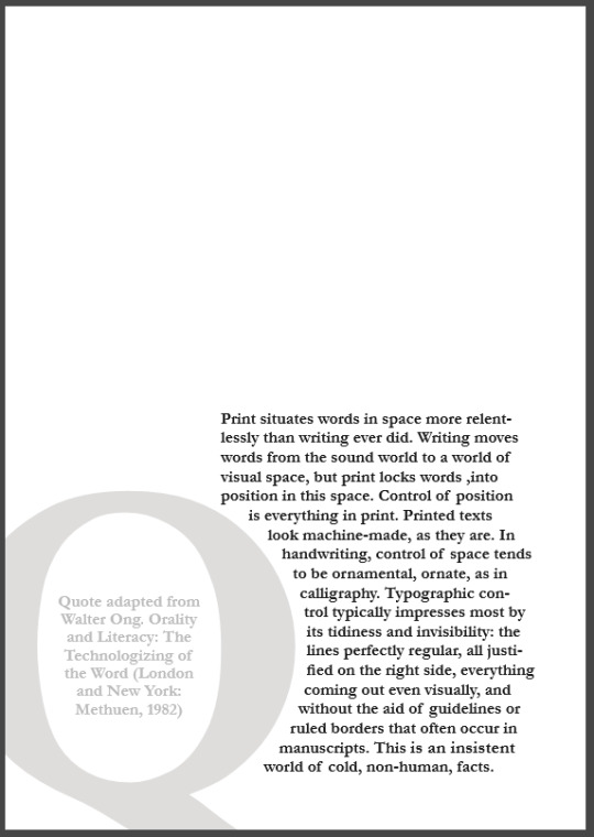
This class was abit lighter on the whole lecture section and I got to finish my typography pages for my little booklet, I feel like I got a good range of techniques and experimented with a nice range of things through my examples.
- 29th aug
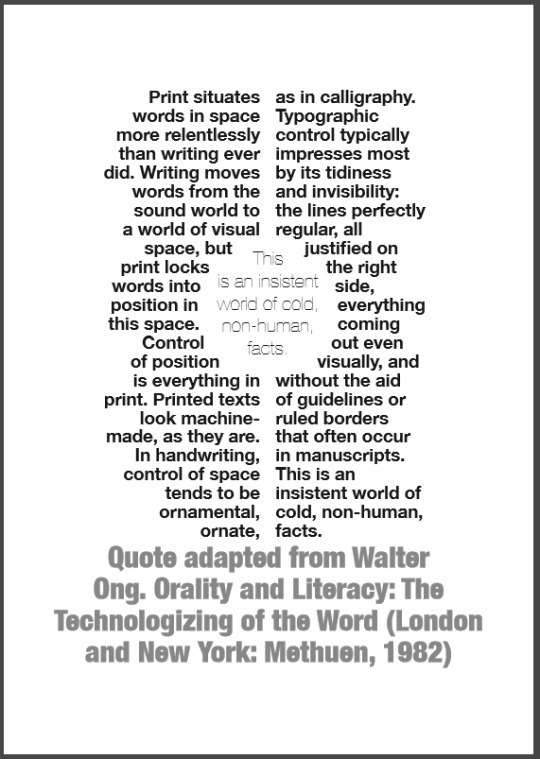
i feel as though this monogram task is the most enjoyable task, playing with fonts and experimenting with the forms and colours of each of the letters was enjoyable.
- 30th aug
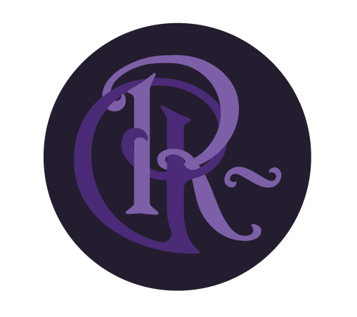
i finished the monogram task and had some different outcomes but settled on the purple one as my final one, im not sure why but i like the swirly letter forms, something elegant about the letters, the colours are nice too.
-Typographic history task-
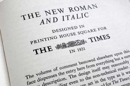
Times new roman originated in London in the late 1920s and came about when the ‘Times’ commissioned a new, more professional style of type after being criticized for its old typeface and print.
The times new roman typeface became a largely popular choice among printers, with its thing elegant letter forms it can fit more letters in a line, allowing for more play with newspaper tabloids and columns, this has helped the typeface stay alive through the years, as printing techniques evolved and changed, Times new roman was one of the first staple fonts to become available, this is understandable with its organic serif style it adds readability with the serifs from one letter naturally and organically flowing to the next. The font also adds functionality with the placement of the text on the page having the letters so thin, it allows for a looser justification and adds the ability to squish the text in tighter without losing readability.
Though with this accessibility, comes notoriety, because the font is readily available and the default option for most word processing applications it’s become the stock standard among courts and lawyers, this continuous use of the font in courts adds a boringness to it, and by choosing it, it gives off a certain show that you haven’t thought about the text all that much and that you just chose the text most readily available.
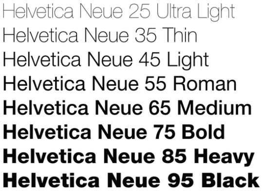
Helvetica was developed in Switzerland in the late 1950s by Max miedinger who sought to compete with the already successful sanserif typeface Akzidenz Grotesk, the design goal of the typeface was to create a type that is as neutral as possible with maximum readability, creating a type that has a wide availability and that’s easy to pick up and put in whatever application that’s needed.
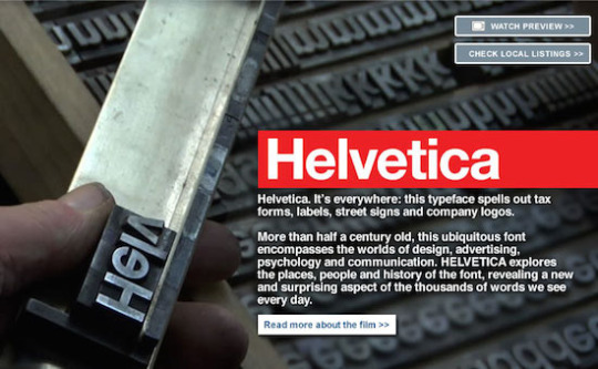
With the success of the basic sanserif typeface ‘Neue Haas Grotesk’ in magazines, government documents and company usage it was renamed in the 1960s to Helvetica to improve marketability overseas and even further broaden its reach.
With the release of arial, helvetica had some competition as a neutral sanserif typeface, though arials tilted ends gave it a more organic look rather than the completely straight 90 degree edges that helvetica had.
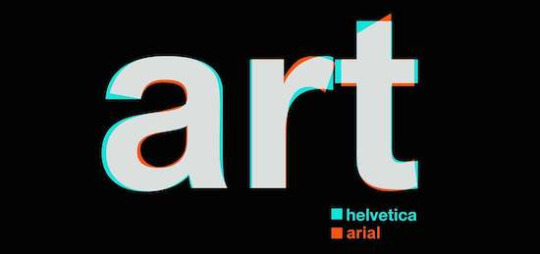
With the phenomenal success of helvetica came many revisions and interpretations through the years, allowing the helvetica family to grow and only become more diverse and have a broader range of usability.
Reflection
throughout the past 3 weeks, i have definitely become a lot more confident with the use of the programs, Photoshop and illustrator, maybe in design could use a bit more work, considering i couldn't get it to print properly, though i have become much more well versed in the actual in program functionalities.
with the lectures and typographic exercises i also feel as though iv’e become a lot more aware of this almost typographic language that i was ignorant of before that’s shown through, font, placement of text, kerning, size, boldness, and i think i’m much more aware of the depth of emotions that typography can evoke in an audience even if they're unaware, and i still feel a bit unaware and am excited to study typography further!
Bibliography -
http://typographyforlawyers.com/a-brief-history-of-times-new-roman.html
http://www.historygraphicdesign.com/the-age-of-information/the-international-typographic-style/736-helvetica
0 notes
Text
Meda102 Assignment 1
Throughout the last few weeks of class we’ve been learning about abstraction and the artistic applications it can have, these techniques can be seen in Sol Lewitt’s works as he largely only deals with the instructions of how an artwork is executed rather that performing the execution itself.
When researching for this task I found that Lewitt’s most visually engaging pieces involved an organic texture contained by a geometric shape of some sort so I began experimenting with the patterns I could create with just a pen and tape.

I came up with something along the lines of this but realized that if I was going to abstract instructions to create this texture the executor would likely get bored drawing one thousand lines and start to do it sloppy, so I explored other methods and came up with sprinkling graphite shavings on the paper and smudging to create an almost Smokey texture that was still surprisingly visually engaging while still being easy to execute, This being paired with the frame from another piece of paper acting as a stencil creates a visually engaging artwork with very simple instructions.

The picture above was something a lot closer to the visual engagement i was trying to go for, with the smokey grey and the square boarder. for the executions i made my mother, sister and brother all try it and my mum and sisters attempts came out pretty close to the original and were both visually engaging though lacking any sort of gradient through the square, i could have instructed that in there with an extra step though i think it would have made the instructions a lot less succinct and a lot harder to follow, i also feel like three squares on a series would be a lot more engaging rather than one on its own.

Intructions:
1. Cut a perfect square (5 cm x 5 cm) in the center of a piece of a3 paper.
2. Place the piece of paper on top of another untouched a3 sheet of paper so the square is in the center of the bottom piece.
3. Lightly shave pencil graphite on top of the two pieces and lightly smudge with finger.
4. Remove the top piece and shake the excess graphite off the paper.
0 notes
Video
vimeo
This video builds off my last two assignments and follows on with the “where im from” theme. ive tried to incorporate as smooth cuts as i can along with a simple sort of narrative throughout the video. as for the audio portion of the assignment, i enjoyed how the absence of audio in the first assignment gave a withdrawn feeling and noticed how the quick cuts and scene changes in this video gave a dream like feeling, so tried to emulate these feelings with the sounds in the environments and audio manipulation.
0 notes
Audio
(Riley.durston) I’ve tried to relate this audio piece somewhat to the first video assignment, using sounds from the places and objects in Remo scope video assignment but also referring back to the poem written earlier in the semester and keeping it relevant to the overall topic. I’ve put together the different settings using steps as a sort of transfer method between the scenes and managed to fit most of the locations in the video, in the audio clip.
0 notes
Text
Subjectivity
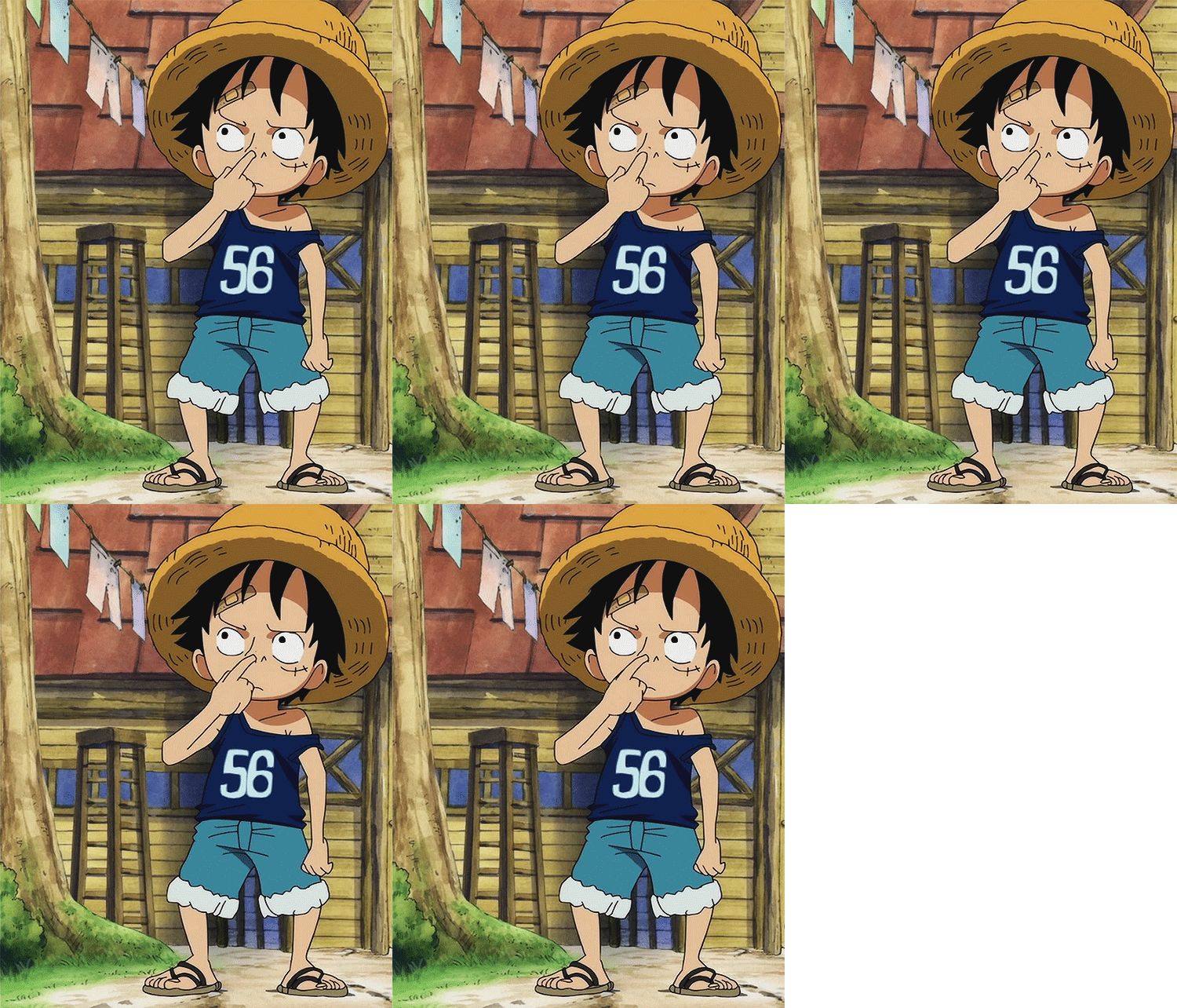
Subjectivity in relation to identity refers to the process one will go through to become an individual and the outside influences an individual will be exposed to throughout their life that come to shape and eventually form a person’s changing identity, this being the style of clothes they wear or the hairstyle someone has. It assumes that without cultural constructs to express one’s self that a person cannot have an identity at all. (Barker, c, p.220), a great example of this is “One piece” due to the amount of episodes the length of the series gives the watcher an opportunity to see the characters develop and watch how their individuality changed due to their experiences.
0 notes
Text
Creative influence

Creative influence refers to the inspiration one can draw from their environment or other artists work they’re exposed to, these inspirations can influence ones creative method and have a great impact on ones work and the decisions they make in the creative process, whatever the medium may be (Ball). An example of creative influence is apparent in Donald Glover’s latest album “Awaken, My Love!” where he explains in an interview that he drew from his childhood memories “I remember listening to songs my dad would play – albums by the Isleys or Funkadelic – and not understanding the feeling I was feeling,” suggesting that these artists work spoke to him and influenced his creative work. ("Childish Gambino Talks 1970S Influences”)
0 notes
Text
Essentialism
Essentialism is the argument that beneath the social and cultural influences that we express ourselves through there is to some degree a “core of the self”(Barker, c, p.221) commonly thought of as a soul, that will remain with us throughout life and though our tastes or styles may change this core stays the same and to some degree influences our cultural and creative choices. (Barker, c, p.221)
0 notes
Text
Authenticity

Authenticity defines the transparency one shows to an audience, family member, or anyone. This transparency, especially in creative influence allows an audience to have a deeper engagement with the artist and a better understanding of their process, when an artist isn’t transparent and truthful they can come off as deceptive and almost as if they are putting on an act. (Ball) an example of artists being transparent with their creative influences is Modern Baseball https://www.youtube.com/watch?v=HT9FzeCkIlc , this transparency with their influences helps the band to seem more genuine and, Authentic.
0 notes
Text
Unconscious
The unconscious is the concept of an underlying section of the mind thought to be hidden behind or under the conscious mind. The conscious mind is responsible for your thought process, your actions and decision making, whereas the unconscious mind works in the background, inaccessible to the conscious mind, and is responsible for the creation of dreams and to some degree for the curation of the conscious mind, the ideas and thoughts you have throughout the day and is a more accurate representation to who you are as a person. (Mansfield, N, pp.27-28)
0 notes
Text
Creative Identity

A creative identity defines the character we play, or the role that we put across in our creative practice. (Barker, c, pp.221-222) This creative identity is largely apparent in musical artist, where alongside their music were presented with a character, and depending on the artist, this character may be in no way representative of the artists actual identity, or it may be the truest articulation of their personality. a perfect, well known example of creative identity can be seen in David Bowie, with his alter ego Ziggy stardust “ in the case of David Bowie — whether in Ziggy Stardust–era glam or as the drug-addled skeleton of his '70s funk period — it was always more than a defiant look. It was part of a much bigger creative identity.” (Gayomali)
0 notes
Text
Over determination
Over determination in relation to Freud’s work is the notion that some of his ideas are too outgoing and may have been taken it too far, and he could possibly be reading too far into the subject and overthinking each small detail, such as nervous ticks being a sign of some psychological intricacy. (Mansfield, N, pp.27-28)
0 notes
Text
Fractured Identity

Fractured identity refers to the different smaller roles that one plays in their life, and these roles then come to make up their identity as a whole. These roles may be contradictory to one another and a person may behave differently and act what is expected from that role, eg. Student, worker, brother, sister (Barker, c, pp.225-226) . its also explained that any core identity that we perceive is only because we construct a narrative throughout our life “if we feel we have a unified identity from birth to death, it is only because we construct a comforting story or ‘narrative of the self’ about ourselves” (Barker, c, p.225).
0 notes
Text
Sensory Knowledge

Sensory knowledge is the perception we get of the world through our senses, eg.sight, smell, sound, touch and taste. These perceptions help to build up our knowledge of an object, for instance, we identify the sun as warm and bright because we can feel the suns warmth on our skin, and see the brightness, we can identify a fruit by taste, because we have sensory knowledge of the taste (Howes, D pp.27-29).
0 notes
Text
Social Identity
A social identity builds off our personal identity and refers to our role we play in a social setting and the impact our identity can have on our relationships with other people and in turn how their identity can impact on our perception of them. Although we can alter people’s perception of us through how we act whether we like it or not the way peers perceive us is closely related and influenced by our involuntary attributes, age, gender, race, “Here identity is a matter not only of self-description but also of social ascription”(Barker, c, pp.222-223). an example of this appears in “Its always sunny in Philadelphia” when one of the protagonists, Mac puts on weight he is immediately made fun of and the group dynamic of the group changes around his weight gain. ("'Always Sunny' Star Rob Mcelhenney: How & Why I Got Fat")
0 notes