
Don't wanna be here? Send us removal request.
Statistics
We looked inside some of the posts by grad603harrietneradt and here's what we found interesting.
Average Info
Notes Per Post
0
Likes Per Post
0
Reblog Per Post
0
Reply Per Post
0
Time Between Posts
18 hours
Number of Posts By Type
Text
17
Last Seen Tumblr Blogs


Fun Fact
Forty percent of Tumblr users are between the ages of 18 to 25.
Text
Reflection
I found this assignment very beneficial to learn about masking, paragraph styles, creating tables, retrained colour palettes and using adobe colour, and the design characteristics:
-PROXIMITY
-SPACE
-CONTRAST
-HIERARCHY
-REPETITION
Using paragraph styles allows for easy cohesive designs and saves time, one of the most valuable tools in the design tool kit! I found it very useful to use the A+ icon in paragraph styles to ensure all text boxes have an assigned style.
Masking and refining cutting out images even down to fine details such as hair is something I didn't know how to use the software for in such a clean-cut way. This will be a useful skill in many areas allowing my designs to have a professional finish.
Using adobe colour to create retrained and perfectly complementary or analogous colour palettes is another useful skill I have acquired form this paper.
Overall I learned many vital design skills in the 6-week span of this paper. I applied to the best of my ability these new skills and will hone and refine these skills further.
0 notes
Text
Choosing a Layout


Both follow similar conventions of grid and layout, however, I felt the left-hand graphic fit my brochure publication better and the grid structure follows how the brochure panels are divided in a 3x4 portrait grid system.
0 notes
Text
Understanding the Audience
Received feedback that I was not properly grasping the brief in the way in which I laid out my information was so geared towards people with a passion for design and typography, design students and/ or designers.
Typografika fixes - feedback
Numbers too big don't treat the audience dumb, feels condescending
Look more at Typography brochures for examples
Check condensed type is readable
Make faces of designers all the same size
Look at more examples and refine
How to organise to make more sense
Once you understand is it a typography conference becomes quite easy?
Black panels random make it just the workshops
Check printing readability
AUDIENCE: -typographers
-design students
-creatives
-anyone with a passion for design
therefore need to appeal toa. designer's eye, must be clean, tidy, well thought and laid out.
0 notes
Text
Colour and Font Choices

Fonts
Helvetica - clean nice slightly more rounded, used for designer's names and titles in regular or bold. Sits really nicely in more negative space.
Source sans pro - title text, black lettering thicker, more striking, easily manipulated in the thicker strokes. Fits well with Helvetica as it contrasts in more square and straight characteristics.
Roboto condensed - decided on a condensed typeface for my body text and it juxtaposes the title text breaking this apart more. This saved more space and fill up to contrast the negative space placed above.
Colour
Black and white was far more striking and tied into the design process concept I am harnessing. The type itself feels to belong in a black-and-white plane both historically and also in the contemporary world and I wanted to keep this throughout my publication to maintain the tone of focus and enforcing the idea of planning and process that goes into design work.

Texture

incorporating this analog, raw, tactile texture into my designs I felt it would appeal more greatly to the audience as they can relate to these techniques. Yet with this in mind, I knew I also had to make the finished product appear clean and professional so merged these two almost opposing ideas to create this outcome. I think the duality of clean-cut and rough allows for insight into the reality of a design process which seems fitting to the brief.
The texture has a grain to it and makes for a more interesting surface to my designs as I didn't want it to appear flat.
0 notes


Text
12 Panel Fold
I began this project with a 16-panel layout for the brochure side. I found it really difficult to fill up all 16 panels with the information provided, therefore I decided to downsize to 12 panels, which fit everything I needed in a panel each divided into a front cover, back cover, introduction page, schedule page, and designers 1-8 panels.
0 notes
Text
Edited Design Process Idea


I wanted to show that there is a large process behind a finished design and by incorporating this analog, raw, tactile texture into my designs I felt it would appeal more greatly to the audience as they can relate to these techniques. Yet with this in mind, I knew I also had to make the finished product appear clean and professional so merged these two almost opposing ideas to create this outcome. I think the duality of clean-cut and rough allows for insight into the reality of a design process which seems fitting to the brief.
I tested adding circles and underlines in an attempt to show more of a designer's process and testing. I want heavily inspired by the 'Outta My Head' music publication that I came across in my research.
However, eventually, I ruled out this idea as it felt too disconnected from the rest of my designs taking away from the cohesive and restrain of the overall finish of my designs. Adding the red, which is classically sued for editing and checking felt too far out of the colour palette and too distracting.
0 notes


Text
Brochure Layout Progression


I began this project with a 16-panel layout for the brochure side. I found it really difficult to fill up all 16 panels with the information provided, therefore I decided to downsize to 12 panels, which fit everything I needed in a panel each divided into a front cover, back cover, introduction page, schedule page, and designers 1-8 panels.
The front and back covers are black as well as the workshop panels, with the rest of the panels being paper white. This allows for the information to flow better and become more consumable.
The layout of the designer's information panel follows a grid formula of numbers and names in the top section and then the image of the designer sitting in an area of negative space to break up the info, and then in the lower third the text blocks and tables with the scheduled times, dates and places of the events. I decided it was important to consider the amount of negative space in each panel as I decided to cut down from 16 to 12 panels. It could have easily become overcrowded therefore the proximity of placement was important to give to illusion of less information.
The point size for the body text I am using is 8.5, which is easily readable at the actual print size.
I decided to put the map on the back cover for easy access for the user to find when it is folded into the brochure. As well as this the schedule is on the first page as the brochure opens in a gatefold.
0 notes
Text
Final Textured Typografika Graphic


Finally I added the texture to the graphic to mark it as part of the family of the publication.
0 notes


Text
Assets


Using Source Sans Pro Black as my image to trace, created these numbers in Photoshop using the same textured brush as part of my assets and conventions in my brochure to number the speakers in order of dates.
Inverted these into white as some of the panels in the brochure have a black fill background.
0 notes
Text
Refined Final Typelayout


I refined the spacing of the letterforms in the grid to ensure there was a pattern and even spacing. I opted for adding the '24 as a continuation of the grid vertically. I like the portrait aspect of the type which follows the same grid pattern (3x4) as my brochure side. I found this to be pleasing to the eye and tied each side of the publication together seamlessly but also subtlely.
Here I am playing around with colours as well as testing using pinks in my colour palette. Later I ruled out colour as I felt the black and white was far more striking and tied into the design process concept I am harnessing. Type itself feels to belong in a black-and-white plane both historically and also in the contemporary world and I wanted to keep this throughout my publication to maintain the tone.
0 notes
Text
Photoshop Edited Cut Out Images


To make my images from the raw images I found online of the designers provided, I first cut them out using the quick object selection tool. I then select and masked these using the refining brushes we learned in week 2 to ensure they were clean-cut.
I then went in with a noise filter that is monotoned to create this grainy feel to the image. I want to achieve a sense of texture in my design and this also made the images feel more like part of the same family and more cohesive.
0 notes
Text
Map Development
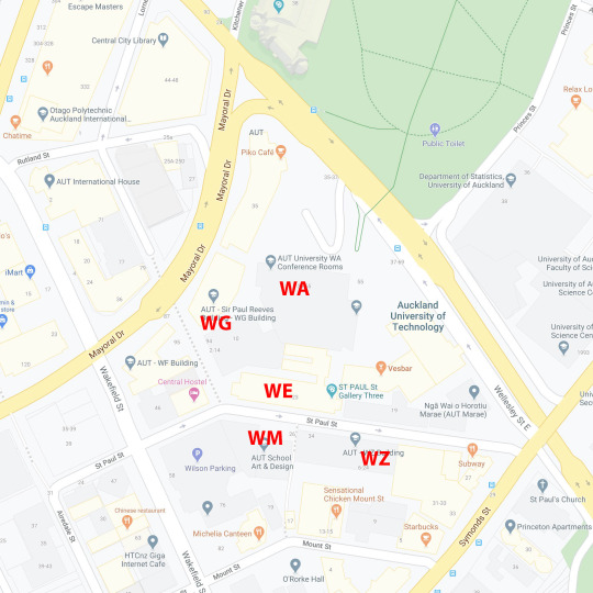


Cropped the map provided in the Word Document to be a smaller scope of just the AUT city campus with the relevant buildings and adjacent access streets surrounding.
I then used the textured pastel brush and took the map into Photoshop to trace over the shapes. I used my font families to label the map.
0 notes
Text


Iteration and ideation of poster side title and graphic.
I created a grid and aligned it with letterforms within this to create the graphic. I had to elongate the stem of the 'T' and 'Y' in order to fit the 'P' and 'O' stack upon one another, as well as shorten the stem on the 'P'.
I began playing around with how the '24 would fit into this graphic as pictured above. I found the playing around with scale using the constraints of the grid created interesting graphics, making sure to follow the don't break the grid rule.
0 notes
Text
Determining Layouts


Playing with scale and orientation for the poster side of the publication.
0 notes