Don't wanna be here? Send us removal request.
Text
Final post/rationale(?)
Wowzers okay so I know rationale are supposed to be formal and everything but this isn’t actually required so imma just write how I want haha. First year design - all done!! Feels unreal oml.
So I took my time with this project and wanted to make sure everything presented was something I was proud of. I’m so happy with the result and even though it was a slow struggle with COVID, I pushed through. It was important that I chipped away at this massive project every week even if it was just one illustration - progress was progress. One thing I discovered about the way I work is that I root nearly every design decision in research. Informing the work to the best of my ability is something I think is important in creating a message that is clear and visually appealing to the target audience. However, this led to a lottt of overthinking and less of that intuitive action being done - something I’m still working on.
Sweep It Over The Rug took its time to really gain direction and establish its ‘personality’ and tone. It was only really in Week 7 or 8 that the campaign was fully settled into its final design system, and even though the time prior that was frustrating, I had to just trust the process. I’m quite passionate about this topic and truly believe in this campaign’s success if it were a real initiative. The collateral are both specific to the plant/botanical field of interest but also cater to the audience (based on demographic research). The project document was fun to write because it was like a slow but massive reflective process that really makes you think: wow this campaign has come so far.
Anyhoose I could keep rambling on and on but you can find all that talk in the project doc. This year of design has been one of the most fun and creatively fulfilling experiences - I had a hard time finding my passion for art in the last of year of high school but I found it again here and I’m so excited for what the future holds. Thank you for coming on this journey with me - I hope you’ve enjoyed witnessing the ups and downs of this project - really, everything on this Tumblr blog records all the mistakes and experiments haha. And who knows, maybe I’ll make another tumblr design blog. Or design website. Until then, here’s me signing out!
Later bo
0 notes
Text
Project Doc Formatting


No need for imagery in this one. Gotta restrain myself.

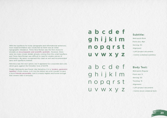
Flipped the image to the other side to fit the design system of the entire project document.




0 notes
Text
Project Doc Formatting
https://www.canva.com/learn/table-of-contents-design/

Unecessary background addition? I just thought the other looked to plain but maybe the minimalistic aesthetic is something we’re going for.


https://www.canva.com/learn/table-of-contents-design/
^ Use the above as inspiration but a broom?


Bold vs Regular Type


^Kept the introduction simple.

Centred it instead - better alignment and it links to the cover page.

Added subte plants - might reduce opacity by a further half.

Added a brush stroke background - better fits with my visual design system.


Decided the entire page should be the brainstorm - so that viewers can actually read it.

Everything has to be shifted to the left.

Nah this is it :)) I like it - might play with the opacity of the illustration!

ohohoh this is noiiiccceee this is very clean

Subtle visual revolution and im loooovvinnnggg it okay so hear me out i feel like this project doc needed some kind of texture bc i wasnt using photography or gradients as much ~ so I used this paper texture in the background and oml it���s such a small change but it makes everything look sooo much better imo. also i really miss the tangible aspect of having an art journal, like last sem, i filled an entire a3 journal book bc i love documenting stuff down yknow. so putting this paper texture was a nice ode to that analogue method i love so much.

Photo by Kiwihug on Unsplash
0 notes
Text
Flyers

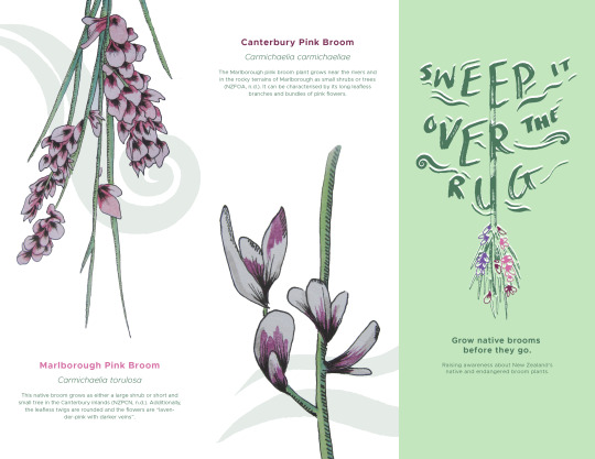
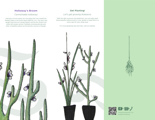
Flyer design from established designed guidelines.
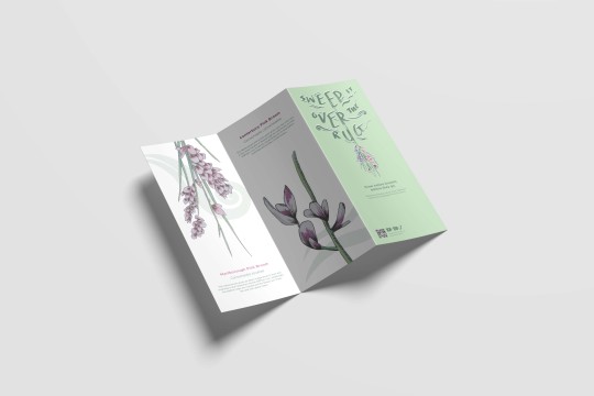
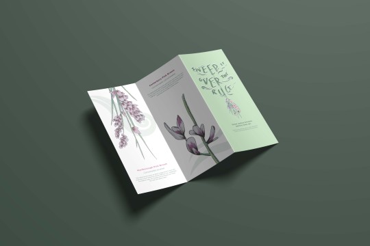
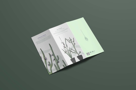
- Made some adjustments with spacing.
0 notes
Text
Yoo leshgo with these pots
Idk why there’s like no mockups for empty plant pots but I managed to find this:

According to my research, these native brooms grow into small trees and need good draining - so I thought these large concrete pots would be fitting.
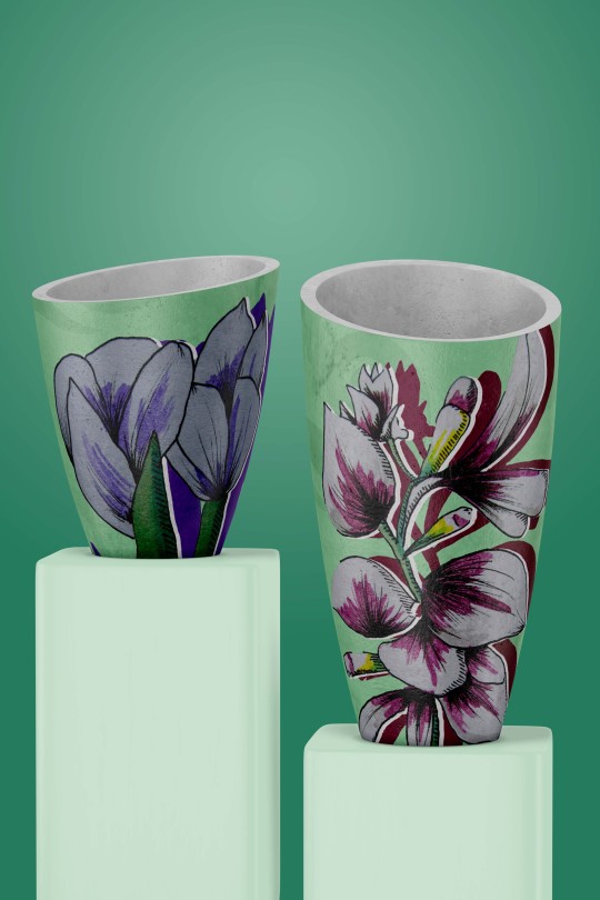
Pots with the corresponding flower wrapped around :))
0 notes
Text
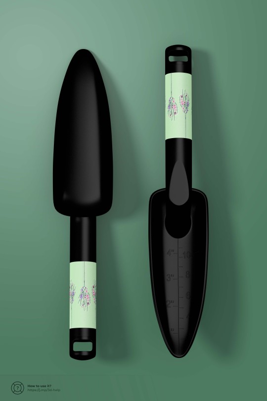
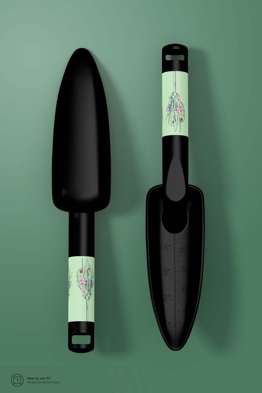
Mini spades!

https://www.notion.so/Customize-a-3D-Layer-Based-Mockup-f6adf29779ef4a56ab9abb466a34a3a7

I had to learn 3D mockup for this particular collateral.

^Different Handle Designs
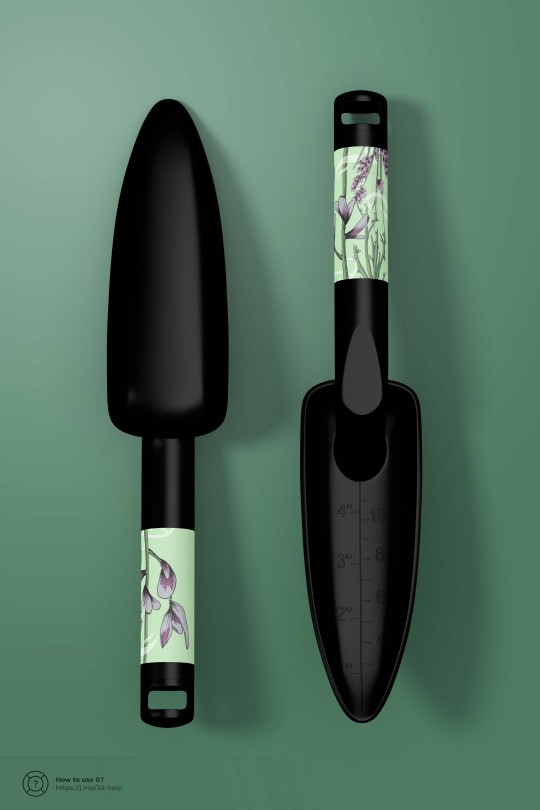
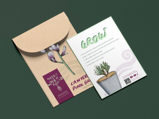
I altered the format of the seedpackets^ I lowered the opacity of the swirls and korus and also slightly altered the titles and body text (super minor stuff).
0 notes
Text
Tactile Stuff woohoo!
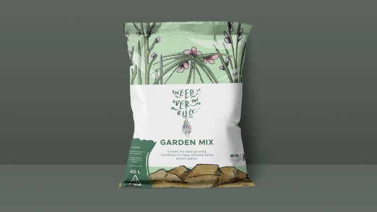
I tried to find soil bag mockups but I wasn’t willing to pay 15 bucks for a mediocre mockup.
So I’m using a chip packet:

It’s gonna work. Trust me XD
https://country4k.com/product/free-chips-packaging-mockup-in-4k-2/

Tui Gardening Mix (as a reference for what information would be needed. There’s no images I could find for the back on such so I just designed the front.

Design from previous soil bag (see gardening research). The ‘ingredients’ are also based on what I researched and the growing conditions of native brooms.
Stickers with the visual elements from the pattern I made before:
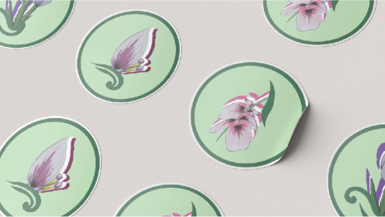
0 notes
Text
New Bustop Posters
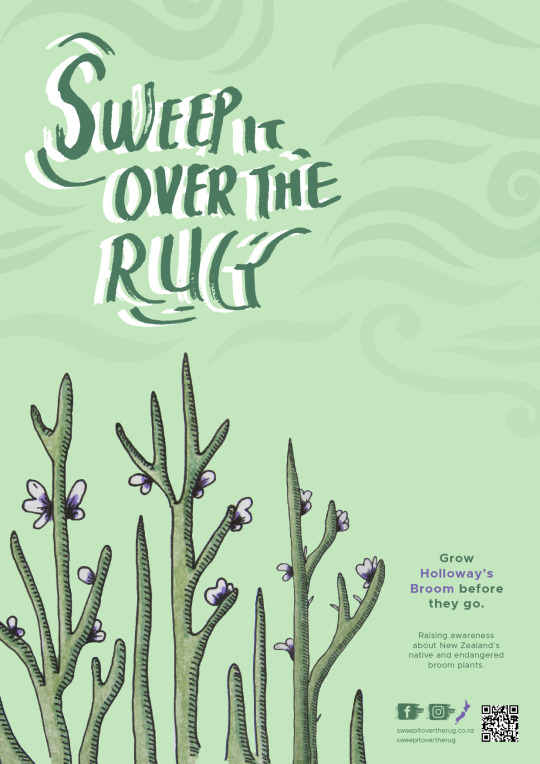
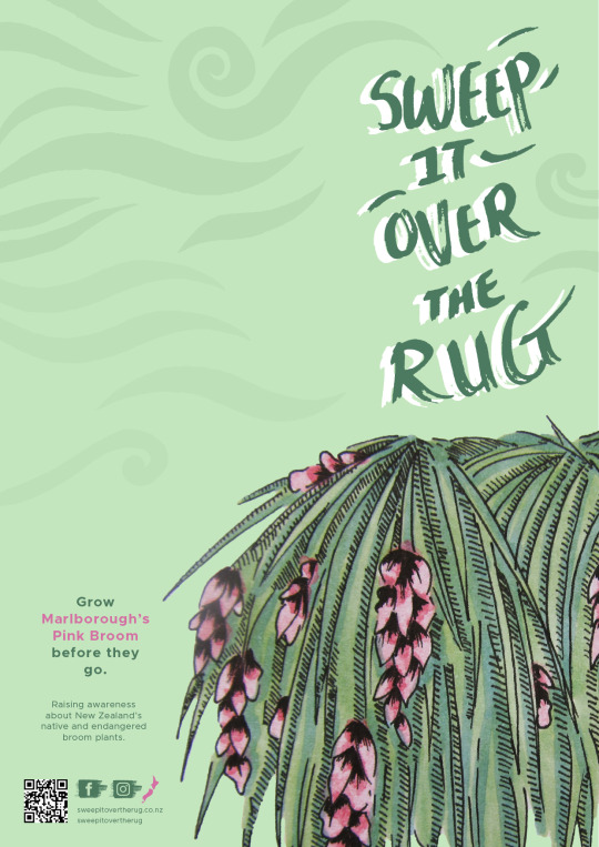
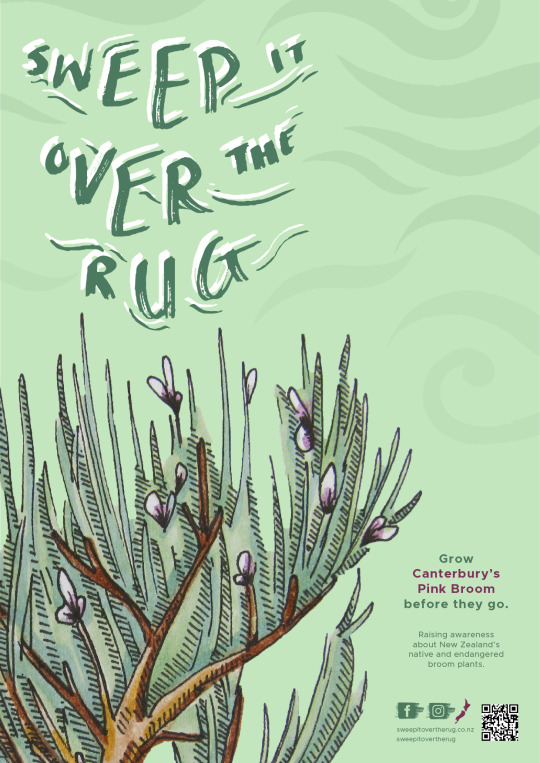
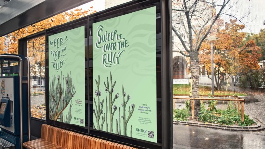
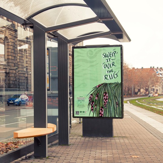
Added subtle swirl patterns in the background (subtly incorporating the koru symbols and everything).
0 notes
Text
Instagram Profiles and Posts
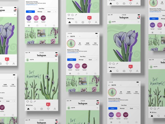
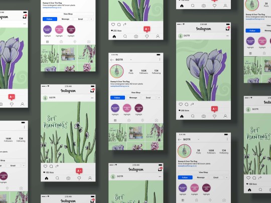
I kept the posts and entire feed more visual because Instagram is more geared towards our visual perception!
0 notes
Text
Final Website Mockup
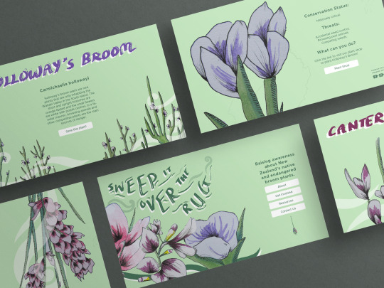
Super happy with the website designs. I used both symmetry and asymmetry layouts, but kept the same font sizing/kerning and imagery to establish a clear design system. Might do some final adjustments later on in the week.
0 notes
Text
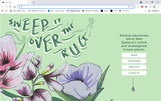
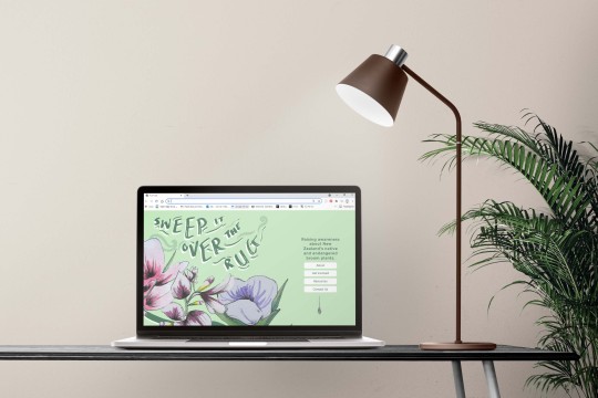
Websites continued
Information Webpages (about the plants)


0 notes
Text
Websites, Infographics and Socials
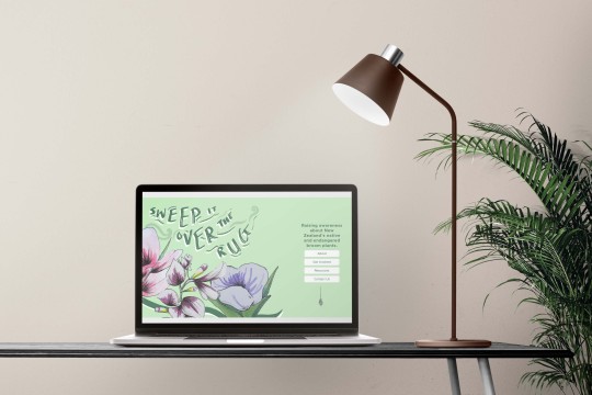
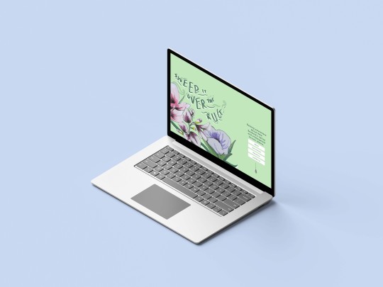
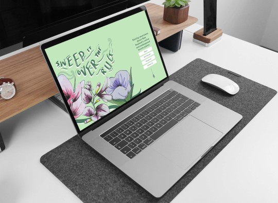
Website iterations


^Better placement imo.


0 notes
Text
Project Document Inspiration
I thought it would be a good idea to look at some brand guideline inspo. I looked at some with my mate but never really noted them down so I’ll take 40mins - 1 hour scrolling through Behance (while listening to a podcast heheh).
Contents

Introductory Page/s


Logo


^Makes me consider the wordmark - keep it more simple?


^Minimum size for the wordmark.


Typography


^Specific typography guidelines


Colour


^Colour Guidelines
Imagery/Imagery Inspiration


^Mockups for moodboards?
Patterns

More informative stuff


Narrative element?
0 notes


