Don't wanna be here? Send us removal request.
Text
Final reflection
Overall, I really enjoyed this brief. One thing I have always struggled with was layout design but as I progressed through this, I can definitely say that I am more comfortable with thinking about and using a grid system - whereas before I worked a bit haphazardly. I also found that when working in a group, I tend to take the roll of ‘mother’. Turns out I can't help but allocate jobs to team members in order to get the ball rolling.
It took me a hot minute to figure out my final design system, however, once I finally knuckled down on what I was wanting to do, the creation of the remainder of the BLAD came quite easily to me. The one thing I do need to work on more though, is thinking outside the box and to get more creative with my layouts and hopefully that will all come with experience :)
0 notes
Text
Front and Back Cover

Original ^

Redesign ^
After some feedback - it was mentioned that the back cover image sort of disappeared and was in a way pointless considering it doesn’t bring much attention to the back. So instead I decided to remove the black design all together, enlarge the pink design and centre it on the spine of the book so the design flows from front to back - essentially giving the reader a reason to turn the book over. The black also wasn’t necessary as the paper is black and the colour palette is black pink and white. So the paper was providing the black, design providing the pink and the text providing the white.
I also unfortunately had to remove the commix logo because it disappears at 4mm.
0 notes
Text
Marx Design images


After looking through Marx Design’s work - I found the they really enjoy using bright, bold colours for a lot of their work. I originally wanted to duetone the designs to match the colour palette, however, because I introduced a spread of images for Inject Design, I am going to carry that throughout the BLAD. Also because of the simplicity of the colour palette throughout the BLAD, I don’t want to include colourful images PLUS the pink black and white - so instead I want to introduce pops of colour through he DPS of image. Also so when looking at the book from the side, there will be strips of colours running through.
0 notes
Text
Marx Design


Using an image from their website, I wanted to use it as a feature page. Along with that, I pulled a quote from their page to include. The top iterations are my original trials as to where to put it.


Due to working with a lot of space, I decided it would be easier to figure out layout and placement if I included more information, which I also pulled from their website and began playing around with the grid layout as well as two different quotes to see which fit best.


One issue I found with trying to place the text over the image, was that whether it was black or white, some of the text would disappear into the image so I then tried different fonts (ABC Social, Extended and Mono) and found the best result was with the text covering the whole page/image.


And to bring back the colour palette, I highlighted the key words in their quote to break up the black and white, and then included the matching photo from their website.


Trying out Duotone of the images.


Once I was decided on the pink and white duo tone image, and the layout of the quote on the right - I just need to figure out text layout.


And finally, I decided the above image was the final design. I tried out the rounded corners for the image but decided against it because the sharp edges work better with this design system of this BLAD which is clean and elegant.

Grids and guides ^
0 notes
Text
TOC alterations

Original ^

Was trying out the ABC Social Condensed font ^

After my feedback, not much was to be critiqued on the contents page which was great, however it was recommended I try and keep some consistency with the layout of my titles on each page, so there is a steady flow from the cover right to the end. It was also this page where I settled on the two fonts I will use throughout the BLAD - ABC Social Extended and ABC Social Mono. Extended at medium weight for headings and at light weight for body text and Mono for any subheadings and numbers, both at a light weight.


And for the table of contents, I removed Table of Contents from the header, and instead replaced it with TOC, to mirror the 3 letter words of Hey and ABC (consistency!) to start the flow between pages. I also changed the font that was originally used for the presentation to ABC Social Extended and Mono. I also chose to right-align the text to give a sense of a grid as well has to clean up the space between the page names and numbers.
0 notes
Text
Inject Project DPS


After my feedback session on the original DPS (first image) I was pretty set on how I was going to change it. I was particular with the images I chose, and this was because I didn’t want too many colours clashing together and creating a sensory overload, and after looking through their website, I found that Inject had a lot of orange tones in their work so I found the ones that looked best displayed alongside one another. The rest of the iterations in this post were just all the tests I went through before finally deciding on a spread lay out. It is actually a lot harder to find the right layout with very minimal writing. I eventually decided to take out the keywords that linked with every project because Inject’s services are already listed on the previous page in the BLAD so I found it unnecessary to include it again. I also chose to reduce the amount of pink on this spread because of the already popping orange, and didn’t want too much going on so I settled for using it just for the subheading.

The grid system used ^
0 notes
Text
Inject Page Layout
Below are all the tests I went through before I settled on the final image right at the end.


0 notes
Text
Inject Title iterations


After a great feedback session, it was discussed about introducing an image of the studio for this design companies page and that's when I remembered that Inject had a great photo on their website that works with my colour palette. Due to the dimensions of the image and the minimal text, the image would be best utilised on half the spread rather than half a page. On half a page, there would be too much negative space considering the minimal information used. I will look into maybe incorporating place holder text to fill in any space that seem too bare, even for the minimalistic design choice.


The above images was me testing out what the Inject name would look like over the top of the image of the studio. The idea was initially my go to however, I did struggle finding the right placement for it.


As shown by the red circle, the title would be disrupted by the fold in the page - and although this isn’t the biggest issue, I didn’t want to distort the E right down the middle, and potentially ruin the flow of the title on the image.


So I then tried breaking the word apart, trying it out in different placements but decided that the word itself didn’t read well when broken up


Testing opacities

ABC Social Condensed font

ABC Social Extended Font

ABC Social Mono
0 notes
Text
Feedback
Front cover:
Increase point size of blurb text
Commix logo does not work on spine
Try mirroring design on back
Try one large design over the whole front and back cover - gives reason to turn book over.
A directory for designer, from designers.
Increase text from thin to medium and from medium to bold. Thin text disappears into the black.
Try Jaeden's square design.
Contents Page
Introductory 'Hey' to match ABC on front cover
TOC on contents to match ABC on cover - consistency
Good choice of font - replace other font throughout BLAD with this one.
Chapter introduction page
Try four columns
Smaller margin
Increase weight for design credit
Bold ABC header - to match front cover - consistency.
Bring text closer together - a bit too far apart to comfortably read
em-dash
Centre text and slightly off centre design to avoid clashing.
Inject Page
Smaller title - match ABC front cover layout - consistency
Change font to same font as contents page
Utilise black space
Multiple page layouts =
Image DPS for Inject
6 images taking up 3/4 of page
Black space with image descriptions listed in same pattern as image layout.
0 notes
Text
Inject Page


This was the first page I had to create from scratch as it was designed for the formative. My biggest struggle is page layout and finding and equilibrium between text, image and black/white space.


I wasn't sure about having the text and image on the same page - purely because of the colour palette. From having such a solid and simple palette, there's a chance that any added images that aren't modified to match the palette could cause clashing and distract the reader from the information and design systems of the page.

So I decided to dedicate a whole spread the the images alone as a way to create a pop of colour throughout the BLAD and to keep it fresh. I plan on trying to do this with every represented company in the directory. I did struggle with the image spread because of the narrowness of each image so I had to leave some kind of black space to even it out and chose to utilise the space at the bottom to credit the companies work.
0 notes
Text
Chapter 1 introduction page

Above was the original design that was presented int he formative. I really like the overall design as it is consistent with the content page layout and the colours. However the spiral that is seen over the whole page was just placed as a watermark for the presentation but from seeing it together and from given feedback, it works quite well.

I first started my redesign/tweaking but adjusting the layout of the text on the right page. I personally felt that they were too far apart.


I tested the text in sections of the page to relate back to the contents page layout, trying to establish a set design system early on in the BLAD.

During this, I remembered the feed back we got about the spiral design so started testing placement for it.


I then remembered what was mentioned in class about trying to avoid altering an image too much, and considering that the image on the right has already been altered to fit the pink palette, I didn't want to take it further by plastering our design over the top of it. So I tried it in the middle and cut in half and at different opacities.


After deciding against that, I tried it centred on the right page only. This worked pretty well in my opinion but I did find then that I had to find a new placement for the text as I didn't want it clashing too much with the design to the point where it was hard to read due to the weight size of the numbers being thin. I chose the placement of my text in the middle so the centre of the spiral was in the middle of the text to create symmetry on the page.
0 notes
Text
Contents page

Above is the original design that was presented for our formative presentation. The overall concept is what I like the most because it's clean, clear, and elegant. However, I wasn't sold not he choice of colour as it doesn't exactly fit with the colour palette of pink white and black.

Starting with a similar lay out, I decided to change the background to a clean white and incorporate the pink in with the black text.


For the table of contents, again I like the layout that was chosen however, again I replaced the black text with pink to get a sense of consistency in the colour palette.


These are all my takes on trying to incorporate the Commix logo into the page to break up the white space just a bit and to introduce some design to the page. I trialed the black and pink spiral along with different opacities, and the final choice is the pale pink as it blends is smoothly with the white compared to the black which creates a bit too much contrast.
0 notes
Text
Creative director was born
Once the group started gaining momentum, I found myself allocating tasks and splitting up responsibilities between the group. From there it snowballed to me monitoring the progress of the group, answering questions, giving critiques and feed back. A lot of the team came to Asha and I for guidance on where to go next with the project. My roles in this project was design company research, publication company research, I came up with the name for our studio, I finalised the colour palette, suggested the multicoloured layout for the BLAD, came up with the idea of categorising the BLAD into branches, ended up rewriting the blurb and working alongside Courtney with tweaking the introduction. I worked one on one with Jaedan who was the designer behind the logo and front and back cover and spine. Him and I corresponded a lot via a private teams chat where he sent me his iterations and we worked together on deciding what worked best for the logo and cover. Towards the end, Asha and I took on the responsibility of bringing the presentation together. Asha sourced all the information together and then I put the final overall PDF together. Hopefully our Studio 42 teams home page is checked as that is where all my work is shown as majority of it was discussing and critiquing and offering ideas and solutions, rather than actual psychial design work
0 notes
Text
Intro and Blurb
There was a bit of confusion amongst the group about the different between a blurb and intro. Below was what was drafted up however, it was pointed out that they are both very similar in a way and my team wanted to confirm this was correct. And in a sense, the blurb and intro do consist of the same information, however I did my best trying to explain the difference between the two. A blurb is the selling point of the product (book) - it's the second go to point (after the cover) for viewers who are interested in getting to know what the product is. It's what informs the buyer/client/reader of what this product contains without completely giving away what is inside. The introduction is what welcomes the reader to the book and 'gets the ball rolling'. It should be fun and exciting and most of all enticing. Original Introduction: Aotearoa Brandscape Creatives Directory also known as the ABC Directory features eighteen ofAotearoa New Zealand's leading communication design companies that specialise in branding.These eighteen studios are divided into three major categories in which they excel. These areprint, packaging, and identity. The ABC Directory is designed to be a useful resource for informing emerging designers about these leading brand studios. My edited version:
Hello and welcome to the Aotearoa Brandscape Creatives Directory! Here you will find the eighteen leading Communication Design Companies based right here in Aotearoa who specialise in Brand Identity, Packaging and Print design.
These eighteen studios have been hand picked, throughly researched and aesthetically categorised into the three major branches within communication design. This directory was created to be a helping hand from one young designer to the other, to be used as a useful resource for those who are taking their first leap into the design internship world! The ABC Directory is here to educate and inform emerging designers of what their possible choices are as well as a look into the secret life of design.
The changes I made was just to add a bit more personalisation to it, to connect with he audience and get them comfortable as finding an internship can be daunting for some, and I wanted it to seem like a fun experience
Blurb: The Aotearoa Brandscape Creatives Directory also known as the ABC Directory featureseighteen of Aotearoa New Zealand's leading communication design companies. These eighteenstudios are divided into three major categories - print, packaging, and identity. The ABCDirectory is designed to be a useful resource for informing emerging designers about theseleading brand studios. My edited version:
ABC Directory - the first step to every young designers journey. Here you will find all the information you need about the leading Communication Design Studios that specialise in Brand Identity, Packaging and Print Design, right here in Aotearoa New Zealand. A little push in the right direction.
I changed it so it separates from the intro and is sweet and concise so when displayed on the back of the directory, it doesn't take up too much space as the design is meant to be elegant and simplistic.
0 notes
Text
Publishing Company Research
About
Unit Editions is an independent publishing venture, producing books for an international audience of designers, design students and followers of visual culture. The company was formed in 2009 by Tony Brook, Patricia Finegan (both Spin) and Adrian Shaughnessy.
High quality design and production standards are partnered with insightful texts and informative commentaries to produce books on a wide variety of subjects – subject that are either neglected or ignored by mainstream publishers.
Unit Editions books are only available through this website and a handful of specialist shops. Our books are shipped postage free to anywhere in the world. Superior protective packing is used to ensure that books arrive in pristine condition, and all large format books are shipped with protective corners.
Unit Editions attends (and sometimes hosts) events, conferences and lectures. At many of these events our books are on sale, often at a lower price.
We have a number of important books currently in the pipeline. The best way to keep up to date with our publication schedule is to sign up for our weekly newsletter. People who receive our newsletter are the first to know about new titles and special offers.
Works
Paula Scher: Works (concise)


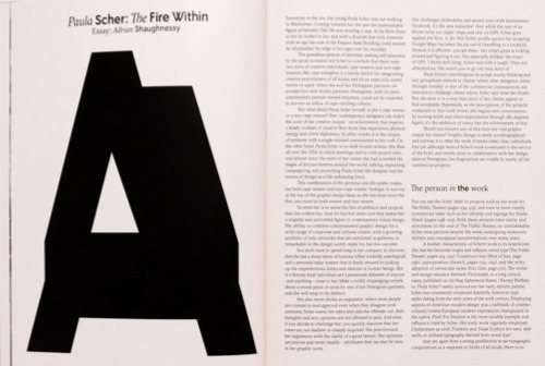


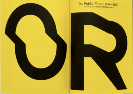
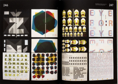
This monograph covers Paula’s early days in the music industry as an art director with CBS and Atlantic records; the launch of her first studio, Koppel & Scher; and her 25-year engagement with Pentagram.
It also provides an up-to-date look at Paula’s idiosyncratic hand-painted maps, part of her prolific artistic practice that complements her still-growing graphic legacy.
The book also a visual record of contemporary New York’s urban fabric, indelibly transformed by the designer’s innovative approach to environmental graphics and identity design: from MoMA to Charter Schools; from the High Line to Shake Shack.
Her logos for global corporations and cultural institutions have cemented her reputation as a giant of identity design.
A large section of the book is devoted to the designer’s socially and politically motivated posters, New York Times Op-Ed illustrations and campaign work.
In a long interview, Paula’s frank and open words lay bare the reality of design culture in the USA. The 326-page book is designed by Spin, under the creative direction of Tony Brook.
Paula Scher, the ‘accidental postmodernist,’ has come to be seen as an emblem of American design: a ‘master conjurer of the instantly familiar.’ (ted.com)
Specifications Size: 203mm×258mm Pages: 326 Print: Four colour litho Cover: Foiled with inside flaps
Rick Poynor: National Theatre Posters: A Design History

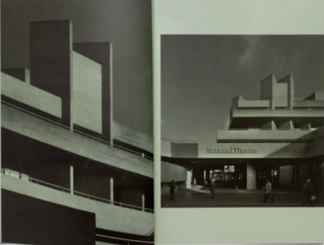
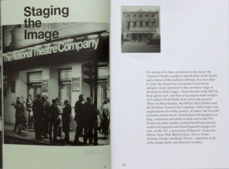
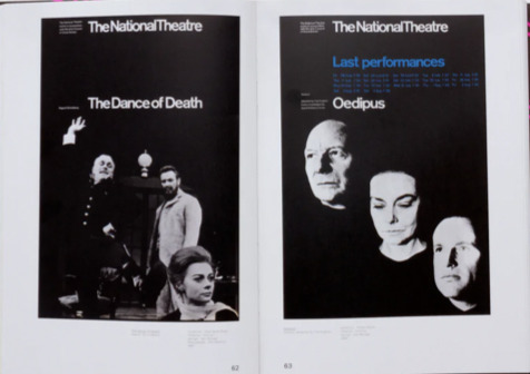
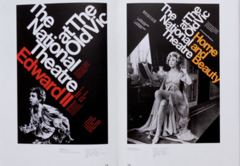


Across the decades, the National Theatre’s poster designs have been the responsibility of just five individuals: Ken Briggs, the theatre’s first graphic designer; Richard Bird; Michael Mayhew; Charlotte Wilkinson; and Ollie Winser.
An enormous range of graphic approaches has been used – typographic, illustrative and photographic. This diversity of expression reflects the designers’ temperaments and skills, the fashions of the time and changing conceptions of the most effective way to communicate graphically with the theatre’s audiences.
National Theatre posters, when viewed collectively, comprise both a history of design at an institution central to British cultural life, and a case study of the way the poster as a medium has evolved in Britain in the last half-century.
Specifications:
Foiled hardback with 2 Pantone colour wrap Size: 216mm×310mm Pages: 256 Print: Four colour litho Special Features: Buckram cover foil backed
Action Time Vision



About
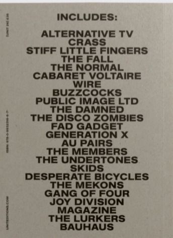
The same thing happened in graphic design. All you needed were a few a sheets of Letraset and access to a photocopier, and you could make your own record covers. And lots of people did just that.
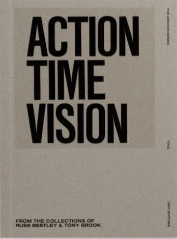
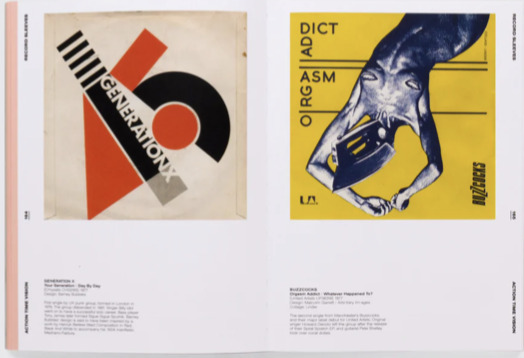
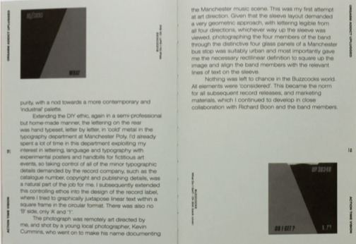
Action Time Vision: Punk & Post-Punk 7" Record Sleeves [Unit 26] is a celebration of DIY graphics from the punk and post-punk eras. You might call it outsider graphic design.
With a few exceptions, trained designers rarely did 7” singles covers for this notoriously shouty and aggressive music. Apart from a few covers done by Barney Bubbles and Peter Saville, most punk and post-punk covers were designed by band members, label owners or friends.
Few of the sleeves showcased here are beautiful in the normal sense of the word. But they all have an urgency and an exhilarating disregard for design conventions that makes them exceptional. They are all clarion calls for independence and freedom from pop industry norms.
The work in this book is culled from the record collections of designer (and Unit Editions co-founder) Tony Brook, and leading punk scholar Russ Bestley. As one of the world’s leading authorities on punk and post-punk music, Russ has contributed an insightful essay to the book.
The book also features interviews with designer Malcolm Garrett, Mute founder Daniel Miller and Sniffin’ Glue editor and musician Mark Perry.
Specifications Size: 230mm×170mm Pages: 320 Binding: Lay-flat Special Features: Three paper stocks
Studio Culture Now


About
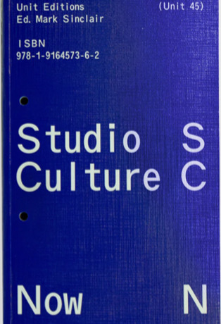
Studio Culture Now features in-depth interviews with a host of leading design studios. The interviewees share their experiences, insights, fears and joys, and reveal how they deal with the fundamentals and aspirations of studio life.
Candid and generous, these extensive Q&As form a blueprint for anyone planning a studio practice, or anyone struggling with maintaining one.
Topics covered include: getting jobs, working with clients, balancing creativity with profitability, accounting, hiring, promotion, wellbeing, and much more. The interviews, mostly conducted in the past few months, also reveal how studios are adapting to the changes brought about by the coronavirus pandemic.
Specifications
Title: Studio Culture Now: Advice and guidance for designers in a changing world Size: 151mm × 235mm Pages: 492 Printer: Ediprima, Italy Cover stock: Brossul, 210gsm Papers: Munken Print White 1.5 80gsm; Materica Clay 120gsm; Materica Kraft 120gsm; Woodstock Rosso 80gsm; Magno Gloss 100gsm; Magno Natural 80gsm
About
Slanted Publishers is an internationally active publishing and media house founded in 2014 by Lars Harmsen and Julia Kahl. They publish the award-winning print magazine Slanted, covering international developments in design and culture twice a year. Since its establishment in 2004, the daily Slanted blog highlights events and news from an international design scene and showcases inspiring portfolios from all over the world. Over the years, more than 180 video interviews with designers and entrepreneurs have been made, forming an archive that bears witness to our time.
In addition to the Slanted blog and magazine, Slanted Publishers initiates and creates projects such as the Yearbook of Type, tear-off calendars Typodarium and Photodarium, independent type foundry VolcanoType and others. Slanted’s publishing program reflects their own diverse interests, focusing on contemporary design and culture, working closely with editors and authors to produce outstanding publications with meaningful content and high quality. These publications can be found in the Slanted Shop alongside other extraordinary products by young design talents and established producers from all over the world. Slanted was born from great passion and has made a name for itself across the globe. Its design is vibrant and inspiring—its philosophy open-minded, tolerant, and curious.
Christina Wunderlich - Mono Moment—Monospace Type Design Release: February 2022 Volume: 208 pages
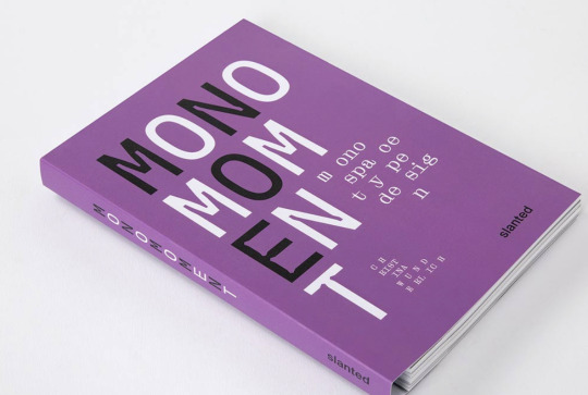
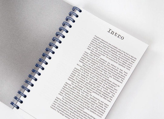

Friedrich Nietzsche was probably one of the first to feel the aesthetic appeal of monospaced typefaces. Since he started writing with a typewriter, typefaces, and punctuation have been important to him. In the meantime, we encounter monospaced typefaces regularly in everyday life: in design and in art, in coding, on tax records, or on our ID. If you take a closer look, you will encounter non-proportional typefaces more often than expected.
Monospaced typefaces are defined by their fixed, equal width for all characters. Every character, letter, and number occupies horizontally and vertically the same space. Proportional typefaces, in turn, have harmoniously balanced spaces with variable widths between their characters. The widths are not set proportional. That is why monospaced typefaces are also named non-proportional. What exactly is the attraction of typefaces, whose letters and characters each occupy an equally large space?
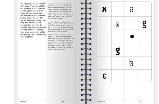
Due to the increase in typeface production over the past few decades, almost every well-developed font family also has a mono or semi-mono cut. When searching for the word “monospace” on the World Wide Web, countless entries can be found in addition to the results such as “I am looking for a beautiful monospaced font,” “Top Ten Monospace Fonts,” or “Best Monospace Fonts for Coding.” At a time when it has never been easier to design and publish typefaces, this book provides a good orientation to monospace!
Continued in next post (only 30 images per post allowed)
0 notes
Text
Commix Logo designs
The group decided on the name Commix. We were brainstorming on a way to introduce the idea that as a group, we all have strengths in different aspects of design so we played around with ideas on ‘blending’, when I came across the word Commix which means “beat them till they be thoroughly commixed”.
Table Drafts

When thinking of blending ideas, the icon for atoms kept coming to mind. Probably because atoms are what make up everything so the thought of “making” something felt fitting. I like to think of the BLAD being ‘made up of’ the members of Studio 42.
Iterations


0 notes


