
gemmasophiaresponsive
RESPONSIVE
Gemma Hill
(Fashion Design)
L5
102 posts
Don't wanna be here? Send us removal request.
Last Seen Blogs

spacestache
Coran, Coran, the Man I Stan


goddesskenzierin
Goddess_Kenzie🍆💋🥵

vaporwave-noripii
(⌐▨_▨)
sparksssflytv
saved
Text
EVALUATION
ABOUT THE BRAND - 7THREADS -
We are a new, innovative and fashion forward unisex brand with a specialism in the sustainable concept of slowing down the fashion production to create a personal, special and bespoke garment for our customers. We create our garments for the customers and allow them to collaborate by expressing their interests and donating an old but loved item of clothing for it to be incorporated into something new. We put our time and love into the garment, it is a one-off purchase for the customer but a special garment to last a lifetime. We create garments on the reflection on who the customer is, and how they communicate themselves as a person. It is a form of art they can wear, based on their own sentimental value which is priceless to the customer therefor worth the time to go through our process.
The number 7 is the main concept in our brand, we give the customers 7 steps to aid us within their collaboration and we have designed jumpers with 7 panels included to give us 7 opportunities to combine their personality with colour, print, fabric manipulations and s detailing. But why 7? ‘lucky 7’ is the world’s favourite number and this brand is all about treasuring the good.
1. Pick your favourite design and choose a size - XS, S, M, L, XL - We have created three specifically selected jumpers suited for everyone in a unisex style, the customers just have to pick which design they like best, and pick the relevant size. We decided to use the jumpers as a default design because its unisex, simple and free. A jumper suits everyone and is simple enough to be applied interestingly, it gives us freedom on how it can be developed. Every jumper will look different as the customer will determine the final look.
2. Donate something special - The customers can donate something old that is loved by them, this can be a piece of clothing (may not be returned in full state). They can also send more than one item, or even a photograph, lyrics, quotes and items. Allowing the customer to recycle and donate old items could really encourage them to think ethically and realise that their old items still have purpose and use.
3. Favourite Colour -The customer can advise us on their favourite colour, this helps us with the fabric sourcing.
4. Photograph of you - A photograph of the customer wearing the item, to give it a more personal feel and helps aid within the communication process.
5. Your story - The story behind the garment or the customer (can take a transcript/audio recording)
6. About YOU - General information to aid us with the design.
- Name, Age, Occupation, Hobby/ interest:
7. Send - The design process begins.
THE PROCESS OF OUR CUSTOMERS AND MY DESIGN DEVELOPMENT
To kick-start the brand, we had to reach out and find two people willing to be our trial customers. We were after a boy and a girl to get the maximum effect of showcasing our brand to be uni-sex. Our brand is all about making the garment perfect for the customer with consideration of their personalities, interests and favourite colours. Within design, I needed to consider fabrics, colour harmonies, print, textiles (sampling), fabric manipulations and panel placements to create the perfect finalised design to express our customers.
Customer Number one - Chris Yates
Our first customer had a keen interest in skiing, and had donated an old ski top from which he collected after he won a ski competition. He had a favourite colour of red, and included a passport to showcase his love of travel. With this information, it was my job to come up with a relevant design, including panel placements, print and fabrics suited for Chris. I feel that I created a suitable design for Chris and his personality thought my choice of colour, print and fabrics. His final design included.
- A colour harmony of white, blue, red (customers favourite colour) with a highlight of black
- Two prints - An abstract passport print and an illustrative ski print.
- The use of scuba jersey and cotton - for a sporty look.
- His donated item showcased in a statement green panel on one sleeve.
Customer Number two - Monica Birzan
Our second customer had a passion and love for dance, and thrived in her studies of fashion design. She had donated a tutu from her dance competitions and a series of photographs of her and when she was younger dancing. Again, with this information I came up with a relevant design suited for Monica including panel placements, print, fabric manipulation and fabrics. I feel that I created a suitable design for Monica and her love for dance and fashion design thought my choice of colour, print and fabrics. Her final design included.
- A colour harmony of white, navy blue (customers favourite colour)
- a print - an illustrative print showcasing her love for dance, fashion, taking pictures and drawing - subtle embroidery details added
- A tactile panel - Fringed panel inspired by a trend to communicate her fashion interest, has the donated tutu incorporated in this
- The use of soft cotton for a comfy - sporty feel.
I feel that our brand was very successful, and demonstrated practices of sustainable fashion though the concept of slow fashion and encouraging our customers to recycle their old items. Our brand is different, it produces garments which are made with care and for our customers to treasure and keep for life. It’s a treasure to them as it expresses them as a person, not by season or trend.
0 notes
Text
WORKING AS A TEAM
Teamwork was important in our project, it was important to cooperate with each other, communicating our ideas, development and opinions to forward us in our brand. Team-work determined the success of the brand and how well we addressed the issue of sustainable fashion. Working directly in collaboration with each-other, it allowed us to combine our skills and specialisms to create a new, exciting and innovative brand.
Gemma Hill - The Fashion Designer - has a skill set in design development, garment production, tailoring, sampling, styling, illustration, working drawings, print design, adobe creative suite and research.
- Responsible for the design development process and manufacture
Emily Davis - The Fashion Communicator - has a skill set in brand development, photography, Styling, garment production, fashion video, illustration, print design, adobe creative suite and research.
- Responsible for the project branding, the brand information and the final photo shoot.
Our project management also worked effectively, we set our own tasks, our own deadlines and communicated daily, checking on our individual inputs, progression and ideas to take forward our brand. Every time we developed an idea, we made sure we asked each other for opinions and constructive criticism to allow us both to get the best out of our work by influencing and guiding each other.
We both worked fantastically as a team, and seemed to gel well together. Our ideas were successfully compromised. We advised, communicated and encouraged each other to get the best out of our work, and to create an innovative, successful substantial brand idea.
1 note
·
View note
Text
EVALUATION ON HOW WE HAVE CONSIDERED SUSTAINABILITY WITHIN 7THREADS
The whole point of the project was to bring awareness and create a brand philosophy that demonstrates an ethical and sustainable practice and mind. We had to respond to the problems and issues the Fashion Industry causes to the environment and take a part into thinking of new, innovate and ethical brand to encourage our thinking to create fashion design and branding using sustainable practices and techniques.
‘Sustainability is and will continue to be a vital agenda both within the fashion industry and beyond, with climate change having the potential to impact on every aspect of our lives and the future of human activity on this planet. ‘- Quoted from our Responsive brief
To respond to the issues of sustainability in the fashion industry we created a new innovative brand named 7THREADS. We understood that the concept of fast fashion was just creating a buying cycle, tripping back the love of making clothes but instead them becoming disposable.
Our brand is slow fashion, which represents all things ethical, we slow down the process of our manufacture to ensure that we give value, care and time to the product. We give our customers three choices in Jumpers, sized from XS-XL to choose from, this is here to stay and will not be changed. Our brand is about our customer, who they are and what they enjoy, not about the fast pacing trends and season transitions.
We ask the Customer to donate an old, loved item which holds a significant memory to them (with clarification that the garment will not be returned in its usual state), The garment is re-worked and designed into one of the panels included in our 7THREADS panel designs (on our Jumpers). This idea of working in collaboration with our customers can encourage them to re-use and re-love their old items, creating it into something new, personal, individual and special.
In addition to our main concept of slow fashion we also represent a sustainable procedure in sourcing our materials. We select our fabrics from Fabworks Mill in Dewsbury which is a local source and even sells reclaimed textiles. Sourcing our fabrics from local businesses reduces CO2 emission from transport such as aircraft and ships, which are needed overseas.
Within our Design Development and Branding process we also try to work sustainability, we screen print our prints using waste inks from the university print room. We Toile and sample using waste fabrics from our personal fabric storage, we brand using biodegradable, sustainable paper.
Through the process of this project, I feel that we have created a successful, ethical and innovative brand, evidencing how our brand is sustainable, showcasing how much we have learnt and realised in a sustainability driven project.
1 note
·
View note
Video
undefined
tumblr
Finalised Customer Package - Printed and Fabrics attached.
I printed out my customer package using a professional printer and applied it to a folder, I added washes, colour swatches and fabrics to liven the package up and express some texture and life to the garment illustrations.
Unfortunately, some photographs in package did not print as professionally is I may have wanted; however, I am still happy that I created this package as it concludes my Design Development and awareness of our customer.
0 notes
Photo


The Customers Design Package (ready to be printed)
After making a design development process sketchbook, I felt that I needed to come up with a way of concluding my customers and their final designs, so I thought it might be good to add on a mini portfolio of work to visualise the final outcome.
I created 6 pages which included.
- A Front cover - using a professional image taken of our customers by Emily Davis
- A page to summarise the customers three choices, the default jumper shapes and panels they can choose from before the collaboration takes place.
- Customer profiles X2 (Chris and Monica) - About our customer, their story, hobby’s, /interests and some inspiration images of our customer’s.
- Final Design Boards X2 (Chris and Monica) - Final Design boards, including technical flats, Illustration and Fabric swatches. (Fabric swatches will be added once printed)
I produced these pages using Adobe Photoshop and plan to print them onto a thin card and display it in a file. Even though that my work may look slightly different to Emily's communication work for 7THREADS, I asked her to advise me on a font she has used throughout her branding process to give my pages some similarity to hers.
Once printed, I will work into the pages using mark making with colours and washes, also adding physical fabric swatches will liven up the portfolio and not making it look so digital.
0 notes
Photo


The process towards my Customer Design Package
- Finalised Working Drawings for Our Customers Designs.
Top = Chris Yates
Bottom = Monica Birzan
In my Customer Design Package, I am going to create a final design board of which includes an Illustration, technical flats and fabric swatches. This is to finalise and showcase the final garments for our customer’s.
It’s important to include professional technical flats of the garment in both line drawing and colour. This is to give a clear view onto how the garment was made, what colours/fabrics and prints go where and how it’s meant to look.
0 notes
Photo

The process towards my Customer Design Package
- The Customers Choice - Working Drawings (Technical Flat)
To professionally finalise the Customers choices, I have made some working drawings (technical flats) of the garments using Adobe Illustrator to clearly demonstrate what is on offer for our customers. As addressed these are the 7THREADS Jumper choices of which are unisex and suited for everyone. They will be sized from XS, S, M, L, XL. These working drawings will be used in my mini customer design package to showcase the three jumpers of which can be purchased and used as a base before our customer collaboration.
0 notes
Photo


The process towards my Customer Design Package
- Final Illustrations of Chris Yates and Monica Birzan.
To start the process of my mini customer designs package, I created some illustrations of my Customers from the shoots wearing the garments to use in my final design boards. Emily also suggested that I create some final illustrations to aid her with a section of her 7THREADS branding package.
We both felt that some illustrations of our customers and the garment would be an engaging way to finalise the Design and Customer. I already have my own personal illustration style of working which involves using loose lines with splashes of watercolour. I then scan my Illustrations in and then edit the levels, contrasts and brightness on Photoshop. This gives the Illustrations a more professional and crisp look.
2 notes
·
View notes
Photo


My Design Development package (Sketchbook)
To display my design development work, I decided to create a sketchbook displaying all my contribution to the project and the design process including the best bits of sequence which I undertook to forward our 7THREADS brand design. I love being tactile and free, I try not to think about keeping my pages too neat and love to express my thinking with notes, annotation and sketches. I work in this way to create a more interesting and hand rendered approach- it also helps me express my thinking and working.
I decided to take out the key areas of my design development, and included samples, research, inspiration, drawing, digital work, pattern cutting and toiling and then some photographs of the final construction.
The Main Points addressed.
- The shape and panelling research, development -
- Chris’s Jumper Development, samples, final garment
- Monica’s Jumper Development, samples, final Garment
0 notes
Photo

The Best Image of them both together -
Model : Chris Yates + Monica Birzan
Photography : Emily Davis
0 notes
Photo


The Best Images of Chris -
Model : Chris Yates
Photography : Emily Davis
0 notes
Photo


The Best Images of Monica -
Model : Monica Birzan
Photography : Emily Davis
0 notes
Photo


The Shoot - Success!
Photographer and main director: Emily Davis
Co-director and Make-up styling: Me
It was now time to follow through with the final shoot in the photography studio. Emily put her communication skills to work, while I helped and advised her along the way. Emily prepared all the lighting, camera, props and backdrops for the shoot. She set up a white, grey and red backdrop to use as a background and set the camera to flash with the photography lighting equipment.
As I am very new to the process of shooting, and photography, so it was great to learn from Emily’s specialism and help at the shoot. Both me and Emily advised our models/customers on how to pose, and changed outfits throughout the shoot. Our models were great at posing and did a fantastic job in helping us within the shoot.
The shoot was very successful. we made the most of the time in the studio to capture some great shots, the images were fun, professional and really captured our brand! Emily will select the best of the images, and then edit them for us to take forward within our brand.
0 notes
Photo


The Makeup styling before the shoot - Getting Ready.
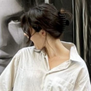
Model and our 7THREADS Customer: Monica Birzan
Using one of my best interests to work, I used my self-taught make-up skills and techniques to produce a look on Monica, inspired by Emily’s styling research of subtle pink tones. I used make-up strobing and contouring techniques for Monica to have a flattering finish ready for the shoot. As Monica’s skin tone was slightly different to mine, I asked her to bring in her own foundation so that the colour matched her skin, she also brought in her favourite blue mascara (which I thought might look cool and harmonise with the blue hem, cuff and neckline of the Jumper).
The Order of Application:
1. Moisturiser - First I applied the Moisturiser all over the face to help elongate the wear of the foundation.
2. Foundation - I patted on Monica’s Foundation using a beauty blender to give an even complexion. (A beauty blender is a beauty tool which has curves and contours within the shape to guide an even foundation complexion)
3. Highlight - I then highlighted and concealed areas such as a triangular shape below the eyes (going as far as the nose and above cheekbone.) below the cheekbone, chin, cupids bow, bottom section of forehead and the bridge of the nose. I draw on the concealer with a small brush in the areas and then blended them out with a beauty blender. This is to brighten these key areas of the face.
4. Contouring - I then contoured the face using bronzer and an applied using an angled blending brush on the cheekbones, hairline, jawline and the sides/tip of the nose). This is to deepen the natural groves in the face structure.
5. Setting - I covered the face with a translucent powder to set the process. (this is to ensure that the make-up does not easily wipe off if touched)
6. Brows - As Monica has naturally dark brows, I did not need to add any colour to them. I used a clear eyebrow gel to brush her brows into a neat and formed position.
6. The Pink shaded eyes- To start off, i primed the eyelids using tinted moisturiser and then applied a very light baby pink colour below the brow and the tear duct. For the mid tones, I added a dash of bright baby pink, then added a subtler rose pink and then blended this out together in the mid lid of the eye. To give more depth, I selected a deep shimmering rose pink and applied blending this carefully into the crease and outer eye to get a slight winged effect (winging eye-shadow gives the illusion of widening the eyes), I again selected the deep rose pink and blended it into the outer lower lash line. I finished off the eyes adding Monica’s Blue mascara, and brushed off any fallen excess.
8. Shimmer Highlighter finish- In the previously highlighted areas, I brushed on some pink pearly shimmering highlighter to add a flattering finish.
9. Lips- I applied a matte rose pink liquid lipstick and then smoothed out the edges with a lip brush to get a softer finish.
When I finished the makeup styling process, I was very happy with the outcome. I felt that I responded to the soft pink concept from Emily’s research. The make-up really complimented the Jumper and looked great.
0 notes
Photo

Quick Makeup Planning
Before the shoot, I decided to make a quick plan to aid me when I was doing Monica’s makeup, I brought in all my makeup, set it all up on a table and then analysed what I had to come up with a plan. I took small swatches of my eye-shadows, lipsticks and highlighters to what I think would be most suitable colours and looks from Emily's research. This really helped me pick and choose colours that went well, could blend nicely and what harmonised.
0 notes
Photo


Previous Make-up Styling work-
From my COP2 shoot (this year) - http://gemmasophiacop2.tumblr.com/
I decided to have a quick look at some of my previous styling work from this year. This project was my Context of Practice shoot where I successfully styled my model for my concept and accessory.
What can I take from my previous work?
- I used the make-up technique of strobing, this is a technique of contouring and highlighting areas of the face to gain a more flattering look to the skin and facial features of the model. It works especially well for photography.
- The shimmering highlighter worked well for this shoot, so this is a must for the responsive shoot.
- Smokey eyes, using complimentary colours on the models eyes. i used lighter shades in the tear-duct of the eye and below the brows, then using two blended mid tones towards the middle of the eye, then using a darker deeper shade in the outer area of the eye and crease. All of which is blended evenly with a eye make-up brush.
- Soft lips, Lipstick softly blended on the lips to reduce too much sharpness.
- Priming the skin with either make-up primer or foundation and then setting the skin with loose powder after foundation application - This allows the foundation to look fresh and last a little longer.
0 notes
Photo


Photo-shoot Preparation-
Emily's Research and how ill contribute to the Make-up.
For the main part of Emily’s Communication role, it was her job to prepare and photograph our 7THREADS shoot with our customer’s. She booked both the customers/models along with the photography studio on the 27th of Feb 2017.
To help Emily, and contribute. It was my job to carry out the make-up styling on Monica and then help and advise at the shoot itself. I was more than happy to be styling Monica's make-up as it’s a big interest and hobby for me personally.
In preparation, Emily researched into outfit possibilities (for Monica) and asked me to bring in any suitable skirts, trousers and culottes for Monica to wear within her shoot - She suggested this because she wanted to show that the garment can be worn with different styles of garment. As for Chris, she suggested that he would be wearing Black jeans with his jumper.
Monica’s Hair -
Emily looked onto Monica’s personal Instagram for some inspiration to what hair style suits Monica, and how she likes to style her hair. She found some images of Monica with her hair tied up in a neat top bun and suggested that Monica can have her hair styled like this - This would look good as it have a dance feel to it (normally dancers do have their hair tied up neatly like this, to stop their hair from going in their face when they are preforming a dance routine, I also remember this from my childhood , when I attended dance classes) Also having Monica hair up will mean that the shoulders and neck of the garment will be fully seen however we could try some shots with hair up, and hair down.
Monica’s Makeup -
To forward me on my make-up styling, Emily researched into some styles to guide me, her research included...
- soft subtle pink shades - Smokey eyes
- soft blush and bronzed cheeks
- Dewy skin - lightly highlighted on cheek-bones, nose and forehead.
- Nude or light-pink lips
With this research, it will help me come up with a make-up planning sheet. I will use my own personal make-up and pick out suitable colours and techniques using the research as a guide.
0 notes