
Reblogging my main tumblr with just my art history as evidence of written work + an extended essay from A Level Graphic Design
Don't wanna be here? Send us removal request.
Statistics
We looked inside some of the posts by gaptooth-arthistory-blog and here's what we found interesting.
Average Info
Notes Per Post
54
Likes Per Post
31
Reblog Per Post
21
Reply Per Post
2
Time Between Posts
1 day
Number of Posts By Type
Link
1
Text
11
Last Seen Tumblr Blogs


Fun Fact
Tumblr is used by 21% of adults online aged 18-29 years.
Link
An example of an extended essay I wrote for my Graphic Design A Level
0 notes
Text
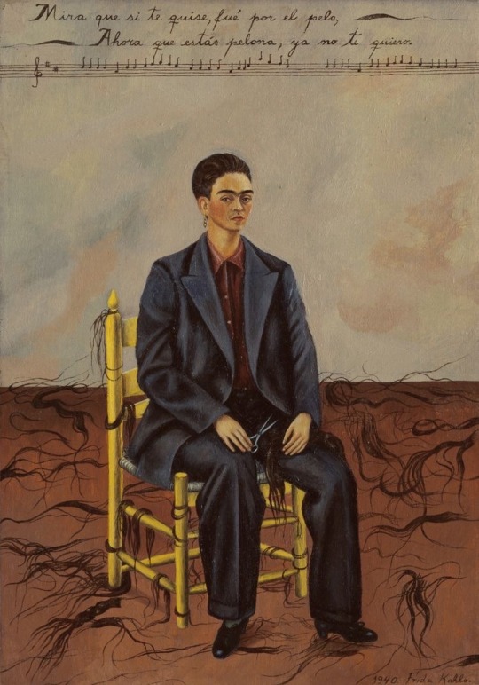
Self Portrait with Cropped Hair – Frida Kahlo (1940)
In this work Frida presents herself significantly differently to most other of her portraits although still choosing to retain her iconic front facing glare. She has depicted herself in an ill-tailored suit with short hair surrounded by the lyrics to a Mexican song and the locks of her hair. In the context of this piece, having divorced from her husband Diego the previous year, the lyrics “Look, if I loved you it was because of your hair. Now that you are without hair, I don’t love you anymore” hold great meaning especially in the context of female identity. I believe this symbolism of cutting all her hair off and dressing in a more androgynous manner suggests that she is free from her female identity as a wife. She is free of being perceived as an add on or object to a man. After splitting with her husband, I believe Frida was trying to establish her own identity and become independent therefore not having to rely on a man. The scissors depicted in her left hand also show a sense of this newfound sense of self, that she did it on her own for herself. It is a concept increasingly found in today’s society; the idea of not wanting people to be perceived especially not for superficial/body-focused reasons or the male gaze.
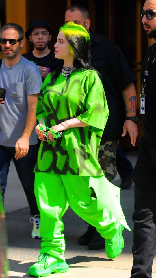
A mainstream modern-day example of this is singer Billie Eilish who only wears baggy clothes to avoid sexualisation in the media especially as she was thrust into the spotlight at such a young age. She too took the power away from men especially.
8 notes
·
View notes
Text
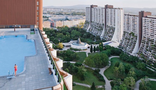
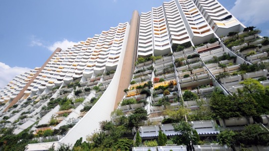
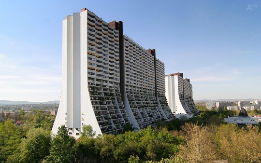
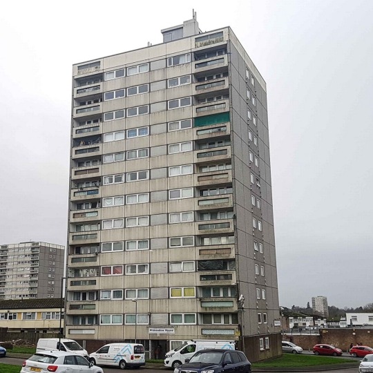
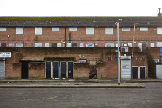
Wohnpark, Alt-Erlaa, Vienna – art history today focused on the function vs the status of buildings as well as architectural patronage. These pictures are that of social housing blocks in Vienna. “2/3 of the population of Vienna live in subsidised housing” which is a staggering figure compared to the UK. A huge factor in this is the architecture itself. The high-rise estates combine modern, brutalist structure with nature and the environment around them. The finish to the building is clean cut and the curvature creates effortless integration between the homes themselves and the surrounding environment and vast green space. A huge difference between this space and the council house alternative in the UK is their emphasis on decoration and ornamentality as well as equally focusing on function. The functionality of Alt-Erlaa is shown not only by its 10,000 residents (therefore preventing a housing crisis unlike in the UK), but by its weight on comfortability in terms of the amount of space you get for your money and the on-site facilities (pools, doctors, shops etc.). The comparison of the two in pictures only further demonstrates how the UK’s council housing system places no value on status which ultimately perpetuates the stigma of council housing as a frowned upon, last-resort place to live.
Source : https://www.youtube.com/watch?v=d6DBKoWbtjE
1 note
·
View note
Text
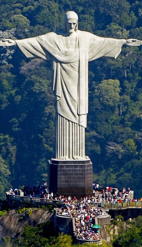
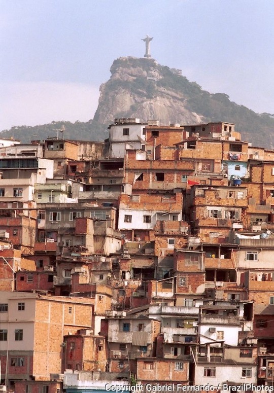
Christ the Redeemer
Completed in 1931, “Christ the Redeemer” was, at the time, the largest concrete statue of Jesus in the world. It resides on top of Corcovado Mountain in Rio de Janerio, Brazil. The sculpture was designed by French sculptor Paul Landowski and then carried through mainly by Brazilian engineer, Heitor de Silva Costa. It was funded mainly by the Catholic community of Brazil (public patronage) which is key in terms of the main aims of the statue and also its scale. It is now recognised as one of the seven wonders of the World.
Built primarily from reinforced concrete, the statue of Christ towers at a staggering 30.1m (without pedestal)! The flexibility of concrete (in terms of it being able to be poured into any shaped mould) played a large role in its design. This allowed the team of designers to more easily create the cross shape that Jesus is positioned in compared to the counter-suggested steel as well as allowing them to create a draping effect to his clothes. Concrete is a great material in regards to its height as it is load bearing and durable; this means it’s highly unlikely to topple onto tourists or weather too severely. Although the concrete is highly important to the statue’s structural integrity, when it came to the finish of the sculpture, soapstone was selected due to its durability. This clean finish presents the sculpture as pure and untainted much like how Christ is imagined/presented to be.
In Brazil, a lot of weight is placed on religion, Catholicism being the most dominating. Due to this pride in their belief system, the sculpture was produced on a grand scale, on top of a mountain as symbolism of how important this figure is to them and perhaps to show how he is always protecting/watching over his followers. The sculpture is an unmissable feature of the Rio landscape. The use of concrete further implies the permanency of the impact of Jesus’ death as concrete is a difficult material to break down. The sculpture was created with Jesus’ arms open to symbolise peace, but structurally, the figure appears as if he’s in the shape of a cross. Despite his position, Jesus is pictured without a physical cross which may further suggest the idea that he is risen and living inside of his followers.
1 note
·
View note
Text
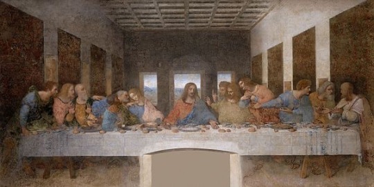
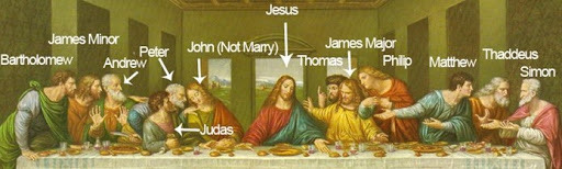
The Last Supper
‘The Last Supper’ is a piece created by renowned, esteemed painter and artist Leonardo Da Vinci. Created in the 1490s, this mural was commissioned by the Duke of Milan as a renovation to the Santa Maria delle Grazie church. It was made on a huge 4.6 m x 8.8 m scale. The mural was originally made using a slightly dated technique of painting called fresco. It is worth noting that little of the original paint remains having undergone vigorous restoration to try and preserve Da Vinci’s work. This is a lot due to the physical properties of fresco painting. This technique is based upon the painting of murals on wet lime plaster, using water as a way of combining the pigment and plaster in order to integrate the mural with the actual wall itself.
Moving away from the normal kind of fresco painting, Da Vinci implemented a new technique of the time called ‘fresco-secco’ which added glazes and tempera. As this was a very experimental technique at the time, it’s likely that the long-term effects on the painting weren’t yet discovered. Although this technique gave Da Vinci a longer drying time (which we can tell would be very useful due to the massive scale of the mural), it also ultimately lead to the deterioration of the piece as the pigment wasn’t combined with the dry plaster. Within the painting we can see how fresco has affected its appearance. Fresco-secco allowed Da Vinci to effectively blend the tones of the piece however, because of the surface it was painted on and the availability and expensiveness of pigment in the 15th century, the painting appears dull in a sense of light vs shadow in some places. The fresco-secco medium has also caused the painting to flake which is what ultimately lead to its most recent restoral in 1999 which used water colour paints as well as all windows (environmental factors) being blocked from the refectory where it resides.
The artwork itself is an amazing example of the principle of hierarchy within painting. Jesus is pictured right in the centre of this 8.8m wide painting surrounded by all of his disciples. This positioning shows him as the most important prominent figure in the scene. Around him, Da Vinci has effectively captured the expressions and body language of each disciple to illustrate how they would have reacted to this news. He has almost embodied the emotions of sadness, shock, fear etc. Focusing in on Judas who ultimately betrays Jesus, he is pictured at a lower level than all the other disciples which only furthers the narrative of the hierarchy of this work.
6 notes
·
View notes
Text
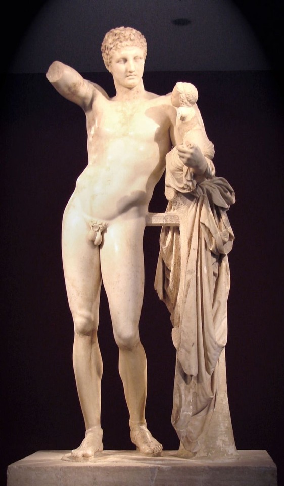
Hermes and the Infant Dionysus
This sculpture was discovered in 1877 in the ruins of the Temple of Hera in Olympia, Greece. It’s accredited to Praxiteles of the 4th century however this is up for debate in the art community as there isn’t enough evidence towards this. The work is 2.1m tall with a 3.7m base. The scale of this model is integral to how Hermes is positioned. Pictured, Hermes leans on his left leg while supporting Dionysus on his arm; due to this imbalance of weight he is positioned in contrapposto. This means that his body is contorted on an axis so that the axis of the hips counterbalances the axis of the arms/shoulders. This is also key to the sculpture as it has meant that it needs a support for Hermes disguised in the form of a drape and also for the fact that the sculpture remains unfinished with no right arm in order to maintain equilibrium.
This sculpture is carved from Parian Marble which is a “pure-white and entirely flawless marble”. Hermes is described to have a well-polished face and bust compared to the rest of his body which holds a much more unfinished surface. This contrast perhaps is used to demonstrate the strength Hermes has and his kind face in order to present him as a great protector of the Infant Dionysus. Ancient Greek mythology states that Hermes was made to look after and shield Dionysus from Hera as Dionysus (along with being the youngest God) was the only God born from a mortal mother as well as their shared father, Zeus. The low tensile strength of the material is a mirror to the fragility of the infant God.
Source: https://en.wikipedia.org/wiki/Parian_marble
5 notes
·
View notes
Text
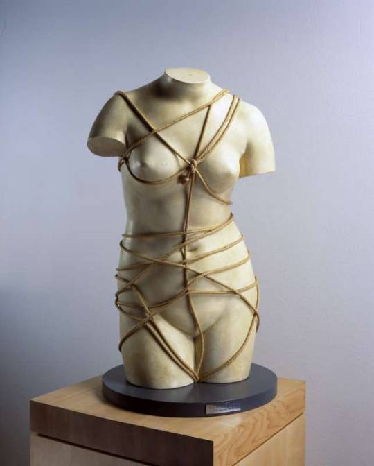
Venus Restored (1936) – Man Ray
This piece of assemblage art was created by American artist Emmanuel Radnitzky, better known as Man Ray. Its assemblage nature features a plaster cast bust bound by rope. This applies Marcel Duchamp’s idea that “An ordinary object could be elevated to the dignity of a work of art by the mere choice of an artist”. Man Ray has taken the everyday object of rope and combined it with the bust, which would’ve been considered traditional art already, which has transformed the sculpture to have a completely different meaning. This principle paired with the title ‘Venus Restored’ suggests a new thought or new life has been brought to this piece through assemblage.
Pictured, Venus appears headless, tightly bound with rope and exposed. Man Ray reduced this Roman Goddess down to her body and placed her in a very submissive, bondage style scenario. The sculpture itself appears quite cold, led by its dull materials although, the marble style effect on the statuette appears to add wealth and value back to the goddess. This was part of commentary about the male surrealist artists at the time playing on the idea of worshiping the women’s body in their art whilst still viewing them as inferior and submissive. As this piece is a sculpture, this makes this message even more impactful. It is intended to be viewed in the round which is even more so aimed at the male gaze and plays on ideas of voyeurism.
8 notes
·
View notes
Text
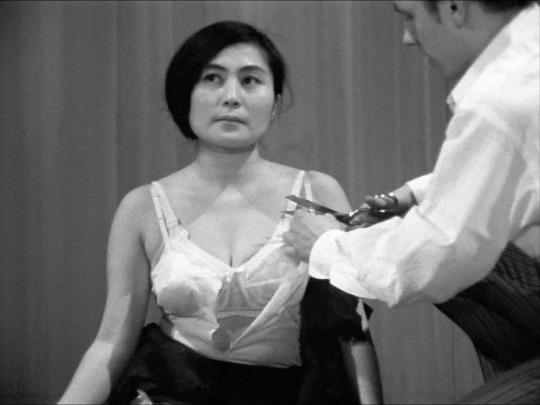
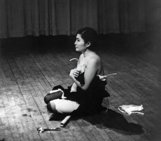
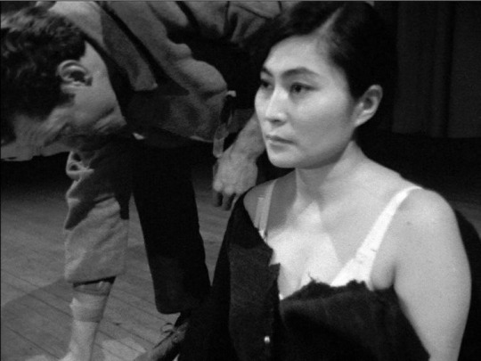
Cut Piece- Yoko Ono (1964)
In one of her earlier performances, at the Yamaichi Concert hall in Japan, Ono took to the stage with only her best suit and a pair of scissors. She knelt and invited members of the audience to come and use the scissors to take away small pieces of her clothing. The instructions for her performance were: “Cut Piece First version for single performer: Performer sits on stage with a pair of scissors in front of him. It is announced that members of the audience may come on stage—one at a time—to cut a small piece of the performer’s clothing to take with them. Performer remains motionless throughout the piece. Piece ends at the performer’s option.” Ono was ahead of her time in allowing audience participation within performance art. It allows for interactivity and definitely added a degree of uncertainty and spontaneity to the resolve of the performance. Some participants took small chunks from her suit, others opted for large slashes; some even targeted her bra straps! This placed the weight on vulnerability and trust between the audience member and the performer really highlights the distance and proximity of the art and its observers.
6 notes
·
View notes
Text
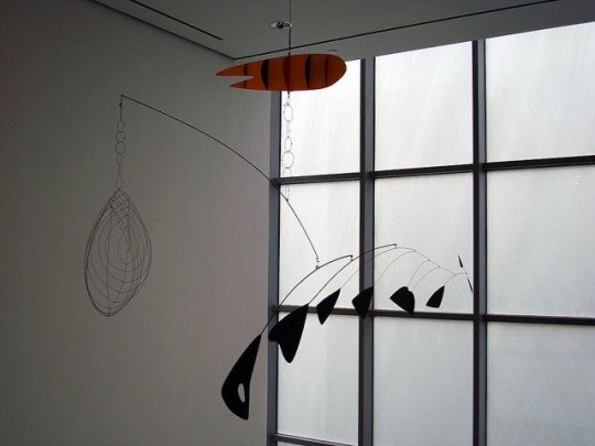
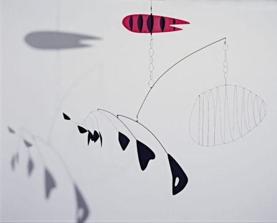
Lobster Trap and Fish Tail (1939) – Alexander Calder
This piece is a site-specific sculpture crafted from painted steel wire and sheet aluminium. It is important to note that these materials are not well established for arts practice compared to the likes of marble or stone. Calder redefined what sculpture was from this very static medium to an idea that can convey movement. His materials are very industrial, but also lightweight which gives them the ability to move and be manipulated simply by air flow. Marcel Duchamp called Calder’s style of sculpture ‘mobiles’ which is a fascinating contrast between the idea of a young child’s way of getting to sleep and a sculpture that features metal traps and dead fish. The figures themselves are very skeletal and stylised which only furthers the simplicity of their motion. This piece is hung and therefore meant to be viewed in the round much like a fishbowl in this example; even standing in the same spot you will get a different view of this piece every time. The gallery space also experiences interesting shadows cast from this sculpture that create an overlapping effect between the fish and the trap which is very effective.
9 notes
·
View notes
Text

The Tate defines a portrait as “a representation of a particular person. A self-portrait is a portrait of the artist by the artist”. In the 16th century when the idea of genres of art first came about, portraits were a lot more heavily focused on flattery of the subject and more often than not, used the medium of paint and canvas. These typical portraits were painted in a way that showed power, importance, beauty, wealth etc. Nowadays the idea of a portrait has changed dramatically through technological development, experimental ideas of art etc. An example of contemporary portraiture is the “selfie” which even derives its name from the self-portrait. This is an example of technology modernising an older art form; with the introduction of filters it could however be argued that the principal of flattery is still at large today. Portraiture has become part of the everyday lives of many people as it has become quick and accessible worldwide. It has definitely lost its status as time has gone on and has ultimately become a pejorative notion of art.
4 notes
·
View notes
Text
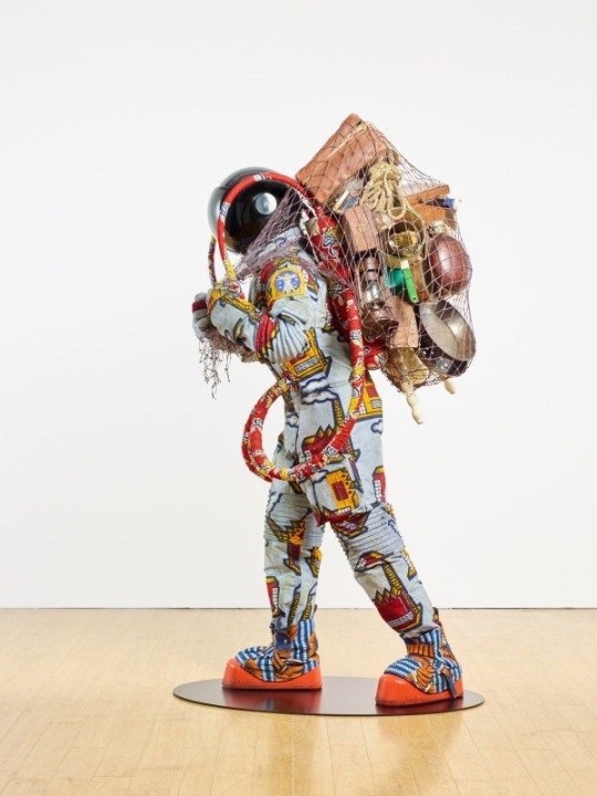
Refugee Astronaut, 2016 – Yinka Shonibare
This is a sculptural piece predominantly built from a fibreglass mannequin, clothed in traditional cultural print on cotton textile. The premise of the piece is an astronaut carrying all their worldly possessions, “looking for better places to go”. This piece tackles issues of the refugee crisis as well as environmental disaster and cultural pride. The contrast of the flamboyant space suit compared to a traditional fully white suit is particularly interesting, as it represents African culture and heritage and how that is a key element of what they want to take into a new world. All the belongings in its backpack are further representative of what might be most important to a refugee that only has ‘the clothes on their back’ and places a greater value on such items when we as a society might take them for granted. They’re also all from the 20th Century which suggested to me the idea of a time capsule that represents the history of the oppression of their culture. The figure is presented with no identity with an opaque reflective space-helmet. This principle is often featured in Shonibare’s work and presents the piece as representative of a wider community. When a viewer comes closer to the piece they’re invited to envision themselves in the shoes of a refugee as they see themselves in the reflection.
3 notes
·
View notes
Text
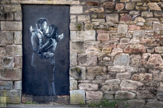
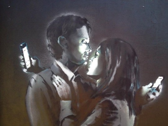
Mobile Lovers – Banksy (2014)
This piece of street art was located in Bristol before being sold to private buyers. The location prevails the piece and only furthers its message. After Banksy had created this piece, he posted it to his website causing a world-wide frenzy to find it. Within 24 hours, it was found but I believe this clearly demonstrates his message about the digital age in which we’re glued to our technology. The piece depicts two lovers embracing while still attached to their phones. This combination of imagery suggests a shift in relationships and how they work around a technology-centric society. It also suggests the idea of FOMO (fear of missing out), that even when they’re with the most important people in their lives, all they can focus on is social media or work etc. Banksy is commenting on how detached we’ve become from real life and the things that actually matter to us. In Banksy’s classic style, he uses mainly silhouettes and the limited colour palette we all recognise, but an interesting detail on this piece is the highlights of white on the figures’ faces where the light of the phone is shining on them. To me it appears like they’re each in a trance, transfixed.
3 notes
·
View notes