
Statistics
We looked inside some of the posts by freddiehelliker and here's what we found interesting.
Average Info
Notes Per Post
1
Likes Per Post
1
Reblog Per Post
0
Reply Per Post
0
Time Between Posts
4 hours ago
Number of Posts By Type
Text
1
Photo
6
Video
10
Last Seen Tumblr Blogs


Fun Fact
Women make up for the other 50% of Tumblr’s audience.
Text
FMP EVALUATION
Am I happy with the outcome?
I was really pleased with the final outcome of completing a 2D and 3D Letterforms to express the correlation between Visual Communication and Interior Architecture through the idea of how we use space. It ended up to be my favourite project I had worked on and I felt really happy with what I was able to achieve, especially in the circumstances we were under as well as pushing myself to create a 3D typeface on SketchUp, a programme I had never used before and felt this was an achievement in itself.
The journey of the investigation was continuously fascinating for me as I have always had an interest in Interior Design and Architecture so to be able to have combined these practices with my own helped to keep my interest ongoing throughout the whole project.
What went well in the project?
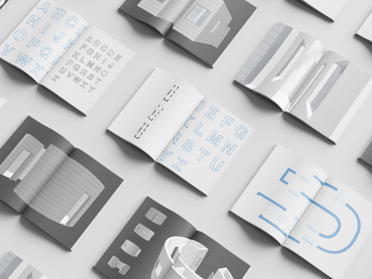
I feel I managed to convey the correlation between my practice and Interior Architecture through an insightful investigation by presenting the evolution of letters as interior spaces, where the idea was pushed from research insights as well as my mini experiments that helped get to the final idea of what I felt was most relevant and presented to the audience the main idea.
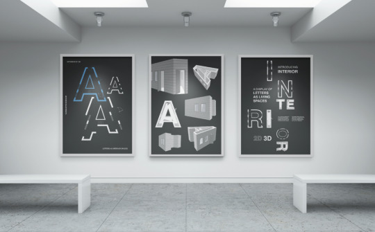
I was pleased with how I showcased the letterforms through a type specimen booklet alongside, 3 posters and a short animation to present to the audience the journey and progression of the 2D to 3D letterforms of how space is used across practices in different ways but also in similar ways.
I felt my type specimen booklet was produced well and conveyed the journey in a clean and systematic way keeping the viewer engaged with what had been produced. I was also pleased with the posters and the animation that worked alongside to further showcase the letterforms I had produced.
What could be improved?
One part that stood out to me, that if I had time to further continue this project was to carry on using Cinema4D for the animation instead of SketchUp, due to the control and sensitivity I could have on it. Due to the time restraints I had I had to make the decision to swap from Cinema4D to SketchUp to animate as learning another whole new programme sadly was taking more time than I had to complete everything and therefore made the decision to swap.
However although I knew Cinema4D might have produced a more clean and realistic animation with good lighting I was still really pleased that I managed to do an animation at all and on SketchUp as this was still a challenge I managed to push through and showcased the letterforms in a different but still successful video.
Overall my FMP was stimulating and really pushed me which helped me to produce outcomes that I was pleased with as well as trying something new.
0 notes


Photo


LINK TO WEBSITE: https://fredrikahelliker.myportfolio.com
0 notes
Video
tumblr
Creatives and their Websites / Portfolios
Another clean and simple website that showcases the work well, feeling more like an online portfolio that I can relate back to.
0 notes
Video
tumblr
Creatives and their Websites / Portfolios
This felt quite different to other websites I had looked at but was still successful in showcasing the creatives work and was nice to see the vast successful ways in which a website and portfolio can look.
0 notes
Video
tumblr
Creatives and their websites / portfolios
Clean, simple and engaging website that was easy to navigate. Really loved the layout as well as the transitions onto different work and parts of the website. Showcased the work well.
0 notes
Video
tumblr
Creatives and their Websites / Portfolios
I looked into some current creatives and their websites to help with my portfolio and website as well as to see what is at the forefront of visual communication at the moment and how these creatives present themselves in the industry that I can get inspiration from and fit into it.
0 notes

Video
tumblr
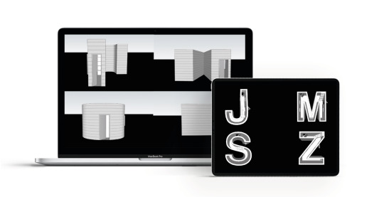
JMSZ - 4 way animation
I was really pleased with this final animation with what I was able to do on SketchUp and then After Effects. Although it didn't have the aesthetic of my rendered dae. files or the Cinema4D, with the time I had to produce a relevant animation to showcase more of my letters, I felt it was the next best way round to do it.
I chose these specific letters to show a range of angles and features of curved and straight walled letterforms. These were also the some of the best individual animations I managed to produce on SketchUp and therefore felt like the right decision to choose them and showcase.
0 notes
Video
tumblr
AMSZ - 4 way animation
My next idea for the animation was to create a 4 way screen that would solve the problem of the animation being too long as well as being able to showcase more of my letterforms in a more ...
I was really pleased with this first attempt where I managed to match up each of the pauses together so the audience can take in the different viewpoints of each letter to then them being revealed of what letter they are at the end of the animation.
The A didn't feel successful within its own animation, due to it bouncing up and down too much as well as the timing being different to the others. My next steps where to showcase the letters I thought had the best animations as well as choosing two curved letters and two straight walled letters to help showcase the diversity of what I had managed to achieve.
0 notes
Video
tumblr
4 Letter Fade Animation
I simply rolled from one letter to the next by adding a fade in and out to produce smooth transitions. I still wasn't completely happy with this outcome and wanted to progress further if it was going to be a final outcome.
0 notes
Photo

AFTER EFFECTS
I imported all my letters onto after effects, too quickly realise my original idea of showcasing all the letters would create an extremely long animation which was not needed.
Realising this I then decided to choose four letters to showcase that I felt had a good presence and showcased my investigation well as well as feeling appropriate in relation to my other showcasing elements.
0 notes
Video
tumblr
SketchUp Animation - J
The letter J’s animation was one of the more successful ones where the camera moves to the inside of the letter to then pan out and move around it till it is revealed as the letter J and not a house.
0 notes
Video
tumblr
SketchUp Animation - H
I wanted to show how some of the final animated letters looked and how I moved the camera around to get different viewpoints of the letters.
0 notes
Photo

Animations for Every Letter
I animated all my 3D letterforms on SketchUp and exported them ready to be imported into After Effects to try create a smooth animation running through each of the letters on a loop. I
If I was going to be showing this a physical grad show I would want it to be playing on a screen where it would be on a loop of letters going from A-Z, showcasing all the individual letterforms alongside my type spec book and the 3 posters.
0 notes