Don't wanna be here? Send us removal request.
Text
Uploaded Game
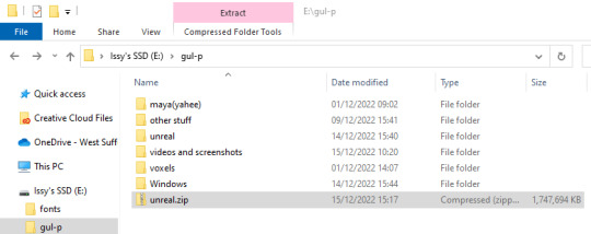
When I tried to build my game out here were a lot of errors, therefore I have had to do it a different in order for it to be accessed and marked. To do this, I had to select the whole file that contained the Unreal project and compress into a zipped file.
0 notes
Text
Evaluation
In this project I used MagicaVoxel to make all my models in my game and I really enjoyed this creative aspect of the project as it is something that I have always wanted to experiment with. At first, I struggled with the 3D part of this project as we were taught to use Maya at first which I found very complicated and overwhelming. So when we started to learn voxel art, I felt much more comfortable. Trial and error was a technique that I have become more at ease with, in reference to both art and coding, as it was something I avoided when I started this course. In regards to the research that I carried out to problem solve and find cool ideas, I think finding similar games that have been made with a voxel or low-poly art style was really helpful as I could figure out what the most important elements were and replicate them.
My main way of identifying issues and investigating the best way to solve them was working alongside my peers. This is because it is useful to see things from another perspective as I often find myself becoming absorbed in an issue and getting frustrated with it. With coding, asking other people for help made me feel more confident that I was going in the right direction when trying to implement something. Whilst coding had its challenges which took some time to overcome, making models and landscaping was quite a rewarding process as I found myself enjoying it more throughout the time we had to do this project. I already had this game idea in my mind before we were given the concept for this project so I had a good idea of what I wanted to achieve, this really helped to visualise the most important elements. MagicaVoxel felt suited to the style of game that I wanted which allowed me to fully explore the software as I knew I would like the outcome.
I feel like I have made a lot of progress overall in my game design abilities in this project. The game came together within the last few weeks as I added in the final touches like the HUD and the title screen so I am very happy with it. My expectations for the game were quite higher than I should have made them but I believe that this gave me the opportunity to challenge myself and learn new skills. The project fulfilled the brief we were given even though I went down a different route.
Despite being satisfied with the project and feeling quite proud of the final result, there is always extra that I would have liked to do. For example, the game itself only goes on for 30 seconds as I rush to input a win/lose state into the game. Therefore, I feel like I focused a lot more on the art as I limited myself due to the time I gave myself. However, I think if I had the choice to make another 3D game with the same software - I would do it again. So far, both the 2D and 3D projects have been really fun and I am looking forward to the next project where I improve my skills and make something really cool.
0 notes
Text
Play Testing - Part 2
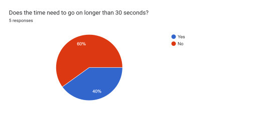
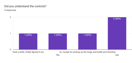
Both of these questions were very useful as the answer has helped me to be reassured that some of the elements in my game like the amount of time and the difficulty are reasonably adjusted. However, the 20% of people who didn't win the game is slightly concerning but this could just mean that they were focusing in looking around the area instead of playing.
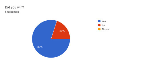
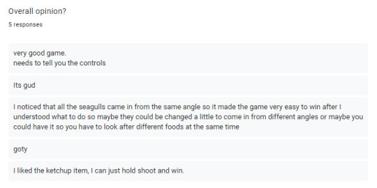
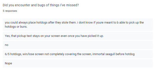
I picked all of the questions and answers that I thought were the most helpful to me and I feel that the overall opinion question is always very reassuring as the participants are pressured to say a certain thing. The third answer is something that I am aware of but haven't been able to fix so I am surprised that only one person picked up on this. The first answer is another element that I have been considering as it isn't that clear so I can understand that point.
0 notes
Text
Play Test - Part 1
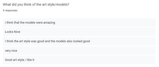
I'm really happy with this feedback for this question, I spent a lot of time making the models so I'm glad that other people thought they looked good. I also think that I made a lot of progress in a this project in regards to 3D models as I haven't had any previous experience.
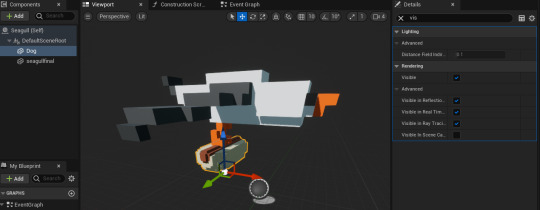
These two questions were really helpful to me as it pointed out issues that I hadn't noticed. I had no idea that there was an immortal seagull at the start so now I can investigate this to fix it which shows why play testing is crucial.
0 notes
Text
Replacing Meshes
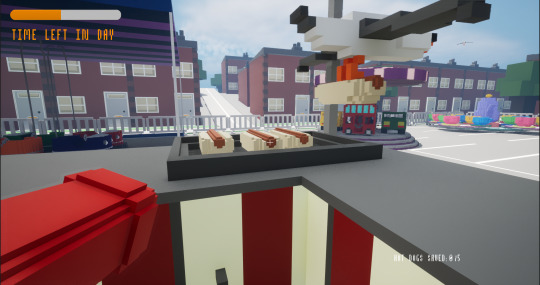
The last element that I definitely needed to add into my game was replacing the place holders for the hotdogs. This would normally be easy but I couldn't figure out why it wasn't working when I originally just dragged it from the content browser. After some experimenting, I realised it was because I wasn't replacing the mesh this way but I was adding a completely new one instead that messed with the code.
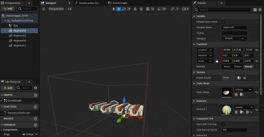
The proper way of doing this was by going into the material in the details panel and selecting the imported voxel hot dog. This meant that it would be scaled to cube that I added so I had to size them up to make them fit into the collision box that was the exact size of the 'grill' on the food stand model, without it looking disproportionate.
0 notes
Text
Better Title Screen!
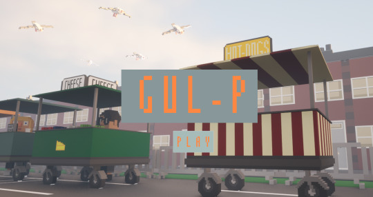
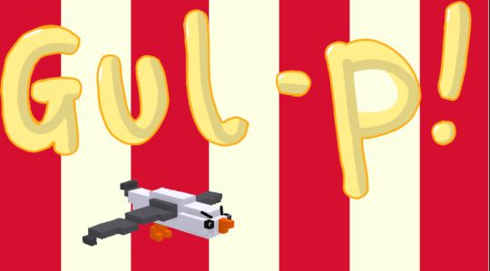
I made the decision to change the original title screen as I thought it looked a bit tacky in comparison to the rest of the game. I had a few tries until I went for the high quality screenshot from the game with the title and a play button.
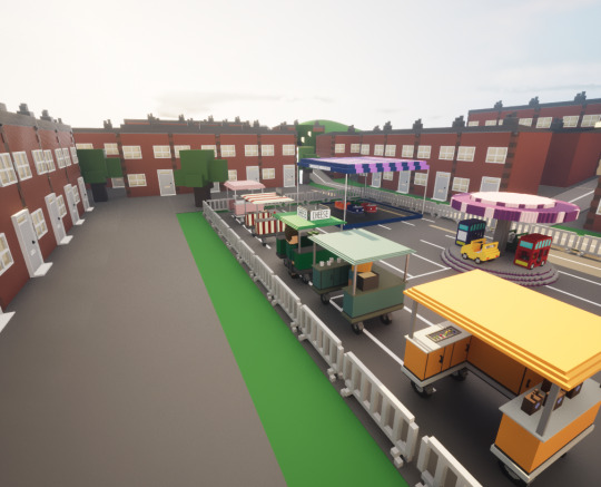
I knew I definitely wanted to be able to see the seagulls so dragged more into the world and placed them so it looked like they were flying to the stand. The element that took the longest time was getting the camera in the right place.
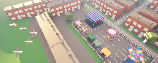
Eventually, I went for the shot from low down so you could get a view of the hot dog stand and the birds in the sky as these are all of the key elements of the game. The picture below was of what the title looked like before I discovered the screenshot button in Unreal.
0 notes
Text
Win/Lose State
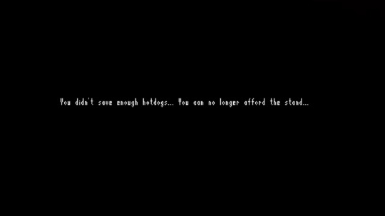
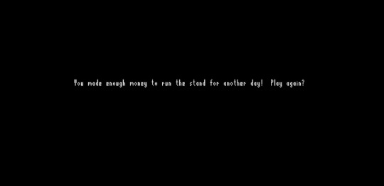
I wanted to add in a simplistic win and lose screen to tie the game together and add the finishing touches. I went with a black screen with white writing as I thought it would be easy to read and look good without too many details. To do this, I created a widget and used a canvas, an image (for the black screen) and text. For the text, I imported a font from dafont.com and picked one made from pixels as suits the style of the game and fits in with the voxel art style.
0 notes
Text
Sun Rotation

I thought it would be really cool if the as the time goes, the sun mimics a day being completed by going around the environment. To do this, I had some help to figure it out as I didn't know where to start. This is because I had to turn the directional light components into actors so I could use a blueprint to code what I needed.

We used event tick as the rotation of the directional light sky sphere and shadows would be moving every second. To do this, we then used a lerp to get a point that the light starts rotating from and another point that the rotation finishes at. I really like the final result of this and think that it looks very effective. Also, it fits the game perfectly as it is realistic in the sense that the player plays a whole day of 'work' in the game.
0 notes
Text
Timer
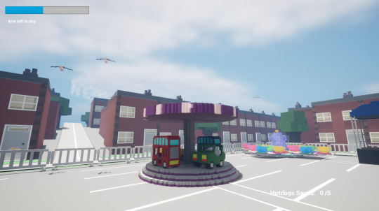
I needed to add a win and lose state into my game so it doesn't just go on endlessly. Therefore, I had to create another widget that uses a progress bar to show the time which goes on for 30 seconds.

Firstly, I had to make a time variable so that I could use the data in it and transfer it to other pieces of code. In order to have the progress bar actually go down in the right amount of time, I had to use a timeline over 30 seconds which felt like the right amount of time when I played it but I will query this when we playtest it.
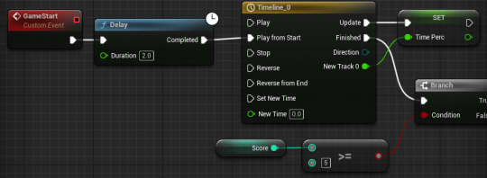
In this code, it also includes the win or lose state that asks whether the player has a high enough score to win by the end of the time. For each state, a widget is added to the viewport that shows the player if they win or lose.

0 notes
Text
Hot Dog Code
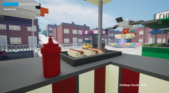
I thought it would be really cool if the seagulls were able to pick up the seagulls that were already made and flew away holding them. To do this, I had to set up a collision box that the seagulls can hit into.

So when the seagulls fly into it, this code will fire off as the actor will be overlapping. Then it will cast to the collision box so that it set visibility off the hot dog that the seagull takes. This screen shot also shows how the score counter goes up when the seagulls are destroyed by the ketchup.
0 notes
Text
Ace of Spades
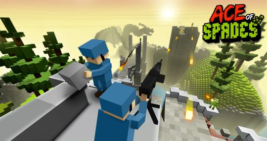
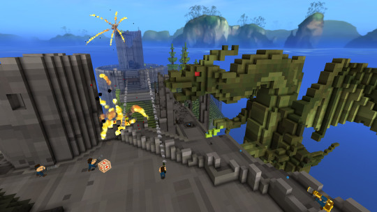
This is another voxel game that I have done research into to help me figure out how I wanted my voxel models to look. It was released in 2012 and is a shooter game that lets players make a battleground to play in with up to 32 players at once. The art style reminds me a lot of Minecraft but it has own uniqueness.
youtube
Looking at pictures of this game was helpful to see how diverse voxels can be and how, despite me thinking, it easily overcomes limitations like how to create round objects and how to make models look like they have some texture.
0 notes
Text
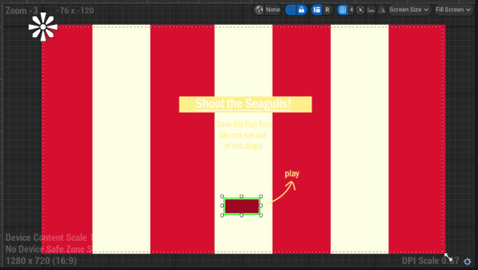
I have added the code for the title screen into the game so that it appears when the game begins. Whilst I am hoping to change the title to something much better, I decided to just go with shoot the seagull for now and will think of what I can change it to.

The code itself ensure that player has control of the mouse so that they can click on the button to start the game. I also had to make sure that you couldn't see the other widgets like the cross hair, score counter and timer until the game had actually started.

0 notes
Text
Title Screen
As we are coming towards the end of this project, I wanted to do something to tie my game together despite how much gameplay I've actually made. I figured the best way to do this was to make a basic title screen!
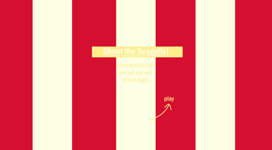
I started off in Photoshop with the idea of having a similar pattern and colour to the hotdog stand as this made the most sense to me. The final result is very simple but gets the point across easily. I think using the same colour palette as the stand looks really effective. Now I need to put it into Unreal to have it at the start of the game by exporting it as a PNG and dragging it into the content browser.
0 notes
Text
Widgets
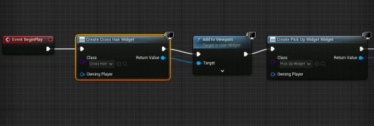
To make the player have better sense of space, I decided to add a cross hair to help this. To do this, I had to create a widget that could be added to the viewport to allow the player to see it. I added an almost transparent image to a canvas in the widget that would act as a cross hair.
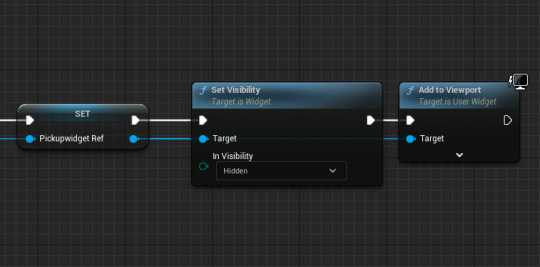
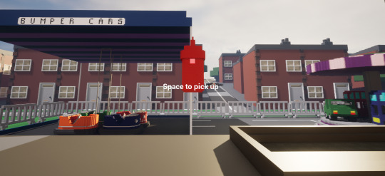
I also included the mechanic that shows the widget that makes it clear that the tongs and ketchup are interactable as 'space to pick up' appears on the screen when the player's line trace hits the items.
0 notes
Text
Seagull Code
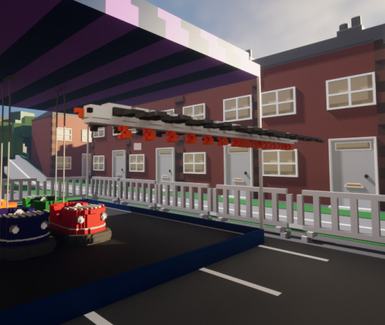
I have started to code the seagull element of the game into my project - as it is only beginning of what I want to do it is definitely not the final product but it's a start! This piece of code will spawn a seagull at a spawn point every tick with a delay of 5 seconds.
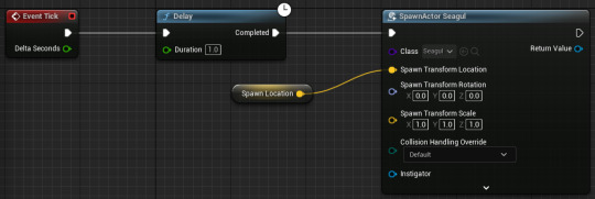
As this caused the issue of being unable to see whether the seagulls were actually spawning in or not as they were just bunching all together, we added an offset so that they move in the Y. This made it much easier to see whether the code was working.

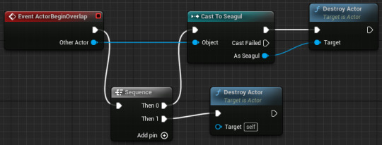
Lastly, to put this code all together it made sense to also add the mechanics of how the ketchup is used to destroy the seagulls. I had to use a cast in order to get the code to coincide with each other and also a sequence as this code is also used for destroying the ketchup once it hits the ground.
0 notes
Text
Character Design
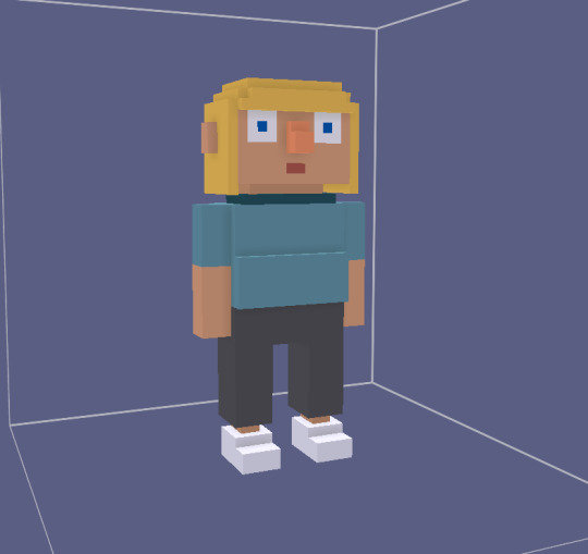
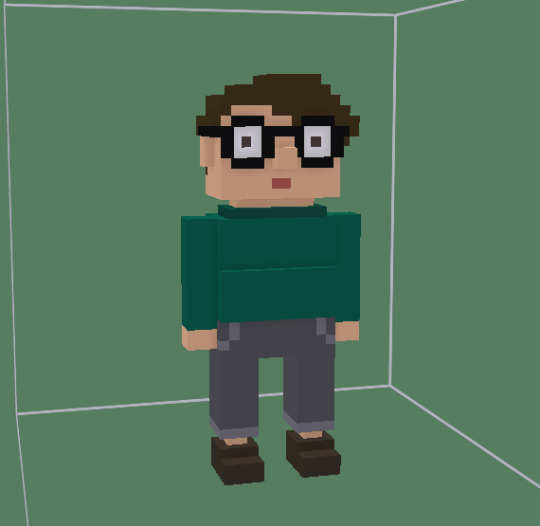
I have come up with some designs for the customers in my game! I'm really happy with how they came out and think that they definitely suit the style of my game. This is because of the simple colours used and the fact that I have kept it very boxy. I hope to make more characters that are all very individual as this is something that I've always wanted to do. So far, making just two characters that look completely different without making them look wild was quite tricky so I would need to do some more research into character design if I were to make some more people models.
0 notes
Text
Line Tracing
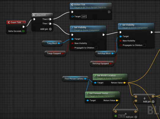
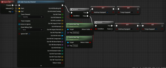
In order for the player to be able to switch between the tongs and ketchup in game, I had to introduce line tracing so the code can detect the objects based on whether it has a tag or not. Depending on what item the player has equipped will toggle the visibility of them both which is how they are simultaneously attached to the character in the viewport but are never actually seen at the same time.
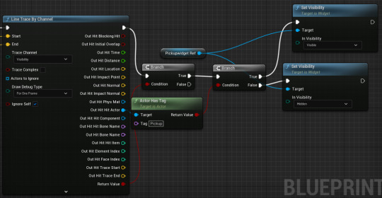
There has also been a widget added within this line tracing that is included in this code as it also uses line tracing. When the player gets closer to the items, text will appear on the screen to indicate that they can interact with them.

This part of the code links up to the first part but includes the fact the space bar has to be pressed for the items to be picked up. So, whilst this code is firing off on every tick at the start as the line tracing will be identifying objects, the event that actually fires the code that allows the player to pick up the is the space bar key.
0 notes