
Statistics
We looked inside some of the posts by fnafandsonamyfsworld and here's what we found interesting.
Average Info
Notes Per Post
13K
Likes Per Post
11K
Reblog Per Post
1K
Reply Per Post
69
Time Between Posts
1 day ago
Number of Posts By Type
Text
16
Note
1
Last Seen Tumblr Blogs


Fun Fact
Tumblr was named as a finalist in Lead411’s New York City Hot 125 in Aug 2010.
Text

Meow~❤️
34 notes
·
View notes
Text
What do you think of drawing a pomni cat and jax Carrying it ❤️
4 notes
·
View notes
Text
I have a hyperfixation on Pomni's shadow 😔
I'm patiently waiting for episode 3


+ bonus 🏃♂️

2K notes
·
View notes
Text
Nightmare
Showtime ✨✨

(I had to do it since there was a shadow figure that looks like Pomni but a scary version of it)
438 notes
·
View notes
Text
The Amazing Digital Carnival

I wanted to experiment with fan posters, so why not use my favorite TADC universe?
This au belongs to sm-baby
291 notes
·
View notes


Text

Art by @burrotello
💥💥💥🔥🔥🔥
39 notes
·
View notes

Text

250 posts!
2 notes
·
View notes

Text
A look at the past & future of Honkai design: Simplicity vs. Complexity (Part 1)
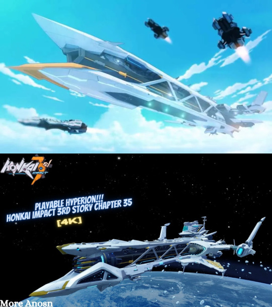
Link to the YouTube channel of the person whose thumbnail I yoinked off of Google Images for this; it was the best image of the new Hyperion that I could easily find which is why I used it for this.
TL;DR:
Original Honkai Impact 3rd designs tended towards large, simply shapes that gave battlesuits (and other stuff) a strong "mecha" vibe. Many newer designs are trending towards more complex designs that do away with these simple and recognizable shapes, instead using more overlapping textures and ornamentation to create detail. Some designs balance the two, using large and relatively simple shapes that still carry enough detail to stand out as newer while still keeping the original vibes.
Because of this, I think there's gonna be a very clear visual split between Part 1 designs and the APHO+Part 2 designs because of this split between simplicity & complexity, and some Part 1 designs feel off because they stray too far from the original design motifs, making them feel out of place even if they're still good designs on their own.
~
I've been thinking a lot about the design philosophy of Honkai Impact 3rd for quite a while now. As someone interested in concept art and illustration and who's played video games for more than 3/4ths of their whole lifespan.
And obviously I'm not alone in this, given how often I've seen discussion of Honkai's character design. Whether it was the march of the pastel battlesuits or the techwear of the part 2 cast or the upcoming Garuda Fu Hua battlesuit, many people have had many opinions both positive and negative.
But I've wanted to do a sort of "deep-dive" for a while now, because I think HI3rd is a really interesting case where we can see the co-existence of (sometimes drastically) different designs made years apart from one another. It's normal for the style of a franchise to grow and change with time- my personal example is Halo, with obvious differences between Halo CE, Halo 3, and Halo 4 in mind. But typically that has been done over the release of different games over many years, not so much in consecutive releases within the same game. HI3rd's not alone in this regard, of course :)
I don't want to label anything as "bad" or "good". I can like or dislike something, and that's my personal opinion. Of course I COULD try to label designs as bad or good, but I'd want to back that up with serious analysis and get the opinions of other players, and that's way too much effort for a reddit post. Instead, I want to present some different designs in Honkai and share my thoughts, so others can feel free to agree, disagree, elaborate, etc. More of a matter of casual discussion rather than trying to present some solid theory, I guess you could say?
What I will say is I intend to label designs based on whether (or how) they fit into HI3rd's aesthetic(s), so that's the main point- not so much whether an individual design is good or not.
To start with, I'd like to talk about the simplicity vs. complexity of Honkai designs because I personally feel like this is the biggest problem I have with HI3rd, outside of story issues that is. Not because of designs being "good" or "bad", but because I feel like Mihoyo has been moving towards a new design philosophy that's different from what I loved most about HI3rd when I first started.
I opened with the comparison of Hyperion because I think it's a perfect example of this concept, and if we can understand what the difference is with Hyperion then I think it'd be more apparent with battlesuits as well. I also have another image that highlights some of the biggest differences between the two models:
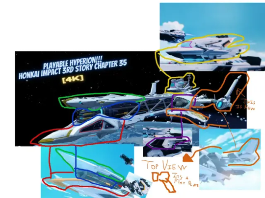
I had mixed feelings about the reveal of the "new and upgraded" Hyperion during the moon arc. It's a neat design I'll admit, but I felt like it deviated a lot from the original Hyperion, not as a difference in fidelity and detail but rather as a difference in the fundamental design of the ship.
What I like so much about the original Hyperion is, as you might have guessed by now: its simplicity. Hyperion was comprised of much larger, blockier shapes with more clear silhouettes. It's actually the same reason I love the design of Halo's UNSC frigates, funnily enough. I'm a huge sci-fi fan and I absolutely adore spacecraft and vehicle design, so I really appreciated the design of Hyperion cause to me it felt very original.
The new Hyperion retains most of the same characteristics, and it's still recognizable as a version of Hyperion. But it bothers me just how much the design was changed. Many of the simple shapes of the design were broken up into smaller parts or almost totally changed, like the cannon going from a sleek polygonal barrel to a spikey... thing.
To me, it feels like Hyperion was redesigned with the idea of trying to make it more "futuristic" or "tech-y", or perhaps it was even designed with some retro anime motifs in mind like the Space Battleship Yamato. But it seems as though this was done by adding many objects that broke up the original silhouette, as well as inventing lots of new detail instead of adding details to complement what was already there. The shape of the winglets was greatly changed; the vent-like structures were totally changed; the barrel was completely changed; most noticeably, the bridge was drastically changed.
The new Hyperion model is technically "better" in terms of fidelity and the amount of detail it has, no doubt about it. But I think changing the fundamental shapes of Hyperion so much really hurts the charm of the original design, to the point that I was actually quite disappointed to see that Mihoyo used the new Hyperion design in the CG of the Captainverse Hyperion farm event. It seems as though Mihoyo wants to consider this as the new default impression of Hyperion, and not a special one-off thing from the moon arc.
I think this can be seen across other aspects of the game, too. In general Mihoyo has moved away from simple designs and towards complex designs, and I think there's been a lot of hits and a lot of misses with this.
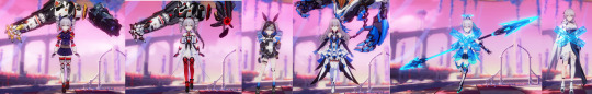
For instance, I'd like to compare the three Herrscher Kiana battlesuits: HoV, HoFS, and HoFi.

There's a clear trend of an increase in complexity across the three battlesuits. HoV's design uses fewer and larger shapes, HoFS adds more and smaller shapes, and then HoFi is almost totally devoid of any large clear shapes.
To me, this is what distinguishes a battlesuit that "feels like Honkai" from one that doesn't.
Everyone starts the game in Chapter 1, and most long-time players have spent more time with older battlesuits than newer ones simply because they were playing the game before these newer battlesuits were even released. I think it's safe to say that even though HoFi is the grand "Kiana in her greatest form" battlesuit, most players will still have seen HoV's design more often because of the years that it's been around, and its prevalence in story content.
Most of those older designs were rooted more heavily in the mecha vibes early Honkai had. For instance, even though HoV is obviously not wearing a mecha battlesuit, the large blocky shapes are still reminiscent of armor, two examples being the large frames on her wings and the large white pad-things(?) on her sides. There's other obvious cases like White Comet being a skin-tight battlesuit which used glowy energy bits for its attacks, but I use the example of HoV because it shows that HI3rd was fully capable of creating battlesuits within the mecha theme without being limited to literal "mecha" designs. HoV's battlesuit is far from mecha in its nature, yet still fits perfectly with that aesthetic.
HoFi has pretty much none of that, though. It's a pretty design for sure, but it's also nearly completely divorced from that original aesthetic. There's few easily-recognizable shapes on her design, with the (very little) clothing she wears being almost entirely detail and ornamentation. It definitely fits the "Princess Kiana" or "Goddess Kiana" theme in isolation, but I don't think it delivers on that theme in the context of Honkai Impact 3rd.
Yet look at HoFS. HoFS definitely has more detail than HoV. Yet there are still lots of large blank areas that define clear forms; for instance, the armor on HoFS' waist. It's reminiscent of that of HoV while still adding more detail. This gives that same effect of a slight mecha vibe. It's still an appealing design and it still feels more modern than HoV, but it also manages to retain much of the same design language.
That being said, I have to admit I ADORE the Honkai wings that HoFi has, though I wish they were a little higher in the air. That's one thing that I think Mihoyo absolutely nailed with HoFi, and I wish more of that aesthetic was kept in the rest of her design.
What's also interesting is that (in my opinion) neither of the other two main Herrscher Trio designs suffer from this. For instance, consider Mei's battlesuits:

I've included Lighting Empress as a reminder that old =/= good. I'd like to make it clear that just because it's an "original" battlesuit doesn't mean it's a good one. I said before that I didn't want to label stuff as good or bad but this is a clear exception and I hope y'all can understand why, lol
We can certainly argue about whether HoO Mei's design really fits the image of Raiden Mei. It's a vast departure from her other battlesuits when it comes to her palette, for better or for worse. I didn't like it at first but it has grown on me, and I think part of that is because of that concept of simplicity vs. complexity.
HoO has way, way more detail than the other two Herrscher Mei battlesuits, no doubt about it. But it also retains many large and recognizable shapes. Nothing on this battlesuit is bulky like HoT or other older battlesuits, but it still gives off the feeling of being armor despite being so thin. Much of the detail is created not by overlapping layers of ornamentation and texture, but rather by using intricate shapes with clear silhouettes and light detail inside that outline.
And HoTr is obviously a mecha design, so I don't think we need to elaborate on that one :)
The point is that it's absolutely possible to make detailed and beautiful battlesuits without getting rid of the original shape language that HI3rd was built on. HoFS is a bit dated now but still much newer than HoV, yet it keeps the vibes. HoO is also far newer, yet it still fits the theme of battlesuit. HoFi, though... not so much.
Finally, I want to talk about the elephant in the room: the Part 2 character designs.

Once again, here's the link to the YouTube video by Matt Is Playing, where I pulled this image from!
Much like HoFi, there's very little trace of the OG Honkai mecha aesthetic in these battlesuits. It's not to say that they are inherently bad because of that* , but it doesn't quite feel like "Honkai Impact 3rd".
*except Dream Seeker, I'm sorry but what the heck is going on there???
But the thing is that this design philosophy isn't even new. In fact, it's years old by now... because we see this in APHO.

For a long time now, APHO has had battlesuits that tip-toe on the very edge of the original Honkai aesthetic. So the designs of Part 2 aren't actually some new and drastic shift in Mihoyo's design philosophy- rather, it's reinforcing a design philosophy that was introduced with APHO.
These new characters all feel out of place if we compare them to the original battlesuits. They don't use the same simple forms, instead using dense and overlapping details. But if we compare them to the APHO cast, they fit right in. We can argue about the merits of the new character designs in other terms, but I think these discussions have to keep in mind this context.
I'd say the APHO designs work well in the setting of APHO because they're following the same aesthetic. As we enter Part 2 and once we see more of the story and setting of Part 2, it's very possible that these new character designs will feel more natural and more like "Honkai Impact 3rd".
But it's a different Honkai Impact 3rd.
This is why I think the idea of "simplicity vs. complexity" is so important to understanding Honkai Impact 3rd's designs. I think Mihoyo might be trying to emphasize two different phases of Honkai through this design philosophy. These are going to be two very different halves to the same game, with the designs of Part 2 possibly becoming as distant from Part 1's designs as Part 1 is from HSR.
You have the OG mecha action vibes from the good ole St. Freya days, and we have the sleek tech-wear of the era of exploring Mars, world-hopping in the Sea of Quanta, and fighting literal aliens.
For better or for worse? Only time will tell.
As a bonus, I'd like to include some extra comparisons, though I won't be adding any more analysis. It's more about having extra examples to keep in mind. Also, I think these ideas can apply to enemies and weapons as well, but that's a larger discussion I'm not yet ready for so that will come in a follow-up later on!


45 notes
·
View notes
Text
Just a thought, what if the Knight: Moonbeam battlesuit had bird-like wings coming off of the arms, instead of the butterfly(?)-ish wings coming from the back? (featuring a super scuffed set of sketches by me)

I want to do a proper drawing with this idea sometime but I'm too tired to try and work on a proper illustration right now, and I also have several other WIPs that need my attention first x-x
but I wanted to share something so here it is! I think the idea is fairly straightforward so I figured a rough set of sketches would be good enough for a tumblr post lol
I've been thinking about making a fan redesign of Knight: Moonbeam sometime, not because I don't like the original battlesuit (it's one of my favs!!!) but rather because I kinda want to try and make it fit the other Godsbane battlesuits more closely (Shadow Knight, VKE, BKE, AKA). If that were the case, I felt that it'd be cool to redesign KMB as a sort of scout/ranger type of battlesuit.
Like if the Godsbane battlesuits were D&D classes, I feel like SK is the Monk (punchy gal), VKE is a Fighter (swingy sword), BKE is the Paladin (tanky fighter), and AKA would be a Rogue (sneaky? I guess? Rita likes sneaking around right?). So why not make KMB the Ranger of the group?
So I felt it'd be cool if KMB had bird-like wings instead of the typical "shooting-out-the-back" wings that most winged humanoids have in fiction, y'know?
Like KMB's wings aren't just the usual wings that let a Valk fly or whatever, they're special wings optimized for speed, letting the battlesuit user zip around the battlefield at Mach Fast. And it'd kinda pair well with the whole Gungnir Canon and missile barrage thing the battlesuit canonically has!


25 notes
·
View notes
Text

got followed by hov themed account just to find out it's full of ai generated pictures and i got so enraged that i decided to draw her myself
282 notes
·
View notes
Text

kiana with abs for your consideration
1K notes
·
View notes

Text

seraaaa <3 alt outfit cause it was so cute..
69 notes
·
View notes