Don't wanna be here? Send us removal request.
Text
Final digital out comes


here are my final outcomes i wanted to draw the second panel with eithos holding the baby but i couldn't figure out the perspective on eithos so i just drew Gregory.


here's the colour pallets for eithos and Gregory. the pen i used mostly was the cartoonist bush (pictured above) there are also pictured the fonts i used, also the purples and the yellows are the colours i used for the lighting and shading
0 notes
Text
a webtoon is quite different though its not too dissimilar, the process of making the comics stay roughly the same, story sketch inking and colouring but id say the biggest difference is publishing with a digital comic / webtoon you only have to find any social media platform to post your comic such as TikTok, Instagram, webtoon, Wattpad ; any of these would let you post your work but with a traditional comic you have to find a publishers and get your drawings copied and printed then you have to find a shop willing to sell your comic. although that's if you want a fully traditional comic though now a days you can still upload traditional comics to the internet.
but for a monthly comic, it would definitely be easier to keep up on as digital is easier to post, but most traditional comics have multiple people working on it and most digital comics I've seen only have the one developer so id say producing time would be about the same. although it'll depend on the speed of the artist / artists that will define if they'll be able to keep up with a monthly schedule.

How to Make a Webcomic: 13 Steps (with Pictures) - wikiHow
0 notes
Text
Thomas John Palmer (July 13, 1941 – August 18, 2022) was an American comic book artist best known as an inker for Marvel Comics.
i find his work good its clear that he is very knowledgeable and disciplined with his inking of figures or characters he knows were to put the shading and lighting, but he's also very disciplined when it comes to lining as well, he's very carful when doing the lines as they all look smooth and clean.
his backgrounds are also nice and smooth without taking away from the characters and you always tell what the main focus of a page is. however as much as i think his work is good i don't think it fits in with my style and if he were to ink my work it wouldn't feel like m work when i got it back.
i got into art because i love creating new things, and also so i didn't have to colour in a colouring book. colouring in a colouring book is something i find a bit boring as your just colouring in someone else's art but i always loved making my own more than colouring it, so having someone line my sketches then colouring in what i get back it would just feel like colouring in someone else's work.


al Williamson i feel is similar to tom palmer


0 notes
Text


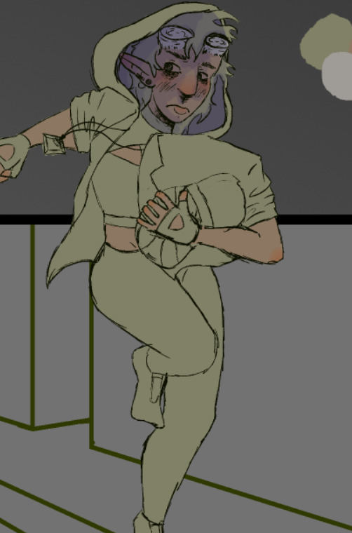
for the background in the first panel i wanted it to look at first glance like a regular city but the closer you look at the details the more you notice its a terrible city. i also added a few new details to Eithos outfit because once i added the colour i noticed that she was way too simple looking for a main character so i added detail to the leggings and i also added extra pockets.
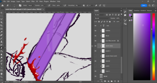
i also found using the smudge tool was very effective for fire.
0 notes
Text
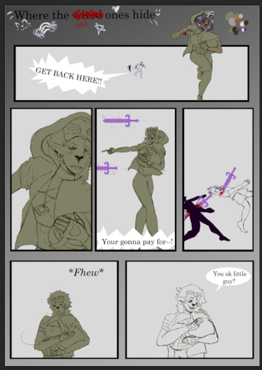
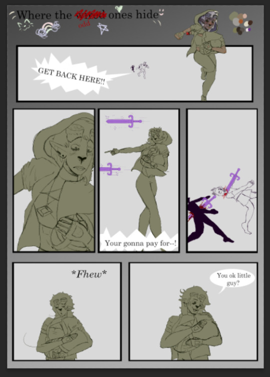
process shots of coulour and re done sketches


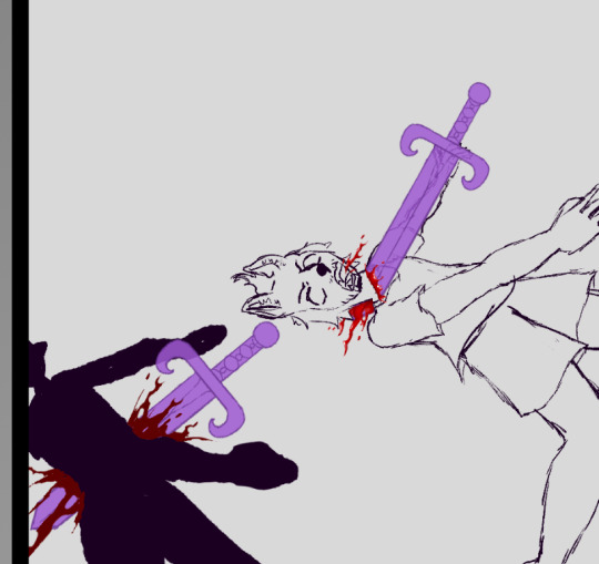
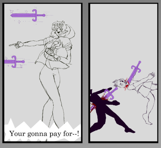
so far my comic looks like this


0 notes
Text
in the website Step-by-Step Guide: My Comics Process (comicsforbeginners.com) the steps to making a comic are: 1: Script, 2: Thumbnails, 3: Rough sketches, 4: Borders and lettering, 5: Borders and balloons, 6: Sketching, 7: Inking, 8: Scanning and clean-up, 8.1: Colouring (optional) and 9: Repeal and replace.
i started my comic in a similar way to this process, starting with a script of sorts. i didn't have a full story written out, i still don't, but i knew the knew the story, even as it changed due to doing more research i know i will need to write the story out eventually, but i know how it starts and ends.
one difference however i don't think i made any thumbnails for my first page though i did toy with a different starting point, but i found it didn't flow how i wanted it to so i changed it into the comic im working on now. i do however have some thumbnail like pencil sketches of other parts of the story as well as a few more pages continuing the time line at the start.
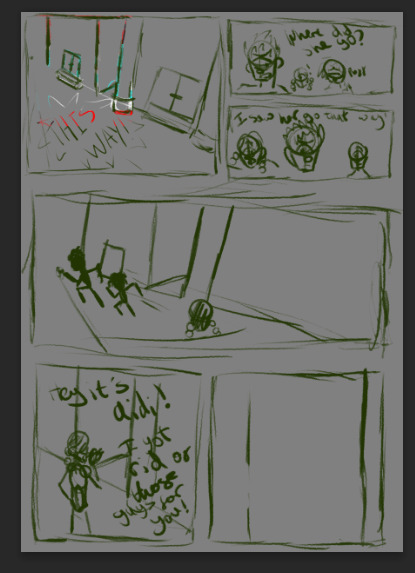
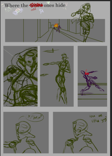
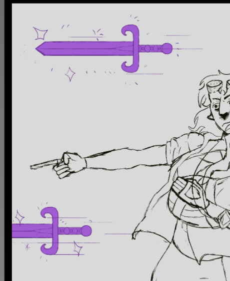
once i figured out the comic panel layout i started my basic sketches, being rough and quick meant i did have to re draw a couple of them just to make them give the look and feel i wanted it to. using reference pictures for this part was vey important as to make the characters look fluid and real, in fact the drawings that i re did were where i didn't use a reference making the pictures look stiff and not believably like my character was a real person.
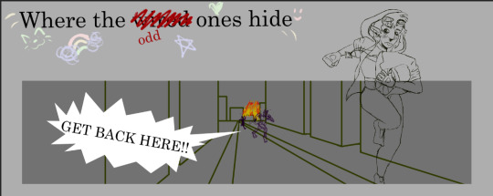

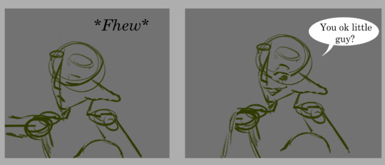
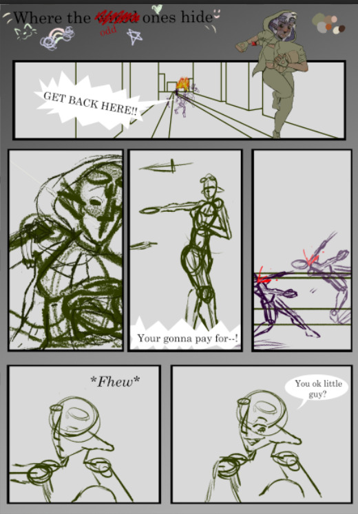
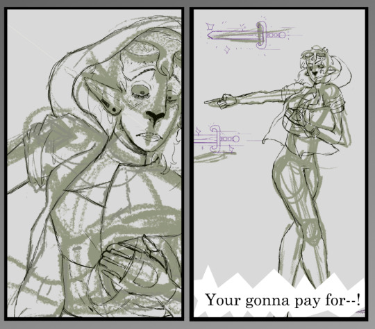
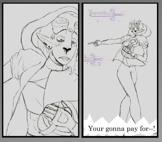
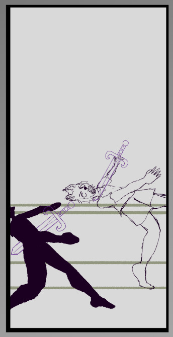


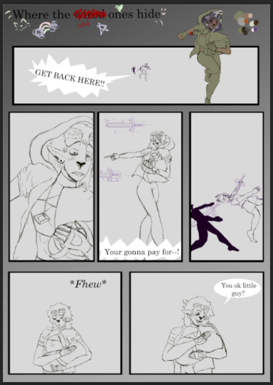
i written in the sketch what i wanted the people to say i used the basic font as a place holder and i plan to find a better font for the final product.
i need to finish all the background sketches but i have the basic sketch done.
another differnce is that i sketch straight onto the computor whereas this artist draws on paper and scans in their picturesad inks them digitally.
i was going to do clean line work but i prefer the sketchy look over clean lines i feel it makes my work mor fluid.
once i was happy with the sketches i have now started with the colour thought i did do this part a bit out of order to start with but now im doing it in a more concise pattern.


0 notes
Text


here are the sketches i have done for the planning of my poster. i plan to draw a pavement with the title of my story running along it and i wan it to look as if the title has been written onto the pavement. below i plan to draw my 2 main characters Eithos and trinity like in the top of the middle, I'm also going to draw a heel walking to the edge of the pavement, i want the heel to be the main villains heel sort of teasing their arrival.
0 notes
Text
My name is Tim. I’m a freelance concept designer, illustrator and author based in Australia, specializing in character design and story development. I work in the French comicbook market as well as animation and video games. My client list includes companies such as Editions Delcourt, Gunfire Games, Animal Logic, Ankama, Blur studios, Blizzard Entertainment, and Wizards of the Coast.
(paragraph from About Me — Tim Mcburnie)
i feel Tim MacBurnie's art is very pleasant, his use of natural and softer colour make looking at his art very appealing. i also like how he draws the backgrounds of his pieces the soft and detailed scenery lets you really get a feel for the setting.


0 notes
Text
Yonkoma manga (4コマ漫画, "four cell manga" or 4-koma for short) is a comic strip format that generally consists of gag comic strips within four panels of equal size ordered from top to bottom. They also sometimes run right-to-left horizontally or use a hybrid 2×2 style, depending on the layout requirements of the publication in which they appear. Although the word yonkoma comes from Japanese, the style also exists outside Japan in other Asian countries as well as in the English-speaking market, particularly in mid-20th century United States strips, where Peanuts popularized the format.
a style of Japanese comic books and graphic novels, typically aimed at adults as well as children: Compare with anime.
manga is a very wide a varied topic and field of art the are even competitions, i think that Alex Brennan-dent, the 2022 3rd place winner's comic, is excellent in a variety of ways. the story of the comic shows the connection between the two characters in it, but also it sets a very though provoking twist at the end that leaving you thinking. this is very hard to do in a full length comic but Alex manged to achieve this in less than 10 pages.
also i really enjoy his art style, its sleek, clean and professional, and looks as if it was pulled from a fully published comic.
he made a video on YouTube about his process and i found it very informative into the processes of creating characters and plot line and i can genuinely say i would recommend the video for beginners, after i watched his video i found i had a clearer understanding of what goes into making a comic and found it easier to start my own.
What is Photoshop Adobe Creative Cloud (youtube.com)

0 notes
Text
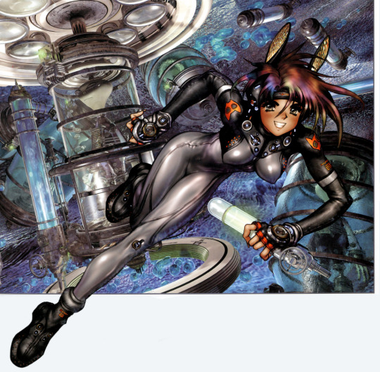
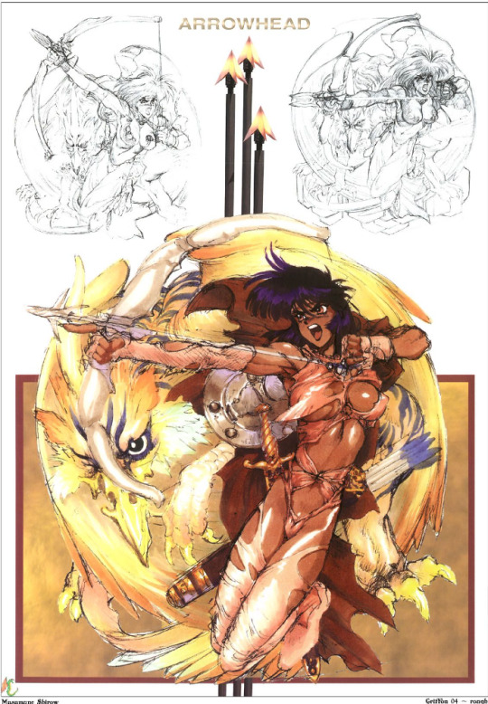
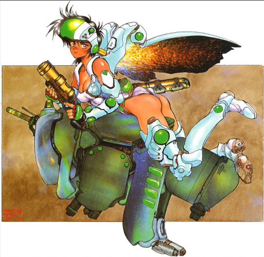
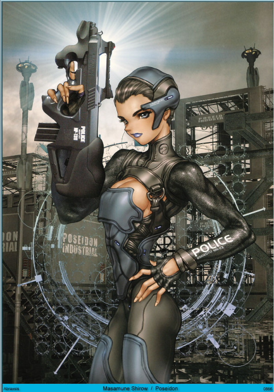
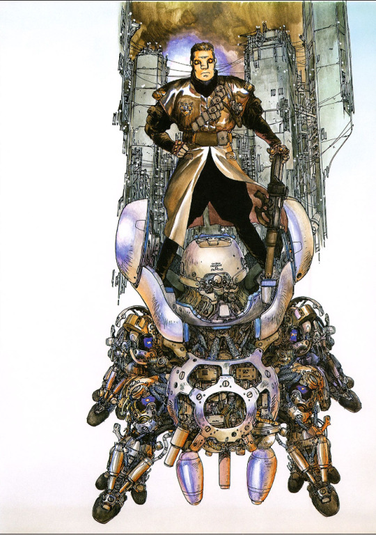
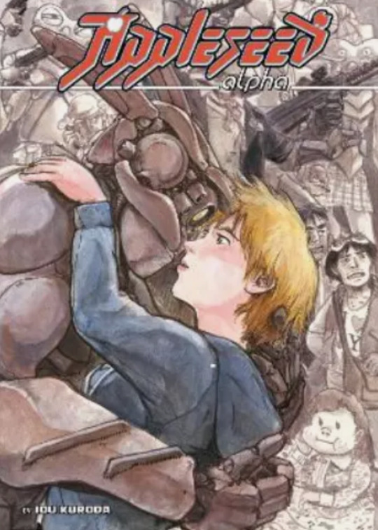
Masanori Ota (太田正典, Ōta Masanori, born November 23, 1961), better known by his pen name Masamune Shirow (士郎 正宗, Shirō Masamune), is a Japanese manga artist. Shirow is best known for the manga Ghost in the Shell, which has since been turned into three theatrical anime films, two anime television series, an anime television film, an anime ONA series, a theatrical live action film, and several video games.
i think the way shirow renders his artwork is very good, he is very skilled at creating realistic looking metal and its clear he's very knowledgeable with the colours he uses. however i can not say i like his art because of his over sexualisation of his female characters. they are in a cyberpunk world, somewhere that's dangerous and deadly with highly advanced tech and he's drawing these women with super revelling suits for driving these mechs.
almost every drawing of his is an over sexualised woman in a provocative pose, and that not just me being over sensitive, this is a big problem in media, over using sex appeal to sell more artwork. the clothes my characters were are not sexual at all, eithos wares a crop top and leggings but i don't draw her with a tiny waist with a big thighs and chest, she is muscular and wares what she does because its sporty and easy to move in and that's necessary with what she does. i do not see a genuine reason that a police officer would need the top of her boobs showing and i doubt she would be very strong because her waist is so tiny. she doesn't look like a police officer at all her body type doesn't reflect her job and makes her seem like an object.
0 notes
Text
Paolo Manuel Rivera is an American comic book artist. He is known for illustrating the Mythos series of one-shots and several issues of Spider-Man as well as his collaboration with writer Mark Waid, his father/inker Joe Rivera and colourist Javier Rodríguez on Daredevil. Although gaining acclaim and recognition through his early fully painted works, he has since moved on to more traditional comics process of pencilling, inking, and colouring (with some occasional sculpting).
Paolo works by hand which is very different from digital art which is my chosen media to works in however i also use traditional medias occasionally as well and i find that digital art is easier and very if not the most forgiving media to work in, its not a simple medium but if you mess up in digital its easy to fix or cover.


0 notes
Text
A Comic-Con is a convention focused on comic books and related forms of pop culture entertainment. Comic-Con is the largest comic, sci-fi, and fantasy event in the world, drawing crowds of nearly 200,000 people to a colourful and action-packed week of super heroes, villains, and fantastic creatures.
people also use Comicon to sell their art, buy bringing in a display and their products. if i were to sell my comic book i would probable start with Comicon as its a large selection of people who you know all enjoy that area of art so your bound to sell a few copies.
for me i always wanted to just post my comic online have it so everyone can enjoy it, but i think printing it and selling it would be a fun experience.


mini sketch of what my potential booth would look like.
0 notes
Text
if i were to give some advice for a young comic artist who wants to start their own comic, i would say character design is probably one of the most important things. but when i say character design i don't just mean what a character looks like, i mean their personality as well. you need to know how a character stands what slang they use, how they react to situations, what their scared of, what or who would they would protect, what their morals and motives are. before even laying out your comic panels your characters must be fully thought through.
though, this is only what I've found in the planning and drawing out just one comic, I've done many basic comic sketches but i feel i cannot give much advice to a young comic artist because i consider myself as a young comic artist with still a lot to learn.
0 notes
Text


a few screen shots of comic cover art for some comics for inspiration for my poster. these comic covers all use text in various and interesting ways. Like in the cover for coffin bound, the text has wrapped around to look like a coffin, this is called word painting and you see it in a lot in these comic covers, its a very good technique to display text in an interesting way.
other that word painting there's the comic covers that make the text part of the environment like the cover of soma where it looks like the title has been painted onto the road, this is the technique i plan to use in my cover / poster, i want it to look like the text was on the pavement and has been drawn over.
0 notes


