Don't wanna be here? Send us removal request.
Text
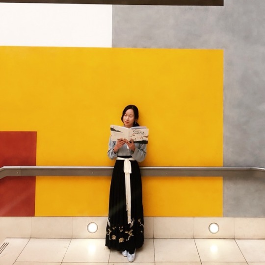
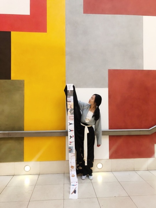
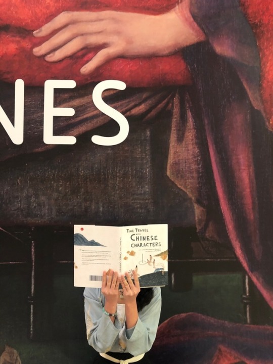
21/11/2018 Me in Traditional Chinese Costume with my new book in Tate Britain.
I time travelled with my book. Although my book travelled all the way back to New Stone Age, I stayed in Han Dynasty haha.
2 notes
·
View notes
Text
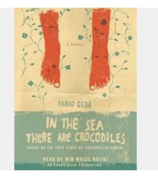
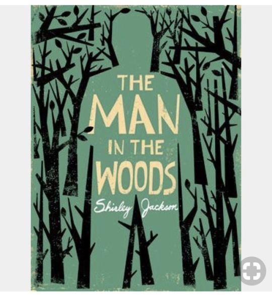
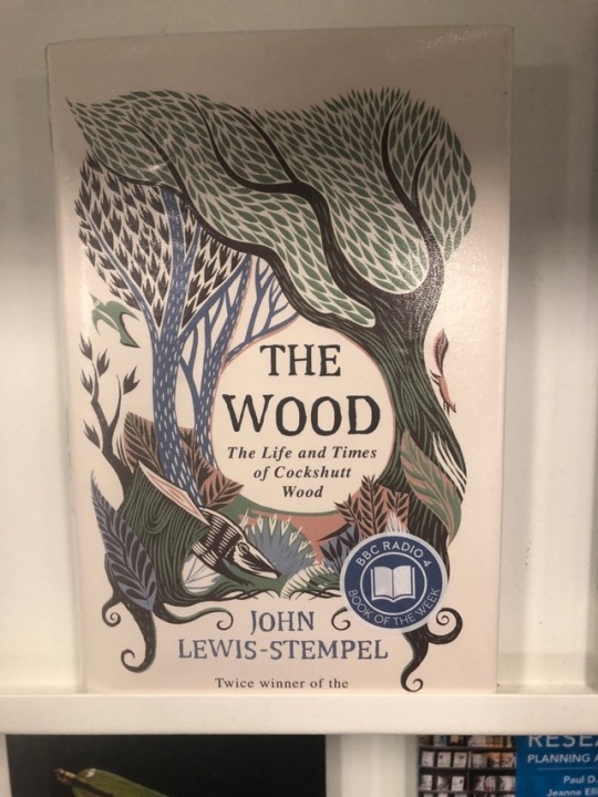

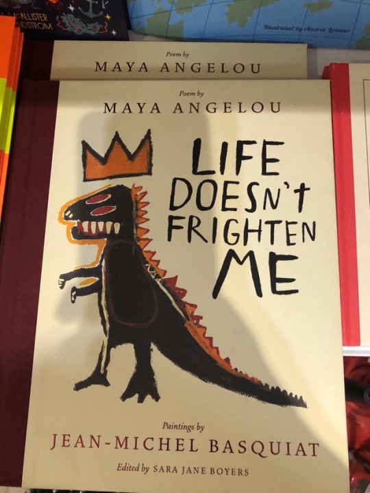
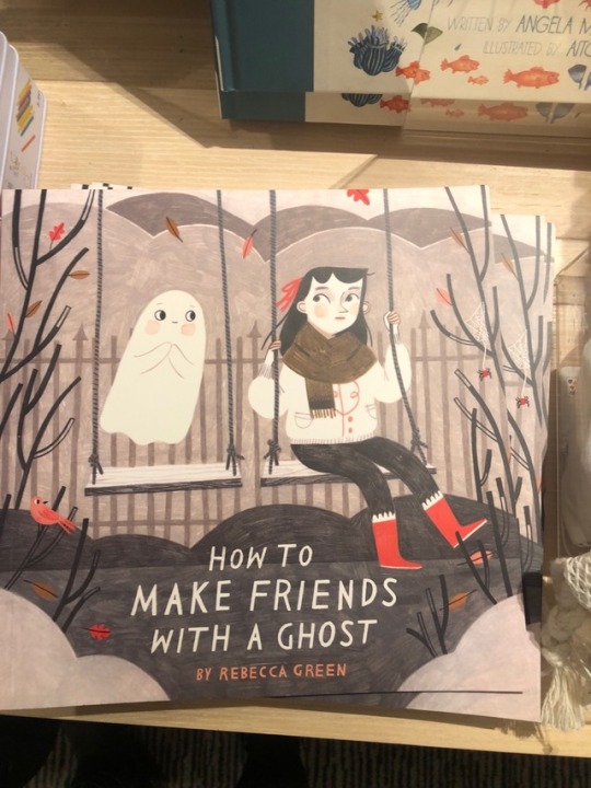
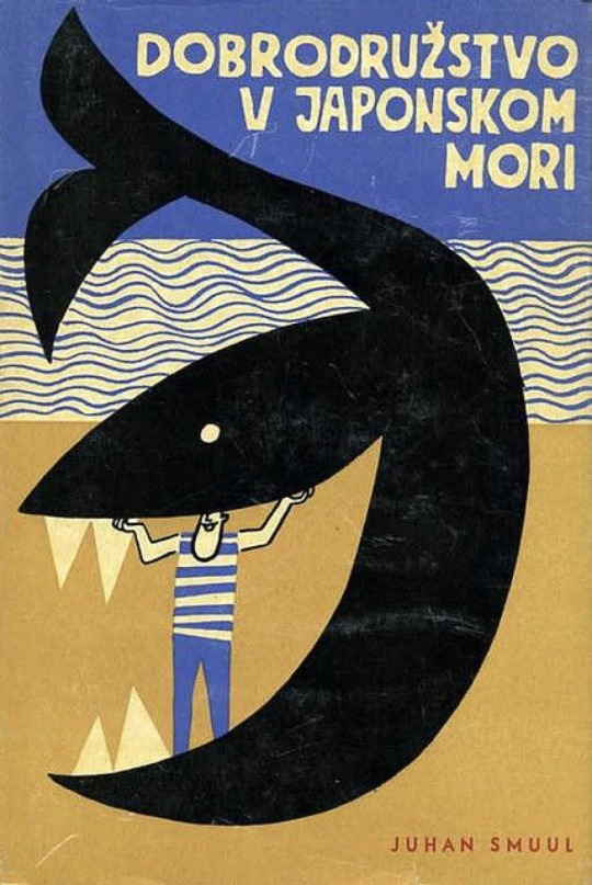
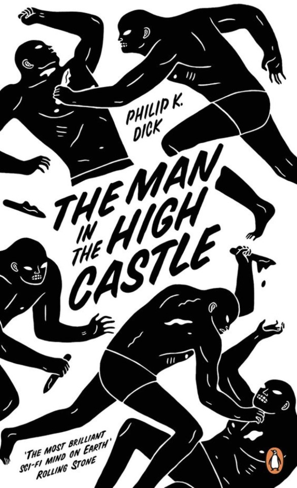
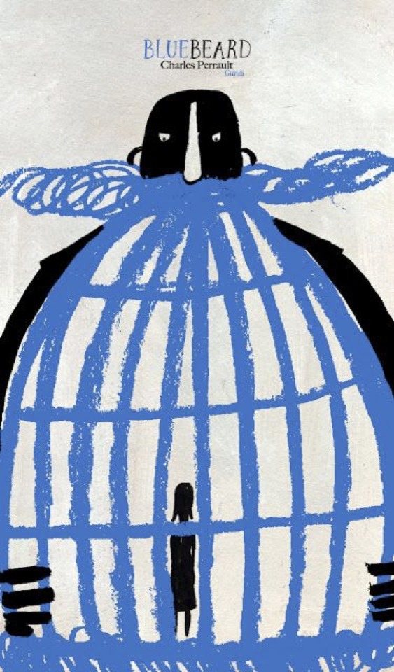
Covers that I analysed to make my own cover work.
My first attempts of using standard fonts was a total disaster. I was very frustrated with my attempts, so I tried to analyze why in good covers the images and texts work so well together.
I think what they have in common is that they treated the texts as images, as an unseparated part of the cover. The brush strokes, the textures are all in accordance with the images.
So I decided to do that as well. Because my images have a paper cut feeling, I hand cut all the characters. Then I coloured them in dark green shade and then add the same texture as the images. In Photoshop, I tried different stroke weights, played with the sizes and positions of characters. Finally, I got a cover that I'm happy with.
0 notes
Photo
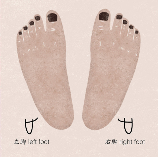
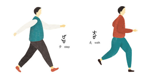
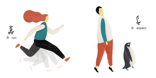
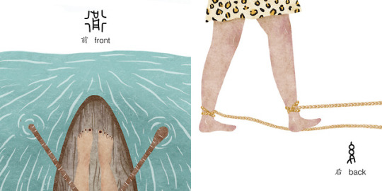
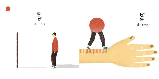
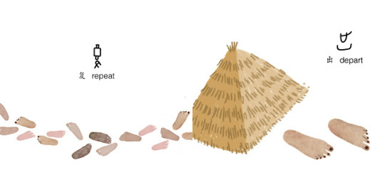
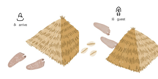
The building block “foot” and new characters created using this block.
0 notes
Text
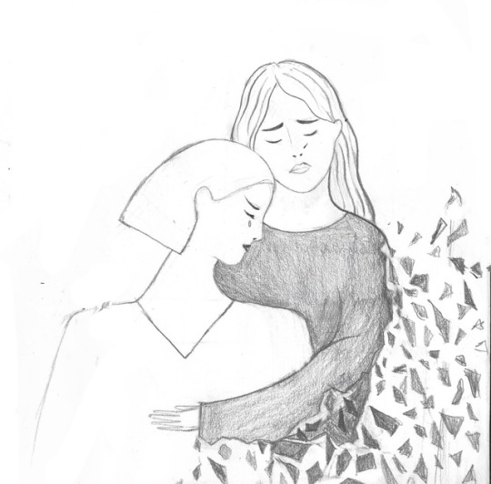
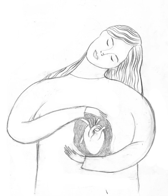

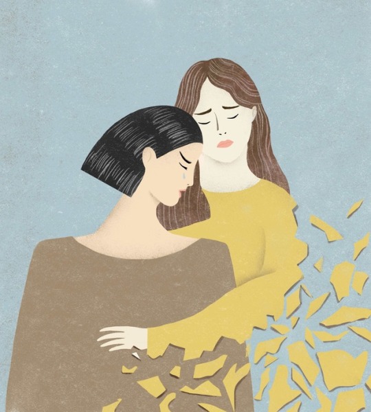
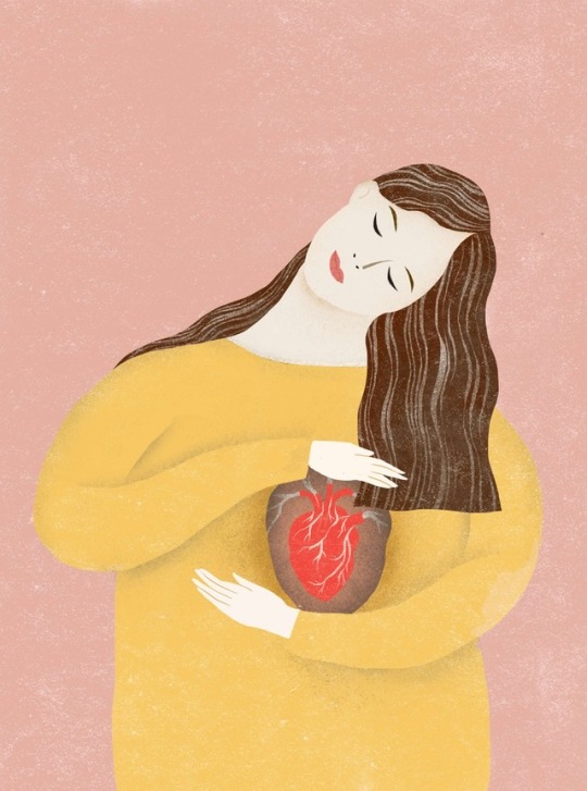
07/11/2018 Did two editorial illustration for Breath Magazine Issue 18.
It’s about an article talking about “compassion fatigue”. It’s about someone cares too much about other people’s matter that themselves are falling apart. So one should care more about themselves before caring for other people.
0 notes
Text
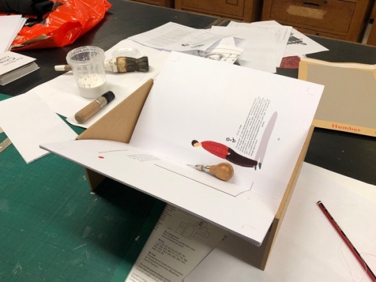
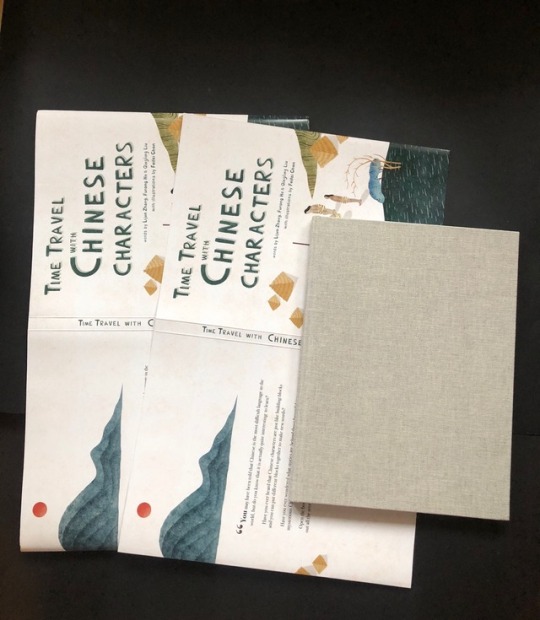
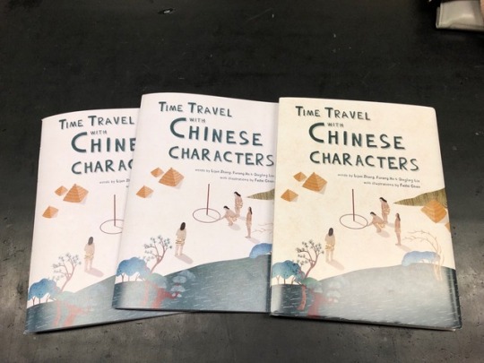
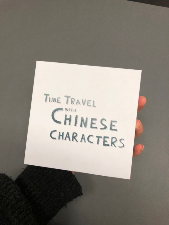
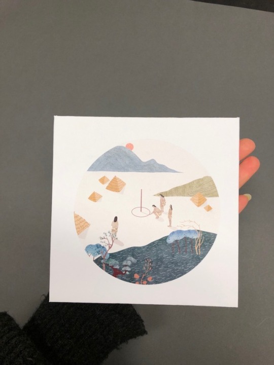
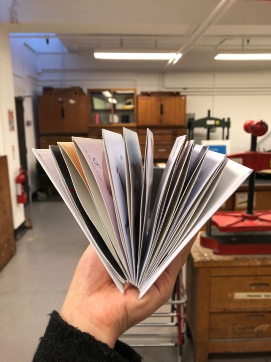
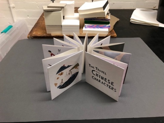
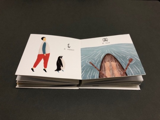
15/11/2018 Putting my book together. In addition to the book, I also did a concertina book about all the shell and bone inscriptions extracted from my book.
0 notes
Text
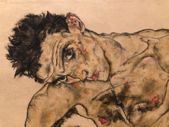
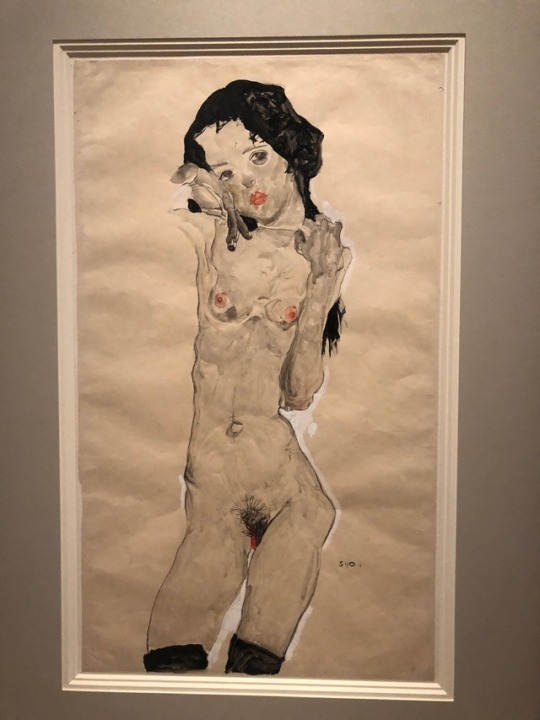
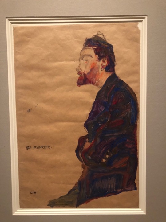
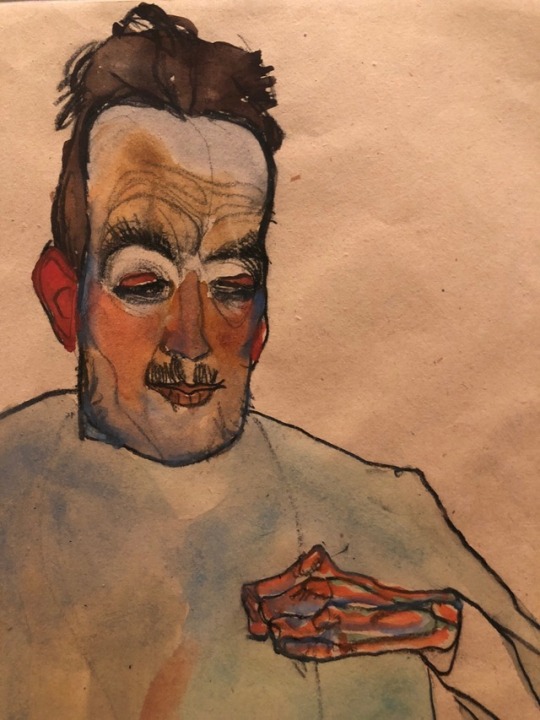
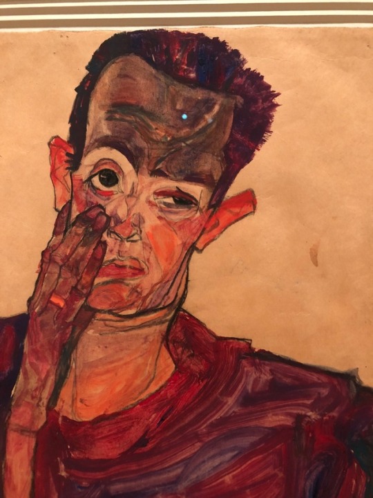
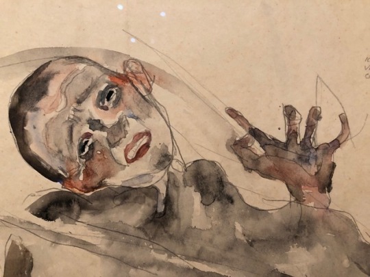
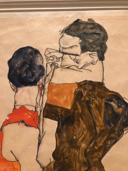
04/11/2018 Went to see Klimt & Schiele’s artworks in RA
0 notes
Text
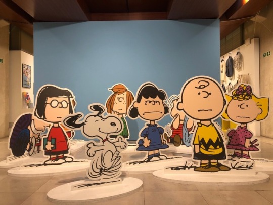

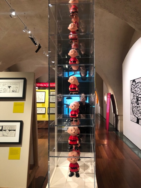
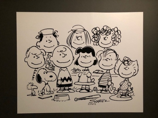
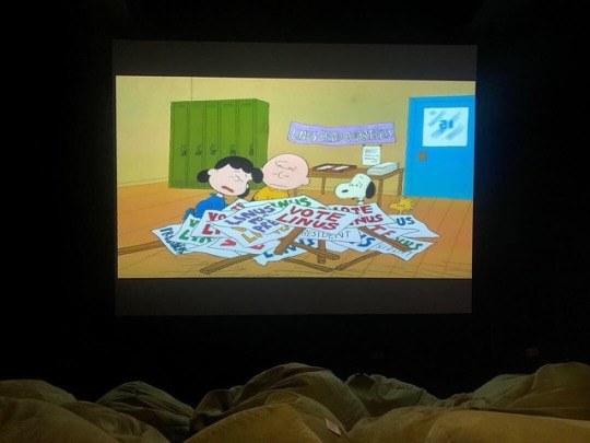
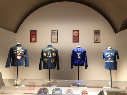

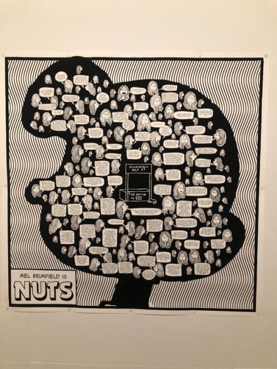
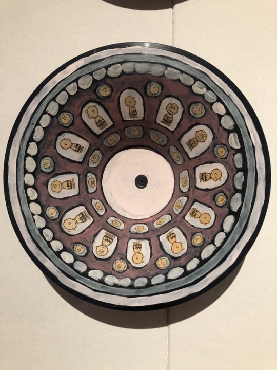
01/22/2018 Went to Somerset House to see Charley Brown to ease my stress from the FMP.
I remember when I read Peanut when I was little, I just paid attention to the narrative. But now I can see the power of lines, the dots, meanings behind the stories, even feel a bit sadness.
0 notes
Text
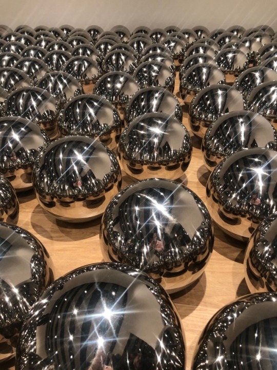
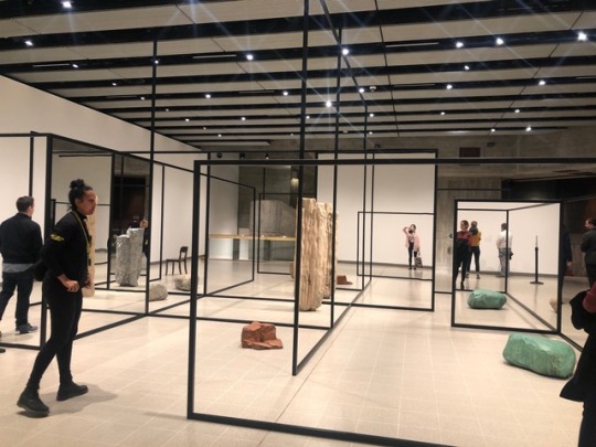
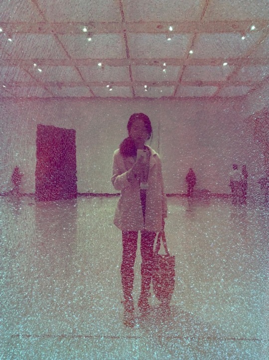
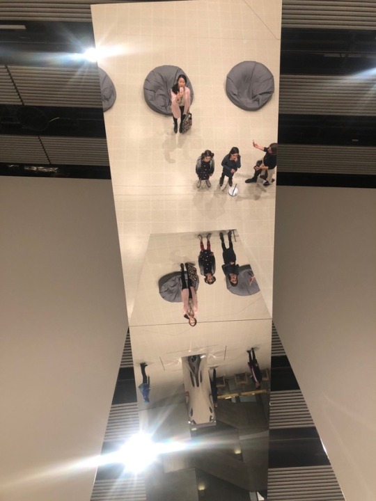
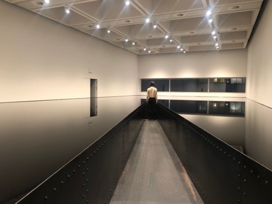
25/10/2018 Mind-blowing “Shape Shifters” in Hayward Gallery.
The way those artists use different materials to distort spaces and create illusions are just mind blowing and other-worldly.
0 notes
Text
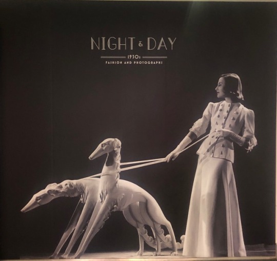
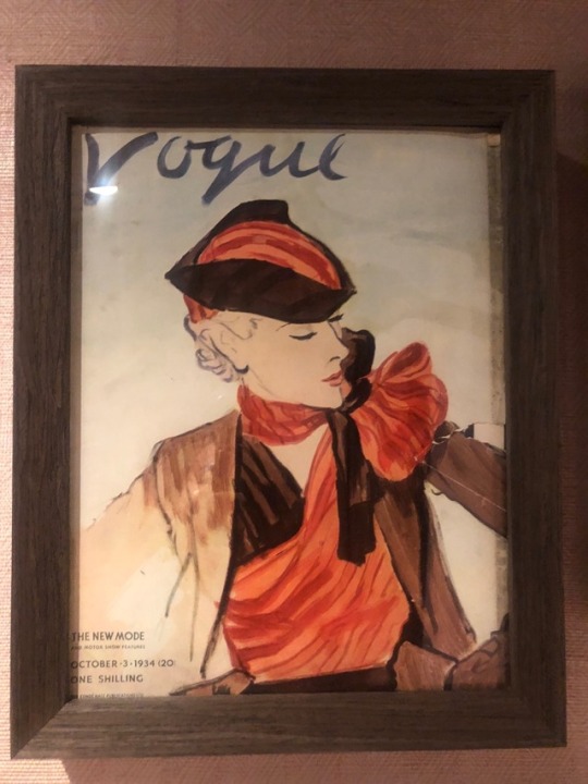

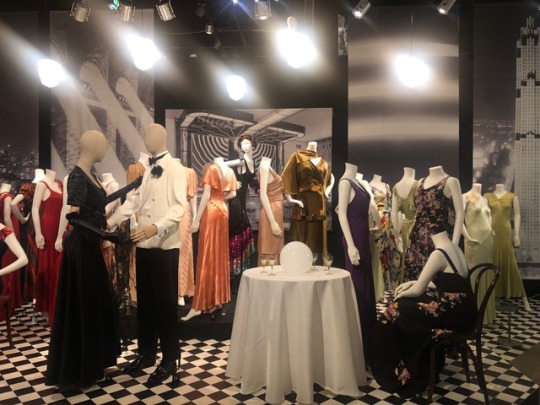
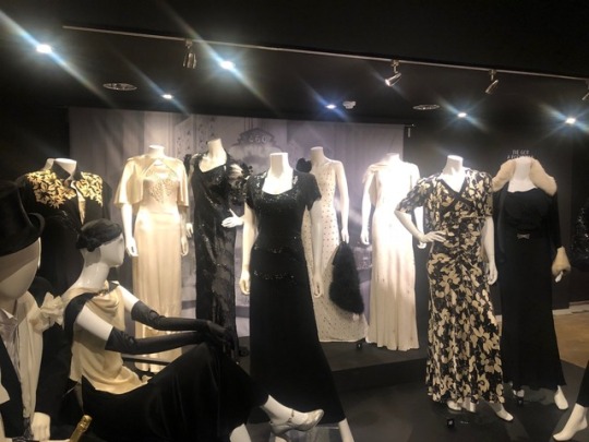
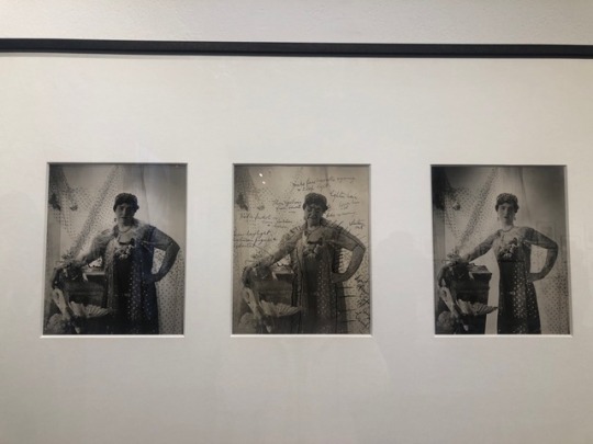
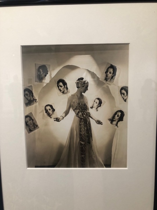
23/10/2018 “Night and Day” 1930s Fashion in Fashion & Textile Museum
To be honest, I don’t like 1930s fashion as much as 1920s fashion. 1920s’ flapper girls are fun, bold, their clothes and styles are free and enthusiastic. In comparison, 1930s fashion seems old, rigid,contained. Maybe that’s because of the women’s social standings had changed, but I was really not enjoying the exhibition.
0 notes
Text
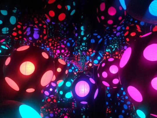
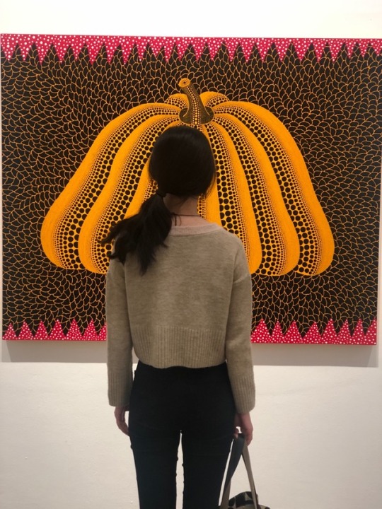
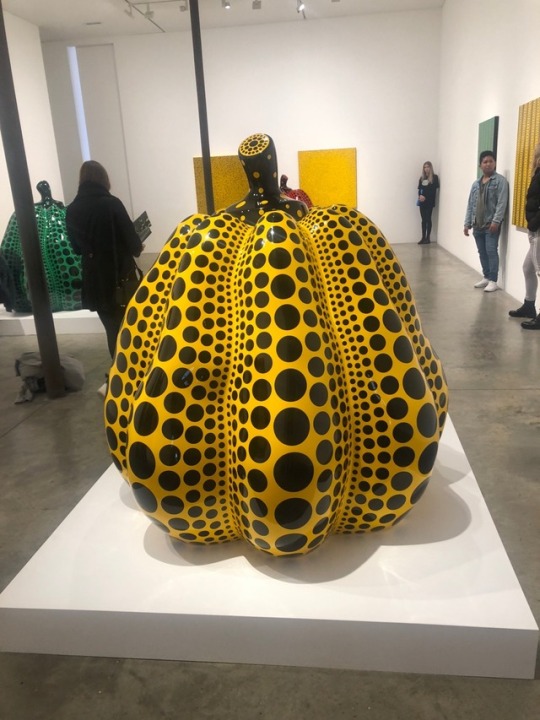
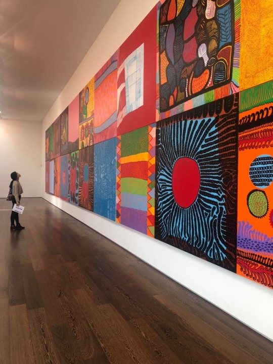
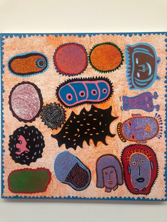
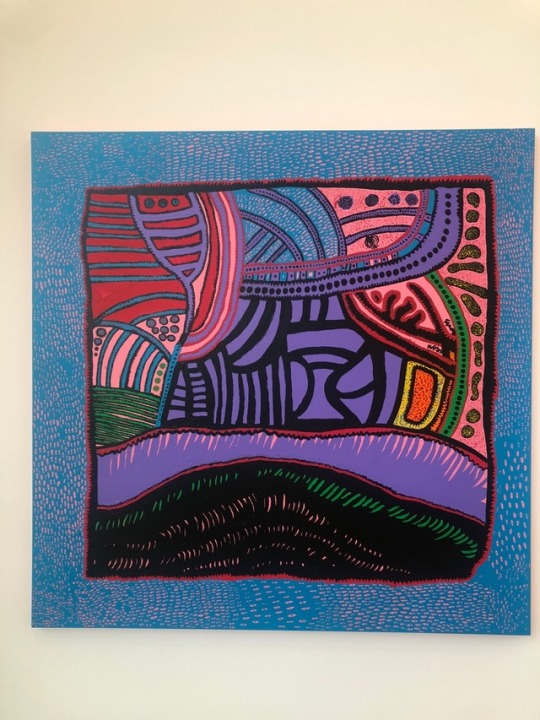
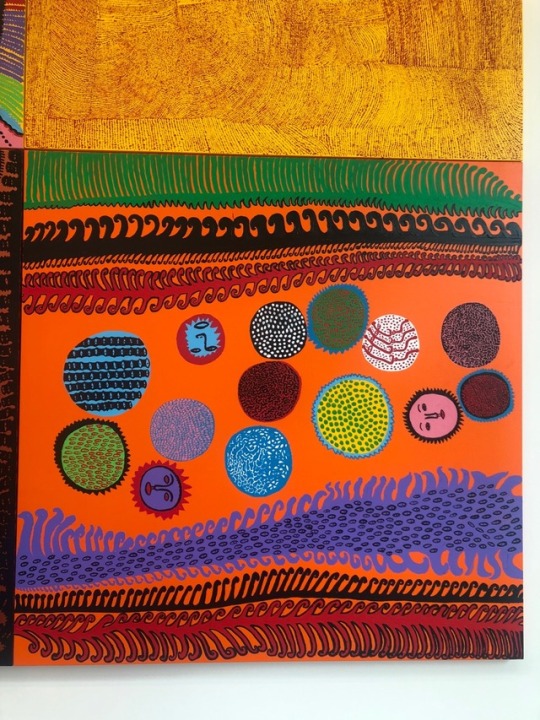
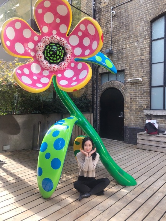
20/10/2018 Went to experience the infinite world created by Yaoyoi Kusama at Victoria Miro gallery.
Really adore her artworks and don’t want to get out of the infinity room.
0 notes
Text
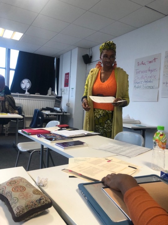
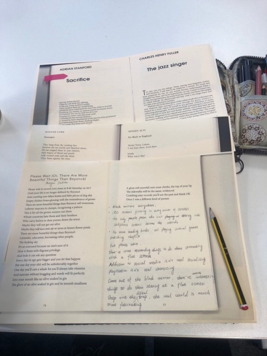
17/10/2018 Participated in one of UAL’s academic workshops, this one is about identity, history and poetry. I spent a really good afternoon reading and writing poetry (never thought I could) with poet Dorothea Smartt.
I even wrote a poetry about my thesis topic: Tittytainment. It’s about pay more attention to real life stuff instead of immersing ourselves in brainless entertainment online. It encourages the reader to wait and think when we are surrendering ourselves to digital screens, there are more beautiful things in life.
0 notes
Text
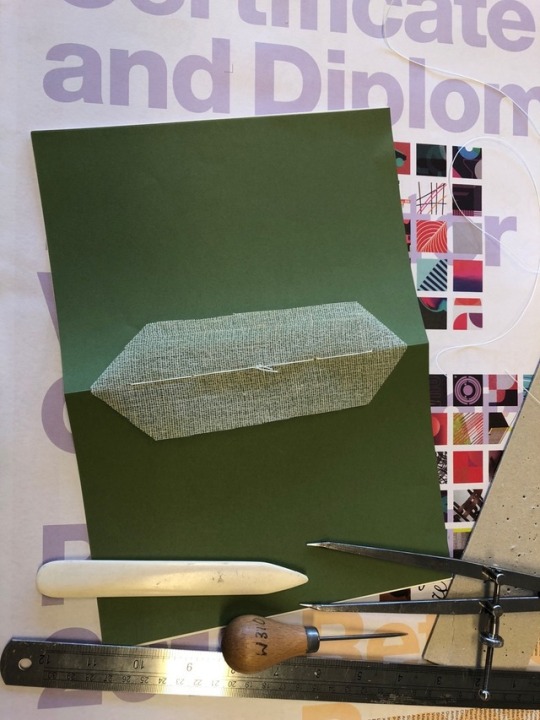

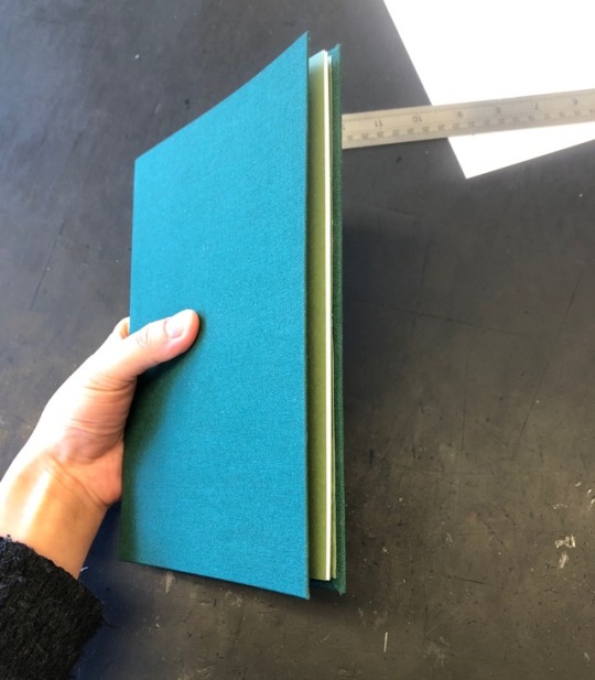
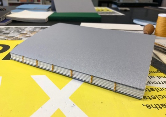
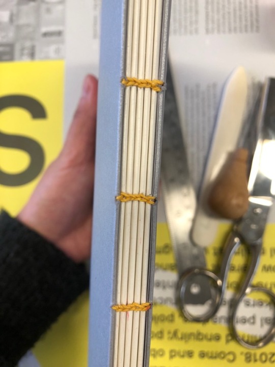
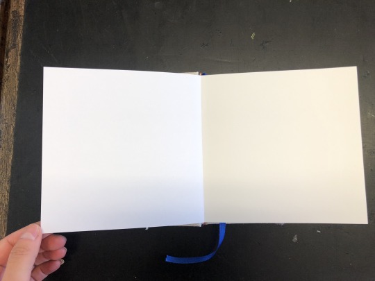

Test Bidings
I did three test bidding for my book. They are single section hard case biding, coptic biding and drum leaf biding.
I’m looking for a way to bide my book so it can be open 180 degree flat.
The single section hard case isn’t working because my book will be way thicker than the test book.
At first, I thought the drum leaf biding would work. because it can open flat and there’s no line in the centre. However, I found out that this makes the pages too thick,the book too heavy and it's not economic for mass production.
Divide the books into sections and then stitch seems a better idea, and I want to put a hard cover around it so it adds more quality.
0 notes
Text

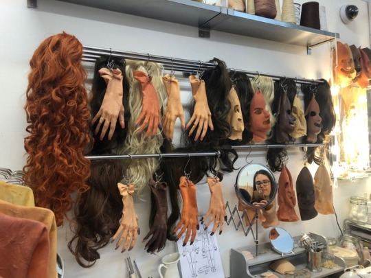
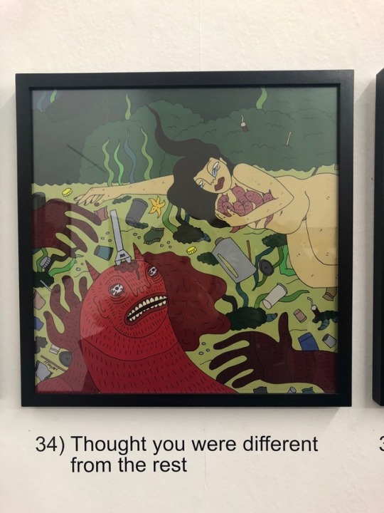
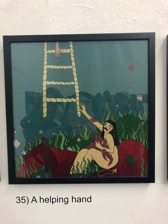
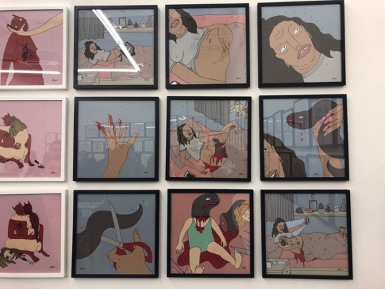
14/10/2018 A fascinating exhibition by Polly Nor
A really weird (in a good way), bold, a bit scary, humorous exhibition by Polly Nor. Never thought that one can depicts boy and girl relationship this way.
0 notes
Text
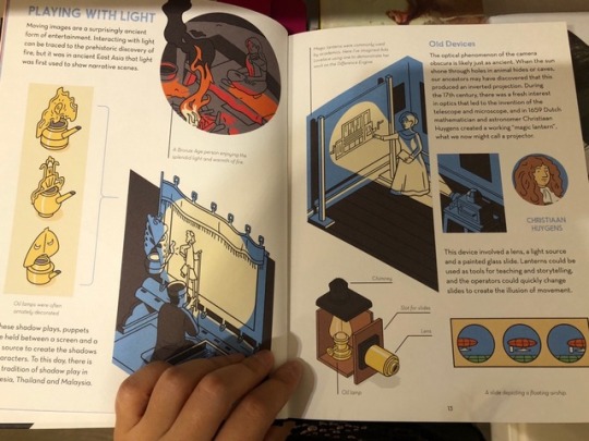
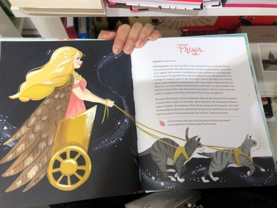
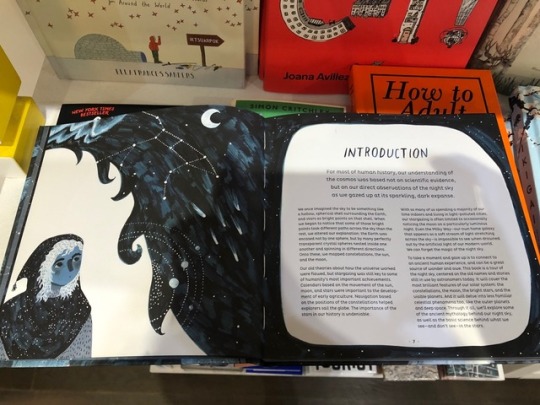

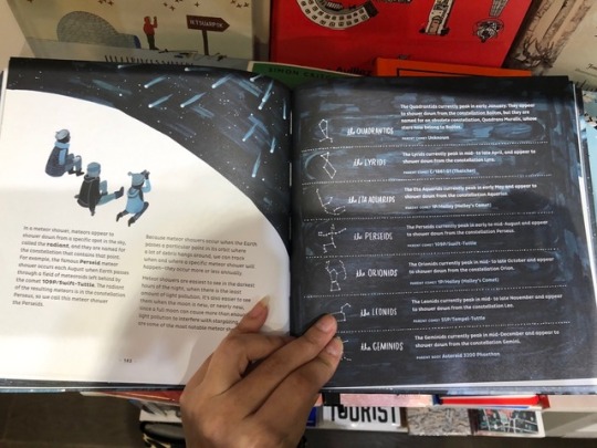
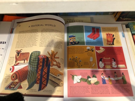
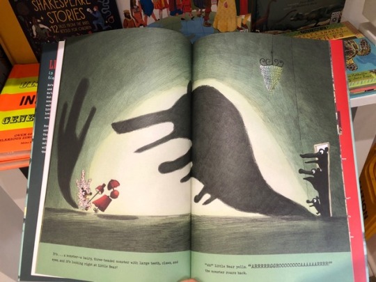
11/10/2018 A trip tp Magma bookstore to study the layout and design of (educational) picture books.
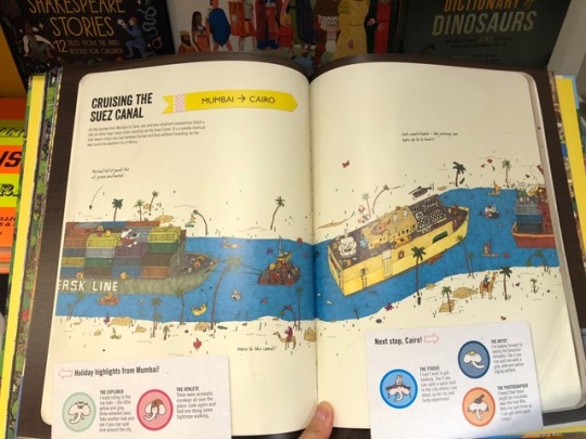
I went to Magma to study picture books as it was recommended by Chris. I was worried about layout and desperate to see some good examples. Magma has a collection of pictures books , many of them educational . I learnt a lot about how to play with texts and images.
0 notes
Photo


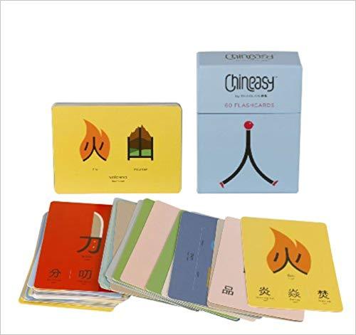
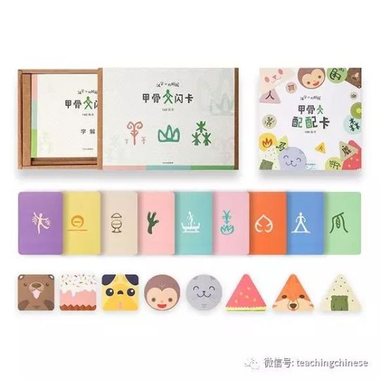
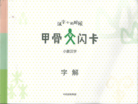
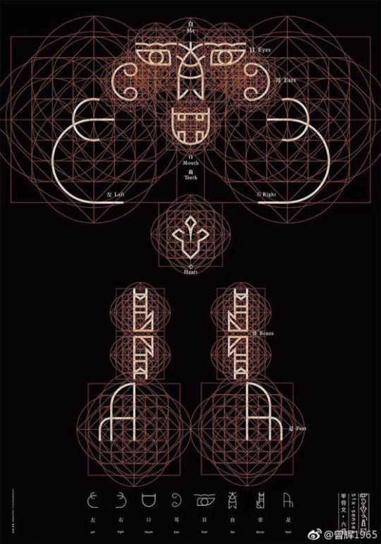
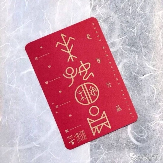
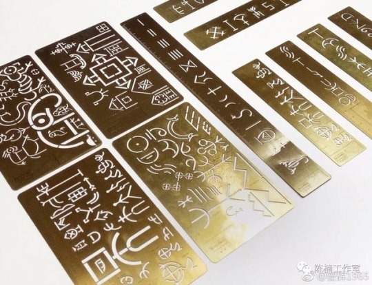
Market research about the successful examples about Chinese Characters or shell and bone inscriptions.
Chineasy is the most famous one, it is written by a Taiwanese woman and illustrated by an British art studio. It is very well graphically designed. However, since I‘ve been trained by experts, even I could spot that sometimes the images are forcing things together , they are not making any sense. I need to avoid these when I illustrate, but I can learn a lot about graphic design from it. Chineasy also has launched a set of character cards. We could do this too, the will be a good supplement to the book. Children can carry these small cards around easily and read anytime. “XiaoXiang” Characters (fig. 4-5)is a famous brand in China that specializes in publications in Chinese Characters. Their target market is little kids( like kindergarten ),younger than our target group. So their style are more simple, more graphic and more Childish. The last three images are from an exhibition about shell and bone inscriptions. They mainly played with the inscriptions themselves and have them beautifully designed. The writer and I are thinking about doing something special about the characters as well.
0 notes
Text
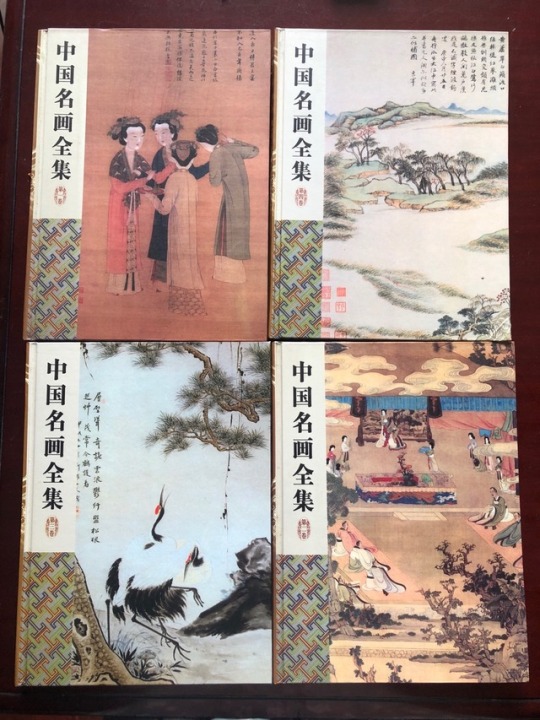
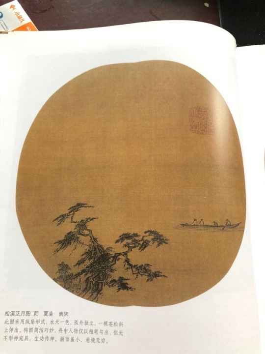
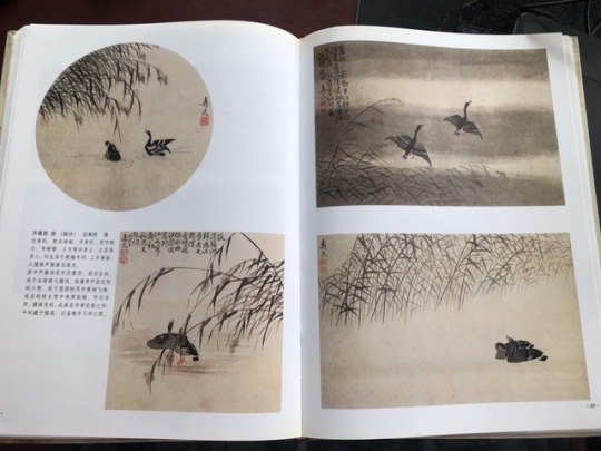
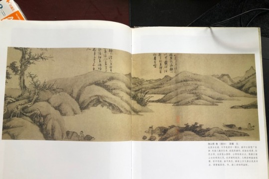
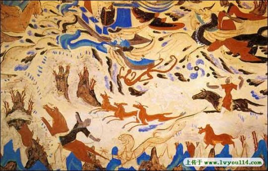
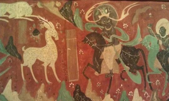

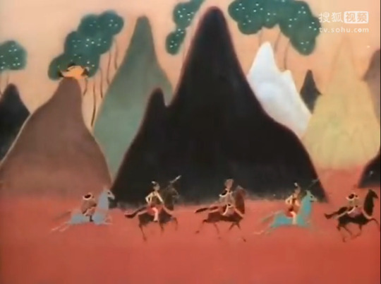
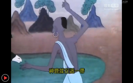
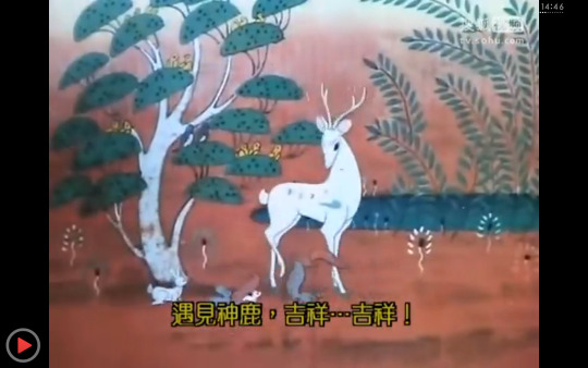
A Study into ancient Chinese paintings, cave paintings in Mogao Grottoes and classical cartoons such as “Nine-colored deer” to colour inspirations and extract traditional Chinese elements.
0 notes
Text
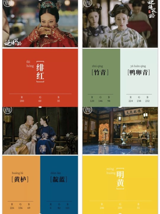
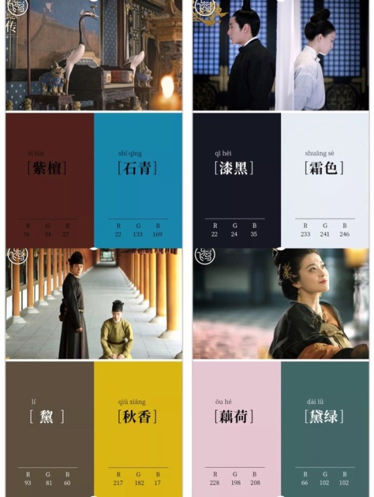
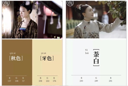


12/10/2018 Research for FMP -Research into traditional Chinese Colors Part 1: through hot TV shows
I studies the beautiful traditional Chinese colors through the costumes and settings in three hot costume dramas which take place in ancient China. Unlike shows with similar storyline made before (which are full of bright and cheesy colours), these threes shows “Story of Yanxi Palace”, “Legend of Ruyi” and “Everlasting Song of Heaven” get really popular for their subtle colours. These colours are beautiful, elegant and harmonious together. They show the beauty of Chinese culture and wisdom of ancient Chinese craftsman (because they went through lots of difficulties to find these naturals colours to dye fabrics according to the background stories I read).
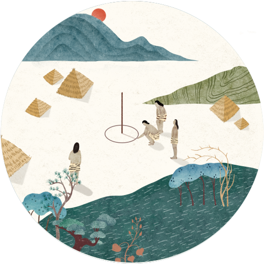
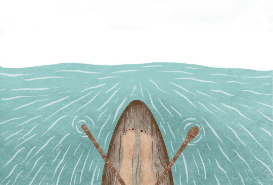
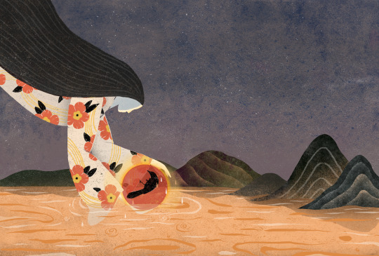
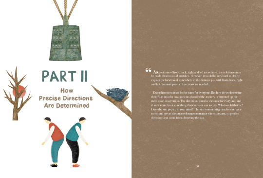
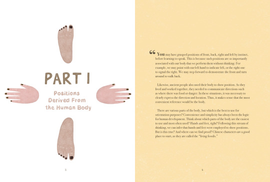
Here are some examples of how I uses these colors in my illustrations and page designs.
0 notes