Back in the day, we had to make our own prototypes BY HAND. This is an account of my creations while in UX Prototyping class, with the goal of ideating, sketching, making, and testing a series of prototypes. This is the start of my path in UX.
Don't wanna be here? Send us removal request.
Text
...but wait! There’s more!
Dear Reader(s?), the time has come for the final blog post for this quarter. Our lords and masters have let loose of our reigns for one final project. We can make something cool!
Let's not worry about all the gravitas this time and get down to something important. My grade. Your well-being. Journaling is a common method of keeping record of oneself, but also finds use in self-driven reflection. Good things!
A while back, I stumbled upon this wonderful article on waitbutwhy.com about how our perception of life seems unfairly biased towards how we are feeling now, as in, right now, today, sunrise to sunset, betwixt the sleeps. http://waitbutwhy.com/2013/11/life-is-picture-but-you-live-in-pixel.html
"Life is a picture, but you live in a pixel."
Let that sink in. Actually, please go skim over the article. ‘Tis glorious.
This had me thinking about how little ability most of us have over getting to step back and see this gestalt view of ourselves. When I was working a miserable very low paying part-time job, I had no idea about myself from any perspective, really. I knew that I was getting by, but I didn't know how I had been handling life, how I was influenced, what I was doing with my time I did have. I think about all the people in this daily grind that they might feel amounts to nothing based mostly on how a few days make them feel. I remember the impact of a single bad day then, and compare it to now. I do have many good things in my life now, true, but I also have much more regular broad perspective. Thus, my resilience is actually pretty great.
Recap: People struggle with the context of time in their lives. We remember days or weeks rather than bigger sections of time. Perspective helps improve resilience and decision-making.
Also: Colors are nifty. Calendars can be used so much better. I like making things that are helpful in multiple dimensions. Let's get people out of their pixels and into their pictures.
Let's make an app.
HappyCell That seems like a fair name. I mean, it's not like every day will be happy, but why not?
Note: I still have yet to assemble the tools to create polished mobile app designs. This is an area that will take some getting used to. I like seeing it done well, but I also like to see the change in my thinking while starting from where I am.
The previously used method of wireframing first, then doing a mock-up in MarvelApp seemed to work well. After a little research, I did find there were more keyboard shortcuts that helped a bunch.
I knew I needed a simple login screen, a home page with the colorful calendar, settings with particulars that protect privacy while still noting some of its capabilities that might have fallen off the radar, screens for reviewing older entries, a page with the different choices for how to log the moment, and (most importantly) a color-picker for the user to code the day.
True, I could have done some cool over-the-top idea of using the app as more of a text-based journal that uses sentiment analysis, then it codes the user's day for them with a system that has research-backed results. Cool, right? Maybe another day. For now, here's some wireframing:
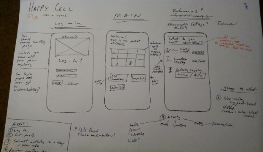
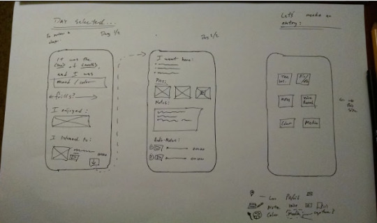
...and that really important color-wheel.

Well, it’s a start. I can’t help but make notes on the sides of my wirerames.
It may be hard to see without downloading the pictures, but don’t worry; you can see plenty on a more polished interactive mobile application design:
https://marvelapp.com/2580f0a

Ah! Much better.
Oh, this, too:
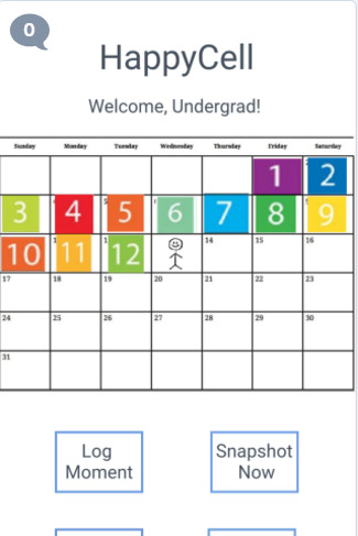
While there are several slides worth covering, I wanted to ensure these weren’t overlooked:

What would you like to re-cap? Personally, I forget ideas I came up with. Don’t get me started on how MIT beat me to ridiculous applications of ferrofluid...But that’s merely an aside. Company, tagging places and scenes to help recall times that were good, or perhaps more importantly, pretty alright. Part of what the article covered was the sense of gratitude being important to instill. I hope these few tools can help, but I’m not naive to think this is enough. No. Humans are complicated, strange, messy creatures. And that’s what prevents this line of work from ever being boring.

Let’s look at how this color is picked. Yes, you pick your color, and that was a hard choice to make. Our instructor noted that there is a scientifically-proven guideline for color-coding emotions, and I think that’s pretty super. After asking around, people noted that they have their own attachments to color, and would find it to be more useful for the application of journaling. I sided with my cohort, but will absolutely study color theory over break. Already have two books set aside. Excellent stuff.
That calendar was easier to think of than it was to make.
Let’s look at some user-testing:
youtube
...and then the user...wanted more? Who am I to deny that?
youtube
youtube
youtube
Well, it was better received than I thought it might be.
“It’s so beautiful.”
Says the ipad user.
“It could get someone who isn’t into journaling into journaling. This is concise. Condensed. Fun. easier to commit to”
!!! Fun? Is that right? By keeping it integrated with normal social media stuff, have I perhaps let journaling feel more...accessible? However, the visual theme is more consistent that before, but still not as cohesive as others will like. The pattern is what;s important.
This makes me feel that if I were to actually study this, that I could make something of use to people who aren’t me. Goodness.
...can we keep doing these? I like these. I don’t normally want a class to not end. Thanks for all the fun, you fantastic people.
0 notes
Text
A new, shiny ListMaster
This week's demands maintained the course of development.
It’s time to make that great leap into Hi-Fidelity Mockups! Do note that this is something all-together new to me, and is definitely my least-explored topic in my formal education as of today.
Excellent! Let’s get to work.
This means Framer js Framer with Atom Framer with Atom and Node js No? Why do I feel that a Mac should have been strongly recommended as a standard tool for this program? … How about Marvel? Marvel it is! Marvel, you are Marvel-ous! You see what I did there? I'll stop. There was just so much work put into deciding which platform will be best to use. I already miss my wireframes. I hope they are doing well without me.
While the sketches of the wireframe for ListMaster showed promise, it became difficult to deside exactly what to reduce the application to in the translation from desktop to a mobile format. I believe there could be a clean mobile ListMaster with all of the functionality of the original, but how would I do that? Let’s start with some notes, of course!


One thing I'm going to do a little differently is try spending more time gathering information about what people do want in place of more sketching. I'm also curious to see what happens if I sketch less. This may seem odd, but I do have my reasons. I have been chronically terrified of sketching, in general, for most of my life thus far. There was something about the permanence of putting any utensil to a medium that kept me asking repeatedly, constantly "Is this right? How do I know? Why am I doing exactly this?" until I made a few terrible shapes, a wiggly line, and a retreat from the paper. I know I've come a very long way in a short time, but could I show myself some hard evidence that it can not only be something enjoyable, but something that brings about success and thus satisfaction with my work? Sure. This is the time for it!
To progress this more Hi-Fi project, I started with my old notes from the wireframe and just kept making more notes around those. Who may have the ideal perspective to help me gather delicious data? Why, none other than some of my coworkers. They are meet the profile of being very technically literate (some, perhaps too plugged-in) and have suddenly found themselves in that place in life where they must shop to survive. Perfect!
Some user ultra-basic user research. (professionals, don't do this. I’m a qualified undergrad)

What I officially determined was that this small representation of the user base was, indeed, desiring features such as a master list, a recipe ingredient adding button, other recipe functionality, and a weekly flyer feature. I appear to have been spot-on! One participant was so excited when I showed her that I had already sketched out her ideas, resulting in a positive user-experience of the moderator (me). They did give me the idea to add focus on store information, as navigating about different store sites can be oddly time-consuming.
However, these users were asking for some things that I had considered, but decided against adding to the full application. For example, one requested a map. I agreed that a map for your local stores might allow you to optimize a grocery route. Then, the participant countered that he wanted a map of the store to find the items. Ha! Surely, you jest dear participant! “No, and quit calling me Shirley”, she responded. In my wounded retreat I decided to meet half-way and add a screen for navigation, seen below.

One thing I learned is that when making a Hi-Fi mockup, it takes more work AND consideration to add features or make changes. The complete lack of detail allowed a more systematic view of what I was doing, even if it was as simple as groceries. I see the most successful apps, but I have not yet seen the pattern for creating that contemporary "this is perfect, of course it wouldn't look like anything else" design. I think we call this the “unavoidable” concept. It’s a big deal right now, particularly due to fake news. On my wireframe, a feature just needed a space on some paper and a few pen strokes. I think not having established a unifying theme as a first step was one of my biggest issues. This made the addition of more features feel like a run-on sentence about nothing.
Let’s look at what happened:
https://marvelapp.com/f7jbbb6
Or for those wishing for the more realistic experience:

A sample of the MarvelApp screen:

I feel like this was fair for my first-ever mobile application attempt. Time ended up being a bigger restraint than I had thought. There are some things that I am still excited about possibly adding in, if I had the time. A barcode scanner, like the one used in "Buycott" would be superb! Think of the real nutrition-tracking you could do! Think of how quickly you could make a detailed review page!
Sketchbook Artifact:

Things I would do the next time: - I was having fun using this as an opportunity to see my mobile app-version of free-writing, and I'm not very happy with it. However, I must solidify exactly where I'm starting in my natural level. If this were not the route I was taking, I would have started with analyzing some currently existing apps, such as the Main and Vine one.

○ I like them, and I wish they were doing better. It would be great if I could help establish balance for the places that carry some of my favorite foods. Just a thought.
- If I had more time, I would have found a serious book or primer on mobile app design. I haven't really considered what's out there. In fact, mobile design has to be my least-broached topic. I feel that I like it more than I thought I would.
Extra: I’d like to see if I can make a simple, useful page just for my informational needs to see how that goes. I volunteer at a youth robotics group, and it would be great to have a ready reference to turnover when I am no longer able to help. Ohhhhh, I have to do this now.
User Testing:
+ Simple
+ Very useful! Can we have this??
- (something that I think was a hint at it being not too ...shiny?)
- No recipe ingredient feature! Wah!
+ Easy to navigate
- - - no clear visual theme
These...I can live with. For now.
Thanks for tuning in!
0 notes
Text
ListMaster
I've realized I can turn my life into a simple flowchart. Is today on or near a Monday? No --> Check again. Yes --> Time for the weekly design blog!
During the design process of this flowchart, I realized how much I actually rely on simple logic operations, then how busy I am, then how it is entirely logical that I am unendingly busy considering how little consolidation I apply to my schedule. In general, I've found that as time goes on, I tend to rely only more on my constant mapping, abstracting, refining, and juggling of even the most simple things. Yes, I think about these things, because I am getting into personal geographies and mind-mapping…cerebrocartography? No, that's too clinical. Autocartography. Yes.
Before I kick-off this week's blog post, I need to start with another admission: I am not only a veteran, but also a veteran grocery shopper. I take pride in knowing a fair estimation for most items and where is usually best to get them according to desired quality and/or quantity. However, being a busybusy undergrad in a program this is deemed "might-as-well-be-a-masters-student" in its time demand, this gets tiring, especially when there are some unique demands for the week.
Why not design an app that would accommodate this need? Two things: 1.) When it comes to designing, the answer is always "yes". 2.) Of course I'll branch-out to include possible needs of other users. I'll abide by the User-Centered Design that binds us.
Enter: ListMaster
This is how I started:
I mapped my needs in the realm of groceries. How do I think about groceries? It kinda goes like this: Food type --> place X location? Place X vs. Place Y vs. Place Z $$ > $ Staples foods reside in Place X and sometimes Y Getting cat litter? --> Bring gloves (SPD…so, I'm not representative of the population)
I know most people likely don't have as much fun with it as I do, but I am curious about incorporating my wants, as they are likely more than what others typically worry about. Yes, I'm absolutely interested in secondary research; I'm not one of those UX designers. However, I am very interested in seeing how far I could take this.
Let's cover some cool things: List Management Store Info Deals
To generalize the process: People need to be able to easily maintain a list, find the items on the list, and do this with fair efficiency. As some extras, how about some added features such as adding items from last time (as well as from ingredient lists), nutritional info, or suggestions to keep people exploring. Covering the basic tasks more solidly, then branching seems like the best idea.
I decided to just see what I could crank out with a few general ideas. This is what happened: https://www.youtube.com/watch?v=KUX2jGuf0so
youtube
Naturally, I was so excited to start something so useful that I forgot to sketch a login page. You'll have to forgive me. It will be in the mobile version next week.
As you can see in the video, I used a simple set of sketches with some paper cutouts of overlays. I could visualize using Axure for this, but I really didn't know if there would be enough time for troubleshooting all the interactions I wanted.
So, this started out with a focus on the desktop design, but that tapered into what looks like more of a mobile …flavor. I meant to make a note that my finger was also supposed to be a mouse pointer to clarify that this was for a desktop website. I think the design slightly morphed due to the simpler needs for specific actions further in, but reviewing it seems like it changed entirely! Where did my continuity go? This isn't good…
The staples that I wanted to cover translated somewhat well onto the paper version (lists, stores, and sales), though it is hard to keep from feeling like everything is just too bare in this low-fi prototype.
Feedback: +People loved the "add ingredients to list" function available in the recipe! Well-received! +Dynamic List, too -/+ Liked the nutrition report, but wanted to interact with it
What is good is that I captured a general flow that seemed to make sense to others, as well as some features that they liked.
(Some) Reflection: Grocery chains are notorious for giving members "deals" whilst mining away their habits from all that delicious data they generate. This makes me wonder if there is a way to sort of "give back" in a way that is directly tangible. What if we could have an app help us perform some more abstract operations, such as "branch out". This makes me think of helping people really develop a more healthy attachment to food, more accurately monitor nutrition, or…dare I say it…help break the average American's vanilla norms? I love all of these. Will they make it in? We'll have to wait for revision 2. Sorry.
0 notes
Text
Wizard of Oz-yness
It's that time again! Have you ever wanted to con an innocent user into thinking that your team possesses supreme technological prowess, and that they are lucky enough to get to test potentially revolutionary technology, solidifying their place in history? Then, the Wizard of Oz prototyping method is for you!
We are hungry undergrads. Hungergrads? As an older student, I tend to notice more about personal care for both myself and others. If there has been any single, glaring problem I've noticed about my cohort, it’s that they don't feed themselves consistently. I won't name any names, but eating an entire box of Grape Nuts in one go is not nutritionally equivocal to the week's upkeep. It's a pandemic.
Our team quickly formed and agreed that food is awesome, and developing a kitchen AI to assist you in meal creation would probably increase the probability of these students eating. But, wait! We need a theme. Food, itself, won't suffice. We joked about a sort of Google Mom idea, then realized that Abuelas would be more subtly comical and fun for development.

Everyone loves Soos's mom.
We started mapping, as we undergrads do, on our preferred medium, the trusty whiteboard.

We decided that we could make an interesting and enjoyable experience for some lucky user. But could it be useful? Well, doing some very quick research on voice assistants revealed that we could keep those cheesy undergrad mitts off that touchscreen that we have all transformed into a cookbook at one time or another. (We later learned during testing that users both want and need a timer to not have to fuss over) Can we give it a name? Yes. Google Abuela, and it will sound like American Heather according to NaturalReaders.com.
We figured that simple voice-assistance for cooking involving ingredient listing and steps would be easy enough, right? Those online screen readers do seem to operate well…until you need them to be perfect. After some tinkering, I developed a process to reliably crank out sound files for the ingredients and steps. Ingredients of what? Oh, right. Tacos. But only after rigorous debate.


Audible to the rescue!!!!
How could we make such a thing happen, though? The user will have to start somewhere digital, interact with an interface to start this process, get food, prepare that food, then actually cook, all while we are scheming behind the scenes and collecting delicious data through observation.
This ideation did come culminate into something substantial. We were just lucky to have both a visual designer and a web designer on our team. One member whipped up a page, and the other made some sweet visuals. However, we did keep things fairly bare-bones due to this being all about interaction with Abuela, the voice. One of us happened to have an iPad, which was perfect for such a situation.

Our team designed a system that would allow one participant to use the iPad to start making tacos with the assistance of Abuela. Pre-made audio files of the voice would be used to reliably communicate the steps to the user. But, wait! Isn’t the testing where things don’t go as intended? Yes. Yes, it is. My team realized during the testing that the point is to keep them from having to use the touchscreen...which is where the timer is...okay, the wizard had this covered. Fortunately, she also added some sweeter personality that I may have failed to provide at the time of file creation. Something to keep in mind for later. You can see the whole experience in this sweet video!
youtube
Looking back, we could only do so much with such short time. I couldn’t even attend, much to my dismay. Could coordination have been better? Yes, it could have. Also, the participant miiiiight have been more observant than we had accounted for. Ignorance can be bliss, which goes doubly for participants.
0 notes
Text
Fine, videos aren’t so bad.
Welcome to another fun-filled week in UX prototyping. This week, they politely request a video. Ok, here we go. I can do this. It's just a video. What could be so hard? Alright, before we dive into this, there is a brief conversation that must happen first: I am visceral. I am very tactile. I am markedly visual. I can handle abstracts and juggle them all day, with joy. I've never made a video. There. I said it.
I’ve starred in plenty of videos (don’t read into that), and I’ve been on student teams of making silly things for class, but I’ve never done one solo. What makes it difficult is that I have a hard time imagining it AND feeling like anything I’m doing is a good idea. BUT! I can say this: In the end, it can definitely work. Windows Movie Maker, far from the MS Paint of movie makers I was expecting, did pull through for me. It does take a little getting used to.
My process ideation for this was simple. Start with simple life. Let a problem arise. Show a simple app helping you get things corrected. Live happily ever after. Trendy happy acoustic music. End. This will have to do for now. No, I’m not pleased with it.

For me, a big issue is with staying on top of stretching. I don’t know why, but my body tends to turn into a stressball of joy. Ok, I do know, and years of gleeful industrial government work might have something to do with it.
youtube
I captured the problem, showed the use of this cool app “Stretching”, then showed myself back to bouncing off logs again. Because that’s how I walk my puppy. I love him.
I had no idea how much issue other cameras have picking up screens. This was an obvious issue, but I couldn’t remedy it. The critics had plenty to work with. Yes, I would keep the flow. No!, I would not make a serious video like this. Don’t worry.
Now, it doesn’t feel so ridiculous of a process in my brain!
0 notes
Text
3-d printed Sponge Phone Stand
Another week, another invention for the master. Also, another flavor. This week, we have another engineering marvel in store for you: printing in more than one dimension! That's right! Our top-tier research institution was able to afford an extra dimension. For educational purposes, of course.
3d printing can be an excellent tool for creating tiny versions of bigger things, creating parts with internals that could not be made both seamlessly and by hand (yes, we craftsmen have our limits), and of course some delicious rapid prototyping.
So, what comes to my mind? Why none other than the things that I search for in nature and use to confuse unassuming community college students: fractals. Here are some great reasons to 3d print some fractals: 1.) Your drafting program hates them. 2.) Modifying 4th iteration geometric patterns in 3-space can freeze your computer! 3.) The printers HATE horizontals. 4.) Your classmates will totally understand you better, because they think about them, too, while trying to fall asleep.
Okay, so this is a bad idea. When has that ever stopped me? I can do this. People have successfully made and printed these before, but mine has to be…useful--a term we don't include when tutoring math. Oh, for clarification, I tutor math. I am one of those that dances around utilitarian concepts, asking you to try again like a little Hell-bent Mr. Miyagi. "Why didn't you just derive?" Anyway, one of those concepts that people show struggle with is limits. What better way to show a student that if you take something to infinity, there are more answers than up, down, and zero. Also, why not make it hold my phone while I'm at it. Guaranteed to break the ice at parties.
For a preview of what I'm up to, here's some "research" I did using MandelBulber, a free 3d fractal rendering program. What a convenient time to print a Menger Sponge! I've always wanted to. Infinite surface area within a given space with no volume…but it has a shape! Oh, yes, it does.

That looks like enough research. Let's get to work.
If you've followed this blog at all, then you'd know that I use SolidWorks. This doesn't mean I particularly "like" Solid, but I just happen to be "accustomed" to its way of life. But let me start with this: Solid doesn't like it when extrude-cuts intersect. Solid doesn't particularly like interesting patterns. This means you should still make attempts again and again and again, but decide where to draw the line. This won't work a lot.
Honestly, this is something I got to work at a basic level (M-sub-2) on my own before, but I just lost my luck as I tried to make it more interesting. I needed more detail, so I downloaded a 4th-iteration sponge from out handy-dandy GrabCad. I cut that once. My computer froze. So, I settled for an already completed 3rd-iteration. I cut off a corner. My computer still worked. This I could work with.
What is so odd about the Menger Sponge is that it's made entirely out of cubes, but it's hiding a secret. Take a moment to think about these faces. They're all the same, yes, but they are all either parallel or perpendicular. All the extrudes are just rectangular prisms. These aren't interesting things. What completely caught me off-guard is the plane of the perpendicular bisector of the long diagonal. Can't visualize? It's okay. It's hard. Pick a corner, follow the three edges that make it up until you get to its corner, then follow those edges halfway (exactly) down the side. Mark these points. Cut a plane, then remove on half of that cube. Boom. Starfield.
Next, I wanted utility, so I gave it a little bump to hold my phone. A little half-circle revolve and an extrude puts a bump that looks like it will work. My phone needs only 3/8" to fit.

The creation: So, my nearby printer at my delightful local library ceased to operate. All three of them. Darn. Fortunately, someone happened to have one in their office in UW! Unfortunately, that meant I had to deal with shrinking the size by 30%. Yes, I have a prototype. No, it does not work. It could be worse.
The reception was warm, all the same. Fans raved. Critics…did their thing. Artful, intricate, and interesting they said. Interesting was what my drill instructor called me in boot camp.


I mean, it was probably a good idea at some point. I could imagine this being a rather exceptional piece if metal-sintered instead! These horizontals were just a bit too much for this size.
0 notes
Text
Tumultuous Tardigrades
It's another week, an you know what that means! Yes. Science and progress do not wait for things like napping. The powers that be have spoken, and they want laser-cut animal puzzles. What do animals mean to me? Why, it's the underappreciated, the unnoticed, and the awkward. Not the prima donna Honey Badger nor the omnipotent Mantis Shrimp. Noobs. Uni-taskers. We are scientists, engineers, designers… If the best of us were to ideate and construct a creature by coalescing, refining, and illuminating the very things that define animals (surviving and existing), then we would be hard-pressed to beat the humble tardigrade.
The tardigrade ( a.k.a.- waterbear, wasserbear, moss piglet ) plays a vital role by being nature's tank and vehicle for life. Being the only creature able to survive the vacuum of space, high amounts of cosmic radiation, six-times the pressure of the Mariana Trench, and take naps for decades at a time, this little piglet may be the mechanism for seeding life via space rocks. The more you know.
Designing:
Eight stumpy legs, round body, round butt, nozzle-mouth, and skin baggier than
JNCO jeans… Since I had a rather demanding introductory class using Solidworks, I have come to accept its odd approach to life and living, and I can now (mostly) manage this strange methodology and use it for good. Deciding on this earlier on in my process led me to sketch and visualize how I would draft this strange creature on-screen. Organic body? Start with a rectangle, then add filets. Need a head? Add protrusion, then add more filets. Want it to look like a robot? Remove filets. This is the summary of my engineering education.
However, there is one obstacle that I had yet to scale: ensuring that these tiny pieces fit seamlessly and contours are continuous. The thickness of the material and the width of the slots determines how well puzzle pieces fit and remain so. Since the paper matboard was 0.06" thick, then this meant the magic number for slot width was 0.05". After all, lasers burn material away in a radius, and rather effectively.
I gave this beast four slots on the back for the legs, which are large circles intercepted by ellipses. By making the distance from the edge of the material to the start of the slot, I ensured that the legs met the back cleanly and evenly. I copied this process for the head, too, which was inspired by the picture used in Cosmos, and designed using a large circle intercepted by three ellipses. Finally, the mouth looks like a telescoping siphon…thing, so a tiny circle with smaller circles-- these were etched.
The final draft was saved as a drawing (dwg), then imported to Rhino 5 where I added the genus and species to the side, because everyone knows Latin.


Critique: “A statue of our gods.”

Tardigrades can withstand the vacuum of space.
Analysis of testing:
The puzzle, even completed, did not seem intuitive to anyone. However, people did enjoy the wooden version of the creature. What worked for people was the way the parts fit cleanly and firmly into place. I imagine that the separation of the main regions (thorax/head) helped since the two head pieces were quite different from the legs. People also don't know their microbes, which is a sad, sad thing.
A Second Iteration:
So, my first life-creation seemed a bit off on the nose part. I mean, the nose is front and center, not high-up like a snooty microbe-god. They are better than that! Moving the nose protrusion further out (0.20") and down (0.20") would set this issue right.

Tardigrades in technology. The future is tardigrade-centered Design and Engineering. TCDE.

Just chillin’.

Who bad? We bad.
0 notes
Text
LOXO (like OXO) Smart Shower Console
A new week, a new prototype!
Who doesn't like a nice shower to feel refreshed? We were tasked with developing a smart shower console as a sort of luxury item. However, this isn't just any smart shower! What do people love above a high-polished product? Answer: sweet simple usability, clear functions, and a design that doesn't leave you stranded if you happen to lose one of your primary senses at the time. Let's talk about form factors, and by form factors, I mean OXO. Anyone who has witnessed the scientifically concise and utterly flamboyant Alton Brown on his show "Good Eats" has seen his preferred tools of the trade. Even a stroll down the (mildly addictive) aisle of kitchen appliances tells you something about each brand. OXO reigns supreme as the general purpose kitchen tool, and for some particular good reasons: dedication to customers and their many physical needs/limitations, ubiquitous contours, and solid performance of each task. This is all done through exhaustive detail-oriented design teamwork.
While I don't know enough (yet) about how exactly these objects pop into existence, I can glean some ideas from the tools I have collected and used over the years. Let me recall my off-hand delicious DHO (Deep Hanging Out - my preferred mode of travel):
- OXO stuff fits in the hand, and just right. As someone with hands wrecked from heavy industrial work, I love and appreciate anything that reduces strain.
- OXO bowls are round at the bottom, but contoured at the rim. In conjunction with a layer of silicone, the bowl my be held still while being mixed or emptied into a pan single-handedly. Bam.
- Heft. Counterintuitively, heft would seem to make hands feel worse over time. Imagine using a vegetable peeler that is razor-sharp (as it should be!). Imagine using one that is light as a feather versus one that weighs a good quarter-pound (or about 110 grams for our rational fellows) when it hits a snag. The heavier one will likely power through it or glance off of it. The super-light one may stick in the vegetable, then maybe stick in your hand, too, from the jostle. Hand shavings were not part of my dish.
- Easy on the eyes. Their best products look like they are meant to… no, asking to be used!
- Also, they are pretty clear what they are meant for.
In short, to answer the age-old conundrum of how King Arthur's knights got the coconuts:It wouldn't matter if the sparrow were African or European, or how it gripped it by the husk.
If OXO made coconuts, then a hummingbird could make do.
Now: to the shower!
My process is generally different from what we are formally taught. Since I am a cerebral oddball, I come to a general shape or structure and test that repeatedly in my mind before I get a chance to put alternate forms on paper…usually. My general process starts with basic needs, then environmental conditions, then wants…like what I want. I knew cardboard would be a go-to material, as I have tons of it just waiting in the garage after my monthly Costco trips. However, my first edition physical frame (a glorified box made from a bigger box) fit the maximum specs of 4 x 4 x 2" did not find much use, as the top and bottom flaps of the rugged reinforced corrugated cardboard did not like being bent at all. They kept popping up and taking material with the strips of tape. While this would be perfectly suitable for a low-fi challenge, my wife casually handed me a box that was made that size. I suddenly had a brilliant idea: I would use this box that I had happened upon. How serendipitous! I have such good ideas.
With the general shape chosen, I sketched out each face with heavy Sharpie lines. I drew it up as an unfolded layout: the central box is the front, the box above is the top, etc. While this layout gave me sight of all the panels, it does tend to leave the drafter needing to recall that each adjacent panel is 90 degrees apart, and not in such plane sight.
The display:
We were asked to put in a few basic features, yes, but if I was going to do something as bold as having a smart shower, it had better have some features that I really care about. Being an incredibly visceral and sensory person, I can tend to lose track of time in such a nice immersive environment, perhaps more than most others. I want a clock! What kind of clock? Something familiar…like the layout of my Droid smartphone. Time belongs in the upper right-hand corner, or so I am conditioned to believe when I am on the go. When I am sitting and chill at my computer and not in any rush, it certainly may reside in the bottom right, but that wouldn't make sense at all!
The next part that should be immediately available is the temperature control. How about a nice big blue "T" with a digital display of the current temperature and some little up/down arrows. The "T" should turn red when the water is hot, to keep the user from having to put their face into a potentially cold shower. A raised glowing red T will do! After all, I'm using my standard procedure for showering:
0.) Start shower
1.) Brush teeth and do any other things that need doing
2.) Check water temperature carefully with extremity
3.) Iff temp is satisfactory, then enter shower
--> Else check repeatedly wait patiently
The next logical need is the spray pattern, which (at least from what I'm used to) changes the way that the water comes out of the nozzle, as well as the pressure. I figured I would just include that next to the digital panel for the temperature.
Sounds
I like music. If you have a soul, then you do, too. Music come safely in four forms to the shower: AM, FM, Bluetooth (ideated and designed by a badass lady long ago!), and singing. I will incorporate the first three. I have a mini-Bluetooth speaker that works great in the shower, but the interface for the buttons could be better. How about a condensed 4-function linear arrangement? Sounds good. Track back, volume down, volume up, track forward. That's about all I need! A good place for this would be right at the bottom, opposite end of the temperature controls. Just above these buttons, I figured there should be the three buttons for toggling which one is active. It felt right to group the AM/FM buttons by stacking them, as they are in the same family, then put the Bluetooth symbol to the side, but large and easy to hit, as it is becoming quite popular. I contemplated making the AM button smaller and off to the side, but I didn't want to break the aesthetic.
Lights
Yes, lights. Spa lights. They are a nice thing, and luxury items are/have nice things. Adding another sensory input adds another layer to the immersion, as well as another possibility for entrainment. Oh, I haven't covered entrainment? I apologize. See, when I was in the Navy/Shipyard/etc., one of the most standard types of abuse is that of one's circadian rhythm. We have nuclear reactors, guns, control over high-energy systems that could vaporize something into a shadow of carbon dust in a mere moment, and most of the staff runs on energy drinks and power naps. What could go wrong? This is my chance to build-in something I that I believe would be helpful for anybody that could use that push to wake up or settle down be it rotating shift-work or the busy life of a high-roller.
I had a hard time deciding where exactly to place this control cluster. On the bottom could be awkward. On the top? That should be a big On/Off button for the entire console. It might need to go on one of the sides. Right side? A majority of people are right-handed. How about a color map along with a brightness slider? (EDIT: This idea was better seen as a knob, rather a bulky expen$ive touchscreen).
Physicality
Showers are notoriously a low-visibility environment with an odd chance of being blinded by seemingly innocent soapy bubbles. How about raising all buttons and making them distinctly shaped so that even I could use it? Yes. Something's missing, though. I like having landmarks when having to feel around. Placing a raised bar in the middle of the interface would divide button families. Yes.
Testing
User testing was…interesting. The user I picked wasn't terribly thrilled with the sun/moon icons I used for the entrainment program, but her feeling changed when I asked her if she had family members that had ever done shiftwork. She liked the color map more than I did! What was interesting is how much guidance I thought might be needed versus how much needed to be given. I want to test this little box on another person later when time permit. Usage of the basic functions: Temp change, spray pattern change, sound and light selection...all the basics seemed fine...by an engineering student.
Overall, the testing was slightly clunky, but the user felt the operations all made sense after a couple minutes of usage. This of course being explained through stickynotes and colored pencils. I feel good about this little device.


youtube
youtube
0 notes
Text
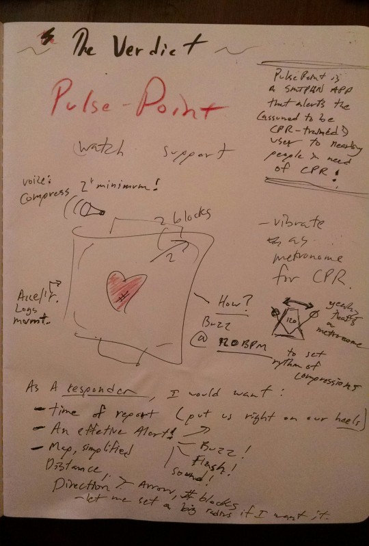
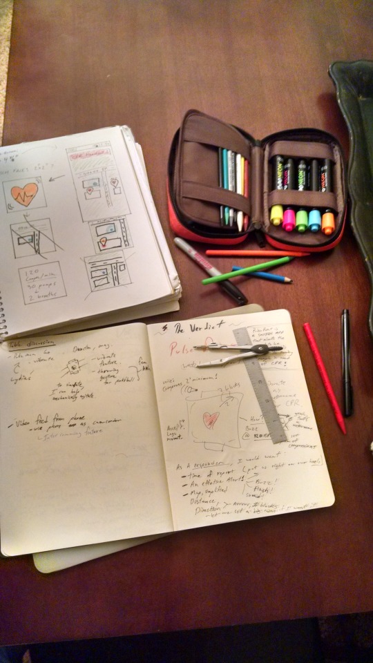
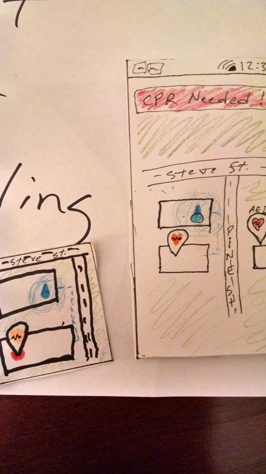
PulseWatch for PulsePoint
Let’s make smartwatches useful.


youtube
youtube
0 notes
Text
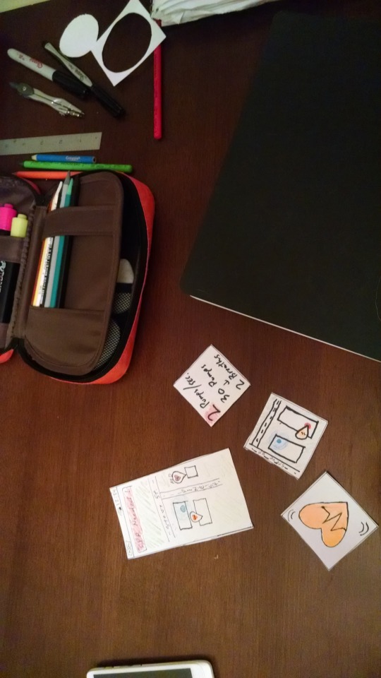
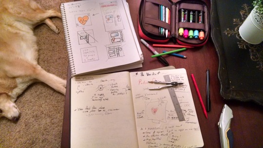
I’m not sure if this is due, so I’ll post this bit for now:



youtube
youtube
1 note
·
View note

