epicrealistyoutube · 6 months ago
Text
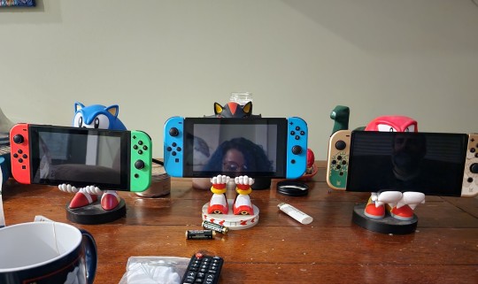
Now this is adorable. 🥰
The side of polyamory they don't want you to know about
Tumblr media
64 notes · View notes
epicrealistyoutube · 6 months ago
Text
No lies spoken.
If polyams had a dollar for every time we heard “I could never do that” after coming out we could all afford the polycule house of our dreams.
381 notes · View notes
epicrealistyoutube · 6 months ago
Text
Reblog if you’re a simblr of color
I’d really like to follow more simblrs like me, making stories with their diverse sims. It just kinda gets tiring seeing white sims, legacies, ect. My dashboard needs more diversity. It doesn’t matter if you post ts2, ts3 or ts4.
4K notes · View notes
epicrealistyoutube · 6 months ago
Text
Tumblr media Tumblr media
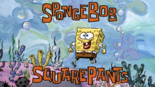
On this day on May 1st, 1999, SpongeBob SquarePants premiered on Nickelodeon as a sneak peek after the 1999 Kids' Choice Awards.
1K notes · View notes
epicrealistyoutube · 1 year ago
Photo
Tumblr media
Ha! Yeeaah, that’s one major perk. 😂 #pronouns #bisexuality #LGBT #music https://www.instagram.com/p/BsVy2LhhqnrVcW50QgzkrVJDGP_8BaygYcsjn00/?utm_source=ig_tumblr_share&igshid=1xug8duojpg35
1 note · View note
epicrealistyoutube · 1 year ago
Text
Tumblr media
My new single is out right now on all music platforms! KaeOnyx: go take a look and support! Thank ya!
0 notes
epicrealistyoutube · 1 year ago
Text
Tumblr media
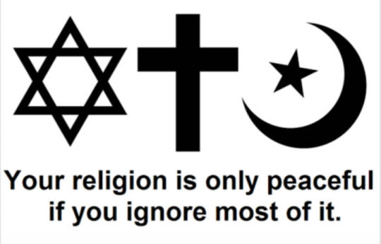
"Your religion is only peaceful if you ignore most of it."
216 notes · View notes
epicrealistyoutube · 1 year ago
Text
I was searching for the meaning of life,  like trying to grasp infinity  with my own hands. Paralyzed by the fear of all that still doesn’t have a name. I thought I was burning up,  but now it’s clear that I’m the flame.
2K notes · View notes
epicrealistyoutube · 1 year ago
Text
Powerful words. 😍
And if someday  the uncertainty of this world  becomes too overwhelming,  I hope you remember  that some mysteries  aren’t meant to be solved,  they’re meant  to be lived.
4K notes · View notes
epicrealistyoutube · 2 years ago
Text
Wow. Such epic truth. 👀
Life is like arriving late for a movie, having to figure out what was going on without bothering everybody with a lot of questions, and then being unexpectedly called away before you find out how it ends.
Joseph Campbell
142 notes · View notes
epicrealistyoutube · 2 years ago
Text
Simple Things Baby Witches Might Miss
I was a baby witch once, and there were tons of small, little things that went over my head until later in my practice. I'm hoping that some of these will ring a bell for those who may need to hear them.
When you're cleansing a room, especially if it's a smoke cleanse, you need to open a window. This gives an 'escape route' for what you're cleansing away and also gives the smoke somewhere to go other than sticking to your walls.
Speaking of smoke cleansing, do not smoke cleanse in a room with pets in it. It can be very, very dangerous to them.
When you're doing research, you should be cross-checking across four to six different sources. If something matches across multiple sources, it's more likely to be solid.
You can incorporate your craft into pretty much anything. Showering? You're washing off the bad energy. Cleaning? You're preparing your space. Gardening? You're encouraging growth and prosperity. And delicious tomatoes!
If you're using a smoke cleanse, you can add the burnt portion to salt to make a beginner's black salt.
Spell jars don't have to go on your altar.
Altars are not completely necessary, especially if you're in the broom closet. Work with what you have.
Every herb has benefits and correspondences. You can utilize these without spell jars, burn spells, etc. Kitchen magic is one of my go-tos - cooking with spices and herbs infuses your food with their benefits.
Ask 'dumb' questions. Reach out to people. If they laugh at you for your questions, you know they are not a reliable source of information. (P.S. - my ask box is always open!)
White wax can replace any other color of wax. Get birthday cake candles for easy, fast burning.
Clear quartz can replace other crystals.
Here's a simple color chart.
Here's a simple moon phase chart.
Here's a simple guide to flowers and their correspondences
Here's a simple guide to cascarilla
As always, do your own research. Take everything you hear with a grain of salt until you do research - yes, even from me, because I make mistakes, too. Blessed be, and good luck, baby witches!
Support your local witch on Ko-Fi or at my store, Hallow Grove!
2K notes · View notes
epicrealistyoutube · 2 years ago
Text
Tumblr media
All that you see
is nothing but a play of light
between the stars and your eyes
continuously revealing
the most precious truth:
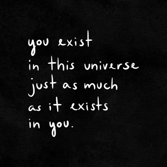
you exist in this universe
just as much as it exists
in you.
5K notes · View notes
epicrealistyoutube · 2 years ago
Photo
Tumblr media
You should feel free to believe any supernatural nonsense you like as long as you keep it away from me.
The only way to protect everyone’s right to a religious belief is to remove religion from all civil functions.
178 notes · View notes
epicrealistyoutube · 2 years ago
Text
Damn. Ouchies. I’m so glad I was not treated this way. Maybe it sort of pays to come out later on in life? 🤷🏾‍♀️☹️ But I didn’t choose that. I didn’t even know I was bi then…
Tumblr media
BI-ERASURE POEM
May 31, 2022 | 2022 Summer - Pop Culture, Poetry
8K notes · View notes
epicrealistyoutube · 3 years ago
Text
Tumblr media Tumblr media
Sending all of you a HUGE GIANT bisexual hug 🫂
84 notes · View notes
epicrealistyoutube · 3 years ago
Text
4 notes · View notes
epicrealistyoutube · 3 years ago
Note
what are your opinions on the different artstyles throughout the seasons?
I'll go through each season!
Season 1 is my favorite in everything. There's no competition. I really adore his design. Tbh his character design changes a bit every episode in this season and I'm not going to go through which storyboard artist's style was in which episode. That's a hassle. But I like the pilot. It looks like Hillenburg's concept art. Looks very gummy and squishy. I like how odd his style looks. But I also like the more consistent style we see in Reef Blower, Valentine's Day, Hooks. It has a thick outline.
Tumblr media
There's another style from season 1 where the outline is very thin. You can generally tell because his eyelashes are drawn very thin. I've seen in some episodes like FUN and ScaredyPants. It's a weird look that I kinda like. Though his toothgap is so wide that it looks like he's missing a tooth.
Season 2 - his design is more angular. The transition from traditional to digital shows. They don't have to constantly redraw each frame. Which allows for a more homogeneous design. I miss how each frame looked different but that's okay. His style is very sharp and square. Similar to the end of season 1. But a lot more stiff. He's more narrow around his waist so he isn't actually Squarepants. More like upside down trapazoidpants. Also idk if this is about early digital animation but Spongebob looks very gray throughout the season. Still I'd rate this my second favorite style because it has the best parts from his season 1 design.
Tumblr media
Season 3 - hes more square here. A lot more yellow. Season 3 has the best colors. Hands down. He's even more square and sharp. Surprisingly his expression doesn't change much. Mostly because of Hillenburg wanting spongebob to always be drawn on model. But the charm of his design is how off model he looks and how every frame looked so unique noooo. Jokes aside, I know this design is what most classics fans consider the best design. It's paired with his personality in this season which was more of a young adult with occasional childish tendencies. He seems the most mature in this season. Seasons 1 and 2 is a lot more kid-ish in a way. Idk why this brings up a random thought of seasons 1-2 SB are how kids think they are vs 10-12 is how adults view kids. I'm getting off topic. This design leads to what we get in season 4.
Tumblr media
1st Movie - very square. Pretty much doesn't have that narrowness towards the bottom like seasons 2/3 has. Now he's not trapazoidpants but actually Squarepants. I've noticed some of Hillenburg's sketches of spongebob post the movie era look pretty much like the movie. That off model, really square shaped look.
Tumblr media
Season 4/5 - this style actually reminds me of the modern style. Very square and spunky. Only difference is he occasionally has black brows. I like it a lot actually. Look at this boi!! He's adorable!! One of the better styles. I'd rank it high up there.
Tumblr media
Season 6 - slight transitional style. Between seasons 4/5 and 7/8. I don't have a particular opinion on it tbh. I guess I don't like what would later become his design for 7/8
Season 7/8/9a - ehhh don't really like it. I have a personal bias tho. I didn't like much of these seasons when I was a kid and I think that childhood bias is clouding my view. But anyways I'm gonna talk about why I don't like it. He's so stiff in these seasons. I feel like his expression doesn't change much. His nose is drawn wider, I don't like that chubby cheeks look he does.
Tumblr media
This one. His arms are drawn so high up. He's very rectangular. His eyes are smaller. I feel so nitpicky but he looks so dead. I feel like my love for the later seasons is kinda reactionary towards these seasons since they feel so opposite to me. So extreme blankness shifts over to extreme expressiveness.
Season 9a actually gets better but it still has remnants of this design.
2nd movie - follows the style of season 9a which was already starting to transition styles to the one we have in the modern era but I will make a pass because this is my comfort movie. Sponge out of water my beloved.
Tumblr media
Season 10/11/12 - love it. Adore it. One of my favorite styles. He's so spunky and definitely a lot more angular. A lot of people complain about the expressiveness. I'm not really talking about it here but uhh I do like it. With digital animation, its a lot rarer to have unique frames. Everything is so on model. It's a bit boring. I understand the expressiveness can be too much for some people but it does remind me of what I found charming about the first season. No frame looks exactly the same. It's so stretchy. It only doesn't have that unique gummy squishy look, reminiscent of Hillenburg's art style in his concept art but none the less I like it. Also something worth mentioning. Sponge looks more shorter throughout the seasons. He's not really drawn shorter but him being more rectangular throughout the previous era and here he's slowly getting more and more square.
I really like this picture. I love his expression so much??
Tumblr media
3rd movie - I heard that storyboard artists from the 1st season worked on this movie. Tbh it shows because a lot of frames looks like those photoshopped CGI version of Sponge's season 1 look. This movie was stunning visually. I like the style a lot. We can see parts of his older design like the narrower nose, more narrow towards the bottom.
Tumblr media
Can't comment on season 13 because it just started, wait for that lateeer
48 notes · View notes