Text
Evaluation of Animations
Overall, I’m pleased with the end result of both animations. The emotion animation I did with the character acting sneaky worked well and I think it does portray that feeling. I feel like I did include some of my research in the final result. I had some of the twelve principles in the animation such as, anticipation as the character holds the leg up in the air before the tiptoes land on the ground. Arc was used for the movement of the legs. Follow through occurred when the character’s body was still moving even though the legs had stopped before the looking around pose. I made the movements exaggerated such the big leg stretch to create a wider stance.
I think I prefer my second animation of the run and jump sequence. This is because I had got the hang of the animation process more and I think it has a smoother flow. This animation was to portray weight in a character. In this animation, I had exaggeration in the jump as it lifted off the ground and the crouched pose when it landed. I also included anticipation before the jump with more movements before the character was in the air and I held the character in the air with longer frames. In this animation I tested out squash and stretch as the character jumped in the air. This didn't work out exactly as I hoped but I think it does add more effect to the overall animation.
As well as, The Illusion of Life: Disney Animation, the books The Animator’s Survival Guide and Cartoon Animation really helped me with this assignment.
I do think there is some room for improvement in my animations like the flow could have been a lot smoother and some poses might not be completely accurate. However, I am happy with the animations I came up with as this was my first time animating a 3D character.
0 notes
Text
Links to the Animations
The Ultimate Walker Sneak Cycle:
Youtube Link - https://www.youtube.com/watch?v=5ZvYlzNLIg4
SyncSketch Link: https://syncsketch.com/sketch/fd9cf92197de/#1549971/1772532
Maya File - https://drive.google.com/file/d/1_jphE6F9a6nfstFAOxTDXdolDP-IuiRd/view?usp=sharing
The Ultimate Walker Run and Jump Cycle:
Youtube Link - https://www.youtube.com/watch?v=ymdTOu-VGBQ
SyncSketch Link: https://syncsketch.com/sketch/fd9cf92197de/#1550133/1772856
Maya File - https://drive.google.com/file/d/1xMxrBJ8rcqKRnCrezeLMCq7YaBOqu6Vg/view?usp=sharing
0 notes
Text
Finished Animations
The Ultimate Walker Sneak Cycle
youtube
The Ultimate Walker Run and Jump Cycle
youtube
0 notes
Text
Run and Jump Cycle - Animation Process
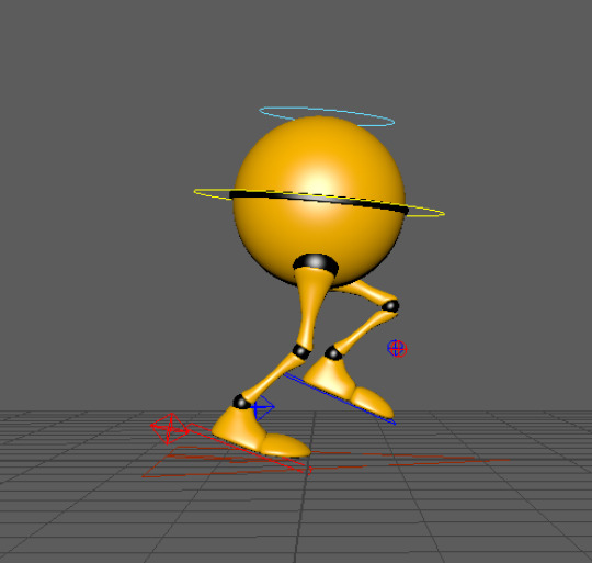
I started off similar to the sneak cycle by raising one of the legs.
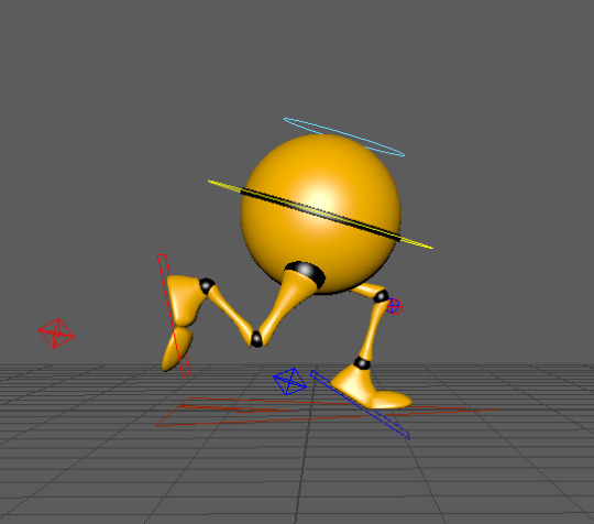
Then, I moved that foot to land on the ground with the toes bent for more realism. The other leg goes back into the air. I also moved the body to be leaning forward to make the running more effective.
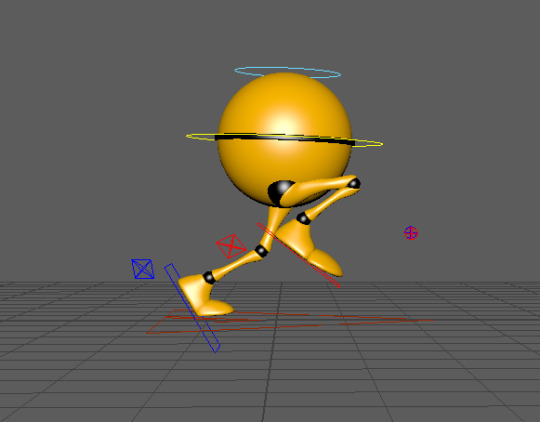
This is now showing the opposite as the front leg is going back and the other leg is now up towards the body.
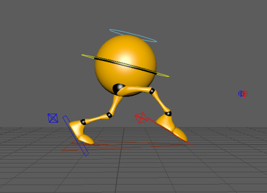
The leg then extends out, like the sneak, but this time it's at a quicker pace.

This is the pose before the leap into the air. One leg is on the ground ready to push the weight of the character into the air.
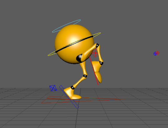
The front leg starting to extend.

More anticipation.
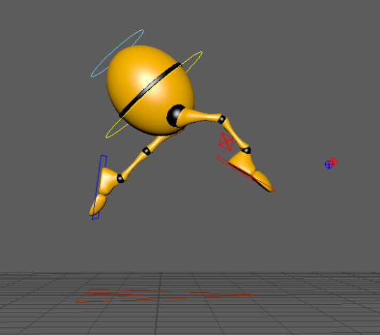
The character is now leaping into the air and I've stretched the body slightly to emphasise this movement.

I’ve now squashed the body to show the weight as the character lands on the ground.
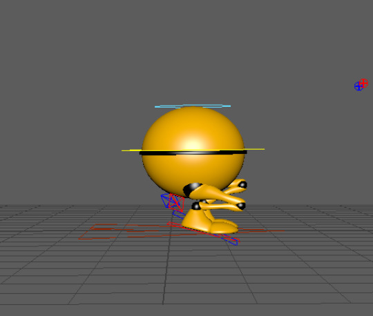
More exaggeration on the low pose to show the character’s body landing. The knees are in different positions so it’s not as symmetrical and the feet both land at different times.
0 notes
Text
Sneak Cycle - Animation Process

For the sneak cycle, I started off by lifting the leg up quite high.
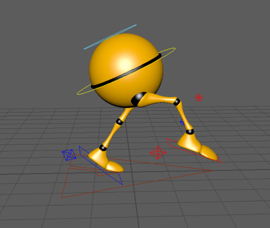
Then moving the other leg backwards to create a wider stance and curling the toes to give a bit of a lift. The toe is moving into a point to show the character is going to land on the tip of the toes to show the sneak.

Next, I lowered the characters body and crouched the legs to make it look like the character is hiding by lowering to the ground.

Adding more exaggeration to the low stance.


Switching to the other leg for the big toe stretch.

Exaggerating the pointed toe.

Switching to a forward position for the sneaky looks.


I rotated the character’s body to show them taking a sneaky look side to side after the tiptoe walk.
0 notes
Text
Sneak Cycle - Storyboard and Animatic
The storyboard helped me plan out what I wanted my animation to look like. I did a rough animatic as well just to see what my idea would look like as a moving image. This was useful to see what worked and what didn't. I was also able to work out some timings with the animatic.


0 notes
Text
Research and References for the Run and Jump Cycle
These reference images are quite useful because they show each position well and will give me a good idea on leg position and timing when I'm animating.


The best references I found for the type of animation I want to make are from The Animator’s Survival Kit. These are really helpful for organising the timing of the animation. Also, they show a good pose for a run going into a jump which is what I want to achieve. I like the exaggeration with the legs in these sketches. When the character goes up the legs are stretched out and then the landing pose shows the legs scrunched down in a very low position.


A video I also found helpful:
youtube
0 notes
Text
Research and References for the Sneak Cycle
I used Youtube and the Internet to find reference images for the sneak cycle to help with storyboarding and thumb-nailing my animation.
REFERENCE IMAGES AND VIDEOS
Also taking a lot of inspiration from The Animator’s Survival Kit.
Most of these references have the same body movements such as high legs and tip toes as well as an exaggerated body moving forward. These are elements I need to consider in my animation.


youtube
youtube
youtube
youtube
0 notes
Text
Deciding Two Emotions/Actions to Animate
When deciding an action to animate, I was quite set on the idea of doing some sort of walking/running. sequence. I thought this would be good to challenge myself because I have never animated a walking sequence before. After doing some research, I decided I didn't want to do just walking, I wanted to add an emotion to the sequence. I found the books Cartoon Animation by Preston Blair and The Animator’s Survival Kit by Richard Williams to be very helpful when choosing my action for the Ultimate Walker character.
I really loved these drawings on page 201 of Cartoon Animation. This helped give me an idea of the types of emotions that can be shown through a walking sequence. The two sequences that stood out the most to me was the strut walk and the sneak walk. I particularly liked these ones because it’s quite easy to tell what sort of emotion they are portraying in the walk.

After doing more research on these two walk cycles, I decided I would try having a go at animating the sneak walk cycle for one of my animations. I chose this one because the sneak has more movement in the legs than the strut walk cycle which would portray more emotion since the Ultimate Walker character doesn't have arms to animate. I also found some really good reference material in The Animator’s Survival Kit for a sneak sequence. I'll definitely find this useful when I am making thumbnails and working out the timing for my animation.


For my second animation I was thinking of doing some kind of jump. I was interested in the idea that the character would do a short run and then leaps up into the air and then lands. Kind of like a gymnast jumping over a beam. I thought this would be a good contrast from the sneak cycle since it’s more fast paced and has a different feeling or emotion to it. Again, I used The Animator’s Survival Kit to give me some ideas on different jumps and I found exactly the reference I was looking for.

0 notes
Text
The Illusion of Life - Acting and Emotions
“In our animation we must show not only the actions or reactions of a character, but we must picture also with the action . . . the feeling of those characters. - Walt Disney
In an art form it is the emotional content that is the difference between technical skill and true art.
When Disney began Snow White, animators were asked to depict more than just happiness and sadness. There were even more emotions they needed to portray, love, jealousy, hate, concern, and fear. The first real example of pure emotion in an entire scene is the dwarfs crying beside Snow White’s bier which was a really big decision to attempt this. They wanted the audience to be involved completely with the dwarfs feelings.


0 notes
Text
Showing Emotion in Animation
Communicating emotions in your character in animation is important because it makes the character look like it’s thinking and has feelings. This helps the audience form a connection with the character and story.
Facial expressions are one of the most effective ways to show emotions. A face can actually make over 10,000 expressions mainly using eyes, eyebrows, eyelids and mouth.


Body language is another form of portraying emotion in a character. Creating gestures using hands, arms, shoulders, legs, torso and head can further exaggerate the emotion the character is feeling at that time.

LINE OF ACTION
Using a clear line of action for your character pose to follow will help create a more expressive pose. This will make the pose feel more realistic and will flow better compared to a straight line which will feel a lot more stiff and rigid.
STAGING
This is one of the 12 principles, by changing the type of shot, position and size of the character in a scene it will affect the audiences perception of the character. For example, The position of a character at the bottom of the scene can make it feel powerless, placing at the top of a scene can show authority.
(https://www.animationguides.com/character-emotions-animation/)
Video on emotion in animation I found helpful:
https://www.youtube.com/watch?v=RHaJ5B2lRUU
0 notes
Text
Inspirational Animators
ALEXANDER UNGER
Alexander Unger is a Swedish sculptor and stop motion animator.
“The feeling of creating something from scratch with my own two hands and seeing it come to life is something that I will never get tired of.”
I discovered Alexander (Guldies) on Instagram and instantly fell in love with his animations. He mainly uses plain backgrounds or a few simple props and then his characters are the main focus. He uses clay to make things such as faces, hands and shapes that then turn into other objects by either falling and hitting the ground or melting/merging into something else. I think these short stories are very unique and it combines the artists love for sculpting and animation. One of my favourite things about Alexander’s work is the sound effects he uses. He is able to make the clay sound like it is made from liquid, glass and ceramic which is really effective for his type of work. I enjoy watching his stop motion process and how he creates such fluidity in animations.
Links to the animators work:
Youtube - https://www.youtube.com/channel/UCHjVCR-fV_X789MsE7GRFqQ
Instagram - https://www.instagram.com/guldies/?hl=en


CHUCK JONES
Chuck Jones was an American filmmaker and cartoonist who was best known for his work in Warner Bros. In his career of more than 60 years, Jones made over 300 animated film and winning 4 Oscars. Jones was one of the animators that helped bring life to many amazing characters we know and love such as, Bugs Bunny, Daffy Duck and Porky Pig.
Bugs Bunny and Tom and Jerry were one of the first cartoons I ever watched and I remember loving and connecting with the characters. I love how Jones was able to make audiences emotionally bond with these characters through the years of stories. The animations are so engaging because of the funny side to the stories and the characters. 2D cartoon animation style is one of my favourites and one which really captures the 12 principles. I like the exaggeration of the characters actions and squash and stretch is used really well to show the characters emotions.


JOHN LASSETER
I was watching a documentary on Disney+ called The Pixar Story and this is how I discovered John Lasseter. He is an American animator, film director, screenwriter, producer, voice actor and former chief creative officer of Walt Disney Animation Studios, Pixar and Disneytoon Studios.
Pixar movies are definitely some of my favourite movies ever so when I came across this documentary I had to watch it. I’m really intrigued by 3D animation and the process behind it. I found John Lasseter to be a very inspirational person. I enjoyed finding out about his journey as an animator and how far he has come. Lasseter graduated university in 1979 and was taken on as an animator at Disney. However, in 1983 he was shown CGI footage in Iron and wanted to bring that into Disney animation and he was sacked. Then he signed a contract with Lucasfilm which was then renamed as Pixar when Steve Jobs invested $10 million into the company. Lasseter came up with the desk lamp coming to life short animation which then went on to become an iconic part of Pixar. Lasseter also came up with the story for Toy Story as his first 3D animated feature film. Toy Story was the first ever CGI animated movie to come from Disney and Pixar’s partnership. Toy Story went on to win awards and became one of the most popular Disney and Pixar movies to date. I think it is one of their best films.
John Lasseter is definitely one of the most inspiring animators as his career journey wasn't easy. He has made animation history with CGI. He is able to make really lovable characters and amazing stories come to life with 3D animation.


0 notes
Text
Styles/Techniques of Animation
ROTOSCOPING
Rotoscoping is when an animator manually alters film footage one frame at a time. This technique was created by animator Max Fleischer in 1915 to make animated characters look and move more realistically. This was mainly used in live action movies at the start then projecting the film onto a glass panel so the animator could draw the action in every frame. Disney also used this method in the 1930s for some of their early movies such as Cinderella and Snow White and the Seven Dwarfs.
This process has changed in more recent years, being replaced by computers and the visual effects industry. This means images are able to be manipulated by removing unseemly wires, putting characters in different settings or making light effects.

https://www.intofilm.org/films/filmlist/87
LIMITED ANIMATION
Limited animation is a technique of reusing animated frames, mirroring images and only drawing new frames when necessary. This limits the work and saves time which also would reduce the budget for the animation. These types of animations usually run on 4-12 or 8-12 frames per second.

Limited Animation: (Cartoon Animation - Preston Blair)
“Limited animation is baed on dividing a character into as many as four cel levels and a dialogue system.”

FULL ANIMATION
This is when animators use very detailed characters and designs to create a very high quality animated film. These types of animation will need many drawings to get the smooth and realistic effect desired.
PLANNED ANIMATION
Planned animation is the combining of animation methods and planning the reuse of artwork for a lot of different scenes. Animators would use full animation for crucial scenes of the story and use limited animation in dialogue with bits of full animation for important movements.
0 notes
Text
Achieving Weight in Animation
Weight is registered in animation by:
1. The visual struggle to move weight.
2. The visual effects of stopping weight.
3. The timing caused by immobility and gravity.
4. Chain balance due to types of sag.
Light Weight is registered by:
1. The spring up with no resistance.
2. The elimination of recoil processes.
3. Timing caused by mobility and float.
4. No sag, stress, strain or squash.

The off-centre balance is caused by one-sided weight.

The chain balance is exaggerated in a figure action caused by high sag, such as with heavy giants and animals.

Strain is created when moving heavy bodies or weights.
Stress is made when pulled and pushed anatomy shows weight.

Timing of a characters action has a lot to do with the weight.

(Cartoon Animation - Preston Blair)
A few video links I found useful to do with weight in animation:
https://www.youtube.com/watch?v=svI3JMYvgQg
https://www.youtube.com/watch?v=HqeDjvqx-B4
0 notes
Text
The 12 Principles of Animation
Animators Ollie Johnston and Frank Thomas introduced Disney’s twelve basic principles of animation in their book The Illusion of Life: Disney Animation in 1981. They based the principles on Disney animators journey to create more realistic animations and the movement of characters.
The twelve principles outlined in The Illusion of Life:

1. SQUASH AND STRETCH
This was the best and most important element Disney discovered. “When a fixed shape is moved about on the paper from one drawing to the next, there is a marked rigidity that is emphasised by the movement.” The squashed pose either looks like it’s been flattened by pressure or bunched up and pushed together. Whereas, the stretched position always made the form look very extended or pulled apart. Squash and stretch really changed the game for animators because it helped with portraying emotions in characters and exaggerated the positions and actions. This made characters come to life instead of being stiff and rigid.

2. ANTICIPATION
The audience watching an animated scene needs to be prepared for the next movement and expect what's going to happen next. This is where anticipation comes in which allows the audience to have time to anticipate the next movement. Anticipation can either be a small change of expression or a bigger physical action.

3. STAGING
Staging is the “presentation of any idea so that it is completely and unmistakably clear.” If something is staged it means it is meant to affect the audience in some way such as a change of mood to the storyline. Each scene, frame, action, expression must contribute to making the point of the story.

4. STRAIGHT AHEAD ACTION AND POSE TO POSE
Straight ahead action means the animator “works straight ahead from his first drawing in the scene.” He dives straight in, doing one drawing after the other, thinking of new ideas as he goes along, until he finishes the scene. The process is very creative which gives the drawings and actions a fresh look.
Pose to pose is where the animator plans their actions, figures out which drawings are needed to animate the business. makes the drawings and gives the scene to an assistant to draw the in-betweens. This scene is easier to follow because it has been well thought out and considered before the animator gets stuck into the drawings.
5. FOLLOW THROUGH AND OVERLAPPING ACTION
Walt Disney wanted to fix the problem of a character entering a scene and reaching the spot for his next action and coming to a complete stop. This didn't look natural and was very stiff. This is where Overlapping Action and Follow Through came into place. “You hit the pose, the drift on beyond to an even stronger pose - everything goes further.” Cheeks go up, ears fly out, goes on his toes etc, but really he is still in his pose. Follow Through can now help give dimension on the fleshy parts to give the feeling of weight and reality. This all adds up to more life to characters and the scene.
6. SLOW IN AND SLOW OUT
Once an animator had worked on his poses and redrawn them to the best he could, he wanted the audience to see them. Animators would time the key drawings to move quickly from one to the next, so that the main footage of the scene would be on or close to the extremes. This meant the character zipped from one attitude to the next - Slow In and Slow Out. Walt’s team continued to analyse how the body worked to keep making the realism in their animations better and better.
7. ARCS
Most movements will describe some kind of arc shape. This discovery made a massive change in the type of movements animators designed for their characters. In a walk sequence, characters were very mechanical popping up and down, but now they are arced in their steps. As this principle was looked at more, scenes were plotted with charts, dots and rough poses to determine the height of a character in any action.
8. SECONDARY ACTION
A secondary action is when extra movements support the main action and is kept subordinate to the primary action. For example, someone stunned shakes his head when getting back up on his feet, or a sad character wipes away a tear as he turns away.

9. TIMING
The number of drawings used in any move determines how long that action will take in a scene. If drawings are simple and expressive, the point of the story can be put over quickly. This proved more complicated when incorporating Secondary Actions and Overlapping Movements which showed how important correct timing was and the constant need for more study.
10. EXAGGERATION
When Walt asked for realism, he wanted caricature of realism. He wanted expressions and scenes to be more convincing, that made a bigger contact with people. If a character was sad, make him sadder. Exaggeration can add more emotion to a scene such as humour or sadness because it is emphasised more to the audience. It also makes characters more life like and relatable which can allow the audience to connect with a story better.

11. SOLID DRAWING
Older animators found it hard to keep up with the demands of the new type of animation. “You should learn to draw as well as possible before starting to animate.” Grim Natwick. “You’ll have to draw the character in all positions and from every angle.” Signs were hung in the Disney studios for young trainees to see them, one of the best said: “Does your drawing have weight, depth and balance?”
12. APPEAL
To Disney, the word appeal meant “anything that a person likes to see, a quality of charm, pleasing design, simplicity, communication and magnetism.” You can be drawn to a figure that has appeal to you such as, a powerful villainess even though chilling and dramatic. A weak drawing or a drawing too complicated lacks appeal. An audience enjoys watching something that appeals to them, whether an expression, a character or a whole story.
0 notes


