A blog about the photography class I am taking with insights on the class as well as my observations and inspirations from other artisits photographs.
Don't wanna be here? Send us removal request.
Text
12/3/19
This is the last week of class. This week, we looked at our photos and I edited a bunch of the ones I took. I printed about 11 images, but now I just have to figure out which ones go and work together in a story.
0 notes
Text
11/26/19
This week I am going to Coney Island to get images of the island during its off season.

This image from Mark Havens collection inspired me to go to Coney Island. I like the idea of a summer place during the off season. Coney Island seems very haunting and lonely during the off season.
0 notes
Text
11/12/19
This was our last week shooting in the studio before we start our final project. So far, I think that this has been the most difficult assignment. It is hard finding time to go to the studio. I was kicked out multiple times because there were classes going on when I was in there. This made it difficult to get the shots I wanted because I was rushed and had to hurry up.
0 notes
Text
11/5/19
This week we continued our studio work. I began to use a lot more mirrors and try to make illusions with it. I also started to use different colored gels for the light.
0 notes
Text
10/29/19
This week we were continuing to work on our constructed images. This is still a difficult process. You have to find good times to use the studio that work with your schedule and the schools schedule which can be tough. A big part of this assignment I feel is being creative. I feel like we really have to think outside the box and try and use ordinary objects to make a set of something that is not so ordinary. It gives an interesting perspective. I like how the creations we make sort of mess with the mind a little bit. I am a big fan of the mirrors and creating reflections. I feel like the mirrors really add to the photo.
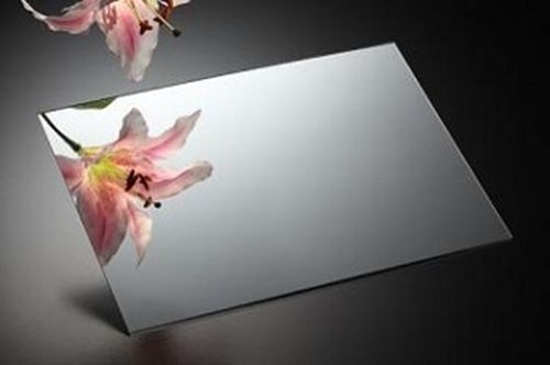

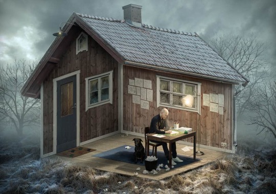
This is an optical illusion image by Erik Johansson. These images are cool because they play with the mind and confuse the viewer. I am trying to go for something like this with the work I am creating in the studio.
0 notes
Text
10/22/19
This week we have started a new assignment. With this assignment we are doing constructed images work and taking photos of our creations. We’re learning to work with different lighting and using different objects such as mirrors and plexi glass for different kinds of effects. This project is the most difficult so far because it requires using the studio and being creative. We had to learn how to use the new equipment and how to create sets using various supplies. It’s fun trying out different things, but difficult figuring out camera angles and lighting. The week before we had critiques on our portrait images and yes critiques are helpful, but sometimes I disagree with the critiques I get. One of my portraits was of my friends girlfriend who goes to art school in New York and designs her own clothes, she does a lot of stuff with her hands and sometimes uses the sewing machine so that’s why I had the sewing machine in the corner of the image. There was also a painting behind her that people said was distracting, but i thought added to the photo because it was the Chicago World Fair in the painting and she is from Chicago a place she misses often because she doesn’t get to go home that often as she is in school in New York and her boyfriend is in New York. I guess photos should be simpler and not that complex, I just felt it added to the photo and her story. There were though a few silly mistakes with lighting I had which is important to be pointed out and maybe I should have chosen some different photos. Overall, I know maybe things can make a picture more distracting, but I love candids and natural pictures. This is personal and can vary for everyone I guess, but I just don’t like messing around with things when taking a photo because then it just does not feel authentic to me. When I take a photo I want it to capture a moment, no changes, and all natural.

This is a photograph taken by Kyle Thompson. It is a constructed image because it shows perception with small boats and a normal sized boy or normal sized boats with a large boy.
0 notes
Text
10/15/19
This week was our final week taking portrait photographs. A lot of my photos I wanted to re shoot because I had more ideas for them. I took a lot of photos of a lot of different people, but ended up not wanting to choose a lot of them. It’s tough trying to get your idea into a perfect image.

This is a photograph taken by Diane Arbus. This image is simplistic but can still tell a story. I think it works because it tells the girls mood, that she might have come just from school and she is in her own home.

This is a photo taken by Kenneth Willardt.


This is a portrait image taken by Lee Jeffries. I like the close upness of it and how the man is so interesting because of all his facial hair he has. He is an interesting subject to shoot.
0 notes
Text
10/8/19
This week we were still continuing photographing people. An important factor to photographing people is to be able to tell a story. You want a background that gives clues about the person being photographed, but not too busy that it takes away from the person. I think I did a good job at capturing a story of someone, especially my stranger picture. I love how the picture was taken in the moment and there was no time to really stage anything. I have so many ideas of photos I want to take, I just hope they turn out how I imagine.
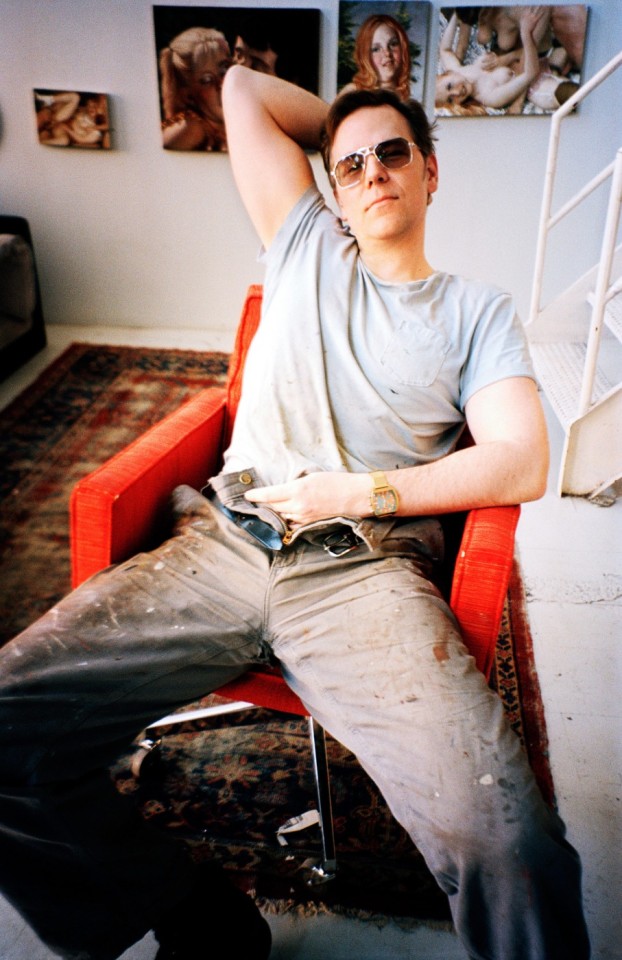
This is a photograph of John Currin taken by Mario Testino. I like this photo because you can tell there is a story with this photograph. You can tell he is an artist. There are photographs/paintings in the background and his pants are covered in paint. The way he is posing also tells a story about him. His pants are unzipped and he is leaning back with sunglasses on inside.

This is a photograph taken by Steve McCurry of a little boy in Afghanistan. I think that this image is really powerful. You can really connect with the boy in this image just by looking into his eyes.

This is a photograph by Eric Lafforgue of two girls/women carrying jars of milk on their head in Ethiopia. This image really tells a story and provides information of the culture.

This is a photograph taken by Lisa Kristine. It shows culture. It is an image of a man with an elephant. It is called These Trunks and is in Thailand.

This is a photograph by Joe Mcnally. This image shows a woman leaning against a mural. Though the mural can be a little distracting, this picture tells a story that she painted it, as she has paint all over her.

This is an image taken by Brian Ingram. I like how this photo is simple, but shows this mans work space and therefore tells a story.
1 note
·
View note
Text
10/1/19
This week we continued doing portrait photographs. You can take photos close up or far apart. A lot of portraits is the expression and someone’s face. I like the natural smiling images although it’s tough for them to tell a story which is what I’m trying to work on is taking images that tell a story.
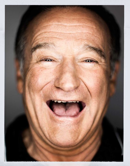
This is a photograph taken by Mark Mann of Robin Williams. I like this photo because it really captures Robin Williams, who was always laughing and making people laugh.

This is another image taken by Mark Mann. This is a photograph of Obama. Mark Mann is famous and known for taking photographs of celebrities.
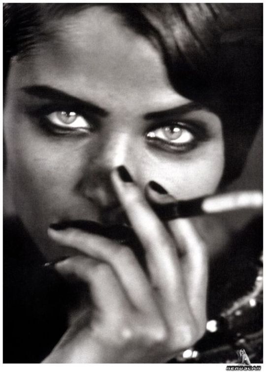
This is a photograph taken by Peter Lindbergh in 1991 of Helena Christensen. There is some depth of field in this image as her hands are blurry, but her face and eyes are more in focus.

This is another Peter Lindbergh photograph that was used for Vogue Italia. This is another example of depth of field being used. In this image, the young boy is the focus, but there is a hand in front of him that is out of focus.
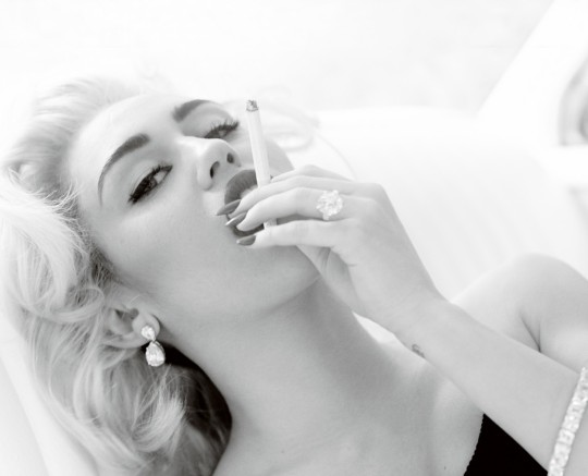
This is a photograph I love. It is taken by Mario Testino of Miley Cyrus. It is used for Vogue in 2013 and is in black and white. I think the black and white really adds to this photo because it makes it look old and it’s giving me Marilyn Monroe vibes.
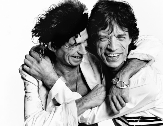
This is another photograph by Mario Testino. This image is of Keith Richards and Mick Jagger for British Vogue in 2003. This image is also in black and white which I think makes this photograph very nice.
0 notes
Text
9/24/19
This week we started taking portrait photographs. This means we had to take pictures of people, but to make the photos interesting, the pictures have to tell a story about that person. It is tough capturing people in their element and figuring out what exactly you want the photo to look like. I don’t really like when my photos are staged, but in this case it’s hard to get them not staged. Finding people is pretty easy though especially people I know.
We recently had critiques from our first assignment. I think the feedback I received was pretty good. I will definitely use the advice going forward. I learned that the photographs print very different than how they look on the computer screen so to be cautious of that.

This is an image of John Lennon adn his wife Yoko Ono.

This is a photograph taken by Holly Rose.

This photograph is taken by Mario Testino and shows a very close up of Jake Gyllenhaal in 2004. This image makes it hard to tell who the person is, but jsut shows pure emotion of happiness and that seems to be the focus of this portrait.

This is another photograph by Mario Testino and it is of Blake Lively. I like the set up, the clothing, and the way she is posing.
0 notes
Text
9/17/19
This past week we have worked on finishing up our photos deciding which ones used rule of thirds, which were symmetrical, and which showed leading lines. I had to retake a few photos, but I think i figured out which rule was which. We also have to think what photos would look nice in black and white.
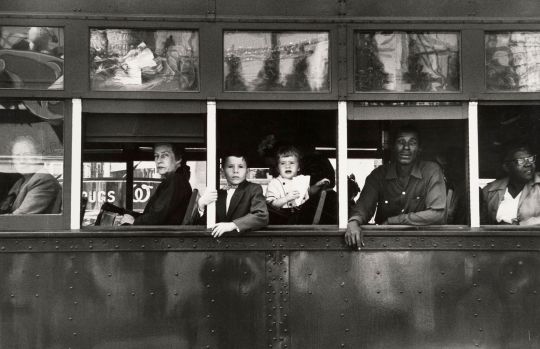
This is a black and white photo taken by Robert Frank.

This is another image by Robert Frank that I really like because the photo captures the time of a Detroit drive in movie theater in 1955.

This is a photograph by Eliot Porter part of a portfolio titled “There is my own spirit”.

This image is by Imogen Cunningham at a restaurant in Chartres in 1961.

This is another image taken by Imogen Cunningham taken under the Queensboro bridge in 1934.

This is one more image by Imogen Cunningham that shows a New York City summer day in 1956. I like how a lot of these images can really depict the times based on the cars, what the people are wearing, and all the other various trends of that time period.
0 notes
Text
9/10/19
This past week I have had to take more photos using composition for assignment one. I’ve gotten better at using aperture and the shutter speed learning how to play with them more changing the way an image looks.

This is a photograph by Annie Leibovitz titled Pat Benatar, St. Petersburg, Florida , 1981. This image shows the rule of thirds as the woman in the photograph is off to the side.

This photograph is by Gregory Crewdson titled Production Still B, 2005 , 2005. It shows framing as the people in the image are standing behind the doorway.

This photography is one by Elliot Erwitt that shows the effects with light. It is interesting to see the shadows of figures as the image focuses more on the background.

This is a photograph by Richard Avedon. This photograph is titled Suzy Parker and Gardner McKay, Dress by Balmain, Café des Beaux-Arts, Paris, 1956, 2001. I like this photo a lot. It shows depth of field because the background is blurred so the eye is drawn to the couple.

This is another photograph by Richard Avedon that also shows depth of field. This photo is titled Times Square, New York City, November 22, 1963, ca. 1963–printed: 2002. I like this photograph because although the people make it seem busy, the effect of the blue really makes the woman and her newspaper stand out.

This photograph was taken by Vivian Maier. I like how there are similarities on both half of the image as if they are symmetrical, but they are still different. This image has a very interesting idea.
0 notes
Text
9/3/19
From this past week, I have had a few struggles. It is my first time using a digital camera like this so I am still learning. A lot of the time it was hard to get the aperture just right, but eventually I figured it out. I’ve definitely learned about how the time of day you shoot can affect your photo. When taking one of my photos for composition, I really liked the photo, but there were shadows being cast from the trees because of the sun. I think there’s still a lot I need to work on, but I’ve found a lot of inspiring things to take photos of, especially on my walk home.
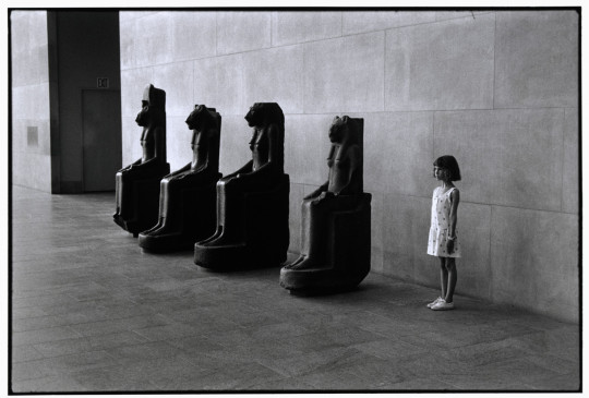
This photograph above was taken by Elliot Erwitt and was in the Metropolitan Museum of Art. I like this photo a lot because of it’s creativeness. The photograph is called “The Art of Looking at Art”. I think there is good composition and the photo is really interesting to look at.

This is a photograph taken by Dennis Stock in Hawaii. This photograph shows the rule of thirds as the eye looks at the tree a little off centered. I like this photo a lot because it is very mysterious and gets you thinking.

This is a photography by Paolo Pellegrin. The photograph has great contrast/exposure features. The photograph is of mountains in Italy. I really like this image because of the lighting and how interesting it makes the photograph look.

This is a photograph by Benjamin Matthijs. This photograph clearly plays with the shutter speed and creates a blurred background. I like this image a lot because the focus of the photo is really on the taxi and it looks like it is going really fast which can also describe New York City which is a very fast pace place.

This photograph is by Ansel Adams and shows the snow in the trees. I like this photo because of the snow in it and the contrast of the white snow and the dark brown trees. I think the snow on the branches looks really cool.

This is a photograph in the MoMA by Harry Shunk and Janos Kender. I like this image because it shows framing, but in a very interesting way. I like the concept of hands being used to frame the boat, making the boat where the eyes are drawn.
2 notes
·
View notes