
Don't wanna be here? Send us removal request.
Statistics
We looked inside some of the posts by emmadun and here's what we found interesting.
Average Info
Notes Per Post
0
Likes Per Post
0
Reblog Per Post
0
Reply Per Post
0
Time Between Posts
1 day ago
Number of Posts By Type
Text
17
Last Seen Tumblr Blogs


Fun Fact
In 2020, 27% of US Tumblr users had an annual household income of over $100,000.
Text
reflection of course is on stetch fab but heres a little extra. I enjoyed the manual elements and went well with doing the technical texturing. this course has been wonderful really well teaching as it went through demonstrations and plently tasks. nothing was too overwhelming until i was lost. I would have liked to do it more longer with the lighting and higlights and more light browns on the tail ball dollop of chocolate as the inner dent on tail was more lighter which shouldnt of been. the lollies on the cake could have been smudged or look joined within the cake itself. some parts like the chocolate ears are wonky with lighting and messy. The techniques ive learnt feels all brand new better learnt than last time as last time all i remeber was painting like photoshop not taking the aspects of substance painter. This class has been a breath of fresh air. i would of worked more with my textures not looking so matte like last time i went too matte at parts. i might of wanted to try a different teture rather than sticking with chocolate and the lollies themselves. but simplicity is key


0 notes
Text
26TH 6
working on the icing today wondering wether i should have icing falling down chest. or not the lecturer suggested that there could be a collar it was tried short around a thin band. however the bigger one was nice two i think i will paint it chocolate and the gloves. as i thought the gloves would be white which wouldnt make sense it definetly being chocolate made the ears and collar more stable.


1 is for brush and 2 is for eraser on photoshop its e and b. new tip f3 doe the uv f2 goes back to main character view


the feedback was good i got asked maybe a detail or lolly in the eyes. the swirly lolly was too much so imma stick with the chocolate ball tail. worked on the chocolate hands pretty eay layered the shades but went down in size then made the obvious lighlight colourstriping along the gloves highest points. the lolly and the little spintop lollies ontop would be too much. 3rd image ddisplays thatits too much and is so off the theme and tone randomising it. the drops of chocolate on the chocolate is nice but probably wouldnt fix it.
0 notes
Text
25th/6 finished off the lollies the white and pink lollies i started getting the hang of a easy way of painting the white lollies were to have the base colour as lighter grey than white. then scratched and dotted white on. the pink was easy as i did small pink lines and bigger deep pink sourroundings of the bumps. the texture is a bit spotchy and distracting. in future we will fix up the loads of textures by the lollies and the dotty lollie cake.
Going into my good piece. Imitating the war head texture i practiced on photshop doing the shine should be paced on the edges i had done white bit then over drew it with pinkish white so i fixed that.


chocolate is fun as you slap the colours on and then use smudge blend tool and either go in circles for buttons or around the ear. changed the ear chocolate drooping to sihloette the ears etc
the 3rd pciture represents smudged chocolate on one side. and i added a chocolate bar join effect on the left ear will see what need to do tommorow for reflection.
0 notes
Text
24th/6


today i asked about the lolly cake texture to implement everywhere we grabbed a image from google using the large image from tools near search bar. then we saved the image screengrabed it brought into photoshop inlarged the item then used clone stamp tool to bring only the cake texture part hiding lollies. croped and copied and pasted the img as it would of calculated the rest of img. copied and pasted layer then tiled it using filter other offset. 512 by 512. used clone tool to fix edges of squares. then to create that more paintily feel to the realistic texture in filter we stylize then oil paint.repeat that to bring it up more as shown in (2nd img)


full opacity of the shading. reflection i thought id have to paint a square of lollie cake texture on photoshop over an image. then tile it. but this was a cheat way right now there is too much textures which make the colours harder already like the blues and white some are blended well the top yellow and white and pink. will blend the others still. reflection of day the texture at back of lollie cake saved me as the lollies took all day to do as a texture themselves the lecturer said just do all of them so i am however they are slowly getting worse.
0 notes
Text
19/6
swirl practice and symetry


the 2nd picture was me trying to do stripes across ball and it did that type swirl. would rather go by the radial symetry. if thats too hard the lecturer just suggested a swirl on top and simple line curve.
after lunch colour picked the darkest undercolour of the lollie cake on purref chose that as fill layer. Working on the base tones and shadows once we added a fill layer and added filter then baked lighting stylized on it that way in base tone we can atleast see from front on where the arches of body etc is there.
working on under tones for shadows having it on low opacity so that we can be suttle not splotchy if at 100%.

mappig out the base colours now per layer lollie base layer then there will bea layer for spongieness and texture . lecturer showed me the way we can portray light and shadow even more. the other layers are just like photoshop adding layers to implement different things or areas. reflection for the day. last year i was not good at layer organization as the layers classed and ended up rubbing away some of my most valued pieces on it. good next week i will do more on the base colours in the morning
0 notes
Text
19/6
Working with the texture concepts for the model such as the marshmello texture, puff lollies and up close or mimicing lollie cake texture. Now this reminds me slightly of my sponges did last year with the puff lollies cut up. but this time there is more brighter orange patches to the lollie cake and more flat no deep hole. i have to now focus on the main colours pallet which i hadnt focused on last year other than the metal on the brush rims.

went over the mirror symetry swirl (2nd icon one on top left) effect turning on radial symetry and mirror y aligning it from dragging the point on y to get where want thats one way or using the twirl effect on photoshop by drawing lines across the screen then using tool. then we can drag and drop the image into the position on substance


reflectionish. lecturer suggested thered be chocolate falling down as it is on the ears of the fox i like the white coconut flakes for the tail.
0 notes
Text
18/6
after lunch the teacher said looking at the fox merging with the lollie cake is to distracting and not visualy understanding so itd be hard to do a realistic fox face. and theres to many colours all on the one so i will get rid of the rainbow straps there. chocolate button for the nose would be nice and the tail i will still stick with as i want that as the pop wow feature. he suggested the white areas of the fox like the cheaks will be the frosting coconut on lollie cake.


the character is now a lollie cake fox its more made up and fantasythe thing im struggling with is pin pointing and designing the different areas like the cuffs and the blending to the face might be whole different material or lollie or just be blended. the warheads wrapers around the leg was a good random idea as i thought it would go with the big red and white lollie on the foxes tail. reflection on second try. the leturer loved this concept better the little white cuff frostings are nice and he tried pink marshmello ears but it became more mouse like so kept the white frosting. the feet will be black but the hands could stay white and just marshmellow right now its time to reference images to then implementing tommorows work.i told the reason as i wanted a plastic package so ima keep the warheads pack for the leg bands. i wanted to have a plastic lolly wrap around it and the red made sense so its not all lovely pastle colours at the frount then the one random strike for the lolly. understood the nose was a chocolate button straight away. he added the lighter white shine on the eyes as chocolate buttons too i think the materials will be quite good i will need to get the right lighting or reflection light for the tail lollie and the plastic warhead packaging i can work with different tone or shadow colour
0 notes
Text
18/6
today working on the character designing The fitness fox would be easier than the lollie fox
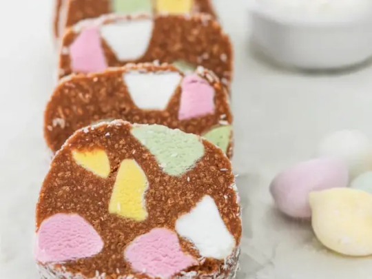
the lecturer said that it doesnt just have to be a bunch of lollies it can be buiscuit or etc. I was thinking about jelly and we talked about it serched jelly stylized texture as whipped cream is difficult and too much white it would be really hard to implement around the sides such as jelly. then i searched lollies and buiscuits variation and there was lollie cake which is so nice as it could be blended with the fur as its same colour as body of fox (img)


this looks cool and fun where as the plastic wrap packagings on the angle bands would be difficult and i would need to think of the colours better as rainbow is quite the theme. the lollie on his tail is the main attraction i need to get the swirl or the lines right atleast they going downward now. the rainbow bands on wrist is still a goto but is too distracting with the lollie cakes light pastel lollies would need to change the colour.


rather the other one had the odd pastle tone and looked off from the original rainbow stips everyone knows and love. it was also that the orange was closest to the fur so it clashed tried a jelly like tummy blue
0 notes
Text


wouldnt put the scarf on the second character initating lollies are hard the first one i took inspiration from a fox top shes a fitness star with nickers ankle jewerly took inspo off board and arm bands and a made up necklace might ask for lecturer to reshape muzzle so i can do fox snout. i would have much more fun doing the sports fox. doing something with the natural curve on the neck i thought a scarf could work but it wouldnt so i might ditch that idea. lollie tail using the classic christmas mint ball and the spin top gum drops for the spikes the lecturer fixed up the nose and the spikes so they could be the drops. and if they were to be the other sports fox could have those wreckball with spikes tail. doing the spheres we learnt in class could be good for the ball shade l. The lollie would have a shine to it do stripes downwards not sideways so i can have a spiral ontop as a lolliepop. Dont have so many clashing random colours
0 notes
Text
17/6
Sort the model out of the few given then think of the lighting what angle it will come from and are the textures enough or too clashy. think of how much work there is for me and the finish line. Plan. I sing purereff we are able to make a board nomatter the size and reshape by keeping images in height or width the same. this is good for notebooking on moodboard


this is the model i like as i work with foxes in projects alot so i was thinking fox the fur is a new aspecct i havent challenged yet. the bands were the first thing that sprang to mind as in sweat gym bands and i thought on the other side could be a bracelete then this got confusing. since the little tail spikes i thought of spintop lollies and the top 2 on right lollies. then thinking into the teacher suggested that it wouldnt be a character that has many aspects like a gym person and a lollie man and a astronuaght. My last model was too busy. the lollie straps for the arm bands would be perfect.
0 notes
Text
12/6/24
if the whole object is adding the one texture when dragged and droped. click the add black mask from library where texture is then click polygon fill on left icons.
after making black mask beside texture in layers if the tiling or woodgrain is on the wrong angle for a few you duplicate layer then clear mask then click the tile want to rotate then rotate it. the clear mask unselcts all the white selected in blackmask.


Left is the community assets Right is the polygon fill options we select, to only get the eg roof selected or a face want and transfer to that texture (click fill each face) remembering x is to get rid of areas textured already filled. I didnt want to put my personal account in community substance.


on right (img) the 4 white dots on top layer show they have been selected and are ready to rotoate. for me i practiced the rotating by using the wood that was rotated wrong. wondered why height wasnt working when it was on base colour so hadn't shown the 3d effect or realistic.


did the engraving on metal on house roof for fun. didnt practice any recolouring of metal or any texture.
0 notes
Text
when you want to bring in your new models down load click file new not file open as that wants to find the substance files. doing a cow practice using height and the steps on fill and used layers that overlay stamps. lecturer showed me that with black mask you can reveal the underlayer if make blackmask overtop if get stuck it had a filter in colour so change and exit out and x is for minus and x again is colour in
0 notes
Text
To do this toad we wanted to create that scratchy highlight edges on the toad. we created a fill layer added a black mask added a metal edge wear. then made a folder added it in folder and pasted on a edge rust smart material texture. then added a blur slope which helps it show that more paintily. you can slightly see that more shine defined edge


this is good to know as it can be changed with colour.
just to start off i want to put textures in you can have a base layer with colour then add fill layer add black mask then add fill and drag and drop textures into the black mask

started stone texturlizing by layers and not hand painted got lost behind. alot to implement on the stone texturlising love the screen visual comunication while talking through. getting our heads around the ideas into designing and solutions to futhur work. to get curvacher to create generator the click curvacher which creates the shine near the lips and edges of the frog

this was good task as we were almost just working with amounts of colours via layer and we could bring afew new things in like curvacher cells 4 and aambient oclusion. for me this excercise showed me it is easy once you understand why the things are on each fill layer creat (remember to use the steps after jade frog img) reflection i could follow along as the starting steps were in my head first. the main 3 greento yellow are cool like anything that gathers ontop of something that is good to know.
0 notes
Text
11TH june tue
playing with meetmap diy colour toning ad fill layer then have colour as the a main tool. What was cool is you can create a smart material from the whole steps created when grouped. That way we can drag and drop the smart material onto the other parts of body. got asked to do different wacky colours with it not sure if i did the two right as i left drk2 the same colour. if I played around with it more on and off like checking which colur lights what. I would be able to understand through the colour wheel about colours to add that contrast.


Making a rock look work now on the Meetmaps face. Don't forget to add the blur slope for the paintily look. Tutorial is online.
0 notes
Text
10th
f2 shows full model and f3,4,1 is other view
doing a model now using meetmap as an example model. working on height and wear effect. We drop gold onto our model then next add a fill layer only on height (img). it then add black mask then place stamp or draw on black. Add another fill layer add metal to it. then a black mask. Then drop a smart mask which is the rusty textures like dirt etc and subtract it (see in img). This is good when we want to create other things that include metal and wear.
To create the height on the icon atom we create a fill layer turn on height only in the fill layer ajust its slider to be on left or right create a black mask in the same layer on that mask we can draw or tap that icon in if we want colour on the icon or drawing we just turn on colour (3rd img)
Being on the fill layer on the layer where icon is (or any draw icon) we want same texture as outter head we use the the anchor point (it names the layer so you can find it for other layers to reference and reflect textures into it. So able to create same effect in any layer with drawicon. We click on the curvacher in (sub layer) which was the texture around the head. Then we click on the Texture use micro details to (true) then go down to micro height and click ancor points like goldie ancor this icon can link to the texture referenced(sub).


reflection : i see the silver metal layer as the base colour just like if there were anything else metal colour painted on and chipped we can probably understand if we put this for a situation like the foam under the sofa cover or a ping pong paddle with a chipped face. Today was vital that i put this down even if its not important to you the lecturer hahahaha. as last time i didnt remeber the process or record it down better
0 notes
Text
10th june mon
substance painter be on 2048 resolution
To rotate and pan click hold alt then use mouse key hold and drag around. Shrink - [ grow -]. Create new layer. Give the layer a colour then add black mask this gives character a white base to paint in colour chosen on layer. If you want to subtract the colour to draw in white add white mask this gives character the chosen colour base so you can draw, paint in white. To paste shapes drag shape from alphas into the alpha the black or white mask is the only way to get alpha.


To apply smart materials it creates a combination of techniques and textures on the one materialin the layers pannel so you can edit parts strength etc. To bake the selection click the croissant icon and click the top book writing icon beside big bank box clock high resolution version from downloads. Symmetry last time was used for my paintbrush bristles handy if you want a full shape for half the work or less work when hand painting 2 things the same. Drag anything from textures or alphas pannel to the character options on what type of material it creates. like base colour, height or metalic. Only works in this panel and alphas pannel.

if adding the shape to alpha on or tapping it on using pen turn off pen pressure for exact shape. whats circled is the pen pressure off compared to other area alpha is what your brush is going to be texturewise or your stamp

to start remembering to make new fill layer add the colour want to be able to draw paint in or subtract. then start colouring texture rember being on black or white mask.


Playing around with this was difficult i understand with hand painted its much easier knowing what black and white mask does and how to preform the first few steps before painting like the different brushes and where colours are.
0 notes
Text


5th June wed.
Bad wood grain, good wood grain as my brush was just a blur tone. the brush wasnt woorking so we changed to a hard brush. There is a difference
working with our 3 subjects either metal bush or wood i choose wood to start with.
the 2nd one doesnt have the shading in it im not sure what type of wood this wood be as its a bit indented i might like the second one more because the first one looks like an old worn in plank boards the grains in the first one is more believable. as a table top or floor.


This was more difficult to accomplish than my last wood grain last year. Maybe it was the colour in the background and the strokes i could pick out more areas to start grain art and plank area. i wasnt focused on the tutorial as much by both lecturer and exampler. just got to remebber dark is depth light ls forward.
0 notes