welcome to my online reflective journal | comm design PLEASE NOTE: there is more than one page and posts may take a little bit to load :)
Don't wanna be here? Send us removal request.
Text
epilogue\ (•◡•) /
Communication Design Studies was an incredibly exciting course which I’ve grown very fond of over the semester. From Andy and Karen’s engaging lectures, to virtual classes with Ben, I can confidently say that I’ve learned so much.
Through the lecture videos, Andy and Karen guided us through the history of design- all the way from pre-printing, through to the printing age, and into the digital age. We learned about design movements and their political, social and economic influences. The lectures provided us with a solid starting point for us to conduct our own further research/reading- documented on our Tumblr journals.
Through our online reflective journal on Tumblr, we were able to engage with our peers. This seemed especially prominent due to our online uni situation. It was pretty much the only way we could see others’ progress, get to know their personalities a bit, and give feedback + compliments. I’m glad that we were asked to document our progress and reflections as it’s valuable to look back on.
Both the assessments (‘Hello, my question is… ‘ and ‘Ask Me Anything’) challenged me creatively and conceptually. I’m proud of both my outcomes, although, I still have a lot of room to grow and improve.
Thank you Ben, Karen and Andy
4 notes
·
View notes
Video
Finn’s video is insane!! I have no animation skills so I can’t wrap my mind around how good this is. Must’ve taken so much time to do. VERY IMPRESSED.
youtube
11 notes
·
View notes
Photo
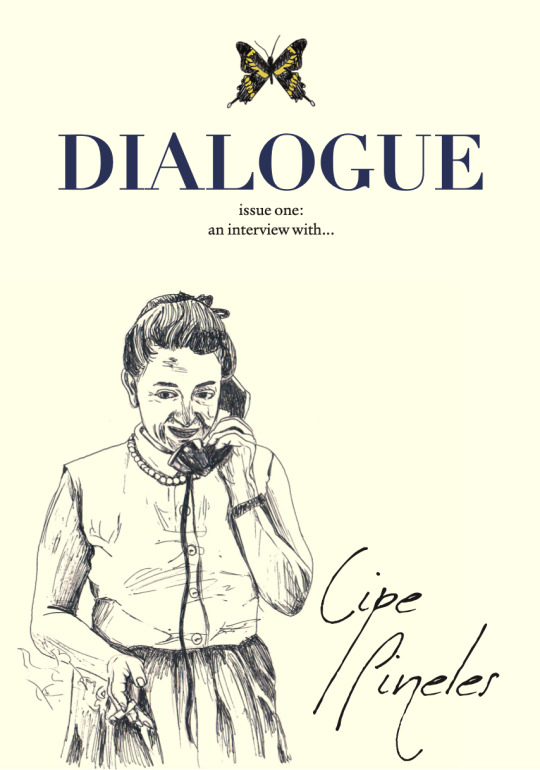


Completed Zine !! Outcome & Reflection
https://issuu.com/emilytian7/docs/emily_tian_zine_cp
Finally the day has come. I can enjoy the satisfying sensation of hitting the ‘Submit Assignment’ button.
Reflecting upon this assessment, I feel like I’ve learned a lot in regards to publication design and my subject herself. Looking back on what I had for my WIPs, I’m pleasantly surprised to see how much has changed. My initial draft spreads were veryyy straightforward, lacking in experimentation, and just a bit below average. Thankfully, with Ben’s advice, I was able to making many many subtle adjustments such as, pull quotes, font changes, colour, cut outs, hand drawings, collages, and more. Throughout the zine, I used a combination of cut outs of her work, drawings of mine, photographs of her, and photographs of her work.
Briefly mentioning Cipe herself, I’ve really learned as much as possible about her life and I think she’s an incredible deserving yet underrated figure in design history. She truly went through the struggles designing at a time where she hadn’t been considered for jobs because she was a woman. The text in my zine might look like too long of a read, but I swear it’s worthwhile.
Anyways, I’m happy with the way it turned out in the end although it was a bit of a rollercoaster. I think everyone was just feeling a bit burnt out towards the end but I’m glad we’ve all worked our ways out of our slumps to finish. Being my first publication or zine design, I feel as though I still have a lot of space to improve.
4 notes
·
View notes
Photo
I love Karisma’s work in progress and can’t wait to see her finished design. I really like the aesthetic she’s conveyed and how it’s consistent throughout. I’m super super impressed as her zine is very different to mine (e.g. childish fun style, vibrant colours, decorative stickers, font subject V.S. my text-heavy, editorial style, person as a subject.) I feel as though I’d struggle to create a zine like hers. Loving the progress- too good.
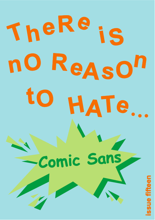


ASK ME ANYTHING WIP
After last week’s work in progress for assessment three, Ask Me Anything, I realised that my zine spreads thus far weren’t appropriately reflecting on my subject, Comic Sans. Since then, I have developed a new five page spread including front cover, introduction and question one as a sample for presentation for my final formal class.
I believe that it looks a lot more refined and focused compared to my last iteration, drawing on one sole design purpose now rather than trying to blend multiple, like in my last mockup. I tried to combine the ugly-childish look with a somewhat comic appeal using speech bubbles to mimic Comic Sans originating from comic books.
I think I’m content with the name of my zine now. It has more focus on my subject and with the ellipsis, it prepares the reader for a new topic each issue at the end of the title.
Based on Bailey’s feedback, my visually strongest page so far is the introduction to question 1 on page 4. I think I need to continue to apply these elements, such as the screen, stickers and vibrant colour in order to fully have a visual impact in my zine.
This page, in contrast to the remainder of the sample looks a bit flat and may need some more depth in order to balance out the dimension on page 4 to these other spreads. I’m planning on adding more collage elements such as a whiteboard screen and potentially some crayons to add to the already present screen and star stickers, hoping that this will add more depth and variety.
11 notes
·
View notes
Text
Week 12 Lecture
The Final Lecture
This lecture was a summary of what we learned throughout the lectures this semester.
Themes & Take-aways:
communication as a visual code
you already have everything you need to create design
what is design made of?
the medium and tool of inscription are co-dependant and shape each other
relationship between images and forms of writing
relating design histories to our contemporary experiences
from movable type to the beginnings of print
the grid
mathematical interpretations of letterforms
Bauhaus’ influential method of teaching
creating a total work of art
impacts digital technology brought on design practice
who decides design?
post-modernism: the opposition to modernism
punk movement and aesthetics
typography as part of the imagery
why we design?
design activism
what’s next for design?
what is a designer?
decolonising design
Andy and Karen mentioned the lack of recognition for women in the design industry.
“It needs to go beyond ‘lets celebrate women in design.’ We need to celebrate design and we need to make sure all the voices are heard.” - Karen
Karen introduced us to some incredible female creatives such as Tolu Coker, Nathalie Miebach etc. She provided us with a helpful list of female creatives, critics, and authors. I’m making it a goal to research all of them and discover their work. Researching Cipe Pineles for my zine raised lots of themes surrounding gender equality and sexism. She was a strong pioneer for women in design and I really look up to her. Back in her day (1930s), she wasn’t even considered for a job due to her gender. Now, it’s less extreme. However, I researched it and there’s a hugeee lack of women in high positions in the creative industry. Some crazy statistics will prove that. There isn’t a shortage of females entering the field (as you can tell by the amount of us taking this course) but it starts to fall flat when it comes to women having the opportunity to grow in companies. I dream of holding a senior position in a creative company and would encourage all of us to strive for this.
0 notes
Photo


Week 12 Tutorial Activity
In today’s tutorial we were given 5 minutes to change the layout of a photoshop file 3 times: text focused version, image focused version, and free for all version. I’m struggling a lot right now with my zine in terms of experimenting with the layout and making it visually interesting. Ben mentioned concerns Andy and Karen voiced about ‘straightforward’ designs and mine, right now, is a v good example of a straightforward design. Thankfully, Ben can give me some helpful feedback.
Anyways, this task was relevant given my current dilemma. I did enjoy experimenting with the last version. Wish I could do something out there for my zine but it really doesn’t suit my subject or the current style.
6 notes
·
View notes
Photo

Week 11 Lecture Research & Reflection
Emerging technology and design, generative design and machine learning.
This lecture I found particularly interesting. There was a large focus on emerging technology and its relationship with design. Andy and Karen mentioned generative design, parametric design, A.I. design, machine learning and robotics and design.
Most of the discussed works push boundaries. I like how art can be created from visualising data and transforming information into imagery. Andy and Karen raised interesting questions such as how much of your design is done by you? Or is it the tools which do it for you?
I picked a few areas I wanted to do deeper research on:
F.A.T Lab (Free Art and Technology LAb)
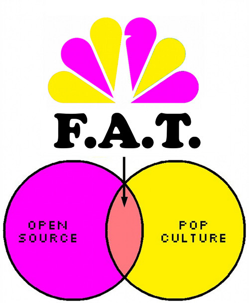
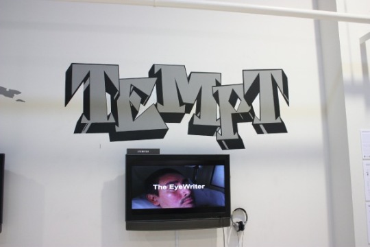
In the lecture, projects such as the Eyewriter and QR hobocodes was mentioned. These projects were both involved with Free Art and Technology Lab (F.A.T. Lab) as Andy touched on. F.A.T. Lab is an organisation dedicated to enriching the public domain. It was founded in 2007 by Evan Roth and James Powderly, also associated with Graffiti Research Lab. Their network of artists, engineers, scientists, lawyers, and musicians are committed to supporting open values and the public domain.
Their website was http://fffff.at/. I genuinely thought that I was on the wrong website or got redirected to some spam but that’s really their website!! Sadly, I found that they actually closed as of August 1, 2015. But their website is still online as an archive.
I have huge respect for all those involved in the group, and very fond memories of the laughs we’ve had and things we’ve built (hopefully some of this will continue under different banners). The excitement of F.A.T. closing is in seeing what its former members will do next.
P.S. @NBC…. 8 years and really no complaints about the logo??!! ¯\_(ツ)_/¯
-Post by Evan Roth, found on their website: http://fffff.at/
As mentioned in the lecture, they worked on some amazing projects such as the Eyewriter. F.A.T. Labs, along with OpenFrameworks, the Graffiti Research Lab, and The Ebeling Group teamed up with TEMPTONE. Tempt1 is a LA graffiti writer, publister and activist who was diagnosed with ALS in 2003. He is nearly completely paralysed except for his eyes. The Eyewriter is a low-cost, open source eye-tracking technology which allows Tempt1 to draw using just his eyes.

Another project was QR_STENCILER and QR_HOBO_CODES. This is what Golan Levin posted on http://fffff.at/ about it:
golan
Yep, it’s a QR code stencil generator! The F.A.T. Lab is pleased to present QR_STENCILER, a free, fully-automated utility which converts QR codes into vector-based stencil patterns suitable for laser-cutting. Additionally, we present QR_HOBO_CODES, a series of one hundred QR stencil designs which, covertly marked in urban spaces, may be used to warn people about danger or clue them into good situations. The QR_STENCILER and the QR_HOBO_CODES join the Adjustable Pie Chart Stencil in our suite of homebrew "infoviz graffiti" tools for locative and situated information display.
I really love how F.A.T. is is dedicated to the public domain and releasing open-source software. Anybody is free to distribute, remix, and modify QR_STENCILER, so long as they share and provide attribution to FFFFF.AT. "he 100 QR_HOBO_CODES and their respective stencils are hereby dedicated to the public domain.”
Golan levin intrigued me as well and I did a bit of research on him. I watched this interesting TED talk he did: https://www.ted.com/talks/golan_levin_art_that_looks_back_at_you?language=en#t-6790. He is a hybrid of an artist and an engineer. Both my sister and my dad are in the engineering field and I’ve always considered us to be in completely different/opposite fields. However, thinking about it more, technology connects engineering and design. They can work together to create fascinating works just like Golan Levin. You can find more of his projects here: http://www.flong.com/projects/. I personally like ‘Eyecode’ and ‘Footfalls.’
Generative Adversarial Network (GANs)
Ok so, GANs was something I knew nothing about but became veryyy interesting to me after researching it a bit more.
Definition (more-so for my purposes than yours): Generative adversarial networks (GANs) are algorithmic architectures that use two neural networks, pitting one against the other (thus the “adversarial”) in order to generate new, synthetic instances of data that can pass for real data. They are used widely in image generation, video generation and voice generation.
I read up on how the actual algorithm works but it was like a different language to me and I really didn’t quite understand the jargon.
Different applications and potential uses of GANs:
Fashion, art and advertising
Science
Medicine
Video games
Design
Age face photographs to show how an individual's appearance might change with age
A GAN model called Speech2Face can reconstruct an image of a person's face after listening to their voice
In the lecture, Karen and Andy mentioned thispersondoesnotexist.com which was created by Uber engineer Phillip Wang. He used the software called StyleGAN, a GAN for producing an unlimited number of portraits of fake human faces. It’s important to be wary of the potential evil purposes of this technology. This type of image synthesis can lead to the production of fake, possibly incriminating, photographs and videos. People can also use realistic photos of nonexistent people to create fake social media profiles. Scary stuff.

Sources:
https://www.wired.co.uk/article/moviebarcodes-interview
https://pathmind.com/wiki/generative-adversarial-network-gan
http://www.eyewriter.org/
https://en.wikipedia.org/wiki/StyleGAN
https://transmediale.de/free-art-and-technology-lab-ft-lab
http://fffff.at/qr-stenciler-and-qr-hobo-codes/
https://pathmind.com/wiki/generative-adversarial-network-gan
https://en.wikipedia.org/wiki/Generative_adversarial_network
https://en.wikipedia.org/wiki/StyleGAN
Images:
https://moviebarcode.tumblr.com/post/4804610224/the-lord-of-the-rings-trilogy-2001-2003-prints
http://www.eyewriter.org/
http://fffff.at/qr-stenciler-and-qr-hobo-codes/
2 notes
·
View notes
Photo

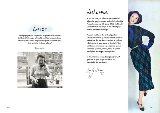
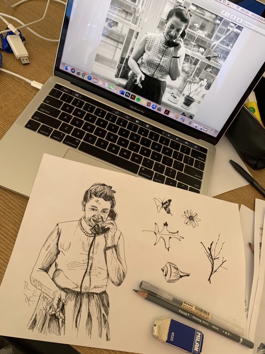

Ask Me Anything Assessment Work in Progress
These are the first few draft pages of my digital publication I showed Ben in class today. I got some helpful feedback from him and other classmates about my body text font. I do agree that it’s a bit too decorative for body text but I like the playful feel it has. I’m now trialling out serif fonts which look a bit more readable and clean.
I initially started designing the zine in a more standard ‘Vogue’ editorial style but I decided that I couldn’t get that to the level I wanted and it wasn’t really resonating with me. Since Pineles liked to illustrate her magazine spreads and advocated for fine arts in magazine editorials, I did a quick pen sketch of her as well as other elements in some of her magazine spreads. I liked the look of that in the cover.
Moving forward, I want to continue building up my zine design. I want it to be cohesive and consistent in terms of style. I’m trying to achieve a playful, personal, and minimal tone.
10 notes
·
View notes
Photo
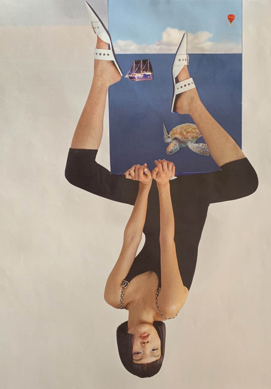
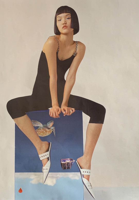
Collaging!!
In this week’s tutorial, we all made collages. It was a fun and somewhat relaxing activity to do even though I can’t say that this is my forte. I cut out so many different things from magazines which I thought would look cool but when I tried to put them all together it was just a mess.
Ben mentioned at some point in the tutorial that sometimes just a few elements can be more effective than just heaps and heaps of stuff happening (nothing wrong with that either- of course.) So I just started again with a more minimal approach and ended up with this.
7 notes
·
View notes
Photo
Really love this collage by Charlotte!! The colour palette is so playful and I like the way the Japanese characters work with the imagery.
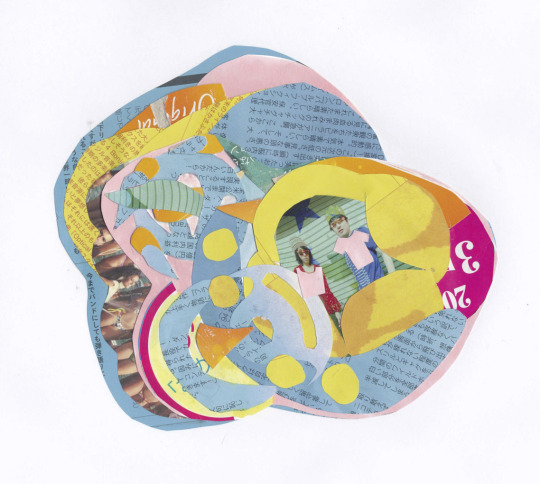
WEEK ( DO NOT KNOW) 15 MAY After discussing a variety of artists who’ve used collage, each for a different purpose or with a different intent, we were asked to go and explore the medium ourselves. I’ve experimented with collage a number of times, usually for leisure. Initially I found a page with bright saturated colours, and inspired by Asger Jorn and other who ripped and composed material, I decided I wanted to ‘shred’ the pieces as small as I could and rearrange to create some sort of satisfying arrangement of colour. This fell through, so I scanned it black and white cut into strips and messed around with other stuff which I hated. Eventually I moved onto this collage, where I mainly focused on use of colour and shape and layering. Doing this got me out of my head, and away from having to work with images of people. The book I had was mainly images of people except for a few and I didn’t take that much interest in using them as my focus. I had more fun doing this, and stopped worrying so much about creating something good.
4 notes
·
View notes
Photo
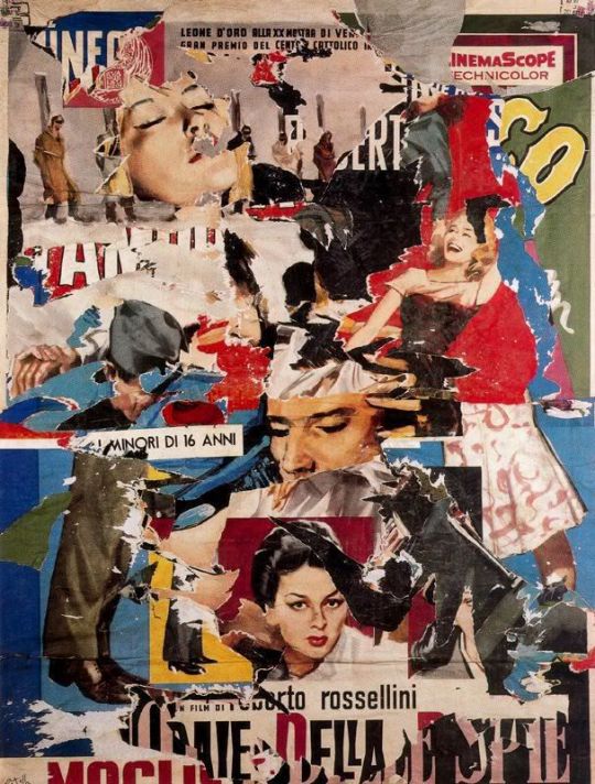
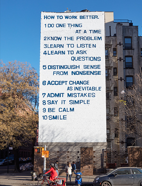
Week 10 Lecture Research & Reflection
Conceptualism and Art Activism Culture.
This lecture followed on smoothly after last week’s punk movement lecture as this lecture linked closely to post-modernism. Being quite a lengthy video, many subjects were discussed such as conceptualism, advertising, activism, computers and design, symbols, contemporary art, and more. For this post, I picked out a few artworks/designs which I wanted to do a little more research about.
Décollage- Mimmo Rotella
Mimmo Rotella was an Italian artist born exactly 83 years before me (birthday twins(!)) In the lecture, Andy and Karen mentioned the term décollage, something I’d never heard of before. Décollage is the collaging process he developed which involves removing or tearing pieces of an existing image. This contrasts against conventional collaging where images are layered on and built up. Rotella explained how the ripped posters that lined the walls of Rome inspired his work:
“I was literally spellbound, and even more so because at that time I was convinced that painting was finished, that something new had to be unearthed, something alive and modern. So in the evenings I began to tear the posters, ripping them from the walls, and take them back to my studio, creating compositions and leaving them exactly the way they were, exactly the way I saw them. That is how the décollage came to be.”
His early compositions resembled cubism or abstract expressionist works. However, they later developed to become more similar to pop, advertising, celebrity, and entertainment. I found researching Rotella and décollage fascinating as I’m always awe-struck at people who think of original, innovative and out-of-the-box ideas. I’m always thinking, ‘I wish I had thought of that!’ This pushes me to explore my limits and grow my creativity.
Peace Symbol (Campaign for Nuclear Disarmament Symbol)
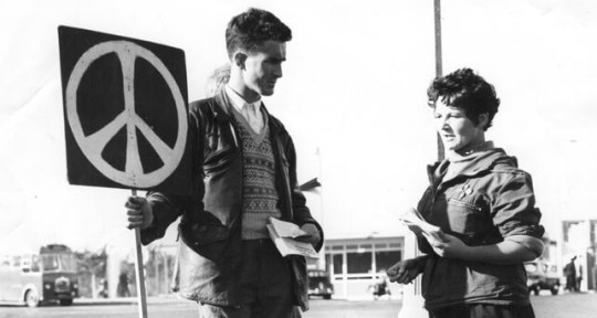
Andy and Karen touched on the CND/peace symbol which I found very interesting. I had never even considered where the peace symbol had originated from. This symbol is the logo for the Campaign for Nuclear Disarmament designed in 1958 by Gerald Holtom. It is known globally as the peace symbol.
Holtom was invited to design artwork for the first Aldermaston march. He explained his idea, ‘I was in despair, Deep despair. I drew myself: the representative of an individual in despair, with hands palm outstretched outwards and downwards in the manner of Goya’s peasant before the firing squad.’ It is also known to incorporate the semaphore letters N and D for Nuclear Disarmament.
I find it extremely inspiring that someone’s design can be so iconic and have such an influential impact. The symbol Holtom created is timeless- transcending all language barriers. It represents peace and hope.
Flags- rainbow flag (Baker) and reconciliation flag (Jones)


Similarly, to the CND symbol, flags, in themselves, are symbols. Gilbert Baker, an openly gay artist, designed the first rainbow flag in 1978. He created it as a symbol of pride for the gay community. Baker saw the rainbow as a natural flag from the sky, so he used the eight colours for the stripes, each colour with its own meaning. The rainbow flag is now an iconic and powerful symbol of pride which encourages unity and solidarity.
I like how Baker drew inspiration from nature, using his external environment to find unconventional design ideas.
Being from New Zealand, I wasn’t familiar with the reconciliation flag at all. To be honest, I need to research more about the history of Australia and their relationship with Aboriginal people. Since I’m now studying and living in Australia (and potentially for the near future), I should educate myself on the confronting history and present issues.
The reconciliation flag was a proposed new flag designed by Brendan Jones. It acknowledges Indigenous Australias, and is a design that unites many different backgrounds. The flag represents a reconciliation of the past, recognition of heritage, and optimism about the future. The design includes many elements which have been consciously crafted to have meaning. For example, the colours represent Aboriginal colours for their indigenous heritage, and red, white ad blue representing their European heritage. The boomerang device gives the flag its Australian identity. The southern cross remains to provide continuity with their current flag. The seven pointed Federation star represents the six original states with one point for all future states and territories.
This flag represents unity and purpose of Australia. In terms of design, I’m impressed with how every element of the flag is carefully though out. This flag is meaningful and powerful. It represents a nation of peace, prosperity and union.
Sources:
https://www.artsy.net/article/editorial-mimmo-rotella-decollage-innovator-is-celebrated-in
https://cnduk.org/the-symbol/#:~:text=The%20CND%20symbol%20is%20
one,broadly%20as%20the%20peace%20symbol.
https://www.tate.org.uk/art/artworks/rotella-with-a-smile-t12854
https://bc.id.au/flags/aus-1.html
Images:
Mimmo Rotella, 1962 Cinemascope. Retrieved from: http://poulwebb.blogspot.com/2011/04/mimmo-rotella-
decollages-part-1.html
Fischli and Weiss, 2016 How to Work Better. Retrieved from: https://au.phaidon.com/agenda/art/articles/2016/february
/04/the-serious-silliness-of-fischli-and-weiss/
https://cnduk.org/the-symbol/#:~:text=The%20CND%20symbol%20is%20one,broadly
%20as%20the%20peace%20symbol.
http://www.theperspective.se/the-rainbow-flag-a-historical-symbol-for-equality/
1 note
·
View note
Photo
Week 9 Lecture Research & Reflection
Punk Aesthetic, Zines, and Post-Punk
Punk Movement
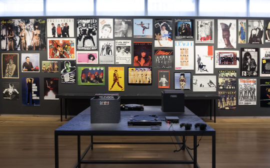
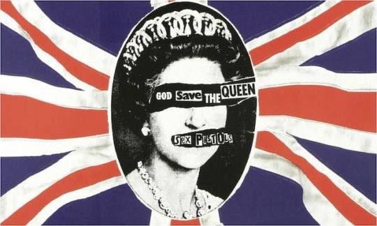
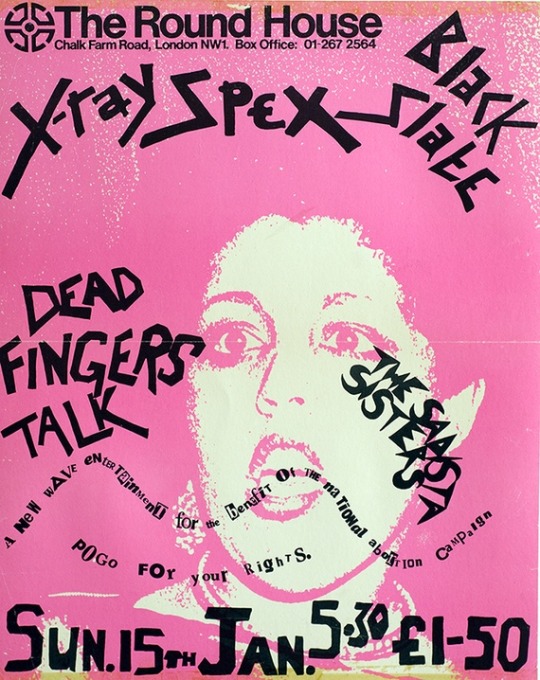
Punk art and design was created from the rise of punk rock in the 1970’s. Bands such as New York’s The Ramones and London’s The Sex Pistols paved the way for this movement. This aesthetic was all about things being cut up, collaging, disorganisation, questioning authority, rebelling, DIY, stencils, cartoon drawings etc. The art created was fast, messy, unpolished and was expressed through the designs of album covers, posters, zines, and more. This contrasts greatly against the modernist movement we’ve been learning about with clean designs, a minimalist style, and the use of grids.

Zines
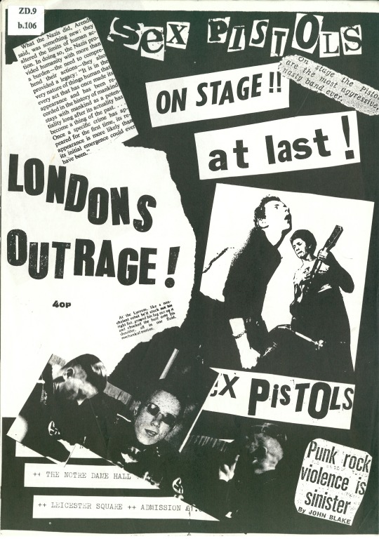
A large part of this movement was the Do It Yourself (DIY) ethos. At the time, people were creating their own graphical style for album covers, concert flyers, and self-published zines. A zine is a self-published, self-distributed magazine which has been referred to many times throughout this course.
A famous example is Sniffin Glue, founded by Mark Perry, which was one of the first punk fanzines. Sniffin Glue featured not only information on the punk music scene, but also anti-consumerist beliefs. As you can see, text was hand written and somewhat scrawled on aggressively. I quite like the effect of this- it gives a sense of authenticity and genuineness.
Post-Punk
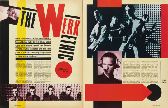
‘The Face’ is a magazine Andy touched on this lecture. From my research, I think it sits in the post-punk period? The Face was a UK music-and-style magazine even referred to as a ‘style bible’ which was founded by Nick Logan in 1980.
Neville Brody was the art director of this magazine. His work was vibrant and artsy- contrasting with the basic or structural rules that existed in the British traditions. His work was heavily influenced by the rebellious punk period from the 70′s. Logan gave him the space to come up with different fonts to manipulate, distort and transform to create fresh typographic designs.
The Face was extremely influential and ahead of its time. It was multi-facial, gender neutral, and inclusive.
Reflection
The punk movement and aesthetics still play a part in today’s culture. Bands use these visual motifs such as stencilling, graffiti, scribbled handwriting, and more, to associate themselves with the punk scene. Punk also influenced other cultural areas at the time like comics and horror films.
Punk rock and punk art encouraged creativity, freedom, messiness, volume, and rebellion. Also it’s quite opposite to my personal art/design aesthetic, I really want to keep creating works which are out of my comfort zone. I want to experiment with aesthetics such as punk to push my design further.
Sources:
https://www.questmag.com/blog/mads-modern-new-vibe/
https://99designs.com/blog/creative-inspiration/ripped-punk-influences-graphic-design/
http://www.designhistory.org/PostModern_pages/Punk.html
https://www.designweek.co.uk/issues/13-19-november-2017/story-face-cult-magazine-changed-british-culture/
http://www.bbc.com/culture/story/20171206-how-the-face-magazine-captured-the-spirit-of-gen-x
Images (in order of appearance):
A view of the exhibition “Too Fast to Live, Too Young to Die: Punk Graphics, 1976-1986.”
Retrieved from: https://www.questmag.com/blog/mads-modern-new-vibe/
Seminal album artwork for seminal Sex Pistols album God Save the Queen, design by Jamie Reed.
Retrieved from: https://99designs.com/blog/creative-inspiration/ripped-punk-influences-graphic-design/
London’s Outrage fanzine (December 1976) by Jon Savage on display at Punk 1976-78 at the British Library.
Retrieved from: https://www.digitalartsonline.co.uk/news/graphic-design/how-punk-changed-design/#6
Volumes 3 & 4 by seminal punk zine Sniffin Glue, found by Alternative TV frontman Mark Perry.
Retrieved from: https://99designs.com/blog/creative-inspiration/ripped-punk-influences-graphic-design/
Nick Logan/The Face Archive (below) ‘The Work Ethic’, no 23.
Retrieved from: https://www.designweek.co.uk/issues/13-19-november-2017/story-face-cult-magazine-changed-british-culture/
Poly Styrene, X-Ray Spex at The Round House, 1978, lithograph. Collection of Andrew Krivine.
Retrieved from: https://www.printmag.com/design-culture-2/culturally-related-design/punk-aesthetic-graphic-design/
5 notes
·
View notes
Photo
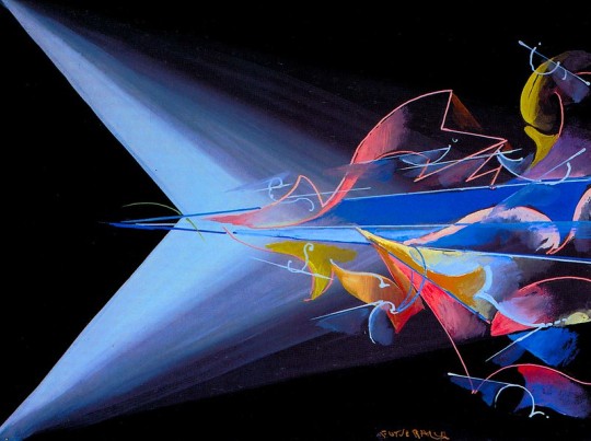
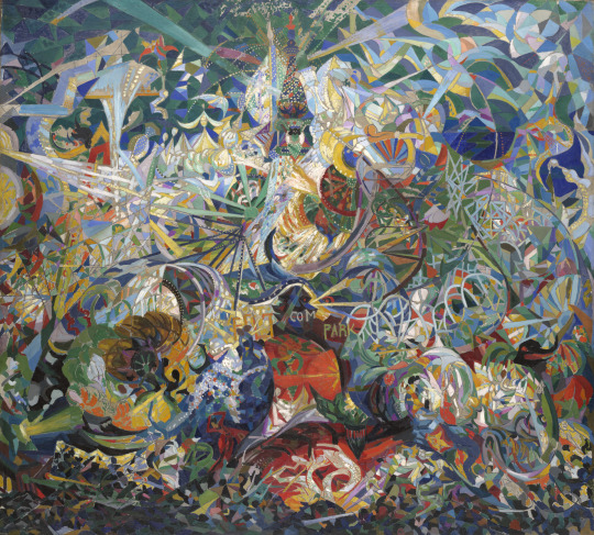
Week 8 Lecture Research & Reflection:
Italian Futurism, Politics, Russian Futurism, Vorticism & Legacies
I’ve enjoyed learning a vast array of design history throughout these lectures. I don’t/didn’t know much about these design movements and it’s interesting to learn how they influence the development of Communication Design.
Italian Futurism
Italian Futurism was an art movement which was launched in 1909 by Filippo Tommaso Marinetti. It all started when he published his manifesto “Founding and Manifesto of Futurism” in the French newspaper ‘Le Figaro.’ Key figures in this movement were Marinetti, Umberto Boccioni, Giacomo Balla, Carlo Carrà, Gino Severini and Luigi Russolo. Futurism tastes until Marinetti’s death in 1944.
As Andy said in the lecture, the beginning of Futurism was parallel to the beginning of mass production. Futurists were inspired by the industrial city, invention, speed, acceleration and flight. They experimented with the fragmentation of form, expressing motion, and unconventional perspectives. Futurists embraced manifestos, words-unfreedom poems, novels, visual and performing arts, politics, and more. They believed that the only way to live was by pushing forward and never looking back.
Politics
The Italian Futurists were extremely involved with politics- Marinetti and his group embraced and supported Fascism. They celebrated war as a means to remake Italy. It’s worth noting that Marinetti believed that women couldn’t bring about the speedy progress he desired.
Vorticism- British Futurism
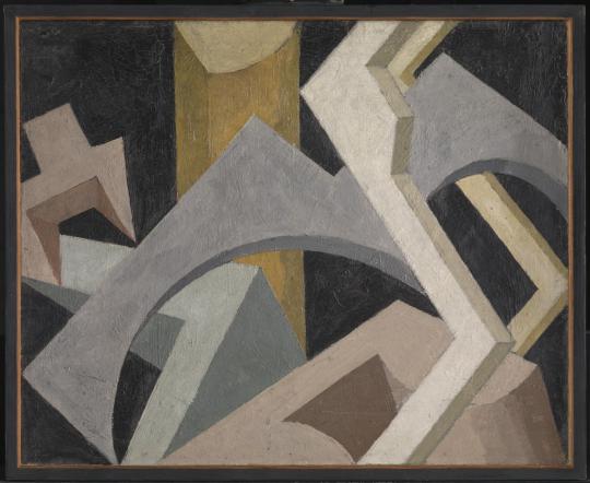
I was interested to research ‘Vorticism’ which was essentially the British equivalent to Futurism. This movement was founded by Wyndham Lewis who was, in fact, deeply hostile to the Futurists. Vorticism was England’s first radical avant-garde group. Similarly to the Futurists, the Vorticists celebrated the dynamism of the Industrial Age and looked down upon British traditions in order to move into a new era. They developed an abstract style of bold colours, sharp angles, and hard edges.
As Wyndham Lewis explained the metaphor of a vortex, "You think at once of a whirlpool. At the heart of the whirlpool is a great silent place where all the energy is concentrated; and there at the point of concentration is the Vorticist."
Key figures of this movement were Wyndham Lewis, Ezra Pound, Lawrence Atkinson, Jessica Dismorr, Cuthbert Hamilton, William Roberts, Helen Saunders, Edward Wadsworth, Sir Jacob Epstein and Henri Gaudier-Brzeska. It would be noted that there are female artists among this list unlike the Italian Futurists.
Legacy
Futurism influenced many other art movements which followed in the twentieth century as as Art Deco, Constructivism, Surrealism and Dadaism. Despite the darker politic associations, Italian Futurism created a bold and brash style which is still relevant today. They created connections between the innovation of new styles in art and the innovation of the machines and inventions.
Sources:
http://exhibitions.guggenheim.org/futurism/
https://www.wired.com/story/italy-futurist-movement-techno-utopians/
https://www.newworldencyclopedia.org/entry/Futurism#The_le
gacy_of_Futurism
https://www.theartstory.org/movement/vorticism/
Images:
Balla, Giacomo-
Science Against Obscurantism (1920)
Retrieved from: https://www.flickr.com/photos/32357038@N08/5510098787
Stella, Joseph-
Battle of Lights (1914)
Retrieved from: https://artgallery.yale.edu/collections/objects/44301
Dismorr, Jessica-
Abstract Composition (1915)
Retrieved from: https://www.tate.org.uk/art/artworks/dismorr-abstract-composition-t01084
2 notes
·
View notes
Photo
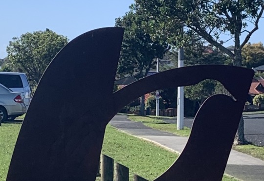
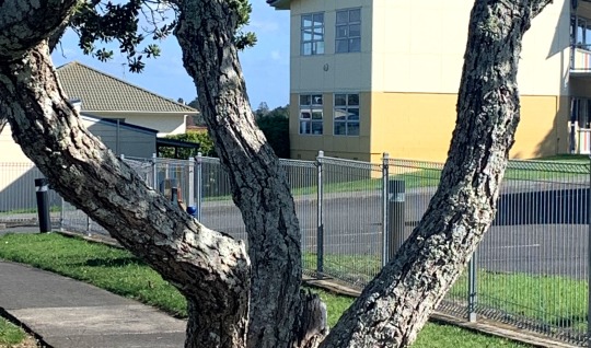
Week 7 Activity: Architexture
This activity was all about finding letterforms in the built environment. On my daily stroll around the block, I managed to found letters including an ‘N’, ‘W’, and ‘F.’ This was an interesting task as I realised I could spot them everywhere. With the right perspective, it’s not so hard to those hidden letters.
“Typography is two-dimensional architecture” -Hermann Zapf
0 notes
Photo
Week 7 Lecture Research & Reflection
All about Bauhaus, Gesamtkunstwerk and finding inspiration.
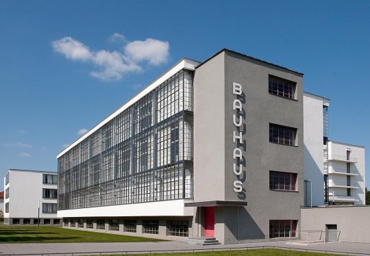
Bauhaus was a famous German art school which operated in the early 20th century. Founded by Walter Gropius, Bauhaus became not only a school but its own art movement. The Bauhaus style is one of the most influential approaches in modern design, contemporary architecture and art, and more.
Many iconic figures of the modern architecture, design and art movements were involved with the school, including Ludwig Mies van der Rohe, Adolf Meyer, Marcel Breuer, Paul Klee, Josef Albers and Anni Albers, Wassily Kandinsky, Marianne Brandt and Lotte Stam-Beese.
The Bauhaus School was eventually shut down by the Nazis- surviving only 14 years. Throughout those years, it moved from its original place in Weimar, to the well-known Gropius-designed building in Dessau, and then a warehouse in Berlin.
“The Bauhaus has shown us the importance of wide-spread collaboration in the pursuit of creative excellence – its work illustrating the multi-layered, high-functioning, creative and rigorous solutions that come only when the most brilliant poets, sculptors, painters, architects and craftsmen work as an integrated, united community; when their shared ideas create a rich soup where all the ingredients come together to make something that is more than the sum of its parts.” - Ab Rogers
Gesamtkunstwerk
Gesamtkunstwerk is a German concept that roughly translates as a “total work of art.” This describes an artwork, design, or creative process where different art forms are combined toe create a cohesive whole. Gesamtkunstwerk was popularised by the composer Richard Wagner.
Bauhaus facilitated the notion of Gesamtkunstwerk- aiming to unite all the artas as well as aesthetic education in all areas of life. In architecture, buildings and everything in them were designed as a whole entity.
Gesamtkunstwerk was touched on my Andy and Karen in week 7′s lecture. I personally find the concept substantial and interesting. Creative mediums shouldn’t be limited and creatives should have the freedom of expression to use however many medias they would like.
Inspiration
Andy and Karen mentioned various examples of Bauhaus creations which were inspired by external subjects. For example, the Marcel Breuer chair inspired by the tubular-steel handlebars of his bicycle, which were strong, lightweight, and mass-produced.

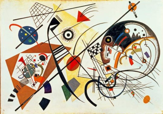
Wassily Kadinsky, Russion artist who taught at the Bauhaus, was inspired by music.
Das triadisches Ballett is a ballet developed by Oskar Schlemmer who taught at Bauhaus. He choreographed the ballet and designed the customres. He named it “Triadic” to reflect the three acts, three dancers, and three colours. Schlemmer designed contemporary costumes based on cylinders, spheres, cones and spiral shapes. The ballet toured around Europe, helping spread the ethos of the Bauhaus.
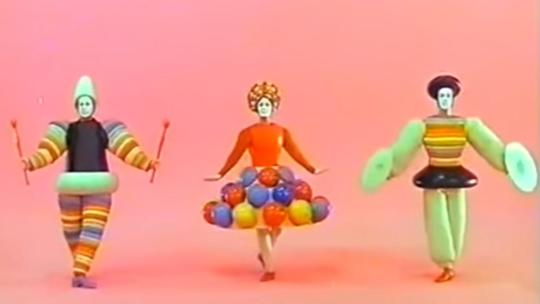
What I find captivating with all these examples is the merging of artistic activity- hybrids of design, art, dance, music, and more. It goes to show that creative inspiration can come from many different forms.
Sources:
https://www.viva.co.nz/article/at-home/how-the-bauhaus-movement-changed-new-zealand-design/
https://mymodernmet.com/what-is-bauhaus-art-movement/
https://www.dezeen.com/2018/11/01/bauhaus-100-guide-architecture-design/
https://www.designweek.co.uk/issues/11-17-february-2019/the-impact-of-bauhaus-designers-tell-us-how-it-has-influenced-them/
https://www.bauhaus100.com/the-bauhaus/phases/the-origins/
https://www.britannica.com/biography/Oskar-Schlemmer#ref1221553
Images:
https://www.moma.org/collection/works/2851
https://www.scoop.co.nz/stories/CU1905/S00349/the-built-environment-frank-lloyd-wright-the-bauhaus.htm
https://www.jasminedirectory.com/blog/wassily-kandinsky-the-painter-of-music/
4 notes
·
View notes
Photo

In this week’s tutorial, Ben set us the playful task of messing up our ‘hello my question is...’ posters in photoshop. The goal was to go bonkers on the filters, adjustments etc. I actually have no idea how my poster ended up like this but I kind of like it?? I think it looks quite interesting and it was a really nice activity to just have no creative limitations on which direction to go.
2 notes
·
View notes
Photo
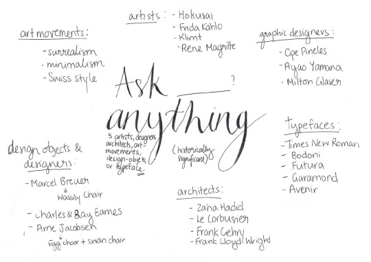
The Beginning of ‘Ask me anything!’: Phase 1
1. Identify your subject
Determine a list of 5 historically significant designers, design-objects or art/design movements that you would like to learn more about. Discuss this list with your tutor and determine one subject (person, object, or movement) to focus on.
I started this project off by brainstorming historically significant subjects in each category. I jotted down subjects which/who I were interested in, wanted to learn more about, and could make for an engaging interview.
My top 5 picks I decided to discuss with Ben were:
Cipe Pineles
Egg chair
Frank Lloyd Wright
Surrealism Art
Ayao Yamana
Unfortunately we didn’t have enough time to get to me in this weeks class. But that’s okay- Ben will just consult with me in the beginning of next week’s class. Before then, I’ll do some basic research into all 5 options and figure out which options I prefer over others.
0 notes