Don't wanna be here? Send us removal request.
Text
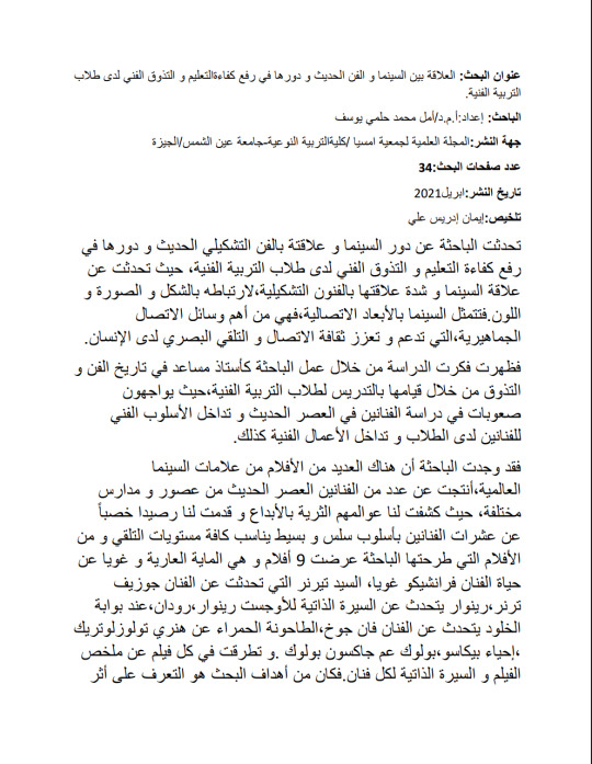
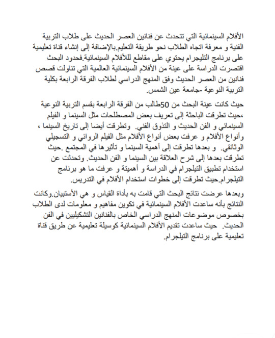
دور السينما و علاقتة بالفن التشكيلي الحديث و دورها في رفع كفاءة التعليم و التذوق الفني لدى طلاب التربية الفنية
للباحثة أمل محمد حلمي
نشر في ابريل ٢٠٢١
@uob-funoon
2 notes
·
View notes
Text

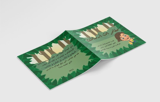


تدور أحداث القصة حول طفل ذكي و شجاع يحب الاستكشاف و المغامرات و لكنه كثير الكذب فسيؤدي به الكذب إلى الوقوع في المتاعب فما هي المتاعب التي وقع فيها؟ وما الدرس الذي تعلمه منه ؟
@uob-funoon
6 notes
·
View notes
Text

FA:214:LANDSCAPE(1)
Midterm project
Dr.Dala alsindi
@uob-funoon
7 notes
·
View notes
Text

FA:214:LANDSCAPE(1)
Project 2
Dr.Dala alsindi
@uob-funoon
6 notes
·
View notes
Text

FA:210: Drawing Techniques
Final project
Dr.Dala alsindi
@uob-funoon
6 notes
·
View notes
Text

FA:210: Drawing Techniques
Midterm project
Dr.dalal alsindi
@uob-funoon
0 notes
Text
youtube
Project 1 FA222 Principles of Graphic Design
workshops
Teaching workshop to paint a landscape in oil colors on the Do it platform, with the trainer Hoda Jardat.
In the beginning she mentioned the steps for drawing, as she said in the beginning, we must start in the back view of the painting, and then we move to the front view, which is the trees, branches, and the rest of the other elements. And before all this, the board must be divided very simple. In this workshop, she mentioned to them what brushes are used and how to combine colors. Where she also mentioned the function of each brush, for example the large brush is used for large areas and small brushes are used for fine details. Then she started teaching them how to combine colors, where she mentioned that the colors should be combined by moving the brush left and right, and not in a circular motion, because this movement damages the brush. And she also mentioned the correct way to sit for drawing, is to sit vertically and at the plane of the painting. Finally, she started teaching them how to paint correctly on the canvas.
These are the most important topics mentioned in the workshop. It was an interesting and useful workshop.
@uob-funoon
0 notes
Text
youtube
Project 1 FA222 Principles of Graphic Design
talks
Michael Beirut is a graphic designer working for a pentagram pentagram company. In this company they have many offices in London, Austin, Texas, Berlin and New York, where Michael works in New York. This company does a lot of things, from designing logos for the smallest institutions to the big ones. They make logos for banks, museums, design websites, make scriptures,ect.
Michael started designing in 1972 and from there he started making a lot of posters, where he used to do all kinds of business books covering signage programs and big brands such as buildings and museums, art and design identities for sports teams such as American football players,ect.
He mentioned his story with the schools libraries renovation project, where he thought about how to make these libraries more attractive and enjoyable. He started with the library logo, where he thought of many logos , but in the end he decided that the library logo should be the same as the library word, but after the letter L there is an exclamation mark. And the other thing that they did to these libraries, they took advantage of the empty space between the shelves of the library and the ceiling , they put pictures of distinguished children, and in another library they drew children and put them in this space, and in others they put poetry, and in another they put pictures of children while they were in Motion mode,ect.
Among the results they obtained after renovating nearly 60 libraries and making them more beautiful and enjoyable, as they noticed an increase in attendance, an improvement in students reading scores.
Advices for designer:
-The more strength and effort you give, the greater your ability.
-Take advantage of every opportunity that comes to you.
-Study carefully what the audience wants.
@uob-funoon
0 notes
Text
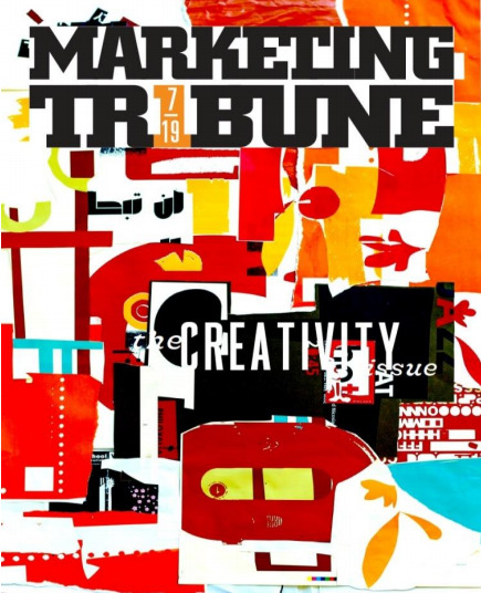
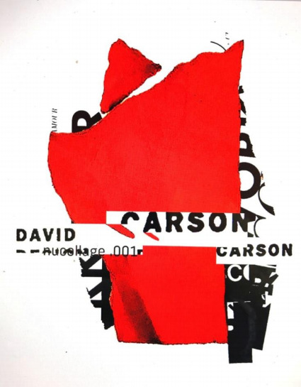
Project 1 FA222 Principles of Graphic Design
Interviews
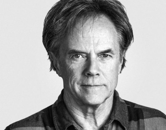
David Carson was born in September 1954, and studied sociology in San Diego University.
He touched upon graphic designing briefly while attending a two-week commercial designing
class at the University of Arizona, in 1980. Subsequently, he attended the Oregon College of Commercial Art to study graphic designing and a three-week workshop in Switzerland as a part of his degree. Besides, his many talents include professional surfing and he was ranked 9th best surfer in the world, in 1989.
An Interview with David Carson:
Question 1: David, could you tell us a little about your new book?
Carson: It’s called The Rules of Graphic Design. I’m working on it now in Zurich, Switzerland, where I have a small studio, besides my one in the states. It will show a lot of the new work I’ve done over the past few years, and will, as the title suggests, finally get the official “rules” out on graphic design. It should be out early spring 2008. My first workshop I ever attended on graphic design was in Switzerland, so the book will no doubt be affected by my being here. I started it in the states and it will be finished there.
Question 2: As one of the most well-known and influential graphic designers in the world, how do you balance work and play? Do you still get to surf often?
Carson: I’ve always felt I make my living from my hobby, so I’m lucky in that respect. As Marshall McLuhan said, if you’re totally involved in something, it is no longer work, it’s “play or leisure.” I surf in the Caribbean every winter. There’s a perfect point break in my front yard. I watch the Internet surf reports, and when a swell is coming, I head down to the British West Indies. It’s a very special place and helps me recharge.
Question 3: When creating a design such as a magazine cover, article, or website, what are a few of the most important things a designer should consider?
Carson: Who is the audience, what is that audience’s visual language, what type of things are they seeing? How can you communicate and reinforce visually what is written or spoken, and how can you stand out from the competition in that particular field?
Question 4: You redesigned Surfer Magazine in 1991 and founded Ray Gun as well. How does redesigning a medium, whether it’s a magazine or advertising campaign, differ from creating something from scratch?
Carson: In some ways they are very similar. You have to determine who the audience is, and what is the message you want to portray through the design. A new design gives you a bit more freedom, as you can help define the language. I think Ray Gun helped establish a certain visual language for alternative music. But redesigning, or inventing something new, both have their challenges and rewards, and I enjoy both. As long as you look for the solution in the particular thing you are working on, and not some predetermined formula or system, you will never run out of ideas.
Question 5: I remember attending a seminar when you spoke at a local school here in Central Florida years ago, and you told us a story about where you had the text in a magazine article covered up or unreadable, but the layout was spectacular. Do you have any other humorous or quirky stories of editors getting mad that your layout caused the article to be unreadable?
Carson: You might be referring to the article I set in the font Dingbat, largely because I found the article very boring. To start designing, I have to read the article, or brief it or listen to the music, to see where it takes me visually and emotionally. It was [a] bit funny, maybe, that at Ray Gun some of the writers complained early that their articles were hard to read. But then by the 30th issue, the same writers would complain if they thought their articles were too easy to read! The layout came to signal something worthwhile to read, so the writers came to look forward to see how their words were interpreted.
Question 6: Some have said that you are heavily influenced by the ocean. Is that true, and where do you find other sources of inspiration when creating a design?
Carson: My environment always influences me. I’m always taking photos and I believe things I see and experience influence the work. Not directly, but indirectly in some shape or color or something that registers. The ocean has always played a big part in my life, but it’s hard to say exactly what that influence is in regards to the work. But I’m always scanning the environment I’m in, and I’m sure it ends up in the work.
I think it’s really important that designers put themselves into the work. No one else has your background, upbringing, life experiences, and if you can put a bit of that into your work, two things will happen: you’ll enjoy the work more, and you’ll do your best work. Otherwise, we don’t really need designers—anyone can buy the same programs and learn to do “reasonable, safe” design.
Question 7: You have branched out into directing television and video commercials. What aspects of print design do you also use when directing video? Do you often focus on typography as a major part of it?
Carson: I’m often asked to direct commercials where the type plays an important role, and sometimes I add type to other peoples’ work. My approach is very similar to print: who is the audience, what is the emotion of the spot, or the feeling we want the viewer to get from watching, and how visually can we make that happen?
Question 8: Could you give an example of a video project that you enjoyed directing? What software do you or your associates use when creating these, and do they include Adobe After Effects?
Carson: After Effects is hugely important in the commercials I work on. It’s hard to imagine how we did them before. Well, actually I know—we did them in very expensive suites in post-editing houses in Los Angeles and New York! I just did some work for Saturn cars, and it was almost all done with After Effects. It’s clearly the best tool for motion graphics. I directed an in-flight commercial for American Airlines—a 90-second spot—that I enjoyed very much, from casting the actors to selecting footage to having some fun with the type. I also made a commercial for the band Nine Inch Nails for the MTV music awards, and the launching of Lucent Technologies, which were type-only spots. In general, I’m drawn more toward moving images and type, but I’ll always do print, even though “print has ended.”
Question 9: Finally, what advice would you have for other graphic designers just starting out?
Carson: Do what you love, trust your gut, your instincts, and intuition. And remember the definition of a good job: If you could afford to, if money wasn’t an issue, would you do the same work? If you would, you’ve got a great job! If you wouldn’t, what’s the point? You’re going to be dead a long time. So find that thing, whatever it is, that you love doing, and enjoy going to work for, and not watch the clock or wait for weekends and holidays.
I learned from this interview, when creating any design, you must define the target audience, and what message you want to convey to the audience. One of David Carson's most important advice is that it is important to do what you love and to trust yourself, and find that thing, whatever it is, that you love doing, and enjoy going to work for, and not watch the clock or wait for weekends and holidays.
@uob-funoon
1 note
·
View note
Text

Project 1 FA222 Principles of Graphic Design
advertisements design
This advertisement is for hot pepper, the idea of the advertisement is they want to show that this pepper is very hot, by Metaphor a fire tube and making pepper in place of it in order to warn people that this pepper is hot and that they need the extinguishing tube to turn off this heat.
In this advertisement, they used the principle of white space, which made the design simple and attractive. They used the red color in the background because it denotes warmth and heat and it is one of the hot colors, so I thought that they used this color for the advertisement, and also used the metaphor in the design.
The advertisement is simple, clear and interesting.
@uob-funoon
3 notes
·
View notes
Text
Project 1 FA222 Principles of Graphic Design
advertisements design
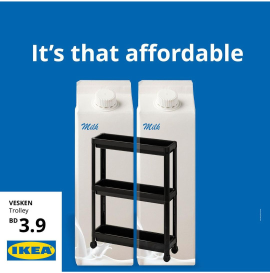
The idea of this advertisement of trolley with shelves in ikea, is trolly with shelves to organize your bathroom ,for the price of 2 milk cartons . Borrow the price of 2 cartons of milk to show just how cheap a trolley with shelves.
They used in the advertisement the principle of white space, this is what made the advertisement simpler, and the blue color that was chosen in the background is a calm color and indicates confidence, and I think IKEA used this color because it is the same colors as their logo. Also, in the design they borrowed 2 milk cartons to show the price of a trolley with shelves.
I think it is a smart and fresh advertising idea to attract customers to buy the product.
@uob-funoon
3 notes
·
View notes
Text
Project 1 FA222 Principles of Graphic Design
Interviews
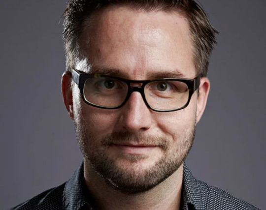
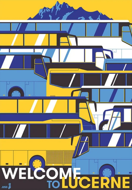
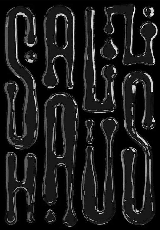
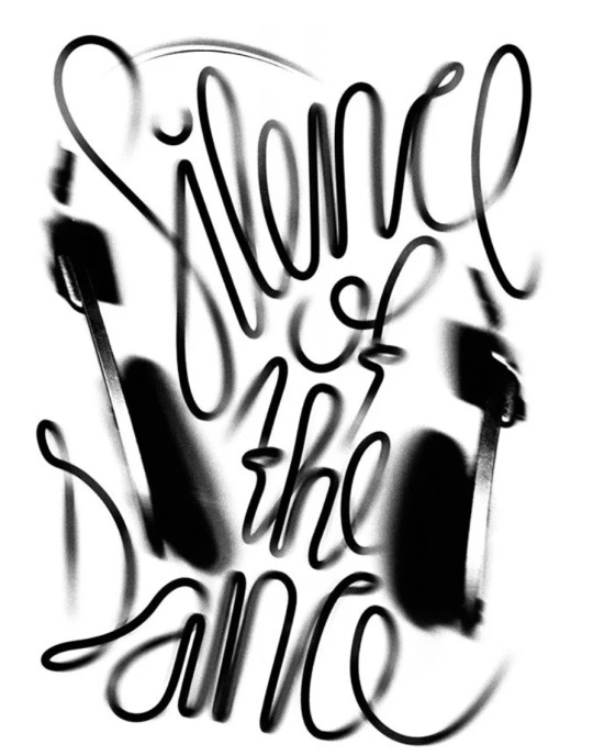
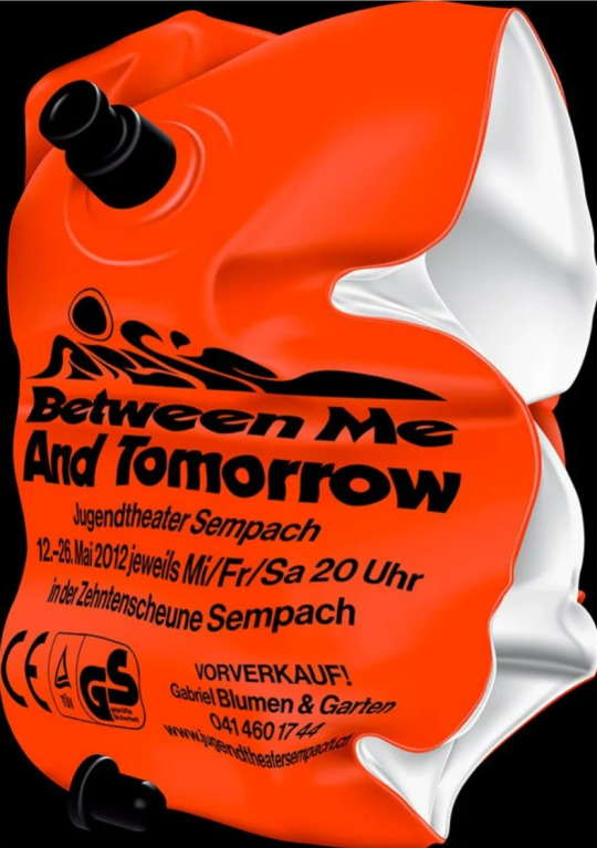
Erich Brechbühl born in 1977, and grew up in Sempach, Switzerland. Erich Brechbühl is a Lucerne based independent graphic designer and is mainly known for his diverse poster designs – his preferred mode of graphic expression. In 1990, at the age of 13, he started his career with the foundation of “Mix Pictures”, an organization for short film productions and cultural events. After studying typography, he became an apprentice graphic designer under Niklaus Troxler and finally opened his own studio, Mixer, in Lucerne in 2003. In 2009 he was co-founder of the Weltformat Graphic Design Festival in Lucerne and started the regular exchange meeting for graphic designers called Show & Tell in 2012.
interview with graphic designer erich brechbühl
Question 1: what originally made you want to become an graphic designer?
erich brechbühl: from a young age I knew that I wanted to do something creative. as a teenager, me and my friends made short movies with which we had some success at youth film festivals. but I soon found out that professional film making is a lot of work. being a graphic designer looked like a lot more fun to me, because the results of your creative work are almost instant.
after a 4-year-apprenticeship as a typographer, where I learned all the technical stuff, I had the opportunity to do a second apprenticeship as a graphic designer at the studio of the famous poster designer Niklaus Troxler. there I was infected by his passion for posters. after this I opened my own studio in Lucerne.
Question 2: how would you describe your approach to design?
erich brechbühl: my approach is to always be as open minded as possible. I want to be inspired by the content of the assignment. I love to get lost in the design problem to find a new surprising solution. I’m also not afraid to fail. because I create a lot of posters in a short time, I had to learn that not every project can be a masterpiece. it’s better if you see them as experiences that can allow you to grow.
Question 3: who or what has been the biggest single influence on your way of thinking?
erich brechbühl: my master Niklaus Troxler is still my biggest influence. he taught me to stay curious and not to seek a specific style. I think it’s the best attitude for a graphic designer; in that way the job never gets boring. my most recent influence is my good friend Felix pfäffli, with whom I share my studio. his way of creative thinking challenges me and my design process a lot.
Question 4: what would you say is your strongest skill and how have you honed that skill over the years?
erich brechbühl: probably that I try to start with every project completely from scratch. because of that I’m interested in all possible design problems; every problem is a new challenge. I’m always focused on arriving at the most simple solution.
Question 5: what type of brief or project do you enjoy working on the most and why?
erich brechbühl: projects that involve a new topic for me. that’s why I love doing theatre posters. every piece comes with completely new content on which I can build up my visual idea.
Question 6: what are your thoughts on specialization vs generalization?
erich brechbühl: I never wanted to be a specialist. maybe some people feel comfortable with that, but for me it would be like resignation. I embrace every new design problem and that keeps myself dynamic.
Question 7: how do you think online design resources have influenced the graphic design being produced today?
erich brechbühl: most of all how design is created. at the moment you can find a lot of self-generated graphic design that follows trends. there are some really interesting results. but there’s also a lot of bad stuff. an algorithm itself can’t hide bad design.
Question 8: what are you currently fascinated by and how is it feeding into your work?
erich brechbühl: right now, I’m organizing an exhibition about poster design from south korea during our poster festival weltformat in Lucerne (sept. 26 – oct. 4). the Korean designer Kim do-Hyung made a nice selection of contemporary posters. I’m really fascinated about the freshness of these posters. after decades of fascination about Bauhaus and swiss graphic design, young Korean designers are now finding their own visual language, based on their culture. it reminds me to stay open and always search for new ways to do things.
Question 9: what are you passionate about besides your work?
erich brechbühl: I like to push myself and my interests as far as possible. for instance, I co-founded the poster festival ‘weltformat’ in 2009 together with some other fellow graphic designers from Lucerne. since then we’ve also curated exhibitions abroad (Russia, Germany, France, korea, japan). we also organize an event in an old municipal indoor swimming pool in Lucerne called ‘neubad’, that’s become a vivid meeting place for creative people. all of these projects are on voluntary basis and I love them because I get to meet a lot of passionate people.
Question 10: do you have any superstitious beliefs or rules that you live by?
erich brechbühl: I believe what you give is what you get. I’m not a religious person, but the karma concept always worked really well for me. if you don’t judge people by their looks and stay open and friendly, people will treat you with the same respect.
Question 11: what’s the best piece of advice you have heard and repeat to others?
erich brechbühl: Niklaus Troxler told me about his way of composing a poster:
‘it’s always good to go with the subject as big as possible until it touches the edges of the format. that makes the poster bigger and louder than the others beside of it.’ I always like to share this knowledge with students.
Question 12: what’s your personal motto?
erich brechbühl: let’s push things forward.
It was a great interview, and I learned from this interview that nothing is impossible with persistence and training, and that every work we do is a new experience. And we always try to improve ourselves, Whatever of our experience.
@uob-funoon
5 notes
·
View notes
Text

Project 1 FA222 Principles of Graphic Design
logos design
Apple was founded in 1976, which was founded by Steve Goes and his friend Steve Wozniak. The logo of the Apple company when it was established was a picture drawn by one of the artists for the Scientist Isaac Newton, and this logo only lasted one year because the logo is large and its have a many of details. The company assigned Rob Janoff the task of designing a new logo that combines simplicity and beauty.
They say that Rob Janoff bought a quantity of apples, put it in a bowl and pondered it for a logo, and by chance he bite on an apple and remembered that it is bite, and bite is pronounced the same as the word byte that measures the capacity of a computer case. The logo became an apple bite . And Rob designed the apple in several colors until it is a bright gray color.
Gray is used for technology and it is a color that indicate balance, neutrality and modernity .
In Gestalt principles, the Apple logo is a closure because Principal allows for the eye to see a whole apple despite the large “bite” in the shape.
@uob-funoon
2 notes
·
View notes
Text

Project 1 FA222 Principles of Graphic Design
First logos design
McDonald's is a chain of international restaurants that serve fast food. The McDonald's logo was two golden metal brackets designed by the brothers Richard
(Dick) and Morris (Mac). And after Kroc bought McDonald's company from Dick and Mac, he converted the brackets into paired brackets (letter M).
Logo Analysis:
I think the letter m was used as a metaphor for potatoes,and the letter M is the first letter of the word McDonald's , and the sign below the m is ketchup and the yellow color is mustard. And I think they used the yellow color in the letter m because it is the yellow color that attracts attention, so they used it to attract people's attention, and the red color is a color that opens the appetite.
In gestalt Principles, the McDonald's logo is symmetrical, symmetric on the right and symmetrical on the left, like a mirror.
@uob-funoon
5 notes
·
View notes
Text
Project 1 FA222 Principles of Graphic Design
coverage of exhibitions
The second exhibition
link of exhibition
http://www.alwasatnews.com/news/1162612.html
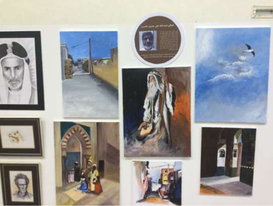
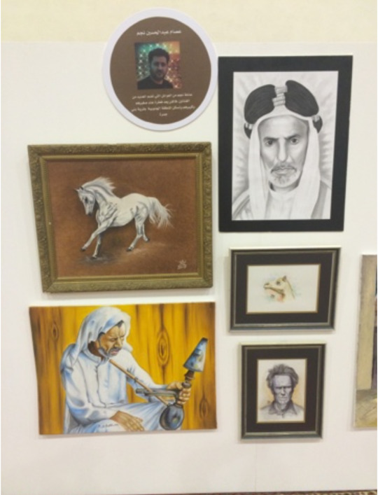
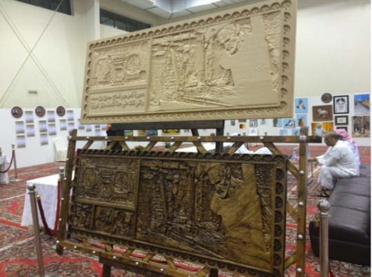
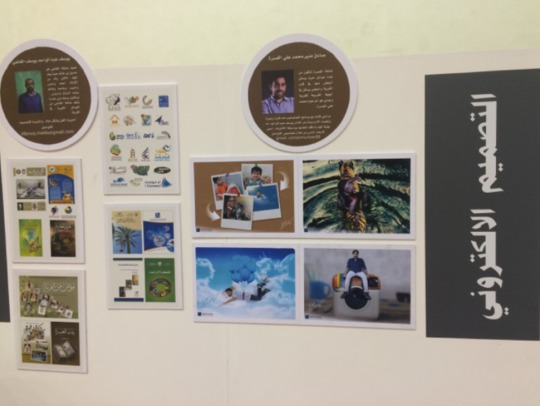
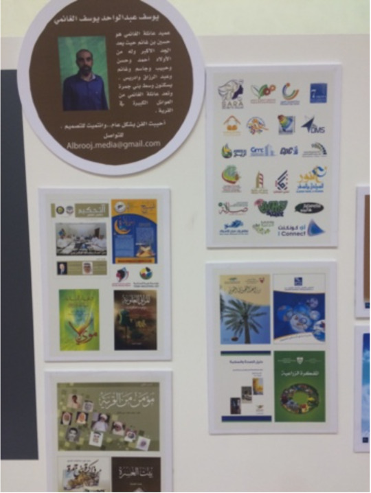
Coverage of the "Textile Art" exhibition held in Bani Jamra village in Bahrain, organized by the Textile Art Committee on September 25, 2016. In the hall of the Bani Jamra Cultural and Sports Club, attended Some of the municipal members and officials , including the Governor of the North, Ali Al-Asfour, and the Chairman of the Northern Municipal Council, Mohamed Abou Hammoud. The exhibition organized by the Textile Art Committee included 12 art: (drawing, Arabic calligraphy, and photography
The art of writing, poetry, film making, sculpture, handicrafts, graphic design, makeup art and henna engraving, weaving, wood works). participated for the exhibition 220 artists, There are elderly and young artists.
@uob-funoon
2 notes
·
View notes
Text
Project 1 FA222 Principles of Graphic Design
coverage of exhibitions
First exhibition
link of exhibition
https://he-il.facebook.com/BuraimiFineArt/videos/752067648573525/
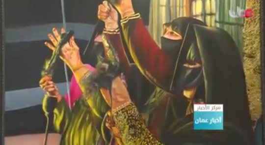
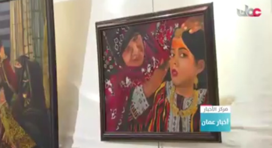
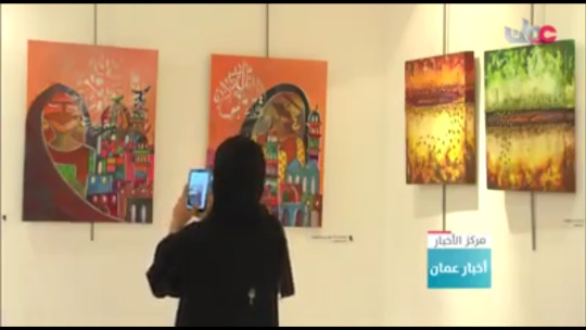
Coverage of an exhibition Erect in Oman by the Omani Society for Fine Arts that was Erect in Al-Buraimi Governorate on October 22, 2019 in its tenth edition .It is the exhibition "Women from Buraimi", which has exhibited 80 Fine art works.
Among the most prominent works in the exhibition are the "Symbol of Glory", which are paintings of horses, There are also paintings of portraits, including these paintings: " Among you heaven ", which is a painting of an innocent girl from Down Syndrome. "Fragrance from the Past", which is a portrait representing Omani women and the profession of Omani women, in the past and in recent times, by the artist Hajar Bin Khalfan. Salma bin Muhammad al-Khamaysia exhibited a painting from the Expressionist School, titled "Look Around You".
There are many works that were made of different materials and tools, while the art schools varied between realism, surrealism, abstract and impressionism, in addition to modern arts. “Women from Al Buraimi” exhibition is one of the most prominent art exhibitions that are held every year.
@uob-funoon
5 notes
·
View notes


