Don't wanna be here? Send us removal request.
Text
FMP
Critical Reflection and Final Thoughts
In my learning agreement I set out to look at branding, identities, typography and editorial which are all areas I have explored and trialled in depth, with some ideas more successful than others. I think I have achieved an identity that is cohesive, but not one that if I had more time couldn’t have been improved or added to. I mentioned Hiut Jeans as a point of reference,as they have told an emotive story which is at the forefront of their identity. To improve mine, a better narrative needs to be told. I have all the work to be able to do this, but haven’t been able to harness this in a ‘story telling’ matter. I did start to think about their being two main histories in Poole, their maritime history and their ‘Potted Past’. Perhaps having these two histories at the forefront of my identity could have done this.
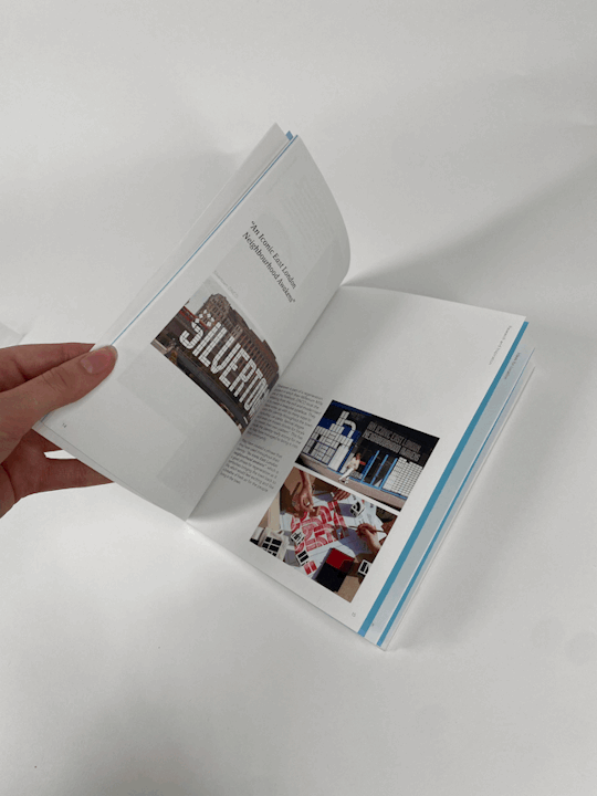
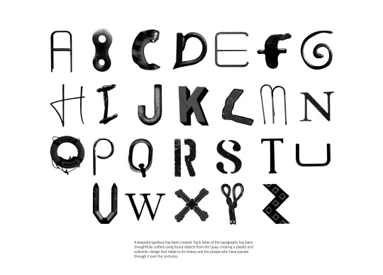
I also think that another element could be needed for my identity. I have used my letters throughout, as I really wanted to put emphasis on them however when I look back at research they have their typography as well as something. E.g. Silver town had transferred their typographic system to oval shapes which they wove throughout their design
This project has been tricky alongside ISTD and I have really pushed myself in this last term. Unfortunately, ISTD was such a huge amount of work that my FMP did get discarded. Due to this, I did miss a few tutorials and therefore my project took a lot longer to develop in a direction I was happy with. Nevertheless, I am very proud of this identity, in terms of what I have achieved in such little time, but that doesn’t mean there are lots of things I want to improve.
After hand-in, I am expecting to go back to Poole to take better pictures and search harder for slightly better letters. In particular; U, W and maybe L, however it has really grown on me.
I would really like to look more into a video showing this identity or perhaps a website.
5 notes
·
View notes
Text
FMP
Picture of Hand-in box

Contents:
- Penguin project
- Learning agreement
- Notebook
- Business card tests
- Experimentation and development
- Print tests
- Mockup book for identity
- Final book for identity
- Process book
0 notes
Text
ISTD
Picture of Hand-in box
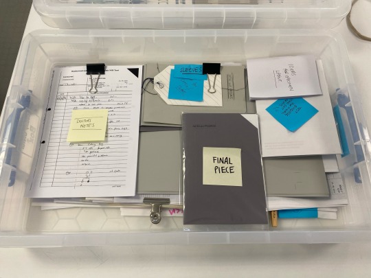
Contents:
- early stage experiments and development
- a huge amount of test prints
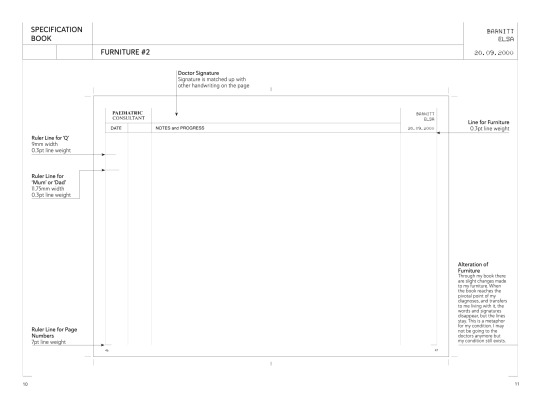
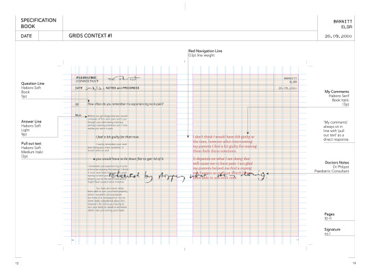
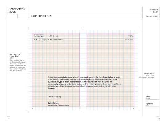
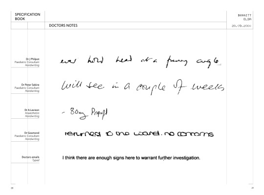
- Doctors notes
- Test prints for sleeves for final thing
- Final piece
0 notes
Text
FMP
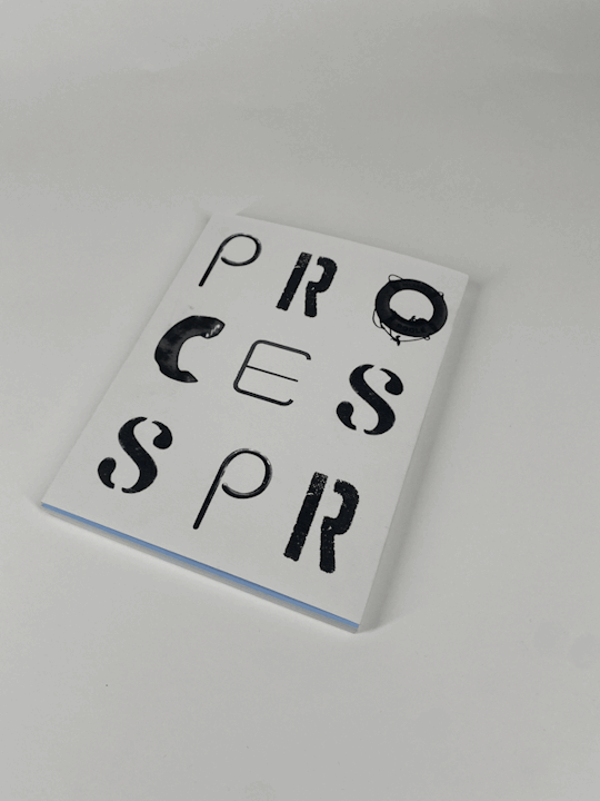
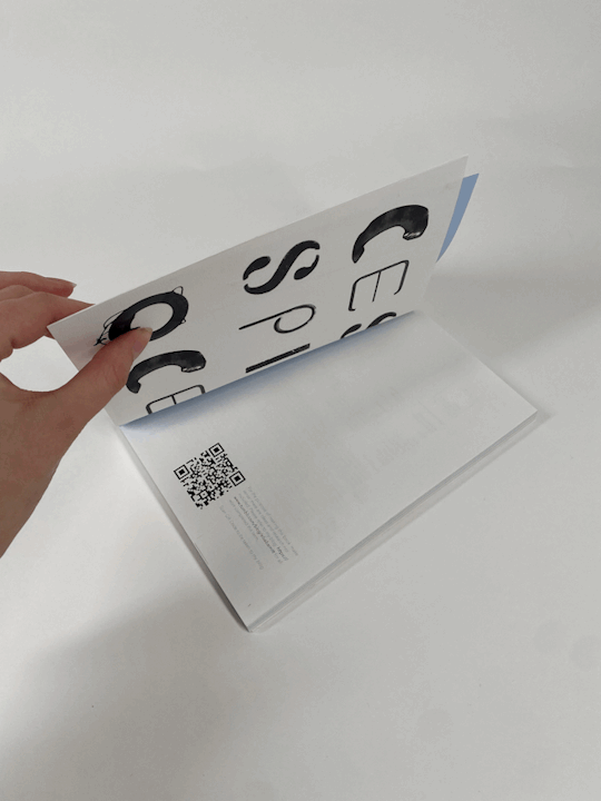
Process Book Making
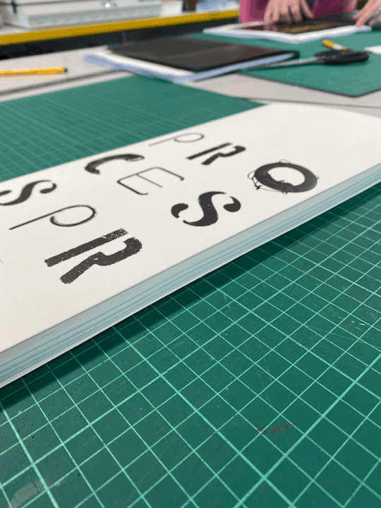
My Process book ended up being a lot longer than I thought it was. I always had in my head (because of timing) that I would perfect bind my book, however now that I feel like I have a little bit of extra time I wanted t make my process book feel more special.
My pages had already been printed my uni print, so the only other option was WhipStitching.

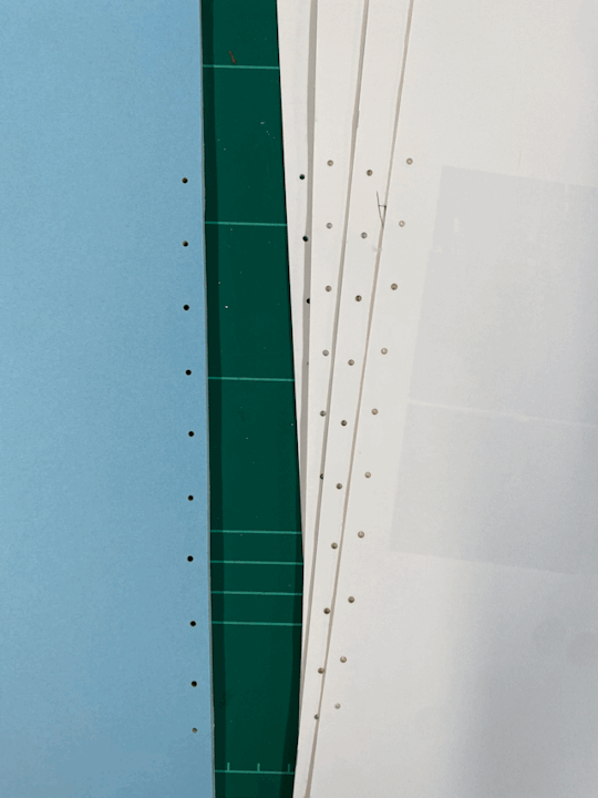

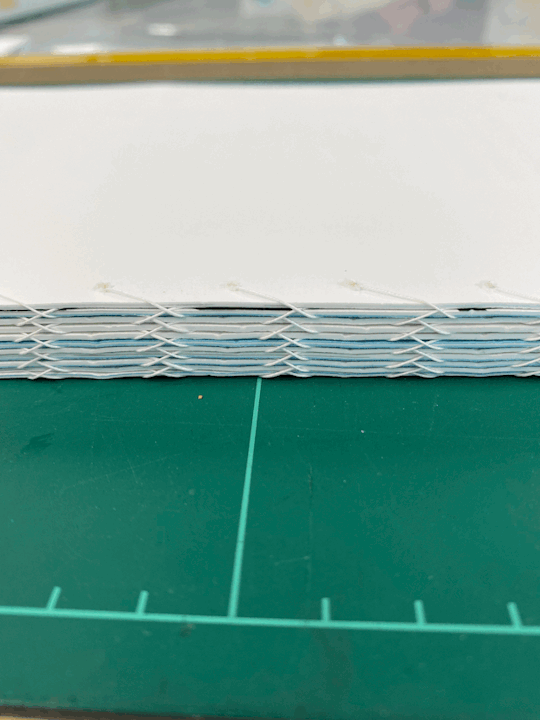
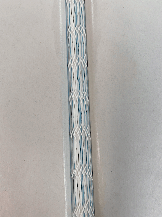
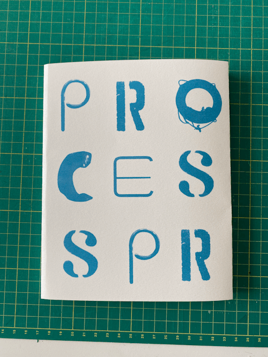
Cover for Process Book
After spending quite a while stitching my book, I realised how pretty it was and that I wanted to have an exposed spine. I decided on making a jacket for it so that you would be able to see it if you took it off.
I did 2 variations of this one in black and one in blue. Blue because that is the colour of my inside pages. I ended up choosing the black as it suits my identity more, however as it is just a jacket it is interchangeable.

0 notes
Text
FMP
Development - Print and Binding
Layflat Binding


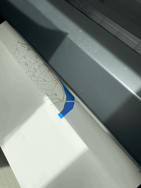
printing cover
Final photos

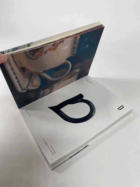
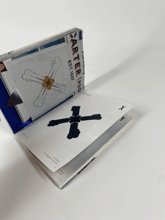
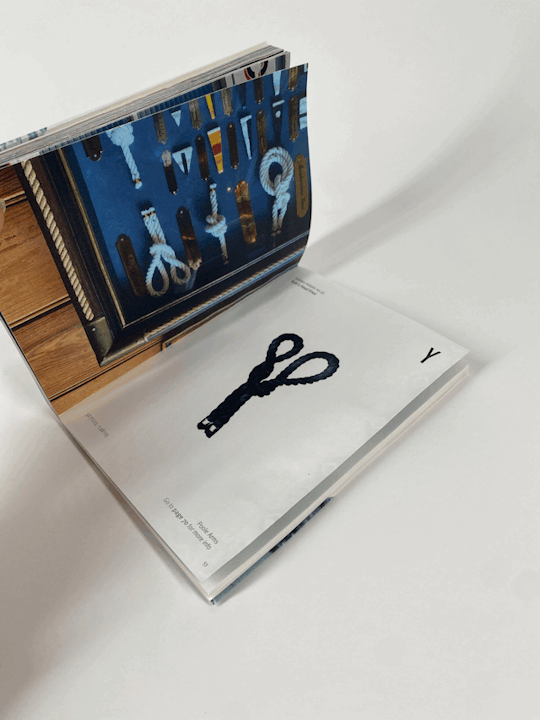
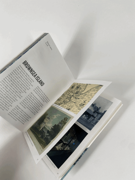
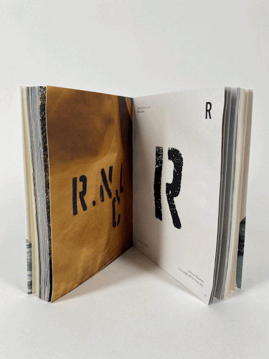
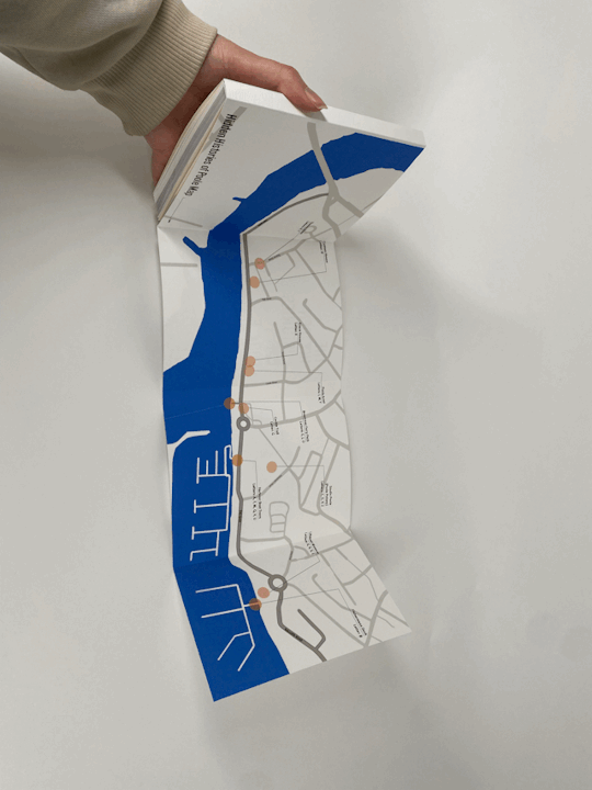
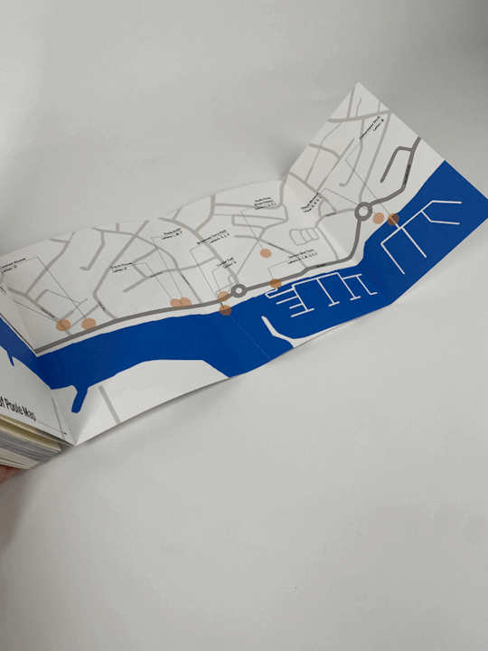
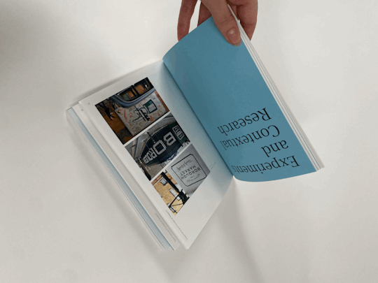
I think this book turned out so well! originally I didn't want this book to be thick. I wanted it to be thin like a leaflet, however as I wanted it to be opened properly, lay flat binding was the way to go. Since doing it I am actually very pleased with the thickness as it has now become the type of book you might buy as a takeaway from visiting Poole. It is something that feels like it is worth more.
0 notes
Text
FMP
Development
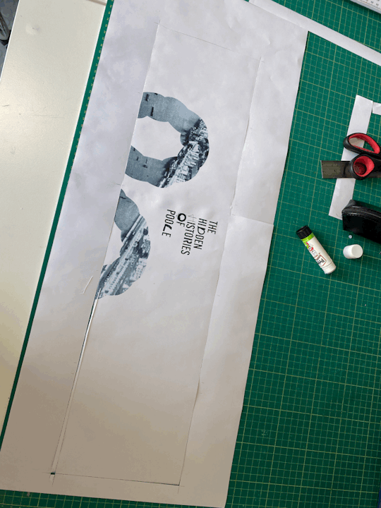
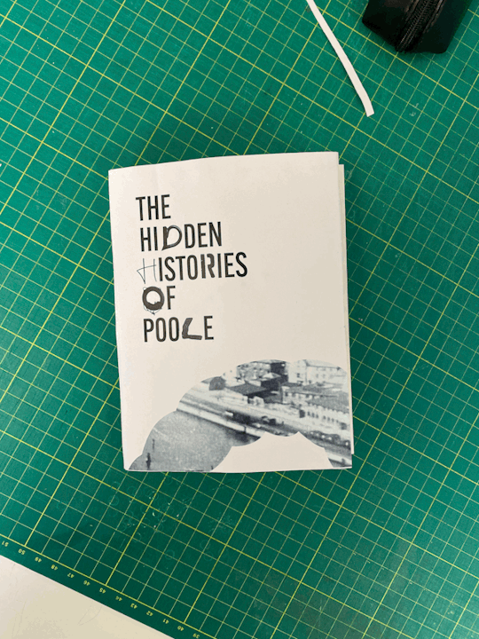
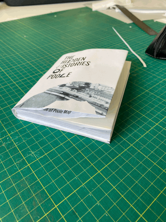
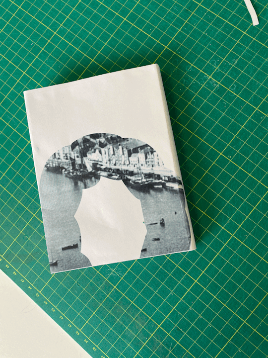
Hidden History Identity Book front cover TRIAL
understanding how this worked was one of the trickiest things. I had left doing it for a few days and coming back to it to have to design a front cover was Tricky.
from doing a print test I know I need to reduce the size of the image in the cut out. It is a bit too pixelated.


0 notes
Text
FMP
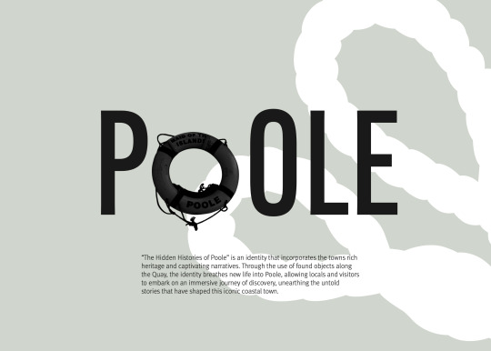
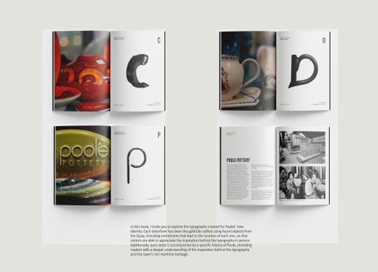
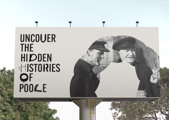
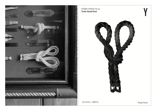
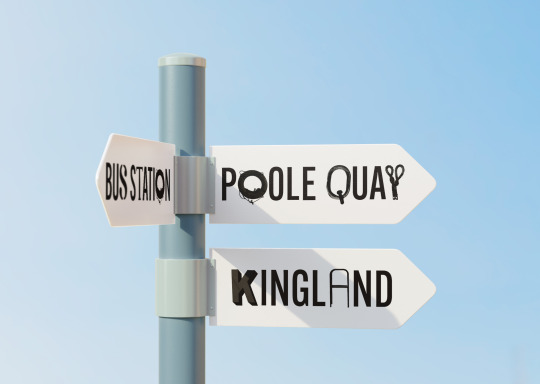
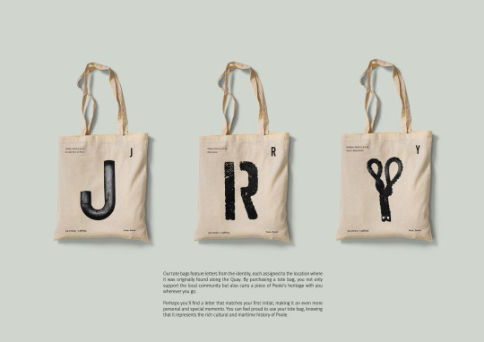
Final Boards for Poole Identity.
I really like the way my boards turned out. The thing I need to sort out is the board with the book layouts on.


0 notes
Text
FMP
Developing and perfecting
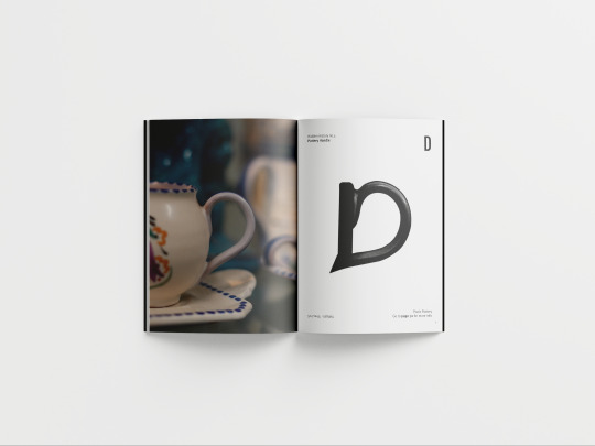
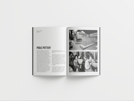
Hidden History Book mockup Digitals
Before real life printing (and for my portfolio pages) I made mock-ups for my mini identity book.


0 notes
Text
FMP
Animation Assets
Successful Video 2
apart from the first 'successful video' this would jest show the letter separately. In a way I think this is nicer.
0 notes
Text
FMP
Animation assets
Failed video 3
parts of this are still moving too quickly
0 notes
