Photo


Exhibition proposed set up
Due to the current circumstances our end of year show is not able to go ahead. So instead I have put together a digital display of how I wanted my work to be displayed in the exhibition space.
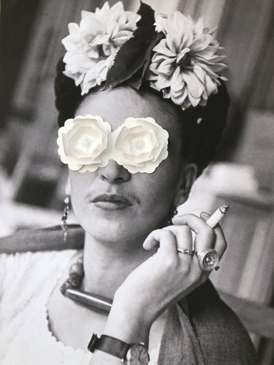
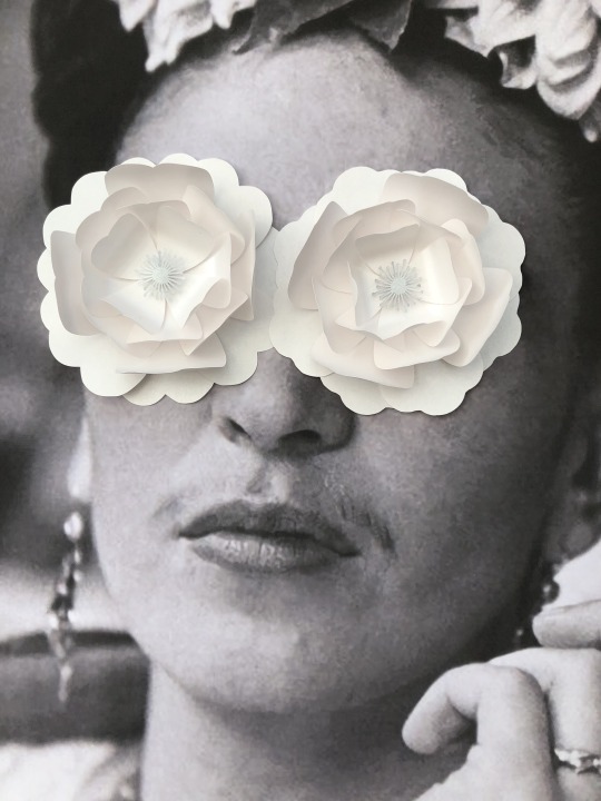
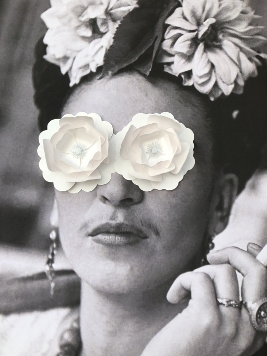
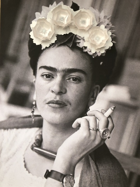
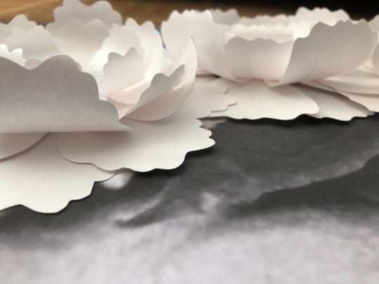
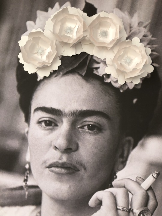
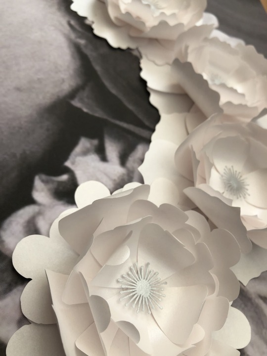
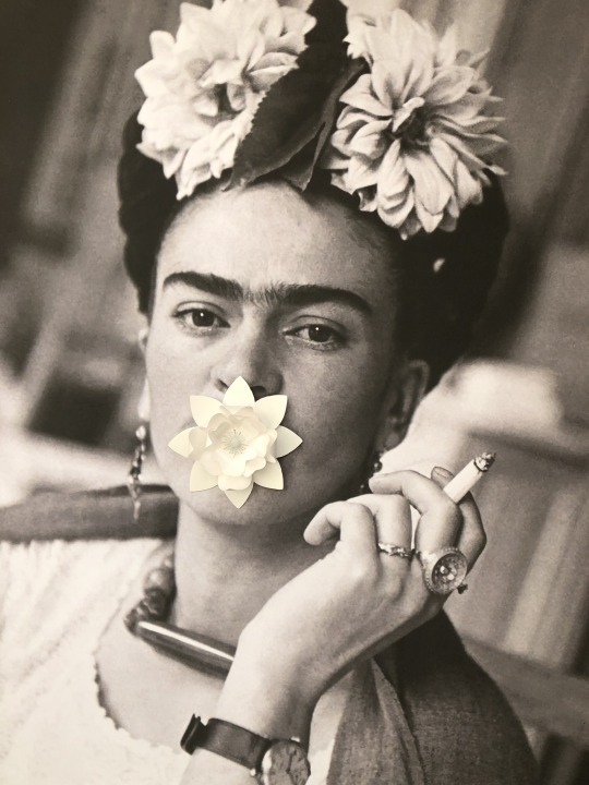
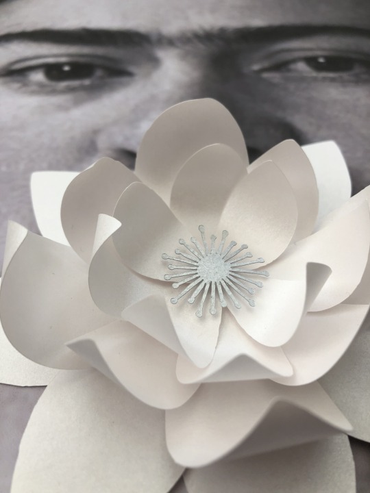
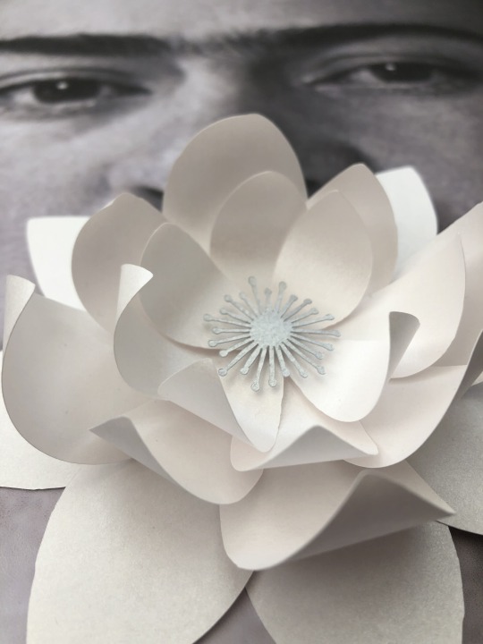
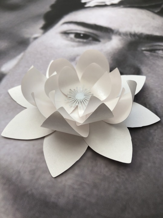
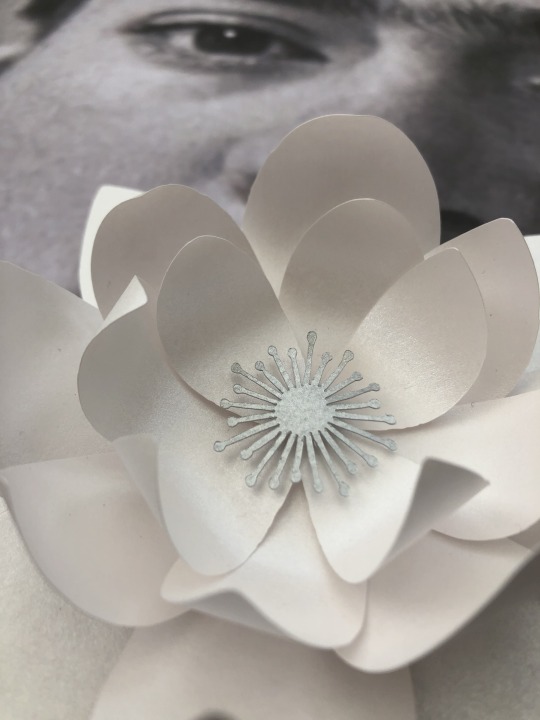
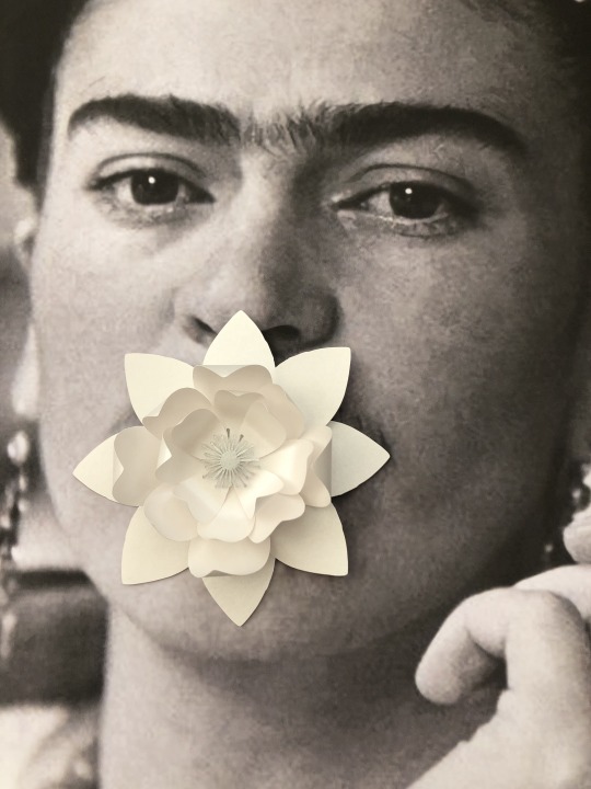
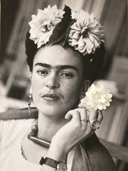
Frida Kahlo has been the main focus of all of my work this semester and I manipulate her own self portraits as a way to celebrate her life and the things she fought for, as well as tell a story through imagery. Her work quite often shows her emotionless face and direct stare into the camera/or viewers eyes. I have found with these 4 pieces in particular that even covering up her eyes cannot hide the gaze that lies underneath and her eyes tend to follow you around the room. As for her emotionless face I feel that the addition of paper flowers changes each image depending on their placement. Some give the image a slightly comedic value where as others make her look menacing. I have even found that her facial expressions, especially her mouth, can “look” completely different in each poster, even though they are the exact same image, reminiscent of Mona Lisa’s smile perhaps?
I ideally would like to have the main 4 images on one side of the wall. 4 images of some up close photographs of the main pieces and then another 4 of my favourite experimentations from my sketchbook all in the same grid like pattern. I would then have a plinth in the middle of the floor with my sketchbook on.
The 4 main posters are A1 and I would’ve preferably liked to of hung them by some silver bulldog clips. When my work was presented in the Minories it was hung in this manner and I really loved the effect that it gave. Especially the slight shadow that it created behind each poster as it wasn’t flat against the wall. It makes it seem more tangible in my opinion and the bulldog clips won’t distract your eye away from the work like a frame could do.
As the posters are not being framed they will need to be weighed at the bottom to prevent any curling and so they all stay nice and straight.
I would like the smaller images to also be hung by bulldog clips, but because they are much smaller in size they probably wouldn’t need to be weighted at the bottom.
As for the sketchbook I would like it just to be placed on top of the plinth so that people could easily flick through it.
Health and Safety and Risk Assessment
To put up these posters and photographs I will need the use of a ladder, hammer and nails.
As the posters and photographs are being put up on the wall, I will need to use a ladder to get up to that height, but this causes a few issues. I will need to have someone hold the ladder in place so that it doesn’t fall. I may also need someone else to hold my legs as the A1 posters themselves are quite heavy and reaching across at height could cause me to fall.
I need to use nails and a hammer to hang the posters onto the wall. I will need someone to hold the ladder in place so that it doesn’t topple over, and to take care when using the hammer and nails as I could hurt my hand if I hit the nail incorrectly. To prevent any harm to myself I could wear gloves as some form of protection.
As for the general public, there are no big risks once the posters are hung. There are some protruding parts but they are very small and near enough impossible to walk into and therefore shouldn’t cause any harm. There is a small chance that the posters could fall down if not hung properly, but they aren’t heavy enough or in a position where they could cause harm if they fell.
Plinths can sometimes be very heavy or an awkward shape that could cause my back injury if I were to pick them up alone. I would need the help of someone to move it into the correct position to lessen the chance of hurting myself.
I will need to use a plinth that has sufficient space to hold my sketchbook to avoid any chance of the plinth toppling over.
A plinth placed in the middle of the floor could be a hazard for a couple reasons. It is very easy for people to walk into, so maybe I would need to section it off or put some kind of hazard tape around the plinth to draw attention and make people aware. Limiting the amount of people allowed into the space at once could also help to overcome this.
There are also sharp corners on the edges of plinths which could be a hazard for small children if they were to walk into them. To combat this I would round the corners off as much as possible to make them less of a hazard.
Due to Coronavirus, having a sketchbook that multiple people can look through is not all that practical and could be a hazard in its own right. To combat this I would need to provide disposable gloves or some kind of sanitiser. I would need signage that informs the general public that the sanitiser must be used before and after touching the book, and gloves must be disposed of correctly in the bins provided.
Coronavirus could also have an impact on the amount of people within the exhibition itself and some form of one way system could be in place to help achieve the 2 metre distance rules.
0 notes
Photo
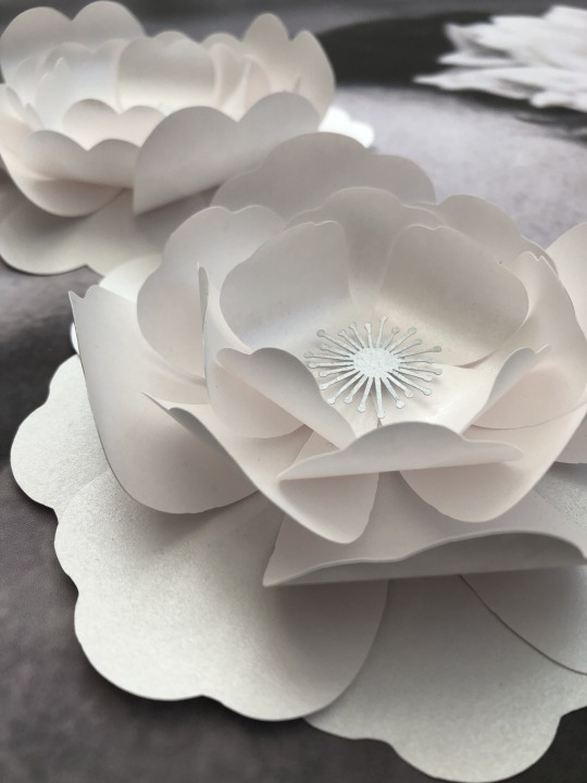
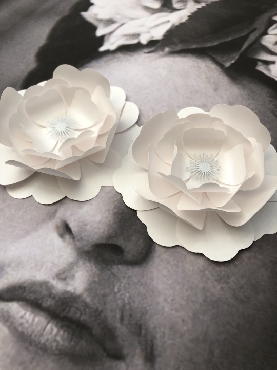
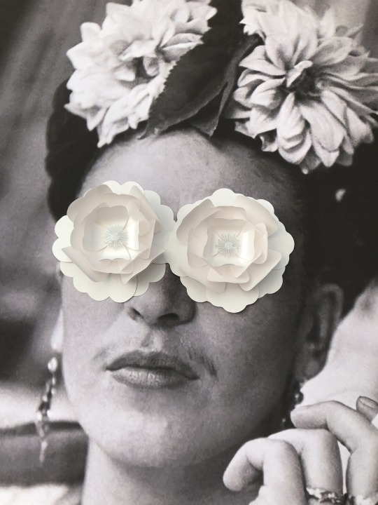
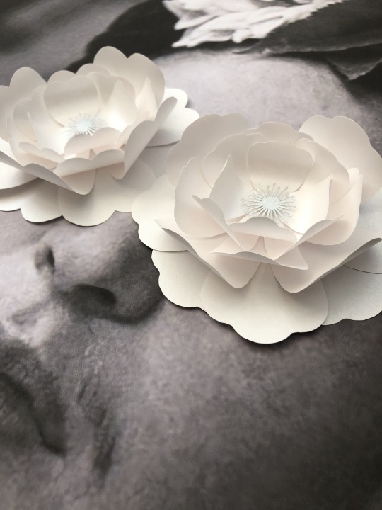
Final piece- 4
Health and Safety
In terms of health and safety I have found that as I have been working in paper at home that there aren’t really too many risks.
Paper
Take care, could cause paper cuts- Risk not bad enough to need to wear gloves.
Take care when handling scissors, scalpel or any other cutting device. Use cutting mats, make sure equipment is not damaged or broken before use to prevent injury. Try cutting away from you when possible.
Adhesives
Glue stick- No major risk. Do not smell as it could be toxic. Do not ingest as it could be toxic
Two part adhesive- High risk. Do not smell or ingest. Do not get in contact with skin or eyes, rinse immediately if this happens, wear gloves and eye protection if necessary. Keep area well ventilated. Be mindful of your surroundings.
Hot glue gun- Risk of burning self. Be careful when using hot glue, use correctly and be aware of the nib as it will burn if in contact with skin. Stand up correctly after each use. Turn off when not in use. Store only when the glue gun is completely cool to prevent the risk of fire.
0 notes
Photo
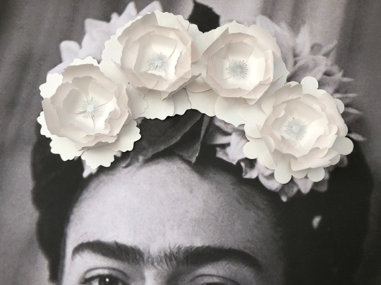
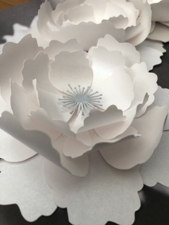
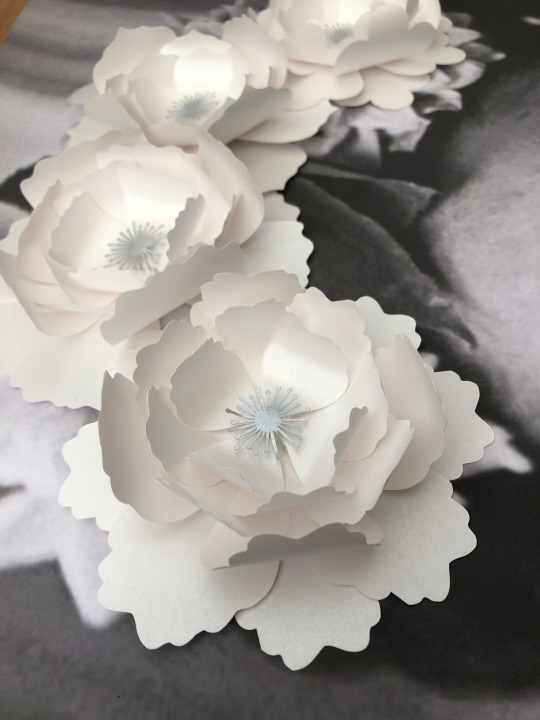
Final piece-3
Last semester I struggled to find any other artists or crafts people that were doing anything similar to me that wasn’t just for displays for events like birthdays and weddings. Out of curiosity I had another look and stumbled across a lady called Zoe Bradley who’s work looks very similar to mine.
She is a paper-caft artist that loves the diversity of paper and the transformation of a 2D material to something 3D. Her work is used to create huge displays and installations as well as background images for jewellery.
It’s really comforting to see someone doing something similar to me as a career, and has inspired me to carry on with my 3D flowers as there is obviously a market for it.


0 notes
Photo


Final piece- 2
Frida Kahlo is a Mexican Painter and all this time I have been making connections to biblical art and shrines, I didn’t even think to look at her own culture and how this may or may not have had an impact of her life’s work.
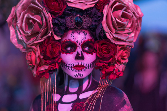
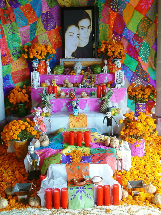
Day of the Dead is a celebration in Mexico where families invite the souls of their loved ones back for a reunion. A quote from the History.com’s article “Day of the Dead (Día de los Muertos)” helps to explain the exact reasoning behind this event.
‘Upon dying, a person was believed to travel to Chicunamictlán, the Land of the Dead. Only after getting through nine challenging levels, a journey of several years, could the person’s soul finally reach Mictlán, the final resting place. In Nahua rituals honoring the dead, traditionally held in August, family members provided food, water and tools to aid the deceased in this difficult journey. This inspired the contemporary Day of the Dead practice in which people leave food or other offerings on their loved ones’ graves, or set them out on makeshift altars called ofrendas in their homes.’
The holiday is an explosion of colour and has helped me to understand the intensity of Frida’s colour palette, it could also help to explain the abundance of flowers in her hair. As for my work, I feel that I have almost unintentionally created a shrine for Frida ready for the day of the dead celebrations.
0 notes
Photo
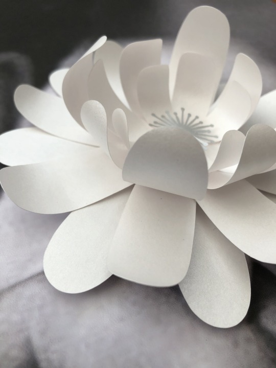
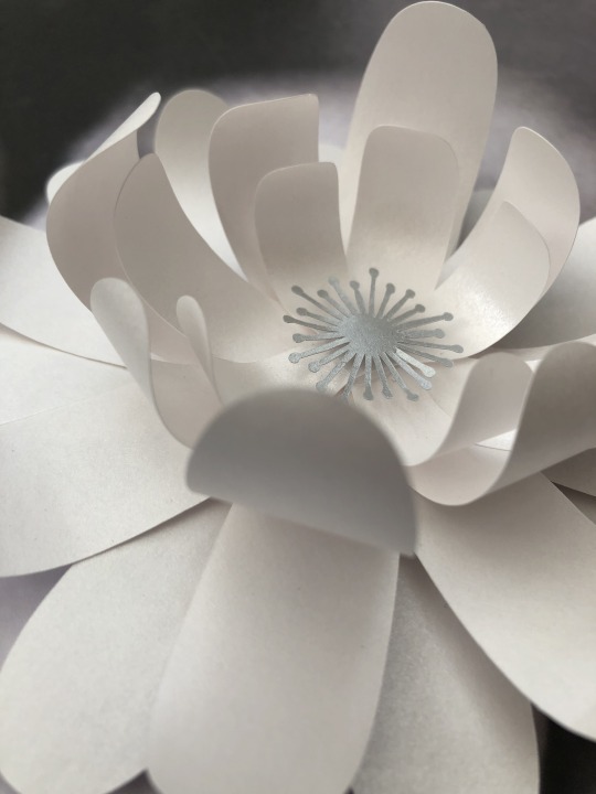
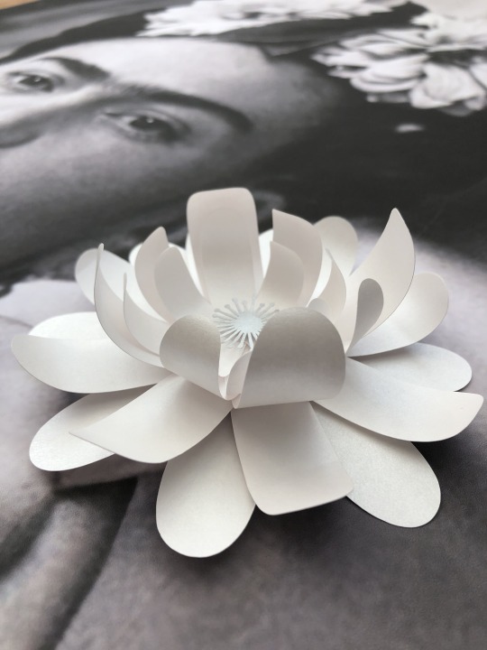
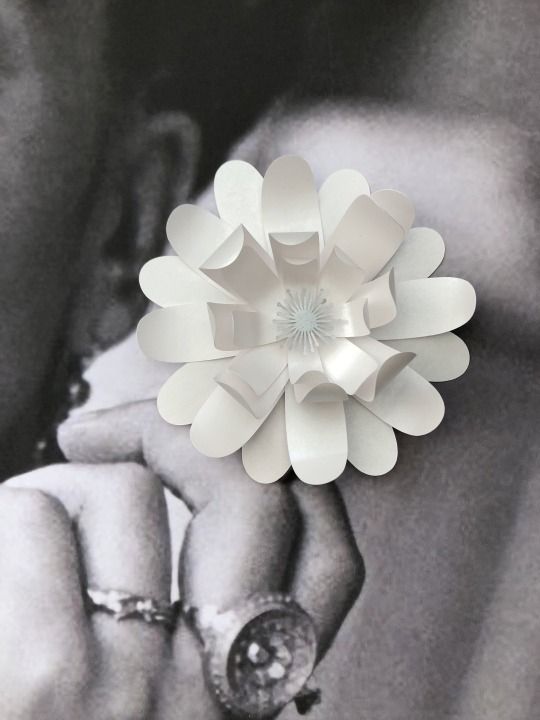
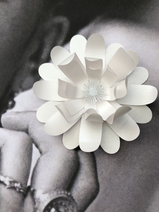
Final Piece- 1
“They’re not essential, but they are”
For the end of year show I wanted to create work that instantly caught your attention as soon as you walked into the room.
Frida had used flowers in her self portraits and photographs so often that they have almost merged with her identity. Her radical views of how a woman should look at and colourful floral scenes were ahead of their time and she is still used and celebrated in popular culture today. Her work quite often shows her emotionless face and direct stare into the camera/or viewers eyes. And I have found all the way through this semester that even covering up her eyes cannot hide the gaze that lies underneath. Her eyes tend to follow you around the room and I feel that this asserts a power that she has had and continues to have even after her death. I feel that the dominance of her gaze alone is enough to grab your attention as soon as you walk into the room and has achieved my exact intentions.
‘I knew that the battlefield of suffering was reflected in my eyes. Ever since then, I started looking straight into the lens, without winking, without smiling, determined to prove I would be a good warrior until the end.’- Frida Kahlo
As for her emotionless face I feel that the addition of paper flowers completely changes each image depending on their placement. Some give the image a slightly comedic value where as others make her look menacing. The flowers show the fragility and beauty of women and act as a crown for Frida, they are a celebration of being different and loving yourself.
‘I knew that the battlefield of suffering was reflected in my eyes. Ever since then, I started looking straight into the lens, without winking, without smiling, determined to prove I would be a good warrior until the end.’- Frida Kahlo
0 notes
Photo
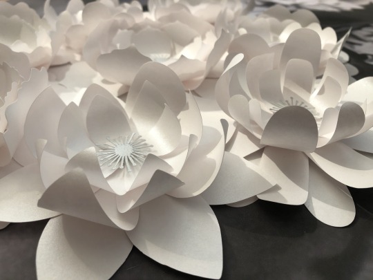
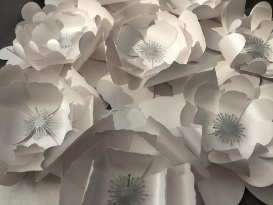
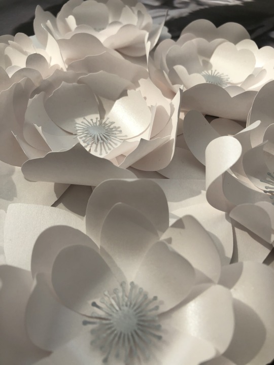
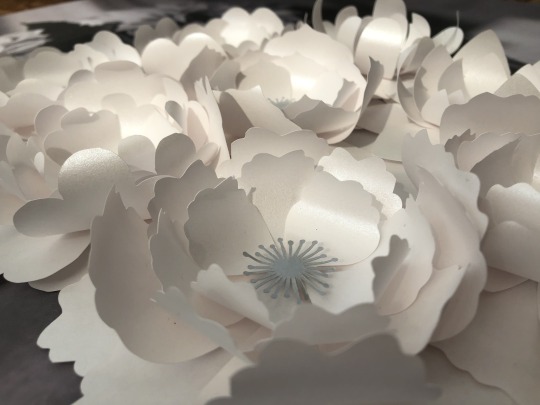
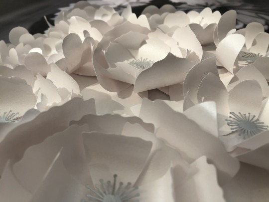
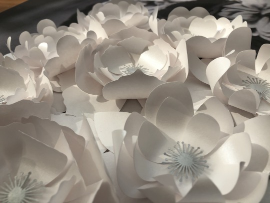
Resolved flower issue
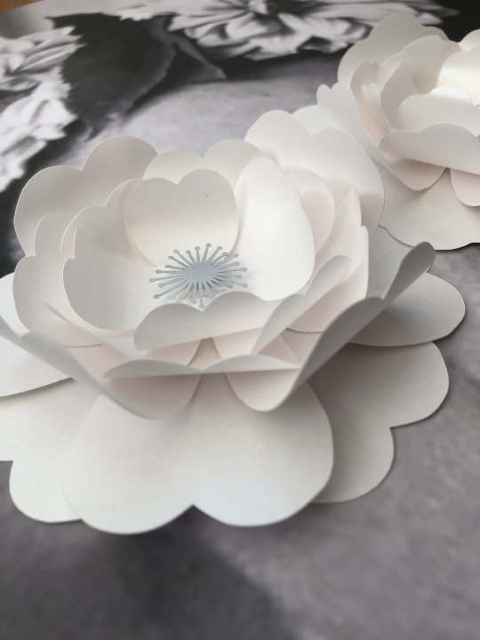
I realised that my final “finished” flowers weren’t actually finished at all and it wasn’t until I had put everything together and photographed it that I realised this. The added petals created a major distraction from the rest of the piece and instead of creating a strong message about identity, power and story telling it became somewhat meaningless.
It took the removal of those leaves and addition of some more petals for me to be happy with the final outcomes and to feel like it gave off a strong message like the original pieces did in the first semester.
0 notes
Photo
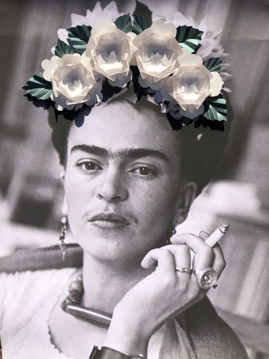
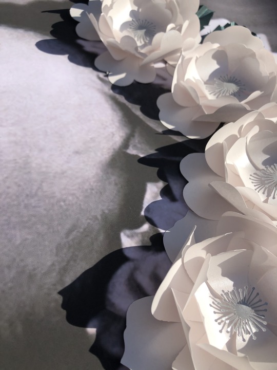
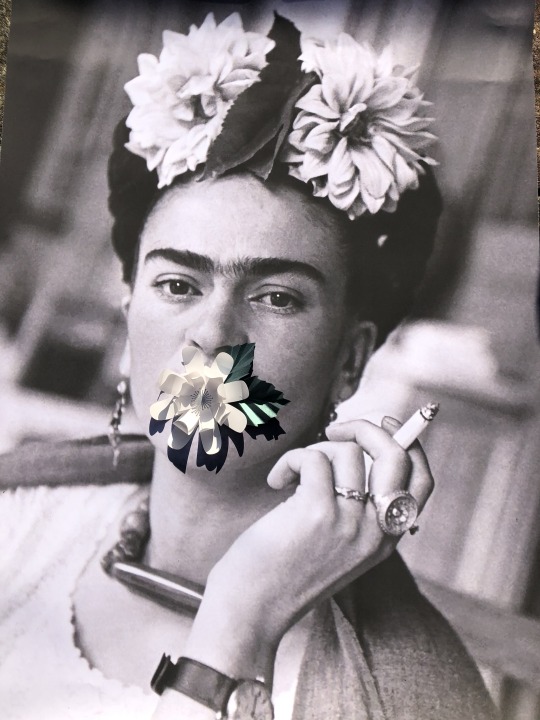
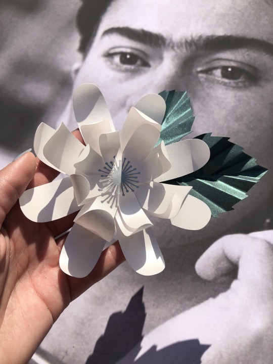
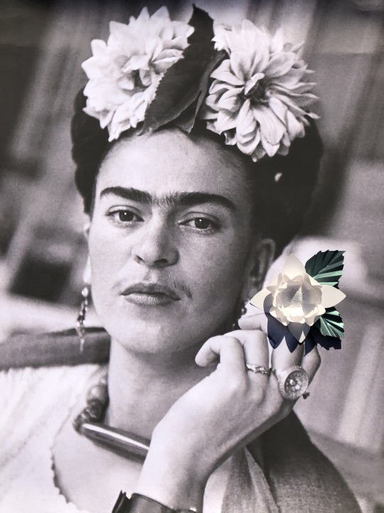
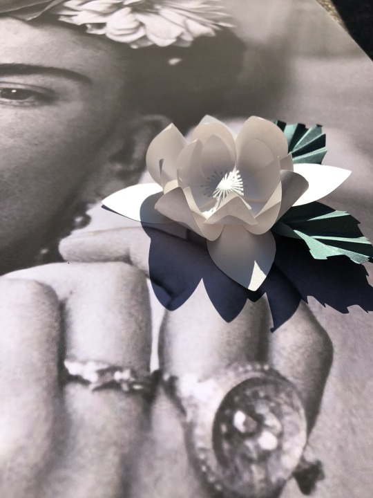
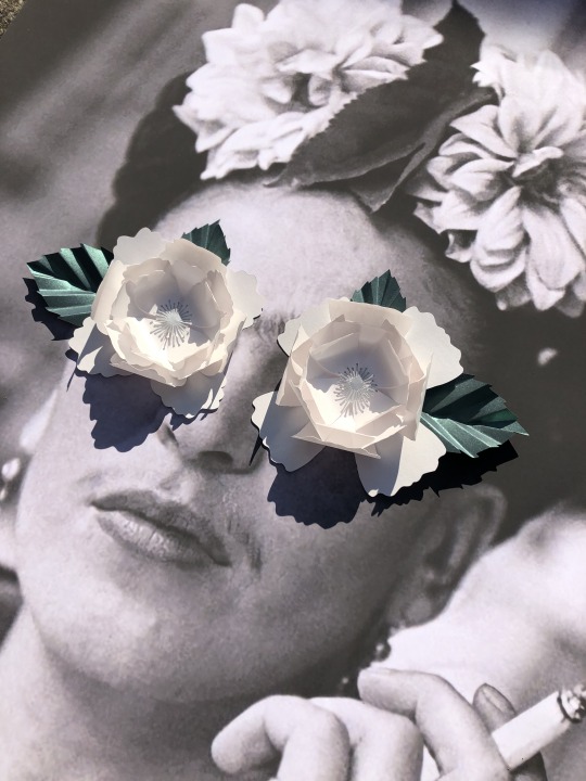
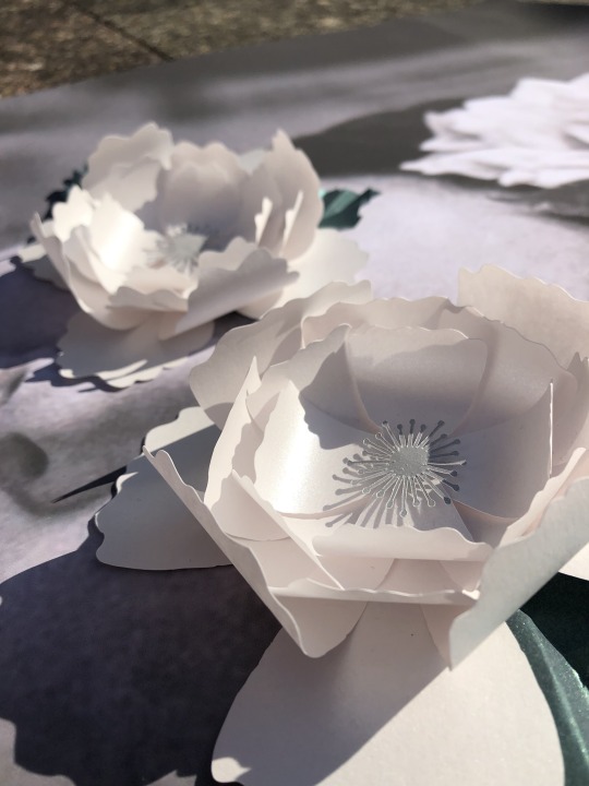
I had finished my final flower pieces and decided it was time to take some professional looking photos for my final piece but I couldn’t help but think that the final pieces didn’t look right.
They didn’t give off the same impact as the smaller versions and I couldn’t think why. I instantly decided that it was the addition of leaves that made me ruined the whole look and story that I was trying to portray.As beautiful as they look on their own, They are far too distracting for the overall image and take all the attention away from the flower itself.
However I found that even after I had removed the leaves there was still something really off about the flowers that I couldn’t put my finger on. After staring at these images in dismay for quite some time. I recalled writing about this exact problem when making the prototype flowers. In that write up I talked about how the shape of the flower was off and this was due to the fact that I hadn’t added enough petals around the edges. And I made the exact same mistake again
I definitely need to remove the leaves and add more petals in order to resolve my issue and hopefully create an outcome that I am happy with.
0 notes
Photo
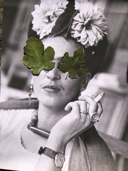
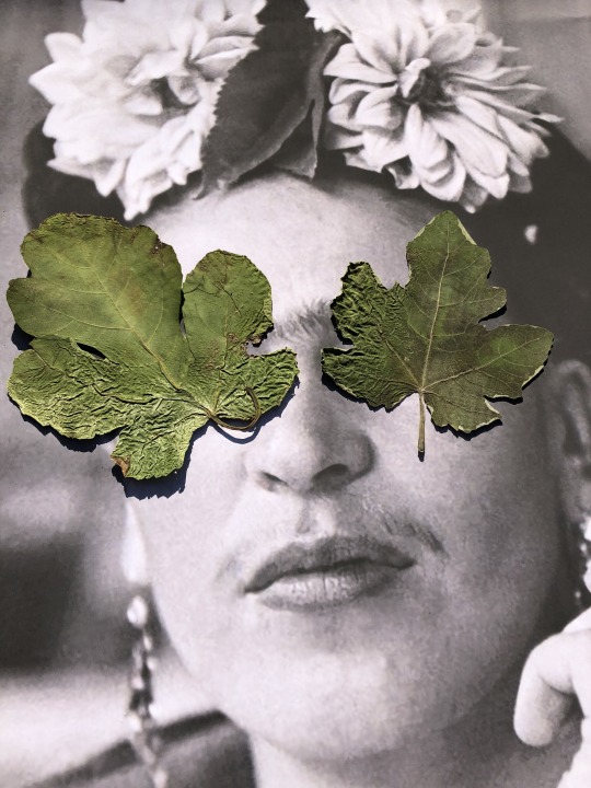
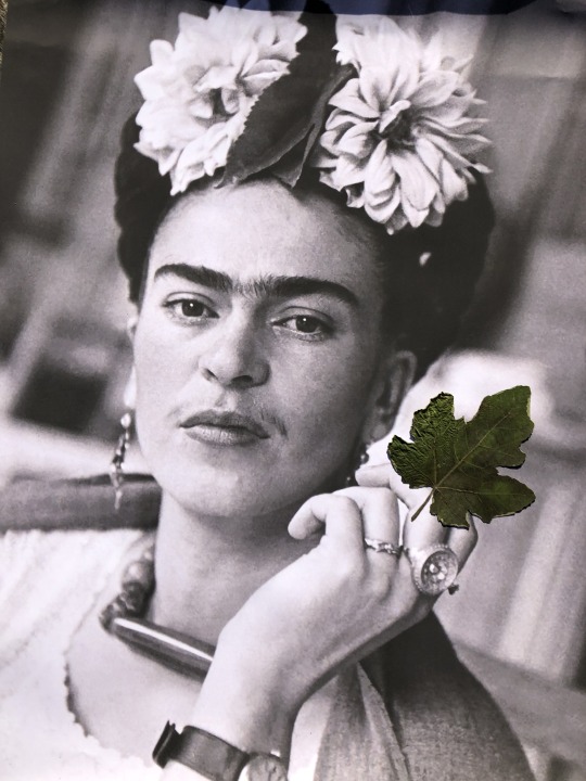
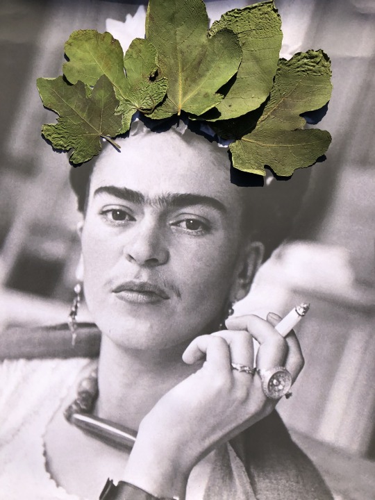
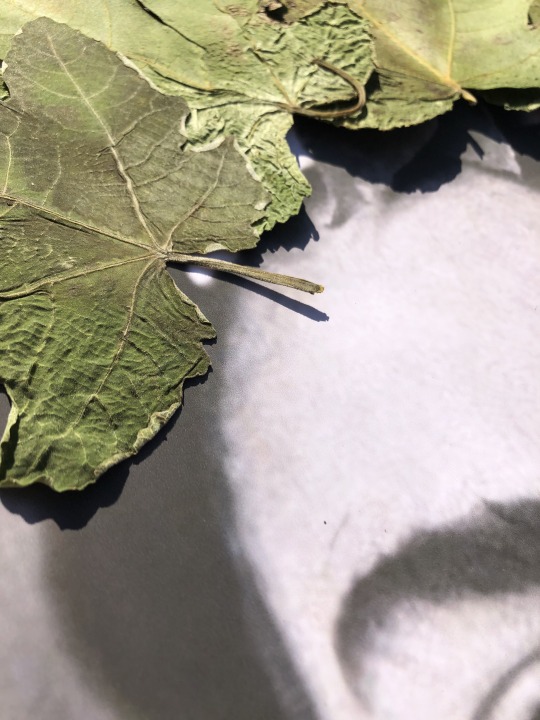
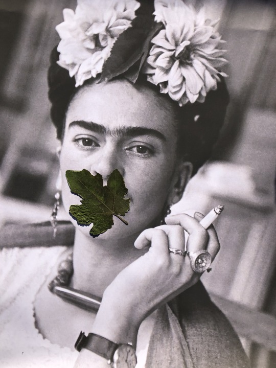
Fig tree leaves
At work we had a bit of a disaster with some top heavy fig trees. They had a tendency to fall over repeatedly which left me with a huge pile of broken leaves. I wanted to make use of these leaves somehow so that they weren't entirely wasted and decided to dry and press them.
I placed the pressed leaves on top of one of my A1 posters of Frida and really loved the outcomes. The fig leaves all have a really lovely, unique shape and I couldn’t help but think of Adam and Eve when I was placing them.
Upon further research I found that the leaves that Adam and Eve used were actually fig leaves and gives off a biblical feel that I seem to unintentionally keep touching upon throughout this semester.

0 notes
Photo
Being a Key Worker during a Pandemic
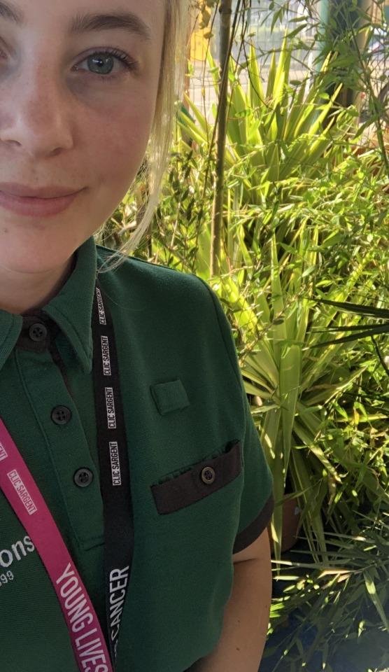
Since Covid-19, my easy little part time job has become more of a full time nightmare. I thought that people would start to calm down once they began to realise the realities of living in a pandemic, but we are now 3 months in and people seem to be getting even more angry and impatient than ever before.
I thought that working full time was going to have a dramatic effect on my uni work but I have found that strangely I seem to do less work on my days off. Corona sadness really is a thing and just knowing that you can’t meet up with loved ones or go for a nice walk or pop to the shops without it being a big deal is really taking its toll on all of us. Feeling trapped inside your own home can be a strange and unsettling experience and urgency and excitement to do anything gets easily lost. I need to remember not to feel sad or angry at myself for not doing anything on my days off and just remember that I am doing my best in these crazy times.
0 notes


