
Don't wanna be here? Send us removal request.
Statistics
We looked inside some of the posts by ellamishannnnn and here's what we found interesting.
Average Info
Notes Per Post
0
Likes Per Post
0
Reblog Per Post
0
Reply Per Post
0
Time Between Posts
13 hours ago
Number of Posts By Type
Text
2
Photo
15
Last Seen Tumblr Blogs


Fun Fact
130K people were victims of a chain letter scam that affected Tumblr in May 2011.
Text
reflection <333

I feel really proud of what I produced this sem. This is one of the more challenging briefs we’ve had however I actually think I enjoyed it more than the other things we’ve done which I was definitely not expecting. Going into this I was quite nervous because packaging and the logistics of creating dielines and making sure everything fits is not something I thought to be my forte. However, I thoroughly enjoyed the whole process including the way it began as a group project and then the ability to breakout at the end and make it our own.
I was really proud of the development on our concept I came up with when we were in a group still and had a lot of fun designing with the inspiration of the Japanese myth behind it all.
I struggled (again) when it came to printing because it never goes perfectly the first time and I find that I can get quite stressed and flustered with it all.
But I LOVED pushing myself with this project though using different types of materials like tracing paper, finally introducing myself to the laser cutting room in the WM building and learning how to use the laser cut I created with the embosser in the bindery.
Overall, this was one of the more fulfilling projects, maybe because you’re left with something tangible, but I just found the whole thing so fun and I think it’s one of the more refined projects I’ve created.


0 notes
Photo


I refreshed the invitation cards just slightly by updating the colour palette and making the line space to write in a bit longer.
I also printed it to check that although they’re small you can still write on them and you can.
Something I encountered as a potential problem was the double sided printing issue of things not lining up; so initially the back of the card was meant to have the heart logo outline but it just wouldn’t be perfect centred when printed. So I ended up using the name of the brand HEARTSTRINGS as a pattern going across the middle of the card.
0 notes
Photo


My final mockups of my print advert in a Frankie magazine - made in photoshop with my on photos, I just adjusted the image and added some highlights and shadows.
0 notes
Photo


Trying out different combinations of polaroid flatlays - leaving room for text to be input in indesign.
top row are some unedited bottom row are the final layouts that made the cut to be edited
0 notes
Photo


Some iterations - basically just shifting/adding text and social media icons and deciding where the logo should go.
0 notes
Photo

Final print advert for Frankie mag - shifted the text so it was perfectly in the gap of no pics and also added the words ‘friendship bracelets with a twist’ so that it’s clear what the product is.
Additionally I photoshopped some images of my packaging into polaroids just so you can see, again, what the product is.
0 notes
Photo

Really enjoyed photographing my packaging today, it’s just so cool to see it all finished, the final product done - I feel like it looks really professional in all the cool shots I got.
I was also able to use the first package I made (but stupidly embossed upside down) as a prop in the background which allowed me to play a bit more, stacking and having one box open, one box closed etc.
0 notes
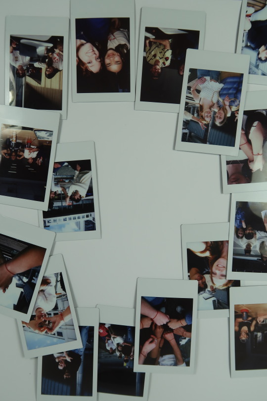
Photo


Spent all yesterday taking polaroids and now I’m left with so many cute pics for this print advert. I also made sure to get some good closeups of our hands wearing the HEARTSTRINGS
0 notes
Photo

I’ve decided that something that might elevate the packaging is if the outer wrap/sleeve is printed on transparency.
I alined the text on the bottom of the wrap with the slogan on the bottom of the box meaning you will be able to see it through the wrap but when the wrap comes off and the text describing the product is gone, the slogan stays on the packaging.
I thought it would be a nice touch also because the logo on the top of the box alines perfectly with the embossed logo on the actual packaging itself.
0 notes
Photo


I went to both pink lime and the cut printers and the same thing kept occurring when I was trying to print the wrap on transparency. The printer chews it up because it’s too thin so I am going to try a thicker gsm transparency.
0 notes
Photo


These are the final die-lines;
The inside of the box is completely red and the other side of the card box and inside framing dyelines will also be full red so that there’s nice contrast between the inside and outside.
The back of the HEARTSTRINGS and connect cards boxes also have small descriptions.
The inside box instructions on the lid will be printed separately to the die-line itself so that I can print the box dyeline double sided and not worry about things lining up perfectly and also so that the emboss on the outside of the lid doesn’t disrupt the inside.
0 notes
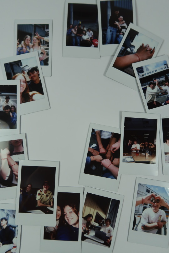
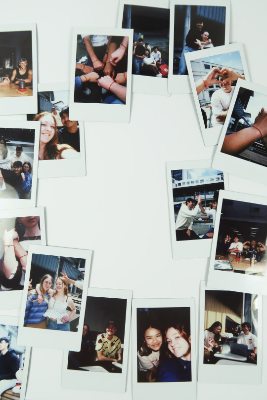
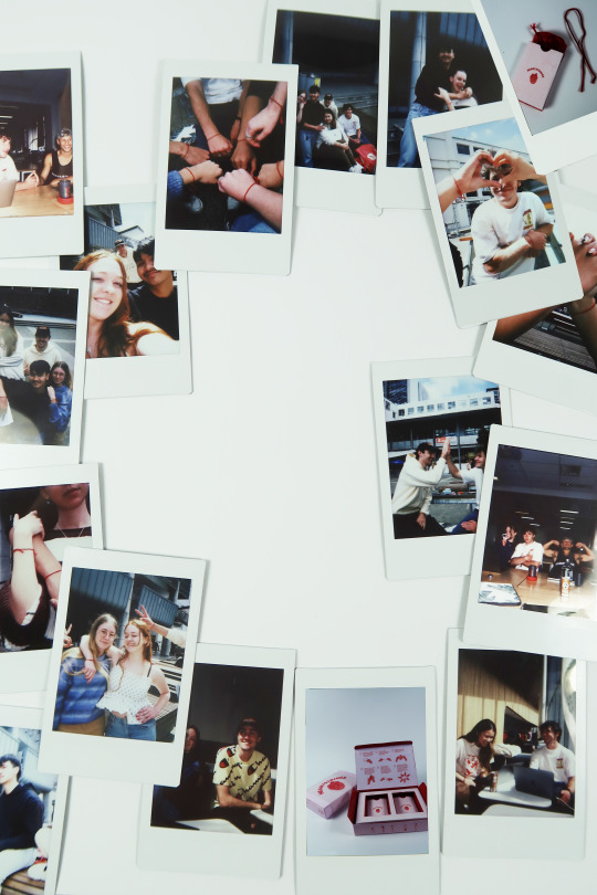
Photo


These are some of my fave pics I got today, I feel like they really articulate the vibe/essence of HEARTSTRINGS and those meaningful relationships that our product hopes to cultivate.
0 notes
Text

This is my final idea for the print advert:
I'm hoping to get all my friends involved tomorrow, give them all a heartsting and take some cute pics of us with my Polaroid cam.
The thing about Polaroids pics and the reason I chose this medium is it is much more special: there's a distinct difference between a burst of pics taken on your phone that will probably get lost in the depth of your cloud storage along with meaningless screenshots and photos of foo- and a Polaroid, a one off, tangible picture that physically prints out. You are far more likely to keep the Polaroids in a special place and get them put when your older to look back on and show people than you are a picture on your phone.
This sentiment is perfectly inline with that of heartstrings, the meaningfulness of a polaroid vs a phone pic mirrors that of a heartstring vs a normal friendship bracelet.
Although this is for my advert, I'm excited to have lots of Polaroids of my friends to keep forever and shoe my kids when I'm older because I genuinely feel very lucky and grateful to have created such meaningfull, connections and lifelong friendships in my degree.
0 notes
Photo


Did a to scale print out of my design and got some final feedback from my friends and Aakifa:
- Don’t need the text on the side of the box because there’s already so much info (put that text on the wrap) - Remove one person from each side of people pattern on side of box so when the wrap is on, you can’t see them but then when you take it off, it’s like a little surprise - Don’t need the logo on the bottom of the box because you’ve already featured the logo twice on the packaging exterior (maybe just have slogan)
0 notes
Photo


More pics of the packaging I printed and mocked up today: the wrap and some notes from some peer and tutor feedback
0 notes
Photo


REALLy struggling to come up with ideas for the print advert - thought about using an image of my final packaging and herring that front and centre but it feels too obvious and a bit naff.
Going to keep thinking and have another brainstorm.
0 notes
Photo


In my search for inspiration for the print advert I'm doing, I came across some images like this, very collage/scrapbook/photomontage aesthetic and the use of polaroids instantly sparked an idea.
I feel like polaroids are very nostalgic but also special and meaningful so I thought maybe I can use polaroid images to make something cool ....
0 notes