Text
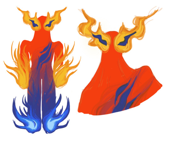
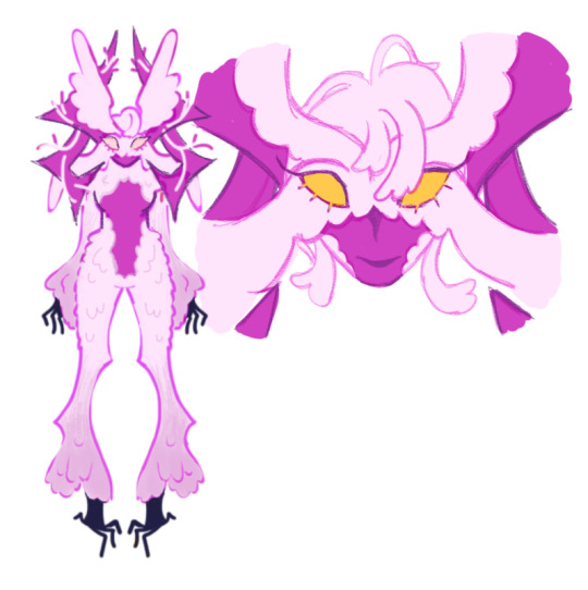
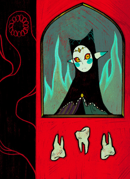
design comm for a mage of eyes and brambles
836 notes
·
View notes
Text
CHOOSE YOUR FIGHTER II
GERTIE GREENTHUMB
COSMO THE RAY
CROSSING GUARD
MISS BONEALONE
4K notes
·
View notes
Text
CHOOSE YOUR FIGHTER:
FERN TWERNY
WIGGLD'Y WIGGLE
AL MIKSTUP
TRAFFIC JAM
1K notes
·
View notes
Text
Ha pasado un tiempo... he
Bueno estos son mis rediseños para charlie y vaggie de hazbin hotel
217 notes
·
View notes
Text
GIVE ME A HUZZAH!!!!
GENERAL WINTER (HH rewrite oc)
Name: General Winter (real name unknown) Death:1815 Status: a potential overlord who tries his luck, facing defeat daily in territorial wars
His Bio and Story : General Winter has died in a battle after falling with his entire army on a frozen lake.
He lived in France and lived the french revolution for years, but his objectives were bigger than him and he ruined everything with his megalomania
and famine for power and conquest, at least until his fatidical last battle during the winter.
You probably think that after his death he would change and learn with his past, well.....you all wrong, he stills the same but even worse, after several years of an eternal afterlife seeking revenge and power through Pandemonium, he is nowadays one of the most megalomaniac/chaotic being in the capital of hell.
But at the end of the day he is just a silly guy that needs love and therapy because of his complex of trying to compensate for something.
More info coming soon...
#artists on tumblr#artwork#hazbin hotel#hazbin hotel oc#hazbin hotel rewrite#hazbin hotel redesign#retro#vintage#comic art#helluva boss#angel dust#angel redesign#´#vivziepop#my art#art#nail art#digital art#illustration#art study#drawings#art style
21 notes
·
View notes
Text
AMAAAAAAAAAAAAAAAAZINGGGGGGGGGGGGGGGGGG!!!!!!!!!!!!!!!!
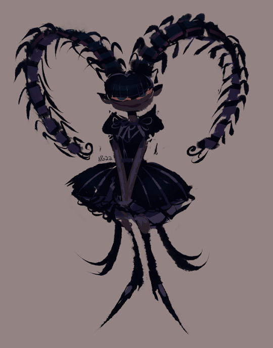
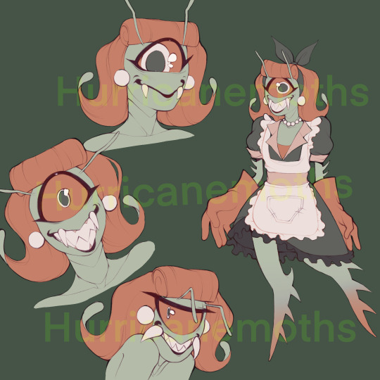
Niffty's finally here!!!! Was gonna post her earlier but I had brain worms. Alr comparison + breakdown time ⬇️
Niffty's another case where I feel like the pilot design was better; mainly with the colors.
I'll admit that my internal biases are definitely in play with these redesigns and opinions, but honestly her more warm hues probably would've helped separate her a little more from melting into the main cast & background red-pink scheme. Other than that tho I'm neither here nor there on either design
Once again, her design is one that shares very little about her as a character. The apron helped to convey she acts as a maid, but her supposed bug themes and the face that she died in the 1950's doesn't really come through at all. She's just. Some little girl!
Here's my Niffty in her unaltered state! Her hair isn't actually legs, it just naturally forms in these odd curl shapes. Usually it's tied back. She naturally has 4 arms (cuz she's roach inspired!) but she hides them bc she's very unhappy with her insectoid features. It's very uncomfortable. She's a fat woman but she's very self conscious about her weight and figure so she always cinches her waist with her apron. Also very uncomfortable.
Obviously has more bug features now. I'd say she's inspired by the Yamato cockroach, which I looked into, but. To be real wit u a lot of roaches look pretty samey. She's got the hair that I wanted to resemble cartoony bug legs a bit, hatched pupils, segmented limbs, the apron tie representing cockroach wings, and the hair tie representing antenna. She has no wings or antenna of her own tho.
Inspired her look off 1950's housewife attire, particularly this one pic I think I snagged off an article
Emulated the collar she has on, as well as added heels to her design bc apparently that's all the gals were wearing. Niffty's very traditional. She's also got cleaning gloves and a front pocket in her pocket for all her cleaning supplies! And I added her lipstick back in there bc it's saurr cute.
Edit: girl I forgot to mention her colors.AAAAAUGH. erm okay. SO. she's green and red now bc. Wrath and envy colors in my rewrite. Prominent sins in her I'm sure. Also just warmer in general bc... Well I liked the look. Also having her be mainly green adds some color diversity to the lineup + helps her stand out.
That's it fr! Here's the rest of the conceptualization page... As a gift
She was very fun to design hehe. Alright that's awl.... Hope u liked her....... Okay bye✌🏾🧍🏾♀️
95 notes
·
View notes
Text
next #Blessimp up is Env'iathan! a fishy imp angered and jealous of those more beloved than it.
47 notes
·
View notes
Text
My silly fakémons Pickerpie & Snagpie! I had sm fun trying to recreate fake gifs inspired by the anime recently, I can't wait to do more :3
29K notes
·
View notes
Text
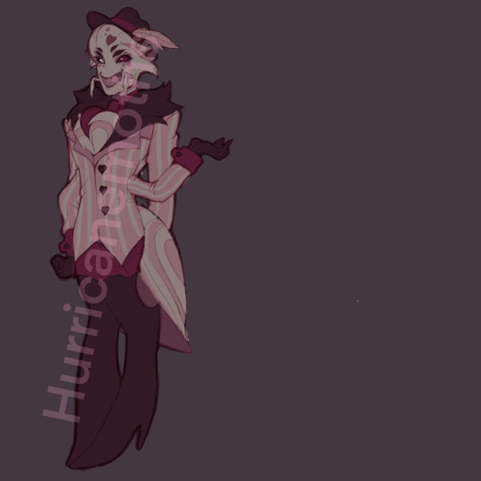
Valentine (redesign)
Name: Vesper Valentine Death:1969 Status: Hell-Lord of the classic adult industry (in our days, going into decline)
His Bio and Story hasn't change much: Valentine has been the adult content Hell-lord since the 60s, known as the Queen of stages and magazine covers.Sadly today he is in decay because of his competitiveness with Joi the newest Hell sex symbol.He is going to try find consolation and help at the hotel. Curiosity: Yes he is my version of Angel and besides Angel Dust he was based in Divas from the 60s and 50s. More info coming soon...
#artists on tumblr#artwork#hazbin hotel#hazbin hotel oc#hazbin hotel rewrite#hazbin hotel redesign#retro#vintage#comic art#helluva boss#angel dust#angel redesign#´#vivziepop#my art#art#nail art#digital art#illustration#art study#drawings#art style
69 notes
·
View notes
Text
He's finally done I think. WOAW! Radio demon time!!!
Okay time for comparison + breakdown rant ^ - ^ another SUPER long one I had a lot to say about this silly guy
ALRIGHT. So. Atp all that can be said has been said about Alastor but I'll gloss over it anyhow. Grossly historically inaccurate hair and clothing. Invisible deer theming. One of the main reasons he's got one of the most clowned on designs in the show is bc he's a pretty good representation of the worst it has to offer. He's absurdly red and has the waspiest waist in town. Also gotta zero in on the coat for a second bc I find it incredibly stupid that he went to that tailor bc of his coat being ripped and then left the shop with the exact same torn coat on oh goddd that felt like a complete joke who wrote this
Also his "redesign" was pointless. He stayed pretty much entirely the same except his colors got pinker and grosser and now he has this?? White trim on his lapels??? Even less 1930's accurate and it only serves to hurt the pallate in my eyes. It's the only spot of white on his entire design, it doesn't appear anywhere else so it throws it all off. And it's so bright. Is it supposed to be a focal point?? His tits????
Anyways onto my guy who I love so very deeply. I'm pretty sure sepia film was outdated by the 1930s but I gave him a palette inspired by it to emphasize how dated and stuck in old ways he is. Added blood red accents bc. Well. Cannibal murderer. Also bc I redid the sin colors so red is wrath and it seems like a fitting sin to pair him with.
After looking into 1930's men's fashion a tiny bit (thanks anon, this video was helpful!) and gave him a double breasted coat but wider and pointier so he looks a little less like just some normal guy and really emphasize how prideful and egotistical he is. "Ooo look at me I'm super big and imposing and powerfulll". I think it's a fun character trait of his. Definitely keeping it.
I liked him wearing gloves bc I feel like he wouldn't like getting his hands directly dirty and would always be covered when committing his murders. Maybe he's a germaphobe even. "I can excuse murder but I draw the line at dried blood on my skin". Also the gloves being white would contrast really well with blood so. Love that
I gave him a long tie to free him from the Vivziepop bow tie uniform and a fedora to add to the 1930's vibe and serve as something that can occasionally obscure his face in shadow. His glasses are also opaque and I imagine his eyes would rarely be shown if ever to make him seem more inhuman and off-putting, disconnecting him from personhood a bit. Wanted to add to that with his smiling mouth never opening and just being a static grin that can only occasionally widen or lessen, his voice cracking out of his "speaker" with fuzzy radio static. Seen multiple ppl use that idea and it always eats
I love Alastor's silly theatric nature (primarily in the pilot) and I'd probably keep it, but I'd add a layer of uncanny-ness to him where when he's not putting on his silly jovial facade, he gives off an unnerving vibe. Trying to appear approachable and charming and pleasant to lure people in before he's revealed to be less than human. Loveee thattt
I love Alastor being a deer. Predator becoming prey (animal) + "prey animal" lulling people into a false sense of security before striking. Love it. We should be CAPITALIZING ON IT❗So I gave him deer like legs, visible deer hooves, and more readable deer ears + the ham radio tower antenna antlers (sorry 4 calling them horns 💀)
Tried to make it a little more obvious that he's a mixed man of color by giving him dark wavy hair and the faintest hint of lip definition Viv uses in her style. I think it works. He's still not dark skinned tho
LASTLY the mic. Also not an original idea as I've seen tons of others turn it into a carbon mic but turned into a pentagram shape and I love the idea a lotttt so I joined the crew.
AND THAT DOES IT!!!! hope u like him as much as I do hehe. Just 1 supplemental doodle this time sorry :/ showing off how his face is probably obscured most of the time. He's. So hard to draw. I'm just bad at men but I'm tryinggggg guys
Alsoooo I've already finished the drawings for Niffty, Angel, and Husk! Once I've finished their breakdowns I'll add em right to the queue, and then I'll make a post with all of the main 6 together :3
100 notes
·
View notes
Text
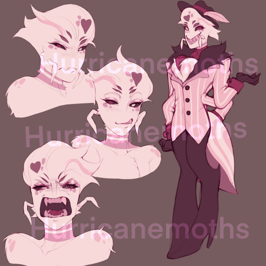
YAAAAALL IT'S ANGEL DUST!!!!! bro I'm so exited to tell u about him hehehehe he might be my fav redesign of the bunch idk
Comparison & rant!⬇️ + A bug/spider cw. I put reference images in there!
Ok guys can I be honest with you. I think. Pilot and pre-pilot Angel were peak 😔 I'M SORRY I'M BREAKING MY SILENCE
Like whaaat... WHAAAT.... I'm sorry he served here he had the BEST design idc idc you can't change my mind. These were NOT bad designs. I've got a slight preference to his oldest design but even then the pilot design was great to me.
THIS however...
OooOOOH MY GODDDDD THEY NEUTERED HIM!!?! NO tits, three measly ugly stripes on an uglier coat, LONG GLOVES THAT ARE MISMATCHED??? ONE OF THEM HAS THESE WEIRD... WHITE FLAPS?? WHO— WHAT. WHY. AND THEY GO OVER HIS LONG SLEEVES 😭😭😭
I'm sorry but Angel will always be the most egregious case of character assassination in this show, design and character wise. He sucks now and I used to love him.
Okay enough crying let's get serious.
So yeah show Angel sucks. Removing his chunky gloves removed a lot of the fun shape in his silhouette so now he's just a gangly twink. Very little visual interest. Also hate hate hate how his new mismatched gloves are pulled over his long sleeve coat. So dumb. Hate it.
Also explain to me how he's gradually gotten less tits but has simultaneously become more femboy-ified..... So many people immediately mistake him for a girl.......
They also mistake him for. Literally anything but a spider. Once again Viv can't code or theme characters for shit. I also don't like how his face changed... I can't describe it but It's so much less appealing and charming. Something in the eyes and his little cheek bump. Idk. Really hate show Angel props to the animators for making him watchable with his bold animation ts was real nice
Okay onto my Angel! He's now a goldenrod crab spider now! Thank you @/cryptablog for this idea!! (Not tagging them bc they hate the hellaverse with a burning passion lol 💀) They can be white with pinkish markings like our og Angel but most of them are tinted yellow or completely yellow!
I decided to make him most similar to that mid ground mix of yellow and white with pink-er markings. 1 because I kept lust pink and I feel like that'd be a prominent sin of his (+ purple is in here a lot bc I feel like he'd also be pride aligned! Purple is now the pride color :3) and 2 because the yellow tone in his fur is kinda meant to connect him to Husk in a way... Cuz that's kinda his main color... Idk maybe I'm onto nothing with that one BUT his primary color is purple and Husk's primary color is yellow(ish)! Complimentary boyfriend's!!! Are you seeing my vision!!!!! (Also on a lesser note his colors look more similar to my fav version of Angel aka his design from the pre-pilot ref sheet I showed)
Another idea you can thank Cryptamen for is him being partially translucent in places just like real goldenrods!!!! The idea behind that was because he was in the mafia in life and he had to be really stealthy at times so now in certain environments he's harder to see... Maybe he can even turn fully invisible for a bit... There's also possible character reasons to consider tying in there as well... Ough very cool idea 10/10
Gave him 4 legs and 4 arms + the big abdomen to really make him scream spider bc yes spider boys can be hot and no Viv was not willing to CAPITALIZE on that 😒 Also lengthened his fangs... Also moved his eyes to his forehead to make them more prominent and hopefullyyyy seem more like eyes. Idk. And now he's got pointy little pedipalps as well!!!
Gave him his boobs back bc he deserves them and just generally gave his body more shape (though the second set of legs definitely helps lol). Slightly de-twinked... But not by much...
Once again looked up some common hairstyles at the time and people loooved their hairspray and curls, or swoops, or waves— they were gettin funky with it. Hard to emulate that on his nonhuman skull so I took some artistic liberties applying ideas from common styles onto him.
Didn't do much research at awl for his clothes... I mean... He's not wearing much to begin with... I kept the long gloves bc I thought they had potential to look cute and I have him rolled cuffs on short sleeves. Wanted to keep the style simple but otherwise I would've drawn button clasps keeping them in place. No notes on the thigh high heels so I kept them. Everything else is just kindaaaa whateverrrr EXCEPT THE NECKLACE. Though it was hella funny and fitting
And that's awl folks.... Do u like him do u fuck with him.... Let me knowwww....... Okay byeeee ✌🏾🧍🏾♀️
91 notes
·
View notes
Text
HUSKER!!!! Husk. Whatever. THIS OLD CAT!!!! ^ - ^
comparison + breakdown ⬇️
Look idk what possible lore reasons there could be for Husk having bird wings and tail feathers whether it's hidden somewhere online or to be determined later in the show even though I can't for the life of me even guess why they're there (if you've got any hc's tho I'd love to hear em) but I just got rid of em entirely, at least for the time being. Declutters him a little. They're definitely a little much.
And I've always hated those buttons on his chest fur... Are they part of his pattern.... Are they hot glued on...... What is it with Viv and melting clothing and flesh together.........
He also does NOT look 60-70 like at all (pretty sure that's canon but I just got it off the wiki) so I tried to remedy that by giving him more wrinkles and creases. He's a Persian cat thing now bc some of them really do be lookin like mustache wearing old guys fr. Also his neck fluff is sorta supposed to allude to facial hair w/ some greying sprinkled in! He's officially like... 62 now. + He's fatter bc 1) beer belly 2) Persian cat build and 3) Vivzie twink fatigue
Husk's outfit is objectively silly for his grown ass to be wearing but I like the hc I've seen around as that being a stipulation in his deal with Alastor where he figuratively and literally "took the shirt off his back". Considering how as an overlord he had a nice suit and he (possibly. Definitely In headcanons) doesn't even like showing off sinner features, or his body at all, especially not in such a way. Is this canonically the case? Probably not. But hey 🤷🏾♀️
I made some comparatively minimal changes there. I undid his tie bc man's usually drunk and doesn't have the energy to fuss with it. I also gave the ends a bit of a spade shape. The clasps on his suspenders are meant to be clovers and there are still hearts on his hands. For the diamond face... I kinda tried to put it into his tail? But that's kinda iffy so 3.5/4 card faces achieved 👍🏾
Turned his top hat into a more flat wide brim hat that i could NOT for the life of me find a name for... Just wider fedoras I think? but they seemed to be kinda popular at the time. For my Husk, as an overlord he occasionally wore a fancy top hat when he was showing off, and now this is like. His downgrade replacement he's got to wear. + Some playing cards tucked into the hat band!
Made those yellows his primary colors bc in my rewrite greed is gold and I definitely think that would've been one of his major sins in life. Also a bit of gluttony too, which I made orange, so I added some of those tones in there. Allsoo after fussing with the colors for literal days I stilllll kindahateemalittle BUT IT'S FINE. I'll figure it out
And that's all for him!! Realized I forgot to put the little anti Viv banner on my last post but then again idgaf fr it's whatever. If you don't know I hate her you'll learn before long
And, of course, dvelopment sketches 4 sticking around!!!!
Ok that's all bye ✌🏾🧍🏾♀️
111 notes
·
View notes
Text
Sandie????!!!!
Angel dust redesign
Pspspspsps
253 notes
·
View notes
Text
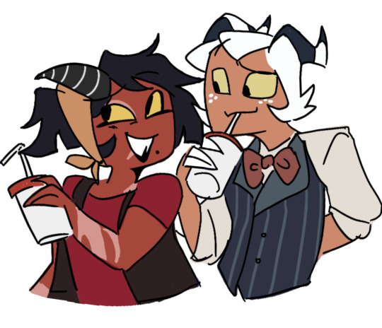
SAY HELLO TO I.M.P !!!!
Your favorite "Immediate Murder Professionals"
(Kids die for free !)
Description:
This is my redesign to the I.M.P (Loona is coming too and the line arts). They are part of my Hazbin Hotel project called the Limbo Hotel, basically a rewrite with some Ocs and a lot of redesigns.
Their background is slightly different, I will reveal them soon when I do the line arts.
Curiosities:
In my version Wrath Imps like Millie have goat features and only 3 fingers in each hand.
The greed Imps like Moxxie have 4 fingers, bigger hands and claws, a more orange tone, a snoot and sharper horns to remember more of a dragon.
Blitz is a hybrid, a mix of a greed Imp with a Succubus so......He is a special case. He is blind from the right eye, and instead of a tattoo the circus symbol is actually an hot iron mark like what farmers do with cattle.
#hazbin hotel#hazbin hotel redesign#hazbin hotel au#helluva boss rewrite#hazbin hotel oc#hazbin hotel rewrite#artists on tumblr#artwork#helluva boss fanart#helluva boss#helluva boss redesign#helluva blitzo#blitzø#helluva boss blitz#helluva millie#moxxie#moxxie helluva boss#my draws#my art#my post#my writing#helluva fanart#Hell#fanart#digital art#comic art#my artwrok#haz
228 notes
·
View notes
Text
millie redesign I did for funzies!!! I feel like she’s often sidelined in terms of story and design TnT so I tried to spice her up a bit. i just made her lean more into southern styled clothing and gave her scorpion features hehe. main goal was to make her looked roughed up so tattered clothes, scars, broken horn, etc. might redesign more characters i dunno ;P big thank you to my friend @quartizinedaze for giving me the idea to redesign her.
90 notes
·
View notes