Text
Evaluation
I was a bit worried when we first got this brief because I hadn’t done tracking like this before or even at all so I didn’t really have any ideas of what I was doing. I knew I wasn’t going to use PFTrack because it created so many issues and I knew After Effects a little bit better so I decided to go down that route. My original idea was to do something really simple like tracking a logo into a scene but then I thought about the idea of making the advert for Cardiff which really interested me because I would have loved to have seen a video like that.
I like how it turned out although I feel it does lack some professionalism. I like how the tempo of the video came across and most of the shots turned out well. I like the motion graphics I did at the start showing the texts because it looks quite modern and fits into the video. I also liked the colour grade I did and the end logo. I’m glad Jason and Geraint told me to change the end part because I think that’s my favourite part about the video as it fits in well.
What I don’t like about the video is how it’s a bit too long and the actual tracking part isn’t great. Some shots turned out well however a large majority are quite shaky so that could’ve been fixed. I’m not 100% happy with the end result but I don’t entirely no why, I just feel like it’s not my best.
I enjoyed learning tracking for this and I will definitely use it in the future as it seems quite a useful skill to have that adds something to a video. Overall, I’m not entirely happy with the track and I think it could’ve turned out better if I used my time better.
0 notes
Video
tumblr
Final Tracking Video
Really happy with how it turned out.
1 note
·
View note
Video
youtube
I decided to use a glitch noise that sounds a bit like a guitar being plugged into an amp so suggests live music etc.
0 notes
Text
Logo


The retro logo didn’t really fit in with the theme of the video so I thought instead to use a kind of punk font and have it glitch at the end with the welsh flag colours. Really like how this turned out.
0 notes
Text
Logo Rebrand


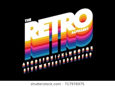
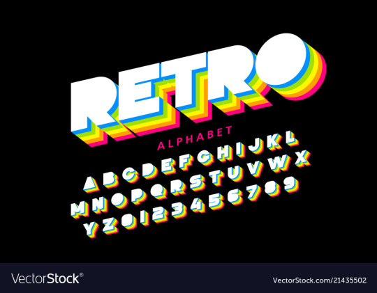
To change the logo at the end I thought about using a retro style that seems more youthful so I found a font and a few inspiration pictures and came up with this logo.
0 notes
Text
Feedback
Jason - change logo, sync up to music more at the beginning and when the phone unlocks
geraint - too dark, change logo as well - font etc more fun, track arrow to background.
0 notes
Text
Draft 2
Tried to fix some little things bugging me i.e sync up with sound and I added in the black bars.
0 notes
Video
tumblr
Draft 1
I did another draft including black bars. Decided i liked the bars so will put them in draft 2.
0 notes
Photo


Finishing Touches
Added some grain and colour graded some shots a bit more and also cropped some clips so they flowed more.
0 notes
Photo


Honestly this arrow thing was the hardest thing ever because I’m not really used to 3D space. It took me so long to get perfect and I kind of just guessed how to do it. Pretty sure it’s right but I’m so glad how it turned out.
Getting the arrow head on the path was so hard as well I had to follow a tutorial to be honest but it helped a lot.
I tracked the arrows as well.
0 notes
Photo


I tried different fonts to try and make it fit in with the club. I decided on the easy to read ones.
0 notes
Photo


Tracking
I did the actual tracking in After Effects which was nice and easy to use. I used masks for the position of the words so that they looked like they were coming from the building. I used keyframes for this and the exposure option on AE which helped me see where the text was going.
0 notes
Photo


For the ‘SPOONS’ part I tried a few different fonts but ended with the more fun natural looking font that looks maybe even handwritten because that’s the vibe of the video.
I used a directional blur so it moved with the camera. Could’ve tracked this tbh.
0 notes
Photo


Colour Grading in Premiere
Still turned out okay.
0 notes
Photo


Colour Grading
Gafyn suggested I colour grade before adding any motion graphics which makes sense so I colour graded the whole thing which took me a lot longer than it should have but then I couldn’t figure out how to get it back into Premiere so basically this was all a waste of time. I colour graded in Premiere instead.
I used splines to darken some spots and grabbed stills etc to ompare shots.
0 notes
Photo


Process 01
The start of the video I wanted text messages popping up so I basically just made a grey shape and turned down the opacity to look like an iPhone message, added text, choosing a font that looked slightly similar to iPhones but I moved the spacing of the text nearer to each other so it looked more modern.
I then pre-comped both messages and created the movement using the speed graph and position keyframes.
Then I had to roto out the hand and feather it so that when it came in it went over the text. I found this part quite fun to be honest I really like how it turned out.
0 notes
Text
AUDIO
The music took me a while to think about, I tested a few different songs in order to find one that would fit the mood well. I knew i wanted it to start off like someone is listening to a song in their room so I wanted to use a more calm song at the beginning and then rush into the fast paced part of the video. I also want to use a kind of quick punchy song that maybe suggests teen angst.
My first option: Black Skinhead by Kanye West.
youtube
I was just gonna use the instrumental for it because it’s quite punchy.
I thought about older bands that I could use such as The Clash because they give this kind of rebellion feel. I decided on Complete Control by The Clash because it has that really old gritty feel I wanted.
youtube
This is how I tried out the music just muting some whilst playing others. I also added in the 1 2 3 4 countdown from (White Man) in Hammersmith Palais also by The Clash because I think it made the transition feel smoother.


I used an FFT filter on a few things i.e the room scenes to make the music seem like it was being played on speakers in their room.

0 notes