
Don't wanna be here? Send us removal request.
Statistics
We looked inside some of the posts by ebaymatee and here's what we found interesting.
Average Info
Notes Per Post
0
Likes Per Post
0
Reblog Per Post
0
Reply Per Post
0
Time Between Posts
14 hours
Number of Posts By Type
Text
17
Last Seen Tumblr Blogs


Fun Fact
Tumblr.com is the 103rd most visited website in the world.
Text
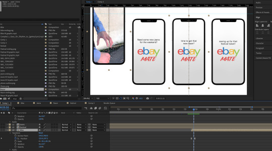
Creating the final slides
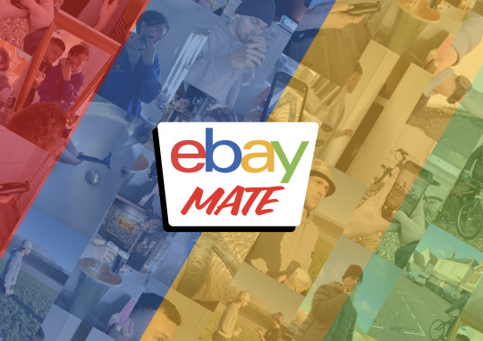
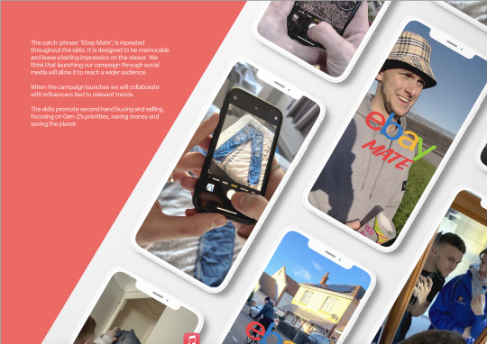

When I made our final slide deck which accompanies our video I knew it needed to be fun and represent ebay mates idea. I made some mockups one of multiple phones as I thought it helped illustrate the multiple shorts our idea was about, This idea was further explored on the background of the cover where I made a collage of screen grabs from the videos.
I also made a mockup of the functionality, showing a swipe up arrow coming from the bottom highlighting the "shop now" call action button, and a heart showing the content being used social media where users would hopefully react to the ad and help to spread the content. I made the main mock up in photoshop and added the icons I made using the 3D function within illustrator. We decided to go with the 3D icons rather than the hand drawn Illustrations Tommy made in the end as we felt it worked netter with the way we presented our idea.
I went for some diagonal lines in the composition to break it up and make it feel more fun and trying to keep it still close to eBay's branding by using their colours green white blue red and yellow.
(Ollie)
0 notes
Text
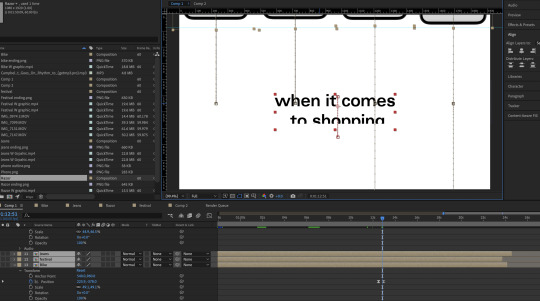
Editing of the final video
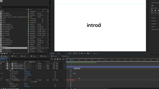
I knew I for the actual D&AD submission we could only upload one 2 min video, so I decided to make a video in the standard HD 1080p 1920x1080 format, incorporating all of our short videos into one.
I decided to stick to a clean white background and san serif font, as this is what ebay use a lot in their promotional material.
Starting off with the word "introducing" I decided to make it appear with a typewriter effect to symbolise someone texting or typing it out. This follow with a upwards reveal of our logo. These small additions I feel makes the video look slightly more dynamic and exciting.
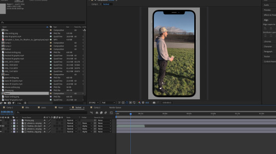
On separate compositions I masked the videos using alpha masks to cut outs of phone screens to show our content in context to how it will be viewed.
This is followed by all four of our shorts being played one by one and ending on a hold frame of the logo and each video has a question talking to viewer, the questions relate to buyers and sellers if you want something new or perhaps you need money as your saving up for someone. Using simple position keyframes and easing I made the phones come into the frame from different angles, rather than just appearing on screen, again just making the video feel more dynamic.
I also decided to re work another example idea we presented in a tutorial where I round off the campaign with a sort of compilation video, if this were a real campaign this would be released after people have got to know the advert, a companied with some music I think this really gives off the fun feeling we intended with this idea. Incorporating a popular song at the moment further re enforces the idea of ebay really connecting with its target audience gen z and shows they understand their customers.
(Ollie)
0 notes
Text


Nationwide for Messenger Slides Case Study:
We also looked at this Nationwide brief entry in 2016 which also won a yellow pencil
We like the simplicity of the text and again the use of the phone templates on screen at once is a nice way of displaying the different elements of their idea
Jamie
0 notes
Text
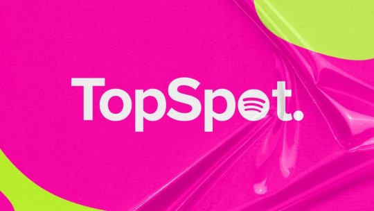
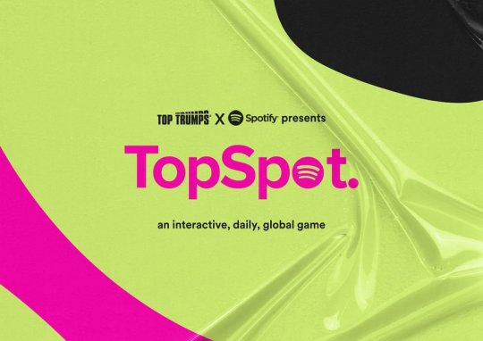


TopSpot Slides Case Study:
TopSpot was a yellow pencil winner in 2022 for the Spotify brief
We liked the design of their slides particularly the bright backgrounds and textures that could appeal to Gen-Z
We also liked the phone templates as a way of displaying our idea. eBay mate is a social media campaign and most of our target audience use social media on their phones
Jamie
0 notes
Text
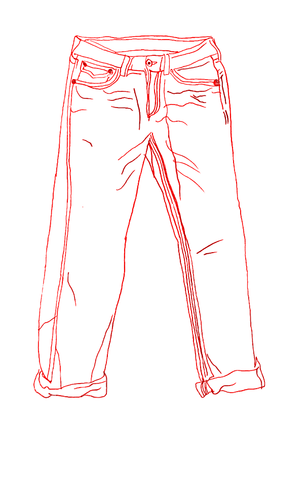
I Illustrated the kew objects we have used within filming our skits, which Jamie and i buy sell on Ebay. Doing the illustrations hand drawn in pencil, then taking them into photoshop to make the lines drawn the same colours as the Ebay logo, it gives a friendly hand drawn style, we will try incorporate the illustrations within our boards, and see if we can include them.
Tommy
0 notes
Text


The 66 Days of Fanlingo Case Study:
I looked at some previous winners and this submission for the 'Duolingo' brief stood out.
There is a title slide with just the name of the campaign on it
There is another slide which follows the problem, insight and solution format which explains how they reached their idea
The next slide is a call to action showing how the idea would be presented to the user and explained in a way that would make them want to partake
The 4th slide is a template which shows some billboards which advertise the campaign
The final slide is a more visual explanation of how they reached their idea
We took inspiration from these slides.
Jamie
0 notes
Text
youtube
Airbag Ad - Ikea I found a similar ad from IKEA where an annoying Mercedes driver is honking at a woman crossing a road. The woman hits the car with her handbag and sets off the airbag.
There is something comedic about the fast, efficient, sleek car being stopped by the slow, dainty, elderly woman and her handbag.
The humour is unapologetic and its something that we could use in our own shorter clips.
Jamie
0 notes
Text
youtube
Ikea Lamp Commercial:
Ad uses dingy colours, sad music and shaky wind to prompt the viewer into feeling sympathetic for the lamp
The red colour makes it seem out of place and the first music note is in-sync with our first sight of it.
The light shows signs of life until its unplugged, it also works fine until its thrown out with the trash, both humanise it more and make us feel bad.
It also uses slow zooms and the rain to increase this sympathy
At the end of the ad, a guy mocks the lamp which goes against the viewer's expectations as this all seems to be building up to a sense of sympathy.
Although its not quite what we're going for it uses filming and editing tools which we can also utilise comedically.
Jamie
0 notes
Text


eBay Mate Presentation 18/01
They said that we couldn't change the logo outside of adding the handwritten elements
They agreed with our choice for the handwritten fonts
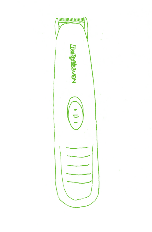
They liked the razor clip, Bryony particularly liked the 'shop now' button as a call to action in the snapchat UI
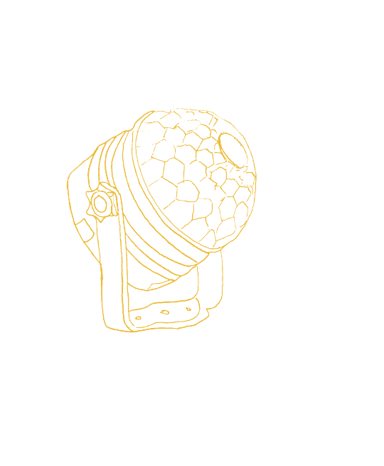
For the house party clip, Bryony suggested that we use the activation of the light as the kickstarter to get the party going
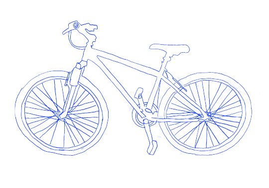
For the selling bike clip they agreed with us that it was a bit flat, they said that it looked more like Tommy was stealing the bike rather than selling it
They liked the billboard templates once we confirmed that they were made up of moving image
The main thing we have left to do is film the clips and prepare our final slides / video
Jamie
0 notes
Text
Various Generation Z articles explaining how much they care about sustainability, what are the common things they spend money on to give us a Better items to use within our ad campaigns.
Tommy.
0 notes
Text
Article on why you should sell items
Shows reasons as to why you should sell items helping to create narratives.
Tommy
0 notes
Text
A Study Of Short Form Content
Champ Sports tested 30 second ads vs 6 second ads. They discovered that the 6 second ads had:
an 11% improved recall for consumers
a 12% increase in return on ad expenses
and a 271% increase in ad completion rate
Although the ad watch time was the same, the improved recall rates show that the fast paced ads effectiveness
Jamie
0 notes
Text
Razor Vs Shaver Short, Editing Process
We did some filming for various shorts on our project, we filmed a majority of the content on Tommys Iphone 14, but we also rented a Sony A7iii with a rode mic also.
The first Issue I ran into when editing was all the clips were filmed on HDR mode on Tommys Phone, however when imported into Premier Pro the lighting looked all blown out and nothing like what it did on the phone, After some trouble shooting I found this was a common issue with the 2022 v of premier, and I found a Colour LUT which I imported and used over the clip which solved it.
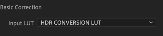
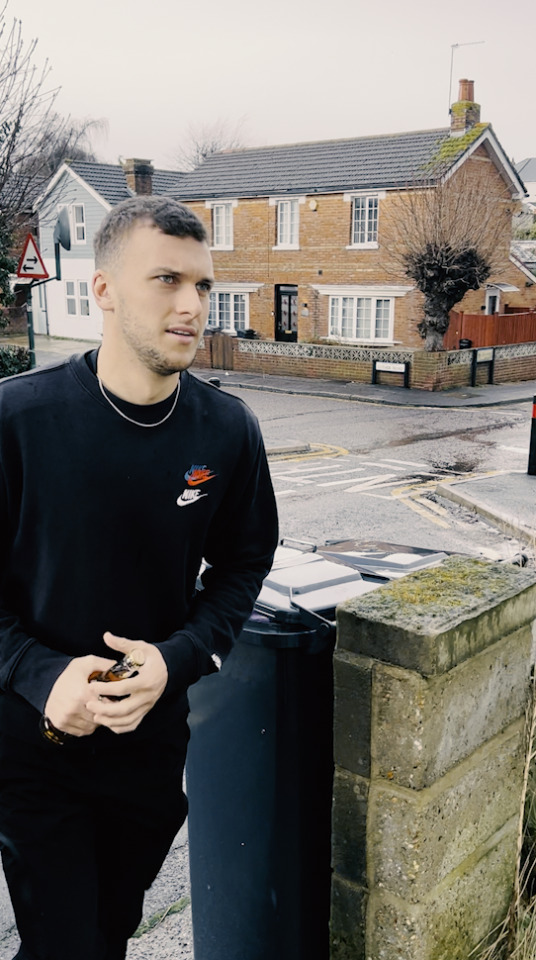
Without LUT
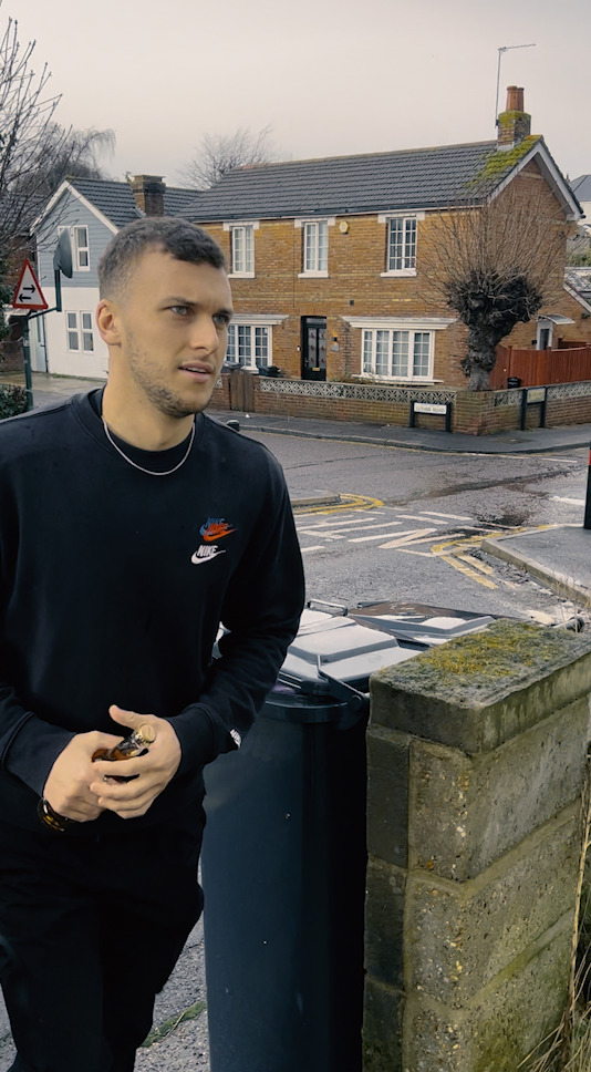
After LUT
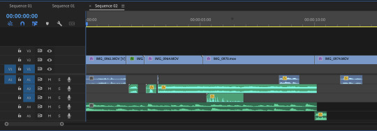
I cut each clip trying to make everything short and fast paced in order to keep the viewer engaged getting to the payoff quick. Whilst filming we actual turned on the razor, however after editing I found it easier to insert sound effects for more flexibility and control. This did lead to the shaver in the original video clashing with the sound effect when somone was talking, so for the final shoot I think recodring the video and audio seperate will be the best way.
I also added some extra sound effects such as a creeky floorbaord as Tommy comes into shot with his shaver, also some swooshes to empashsise the movment of Tommys hand.
The short was missing something so I added some music which aggressivly cuts with the sound of a record stopping right before the tag line "ebay mate".
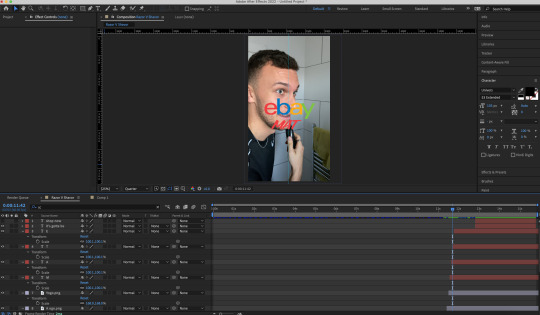
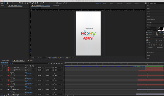
Then in after effects I added the ebay mate logo apearing on the screen in sync with Tommy saying it. I also made each letter appear one by one to make it look as if it is being typed out, to further ephasise the targert audience of gen Z. It then cuts to white with the final text reading "its gotta be ebay mate".
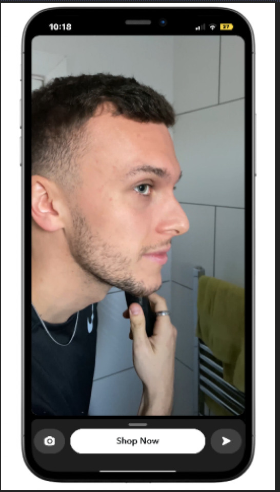
After doing some research on how other companys short ads look on various social media platforms I realised the call to action was noramlly a seperate button to the ad itself on the bottom of the screen. So i imported the final video into after effects again and mocked it up on a phone. In this exmple this would be how our ad would be viewed on Snap Chat.
(Ollie)
0 notes
Text
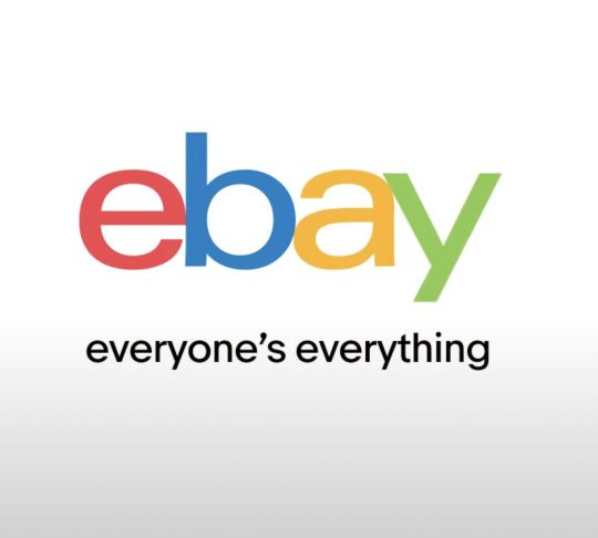
How Ebay Use Their Logo
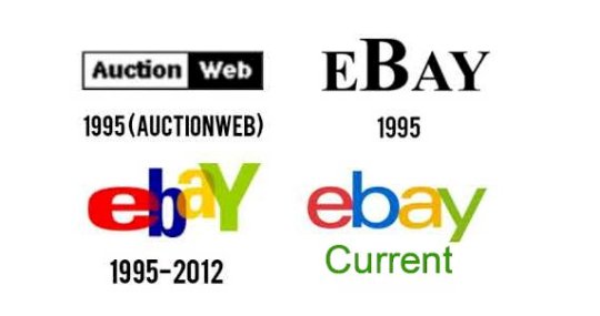
The eBay logo has a long and interesting history. It was first introduced in 1995 when the company was founded by Pierre Omidyar. The original logo was a simple black and white design that featured an outlined box with the eBay name in the center. The box was meant to represent the idea of a virtual marketplace, while the name was meant to be inviting and friendly.
In 1998, eBay updated its logo to a more modern look. The box was replaced with a red and yellow sunburst, symbolizing optimism, energy, and growth. The name also changed from eBay to “ebay.com”, emphasizing the company’s online presence. In 2002, eBay changed its logo again. This time, the sunburst was replaced with a swirl of blue and orange, with the word “ebay” in the center. The new logo was intended to reflect the company’s growth and expansion into international markets. The bright colors were also meant to be inviting and friendly.
In 2010, eBay changed its logo yet again. This time, the swirl was replaced with a bold, modern design that featured the company’s name in a bright green. The new logo was meant to be more modern and eye-catching, as well as to reflect the company’s move into mobile commerce.
Today, the eBay logo is still the same as it was in 2010. The bright green color and bold font are meant to be inviting and friendly, while still reflecting the company’s modern and technological advances. The logo is a symbol of eBay’s success and growth over the years, and it is a reminder of the company’s commitment to providing a safe and reliable online marketplace.
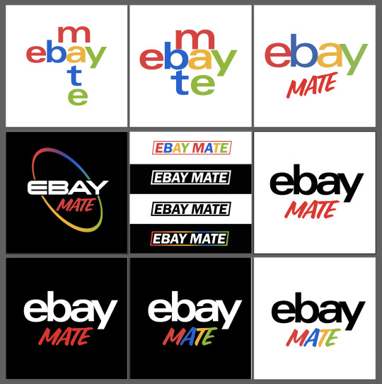
I wasnt able to find any information on the use of their logo within their brand guidlines, or in the D&AD breif, the pack just included jpegs of their current logo. "ebay mate" is the tag line or phrase we want associated with this ad campaingn, so I experimented with potential re designs above.
Ebay and mate both have four letters and share the letter A, this was the thought process behind the top two, however the balance and reability is totally off. Personally I think the ebay logo and web/ app UI is horrible and as a customer to platforms like this the logo itself puts me off shopping there. I thought a potential re brand could speak to our target audience and encourage them to take action and actually buy and sell on there, after watching the ad.
The middle left logos use Changeling Neo Bold and FranklinGothic URW, I did try to use the ebay colours within the logo still however using it in a gradient symbolyses a rainbow more than the ebay logo in my opinion. Use the ebay colours on the logo with FranklinGothic URW looks childish and i dont think appeals to our target audience.
Keeping the original ebay font which is a slightly modified version of the univers font but including "mate" in a sort of handwritten style font i think is the most effective. I did some black and white variations of this, but i think either "ebay" or "mate" still has to use the brand colours.
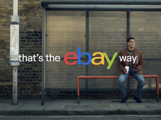
I also had a look at how ebay uses their logo at the end of adverts, and in some cases they do loose the red, blue, yellow, green colours and opt for completely different ones. The advert titled "thats the ebay way" is actually animated to look as though it is typed out on a laptop which is a nice subtile visual language we could use in our adverts, as texting is a form of communication which Gen Z can relate to.
(ollie)
0 notes


Text
Burglars Just Want Taco's
youtube
Low budget ad where a taco chain takes footage from a robbery of their store the night before and flips it into an advert
mocking the robbers and framing it as them really wanting the tacos because of how good they are
Jamie
0 notes