
Don't wanna be here? Send us removal request.
Statistics
We looked inside some of the posts by eargueta971519-blog and here's what we found interesting.
Average Info
Notes Per Post
0
Likes Per Post
0
Reblog Per Post
0
Reply Per Post
0
Time Between Posts
5 days
Number of Posts By Type
Video
7
Photo
5
Text
5
Last Seen Tumblr Blogs


Fun Fact
Tumblr.com is the 103rd most visited website in the world.
Photo

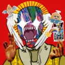
Augmented Reality
(pictured above) Trigger Image
Project Summary:
I approached this project with a similar approach to the Video montage. In this way, I am using augmented reality as another to “deface” Disney’s facade. I used a skull and crossbones image as my trigger as the start of my concept. With using this image, I am immediately telling my audience that is evil. When opening Aurasma, my video plays where it is a slideshow of the different companies Disney owns (ESPN, Marvel, Lucasfilm, and ABC Studios) but all of have effect that makes it displeasing to watch. The slide show then ends with the Walt Disney Studios logo super-imposed with a money shower. Another way to look at it is that Disney making money off of these companies is essentially evil.
0 notes
Photo


Project Summary
For this project, I decided to choose an approach that I used in a previous class last year. The main tools that I used was a pencil, scanner, and tracing paper. The process of these three GIFs is that each frame was essentially one drawing. Tracing paper really helped with the whole process because it allowed me to see each frame underneath so that it allowed no error when the entire GIF was completed. After I drew all of the frames for the GIFs, I scanned each one of them onto my laptop. Then, I had imported those scans into Photoshop. I had to make sure that there was one scan per layer of the project and then created the GIF animations using the Lynda.com tutorial.
0 notes
Text
Animate Research
Avant-GIFs Turning online animations into high art by Jesse Walker is actually a pretty good read. In his article, Jesse Walker talks about how video outlets were limited by time, specifically. Now, he considers that these limits have been shattered. This could be because of the introduction of cable, DVD, and the internet. Then, he explains the definition of animated GIFs and how they are usually connotated with comical uses. But, the point of Jesse Walker’s article is that animated GIFs could be used a high form of art. He takes a look into such artists like Milos Rajkovic, Lilli Carré', Erdal Inci, and Tiago Spina. Each of these artists has their own unique style of animated GIF, each serving a specific purpose.
There are three specific artists that produce animated GIFs that have caught my attention during my research. The first artist is David Szakaly. Szakaly produces purely simplistic GIFs but in their own way, are truly beautiful. His GIFs don’t have a specific setting or plot, but he uses simple patterns that can be mesmerizing through the use of repetition. I have noticed that he switches between two color palettes for his animations. These palettes are the rainbow and grayscale gamuts. His style of GIFs is so simple that you can’t help but to keep staring at his work.
The second artist whose work caught my eye was Michaël Reynaud. His animated GIFs are completely different in many ways. First of all, he uses real life as his art tool. He uses nature like trees, skies, tents, and real-life situation to create these GIFs. He uses time as a great factor in his works. For example, he took an overall time-lapse of the sunset and increased the speed to create this GIF. Reynaud uses other subjects as well for his work, like tents, street art, among others.
The third artist whose work caught my eye was the Renaissance GIFs by Scorpion Dagger. One of the things that caught my eye in the first place was the idea of taking art that ushered a new era in art culture and manipulating it into the current world. These manipulations often including putting the Renaissance work into sometimes comical, yet relatable situations. Another aspect of these GIFs is that they are not repeating. These GIFs instead tell a short story. This makes these animations quite amusing.
0 notes
Photo

Project Summary
At the beginning, I had trouble deciding how I wanted to portray this piece. I didn’t quite understand how to connect big data to another meaning. For this project, I took a look at all of the movies within the Marvel Cinematic Universe and found similarities or unique aspects between them. Then, I took these findings and tried to make a connection on what this says about us (the audience). The aesthetic that I decided to choose for my final piece to look like a comic book panel spread, complete with text boxes with explanations and alternating images.
0 notes
Text
Visualization Research
The Digital Age of Data Art is an article posted by Maxence Grugier on tech crunch.com. Grugier writes about how data art is used and the different aspects to it. The author begins by stating what effect data art has in a world of traditional art. Grugier says that data art blurs the boundaries between art and information and that it dispels the myth of the romantic artist while offering a fundamental artistic act in a critical commentary of the digital age in which we live. Grugier later defines the objective of data art as creating aesthetic forms and artistic works from the digital nature of the data generated from big data. Big data is a massive amount of data that is collected from any source (email, Facebook, texts, etc.) and an interested party deciphers its content for use. Data artists often use algorithms used to compute big data and create a visually appealing work to present the data. To understand, artists or the viewer must understand data visualization. Grugier describes it as this, “data visualization has become a fundamental discipline as more and more businesses, local councils and public services are forced to invent visually amusing and striking ways to classify dig data generated by the movements in populations, their patterns of consumption, communication and travel, etc.”
I want to first discuss the TED talk presented by David McCandless. McCandless talks clearly about the underlying beauty of data visualization. During his talk, he takes massive data art and displays them as beautiful graphics. What amazed me was that the graphic were beautiful, but it also helped understand the concept better through clear and understandable design choices (size and color, for example.) Most of his talk was to show us these data design but also help us see the unseen patterns and characteristics of the design itself. He says that data art helps make the invisible visible.
This leads to my next discussion about the Shadow Peace by Neil Halloran. Hal loran takes something that is often overlooked, like the deaths of soldiers and civilians over any sort of conflict whether it is war or battle, and creates creates a visually appealing animation video. Yet again, it helps the viewer to be able to visualize that impact that these deaths have had. Again, the animation helps make the unseen seen.
0 notes
Text
Composite Research
Representation and the Media is a lecture given by Stuart Hall. The lecture is split up into 4 parts. In the first section, Hall discusses the concept of representation. He explains two different views on representation, an old and new view. The old view is that representation is the way in which a meaning is somehow given to the thing depicted. He does go on to say that the old idea of representation is too literal. This new view is seen as representation as constitutive. In the second section, Hall explains culture as primary in regards to representation. Ultimately, Hall states that culture is a system of representation. Also in this section, Hall explains that language plays a huge part on how we see culture around us. In the third part, Hall says that the issue of power can never be bracketed out of the quest for an understanding of representation. He also explains how advertising uses the concept of identity claim implicate the viewer within the ad. The final part of the lecture explains the concept of stereotypes.
The series that intrigued me the most when looking at artists dealing with composite images is The Gender Ads Project. The section that specifically peaked my interest is what the webpage had to say about advertising toward the female and male gender. Looking at ads for men, advertising agencies take their product and very often show a muscular male, shirtless, saying that if you use that product, you can be like the model. Another example of this is ads tend to show a muscular male with a beautiful female in an intimate pose. This scenario is usually used in alcohol or cologne campaigns. These type of ads imply that if this product is bought and used by a man, then beautiful women would surround him in no time. A great composite piece would putting a common man in place of the male model for a more relatable composite piece.
0 notes
Photo


Project Summary:
In my opinion, this project was very amusing to make such pieces of glitch art. The basic concept I chose was anything that had to do with Marvel. This concept includes Marvel movie stills, or the Marvel logo. Out of the many ways to create glitch art, I decided to convert .jpg files into .txt files. While these photos were in .txt format, I either deleted, copied, or rearranged the converted code. After this process, I just convert the .txt to .jpg files again to see the final results.
0 notes
Video
youtube
(via https://www.youtube.com/watch?v=yROwGaSVFVk)
Note: Final Cut Pro cut about 4 seconds off of my previous submission.
Project Summary:
This part of this piece focused on sound. Upon looking at my video montage, I decided to take a darker approach for my soundtrack. I wanted to give my intended audience a somber feeling when looking at Mickey Mouse and other Disney properties. I did change most of the images into grayscale from my previous submission to add this effect as well. The main original sounds that I used included: a Subway salad chopper, car door slamming shut, ice in a cup, stuttering soda machine, and rhythmic hand claps to keep time throughout the piece.
0 notes
Text
Glitch Project Research
In Central Glitches and Glitch Art by Michael Betancourt, the entire page has to do with identifying glitch art and how it differs with glitches that happen to be mistakes. The beginning part of this entry begins with defining what a technological mistake that is out of control, a glitch, that mess up a certain project, or work. In the same section, Betancourt begins to states how “the understanding and theorization of glitches in digital art is uniformly concerned with Modernist conceptions of a passive audience rendered active by the disruptive affect in art.” In other words, Betancourt says that once we become more engaged in the understanding of how glitches in digital art then we could better understand its purpose in glitch art. The next part begins to define what ‘glitch art’ actually is by giving the numerous definitions that other artists have come up with. The article states that “glitch art” is identified as a method that artists use where they have produced and exploited the mistakes found in digital technology, and the artists use those errors to produce works of art. Near the end, Betancourt writes about the different approaches of glitch art. For example, glitch art can be a recording, a still image, or an soundtrack.
The first glitch art piece that I want discuss is Rosa Menkman’s Blogspot website in its entirety. When I first opened up the webpage in my web browser, I thought that the website wasn’t loading correctly. But, I believe that was the purpose behind Rosa Menkman’s artistic choices. The whole website looks a piece of the webpage’s code was broken given it its “glitch” appearance. The black background and white coding text adds to this effect. Everything about this website looks so disorderly, yet it has its own uniqueness that makes me not want to look away. Menkman also has her own glitch art pieces on display on the webpage that fit so well with the entire theme of glitch art.
The second glitch art piece that I want to discuss is Malevich Glitch by Denis Volnov. The main aspect of this art piece is the abstractness of the human figure being presented here. The viewer can still make out the human figure into which allows for the eye to move around the image to see what exactly they can make out. But, the feature that interests me the most is the pixilation of the body that gives it the glitch effect. This pixilation and the different colors offers the illusion that this looks like a still image that is supposed to be clear, but the glitch adds this new layer of beauty to it.
The last glitch art collection that I want to discuss is James Connolly’s RGB.VGA.VOLT stills. The description that Connolly gives about this collection is that “these images are digitally synthesized audio waveforms visually in VGA computer monitors.” The most interesting part of this collection is that I get the feeling that I can see the sound in these images. To me, the different colors in the waveforms represent the different frequencies of the registered sound. The images themselves seem to be flowing by their wave-like appearance. I think that this is an interesting approach to glitch art because Connolly is giving the intended audience an outlet to look at sound by producing this art collections.
0 notes
Text
Sound Project Research
The first selection I chose was the opening credits for The Shining. The overall tone of this sound selection is very ominous. The beginning notes of the low horns start to give that feeling once the credits begin. As the title is shown, there are metal-sounding clicking noises and a wailing sound that crescendos to build up suspense. While there are many horrifyingly sounding noises that continue, there is still a dark bass that remains constant in the sequence. This variety of unsettling sounds already give off the unsettling tone that the movie will personify with The Shining. I also believe that the contrast between the music and the peaceful nature of the setting shows that this area where the movie takes place, has a dark secret looming inside.
The second sound piece that I will like to discuss is The Time Machine from the Looper movie soundtrack. The first thing that amazed me was the process that Nathan Johnson and the sound team took to come up with the songs for the soundtrack. I was shocked to see that a microwave hum or a treadmill motor can be distorted to mimic other instruments to create an entire library to be able to use. The Time Machine is more of a mechanical-sounding piece where the chosen sounds make the piece sound robotic. There are staccato beeping sounds and motor sounds that help give the illusion that you are in The Time Machine.
The third piece that I would like to speak about is the second score preview from Looper. In this video, Nathan Johnson and the sound team work on gathering different things like pipes, or car doors to develop a custom percussion library for the movie. I believe the point that Johnson wanted to convey is that there a variety of materials or objects that can be morphed into something else. For example, he uses the slams of car doors to build the sound of a kettle drum. Using the same idea, they used a gat gun and recorded all of the possible sounds that it could make to create a basic drum kit sound board.
0 notes

