
Statistics
We looked inside some of the posts by drowningtheseus and here's what we found interesting.
Average Info
Notes Per Post
40K
Likes Per Post
32K
Reblog Per Post
8K
Reply Per Post
161
Time Between Posts
19 hours
Number of Posts By Type
Text
10
Last Seen Tumblr Blogs


Fun Fact
28.6 is the average number of monthly visits per US mobile user.


Text

scribbling away
345 notes
·
View notes
Text
So I'm new to the show/fandom, but when I saw the designs I had to watch it.
These designs are so brilliant, I think this is a master class in how to design characters.
Let me analyse this for a second.
The artstyle uses a round and bouncy shape language, but the angles that ARE there always work in contrast. They are accents in the protagonists and base-language for the antagonists.
Following the rules of character design, the villains ARE more angular and sharper, like Eclipse's hair, or DeVoid's horns - while Aika & Zira use a more roundish shape language. (Especially Zira, having SO many circles in her design. Her hair are circular circles, her glasses, her pins... Literally friend-shaped.)
Aika's star buns are triangles that make her silhouette more adventurous & bold, but are STILL rounded and friendly enough to mark her as friendly.
Also we need to talk about her hair?! It's silhouette is iconic enough to make her stand out among a line-up of anime-haired protagonists. But instead of relying on her silhouette alone, the design does something even more brilliant, so effortlessly.
The light top of her hair versus the dark lower hair is a perfect technique of reverse countershading!
In nature, a lot of animals (sharks, deer, tigers, lizards etc.) have a darker top half and a lighter belly, because its counter-shading and blends them into the background. Aika's hair is doing the exact opposite. Her hair being darker where we would expect shadows to go makes the contrast pop-out against ANY background. We are literally wired to notice her. This design is genius.
Her shorts are also a great indicator of a highly active character. The yellow-blue complementary color contrast (on opposing ends of the color spectrum) which makes us instantly more attentive to them. UGH, It`s SO GOOD.
Zira wearing a lot of layered long clothes indicating her introverted personality, BUT she wears pants under her skirt AND the cuffs of her pants are triangles. - Sharp angles (especially around legs/arms) indicate active/fast objects (or in this case, characters), and it's hinting that she is down for action if necessary and CAN be active. (Like how she defended Aika in ep 1.) Also AGAIN, purple and green are complementary colors, but they are muted in her. Which signals she is important but not necessarily as bold.
I could write pages about this, but the one thing I really want to note down too is about Lady DeVoid & Eclipse using white-on-black and black-on-white contrasts to MAKE SURE they pop out against any background they are placed on. (DeVoids white wings and black dress use the same contrast-psychology as most iconic villains. See Darth Vader, whose strongest appearances place him in a bright background, giving him the highest gravity of attention. You literally cant look away from this kind of contrast. Look how effortlessly its executed here?! I`m in AWE.)
Plus DeVoids pink her and her high-femme outfit works so well, and I think its again, because of the contrast. The pink stays in her color pallete, while also being associated with girlishness, giving her a contrast of hot femme-fatale shape-language versus girl-youth-accents.
(I also ADORE the expressions, like Zira in shot 4 xD I can`t wait to watch that next episode)


Episode 2 board is coming along
14K notes
·
View notes
Text
Your art is so astounding! Thank you for sharing <3


Hello!! I'm natotofu, an artist from Japan! I'm usually on Instagram but I decided to try this out this place:) I'm incredibly slow at making new pieces, but I hope I can interact with the ppl here. English is not my first language so please bear with me:)))
11K notes
·
View notes
Text
Oh my gosh, your art is so good! The form-language, I'm in love

I love seeing them together 🌊⚡️
Another old art I did from last year
6K notes
·
View notes

Text
I had a dream about how my boss found my old wattpad account

0 notes
Text
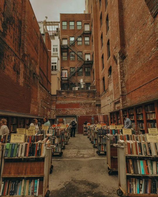
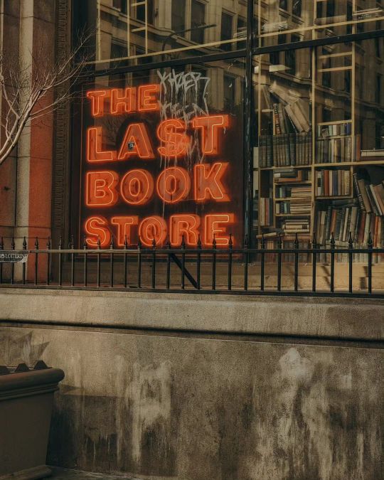
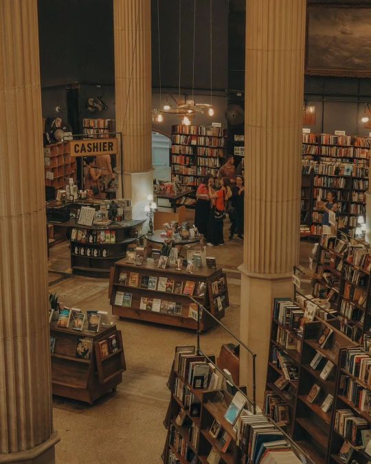
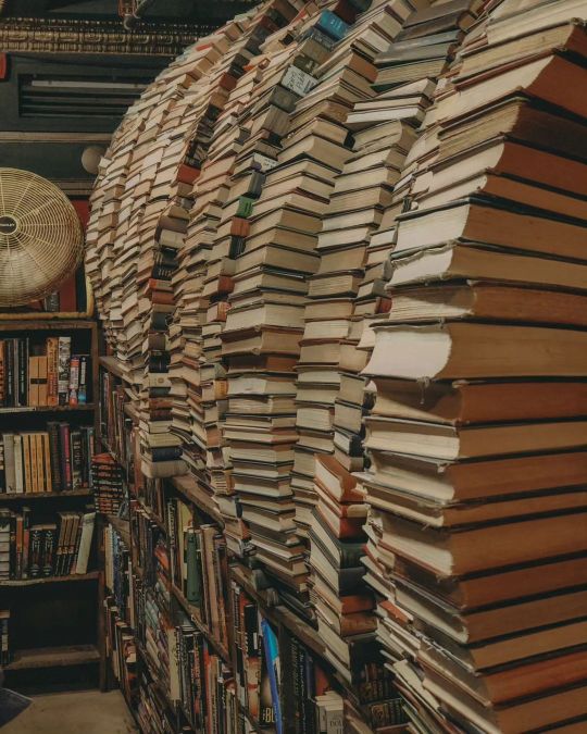
realizing that I can't read every book in the world because I can`t learn every language:

What do you mean I can’t read every book ever
129 notes
·
View notes
Text
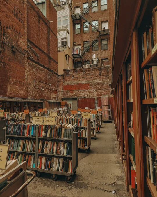
The BEST book covers of all time (an entirely objective list)
The OG POJ`s


Warrior Cats (German covers) & Gideon The Ninth


A Game of Thrones (later editions)


Please feel free to add ur faves! I must collect more
#book covers#booklr#books and reading#percy jackson#books#pjo#pjo series#percy jackon and the olympians#rick riordan#percy pjo#GRR Martin#percy series#riordanverse#warrior cats#erin hunter warriors#writing#inspiration#Tamsyn Muir#book design#bookblr#wc art#gideon the ninth#gtn#george rr martin#the sea of monsters#the lightning thief#game of thrones#a song of ice and fire#a game of thrones#reading
12 notes
·
View notes