Don't wanna be here? Send us removal request.
Text
Week 4, Thu: InDesign continue...
CONTINUE...
7) How to make repeat patterns?
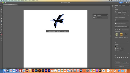
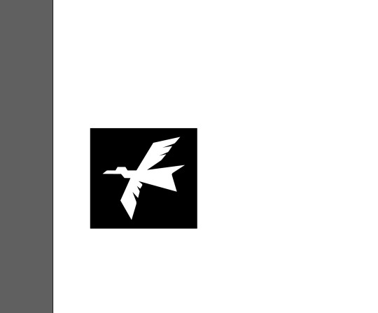
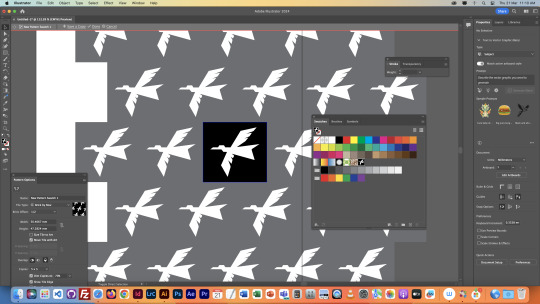
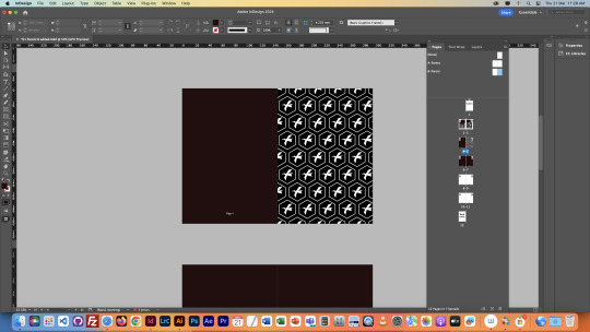
We opened Illustrator, and drew a bird that suits my preference, although I just tried to copy what Toby made in class. It was a great practise !!! Second, we put the bird in a black box.
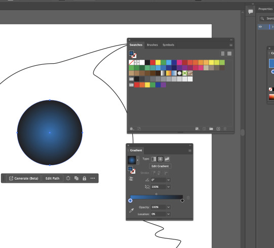
Third, we opened the swatches window and made a random shape that suited my preference.
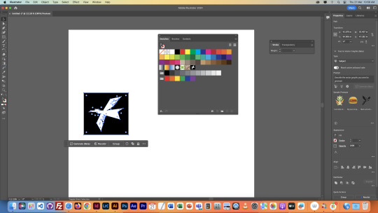
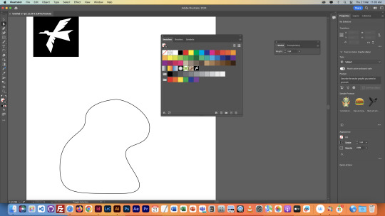
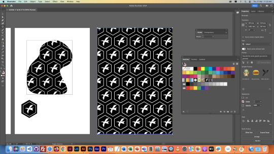
And now, if I clicked on the shape I made, it was not filled with any colour but a. black stroke. After we swap the stroke's colour and background colour, then fill shape with the graphic we made, something happened !!!
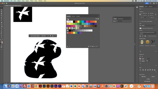
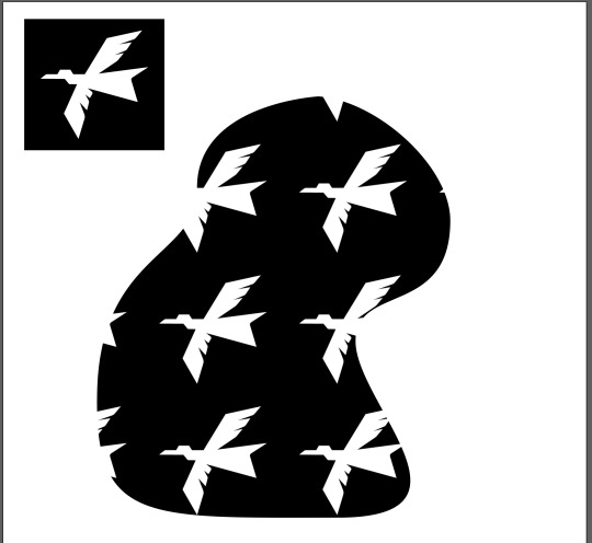
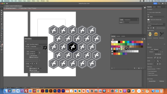
Also, if we double clicked on swatches, there would be a window popped up, it showed the settings of the swatch, and we were able to adjust the transform of the swatch as well.

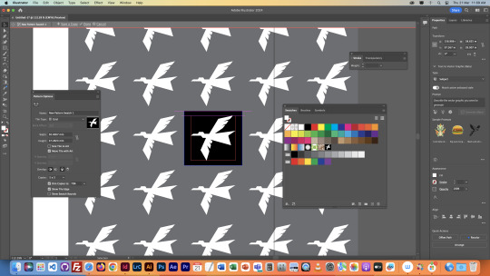
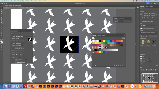
8) Extra screenshots

0 notes
Text
Week 4, Thu: InDesign
In today's class, we focused on designing an A5 booklet, preparing for a future assignment where we'll be designing our own.
1)How we created a A5 booklet using InDesign in class & change settings before we start designing?
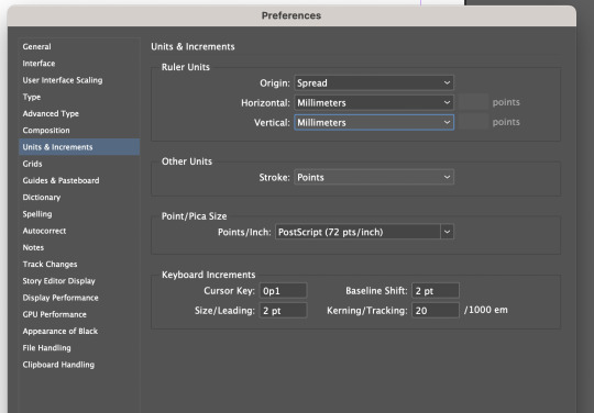
First, pick A5 as your new file. After that, click on InDesign at the top left corner of your screen, and hit preference and select "Units & Increments". You should see a pop up window. Lastly, change horizontal unit and vertical unit to millimetres.
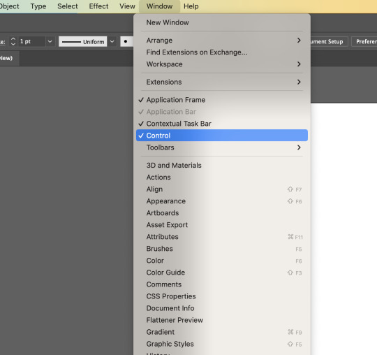
Second, open Control window (You can see all control settings at the top bar)
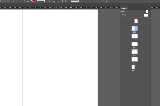
Third, open Page window & create 11 new pages
2)How to make cover page & back cover page?
Before we started, the followings are shortcuts we should remember...
t: text box toggle
w: preview mode
Command + A: select all
Command + click outside of text box + v: escape text mode
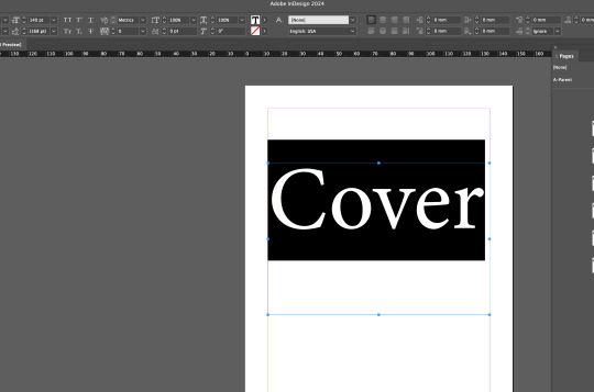
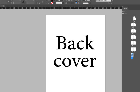
Add text to cover page & back cover page. While making our back cover, be aware of the icon underneath font size, it represents spacing between top text and bottom text, so it's really useful when we want to make the adjustments.
3)How to make page number in A-parent?
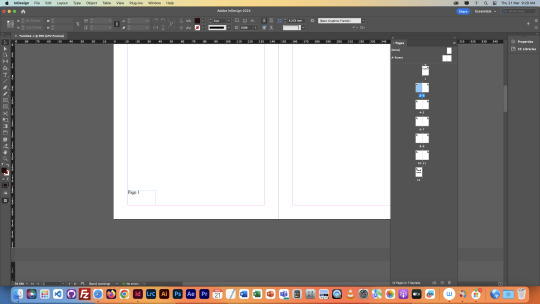
First, you have to know where is A-parent page. The A-parent page section is right above the section where all pages are displayed. Select A-parent page & add 2 things for each page, one text box that fills the whole page & one text at the bottom of the page.
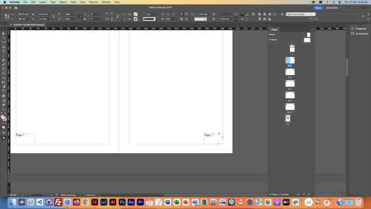
Second, we set page number to a special character. Select the number, go to 'Type', hit Markers and select current page number. However, we don't want to see page number on cover page and back cover page...
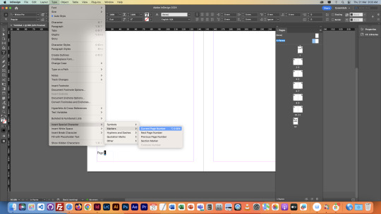
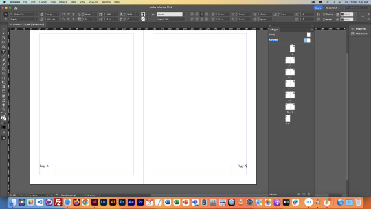
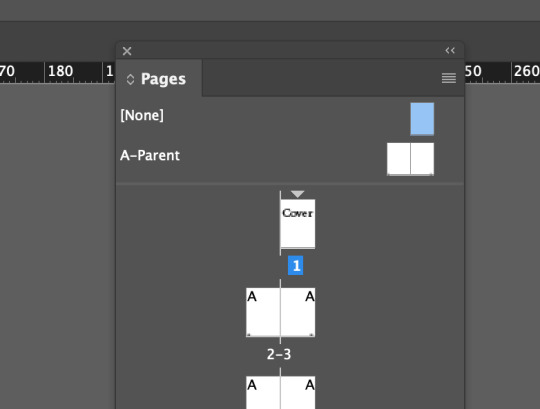
Drag '[None]' thumbnail to cover & back cover page !!!
It's actually extremely convenient.
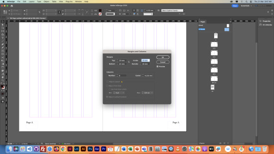
4) Extra practise !!!
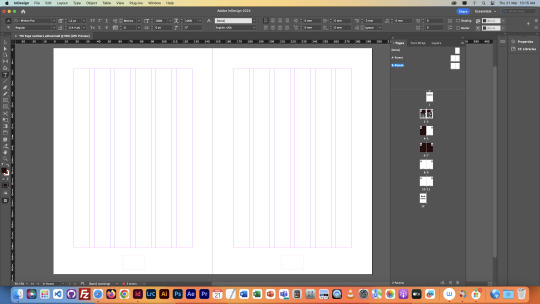
Shift click both A-parent pages, go to layout. Change the value of margin and column, so the final look should look like below !
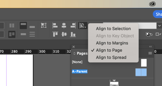
We also put page number at the middle bottom of the page by changing align to selection to align to page, then click on align to middle icon.
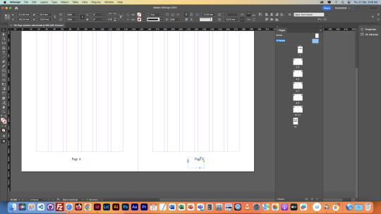
5)How we filled a page with texts and boxes?
We added texts and black boxes using techniques we learnt from last class !
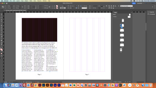
Second, we learnt how to place overflow text...There is normally a tiny button at the right bottom corner of the text boxes that has overflow texts. Then, go to the area where you want to paste the text, drag out a text box.

Third, we filled up our 2nd page. We also applied text wrap to it.
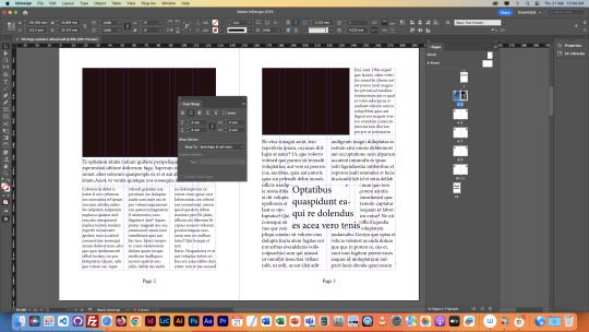
6) How do we add white page numbers when the whole page is in dark colour?
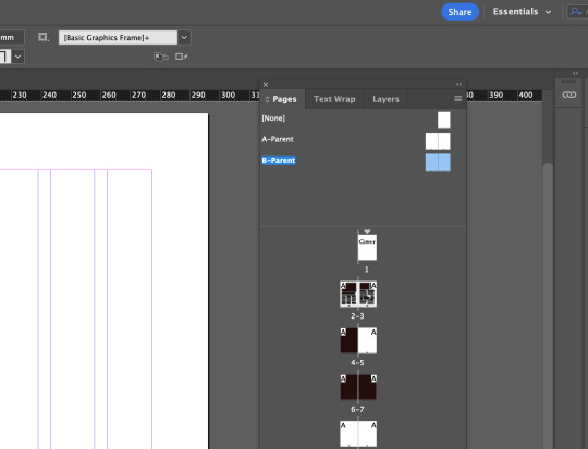
First, we opened a new Layer window. Then we went back to parent pages and select those page numbers boxes In layers drag them up to a new layer, drag the blue dot at the right hand side up one layer.
Second, we duplicated the A parent. The new parent page is called B parent. And changed the colour of page number to white, chuck B parent onto dark pages.
0 notes
Text
Week 3, Thu: InDesign Styles & Image Replacement -> Shortcuts
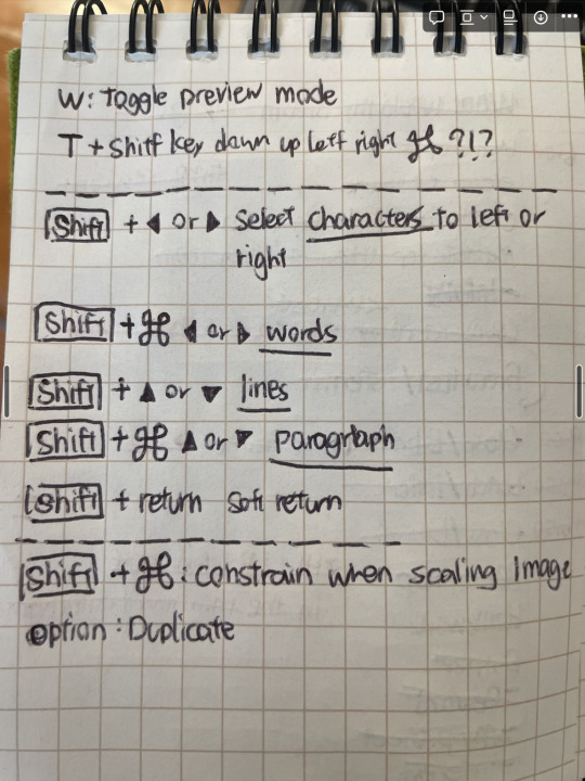
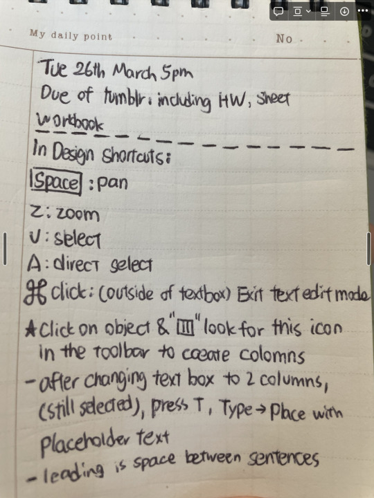
The followings are photos of useful InDesign shortcuts that are so commonly used. I found the shortcuts really familiar because some of them are the same as the ones I used in Photoshop and Illustrator !!
0 notes
Text
Week 3, Thu: InDesign Image Replacement
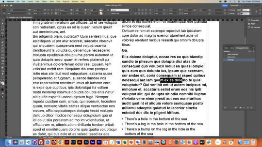
5) In the fifth exercise, we introduced a new tool called "Character Style". The reason why this tool is as important as "Paragraph Style" is because in paragraph style, styles are strictly applied to either one heading, one paragraph or so on, rather than a few sentences in a paragraph.
The first screen shot below shows that I only selected a few characters in one paragraph and then clicked on paragraph style. The whole paragraph was applied with the same style.
Therefore, in order to do that, I created a new style in character style section. It works !!!
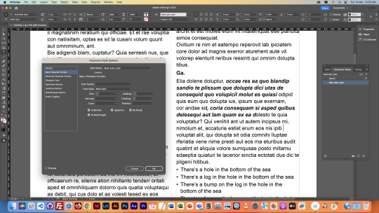
6) Next, we used the tool "place" to place an image onto our page.
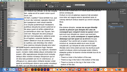
Then, we opened the original image in Photoshop and tried to make changes to the image and see if the changes apply to the one on our page.
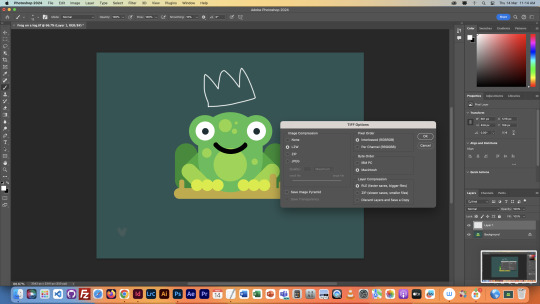
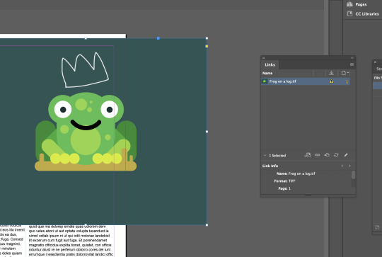
We then open InDesign. Open a new window called "Links". We would see a exclamation icon right next to our image source, which means there has changes been made to the original image. To make sure the changes are updated, click on the refresh icon then we saw the changes.
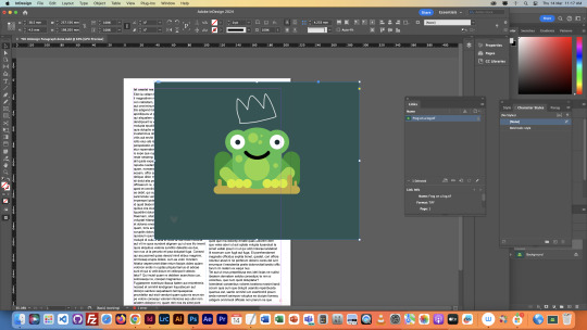
7) How to resize an image?
Hold command & Shift to resize an image !!!
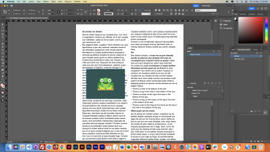
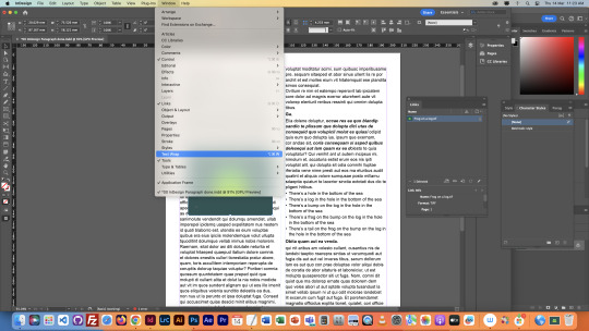
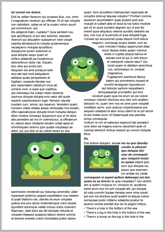
8) We had a issue in which, when we place an image onto our page, it covered some of the text, and we want to see the text !! The solution to this case was, first, go to "Text Wrap" window. Second, click on the second icon !!! Then the picture perfectly fitted between texts.
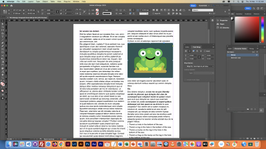
9) We cropped the frog picture into a circle ! First, we drew a circle with pen tool. Second, we did command x for cutting & right click "paste in place". The 3rd icon in the text wrap window is adding space between the pictures and texts. Really useful !!
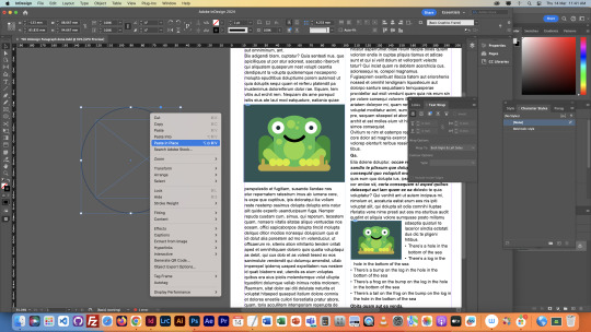
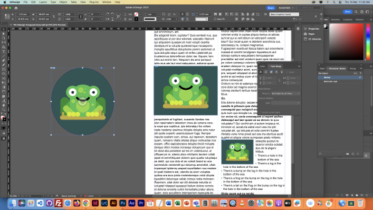
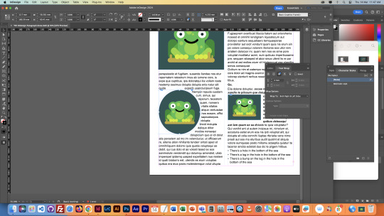
Here's our final work !
0 notes
Text
Week 3, Thu: InDesign Style & Image Placement
In today's class, we explored a new software called InDesign. InDesign is a software that focused on magazine and page design, moreover, it also makes grids, columns, text and picture arrangement. And in class, we covered most of the fundamentals.
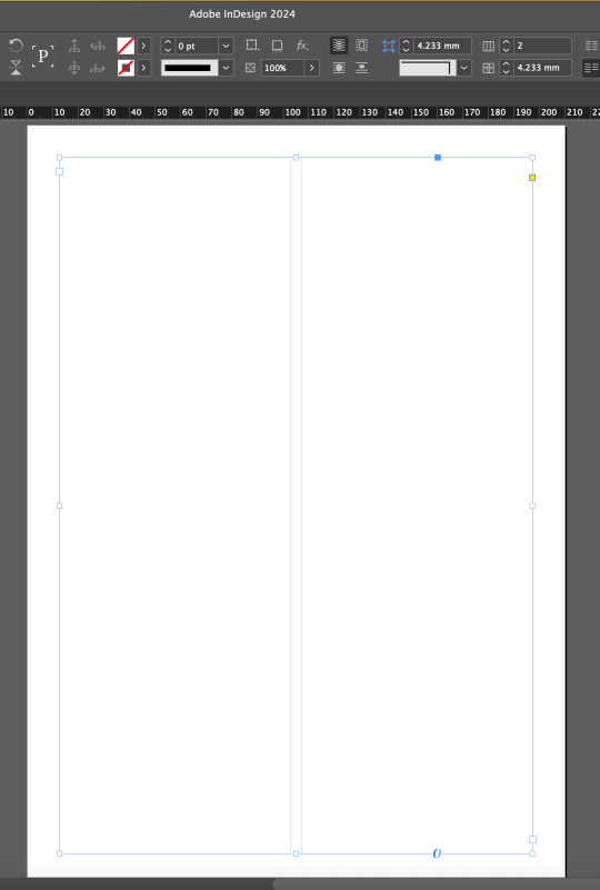
1)How to make a two column grid ? And fill the text box with random text ?
We learned how to create a two-column grid and fill a text box with random text. First, we dragged a text box to fill the entire page. Then, we changed the number of grids to two next to the grid icon, located at the top right corner of the screen. Lastly, we filled the page with random text by right-clicking or accessing the menu bar and selecting "Fill with Placeholder Text."
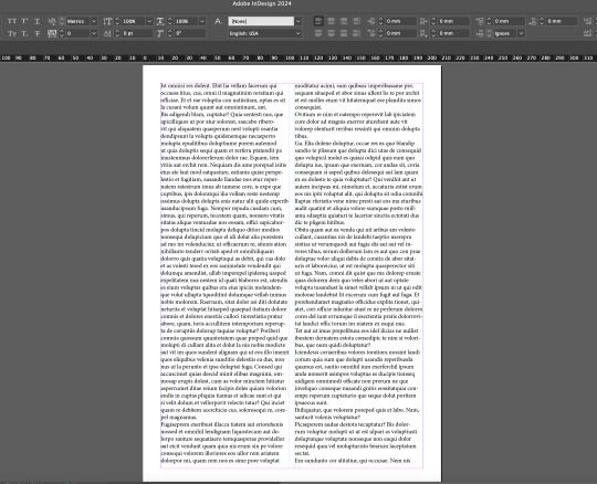
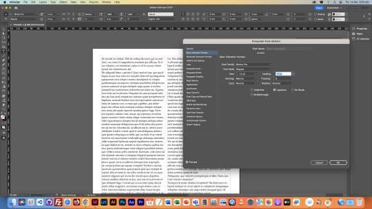
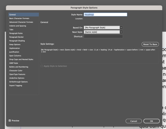
2) The second thing we covered was paragraph style. First, we added a paragraph style window. In the window, we could see the basic paragraph option at the top. Double-clicking it brought up a larger window showing all the details of the currently applied paragraph style. We adjusted the leading value to increase space between lines.
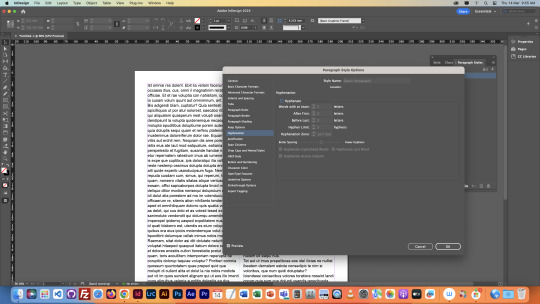
Second, we deactivated hyphenation because we wanted the article or paragraph to look more natural rather than seeing hyphens at the end of each line.
3) Next, we created a new style for headings, making the text bold.
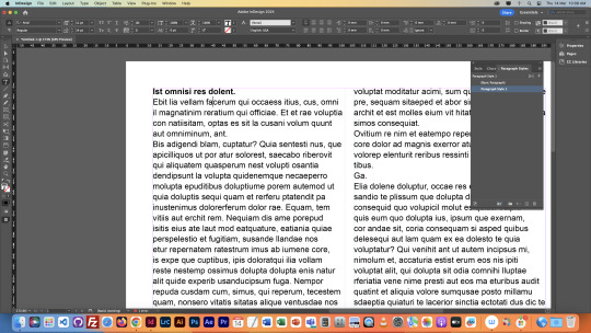
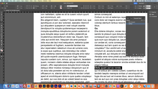
One thing to be aware of is in style settings, this section is where all the adjusted attributes of the current style are displayed.
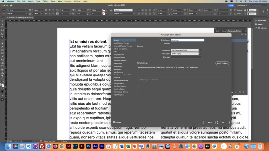
In the heading, we made an additional adjustment to "Indent and Spacing," adding space before and after the text style.
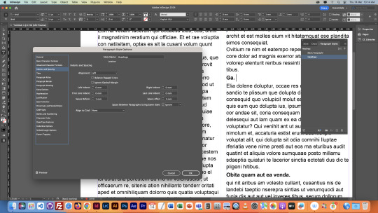
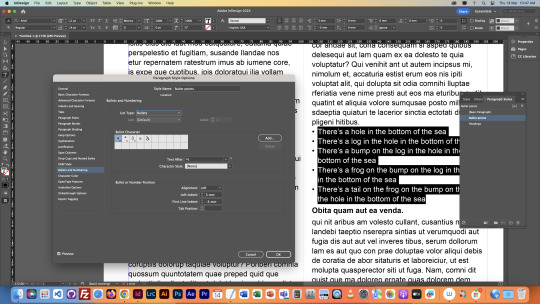
4) For our fourth exercise, we added bullet point styles. We created a new paragraph style, selected a range of text, double-clicked the new style, and went to the Bullets and Numbering section to add a bullet before the text.
NEXT POST -> -> ->
0 notes
Text
Week 2, Thu: Homework
Today's homework is to add two vector images and two pixel images of our own sourcing to the image we worked on in today's class...
So, for the first pixel image, I decided to add one tree to the main image...
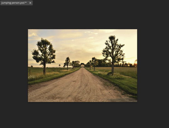
While attempting to select the tree, I used a few selection tools. I started with the object selection tool, however, it didn't select any of the bit around the tree, the leaves. So, I had to jump to quick selection tool to select them. Here's the tree down below. There was still bits that I missed but I really liked it.
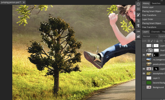
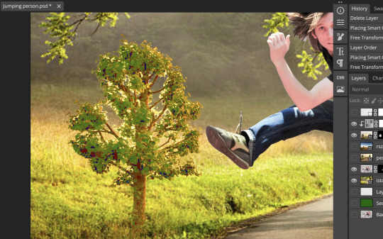
After I successfully select out the tree, I started making adjustment of the image. I used two image adjustment tools, curve and HUE/saturation. First, I brightened the tree so the colour sort of matches the new background for it. Second, I tried to saturate it so it could look more colourful.
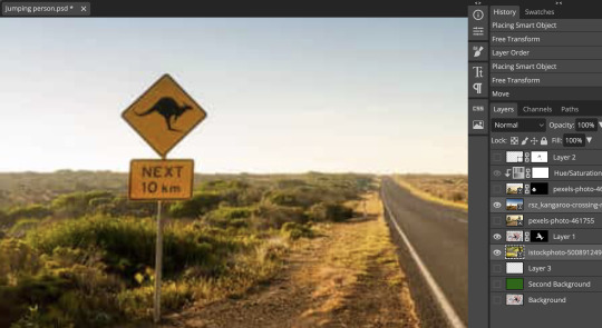
For my second pixel image, I decided to add the following sign to the main image.
I used curve and colour balance for image adjustment, so the sign looks not only brighter and also more yellowish.
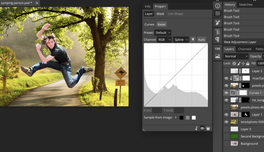
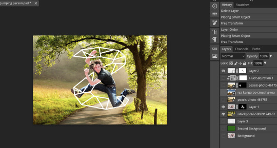
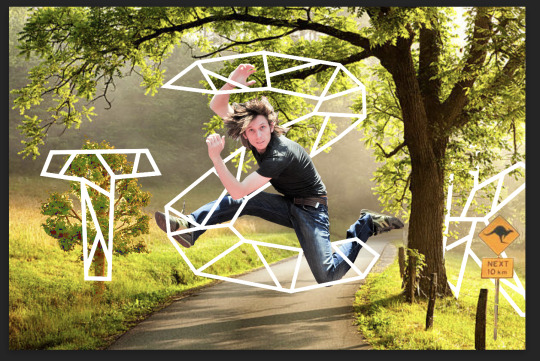
The followings showed the two vector image I added to the main image. T represents tree. K represents kangaroo. I purposely put the T graph in front of the tree because I reckoned the colour of the tree didn't really fit there. I could have worked on image adjustment for the tree but putting a graph above it the was a good solution too.
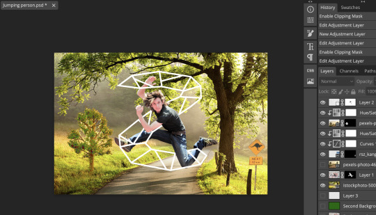
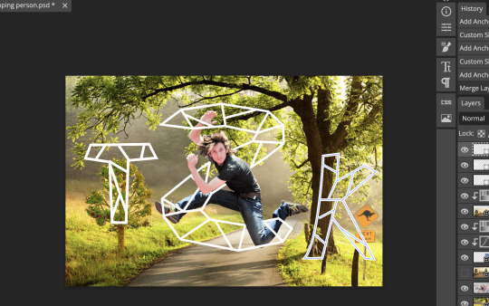
Here is the final look !!!!! I absolutely loved this. I hid the K graph behind the tree, and I couldn't find anything that's more important than this. The K there just made the entire image look a little bit more realistic!!
0 notes
Text
Week 2, Wed: Homework
For today's homework, we need to find one background image and one image to use as 'Interest'. So, basically, I have to cut off the main character from the interest image using the selection tool, then put a new background image behind the main character. It doesn't sound challenging at all so I'll just get started !!
1)Look for one background image and one image to use as Intererst.
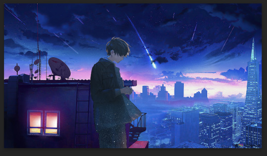
I love the vibe of this character standing under a clear sky full of stars and some random visual lights. And I'm pretty sure this image is Photoshopped so it'd be easy to select this character using object selection tool. To me, the image on the right is a perfect example of what I want my final work to look.
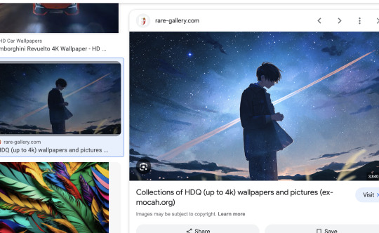
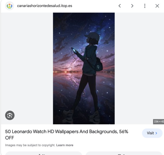
I found the image I'd like to use for my background !
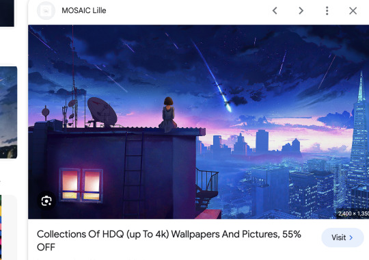
2) Start from selecting the character ! I used two selection tools, one is Object Selection tool, another one is Polygonal Lasso Selection tool.
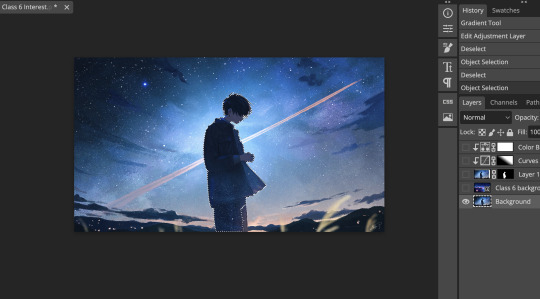
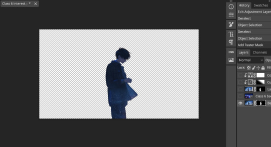
3) Add background & Reposition the character
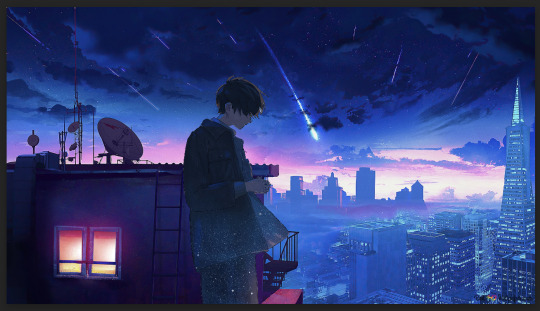
4) Add adjustment to the character
Because in my opinion, I think more light should be cast on the character's head and upper neck so I utilised the gradient tool to achieve that. Eventually, it looks like this !! I'm really happy with the final look !!
0 notes
Text
Week 2, Wed: Layer Masks
In today's class, we focused on utilise layer masks to their maximum potential in Photoshop.
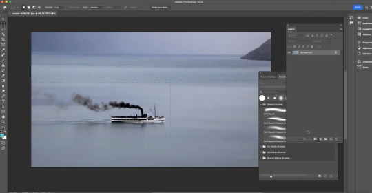
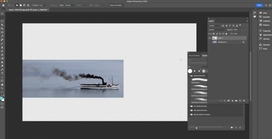
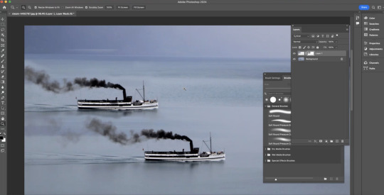
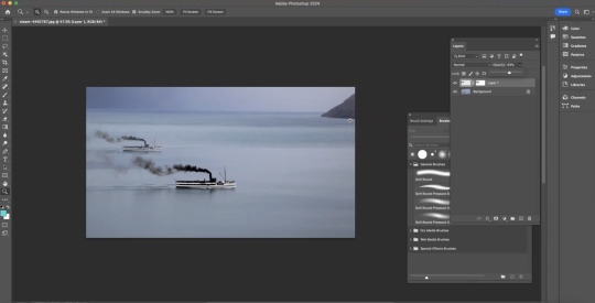
1)In the following exercise, our goal was to add another ship to the original picture. First, we used rectangular selection tool to copy and paste the selected ship onto a new layer. Then, we added a layer mask to it. By adjusting the details, we used black and white colour which represent visibility
The end result looks very natural to me. I loved it.
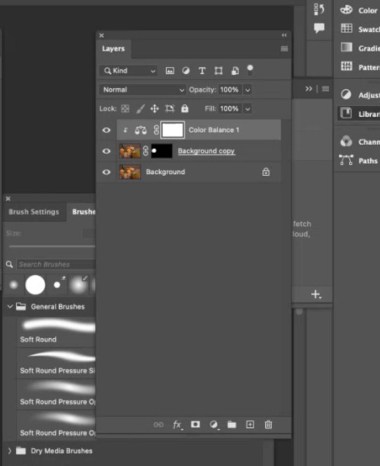
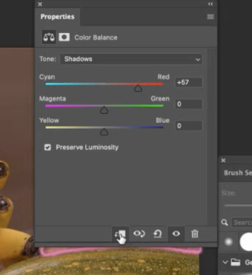
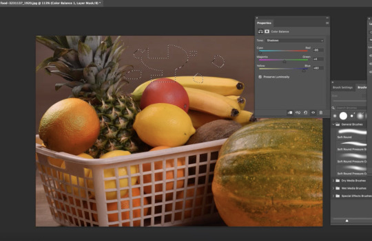
2) The second exercise was about changing the saturation or colour of the selection using layer masks. First, we duplicated the background and selected the section we wanted, and added a layer mask to it. Then, we clicked on the duplicate and added a colour adjustment. However, at this point, the colour change seemed to apply to the entire image, so we clicked on the icon at the bottom right to limit the application to just one layer below it.
Some buttons are really useful in photoshop !!!
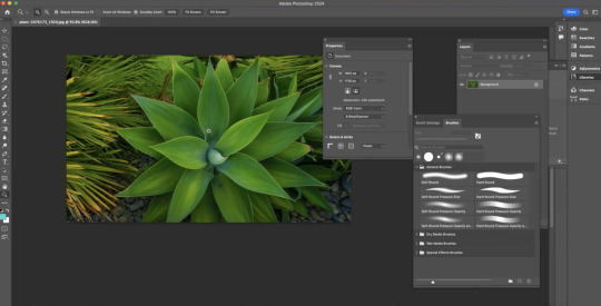
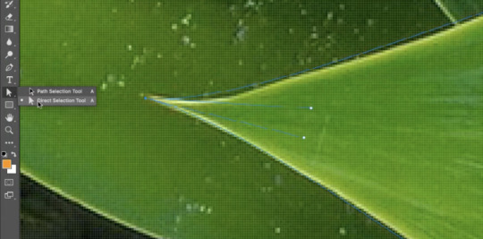
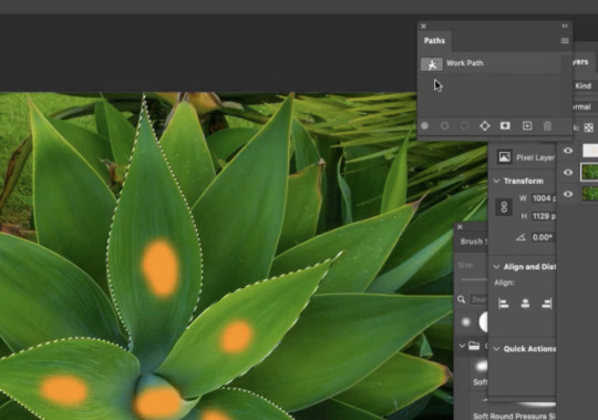
3) The third exercise was similar to the second one, which was focusing on selecting a small part of the image and adjusting its colour. First, we opened the plant picture and used the pen tool to select the leaves with orange dots. After that, we used the direct selection tool to modify the details.
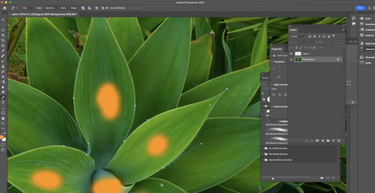
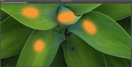
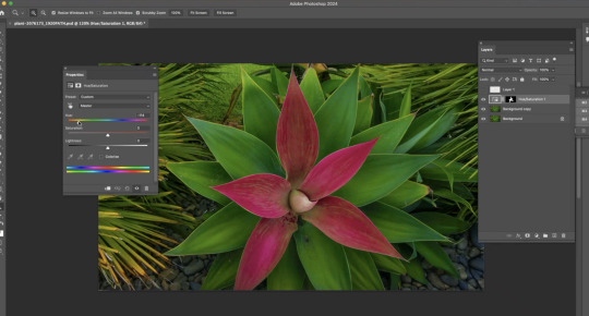
Then, we duplicated the background image, went to the path window, held command, and clicked on the thumbnail. Lastly, we added HUE/Saturation over the selection.
4) In this exercise, our goal was to cut the bird out of the picture and display a new background behind it. The tricky part was the wing. First, we used the object selection tool to select the bird and duplicate the picture, adding a layer mask to it.
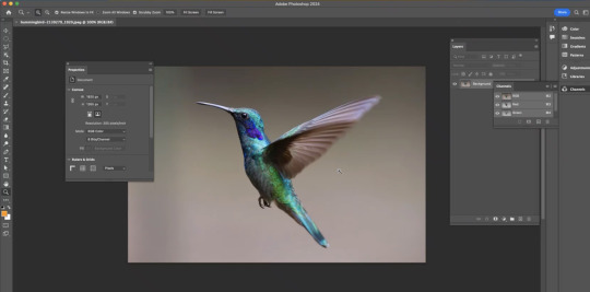
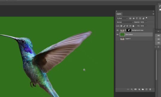
Then, we used the pen tool to select the edges. We went to the path window, clicked command to change to selection mode, and option + clicked on the layer mask to fill it with white colour.
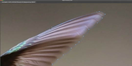

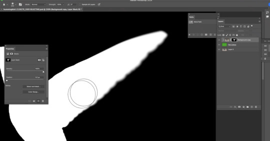
We then added a blurry effect on the wing by clicking on the layer mask, selecting the blur tool, and starting to brush.
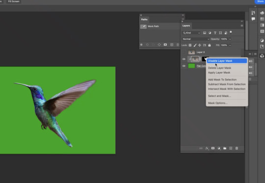
Lastly, we applied a new background for the bird by right-clicking on the layer mask and applying it. After adding the background, we could always go back to the bird and adjust its lighting, colour, saturation, and so on.
The picture looked very realistic after Toby taught us to remove the tiny highlighted part at the bottom of the bird.
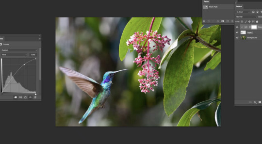
Today is the day that I found out I could fake an image with only Photoshop !! Because this software is so powerful that anything could look real or matches the new background after the use of image adjustments.
0 notes
Text
Week 2, Thu: Compositing
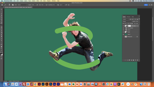
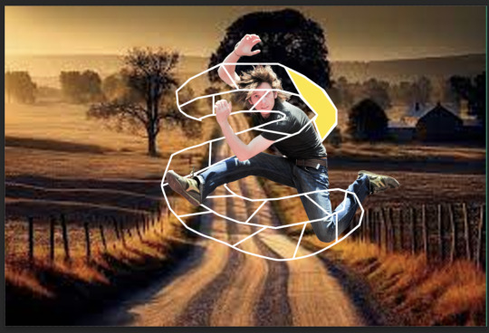
In today's class, we focused on compositing a photo of a guy jumping up. At first, I thought today's class would be particularly challenging because of my absence from yesterday's class. Luckily, Toby did a little bit of recap on yesterday's lesson, so I was able to catch up on the fundamentals of using the selection tool.
In today's class, I found editing extra stuff out of an image quite fun using the magnetic lasso tool and other lasso tools. All of them are convenient to use.
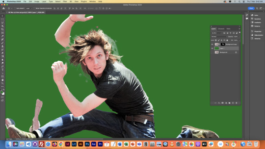
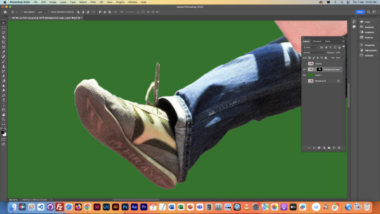
I found it funny how Toby gave us approximately 10 - 15 minutes to focus on the details of the person's hair, and some people finished faster and told Toby. Toby said something like, 'If you've already finished what you're doing, you probably haven't done enough.' At that time, I was one of those who thought we had finished, so I went right back to it.
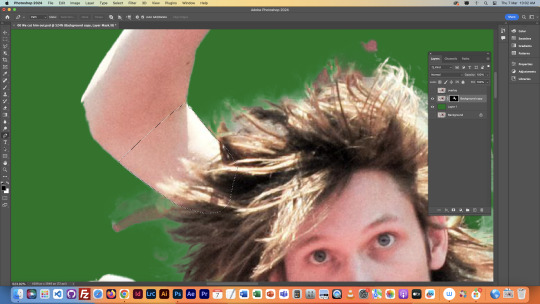
I remember there was a section where we were asked to draw an 'S' shape over the person, and I played with it a little bit, and it looks like this. ->
Here's the final work of the day!!!
0 notes
Text
Week 1, Fri: Homework
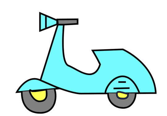
The left graphic is the one that I was trying to replicate, but I'm definitely still getting to know this app. There's still a lot that I need to learn, such as rounding the corners or creating incomplete circles.

8/3/24
Here's a better version I created today after a certain amount of practise since the last version I did. The motorbike looks a lot more similar to the original picture. I also discovered that there are a lot of hybrid points in this exercise which I was not familiar to, but now the curves look clean, the colours are accurate. Although I still have to put a little bit more work on the highlighting next to the lines, overall, it looks perfect.

0 notes
Text
Week 2, Mon: Homework
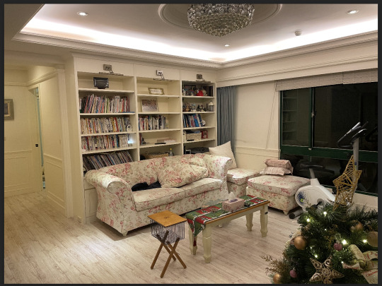
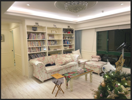
1)Home Interior Design: corrected. I thought the initial photo was too underexposed, so I increase the overall brightness of it. Additionally, I added a little bit of green to the balance out the yellowish colour at the left side of the initial photo.
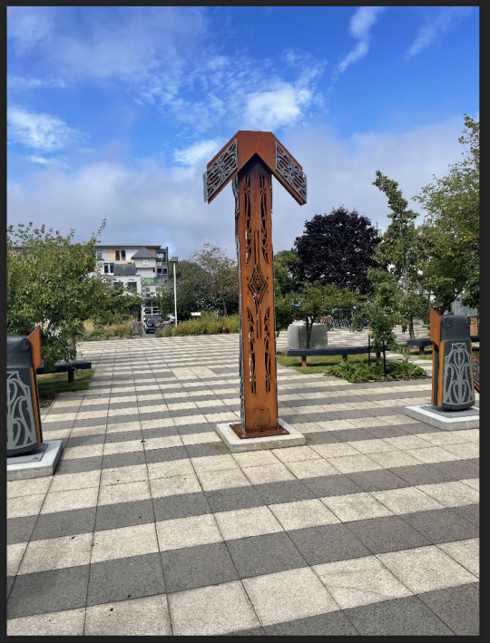
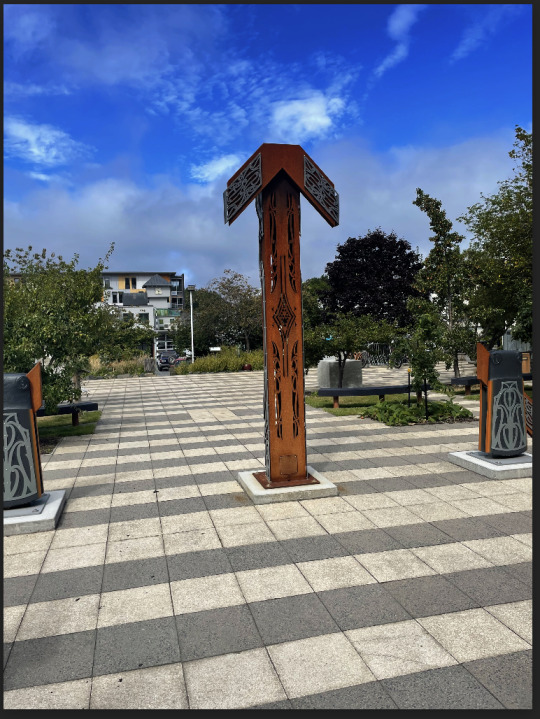
2) Photo at Polytechnic: corrected. I practised using the curve & gradient tool by applying the effect on only half of the photo.
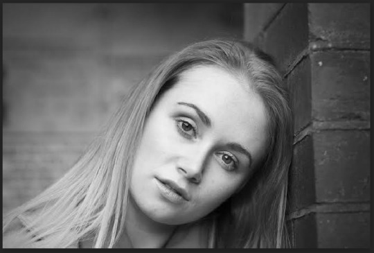
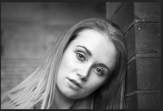
3) Female black & white portrait: corrected. I found that the colour of the portrait is lacking contrast. As you can see from the corrected version, the facial features that's right on top of the shadow look more stand out.
4) Forest: corrected. I tried to reduce the intensity of the black pixels to give it a nostalgic vibe.
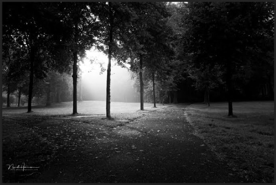
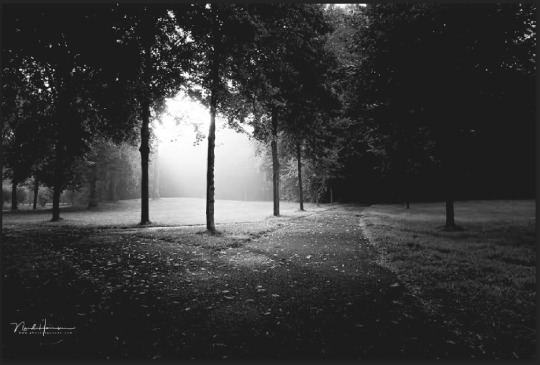
When doing the exercises above, the most challenging part is to find an image that has its colour or brightness purposely stuffed up because frankly, most of the images I found had good colour and the brightness was perfect as well.
0 notes
Text
Week 2, Mon: Colour Correction
7) Correcting the following photo is tricky because the overall picture is too bright, causing some details and textures to become unclear. In photography, this situation is referred to as low dynamic range. Additionally, the edges of the photo seem to have a white effect, so we need to eliminate that by adding a blurry and black shading towards the edge. Important shortcuts: 1. x = swap foreground and background colour 2. Shift, command, delete = fill selection with foreground colour 3. Command D: let go of selection
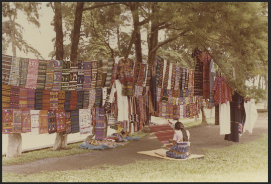
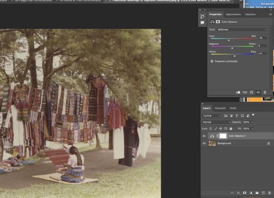
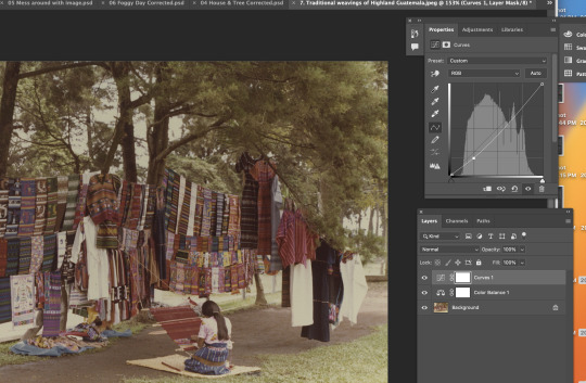
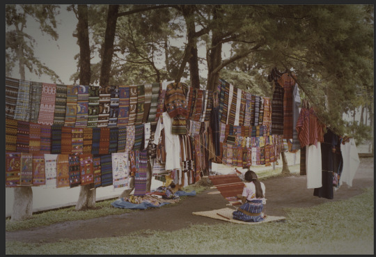
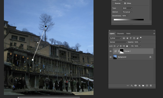
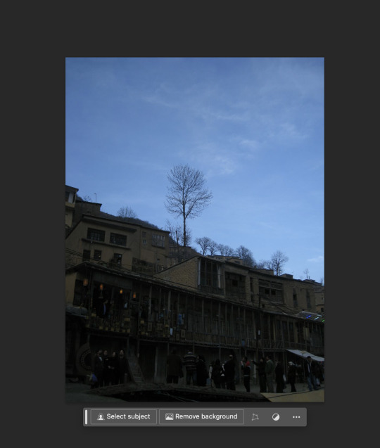
8) For our last image correction, our plan is to darken the sky because it looks overexposed, while also avoiding adjustments to the brightness cast onto the building. Therefore, we used the gradient tool to do so. It looks amazing after the adjustment.
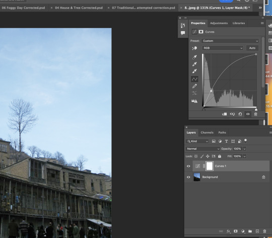
I absolutely loved how we apply different image adjustment tools to different images. It helped me understand what the element or adjustment is that an image lacks.
0 notes
Text
Week 2, Mon: Color Correction
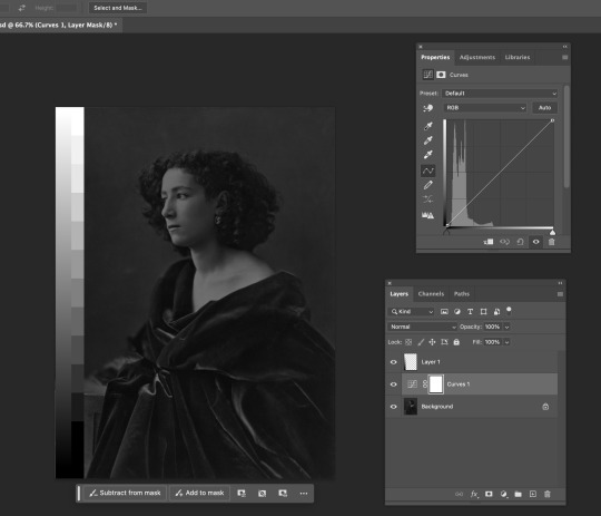
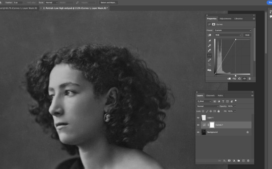
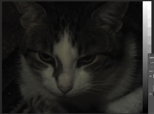
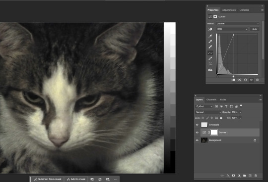
1) The first image we're trying to correct is a black & white female portrait. As you can see from the image below, it's clearly too dark. Also, from the histogram, all the pixels are on the black side. To solve this without making the image look too bright, which could lead to ruining the details of the portrait, we found a point at the middle of the histogram where the image looks slightly brighter, much clearer, and prettier.
2) The following image looks too dull and dark. When we look at the histogram, most of the pixels are clearly distributed on the darker side. To lighten the image, we did what we did to the first image: moved the light anchor to the left, at the same time not trying to overexpose the highlights of the image. Lastly, I saturated the image a bit so it looks redder & warmer.
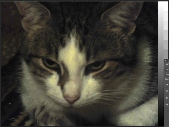
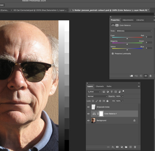
3) I changed the colour balance of the grandpa photo by adding more cyan, less red, more dark blue, and less yellow to the photo.
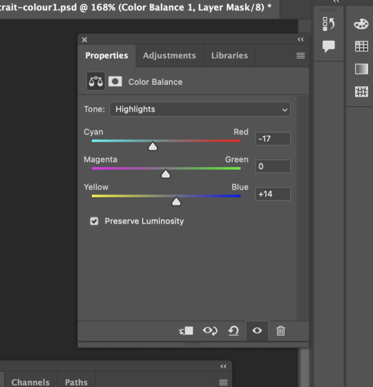
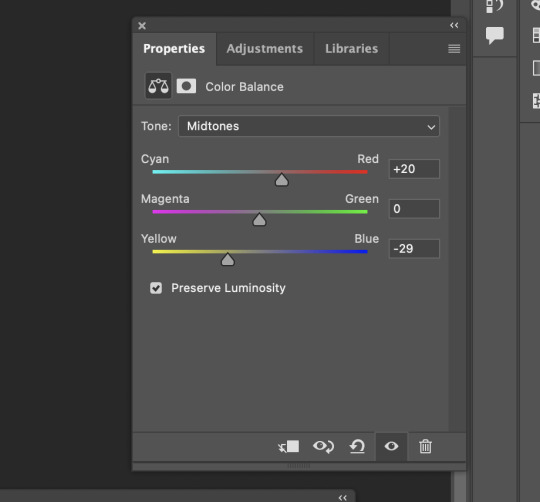
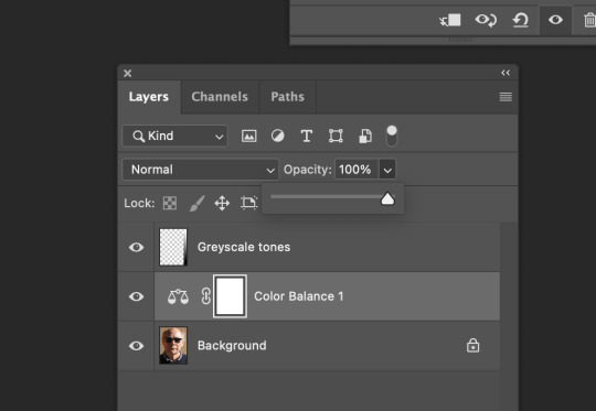
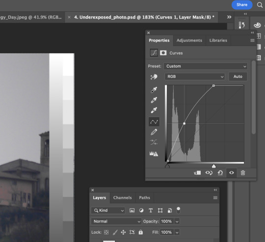
5) This is a slightly dark image. To correct it, I opened the histogram to adjust the overall lighting of this image. Lastly, I saturated the image towards a little red so the whole image looks more lively and real.

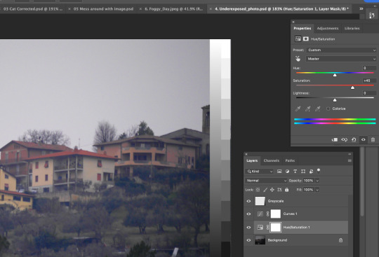
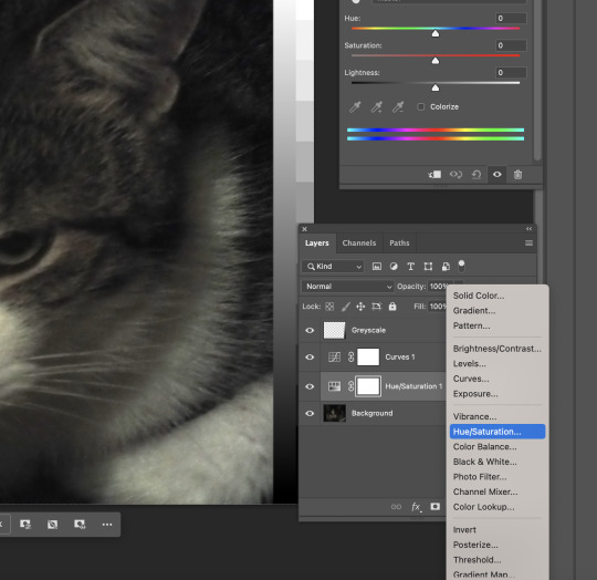
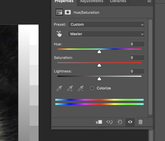
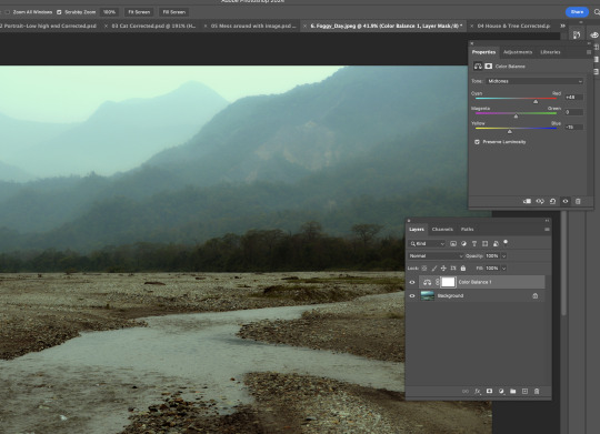
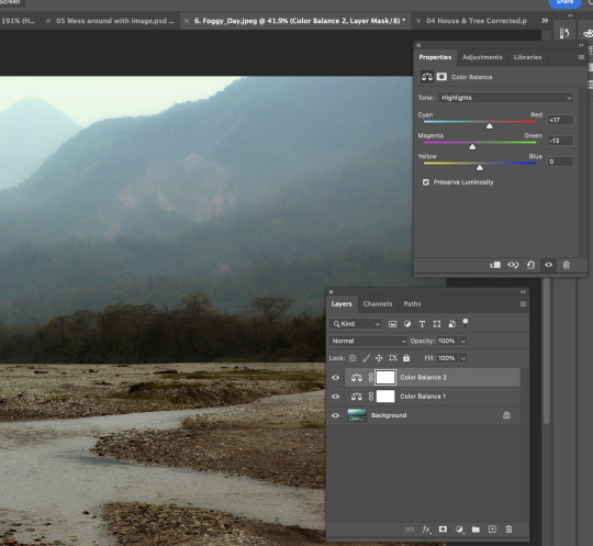
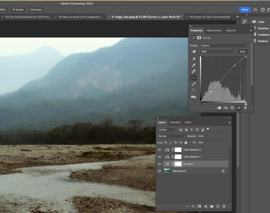
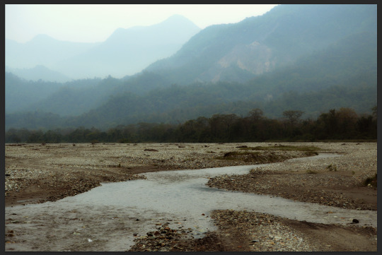
6) A well-captured photo already, but we still can modify the overall colour of this photo by using saturation/HUE. Having the saturation window is like having a color palette. Initially, the photo looked dull and desaturated. Then, I added more red and magenta to it. The colour distribution in the photo is clearer, including the darkest part, the trees.
0 notes
Text
Week 1, Fri: Penguin
Today is our first day diving into Photoshop. Surprisingly, I'm pretty familiar with the layout of its interface, perhaps because we used it for a few classes last year during my studies of New Zealand Design Certificate.
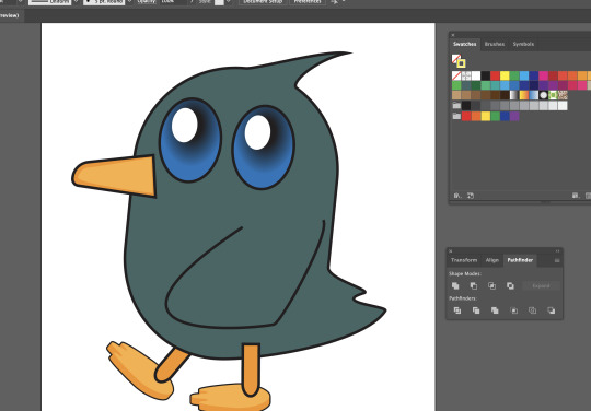
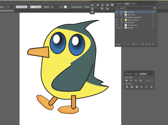
I designed an bulky looking penguin in class today. I began with the tail, hair and eyes. The eyes are particularly challenging because we have to use a variety of tools to give it a sort of cartoon vibe.
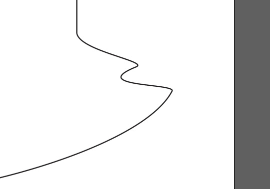
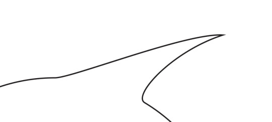
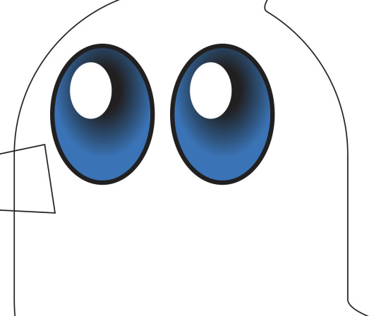
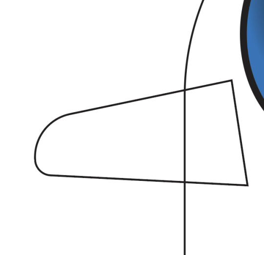
Next, we started designing the beak. Making a rectangle at first was relatively easy, but when it came to stretching only the top-right corner, I started falling behind, unable to find the way to pull that corner down. Eventually, my fellow classmates helped me solve it. Basically, after drawing a rectangle, I was supposed to click off the object and press a to go to the direct selection tool, then drag the top-left corner anchor to move it downwards.
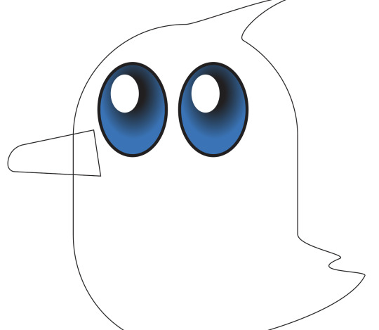
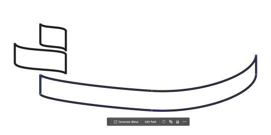
Then we moved on to its feet. This part was clearly, clearly the point where I got totally confused. Looking at the third screenshot below, I wouldn't have been able to tell what it was until we dragged the actual penguin feet onto that area. Then I found out we were making the sides of the feet. W

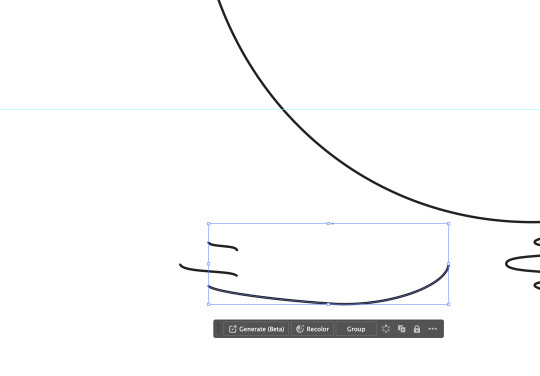
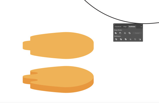
We tilted the body of the penguin to make it look funny.
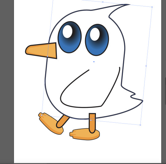
I tried to make it look appealing through picking the right colour, but unfortunately, I don't have much knowledge in colour harmony so I gave up half way.
0 notes
Text
Week 1, Thur: Straight line shapes
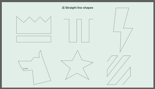
2) Straight line shapes
While drawing the shapes below on paper, I really struggled with the dog, the star and the thunder. While drawing the dog shape on paper, it's hard to estimate the size of the head compared to the neck. It's funny how I ended up making the head looking too big that I left no room for the neck.
3) Single arc curves
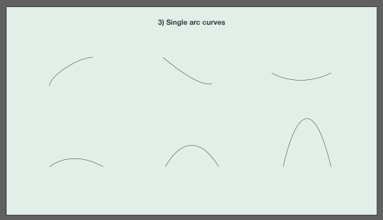
Drawing these shapes is easy, but when using Illustrator to draw them, it's tricky to keep the handles short. However, in the long term, I believe it's going to help me.
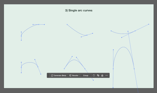
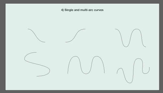
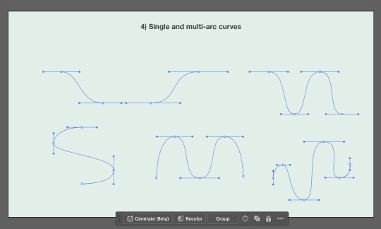
4) Single and multi-arc curves To be honest, I found drawing the following shapes/lines on Illustrator pretty easy. I think i'm just getting better after practising and practising in class.
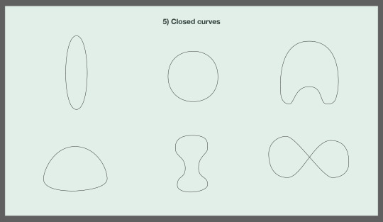
5) Closed curves The shapes are definitely getting harder and harder to draw, especially the bone looking one. That one took me ages to do, I ended up behind in class because of that graph.
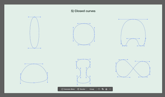
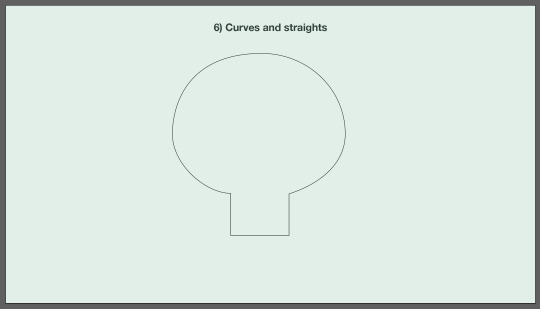
6) Curves and straights
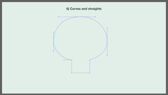
I found the following shapes kind of challenging due to the corner of the straights and curves. I definitely need more practice.
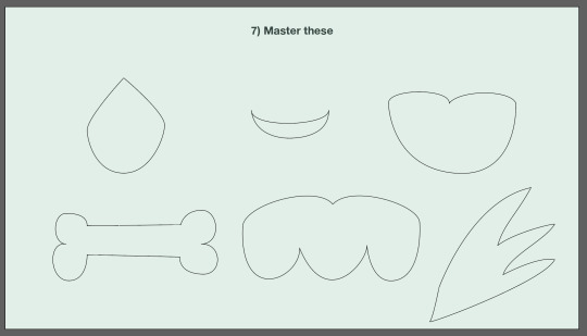
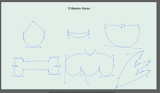
7) Master these
Literally the hardest session of the day, especially the heart shape and the wing.
0 notes
Text
Week 1, Tue: Illustrator shortcuts
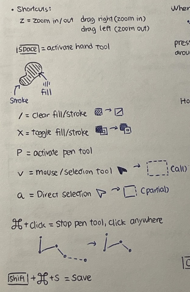
The photo below includes all the shortcuts I've leant from Illustrator today. A lot, but important.
2 notes
·
View notes
Text
Week 1, Tue: Drawing straight line
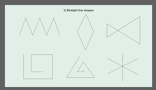
I really enjoyed drawing lines using Illustrator in class today. And thank GOD I still remember some Illustrator techniques Thomas taught me last year. In class, the shape I struggled the most doing is the left bottom one, I messed the one on the paper first then the one below using Illustrator haha. I'll get better I'm sure. Here is the work I did :)
1 note
·
View note