'tension' for this brief I have decided to deveolpe further into personal relationships and how certian attributes can effect your mental health. I will be focusing on one particular word which is 'tension'. I will be looking at how tension can build up in a realtionship and how that build up can put a strain on yourself and your partner, but I will mostly be looking at creating tension using different forms of materials and techniques. Tension can be a very difficult thing to handle because sometimes you yourself are not entirely sure what is causing you to feel so jittery and all tensed up. So this can result in confusion because each time it will change, your emotions and the situation you are in can contribute to why you are tense and this can then influence how you handle that tension. so to demonstrate this tension I will mostly be focusing my practice on prints, photography and graphic design in 2D form. I will also be looking at creating different textures using new programs such as photoshop. I want to be able to create multiple mixed media peices that demonstrate an overlayering effect. this is to show the repeat process of tension and how it can build up over time. I will be showing this by continusly overlayering and manipulating each layer to create repeat patterns and textures.
Don't wanna be here? Send us removal request.
Text
Final submission
'Tension'
Sinead cameron
For this brief, i am developing further with the idea of physical relationships and how it is important to have balance and understanding in everything you do with your partner. However, i am mostly focusing on the tension that builds up in a relationship and how it can become very uncomfortable and put a strain on you and your partner. Tension can be a very difficult thing to handle because sometimes you yourself are not entirely sure what is causing you to feel so jittery and all tensed up. So this can result in confusion because each time it will change, your emotions and the situation you are in can contribute to why you are tense and this can then influence how you handle that tension. With each development i want to be able to create work that show repeat tension and to show this i will be creating induvial layers that combine to create chaotic lines and texture. This is to show tension in many ways through colour, form, texture and composition. I will be mostly focusing on a large variety of 2D prints, drawing and graphic design. This is to emphasize the word ‘tension’ by continuously over layering and manipulating each later to the point that each work does not make sense.
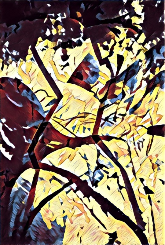
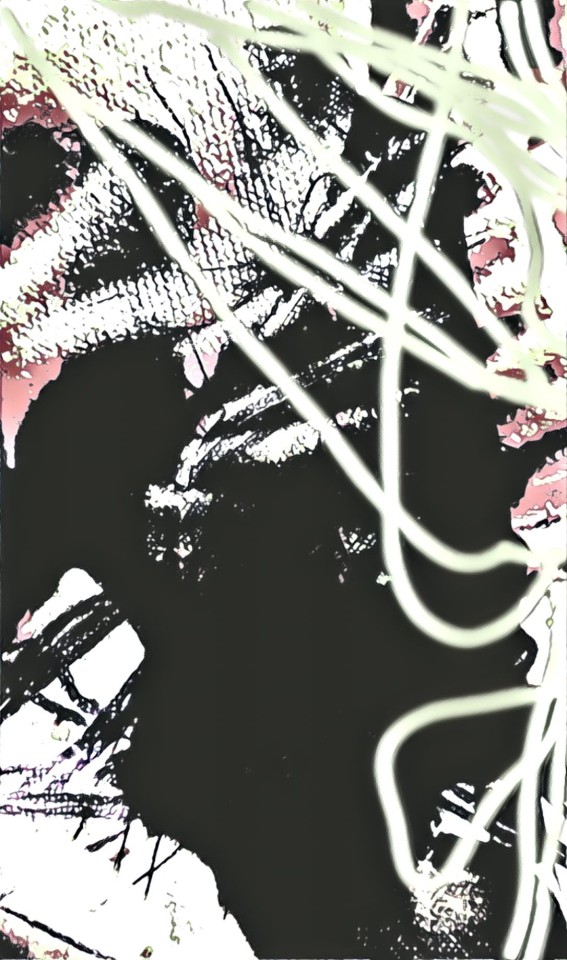
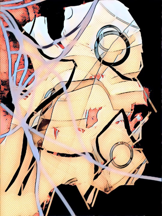
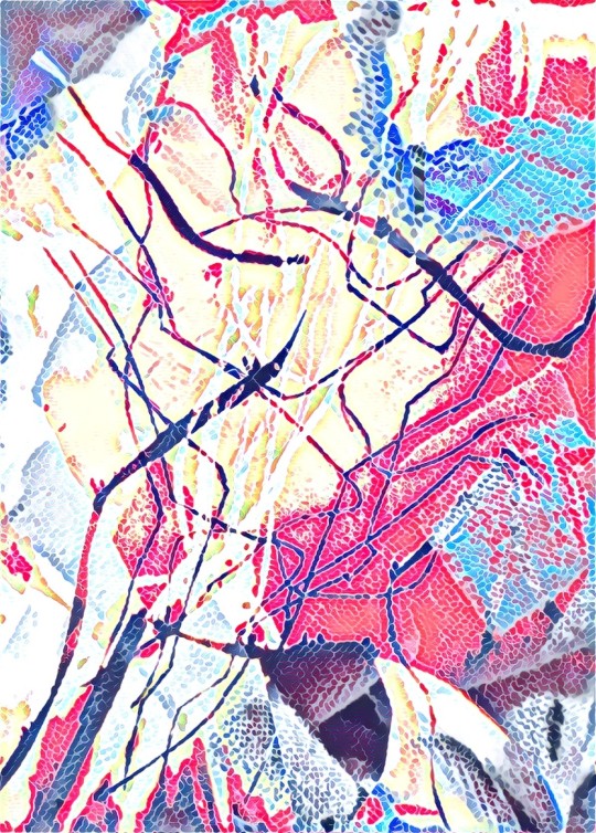
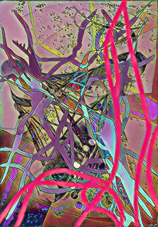
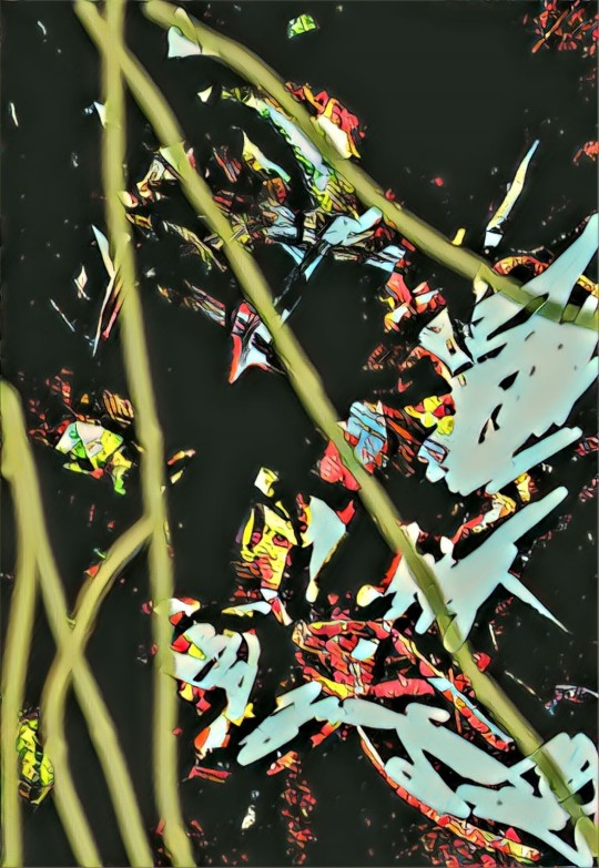
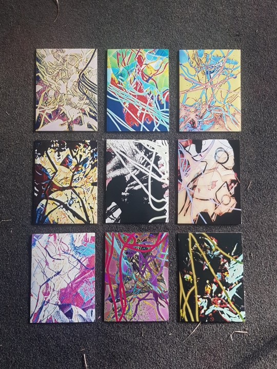
Overall, i have worked in a large variety of 2D methods and worked towards creating individual 2D mixed media graphic prints. By doing this i used 4 separate layers by using different materials to create over layering tension and texture. Working towards this i have created nine 2D pieces that demonstrates a large number of techniques and detail to emphasise the word ‘tension’. Each layer is different and is unique on its own, but the final layer is a 2D photographic drawing that i have stretched digitally on photoshop to be displayed over the full piece. Furthermore this helps to bring the whole piece together.
Final installation
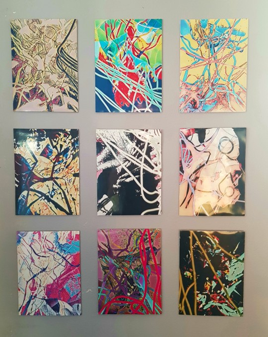
2D graphic prints
( I have put each print underneath. so it is more clearer to see each detail)
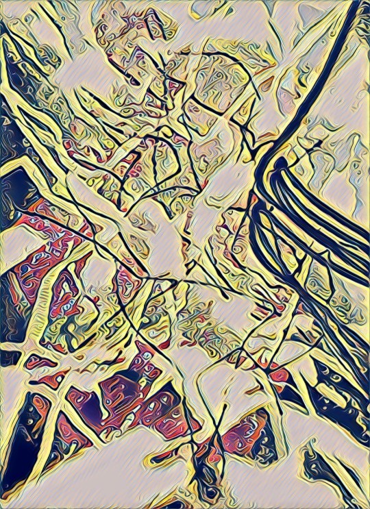
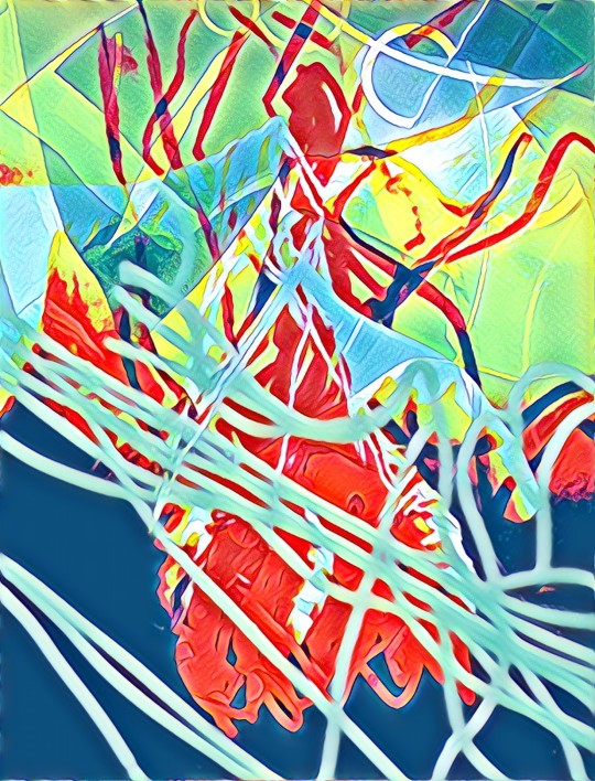
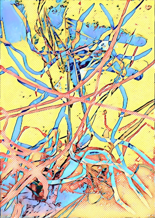
0 notes
Text
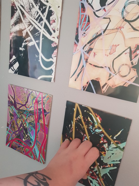
I was lucky enough that I have just recently painted the walls in my living room so I used one of the blank walls to place all 9 of my final peices and install them onto the wall. I really liked this process because it remind me of working in collage and I did not want to limit myself for not being able to display my work in a professional way. So i wanted to be able to display my work physically so I am able.to see what they look like in person and not on a small screen
0 notes
Text
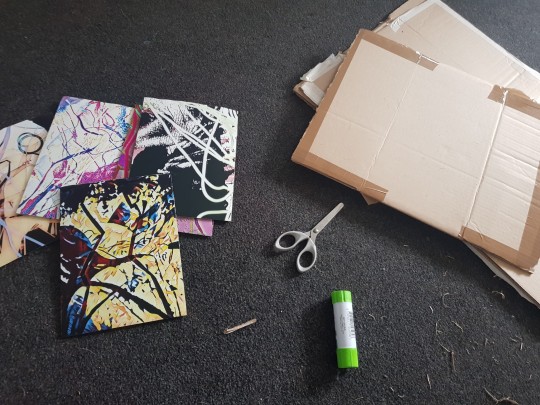
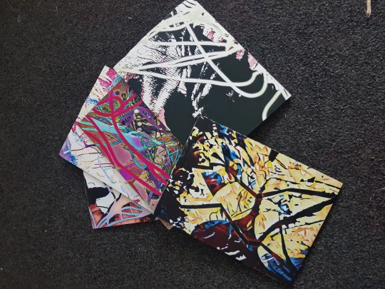
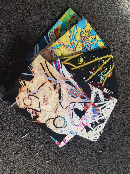
Having my final work I wanted to print each one out so I could display them on one of the walls in my house. Because I did not have a printer I had to go to my local tescos and print them there, due to limited sizes the largest I could print was A5.
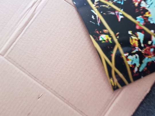
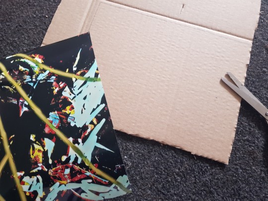
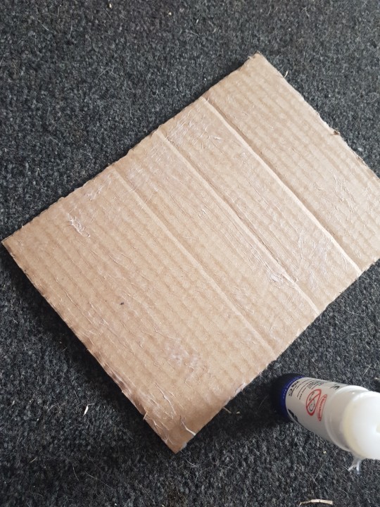
Because the prints are really flat I wanted to be able to raise them off the wall a bit so they do not look to flat. So I got spare cardboard and used that as a back support for the prints. This helped to push turn off the wall and again helped me to think on the mind set as if I was setting up a space. Trying to find different ways to make my work more interesting.
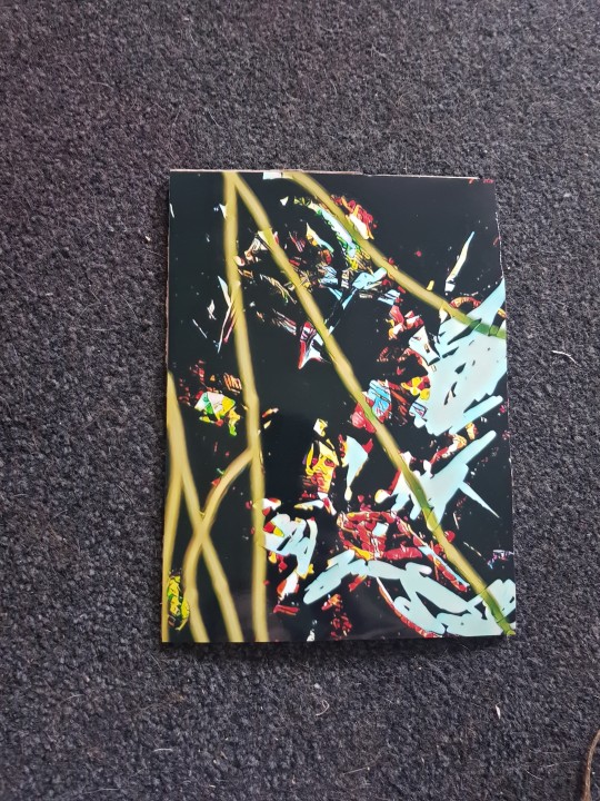
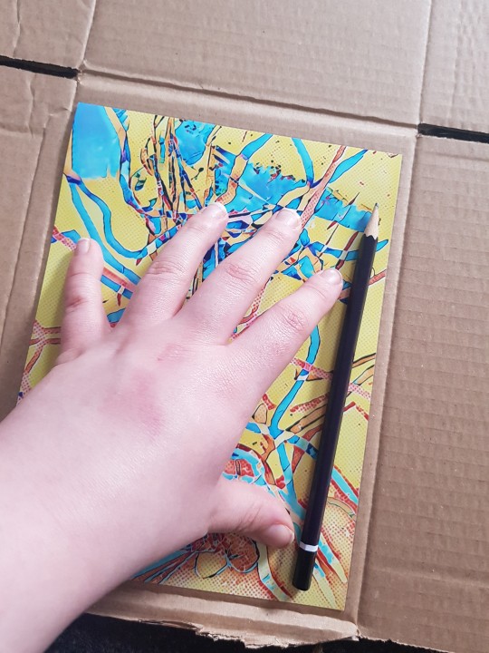
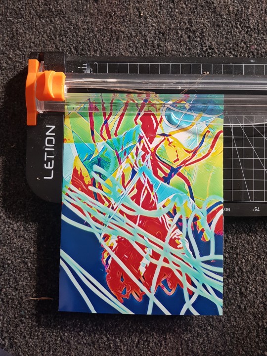
I used each print as a template so I made sure that I had the right size of cardboard so the prints would fit perfectly. I used normal glue to stick the prints on and for the edges that where not even I used my.small portable paper cutter to make the edges more straighter.
Once I had all 9 I laid them out on the floor in the layout I wanted. So.i could see what each one looked.like before I placed them onto.the wall
0 notes
Text
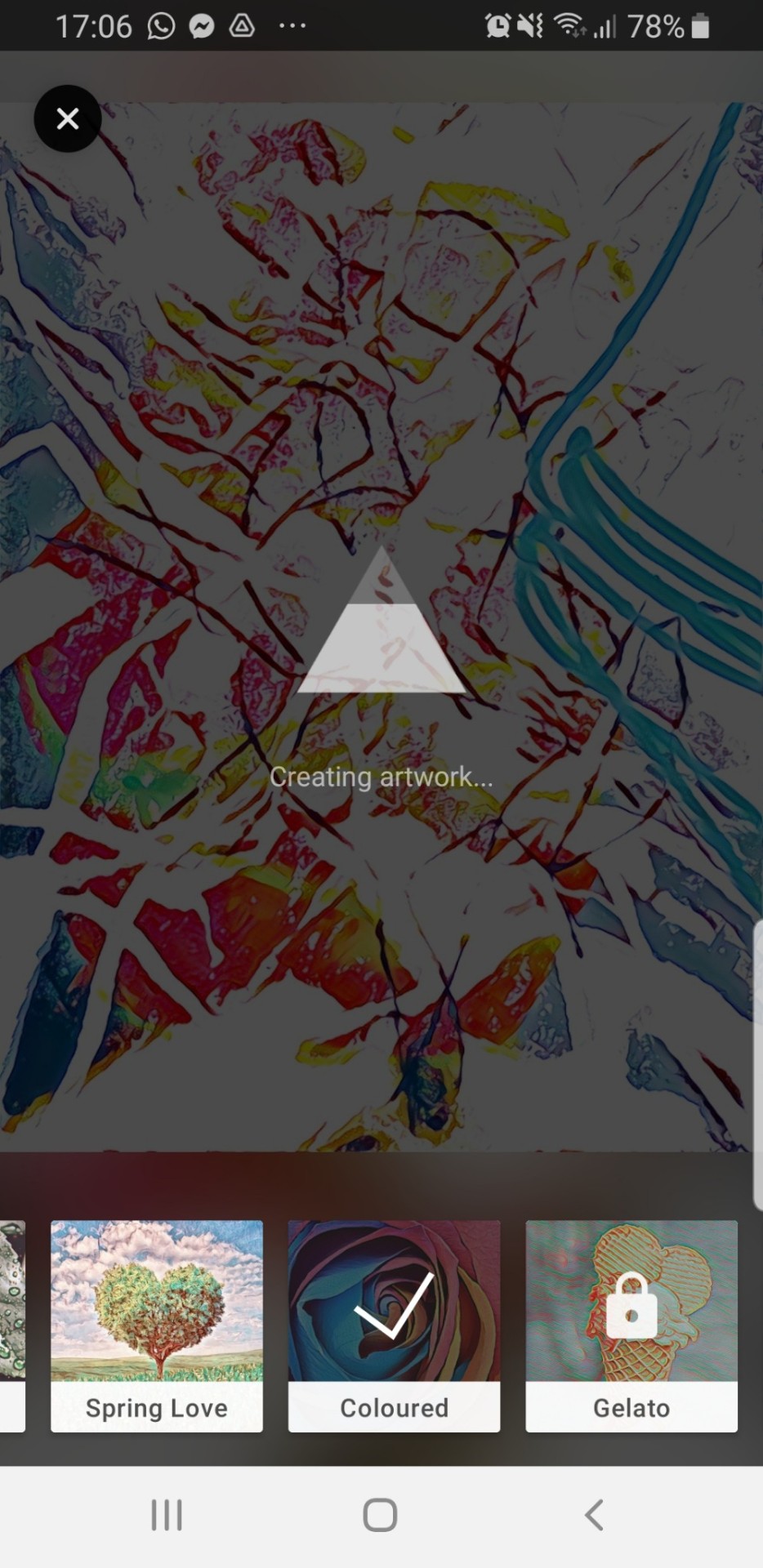
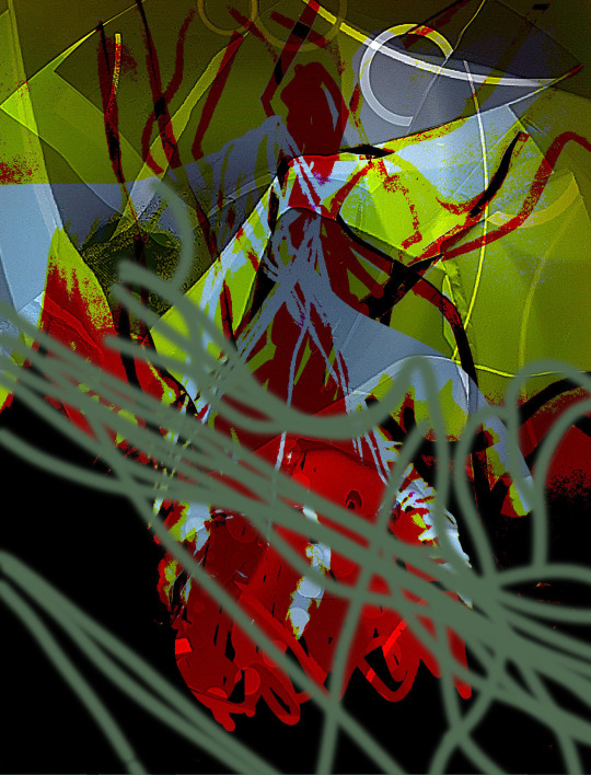
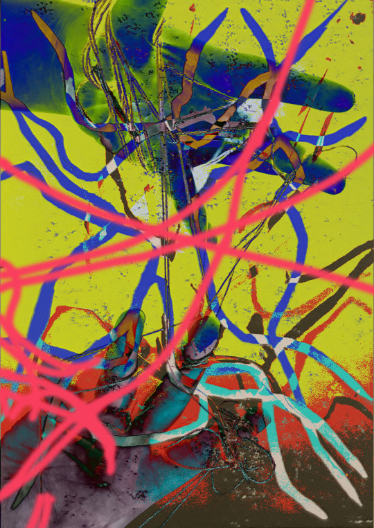
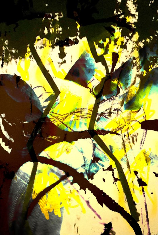
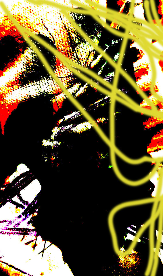
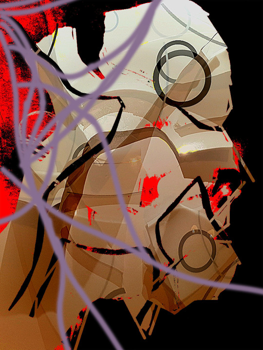
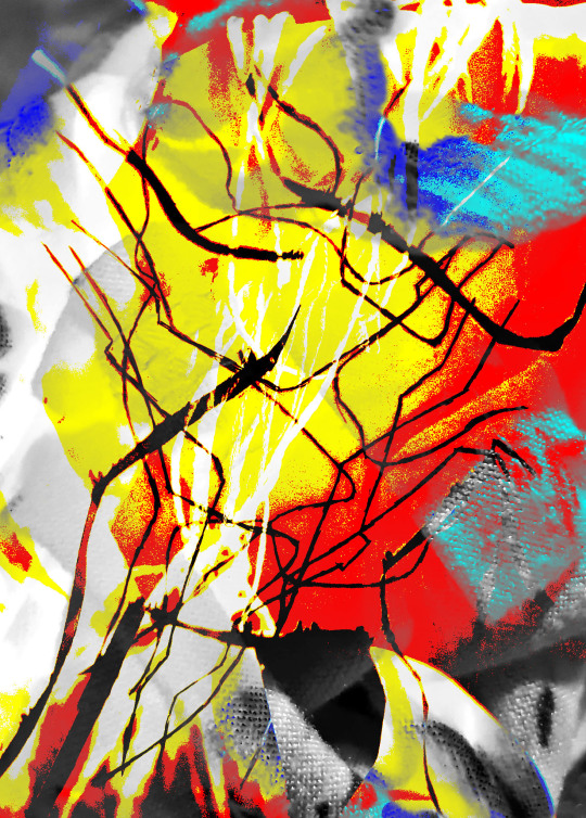
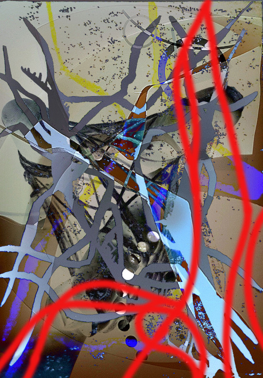
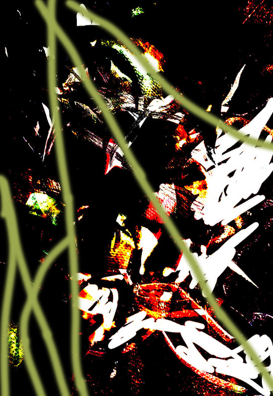
Once I had my final peices and what I wanted to work with. I placed them into PRIZMA so I could get the final effect I was looking for. The reason for placing these in PRIZMA is because I believe each one is too dark and the detail is being lost because of how dark the colours are. So putting another layer on them will help to had more effects and will separate each one so they look like their own work.
0 notes
Text
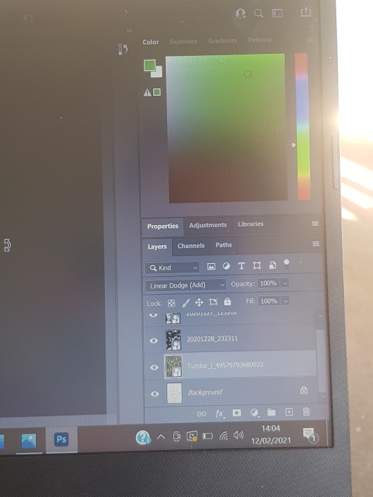
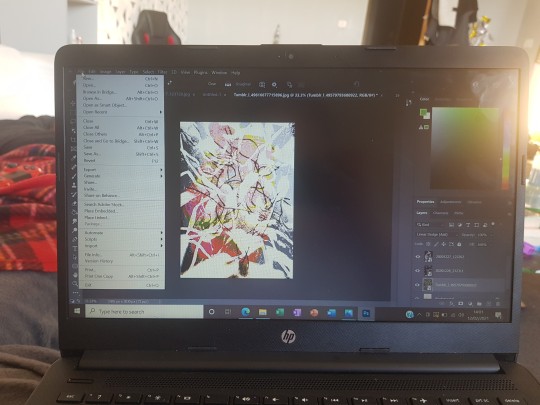
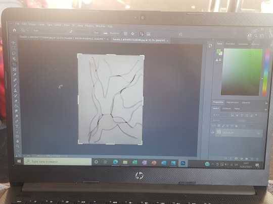
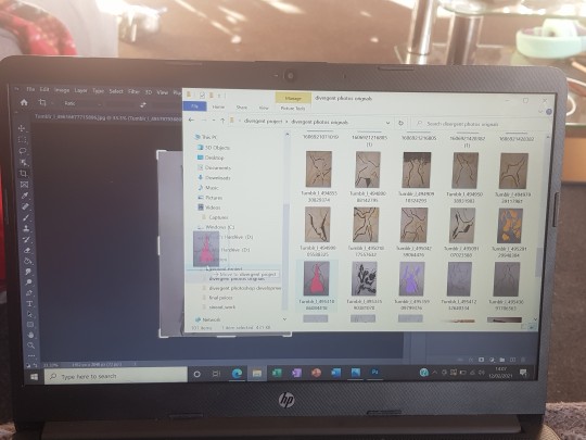
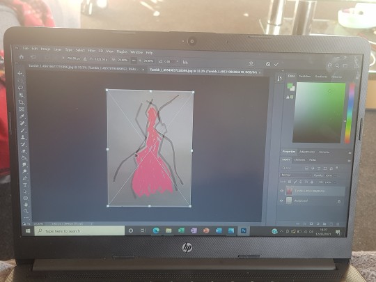
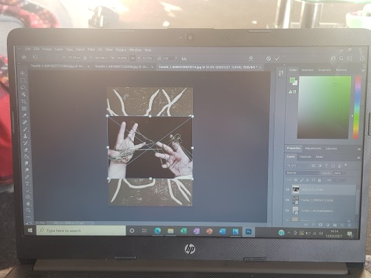
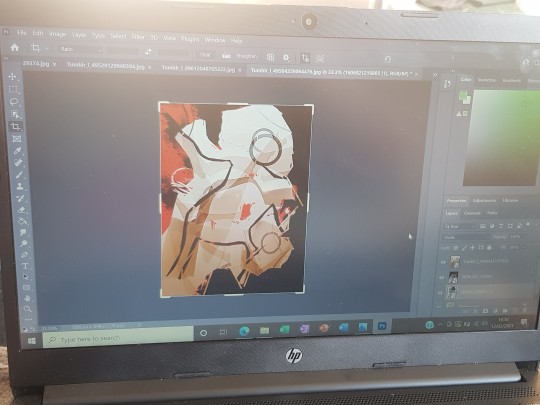
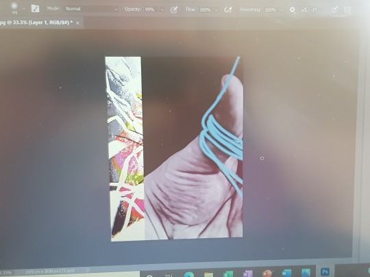
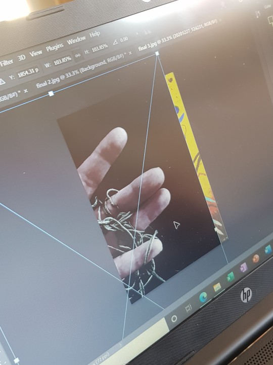
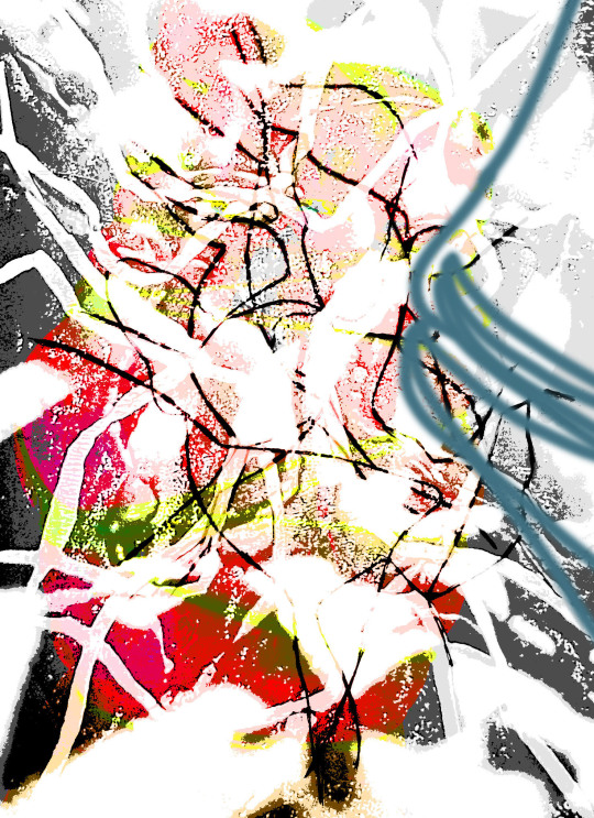
Further developing my work I have decided to start on my final peices. As shown above I started to create the background layers for each piece by overlayering and creating transparent effects that helped to mold each layer together.
I think put 4 different effects ontop of each indiuval layer so I could get different textures through each layer. But with everytime I would had more effects each layer would eventually start to change and have a minimalist feel to them.
When I have each layer complete I then had 9 separate peices, with these I then picked one of my old 2D photographic drawings. I worked out how big I would have to enlarge the image so it will cover all 9 digital drawings.
Doing this was hard because I had to keep looking back at my references to make sure I was getting the right proportions and the lines would match up. But I had to make sure I was putting the right design on the right grid.
The pictures above are just how I made each work and what techniques and how many layers it took to make each one. Each layer has 4 layers and 4 different effects on each one.
0 notes
Text
Sébastien Zanello: Artist Sculptor
https://galerie22contemporain.com/sebastien-zanello/?lang=en&
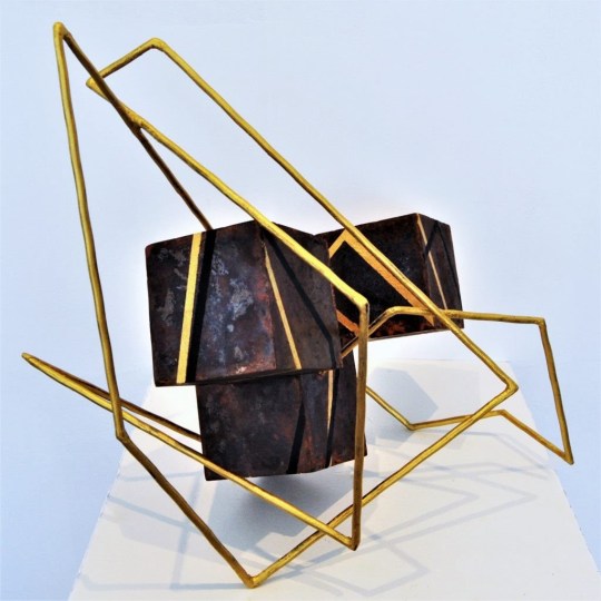
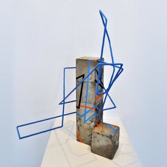
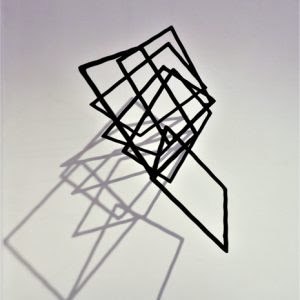
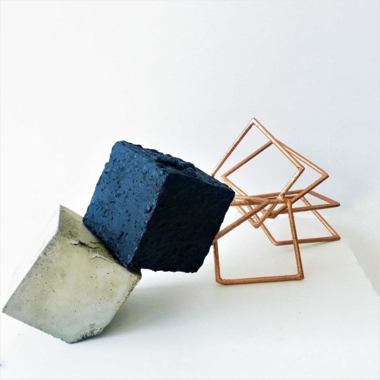
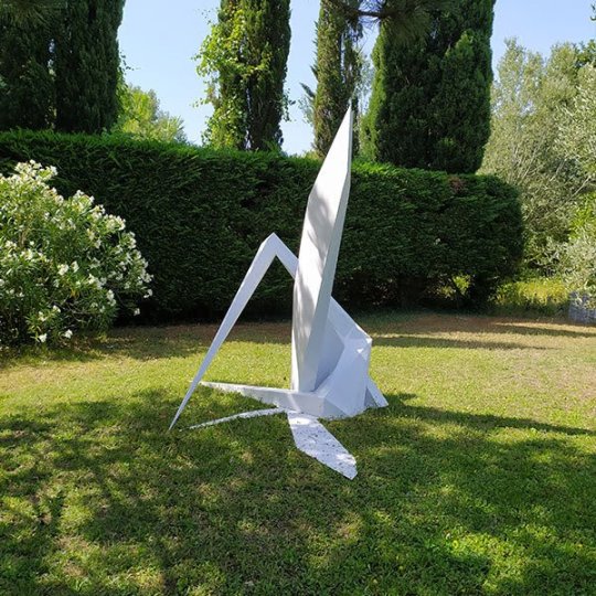
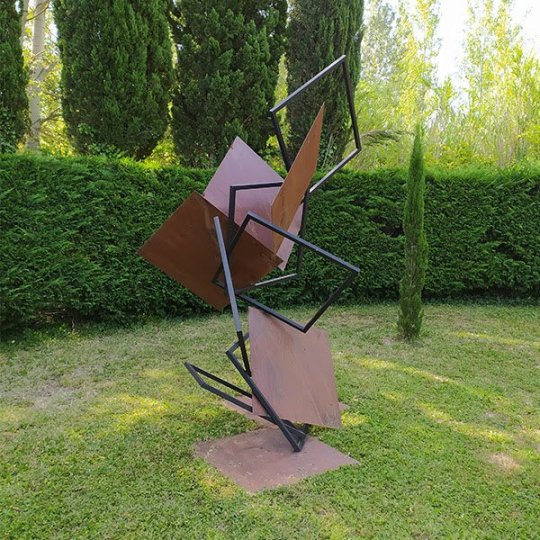
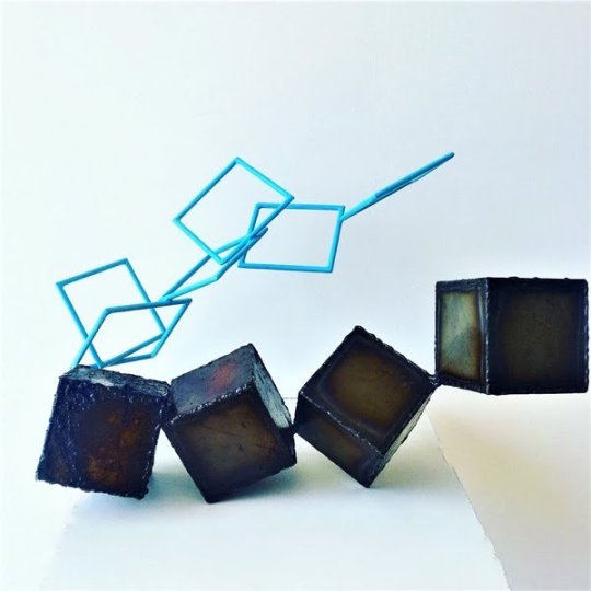
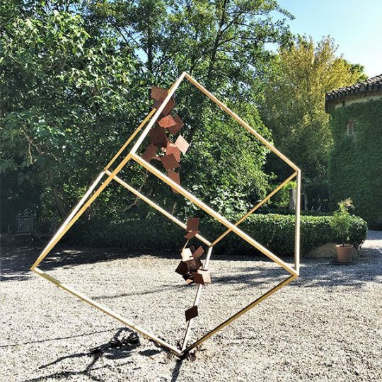
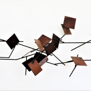
Zanellos work consists of observing the void that is around us and by adding matter to it he is able to capture the light that gives it more meaning. He makes astounding work that is about a moment stuck in time, to create mixed media scultpture that capture something fall and freezing mid movement.
He is attracted to the space around him and how that effects the time and people through out different centuries. His work takes on new forms depending on whatever environment he is working in. Meaning the shape, colour and whole aesthetics of the peice can change depending on its surrounding. He is an amazing artist that allows himself to adapt to his surrounding and use limited resources.
To me his work are amazing geometric structures that create a sense of authority. The sharp edges and the way the shadows work to use unique forms help to create that sense of structured tension. Because looking at his work you would not believe they are standing their own, so this makes you uneasy and entranced.
His work I believe relates to mine because he is some what limited to the environment he is in. This to me is similar to my work because I am limited to what material I can use and only limited to my laptop.
But his sense of knowledge on how to push past those boundries and experiment with what you have is inspirational. Because that's what I do if I am not able to use this particular method then I will think of ways to recreate that method.
0 notes
Text
Tom Fruin - Wikipedia
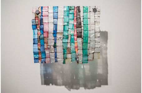
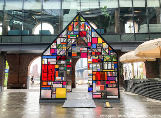
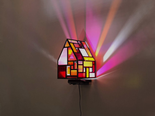
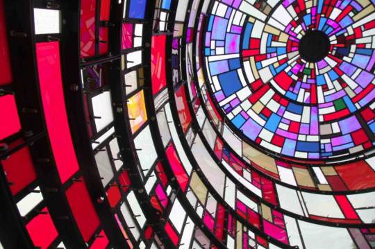
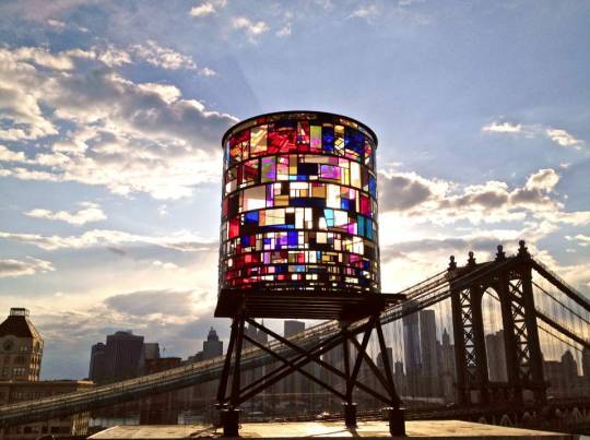
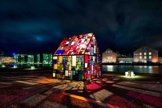
"Known for his large scale scale installations , Fruin most commonly uses steel and highly colored plexiglass to create monumental sculptures referencing local building structures. He describes his drive to make art that is publicly accessible, as well as sustainable by working with reclaimed materials and alternative energy."
His work is targeting his audience by create installation peices that are interactive and allows the audience to become involved. This give the audience a new experince of being surround by different shapes and colour of glass. Sort of like you are being encased in a room and your experince a large volume of emotions
With my work I want to take that message and demonstrate how I portray tension and how that tension can influence your daily live. By trying to engage with my audience and provoke emotions and undertsaing through my work
0 notes
Text
MALHEIRO - Graphic Design Studio

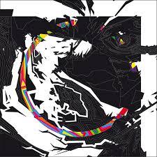

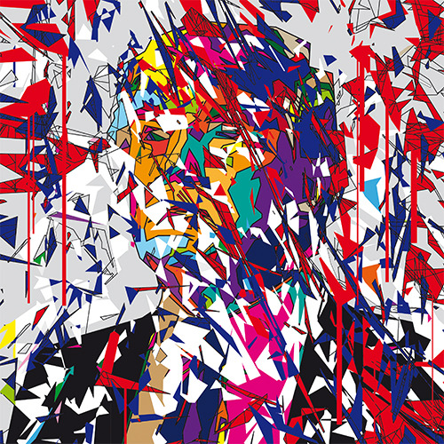

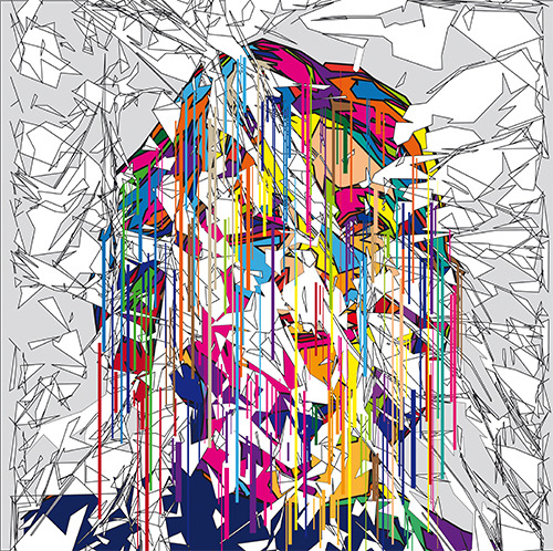
graphic designer, digital artist and web designer, Alexandre is used to being both in front of and behind his creations. This atypical artist director knows perfectly well the challenges of digital graphic art: creating works and images that will speak for themselves and accompany them with energy, finesse and personality.
0 notes
Text
Ivan Chermayeff: Graphic Designer & Collage Artist
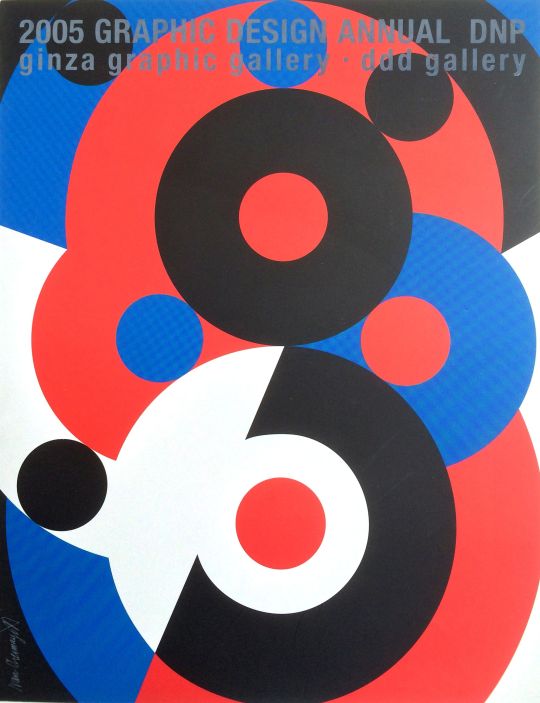

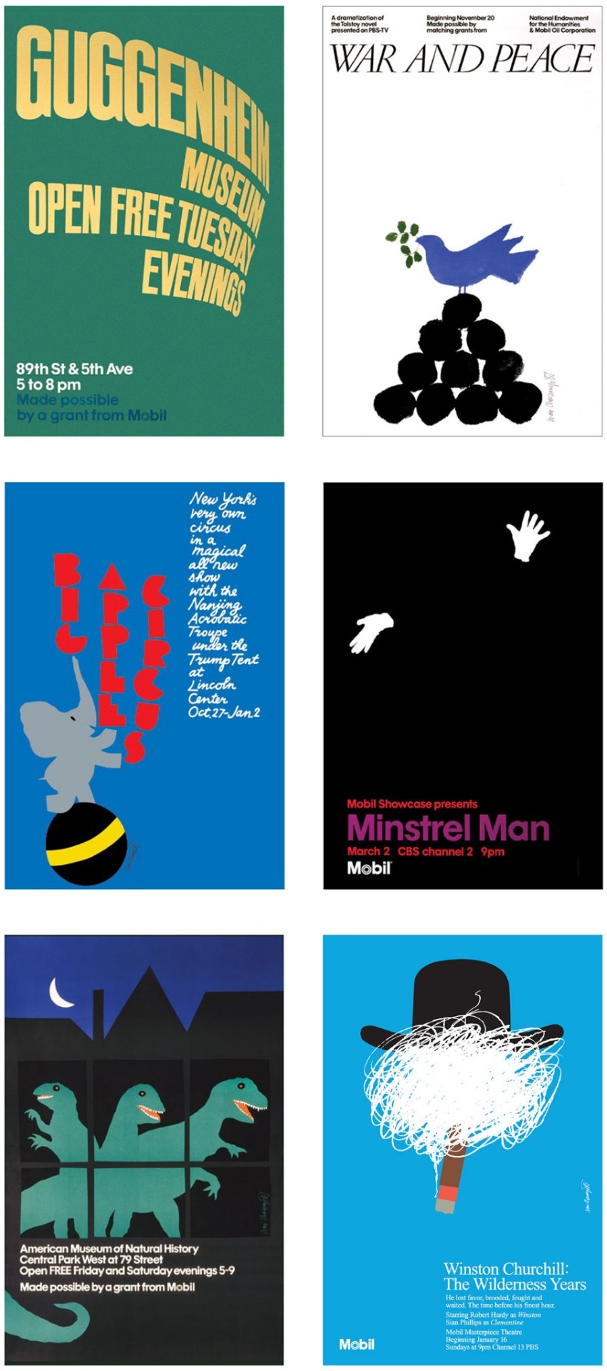
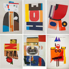
Chermayeff is also an artist, whose droll collages and assemblages of found materials have the same modernist sensibility as his logos. His pieces transform the discarded — scrap paper, envelopes, wood, gloves, aluminum cans — into whimsical faces and abstractions with a minimalist bent. He is a well known graphic designer, but what I am inspired by is his use of transforming mundane items that we would easily through away into abstract forms. Each design is minimal and does not have a lot to portray. But I believe the aesthetic and composition helps to still make a strong impact.
0 notes
Text
Benjamin Savignac - Syndikat Artists
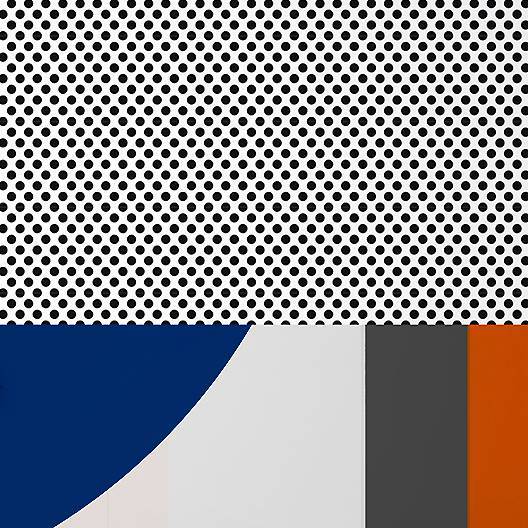
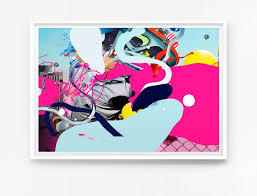
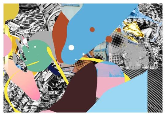
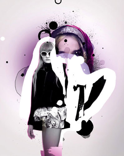
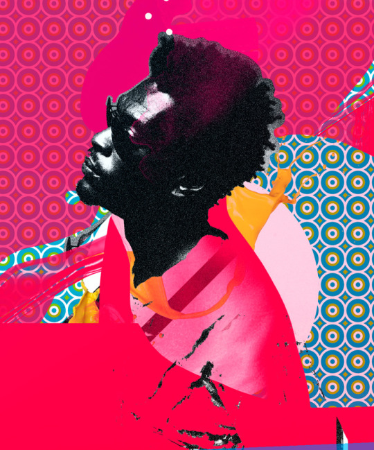
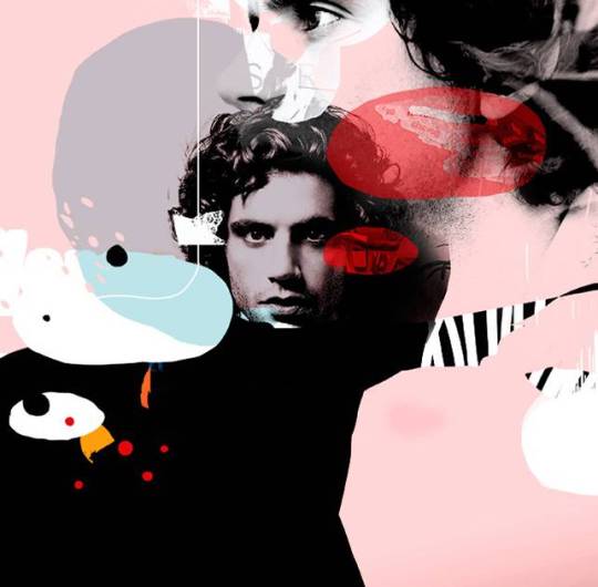
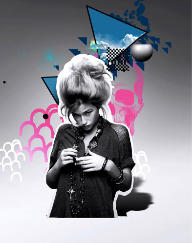
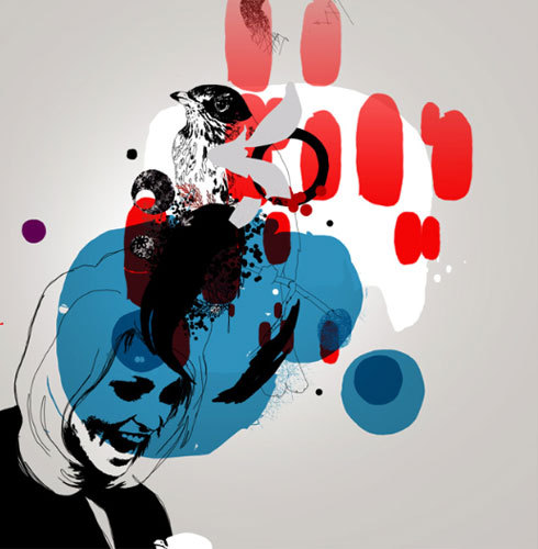
Benjamin Savignac work consists of modern day aesthetic to create dynamic design for fashion magazines. The reason I have picked him as an artist because I love how he uses both photography and contemporary shape to contrast together to create a sort of punk rock feel to it. His graphic designs are incredible but also minimalist. There is not alot going on but you can see the concept he is trying to portray
0 notes
Text
Sigmar Polke 1941–2010 | Tate
https://www.tate.org.uk/art/artists/sigmar-polke-2213
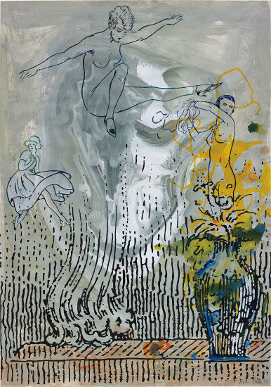
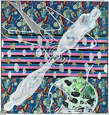
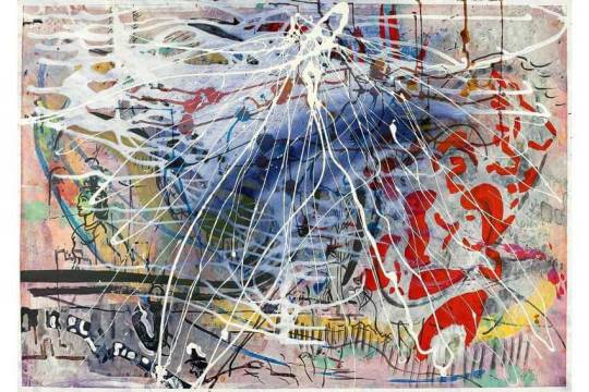
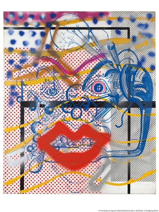
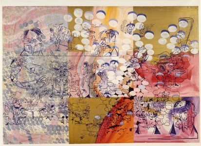
Polke experimented with a wide range of styles, subject matters and materials. In the 1970s, he concentrated on photography, returning to paint in the 1980s, when he produced abstract works created by chance through chemical reactions between paint and other products. In the last 20 years of his life, he produced paintings focused on historical events and perceptions of them.
As my work I have worked in the same way polke has worked by developing through photography and using mixed media to enhance the meaning of each peice.
His overlayering and use of materials is great to look at because at first glance they look confusing and you do not have a clue what you are looking at. But if you start to look closer you noticed each intricate detail that is hiding behind each layer.
This to me resembles my work because I want each layer to be influenced by each other to share each little detail and to create new work
0 notes
Text
Christopher Janney - Wikipedia
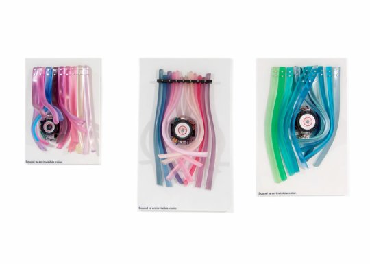
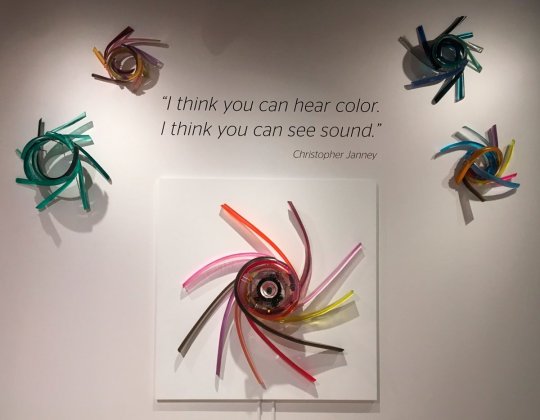
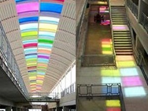
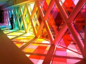

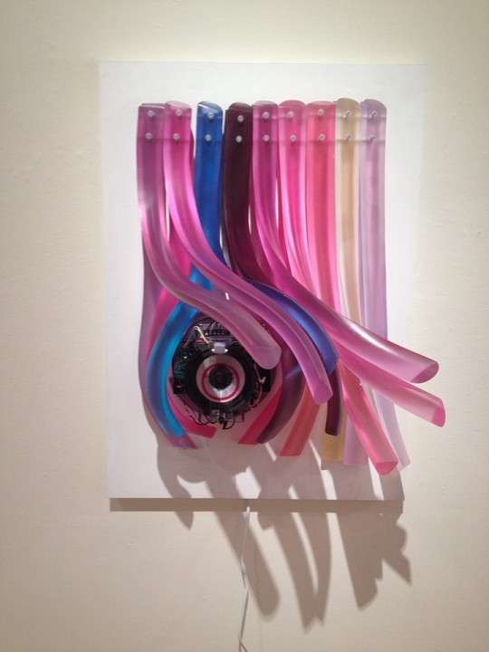
Christopher janneys work is all about movement, sound and participation. He creates beautiful peices that are interacting with its surroundings to create incredibly colours that reflect onto the surfaces around it. His work is simple and each colour blends into each other to create new work.
I love his idea of block colours and how he uses the light to then blend them onto the surrounding environment. With my work I want the colours to be able to blend in a way his colours do when light hits them. I've took inspiration from his work as I want to create the sort of appeal of a stain glass effect with the different colours and patterns without physically making a stain glass peice.
0 notes
Text
The History of Stained Glass - Stained Glass Specialists, The Stained Leaded Glass Company, Bolton, Greater Manchester - The Stained Leaded Glass Company Ltd - Stained Glass Specialist in Greater Manchester
0 notes
Text
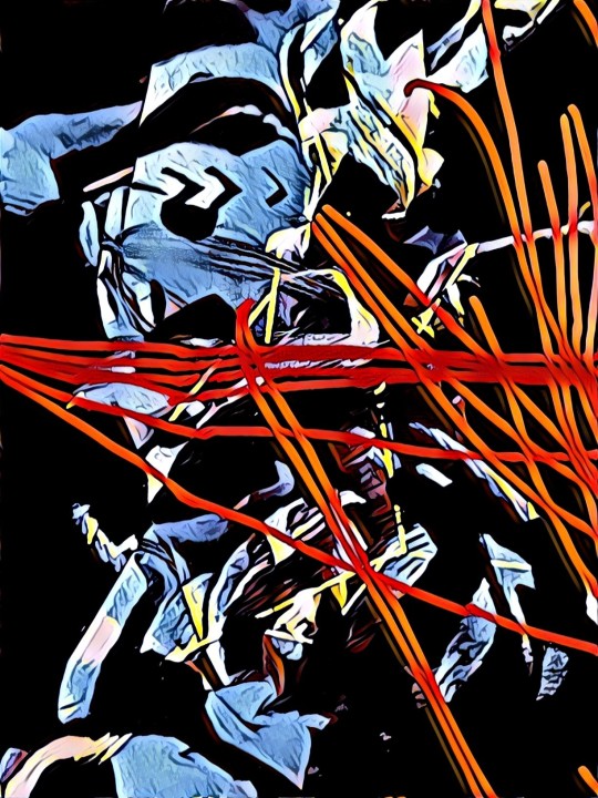

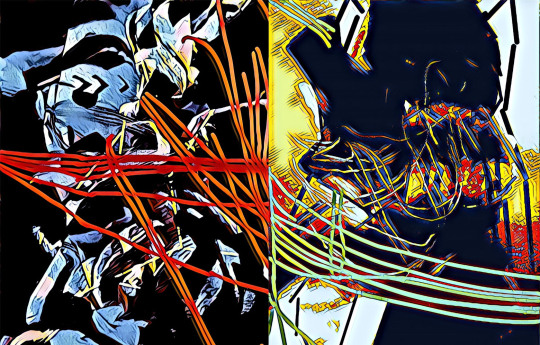
Using the techniques and the process I developed I was able to create a mini peice of my final work. Where i was able to connect the lines perfect to show what the overall work should look like. However the colours I feel are too similar so I will be looking at different styles that will create more bolder or pastel colours. The top layer is what the prices are going to look like on the wall when displayed. As I want to create a sort of gap. So even If you are looking at it far away you are still able to see where each line connects
0 notes
Text
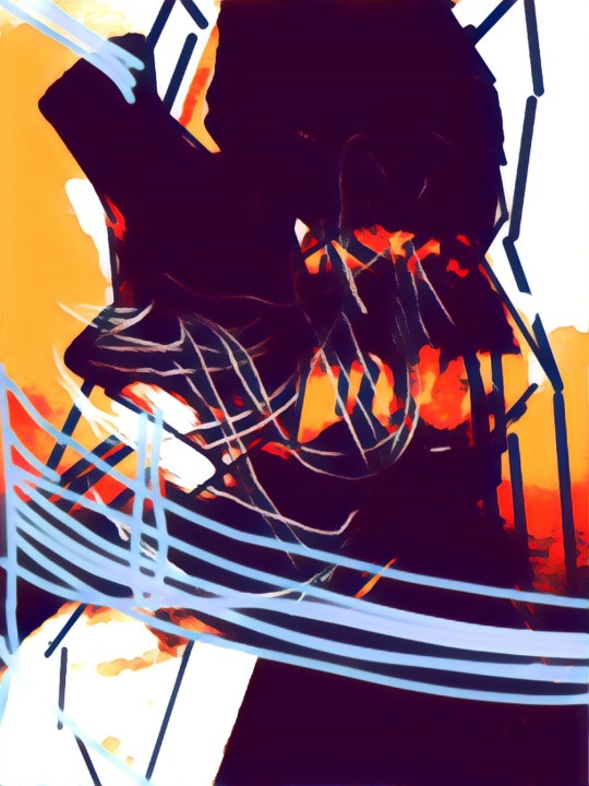
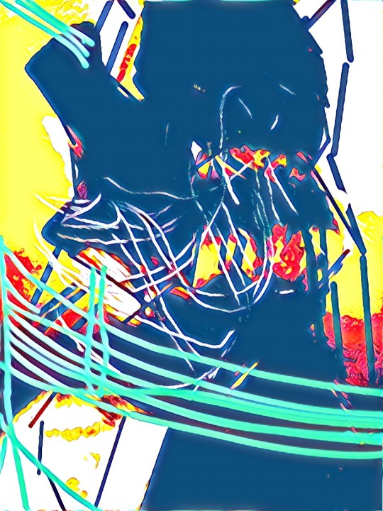
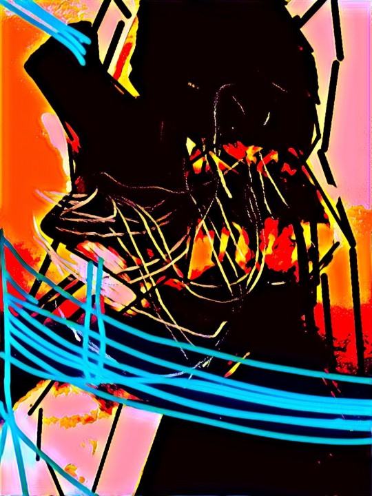
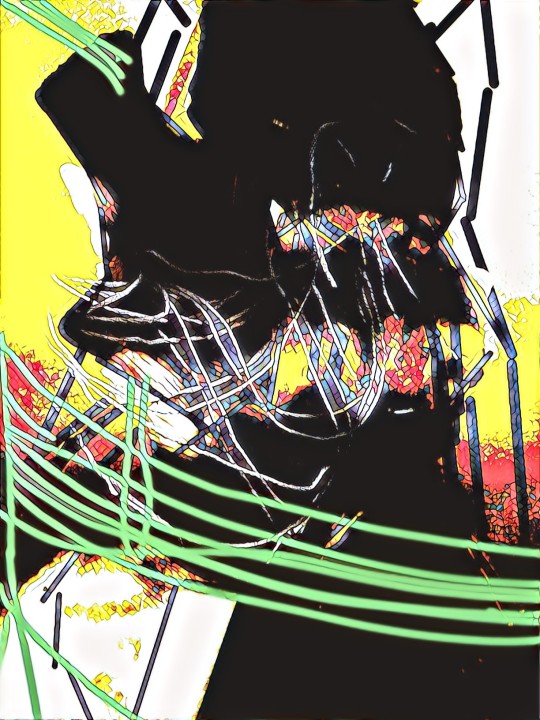
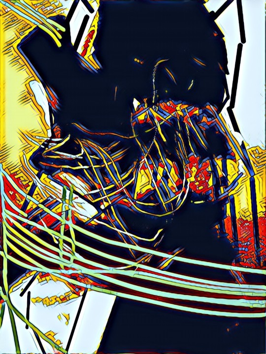
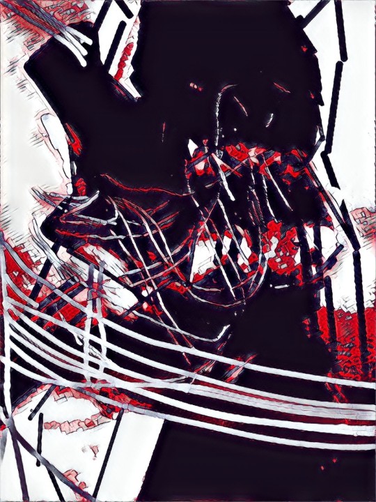
Large body of development work showing more of the styles that PRIZMA offer
0 notes
Text
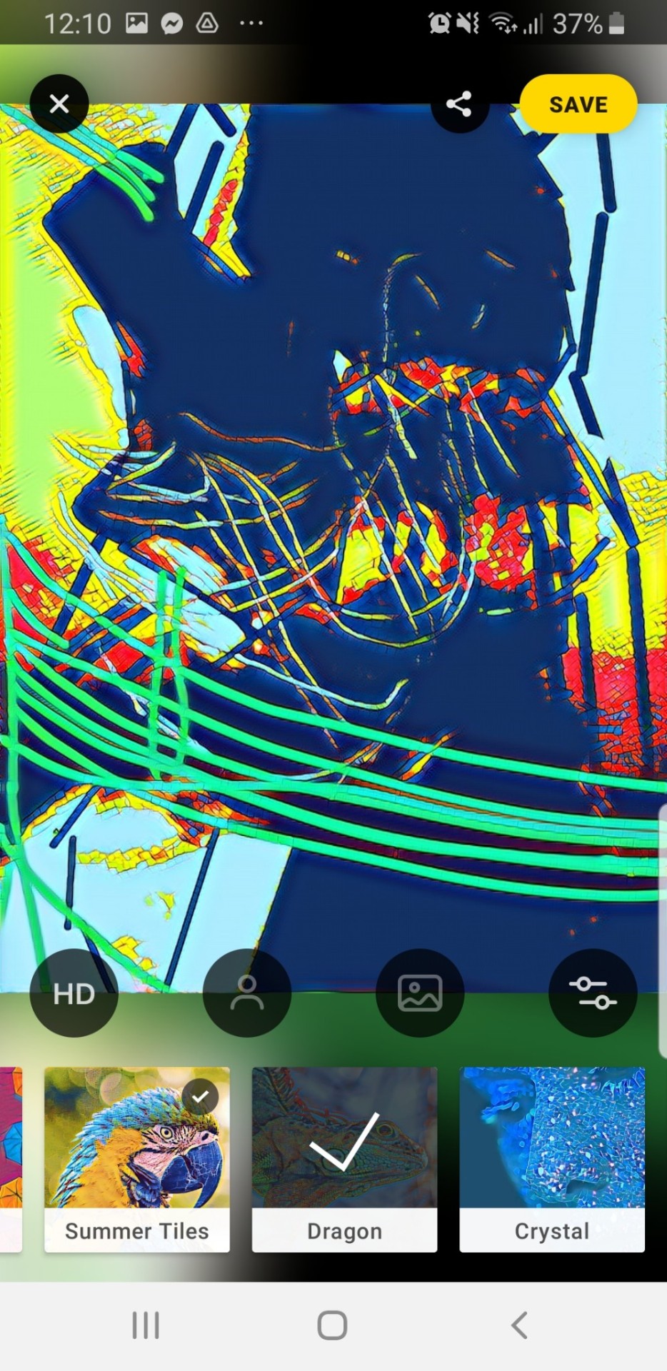
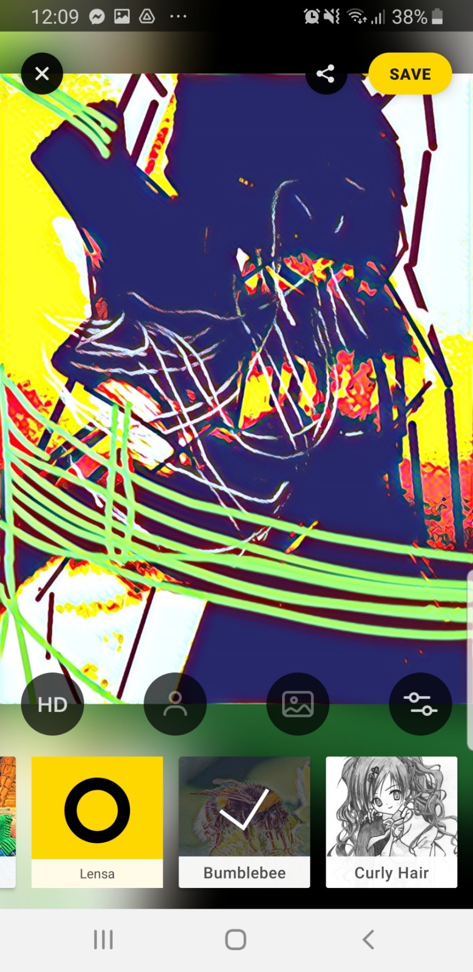
Again more examples but this is showing how you can take the same design but using different styles can change the overall effect and can make them look different to the original
0 notes
Text
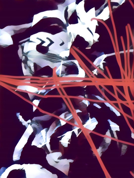
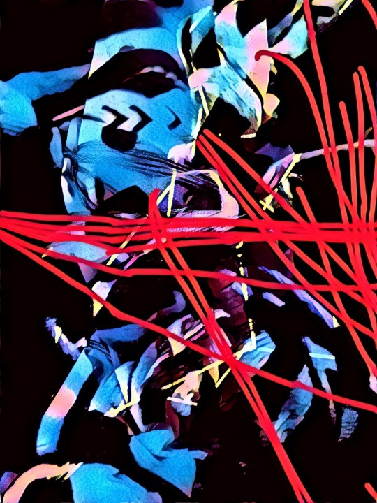
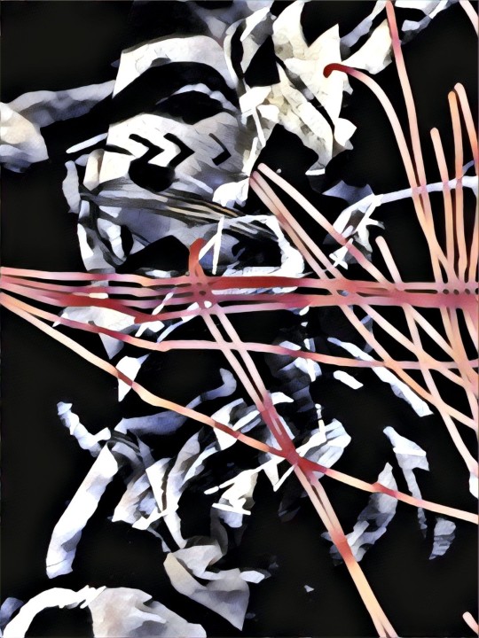

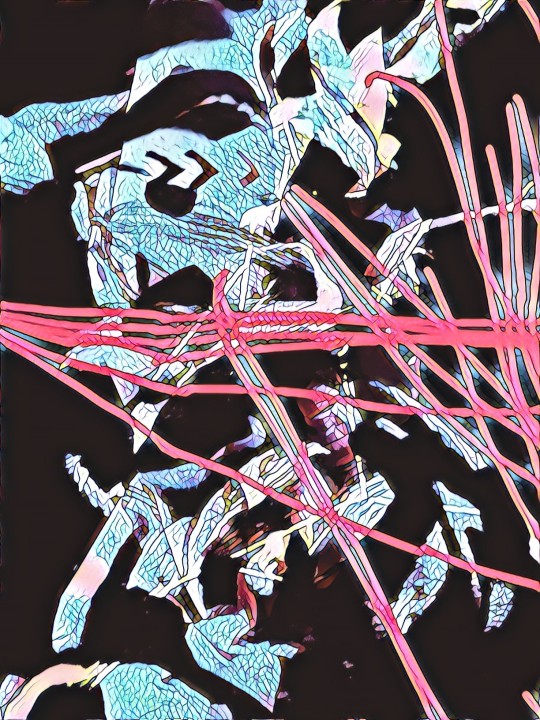
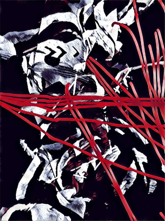
Having alot of example in PRIZMA is helping me to see what the different styles look like and so I can have an understanding of which ones work best with each other. Even tho each peice will look different I dont want them to clash. I want them to work together but still have their own individuality
0 notes