Don't wanna be here? Send us removal request.
Text
UX Myths Research:
Over the summer I decided to carry on my research about UX Design and found various articles which could potentially help with my dissertation, if not my career post graduation.
Since I hadn't yet re-started my blog all of my note takings was on Microsoft Word. With additional notes to the side of the research.
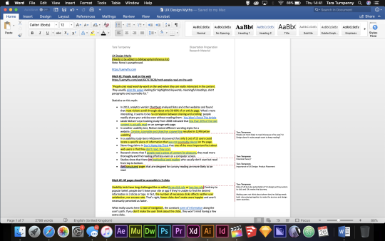
***** Attached in the blog PDF will be this word document.
Here are the main sections of the notes:
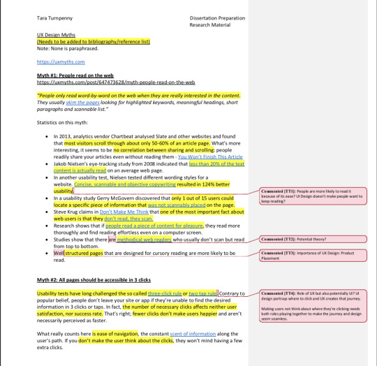
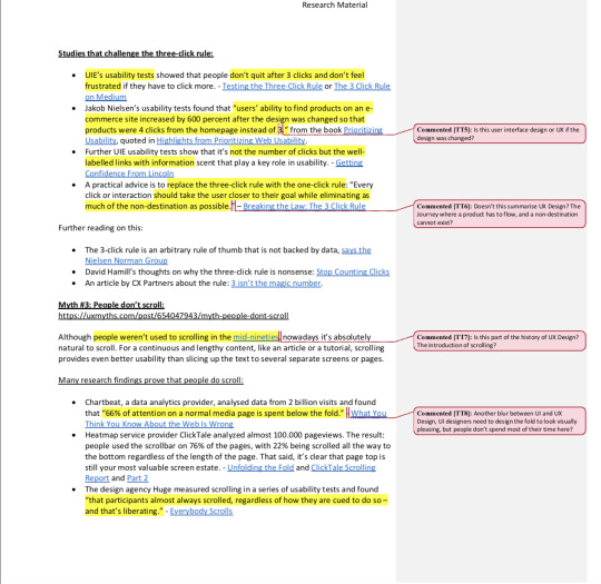
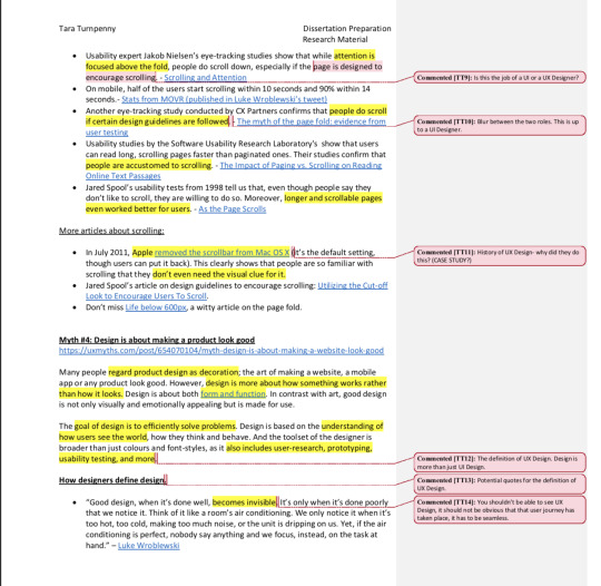

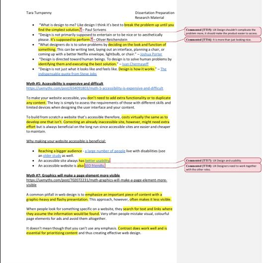
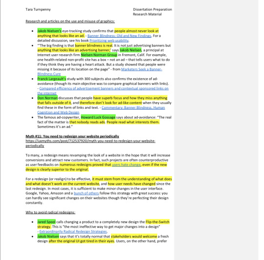
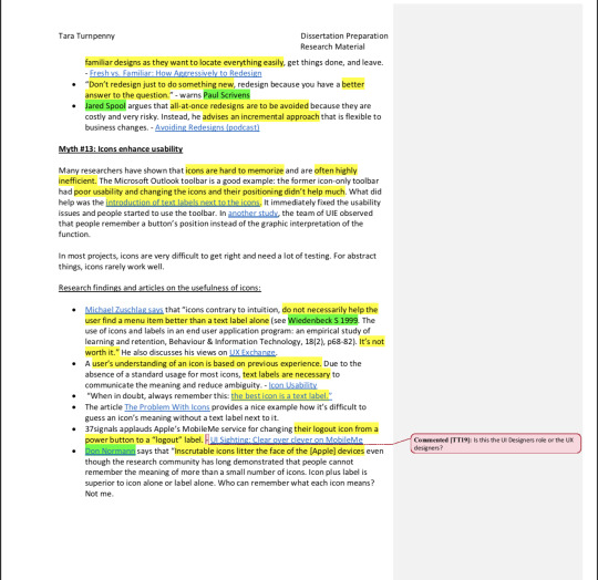
Here is the file copied and pasted from the word document without the comments in place:
UX Design Myths
(Needs to be added to bibliography/reference list)
Note: None is paraphrased.
https://uxmyths.com
Myth #1: People read on the web
Dissertation Preparation Research Material
https://uxmyths.com/post/647473628/myth-people-read-on-the-web
“People only read word-by-word on the web when they are really interested in the content.
They usually skim the pages looking for highlighted keywords, meaningful headings, short paragraphs and scannable list.”
Statistics on this myth:
In 2013, analytics vendor Chartbeat analysed Slate and other websites and found that most visitors scroll through about only 50-60% of an article page. What’s more interesting, it seems to be : people readily share your articles even without reading them - You Won’t Finish This Article.
Jakob Nielsen’s eye-tracking study from 2008 indicated that less than 20% of the text content is actually read on an average web page.
In another usability test, Nielsen tested different wording styles for a website. Concise, scannable and objective copywriting resulted in 124% better usability.
In a usability study Gerry McGovern discovered that only 1 out of 15 users could locate a specific piece of information that was not scannably placed on the page.
Steve Krug claims in Don't Make Me Think that one of the most important fact about web users is that they don't read, they scan.
Research shows that if people read a piece of content for pleasure, they read more thoroughly and find reading effortless even on a computer screen.
Studies show that there are methodical web readers who usually don’t scan but read from top to bottom.
Well structured pages that are designer for cursory reading are more likely to be read.
#2: All Pages should be accessible in 3 Clicks:
Usability tests have long challenged the so called three-click rule or two tap rule. Contrary to popular belief, people don’t leave your site or app if they’re unable to find the desired information in 3 clicks or taps. In fact, the number of necessary clicks affects neither user satisfaction, nor success rate.That’s right; fewer clicks don’t make users happierand aren’t necessarily perceived as faster.
What really counts here is ease of navigation, the constant scent of information along the user’s path. If you don’t make the user think about the clicks, they won’t mind having a few extra clicks.
Studies that challenge the three-click rule:
UIE’s usability testsshowed that people don’t quit after 3 clicks and don’t feel frustratedif they have to click more. - Testing the Three-Click Rule or The 3 Click Rule on Medium
Jakob Nielsen’s usability tests found that “users’ ability to find products on an e-commerce site increased by 600 percent after the design was changed so that products were 4 clicks from the homepage instead of 3.” from the book Prioritizing Usability, quoted in Highlights from Prioritizing Web Usability.
Further UIE usability tests show that it’s not the number of clicks but the well-labelled links with informationscent that play a key role in usability. - Getting Confidence From Lincoln
A practical advice is to replace the three-click rule with the one-click rule: “Every click or interaction should take the user closer to their goal while eliminating as much of the non-destination as possible.” – Breaking the Law: The 3 Click Rule
Further reading on this:
The 3-click rule is an arbitrary rule of thumb that is not backed by data, says the Nielsen Norman Group
David Hamill’s thoughts on why the three-click rule is nonsense: Stop Counting Clicks
An article by CX Partners about the rule: 3 isn’t the magic number.
Many research findings prove that people do scroll:
Chartbeat, a data analytics provider, analysed data from 2 billion visits and found that “66% of attention on a normal media page is spent below the fold.” What You Think You Know About the Web Is Wrong
Heatmap service provider ClickTale analyzed almost 100.000 pageviews. The result: people used the scrollbar on 76% of the pages, with 22% being scrolled all the way to the bottom regardless of the length of the page. That said, it’s clear that page top is still your most valuable screen estate. - Unfolding the Fold and ClickTale Scrolling Report and Part 2
The design agency Huge measured scrolling in a series of usability tests and found “that participants almost always scrolled, regardless of how they are cued to do so – and that’s liberating.”- Everybody Scrolls
Usability expert Jakob Nielsen’s eye-tracking studies show that while attention is focused above the fold, people do scroll down, especially if the page is designed to encourage scrolling. - Scrolling and Attention
On mobile, half of the users start scrolling within 10 seconds and 90% within 14 seconds.- Stats from MOVR (published in Luke Wroblewski’s tweet)
Another eye-tracking study conducted by CX Partners confirms that people do scroll if certain design guidelines are followed.[TT2] - The myth of the page fold: evidence from user testing
Usability studies by the Software Usability Research Laboratory's show that users can read long, scrolling pages faster than paginated ones. Their studies confirm that people are accustomed to scrolling. - The Impact of Paging vs. Scrolling on Reading Online Text Passages
Jared Spool’s usability tests from 1998 tell us that, even though people say they don’t like to scroll, they are willing to do so. Moreover, longer and scrollable pages even worked better for users. - As the Page Scrolls
More articles about scrolling:
In July 2011, Apple removed the scrollbar from Mac OS X it’s the default setting, though users can put it back). This clearly shows that people are so familiar with scrolling that they don’t even need the visual clue for it.
Jared Spool’s article on design guidelines to encourage scrolling: Utilizing the Cut-off Look to Encourage Users To Scroll.
Don’t miss Life below 600px, a witty article on the page fold.
Myth #4: Design is about making a product look good
https://uxmyths.com/post/654070104/myth-design-is-about-making-a-website-look-good
Many people regard product design as decoration; the art of making a website, a mobile app or any product look good. However, design is more about how something works rather than how it looks.Design is about both form and function. In contrast with art, good design is not only visually and emotionally appealing but is made for use.
The goal of design is to efficiently solve problems. Design is based on the understanding of how users see the world, how they think and behave. And the toolset of the designer is broader than just colours and font-styles, as it also includes user-research, prototyping, usability testing, and more.
How designers define design.
“Good design, when it’s done well, becomes invisible.It’s only when it’s done poorly that we notice it. Think of it like a room’s air conditioning. We only notice it when it’s too hot, too cold, making too much noise, or the unit is dripping on us. Yet, if the air conditioning is perfect, nobody say anything and we focus, instead, on the task at hand.” – Luke Wroblewski
“What is design to me? Like design I think it’s best to break the problem up until you find the simplest solution.” – Paul Scrivens
“Design is not primarily supposed to entertain or to be nice or to aesthetically please. It’s supposed to perform.” – Oliver Reichenstein
“What designers do is to solve problems by deciding on the look and function of something.This can be writing text, laying out an interface, planning a chair, or coming up with a better Netflix envelope, lightbulb, or chair.” – Joshua Porter
“Design is directed toward human beings. To design is to solve human problems by identifying them and executing the best solution.” – Ivan Chermayeff
“Design is not just what it looks like and feels like. Design is how it works.” – The indispensable quote from Steve Jobs
Myth #5: Accessibility is expensive and difficult
https://uxmyths.com/post/654091803/myth-5-accessibility-is-expensive-and-difficult
To make your website accessible, you don’t need to add extra functionality or to duplicate any content.The key is simply to assess the requirements of those with different skills and limited devices when designing the user interface and your content.
To build from scratch a website that’s accessible therefore,costs virtually the same as to develop one that isn’t.Correcting an already inaccessible site, however, might need extra effortbut is always beneficial on the long run since accessible sites are easier and cheaper to maintain.
Why making your website accessible is beneficial:
Reaching a bigger audience- a large number of people live with disabilities (see an older study as well.
An accessible site always has better usability.
An accessible website is also SEO friendly.
Myth #7: Graphics will make a page element more visible
https://uxmyths.com/post/702072231/myth-graphics-will-make-a-page-element-more-visible
A common pitfall in web design is to emphasize an important piece of content with a graphic-heavy and flashy presentation.This approach, however, often makes it less visible.
When people look for something specific on a website, they search for text and links where they assume the information would be found.Very often people mistake visual, colourful page elements for ads and avoid them altogether.
It doesn’t mean though that you can’t use any emphasis. Contrast does work well and is essential for prioritizing contentand thus creating effective web design.
Research and articles on the use and misuse of graphics:
Jakob Nielsen’s eye-tracking study confirms that people almost never look at anything that looks like an ad.- Banner Blindness: Old and New Findings. For a detailed discussion, see his book Prioritising web usability.
“The big finding is that banner blindness is real. It is not just advertising banners but anything that looks like an advertising banner,’ says Jakob Nielsen, a principal at Internet user research firm Nielsen Norman Groupin Fremont, Calif. For example, one health-related non-profit site has a box – not an ad – that tells users what to do if they think they are having a heart attack. But a study showed that people were missing it because of its location on the page” - from Marketers Seek a Banner-Blindness Cure
Franck Largeault’s study with 300 subjects also confirms the existence of ad-avoidance (though its main objective was to compare graphical banners with links). - Compared efficiency of advertisement banners and contextual sponsored links on the internet
Don Norman discusses that people have superb focus and how they miss anything that falls outside of it, and therefore don’t look for ad-like content when they usually find these in the form of links and text. - Commentary: Banner Blindness, Human Cognition and Web Design
The famous ad-copywriter, Howard Luck Gossagesays about ad-avoidance: “The real fact of the matter is that nobody reads ads. People read what interests them. Sometimes it’s an ad.”
Myth #11: You need to redesign your website periodically
https://uxmyths.com/post/712537920/myth-you-need-to-redesign-your-website-periodically
To many, a redesign means revamping the look of a website in the hope that it will increase conversions and attract new customers. In fact, such projects are often counterproductive as user feedbacks on numerous redesigns proved that users hate change, even if the new design is clearly superior to the original.
For a redesign (or realign) to be effective, it must stem from the understanding of what does and what doesn’t work on the current website, and how user needs have changedsince the last redesign. In most cases, it is sufficient to make minor changes in the user interface. Google, Yahoo, Amazon and a bunch of others follow this strategy with great success: you can hardly see significant changes on their websites though they’re perfecting their design constantly.
Why to avoid radical redesigns:
Jared Spool calls changing a product to a completely new design the Flip-the-Switch strategy.This is “the most ineffective way to get major changes into a design” - Extraordinarily Radical Redesign Strategies.
Jakob Nielsen says that it’s totally normal that stakeholders would welcome a fresh design after the original UI got tired in their eyes. Users, on the other hand, prefer familiar designs as they want to locate everything easily, get things done, and leave. - Fresh vs. Familiar: How Aggressively to Redesign
·“Don’t redesign just to do something new, redesign because you have a better answer to the question.” - warns Paul Scrivens
·Jared Spool argues that all-at-once redesigns are to be avoided because they are costly and very risky. Instead, he advises an incremental approachthat is flexible to business changes. - Avoiding Redesigns (podcast)
Myth #13: Icons enhance usability
Many researchers have shown that icons are hard to memorizeand are often highly inefficient.The Microsoft Outlook toolbar is a good example: the former icon-only toolbar had poor usability and changing the icons and their positioning didn’t help much. What did help was the introduction of text labels next to the icons.It immediately fixed the usability issues and people started to use the toolbar. In another study, the team of UIE observed that people remember a button’s position instead of the graphic interpretation of the function.
In most projects, icons are very difficult to get right and need a lot of testing. For abstract things, icons rarely work well.
Research findings and articles on the usefulness of icons:
Michael Zuschlag says that “icons contrary to intuition, do not necessarily help the user find a menu item better than a text label alone(see Wiedenbeck S 1999.) The use of icons and labels in an end user application program: an empirical study of learning and retention, Behaviour & Information Technology, 18(2), p68-82).It’s not worth it.”He also discusses his views on UX Exchange.
A user’s understanding of an icon is based on previous experience.Due to the absence of a standard usage for most icons, text labels are necessary to communicate the meaning and reduce ambiguity. - Icon Usability
“When in doubt, always remember this: the best icon is a text label.”
The article The Problem With Icons provides a nice example how it’s difficult to guess an icon’s meaning without a text label next to it.
37signals applauds Apple’s MobileMe service for changing their logout icon from a power button to a “logout” label. - UI Sighting: Clear over clever on MobileMe.
Don Norman says that “Inscrutable icons litter the face of the [Apple] devices even though the research community has long demonstrated that people cannot remember the meaning of more than a small number of icons. Icon plus label is superior to icon alone or label alone. Who can remember what each icon means? Not me.
Where icons add value:
Universally understood icons work well (ie. print, close, play/pause, reply, tweet, share on Facebook).
Icons can serve as bullet points, structuring content (ie. file type icons for PDFs, DOCs, etc.).
Read iA’s primer on icons for more guidance.
Myth #26: Usability testing = focus groups
https://uxmyths.com/post/1319999199/myth-26-usability-testing-focus-groups
When it comes to collecting feedback from users, usability tests and focus groups are often confusedalthough their goals are completely different.
Focus groups assess what users say: a number of people gather in order to discuss their feelings, attitudes and thoughts on a given topic to reveal their motivations and preferences.
Usability testing, on the other hand, is about observing how people actually use a product, by assigning key tasks to users and analysing their performance and experience.
How the two research methods are different:
They have different goals. As Chris Giegersummarizes in his article: focus groups are about understanding people’s feelings and opinionsabout something whereas usability tests are about learning how people use things”. A focus groups tell you what people want; user studies tell you whether something works.[TT1]
The research processes are entirely different. Focus group research implies discussions with members of your target audience, while usability testing is about observing users performing given tasks. A focus group research, in addition, is typically performed with a group of participants while a usability test is typically performed one-on-one.
What people say is not what they do. According to Jakob Nielsen, the most important difference between the two methods is that focus groups can only reveal what “customers say they do and not the way customers actually operatethe product”. Cardinal Path has written a great comparison between the two methods. (For more sources, see Myth #21: People can tell you what they want.)
They should be performed in different phases of the development. Focus groups should be performed early in the project to discover your target audience, while usability testing should be used to measure the performance of your site after it has been finished or is in a test phase, as a Webcredible article points out.
0 notes
Text
Stick or Twist?
Old Question:
‘How far has user experience design developed over time and what does this present for the future of UX Design?’
Potential New Questions?:
‘How far does the role of UX design create uncertainty within the design industry?’
‘How has user experience design developed as a role and diver from other roles within the design industry?’
0 notes
Text
Rounding up the Dissertation Proposal Brief:
I felt strongly that I wanted to round this blog off with a short summary of this brief.
I feel these brief was extremely different from the rest and proved to be quite challenging at times. Trying to find a topic I was happy with and felt settled writing about and creating an artefact for was more difficult than I first thought.
I began with the concept of brand loyalty and their production ethics, since I’m really into fashion I felt this was a good route to go down at the start. I then began looking into social media marketing with Fenty Beauty as a case study. However, although I had a large amount of research and theories surrounding this topic, it would be difficult later on down the line to create an artefact for it.
After creating a proposal and planning out my dissertation within a document for my first chosen topic: brand loyalty and their production ethics. I spoke to Mark and he told me maybe I should look more into a UX Design route for my dissertation. I feel changing to this was the best decision I could have made.
Not only was it an interesting topic to find out the history and future of UX Design and how it all came about, I feel strongly that it will help me a lot further down the line having this extra knowledge on the design role. I already feel that through research, my UX Design skills have got better because of this better knowledge.
My question was “How far has User Experience Design developed over time and what does this present for the future of UX?” and I feel this has given me great scope in terms of how I approach it. Therefore I don’t feel like I will get stuck on what to talk about or what artefact to create.
It was interesting to see how businesses still don’t see the need in user experience design despite the statistics surrounding it. More so, the blur between user interface design and user experience design is very much prominent and its actually quite a big argument as to whether they are the same job role or whether it’s completely different and be done by two different people. I really enjoyed the visiting designers, It allowed me to learn more about UX Design (Christine) as well as SEO. It was interesting to see that all of these job roles within a design project do somewhat blur together and to a degree also contradict each other. As one role says one thing, whilst the other says a different thing. I feel it’s really important to create an effective and efficient design project to have all of these working with each other rather than going against each other. I feel this would help both agencies and businesses through to the designers and clients.
I’m quite excited to learn more about this topic and create the artefact to go with it.
0 notes
Text
Is there a link between psychology and UX Design?
https://uxdesign.cc/ux-psychology-go-hand-in-hand-how-gestalt-theory-appears-in-ux-design-18b727343da8
“In the age of AI and “Human Centered Machine Learning”, it’s essential that we understand the needs and behaviour of our users. This is doubly true as a UX designer. In order to create work that better serves the needs of our users, it’s important to understand some basic psychological principles. Which is why I want to share with you Gestalt theory. With this toolkit under our belt, we can consciously design user experiences that truly fit the users.”
NOTE:
When looking for books in relation to user experience design, I struggled...they were all digital articles and I felt this is as a result of it being such a newly developed role which is still growing and people are learning about.
Therefore I did begin looking at psychology books, following seeing this article this gave me a bigger boost to begin actually looking further out in the field and actually try to have a look at some psychology theories.
vimeo
This above video goes through where to put the submit button in regards to Gestalt theory as mentioned previously in a blog post.
This is definitely a theory in which I need to look more into for next years dissertation.
Gestalt actually means design when you translate it from German.
“Humans like order and they are really, really good at pattern recognition.”
This isn't new, it’s been around since around 1910. How to figure out how we take our environments and read it into a simplistic model.
“The hole is more than some of its parts” we group elements and figure out simplistic ways to review our experiences.
0 notes
Text
“Just because people can do something does not guarantee that they will — they must be motivated and persuaded.” - Norbi Gall
https://uxdesign.cc/the-theory-of-influence-7c8ceb140835
I feel this is a quote in which I’ve been working around this past semester. I always go off the fact that just because something looks good, it doesn't mean that the design work. As in, if the product or service doesn’t work then the whole goal for it being implemented in the first place is not successful, despite it looking good.
However on the flip side, if it doesn't look good but do the job...that doesn't mean people will do that user journey that works. The design also has to work with the UX Design to persuade the user to complete that journey.
“Persuasion in design has become an art.”
Robert Beno Cialdini’s 6 Key Principles of Influence.
From the book “The Psychology of Persuasion”:
Ciadini’s theory of influence is based on six key principles: reciprocity, commitment and consistency, social proof, authority, liking and scarcity.
NOTE: This theory is one in which I can look more into.
0 notes
Text
Useful people and Theories to research next semester:
To get a head start of next years work, I decided to get some useful links, people and theories in which I could begin my research on rather than having to go out later on in the year trying to find areas of study to research.
https://www.secretstache.com/blog/laws-of-ux-design-theory/
Don Norman: https://www.nngroup.com/people/don-norman/
Hick-Hyman Law (Hick’s Law)
Fitt’s Law
Occam’s Razor: the simplest solution is always the best.
Miller’s Law: the number of things the average person can remember is seven.
https://uxplanet.org/gestalt-theory-for-ux-design-principle-of-proximity-e56b136d52d1
Gestalt Theory: Gestalt theory is based on the following idea: when people perceive the complex objects consisting of many elements, they apply conscious or subconscious methods of arranging the parts into a whole organised system instead of just the set of simple objects.

https://blog.marvelapp.com/psychology-principles-every-uiux-designer-needs-know/
Von Restorff effect: predicts that when multiple similar objects are present, the one that differs from the rest is most likely to be remembered.
Serial position effect: the propensity of a user to best remember the first and last items in a series. This is why most applications nowadays ditch the hamburger menu and go for a bottom or top bar navigation.

Cognitive load: “Cognitive load is the amount of thought you need to exercise in order to complete a specific task.”
0 notes
Text
Designing User Experience: A Guide to HCI, UX and Interaction Design
Following the design proposal being completed, Mark gave me this book to have a look at as he felt it would help me a lot with my dissertation.
Therefore, I took it upon me to begin reading it and making notes on and key parts in which would be useful to my dissertation.
I look forward to completing this book when I’m less time restricted and learning more about UX Design. I felt when doing this topic, finding actually hard copy books surrounding it was a somewhat difficult task. They were all digital based, and the older ones you had to start looking at design psychology rather than UX Design as that term did not exist, however the role did.


0 notes
Text
POST DISSERTATION PROPOSAL WORK:
After completing my dissertation proposal, I continued looking into my research in line for next years work.
0 notes
Text
Feedback on the Dissertation Proposal:
Coming into the final week before deadline, I wanted to get some final feedback and checks on my proposal to make sure it was ready to submit, and all of my referencing/bibliography is correct.
Thankfully, my proposal was ready, minus a word change which could be easily be done within the document.
Here you can see below the highlighted sheet, I was also able to get some new ideas from Mark through this final check.


0 notes
Text
Collating UX Tools from Instagram:
Following the creation of my Instagram page I found many tools from UX Pages in which could be useful in both my dissertation, and also my work in general. So I decided to create another folder in my Instagram saved section to place these and refer back to them in the future.
Here are the current albums within my saved posts in Instagram:

Here you can see various tools and help sheets which could be of potential help for this brief and also for my work:

An example in which I found quite useful here was the post below, I always struggled finding books in relation to UX Design as It is quite a new role, and most books in relation to it are actually digital. Therefore, I think these are books in which I should look at for my dissertation:

0 notes
Text
Video: 10 UX Challenges for the Next 25 Years (Jakob Nielsen Keynote)
youtube
Notes from this keynote:
You can’t really predict the future of UX: things can change extremely quickly e.g. from the space age to the age of the computer...it flipped very quickly.
He picked 25 years because that's when things could actually change:
For example it took 20 years from when the mouse was invented, and it being in common use.

The term ‘User experience’ was invented 24 years ago. (Don Norman) But it had existed previously before this word was came up for it.
Long term challenges: 25 years
1. Product knowledge productivity:
“We are not improving in any rapid pace on how much we can do and produce. Which to a great extent is the fault of computers.” more so, people are wasting time on computers being caught up with lots of problems so you’re not producing, but even more so: “we don’t really know how to truly support creativity or decision making or advanced “anything” of knowledge work.”
Doug Engelbart: (mouse inventor) the real project was augmenting the human intellect: to make people and computers knowledge better however he made little process, still today, not much process.
Only about 5% of the population are able to do advanced things with computers; things which require real decision making, compiling multiple sources of information, or using any force of advanced features. Most people can only use linear steps, appressed by computers by companies putting these products out but not having the liberating ability to make it into a powerful tool.
Computers are too difficult and not designed for the way most people think and work.
2. Better design for old users:
Many of the rich countries are now rapidly ageing societies because people now having longer living expectancies.
Computers are not well suited for the ageing population and not aimed for the older demographics.
3. Usable security:
Scandals are on the increase with peoples privacy being invaded.
Solution is not to make longer passwords and more complicated, people just have to write it down because humans cannot remember these. Offices etc. have passwords in drawers.
4. Proper UX Methodology:
Usability problems still exist and occur as a result of bad design.
We know how to not have these bad things but it’s just not really being done, even the companies that do some kind of UX work...it’s kind of done wrong.
A want to get the full scope of that design thinking life cycle of all that methodology: early focus on users, good usability testing, all of the entire range of things - Persuasive.
Short Term Challenges: 5 Years
1. Artificial Intelligence:
Like any new technology: suffer in the beginning from being driven by technology focus design rather than human focused design. There is a need for UX within these products for them to really work and be successful.
2. Non screen UI and multi device UX:
The user interface is no longer just a computer screen: we have multi device with the full environment.
Omni channel UX: the world we are going through. It’s harder to design for a full environment than just design one user interface for one device.
3. Big Screens:
People are un-empowered when they have a big screen: no software takes advantage of having a bigger screen. But spreadsheets do.
Very little work on how to take advantage of the big screens, but a lot for small devices such as the phone. We also need to design for the big screens, just not making the small screen stuff and making it bigger. You should be able to do more.
There’s a need to improve, enhance, knowledge worker productivity. This is one of the ways in which we can do it. Better dashboards and information displays.
How to do it without overwhelming people with more information.
4. Make technology work:
Stop accepting that it always crashes and freezes and doing the wrong thing.
e.g. Microsoft word is now a 34 year old product; and still when you print for example, something goes in the wrong spot or gets cut off and it takes hours to work it out.
Hold back on new features and fix what you already have.
5. Evangelising UX Methodology:
A push for more understanding and acceptance. A better use of User experience could be achieved.
Other things that don’t have challenges:
Voice UI:
Still a design issue, but it’s just dialogue design.
Autonomous cars:
Big technology changes just about to happen; could have potentially been a big challenge but not anymore. The user interface problem is pretty much solved.
Driver distraction:
As a result of autonomous cards this won’t be there. But right now, is a big issue.
Summary:

Notice: UX Methodology on both.
Jakob believes this is actually the solution to all of the other challenges, if we really adapt to UX into deep design not surface design this could solve those other challenges.
How far have we come in UX?

Jakob believes we’re only 10% there to where we should be in UX.

1950: Bell Labs who designer the touch-tone phone, which we still use today. (Shows importance of getting UX right.)
The middle section has a different angle because the was a boom in user experience which was caused by:
The PC revolution: (80′s) where computers became personal rather than only business. Meaning you had to design for normal people.
Difference between people buying a computer vs. people using it.
Web revolution: (Mid 90′s) difference between PC and Web is that in PC software you pay FIRST and second you have the user experience. This is reversed with the web, first you have the user experience then you give the money if the user experience worked.
This made UX come more upfront and become higher visibility for businesses, and more investment in our field.
Positive PR around UX at that time:
It was kind of a new field (not that new as already existed), but it was new in the public eye and businesses cared more about it.
The growth in UX takes place in 3 arenas: but only one of them you can personally experience.
1. In your company.
The hiring of my UX designers.
2. More companies are doing UX:
So many industries want to use UX in their businesses.
3. Number of countries where there is UX work being done.
Used to be the most advanced countries doing it.
0 notes
Text
UI Technology
https://www.quora.com/What-is-the-future-of-UX-UI-designer
As you explore different industries throughout your career, you may come to specialize in the application of UX to a specific technology or interface, such as:
Voice UI
youtube
Chat UI
Artificial Intelligence Personalities
Information Visualization
Virtual Reality
Augmented Reality
Automotive UX
Internet of Things
Haptic UI
0 notes
Text
Article: What is the Future of UX Design?
https://uxdesign.cc/what-is-the-future-of-ux-designer-5832475ab454

Then UI generators such as https://thegrid.io/ are the disruptors who will likely be the norm (read this about Websites that design themselves on Wired). Hand crafted UI and UX design will likely transform to curation and product management aspect of UX.
IMO, the future of UX is likely to change — Self taught machines perhaps can soon and will iterate 1000 times faster and produce far greater variety than human history has ever. In such a scenario, whenever that happens in 10, 20 years from now, UX design education and training need to transform.
If UX design in future were to include more formal studies (no pun there) viz.
Study of cognitive neurosciences and human behaviour
Study of ethics
Product management — to envision for technology aided interfaces stemming from AI advances, generated and unsupervised ML based system interactions, predictive UX, personalized robotic services, so on.
0 notes
Text
Article: The Future of UX Design Is Automation
“We’re embarking on an increasingly automated future. By 2029, computers are likely to be more intelligent than humans, according to Ray Kurzweil, Director of Engineering at Google.”
Design Automation: From Idea to High-Fidelity Mockup in Minutes
“Historically, UX designers have mapped out user journeys and information architectures, informing product design with valuable user-research findings.”
Usually to document these findings they use: sketches, diagrams, sitemaps and wire framing.
Example of a Low Fidelity:
Quick and simple.

Example of Medium Fidelity:
Can take weeks to mock up to the highest quality.
Development usually can’t continue until this design process is completed.

Question here:
Could automation create these product user interfaces in shorter periods of times, do research on many more people, and expedite UX research and design process?
Endless Opportunities in Automation:
Air BnB:
“In their article “Sketching Interfaces,” Benjamin Wilkins, Design Technology Lead at Airbnb, and Jon Gold, Design Technologist at Airbnb, demonstrate how they produce low-fidelity sketches and high-fidelity visual mockups in real time, using specialised camera equipment and software.”

“We’re investing in code as a design tool. Moving closer to working with assets that don’t only include layout and design, but also logic and data. This helps bridge the gap between engineers and designers, thus reducing the need for design specs—or redlines—and the steps between vision and reality.”—Alex Schleifer, Head of Design at Airbnb
Embracing Design Automation to Create Better Products
Visual Design and Branding Teams
“An automated design future relies heavily on developing a strong visual language that supports an extensive library of design patterns and style guidelines.”
This ensures a consistent, seamless, on-brand experience across touch points, devices, and platforms.
Product Owners and Product Managers
Need for “some research and development time in investigating new methods that speed up the design process.”
UX Designers
Need for a “start using new technologies in your day-to-day workflow. Instead of seeing automation as a threat to your creative talent, view it as an opportunity to enhance your expertise with innovative technology that can enable you to build an even better product.”
“By offloading time-consuming, repetitive tasks, you can allocate additional time and resources to customer research, concept testing, or validation with your actual audience.”
0 notes
Text
The Changing Face of UX Design: Keynote
What are the roles and responsibilities of UX Design?

Definitions: What is the difference between role and responsibility?
Task: Coming up with a role and responsibility
How do people interpret these definitions differently?

Don Norman: History of UX Design-

Is UX Design solely restricted to the design of websites and mobile apps?

youtube
Activity: How do the roles with UX and other design processes link together?


UX Design roles blending together:

Equality and Diversity in the Creative Industry:
The UK Creative Economy 2017:

The Design Council:

No agencies want to take the big jump to move up north.
Big corporations such as the BBC/ITV Studio’s are based mostly in London: agencies want to be around those

Design has a diversity challenge:

vimeo
Statistics: Creative Industries Workforce Demographics
Unconscious bias is important to note.

What is unconscious bias? (Recap)
youtube
The Future of a UX Designer:
1. A change in technology:

2. AR and VR

3. Artificial Intelligence:

Building Trust:

Becoming more adaptable:

Empathetic:

Becoming collaborative:

Reflection/Recap of the Session:


0 notes
Text
Article: What is UX design really?
https://thenextweb.com/dd/2016/08/11/what-the-hell-is-ux-design/
“One of the most common misconceptions people have is that User Experience Design is all about usability. It’s easy to see why – usability means that a product is both usable and useful.
When you walk into an empty room, you can instantly imagine what purpose it will serve. Glance around and you get an idea for how to turn that space into anything that you want it to be. You can use it as a living room, an office, or a bedroom. It all depends on what furniture you choose and where you put it. The empty room is usable, but it’s not useful until you fill it.”

That interaction becomes an experience they go through when they use the product. It’s the UX designer’s job to make that experience a great one.
User Experience Design is about feelings
“Good user experience doesn’t have to be memorable, but it does have to make you feel something. Ideally, it should make you feel like getting a product to solve your problem was easy. Effortless, even.
Design isn’t just about problem solving; it’s about creating a more humane future. – Dan Saffer, The End of Design as We Know it.
People always talk about products that delight the user, but often misunderstand what that means. It’s not about the vibrant colors or how beautiful the design is. Great user experience is often completely disconnected from how the product looks. Sometimes the best user interface is no user interface, because UX is about how something works, and not how it looks.”
The wheel of emotions:

UX Design is about Behaviour
The UX Designer has to anticipate user behaviour when they interact with a product, and how that interaction fits into their goals.
Empathy will get you to see the problems from the users’ perspective, but not the solutions. It’s a stepping stone on the way to a more important place: understanding – Dan Saffer, In Design, Empathy is not Enough.
This means that user experience design is an ongoing process, not a step in prototyping. As the product evolves and changes – so does the user experience. Small updates on the backend, and a simple UI redesign can have a profound effect on how the product feels.

0 notes