Hi, this page contains my journey as a fresh year student in Visual Communication, Arts University Bournemouth.Expect less, have fun!
Don't wanna be here? Send us removal request.
Text
Intersection - Final Piece
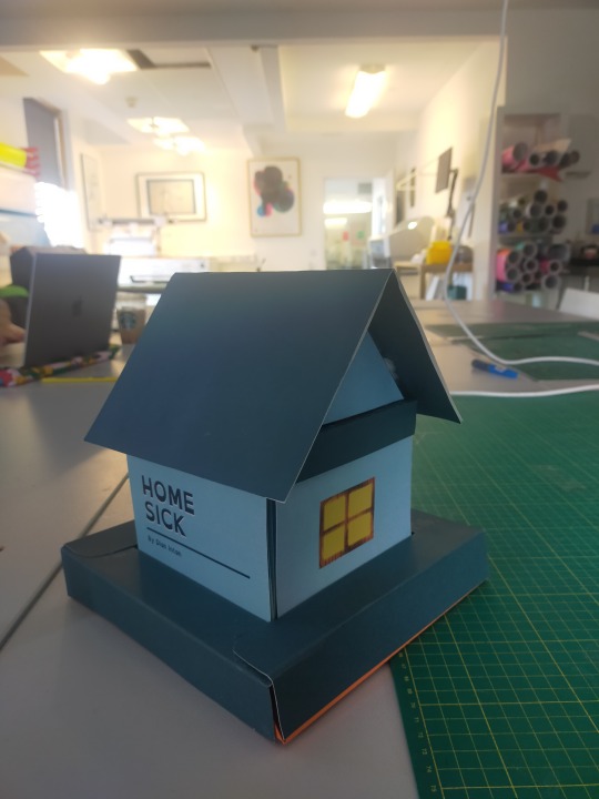
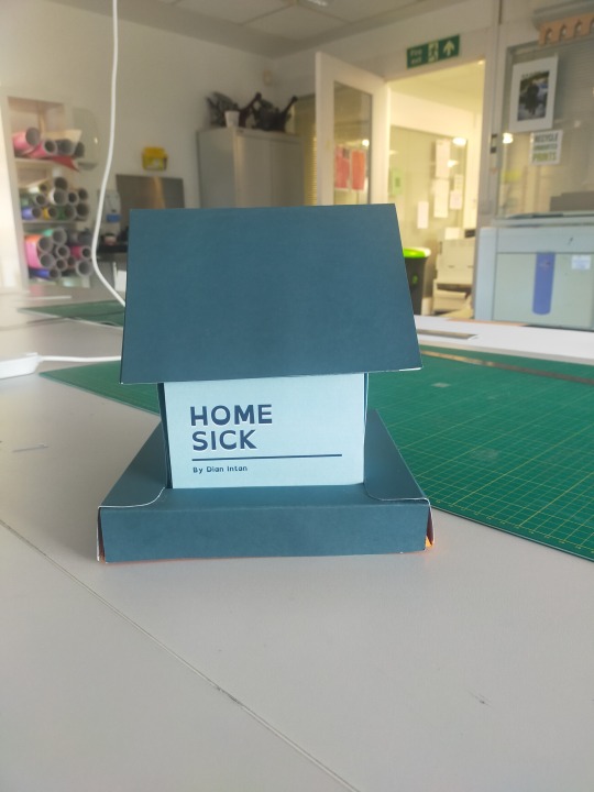
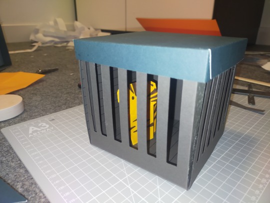
With all due respect, the Intersection project’s final piece is out!
Do I happy with the final outcome? Yes. Do I have things to improve? Yes, of course!
The final piece was quite satisfying for me as I didn’t expect it to look that good. Big thanks to Jordy because without Jordy I think it’s impossible to print all of these out all by myself.
What I like about the final piece:
The colour looks alright.
It made of good quality papers so as you could see, it’s quite tough.
Everything are fits; the prison box, the wall that contains the story, the roof, and also the bottom frame.
It looks good.
I managed to accomplish almost everything that I wanted to do in the final piece. Yet I wish I could add a text on top or in front area of the prison “Would you saved me and ruin this book?", I forgot to do this + I think I’m too caught up in the printing of the story.
That I finished it. I was quite doubtful as I also prepared a second plan just in case it didn’t work. My backup plan was to make it more like a concertina that Hannah taught us during bookbinding session. But I planned to give it a roof-like cover so it’ll look more like an envelope (I told Briony about this on the one-on-one tutorials, unfortunately I can’t find the rough sketch of the plan)
What I wish I could improve:
The drawings. I like it but I think I could make more variety of the two different point of view if I got more time.
There are a few colour that doesn't really uniform, for example the light blue, if you see closely, you’ll see there are areas where the wall are in the different shade of light blue. This is due to the brightness change that I made before printing so all of the stories won’t look too dark.
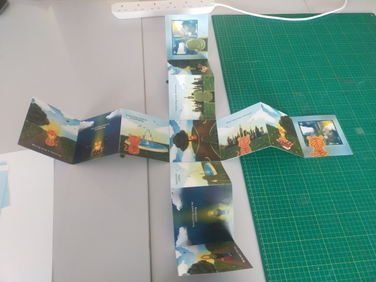
One text of the story is missing. 😭 It’s the tiger and the window one, let’s just pretend the tiger just simply doesn’t say anything. 😬
Many parts were not cut precisely so some parts look sloppy. This is also because I made mistakes in the dieline making. I hope I could improve it in the future.
The box cover that sticked to the roof is dark blue, I think it would be nice if it’s light blue even though I think it’ll make look more empty. But I’m fine and quite happy with it.
This final piece was finished around 30 minutes before the deadline. It was amazing that I could finish it on time. A huge thanks and appreciation for everyone that has been helping me throughout this project making. Including me. Also biggest apologies if I have been a burdensome, and not a very nice person during this project -or this term. As I’ll leave in December and may be never coming back ever again, I will keep all of these memories and cherish it quietly far back home, the project, the course, and especially the people. 🥹
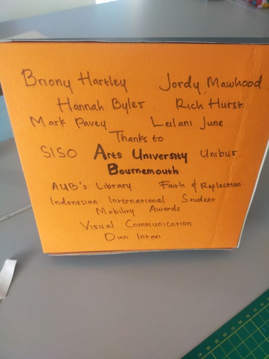
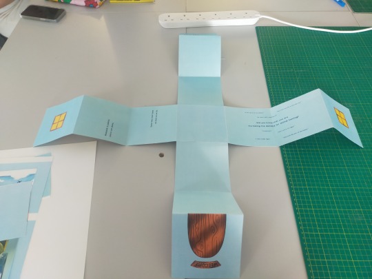
Here’s the final layout of the printed version this morning. It was a nightmare doing all of the two sided printing. I blocked the background with blue on the back page so there won't be any unnecessary white space just in case it went wrong again. Once again, I can't thank Jordy enough for the whole printing mess.
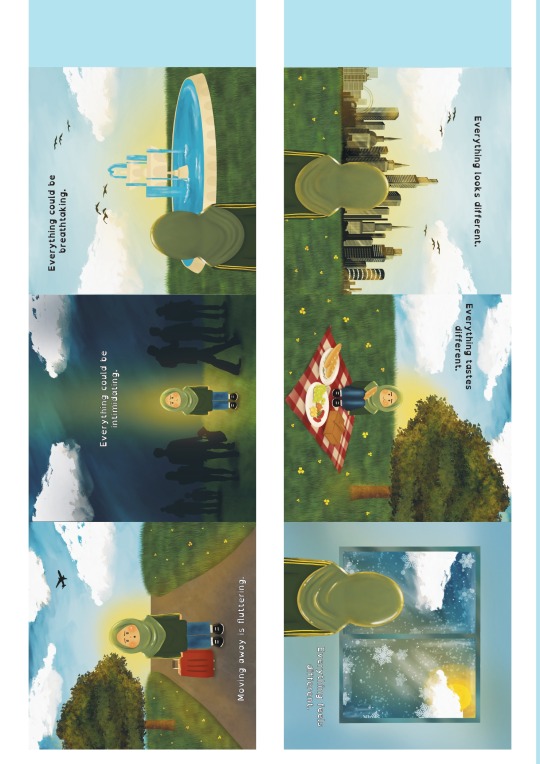
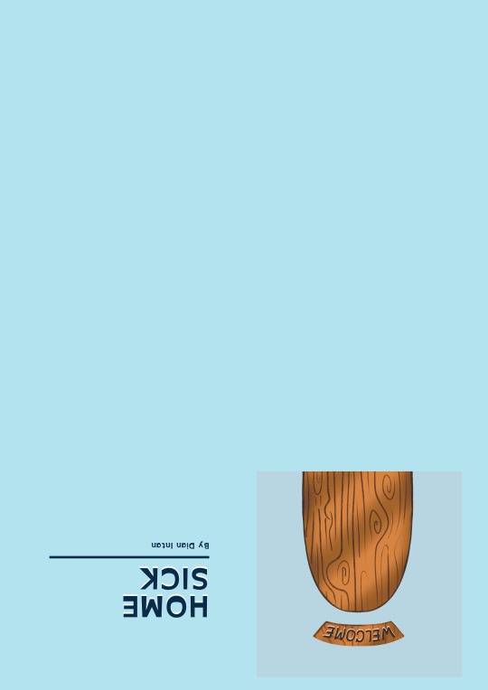
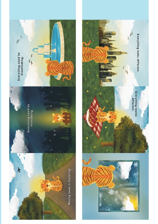
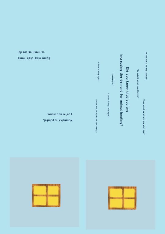
I made the dieline and layout on Adobe illustrator, as well as adding the text. I decided to put the text as well on the blue wall side! As you can see, the tiger story has one missing text. But that’s fine, the tiger doesn’t say anything, trust me. 😬
That’s all.
Also, an appreciation post for all of my works throughout this term!
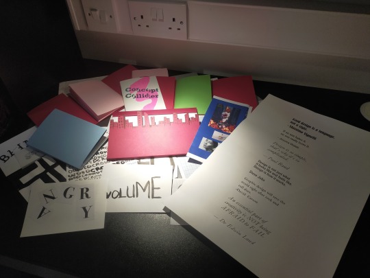
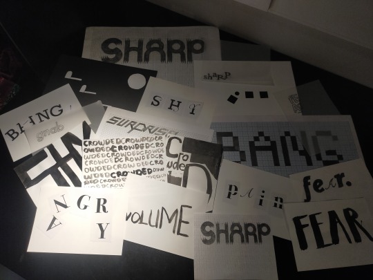
0 notes
Text
Contextual Studies Talk - Jon Trayner


Feels like a Time Machine session, Jon took us through so much art style through years.
0 notes
Text
Concept Collider
Bookbinding the final result of concept collider!


It’s fun to do the binding ourselves. Touching the Riso printed paper left pink and turquoise stain on our hands, that’s why we have to wash our hands afterwards.


0 notes
Text
Intersection
Work in Progress


I found it quite challenging to do all of the drawings that’s why it took me a long time to finish it. Last day Jordy helped me to print my works on A2 papers, but unfortunately I wrongly placed the pages so I can’t use some of them.
Fortunately I made it to finish my roof and the bottom frame of the house!


During weekend, I also managed to make a tiger in a prison cell! Fortunately I asked Jordy for some dark grey and orange papers, then printed the cell dieline on the grey paper.


It was just a wild thought of having it because I didn’t think I would make it, but look what it turned out to look like!


0 notes
Text
Another Walk of Inspiration
London, November 17th 2023


During the course’s London trip, I explore V&A Museum, Science Museum, and The Design Museum. There are so much things to see and I have a wonderful experience (including the fire alarm in Science Museum).


1 note
·
View note
Text
Intersection
Prototype Making


As what Briony said during the one-on-one tutorials, it must be better if I tried to make a prototype of my dieline. I made these with thin paper so it kind of hard to make it looks like a box.


The pyramid shape for the roof was also failed, that’s why I decided to make the triangle shaped roof just like what Briony suggested.
Drawing
Here are the original drawings for the Homesick story.


During the layout making, I was confused about what should I put on the outside pages of the wall so it’ll look like a house.
I tried to make this face, but I think it looks weird.

Then I decided to put these, a door and two windows.


There’s no text yet because I added the text on Adobe illustrator, together with the dieline. You can find it above this post! 😉
0 notes
Text
A Sit of Inspiration


AUB`s library is a great place indeed.
0 notes
Text
Indesign Induction 3


We learned about pagination and how to make a booklet. Jordy also gave us a challenge to tidy up a document and exchange it with student next to us. At the end of the day, we also did bookbinding of the booklet.
0 notes
Text
Intersection
In the previous research presentation, Rich suggests me to try to do more research in my surroundings, nature and myself. That was a very impactful feedback that lead me to the concept of homesick from two different point of view, from the animals and myself or human in general.
Intersection - Mid Point


In the mid point presentation, I came up with my rough sketches of my work. The aim of the final piece is a children book, but not necessarily only for kids. This is because I believe we have to give the understanding that what’s in the forest belongs to the forest. That animals belongs to their home, not our home. As it’s intended for kids, I planned to make it colourful with puffy drawings. Above are two accounts that inspires me, other than that, there are so many more artists on instagram or Pinterest with cute bubbly art style that inspires me.
Final Piece Plan After seeing people’s amazing plan for their project, I was highly motivated to make mine as well. Suzi’s library session was one of the main reason of why I came up with the idea to make a book with 3D house shape. First of all, I tried to make a dieline.

I showed Briony my first sketch of what’s the book gonna look like (can't find the image of it), my concerns about should I make it light or dark coloured, also what shape should I make the roof part of the house. Briony told me that I could try both light and dark coloured first to see which one is better. Briony also gave another option of the roof, the triangle shaped which seemed to be a lot easier than the pyramid or cone one. Lastly, Briony also suggested me to make a prototype of it first so I could have a better image of what is it going to look like.
0 notes
Text
Indesign Induction 2
Today we learned about making brochure and other features in Indesign. We also printed our work!


0 notes
Text
Inspiration Walk


Talking about inspiration for the intersection project, Asda was on top of my list.
0 notes
Text
Bookbinding
As someone who is really bad at measurement and folding, bookbinding was very challenging and exciting at the same time.


I made a city-shaped cut on the edge of one of the book cover to hide that it was failed -the line was not straight and it’s overall too short. Now it’s not failed anymore!

0 notes
Text
Open Friday - Radim Malinic

Have an amazing talk with a creative director, designer and bestselling author, Radim Malinic, who also runs Brand Nu Studio https://www.brandnu.co.uk/
"Creativity is an untamed beast."
0 notes


