Don't wanna be here? Send us removal request.
Text
Final project
For this, we were asked to create art, We could do a painting, a sculpture, an installation, a mixed media work, a film, a photograph, or an interactive design. Any media. We were told we’re only limited by our creativity. Our professor said that this isn’t a contest on who is the best artist. He was looking for projects that show any of these things: an engagement in the creative process, a willingness to innovate, an experiment with media and ideas, or thinking inspired by examples of artist throughout time. I spent about a week and a half on this painting that I did. I also took the photograph that was taken for this. There is a link for how I documented my entire process, the video was so long though even after speeding it up, I couldn’t just add it onto here so I had to do a link for it and post it on YouTube.
Link: https://youtu.be/WPCzyO4-wSM
youtube
For my project I did an acrylic painting. I used a photo that I took myself. When taking this photograph, I was going to use it as my final, but I didn’t think that it was enough, like it needed to more to showcase my creative process. So instead of just using my photograph, I decided I was going to make a painting out of it. This painting was a very long, creative and engaging process for me. I have never truly painted something that is realistic, but that’s why I chose to do this. I feel like this painting really represents the realism factor that we studied throughout the course and how difficult it truly is. This painting definitely showcases that I’m not the best artist, but I do believe it shows how I engage in the creative process and also how hard I tried to make it as realistic as possible! I did truly try my very best to make this as realistic as possible too! I hope you enjoy, thank you for a wonderful semester!
Tittle: The true pomsky smile


0 notes
Text
Virtual Sketchbook #4


Part one:
For this assignment, we were asked to watch two short videos on Jackson Pollock. After watching the videos we were asked to answer the question at least six sentences. The question was “ how did Jackson Pollock go from studying with Thomas Hart Benton and using abstract imagery in his paintings to remove all imagery in his drip paintings?”
Jackson Pollock’s transition from studying with Thomas Hart Benton, and using abstract imagery in his paintings to remove all imagery in his famous drip paintings started through a gradual evolution in his artistic approach. Initially Pollock was influenced by Benton's emphasis on figure elements and abstract forms, which is evident in his early works. However, as Pollock continued to experiment and explore new ways of artistic expression, he gradually moved towards complete abstraction. Pollock’s breakthrough came with his drip technique, where he abandoned traditional methods of painting, and instead poured, dripped, and splattered paint onto the canvas. Using this initiative approach to focus on the physicality of paint itself, creating a dynamic and spontaneous compositions that were devoid of any recognizable imagery. By removing all imagery from his paintings and embracing pure abstraction, Pollock was able to convey emotions, energy, and movement and away that was unprecedented at the time. This shift marked a significant turning point in Pollock’s career and solidified his reputation as a pioneering figure in the modern world of art. 
Part two:
For the second part, we were asked to create an original abstract non-representational artwork. This artwork was able to be a photograph, a drawing, a painting or digital artwork. We were advised to use something as your inspiration. This could include a memory, a song, an object you treasure or someone that is important to you. We were asked to convey our meaning without using anything that represents something in real life (imagery).
From my work, I chose to do my painting off of a song. The song I chose was “In The Stars” by Benson Boone. I choose this song as it has a meaning to me as well as inspiration. The song is about loosing someone and how they are now in the sky (heaven). I recently just lost my 14 week old puppy, as well as loosing my grandmother awhile ago. I took the meaning of the song and how I thought maybe someone of younger age (like my puppy for instance) would possibly view the song after loosing someone they loved. My painting has a beautiful meaning of loss to it, although I think it is in a brighter way of viewing the darker times.

0 notes
Text
Virtual sketchbook #3
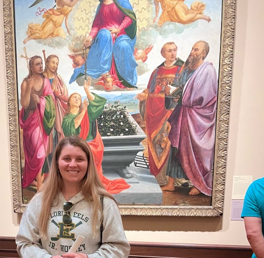
For this sketchbook we were asked to see art in the real world at The Ringling Museum of Art. With seeing art in its natural habitat, we were asked to pick one piece of art to observe in detail. With doing a good amount of research on our chosen piece, we also need to include a reproduction of the art piece, specifically a picture, one from the online data base if possible. As well as the title, date, artist, and media. Mondays were free for all students, so that’s when I decided to go to The Ringling Museum of Art, although it was free they didn’t provide wrist bands to prove we went like asked, so instead I took so pictures specifically of the entrance, the map provided, and with my chosen art work I took photos of not only the piece but me with the piece that way it proves I went! I also added some extra pictures of the museum as well at the bottom!
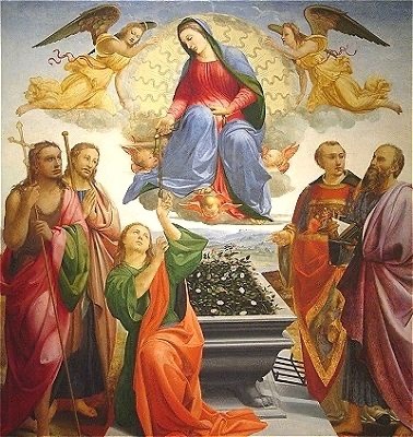
RECREATION: (online database picture)
DESCRIBE PHYSICAL QUALITIES:
My art piece I choose for this project is “The Assumption of The Virgin” by Francesco Granacci, Italian 1469-1543, who was active in Florence. This piece was created in 1515, and was oil on a panel, this panel was 228x205cm. The colors on the actual painting are very vibrant, although on the digital file of the painting they were very dark. The values are very good through out the painting, along with the shading as well with the people, angels, clouds, sky, background, and the whole piece overall. Within every brushstroke there is added detail into the textures of this piece which ads to the overall structure and definition.
The shapes used within this artwork can be broken down into many different parts, you have basic shapes throughout the entire piece. Circles, squares, triangles, many shapes were used throughout to make the people, as well as all of the details. The subject that is represented within this piece is religious, as this piece includes the virgin and the represented saints are Thomas, John the Baptist, James, Lawrence and Bartholomew. “The Assumption of The Virgin” is a balanced piece mostly, the piece as a whole is pretty proportionate, with little differentiation between the saints throughout the painting, with three on the left side and two on the right side. Otherwise the painting is mostly proportionate. There is also some symmetrical aspects as well, with the angels at the top, and also the baby angels along the sides of the virgin.

THIS PART IS ALL ABOUT YOU:
“The Assumption of The Virgin” is a very powerful piece, as it shows the Virgin giving her girdle/belt to one of men. This piece shows a variety of feelings, based on how you may look at it. I personally view this from a religious perspective, which makes it even more powerful to me. I think personally this evokes feelings of wonder for me, as someone who is religious but also doesn’t fully know the entire history behind my religion, this piece allows thoughts of curiosity and interest. I wonder what this piece could mean within other religious viewpoints, and how they make see it versus how I personally see it. Such as does one view it as the Virgin Mary also being lifted up to heaven? Some may also not fully understand it and the meaning behind it. It’s a truly powerful piece for most who view it.

RESEARCH:
The movement within this piece is brought upon Francesco Granacci after he spent a short amount of time in Rome. This is where he assisted Michelangelo in painting the ceiling of the Sistine Chapel in the Vatican. When Granacci returned to Florence he executed this painting for the Medici chapel in San Piero Maggiore. It reflects the contemporary Florentine style. Vasari described it as Granacci’s masterpiece, saying that the figure of St. Thomas could have been painted by Michelangelo himself.
Granacci was telling a story within his piece. This story is about a Christian legend tale that St.Thomas was the apostle who wanted proof of the Virgin’s Assumption. With the term used to denote the taking up to Heaven of Mary’s soul and body three days after her death. The Virgin lowered her belt as proof to Thomas who doubted her. The legend continues as a crusader returned to Prato, which is a town near Florence, from the Holy Land with the belt. Which had been given as dowry to his wife, the daughter of a Greek priest in Jerusalem. The belt was deposited in the Cappella della Sacratissima Cintola in Prato, which accounts for the popularity of this subject in Florentine painting.
Granacci got his message clearly across during the time, as this was one of his most memorable and famous paintings. The praise earned from this painting often came from him being one of Michelangelo’s pupils, leading to his work being compared to Michelangelo himself. With even praise as it was just as good, some even convinced Michelangelo himself painted some portions on this piece. As the work was extravagantly praised by the sixteenth-century critic Giorgio Vasari. He wrote that “the figures of Saint Thomas and the Virgin were so full of grace that they were worthy of Michelangelo”. Indeed, the poses of these figures recall the powerful, three-dimensional forms of Michelangelo's paintings. This shows that Granacci was a detailed and powerful artist, especially with being compared to one the best artists known worldwide.
THE LAST (most important) Part:
In conclusion, “The Assumption of The Virgin” is a historically religious piece, and holds significance in art history and society for several reasons. Firstly, the artwork is a representation of a religious theme, specifically the assumption of the Virgin Mary into heaven. The subject matter was popular during the renaissance period, and reflected the deep religious beliefs of the time. Additionally, the painting has influenced other artist to have created there interpretations of the assumption of the virgin, with each adding their own unique style and perspective. This allowed evolution of this piece of art, and the exploration of different artistic techniques.
Furthermore, the painting hold significance in society as it symbolizes theme, such as religious devotion, the empowerment of women through the portrayal of the Virgin Mary, and the fusion of art with science and theological concepts. This representation of the Virgin Mary ascending into heaven, has served as a source of inspiration and contemplation for viewers throughout history, reflecting cultural norms and beliefs of the time. Overall, “The Assumption of The Virgin” by Francesco Granacci is a notable artwork that has left a lasting impact on art history and society, influencing artist, viewers, and cultural perspective on religion and spirituality, which is exactly why I chose this piece as it stood out to me personally.


1 note
·
View note
Text
Virtual Sketchbook #2
1:Journaling-
In chapter 4 we learned about Principles of Design. We were asked to define the following terms in our own words as we fully understand them. “unity & variety, balance, emphasis & subordination, directional forces, repetition & rhythm, scale & proportion”
Unity & Variety: Unity is the feeling all parts of a piece that work together, whereas variety is different visual elements within a piece, even if they do not work.
Balance: Balance is space and visual weight within color, objects, and texture that is distributed to allow a piece to feel stable.
Emphasis & Subordination: emphasis is a principle of creating interest in artwork that is centered, whereas subordination uses direction and placement to organize elements in artwork.
Directional Forces: directional forces is paths that are implied or created that lead that I threw the composition which will create interest and keeps the viewer engaged within the artwork.
Repetition & Rhythm: rhythm is when one or more elements of design are used to create a suggested movement, whereas repetition is the use of the same shape or colors within a piece of art.
Scale & Proportion: scale is a size of an object in relation to other objects in an artwork or a design, whereas proportion refers to the size of an object in a relationship to other parts of the same object(s). 
2. Connecting Art To Your World-
We were asked to share a personal experience of how color has affected you personally, with included use of some color vocabulary (hue, value, intensity, and saturation.) Then we were asked to picked a color scheme for our life.
Color personality affects me in life on a day to day basis. Everything I personally view has color to it. Color affects me daily by what I wear, my makeup colors, and my views inside and out of my home. The Hues that I personally see within my house always are differentiated between me and friends and family. I have a very particular color scheme within my house. I have a very happy and upbeat color variety’s, which includes blues, yellows, whites, and browns.
Overtime I have also added some different values of black within my house. The main reason I’m going so particularly in-depth on my house is because every person that has came in my home has seen the blue that is on my walls in a different value. Some view it as light and some view it as dark. Which I have personally noticed that it changes whether I have curtains or blinds open or lights on or off.
Personally, this affects me, because when designing everything within my home, I had a very particular view for the values of color and the saturation of colors when place together. Overtime I noticed that if I paired a brighter yellow next to the blue on my walls, that the saturation of the blue and the yellow would change, just within my eye, which affected me on how I personally bought items for my home and place things in my Home as well. this also allowed me to view colors in a whole different appeal based on value saturation, and Hue’s. Now, when I’m out shopping around, I pay particular attention to every part of choosing an item based on the color, the intensity, the hue, the value, and the saturation. I truly can say that this is one of the biggest personal experiences of how color has affected me personally, and changed my look on color within my life.
 Within art and design, a color scheme is an association of colors based on an organizational system. If I had to choose a color scheme for my life, even though it would be so difficult I would choose a Triassic color scheme. I personally love all colors, but I tend to stick to colors that go well together but are also a variety (such as Blue, Yellow, and Red).
3. Art Project-
For this art project we were asked to draw a comic style cartoon, or make a painting. Depending on what we chose, whether it be a comic style drawling or a painting, It needed to be executed with any of the materials outlined in our textbook (Chapter 6 and 7). specifically stating that painting involves the use of wet media. For this, it also states that the subject matter should be something that you are passionate about, and has deep personal meaning for you the comic or painting should be able to tell some type of story that relates to your feelings about your chosen, subject matter. We also were asked to post a picture of the finished product and at least one in progress photo. 
For my painting I chose acrylic and oil mediums. For this painting you will see mountains with a road leading through. At the end of the road you will see a faint angel. I chose this for my painting because this represents my nana, whom I lost to pancreatic cancer. This is not only something I am truly whole heartedly passionate about, but has the most significance to me. The mountains were a special place to us, personally. I even have a tattoo for her memory of mountains and an angel. I hope that you can view the story that this painting represents of me and my most wholesome story. The first picture is very dark and gloomy, as that is what I originally was going for, but I ended up not wanting to represent this story to viewers like that, as she was a light to me in this world. So I repainted the entire thing and made it lighter and more wholesome. I changed the values of the colors along with the hues. I used one green that I personally mixed, and then added black and white t different variations of the green to make the colors of the mountains. The grey for the road and blue for the sky I also mixed for the perfect saturation to match the bright colors of my piece. 


4:Discussion-
For this discussion, it is copy and pasted from the contents of our class. Discussion post: photography, digital art, and graphic design.
Photography:
Portrait: this is a portrait of a young girl. This portrait was taken by William Edward Kilburn who was British and this was approximately taken in the 1880’s. This photograph shows and tells me that it was set up, you can tell by the way the young girls post alongside the chair. As well as how the background for this photograph is almost “ picture perfect”, although it is a beautiful photograph, and shows historical significance.

Landscape: this is a photograph taken in 1884 by Stanislas Ratel. Taken in eastern France, this photo is giving a very calming and relaxing environment. The environment looks to be almost in the “country” of France. Maybe a neighborhood, as it seems to have another house like structure behind the cottage. There’s also a lot of trees, and a calm lake which cast the reflection of the cottage very well.

Still life: This is a photograph of envelopes, which was taking a 1993 by Andrew Bush. I think there’s a particular meaning a message behind this photo. The intricate details with how each envelope is placed and also each one looks to be framed tells me that the artist and it just stop and take this, he had intentions with this piece. I believe the message behind this photograph is something to do with messages. It might be something with family history, or even love letters between a couple that are being set up as a display of time and how over a certain time history can fade. With this I mean, as each envelope sets, they are left on red as Time moves on. This photograph could represent how overtime history (love letters for example) will be existent, but not available to everyone. As you can see them in the photograph, but you cannot read them.


0 notes
Text
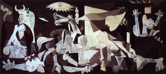
Pablo Picasso 1937 Guernica. Oil on canvas; 11’ 5 ½” x 25” 5 ¼”
Introductions/First Artworks: #1
5 New Facts on Guernica:
1. Women were the main characters in this piece.
2. This piece was criticized and used later by nazi Germany.
3. Guernica was commissioned artwork.
4. Picasso refused to make comments on the symbolism in this piece.
5. Guernica was not always considered as a masterpiece, as it is now.
6. Picasso started this piece after the bombing in Guernica
( I felt like #6 was needed to help explain some of my reasoning below!)
Upon doing some research on this Picasso piece, the way I look at it now definitely has changed. Looking at this piece the first time I truly had no indication that it was based of all females. Which is quite interesting when going back and viewing the artwork. The details within the greyscale and format of position are quite compelling.
When first viewing this artwork my eyes flowed around the entire piece, but after researching and learning about where the pieces historically came from and what it was based on I can truly see the intended detail behind every part of this. Love this piece personally, and first looking at it I didn’t know it was a Picasso piece, which was awesome to learn as well!
Sketchbook #1
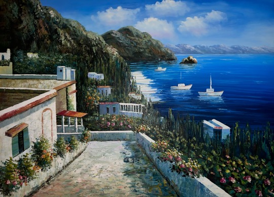
#2: This art work is a piece I have hanging in my home. The media used on this painting was acrylic paints. This particular piece serves a meaning of home to my boyfriend and I. He is Greek, and this painting came directly from Greece from a past trip, it serves as a home away from home for us. This piece is very beautiful, the details within every stroke on this painting are visible to the eye. The colors that were used are so identical to the real thing, its crazy to compare the two. The details to the light and shadows within the piece are accurate and blended seamlessly. This whole work is just pleasing to the eye, and overall catches attention immediately.
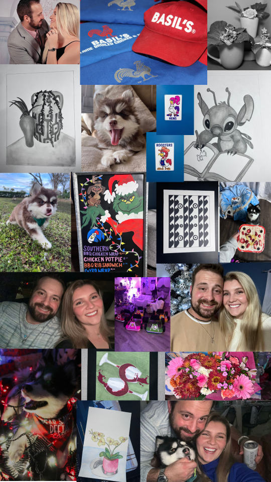
#3: I am a 22 year old female, born and raised in Bradenton, FL. My dad is half Puerto Rican, while my mom is Irish mixed with a few other ethnicities. For fun I commonly find myself working with art. Whether it be painting, drawing, taking photos, or digitally I always seem to be doing something creative. In between school and my art I work at a locally owned Restaurant. I’ve worked at Basil’s since I was 16. I also do some art work for them for their specials board every month which is really fun and allows me to bring my creativity into work. The perspective I bring when I look at art is being open minded, I say this because every little thing is different in every piece. I think being open minded has allowed me to take in all the different aspects when it comes to art.
#4: Below is my piece for my self-portrait. I decided to do a collage, as I thought the best way to show my self is to show what I love. The people, pets, places, art works, simple things and some pictures of my life. These are a variety of things that simply fascinates me daily and truly shows me.
1 note
·
View note