Don't wanna be here? Send us removal request.
Text
A touch more refinement
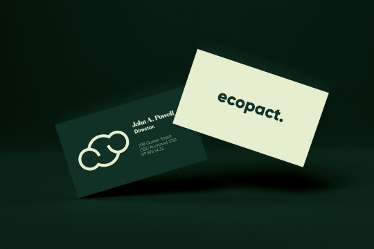
Feeling good about where the branding was now sitting I decided that it just needed to feel a little more serious. So to achieve this I added a much darker green/verging on blue:
0 notes
Text
Logo creation again
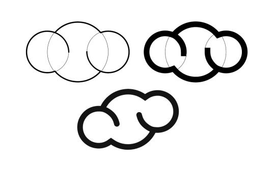
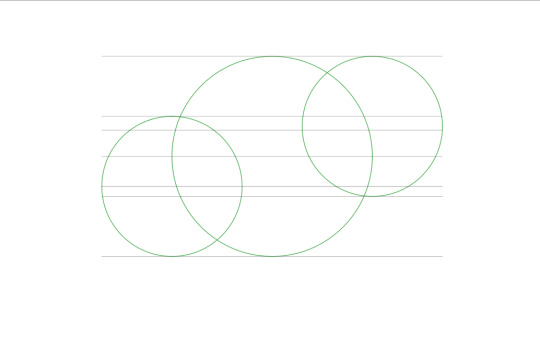
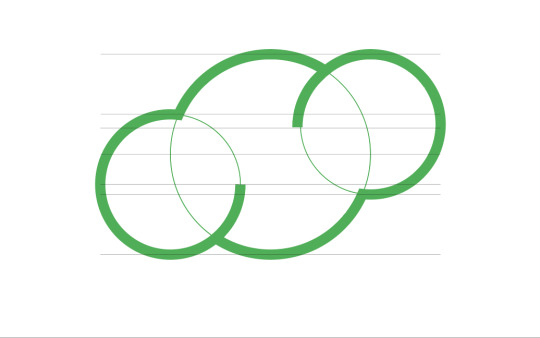
Moving on with the project and ditching the grid meant creating a new logo. I thought about all aspects I had covered so far in the project and thought about how ultimately the pollution is happening at a molecular level - and how Ecopact is addressing the molecular chemicals in side cleaning solutions - so I began thinking about how I could show that and potentially make it the logo. I chose to first design the molecule for water seeing as this whole project started from wanting to prevent waterway pollution:
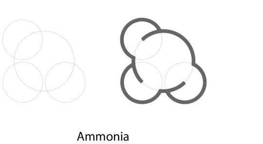
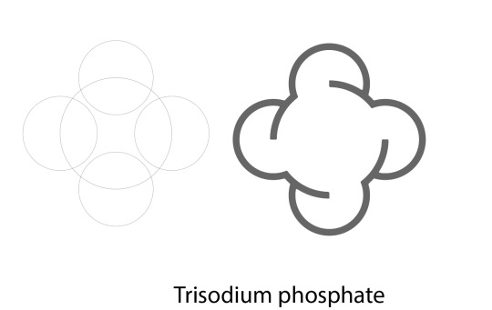
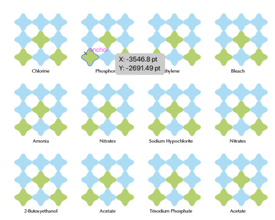
This then led me to create a whole lot more of these illustrations based on other chemicals. At this point, these illustrations didn't have a purpose, but I knew that I somehow wanted to incorporate them into the branding at some point:
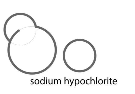
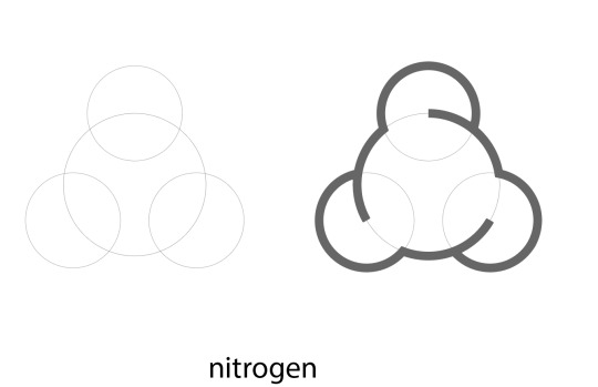
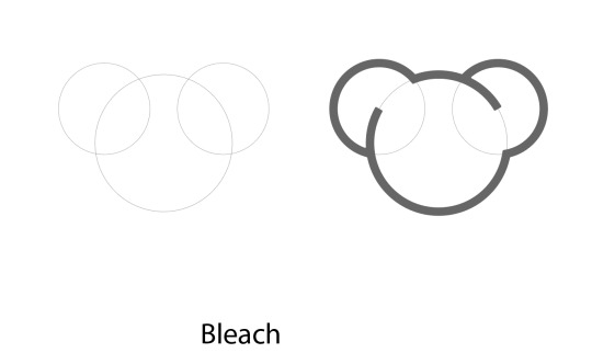
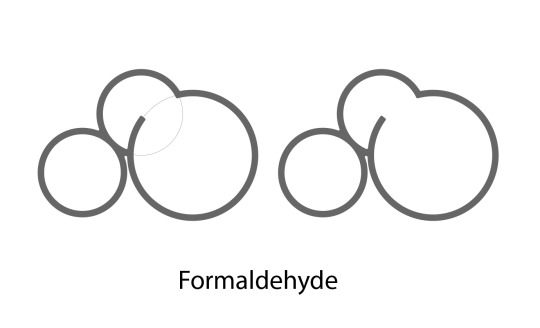
Happy with where this was heading I refined the water molecule until it made an effective icon for a logo:

0 notes
Text
Typefaces...
After feedback, I realised that the san serif typeface I love so much and used everywhere was so clean it made the branding look, boring. So I looked at the context of my message. Ecopact takes its inspiration from the eco-friendly movement. This movement really started to take off in the 70s, so I took a look at what was happening in the design world around that time.
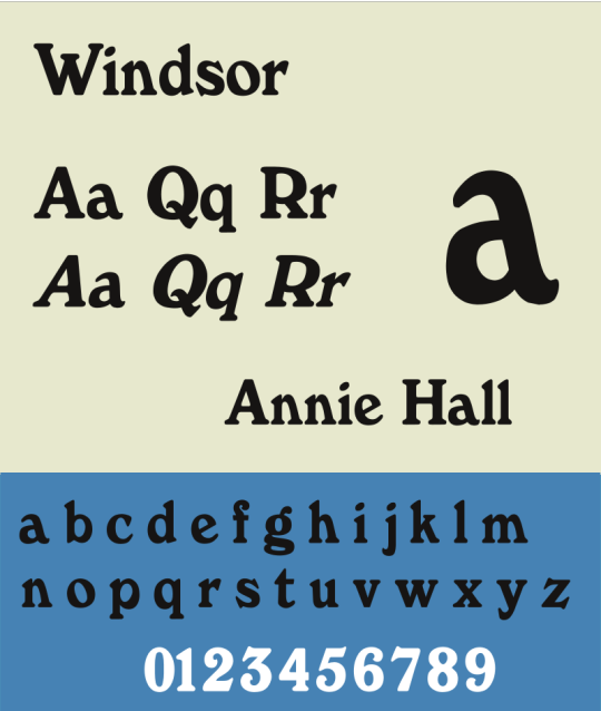
Whether you view it as cliche or classic, the 70s fostered a wide variety of drastic serif typefaces, notably Cooper black. Using this knowledge I took a look at Windsor pro. Whilst I liked the fact Windsor pro gave a little more character to the branding, it now felt that I had gone the other way and made my design too busy and I couldn't see Ecopact being taken seriously using it.
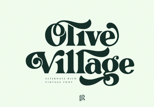
So after a lot of searching, I found a happy medium. A typeface called Olive Village had everything I wanted; nice serifs with character, whilst still maintaining a clean and refined atmosphere.
So I started to put it to use in my work:
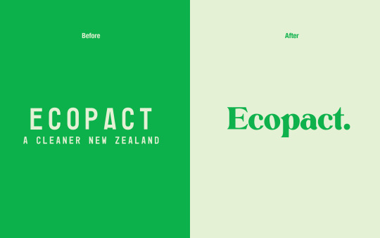
I liked it, however, I eventually felt that the olive village typeface would work better as a display type for things like quotes or brand collateral, so I revised the logo once more:
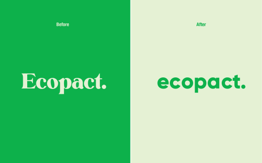
Overall I am happy with this as now the olive village typeface can be better utilised elsewhere in the branding.
0 notes
Text
Ecopact stickers instead of a rating system.

Image from: https://www.stuff.co.nz/life-style/food-wine/food-news/106774482/award-stickers-can-make-you-think-the-wine-tastes-better
Talking with George I realised that my grid rating system was going to be problematic from a design standpoint. Firstly the design is rather big and clunky, using the grid means that companies would have to give up a lot of label real estate that could otherwise be used for different information, and given that the idea is to get as many people using Ecopact's system as possible I knew I had to pivot the idea slightly.
Thinking of other ways companies have to piggyback on existing products and label design I thought about the stickers used on wine bottles. This is something I knew related heavily to my project.
The wine company doesn't have to add a new design to their label, whilst the information that is provided on the sticker still lets the public know that their wine has won awards.
And the benefit to the company that reviews/ranks the wines and provides the stickers is that the consumers of these wines, trust the stickers and buy the wine accordingly.
Using this as a starting point I began brainstorming what an Ecopact sticker might look like, and the original design is attached here:
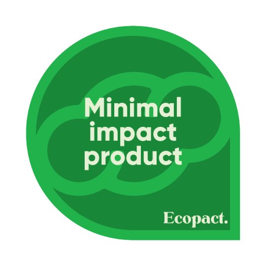
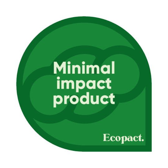
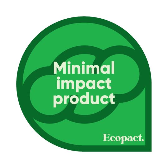
Whilst the idea was taking shape I realized that the stickers were not clear enough about what they were indicating. To explain what I mean better, I will discuss the wine labels again.
The stickers indicate that the wine on the shelf with the stickers has achieved a certain level of quality worthy of and an award, and as such the stickers have been printed onto foils that represent, gold, silver, and bronze awards. The idea is so clear, that you don't even read the text before you know what the sticker is conveying.
I thought about using this exact technique and creating a similar sticker set in gold, silver, and bronze. And yes whilst effective and an improvement upon the original stickers there was an issue.
The foils that the stickers are printed on use plastic to achieve the metallic look and feel, this is a problem for Ecopact as using plastics that degrade ecosystems is the exact opposite of Ecopact's core values. So I thought about how else I could create a representation of an award and came up with a shape that looks similar to a pin.
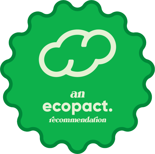
The benefit to this sticker is that it can be printed onto eco-friendly stickers whilst maintaining its message. Additionally should a company decide to partner with Ecopact, the company won't need to make any changes to their deign to incorporate the Ecopact sticker.
0 notes
Text
A revision in the colour scheme


During the mid-semester break, I went back and took a look at my project. Whilst I was happy with a more refined colour of black, white, and pink I couldn't help but feel the project looked off. I concluded that the reason was that the pink didn't suit the message, initially, I steered away from green as I didn't want to risk looking like just another eco-friendly awareness campaign.
Above you can see the green colour palette (both colour palette and colour palette proportionality) I have decided to use in my design from this point on.
0 notes
Text
https://issuu.com/taylorsfianlproject/docs/ecopact_brand_guidelines_prototype
link to initial brand guidelines
0 notes
Text

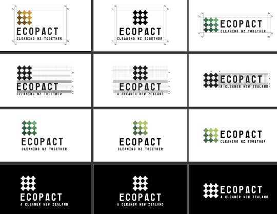
Justifying logo within a grid and applying icon to logo
0 notes
Text

After changing characters to have more personality
0 notes
Text

Final typeface chosen and prior to editing characters
0 notes
Text
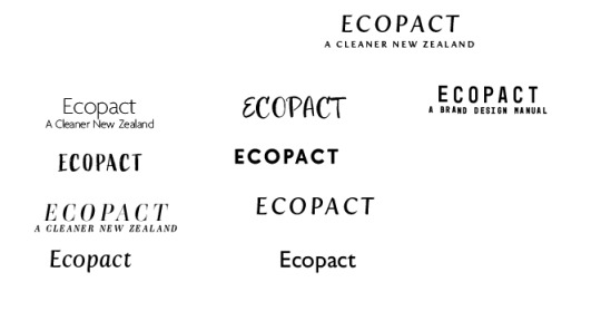
Best typefaces being refined for a final design choice
0 notes
Text
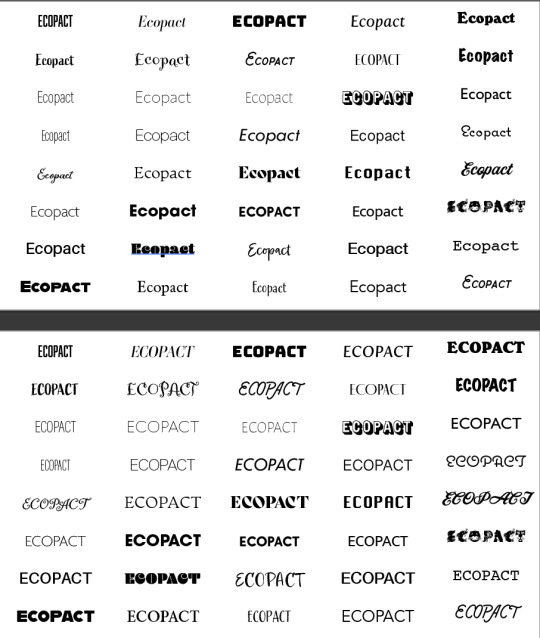
Exploring typefaces (after coming up with a name for the company/organisation)
0 notes
Text
Circles were too childish looking exploring other shapes
0 notes
