Text
Week 13- Overall Course Reflection
What went well/ What did I enjoy?
During this course I’d have to say the most successful parts have been in Autocad and Photoshop which were two software that i had never used before but to my surprise became very fond of and enjoyed using a lot. Because of this i feel like I’m finding a direction in which i want my design path to follow and it lies within the technical drawing and product rendering side. Both i had already been interested in, Cad due to its technicality, my interest in engineering and *cough* better pay *cough* and product rendering due to the fact I’ve been following industrial design sketches and designers since year 10 when I decided to pick this course and love being able to see and produce those product ideation and final sketches.
What did I have difficulty with/ What did I dislike?
the tasks i had most difficulty with were measurement taking and public speaking. this was due to simply finding methodologies that were efficient and accurate to measure the product a difficulty and time consuming in its nature. the second is merely a lack of confidence and comfort which is an internal thing that may be worked upon but both of these are areas in which i may need to aim to improve upon.
What were some of the key things I learnt, or insights which I developed?What led to those experiences or insights?
All of the key lessons i learnt are found in each individual blog but as an overall lesson i think the two most important things you need to consider when learning any new skill is patience and practice. Developing a skill takes time and effort and it is important that the time and effort you apply is done in a manner of complete concentration and devotion to the task at hand to maximise your improvement.
Summary
In summary i thought this course overall was a very useful and beneficial experience and i learnt many valuable skills throughout that i may apply into the future and give me purpose and direction.
3 notes
·
View notes
Text
Week 12 Studio Tutorial – Photography
Task:
Part 1: The 2 hour photo challenge Your are on photographic assignment! You have been dropped into the UNSW Campus from far afield and have been asked to put together a photo essay that captures life on campus. Your photo essay will feature in an upcoming edition of a prominent magazine and you need to supply a selection of 6 amazing images. The shoot deadline is tight - the shots are be taken today, within a two hour window.
Part 2: Editing and Post production In the next few days, you must then edit your shots to select the best series of 6 using Adobe Bridge, enhance them in Adobe Camera RAW / Photoshop and post them on your blog by Sunday midnight. Your final edit must include:
A portrait (preferably of a complete stranger)
Something from the built environment
Something from the natural environment
An interesting detail
ORIGINAL IMAGES-
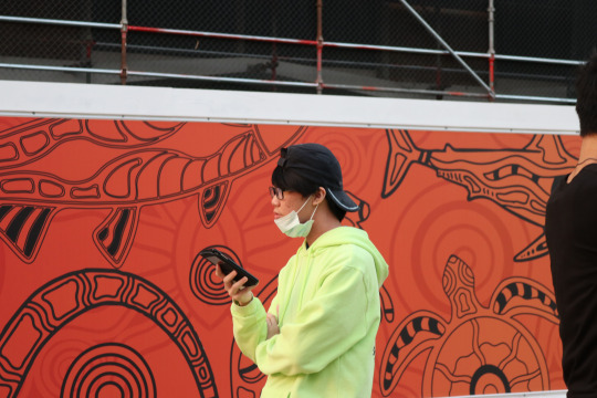
-portrait/candid photography
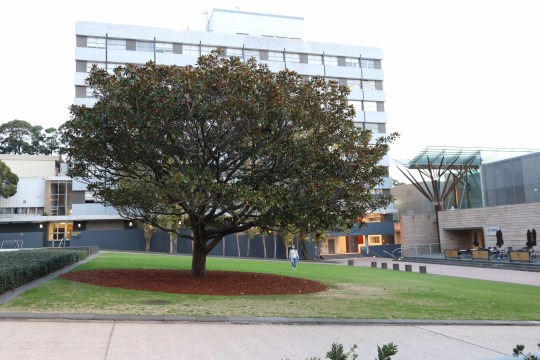
-natural environment/street photography
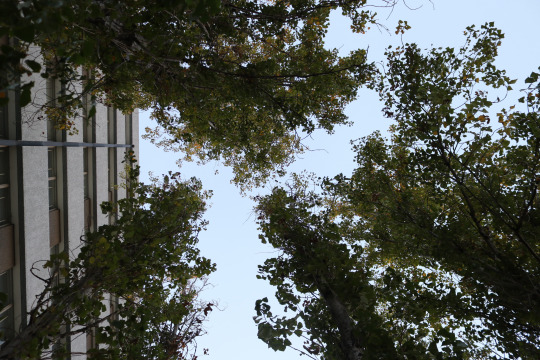
-natural environment photography
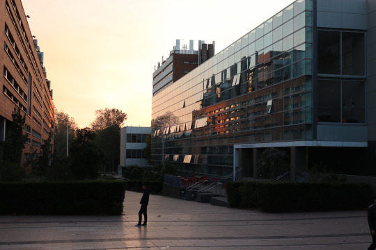
-built environment/street photography
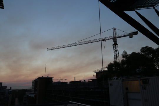
-‘natural’ environment meets ’built’ environment (not the faculty) photography
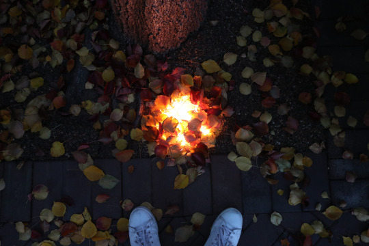
-interesting detail/ ‘natural’ environment meets ’built’ environment (not the faculty) photography
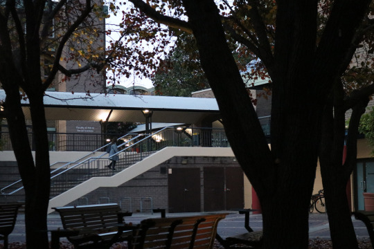
-street photography
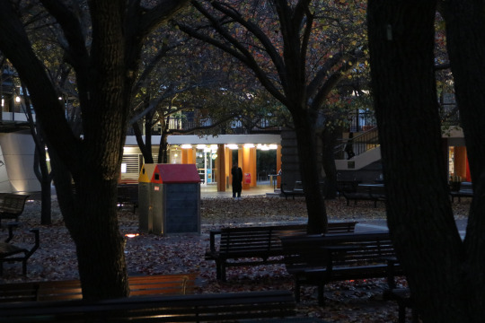
-street photography
EDITED IMAGES-
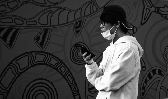
AIM-
For this image i was trying to go for that b&w film street photography style by adding some strong contrast between the background and jumper and adding noise to the image. The blank expression, clutching of the phone and gazing into the distance at something we cant see, as well as his gesture of having his arms folded in to compact his ‘personal space/bubble add a mysterious feel to the image as well as showing a disconnect and loneliness facing whatever lies past the darker half of the image (perhaps zooming out and making him smaller would’ve furthered that disconnect from the world and loneliness however the background cut off if i cropped any higher). During year 12 i had purchased my first camera cos i wanted to start with film; a Nikon FE (the poor mans F3) and unfortunately I’ve only shot multiple rolls of colour film, but this shot and further on below, my other two “street” photography (loose way to describe them) shots are making me more interested in purchasing some b&w film (maybe after i try out some cinestill 800 film too).
POINTS FOR IMPROVEMENT-
with this image i probably would've benefited from brightening up his face to capture his expression more but i pulled back the red exposure in my HSL sliders to darken the background and make his jumper pop and that pulled his face back as well and i wasn't too bothered going in separately
the head room is a bit too close in my opinion however was only placed like that so the crop would have him on the third and the pattern background would fill the whole screen
coming one or two steps to the left to capture his gaze may have created more interest or perhaps as it is the emotionless face staring into the distance of something not depicted in the image is enough
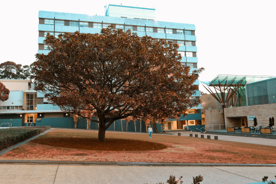
AIM-
Just another sad teal and orange edit, I was trying to create more visual interest in the tree and figure staring up at the tree, I simply saw the moment as she was walking towards us, saw the tree added some form of visual interest and tried to capture her walking and gestural actions facing the tree. Unfortunately as soon as she saw the cameras she did a U-turn.
POINTS FOR IMPROVEMENT-
perhaps stop using photo edit cliches (but if it ain’t broke don’t fix it)
capture the image with the same composition or similar variant if I had more time to plan the shot, but where shes walked closer to really see her facial expression and walking motion (which couldn't happen cos she turned away)
somehow isolate parts of the image more
bracket my exposures or just bring it down to retain the sky detail (or maybe white looks nice, I crushed the whites a tad so it wouldn't blend with the Tumblr feed background)
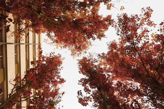
AIM-
In this picture I simply wanted to capture a perspective not many people think about or see during a normal day and I wanted to further contrast the trees and natural environment by having a building fill the left side to show people that its okay to be part of that world but there’s beauty all around and sometimes all it takes is looking up. Of course to further this again i warmed up the image quite a bit and shifted the greens and yellows to a nice red and orange to create a more beautiful, deep and rich colour.
POINTS FOR IMPROVEMENT-
perhaps better composition and having a distinct gap between all the trees or more of the building on the screen
exposing lower to capture more detail in the trees and sky although quite a bit was pulled out compared to the original
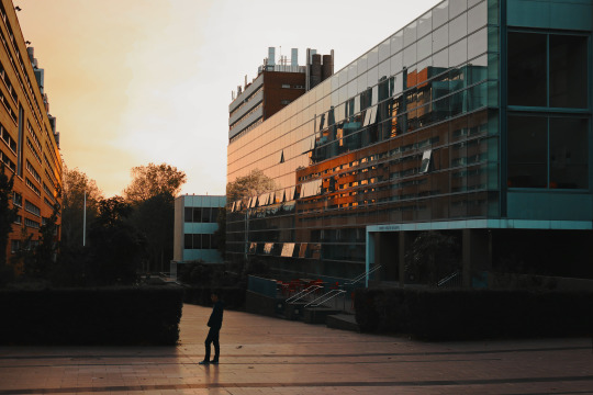
AIM-
Another teal and orange edit, in this image i was simply captured by the sun setting but as i was walking noticed the building on the right and the use of reflections in an image was really interesting to me so i tried capturing the built environment faculty in the reflection, the warm glow of the setting sun and the posing figure was a bonus i waited for to walk in the frame.
POINTS FOR IMPROVEMENT-
perhaps if the figure was standing closer or there just wasn't such a dark object behind him so his head wouldn't blend in with the background and he could stand out more as a visual element

AIM-
when I walked up the building overlooking the main walkway, instead of capturing the cliche walkway photo itself (although a crowd walking with a bit of a longer exposure would’ve been cool- something Hans captured) I noticed there were about 4 or 5 cranes all lined up along the skyline. Unfortunately from the position I was in i couldn’t capture that and even this image was a bit of a cheeky edit to get a whole crane as seen in the original having a massive object in the way. i wanted the built man-made environment to come out and above the natural environment (trees on the right) and to emphasise that i simply increased the blacks until the only colour was sky to which i desaturated the blues and added orange in the overall tone.
POINTS FOR IMPROVEMENT-
the Photoshop is a bit dodgy, it was a two minute fix with the spot healing brush and looks a little unnatural with the ripples

AIM-
in this picture i noticed a light on the ground and these colourful leaves spread all over the floor so decided to pile them on top and let the light filter through. I added my shoes in the bottom of the frame to emphasise the image as something that was set and there and to add visual interest and also shifted the colours to a really warm orange for the autumn/fall vibes. The light adds strong visual interest as it filters through and around the leaves but wasn’t strong enough by itself.
POINTS FOR IMPROVEMENT-
small compositional things could've been done to improve this photo
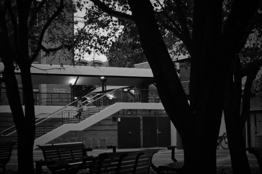
AIM-
Something i used to do a lot when i first bought a film camera was to look for moments made by people framed within these natural or man-made frames in the real world. The empty seats at the front and lack of life emphasise the loneliness of the figure and night life on campus however we don’t know where shes going (probably the library up the stairs actually.. but not knowing the context creates interest).
POINTS FOR IMPROVEMENT-
making the figure stand out more and perhaps having a bit more of a slower shutter speed to get a little motion blur in her walk
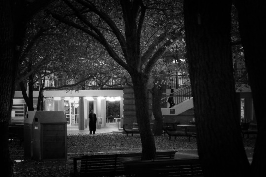
AIM-
Another framed shot and my favourite shot of the bunch. The light behind the figure on the phone, her stance, the second figure walking up the stairs, both framed by outside objects, interest in why the person is alone or what the phone calls about, the all black clothing, the leaves on the ground, the tree splitting the image in two and two juxtaposing characters, etc. etc. Wondering what this would look like in maybe a 400 speed b&w film for the noise and slower shutter speed.
POINTS FOR IMPROVEMENT-
being an attempt at ‘street’ photography (never going to be brave enough to actually get in peoples faces..at least not yet) I’d say perfection isn’t something you can capture because it isn’t a real thing so compositionally I wouldn't change anything.
3 notes
·
View notes
Text
Week 11 Studio Tutorial - Introduction to Perspective Drawing
Task:
Using the method demonstrated in class this morning, and using your drawing tools, draw a 2-point perspective cube in proportion to the Wassily chair’s actual dimensions. Create a grid on your orthographic sketch views, then transfer this grid to the 3 visible faces of your perspective cube. Note: The cube should be drawn as large as possible to fit on your page. Tip: Stick down your page so that it doesn’t move around.
Annotated images:

“perspective drawing practice and understanding shadow”

“final perspective sketch of the Wassily chair by Marcel Breuer. the 4x4 grid was erased to leave a clean image and perspective lines drawing in pen to show the vanishing points on the horizon line.”
Reflection Questions:
What did I have difficulty with and what complications arose? Why?
understanding how to transfer the detail from a 2D orthogonal sketch to a 3D perspective sketch was initially a hard task to understand but after finding the midpoint of the squares and creating a grid and further grids if i wanted to find more points helped
ultimately i ended up estimating some points roughly to finish the sketch which isn't 100% accurate and made it look more like an unfinished 3 point perspective
How would I fix those complications and what would I do differently if I had my time again? Why?
take my time when sketching and finding points
understanding how to transfer points properly
ensuring vertical lines are perpendicular to the horizon plane
What were some of the key things I learnt, or insights which I developed? What led to those experiences or insights?
All of the insights I developed during the studio tutorial were documented under the annotated images and it was through complications or discoveries made and shown in those images that I was able to learn key lessons/skills/techniques that I should apply into the future.
2 notes
·
View notes
Text
Week 10 Studio Tutorial - Measurement & Model Making
Task:
You are to measure the external surfaces of a manufactured product, use these measurements to create a contour and outline drawing and then use this drawing to make a form model of the object such as shown below.

Annotated images:

“attempting to use a 1 cm grid method and photos to work out the measurements of the objects shape”
(unfortunately i realised this didn't work due to the grid not being on the same plane as the section you're measuring. i ended up resorting to the use of calipers after also trying the profile gauge in the workshop)

“final outcome of the measurements applied in Autocad”
Reflection Questions:
What did I have difficulty with and what complications arose? Why?
the measurement of the object itself was the hardest part of this exercise as it was both time consuming and often inaccurate depending on the method you used
ultimately i had realised the first few methods i had come up with for measuring were unsuccessful and resorted to a simple caliper and even ruler which isn't 100% professional or accurate all the time
transferring this into Autocad however was very easy as i am starting to grow fond of the software and then printing this out to cut the foam-core model also proved quite useful and easy
How would I fix those complications and what would I do differently if I had my time again? Why?
Ultimately taking more time and adopting a more accurate methodology would be the most beneficial aspects in this exercise
What were some of the key things I learnt, or insights which I developed? What led to those experiences or insights?
All of the insights I developed during the studio tutorial were documented under the annotated images and it was through complications or discoveries made and shown in those images that I was able to learn key lessons/skills/techniques that I should apply into the future.
0 notes
Text
Week 9 Studio Tutorial – Presentation
Task:
Make a high quality presentation rendering of an existing consumer durable product that effectively communicates the design. You are to use a rendering technique based on the one shown in the week 7 Photoshop rendering tutorial and present your work to your tutorial group during the studio tutorial in week 9.
Annotated images:

“presentation research storyboard depicting the process i took to achieve the final render”

“final rendering of Audi r8”
Reflection Questions:
What did I have difficulty with and what complications arose? Why?
I’ve always been really quiet and shy and had a strong disliking towards public speeches and talking in front of groups, this usually results in strong shaking in my hands (which i confirmed with people after) and a slight shake in my voice. I feel as though the presentation itself and the information I gave was better than I expected as I improvised and didn't prepare material, instead I relied on the process I had drawn out and knowing the product and what I did to achieve it. So in that regard it was okay but I didn't manage to talk about every detail on processes I learnt in this exercise. It was my first time using Photoshop so I’m pretty pleased with the render itself but presentation-wise I felt like I could've been more engaging in my tone of voice and use of gestures as well as controlling the shaking so it wouldn't be so noticeable.
How would I fix those complications and what would I do differently if I had my time again? Why?
Obviously as a designer pitching ideas to a client is very important and being confident in your ideas and showing that sometimes makes or breaks a deal so practising or just relaxing myself and building up confidence before a pitch would be beneficial in the future and as for material itself although the information I gave was sufficient because I knew my process, having prepared material will help the flow of the talk and expressing key and important ideas/concepts.
What were some of the key things I learnt, or insights which I developed? What led to those experiences or insights?
All of the insights I developed during the studio tutorial were documented under the annotated images and it was through complications or discoveries made and shown in those images that I was able to learn key lessons/skills/techniques that I should apply into the future.
0 notes
Text
Week 8 Studio Tutorial - Working with Photoshop Continued
Task:
Make a high quality presentation rendering of an existing consumer durable product that effectively communicates the design. You are to use a rendering technique based on the one shown in the week 7 Photoshop rendering tutorial and present your work to your tutorial group during the studio tutorial in week 9.
Annotated images:

“first step was to create the custom A3 canvas to compose the piece on”

“the basic shape of the shell of the car was produced in a similar fashion to the hairdryer. The outlines and line highlights were also added to define the sections of the car and some of these lines were taken back with a soft eraser to make them less harsh in certain areas”

“next the highlights and the shadows were added to the front with a soft brush and smoothing transitions with the Gaussian blur tool. This proved to be highly useful as in essence you can block down shades and if its slightly messy you can save it and create a smooth transition by selecting it with the polygon lasso tool and using Gaussian blur”

“the front section was completed. I had to keep in mind how light behaves on a chrome surface as the reference image I was using was a white high gloss paint but I felt like experimenting and trying something new. Strong contrast between light and dark values often give the impression of a chrome surface or shine.”

“the next lower door part was sectioned off with the lasso tool which was highly useful when trying to focus on certain areas within a layer. Again improvising the look of a chrome surface by having streaks of extreme light against dark. This one panel was my favourite on the entire car.”

“demonstration of Gaussian blur tool and blocking in shades in conjunction with the lasso tool. See next picture for result.”

“demonstration of Gaussian blur tool and blocking in shades in conjunction with the lasso tool. See previous picture for start.”

“once again carving out the car shape with paths, the lasso tool and strong highlights with light streaks within.”

“completed lower half of car shell.”

“adding little detail highlights along the edges and inside.”

“blocking out a light shade on the upper half of the door for a higher contrast and more chrome like look while once again utilising the Gaussian blur.”

“completed top section of the car shell with some sections matching the white background and others completely dark for a strong contrast in values.”

“completed hood of the car. This section was probably my least favourite as I had to improvise the look of the chrome and most obviously I’m not an expert so it came out quite unprofessional and of a lower quality compared to the other sections in my opinion.”
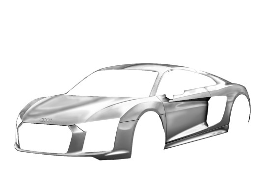
“completed shell of the Audi r8 with logo added on the front hood with light and shadow to make it stand out a little more.”
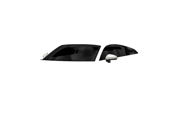
“completed windows air inlet and side-view mirrors. The reflection on the windows were created with multiple path shapes and creating the selection and brushing over the areas softly. The air inlet has a grill texture inside but unfortunately it is too dark and small to see the detail inside.”
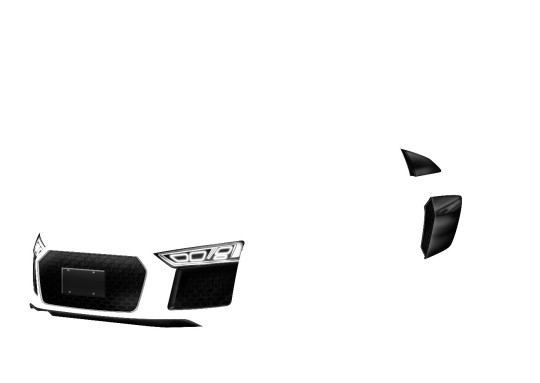
“completed front grill, headlights and side inlets. The headlights were produced in multiple shapes until I was happy and was created from squares that were warped in perspective, it also has a gradient applied behind and duplicated layers applied with Gaussian blur to achieve the slight glow. The air inlets and front grill all display the grill texture I had found and then highlighted or shaded to suit each section. The front number plate was created with a square and applied with a bevel and emboss layer style type, the individual screws were actually creating using three layered circles with different gradients applied but unfortunately the detail is too small to see.”
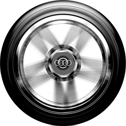
“completed wheel overlay for the car. This was my second attempt at the wheel and simply involved creating a separate photoshop sketch, modelling it after an image of a wheel found online, and then applying a radial blur over the top to hide the mistakes but to also create a sense of motion within the wheel. Finally, the Audi logo was added and the wheel itself was moved over the car sketch and put into perspective by transforming the selection and dragging the corners of the shape.”

“completed car sketch in its entirety bringing all the pieces together. Below are examples of different colourways in the primary colours.”


“FINAL SKETCH RENDER WITH MINIMALIST SPOTLIGHT BACKGROUND”
0 notes
Text
Week 6 & 7 Studio Tutorial - Working with Photoshop
Task:
In this tutorial, you will learn how to create a 2d Photoshop rendering of a modified Remington Pro Ionic hair dryer. By completing this tutorial, you will gain the skills required to complete Project 2, where you will apply the same technique to a product of your own choosing.
Annotated images:

“the initial linework was layed down for the sketch and adjusted as seen fit.”
(a difficulty that was experienced while trying to achieve this was moving/scaling/rotating the image, sometimes clicking ‘transform selection’ wouldn’t work or moving the midpoint didn’t move the image itself or scaling the image caused it to stretch, solutions to this were- ensuring you're on the right layer, grabbing the image from different points and holding Shift to scale the image in proportion)

“after creating the necessary work layers the object was sectioned off into parts and colour blocks.”
(a useful discovery made after this exercise was the ability to move points by holding Control and dragging and also adjust the angle and length of lines extending from the point after they’re laid down by holding the Alt key)

“completed sectioning of the hairdryer.”

“adjusting the colours to a personal preference.”

“shading the first main casing of the hairdryer to emulate chrome.”
(possible improvements for the future could include testing different brush types as I had used a soft airbrush in this instance when the exercise had suggested a hard brush, researching material finishes and their defining qualities to recreate them would be helpful)

“rest of grip completed”

“rest of top casing completed”

“the side display detail was added”
(difficulties experienced while trying to render this piece was emulating the reflection on the screen and utilising gausian blur to create the glow, useful tools that were learnt from completing it and applied heavily into the future were the gradient tool and the gaussian blur tool itself once I had learnt how to use it, the blur allows you to smoothly transition shades together)

“finally a background and logo were added to the design utilising the gradient tool once again”
Reflection Questions:
What did I have difficulty with and what complications arose? Why?
The first complication I had run into was simply being exposed to a new software I had never used before and not being able to follow the instructions precisely
Some of the software functions such as when pressing control+z to undo and instead looping between undo and redo, shortcuts and keys that need to be pressed for certain functions and other issues with learning the software functionality proved to be time consuming
Simple mistakes such as being on the incorrect layer or not creating paths correctly were also an issue
All issues experienced were simply due to the software being new
How would I fix those complications and what would I do differently if I had my time again? Why?
After completing the drawing most of the issues had already been solved during the process and Photoshop became easier to use and this can be seen in my Wk 8 blog-post, it was simply a matter of getting a basic knowledge of the software and becoming efficient in its use like learning most skills in life it just took a bit of time and practice and now i enjoy using Photoshop for product renders and other uses
What were some of the key things I learnt, or insights which I developed? What led to those experiences or insights?
All of the insights I developed during the studio tutorial were documented under the annotated images and it was through complications or discoveries made and shown in those images that I was able to learn key lessons/skills/techniques that I should apply into the future.
0 notes
Text
Week 5 Studio Tutorial – More Drawing with CAD
Task:

Annotated images:

“jumping into the CAD drawing and furthering upon last weeks experience and reflection I first created the individual layers I had hoped to be using and utilised the rectangle tool to quickly lay down the A2 page size.”
(by considering what I had learnt from last week’s experience I was able to speed up the process of my work and become more efficient, by the end I needed to create many more layers than I realised but having the initial base layers helped)

“once again approaching the drawing with a prepared plan of the spacing for the elements but this time with the addition of a title block.”
(the title block was a new part I had to compensate for within the drawing plan, but I decided to leave it as a simple block until the very end, so it wouldn’t become a distraction and only aided in spacing purposes)

“the first view was carved out of the box to create the front view of the object using the same process as the last drawing with the line, circle and trim tool.”
(the process was extremely easy this time around, the radiused corners proved to work well with my circle and trim tool technique but for other students beside me we found the fillet tool method they were using did not work and created an odd overall curved line, another problem experienced by students beside me were having to work out distances mathematically on the exercise sheet and then when applying those measurements into CAD having the object came out incorrect, this is why I choose to create boxes to ‘carve’ into as it allows me to keep things organised and within boundaries that I know already exist, they also aid in ensuring symmetry and I had noticed another student using a mirror symmetry tool that I should look into as it may be useful)

“the other views, hidden lines, centrelines, hatching and other details such as line types/colours were then created and applied quickly and easily in the layer properties tool tab”
(this process wasn’t documented in its entirety as it is very much the same as last week’s task, the only new addition was the use of hatching lines which one of the tutors taught us how to do and was quite simple, I didn’t bother locating the tool in the overhead tab because I didn’t know where it was but instead used the ‘H’ shortcut which is beneficial in the sense it speeds up the process anyways, I believe I should make an effort to learn many of the key shortcuts to further improve this time efficiency)

“finally, the zoning system was added to the drawing as well as all the details for the title block, dimensioning and view titles as well as editing the line weights for later use when plotting the drawing.”
(the only new tool used here was the annotate tool which was quite self-explanatory, other than this it was simply a matter of referring to the engineering drawing textbook for specific measurements, line weights, included information, etc.)

“the drawing was moved into the plotter to preview how it would look once printed”
(at the time of writing this I’m not sure how to take this further and actually print the drawing, its been plotted on an A1 page preview to be able to fit the A2 page dimensions and border in so perhaps I need to print on A1 and cut it out, but the different file type options and finding where and how to print is still a mystery so I shall have to consult either a lecturer or another student at another date)

“upon review I realised I had left out the counterbored section on the back of the object, so I simply went back and corrected this”
(the beauty of CAD software is how easily and accurately you can go back into a drawing and review/change sections that would’ve been impossible in a hand-drawn piece)

“the final drawing completed and plotted”
(once again after reviewing however I have realised I left out key features such as the cutting plane through the front view, this should have been added however I believe I haven’t left enough room after the dimensioning, I shall try to add it but for future purposes remember to complete it before dimensioning, and the third angle projection symbol)
Reflection Questions:
What did I have difficulty with and what complications arose? Why?
CAD drawing is my new preferred method of technical drawing as it is much more accurate, and I find it much easier to lay down varying line weights, projection lines, correct spacing, etc. to me the process is much quicker and easier than hand drawing. However, the problem I seem to have discovered while completing this drawing is simply missing key details in the drawing itself by becoming too overwhelmed by the programs ease of use. This can be seen when I initially missed the counterbored section on the opposite side of the object
One big complication I do have however is printing my finished product which is caused by not understanding the confusing menu system and options for the plotter and also figuring out how to print all the way the edges of an A2 page to retain the borders without having to instead print on A1
How would I fix those complications and what would I do differently if I had my time again? Why?
The first complication of missing minute details in the object itself simply is a matter of paying closer attention and not a problem with the software use so to fix this I should simply continue reviewing repeatedly or perhaps make a rough sketch/plan or even list of each detail to ensure I don’t miss any
Printing the drawing itself was somewhat explained by a lecturer and a few students so if I am still unable to do it I should simply ask for help and this complication will be solved
What were some of the key things I learnt, or insights which I developed? What led to those experiences or insights?
All of the insights I developed during the studio tutorial were documented under the annotated images and it was through complications or discoveries made and shown in those images that I was able to learn key lessons/skills/techniques that I should apply into the future.
0 notes
Text
Week 4 Studio Tutorial- Drawing with CAD
Task:

Annotated images:

“the first stage in completing the CAD drawing I had initiated by laying a foundation of boxes so I could carve the object views out of these boxes and ensure all the elements were spaced evenly apart and fit within the A3 page and border boundaries.”
(the page, border and boxes were created with simple lines, however ways of increasing this processes’ speed would include familiarising myself with the key shortcuts such as ‘L’ for line or instead creating the box with the rectangle tool, in this drawing there is no title block but for future purposes this is why planning the layout of views is so important in creating clean and professional work)

“the first view was carved out of the box shape to create the top view of the object”
(the radiused corners and semi-circle interior section were created by using a method out of the norm, I noticed most people were using the fillet tool for radiused corners and the arc tool for the curved inside, however I adopted the methodology of instead creating circles and using the trim tool to remove unwanted parts for both of these applications, this enabled me to attain greater accuracy and control of what I was drawing, and in later sections while helping others who used the fillet tool I had found instances where it simply did not achieve the required end result)

“the second view was then carved out of the box shape below to create the front view of the object”
(this process was extremely fast and easy due to the programs ability to lay down and delete projection lines between views)

“the third view was then carved out of the box shape to the right to create the side view of the object”
(the curve of this object was created in a similar fashion to the top view but however exhibited a key difference, the angle in which the line approached the circle wasn’t straight and centred and therefore I had to ask the lecturer how to approach this and find the tangent of the circle, of course in the end I found there was an option simply named a ‘tangent object snap’ which allowed me to achieve the desired result)

“the next stages of the drawing were to add the dimensions and hidden lines and finally move each section onto separate layers to organise my work”
(the layers weren’t initially created due to not understanding where they were located but proved to be extremely useful and for future purposes should be created first to ensure work can be quickly laid down and organised from the get go rather than having to move everything later causing a lengthier process, it was useful as it allows you not just to organise different sections but apply different line types or properties to lines such as the long dash and short dash for hidden detail lines or having to scale this line type to 0.5 for every line, this would’ve taken a much lengthier amount of time if I had simply continued to use the match properties tool)

“finally, the centrelines for the circle elements of the drawing were added on a separate layer as well.”
(to find where to locate the different line types and how to apply them I had to ask a fellow student for help, the only downside I’ve found is you need to re-load the line types for each new drawing you attempt but perhaps there is a way around this that I haven’t discovered yet)
Reflection Questions:
What did I have difficulty with and what complications arose? Why?
there weren’t many complications faced while completing this drawing just processes that could’ve became faster and more efficient, such as using key shortcuts, locating the tangent snap or layers tool
How would I fix those complications and what would I do differently if I had my time again? Why?
To improve the overall quality of work and workflow I think I simply need to familiarise myself with the program more and its capabilities to learn about things such as new tools/shortcuts/etc. this could be achieved by watching the suggested Lynda.com videos
What were some of the key things I learnt, or insights which I developed? What led to those experiences or insights?
All of the insights I developed during the studio tutorial were documented under the annotated images and it was through complications or discoveries made and shown in those images that I was able to learn key lessons/skills/techniques that I should apply into the future.
0 notes
Text
Week 3 Studio Tutorial – Cross Sections and Dimensions
Task:

Annotated images:
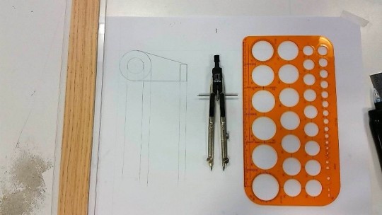
“this was our third drawing task and by this time processes I took back in high school HSC engineering and new processes I discovered in the communications course became natural and fluent once more.”
(reflecting on last week’s experience the use of projection lines and equal spacing is of high importance in these drawings so a pre-made plan of the page setup was established and the result can be seen below, finding the tangent of circles as seen in the above image was found to be merely eyeballing the line as seen appropriate)
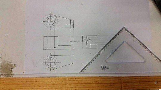
“the following 3 views were completed equally spaced apart with the use of projection lines as an aid and hidden detail lines were drawn in as well as centrelines for the circle elements of the views.”
(the different line types for centrelines and hidden detail lines require specific measurements and spacing's to be applied, there was no fast/easy method found to achieve this other than simply slowly working out the start and end points as you move along the ruler’s edge)
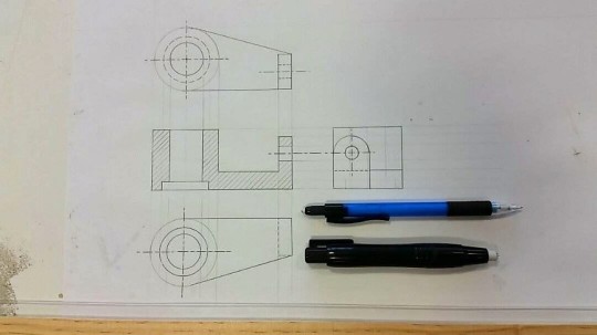
“finally, the hatching lines for the cross-section view was added with the 45/45 set square and T-square combination.”
(a really useful aid that was discovered while completing this was brought up by a fellow student as it was found in the engineering drawing textbook, this was the use of the 2mm indent on the set square which I had always assumed was only used to prevent ink bleeding, instead it was found that this could be used to create equal spacing's between each of the hatch lines)
Reflection Questions:
What did I have difficulty with and what complications arose? Why?
By this week many of the problems I had previously experienced I had come to be able to fix and therefore there wasn’t many complications
The only points of possible improvement and research into better methods of approaching would be drawing lines tangential to the circle and finding faster ways to lay down the exact measurements for the long dash / short dash lines
How would I fix those complications and what would I do differently if I had my time again? Why?
As stated before there wasn’t many complications, just room for improved efficiency, eyeballing the tangent seems to be the most appropriate option and laying down correct measurements simply takes as long as you personally do to work out the maths of distances so there is no true way of improving the processes I have used, I just simply need to continue practicing to improve the overall quality of work
What were some of the key things I learnt, or insights which I developed? What led to those experiences or insights?
All of the insights I developed during the studio tutorial were documented under the annotated images and it was through complications or discoveries made and shown in those images that I was able to learn key lessons/skills/techniques that I should apply into the future.
2 notes
·
View notes
Text
Week 2 Studio Tutorial – Multi View Orthogonal Projection
Task:


Annotated images:
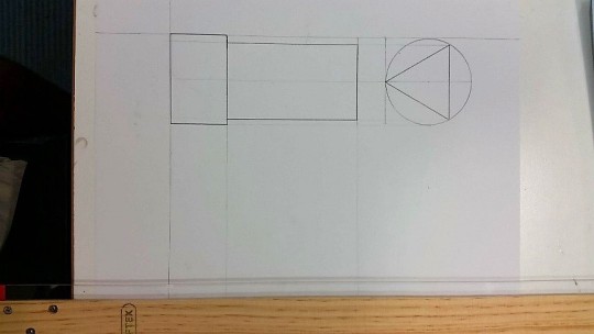
“being the second drawing task, the initial stages weren’t documented as it was very much the same process as the former and complications experienced in the last were taken into account and improved upon in this new drawing, the initial constructions lines were set up using the T-square, set square and clutch pencil.”
(a lesson learnt in this initial picture displayed was the importance of using projection lines to evaluate positions of lines in other views that were unknown)
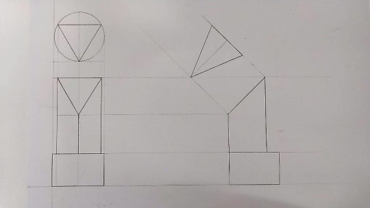
“the right-side view was then drawn in and a new view was added known as the auxiliary angle view.”
(the auxiliary angle view is used to depict an object or lines true length, useful lessons learnt from this was proper planning of a page setup and spacing of the diagram views as I initially had not realised the auxiliary angle view projected off to the left of the right side view and this meant I had to compensate and leave a large gap to ensure it would fit)
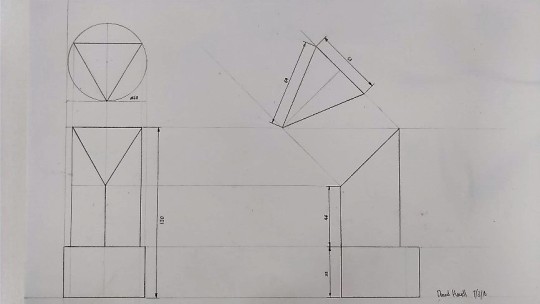
“the drawing was then dimensioned dated and signed.”
(a useful tool/aid found when completing the dimensioning of the drawing was the use of circle template as it had small arrowhead guides that were roughly 3mm in length and 1mm wide, which was later deemed usable and appropriate by the lecturer)
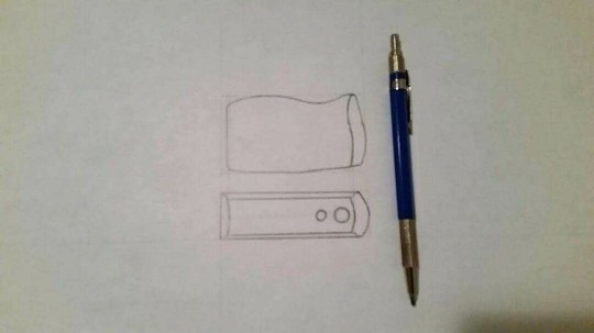
“a drawing of a desk item was then completed in my own time, this was a pencil sharpener”
(as seen in the drawing the object displays something that we have not yet practiced or learnt to draw and this is curves, the overall quality isn’t of a high standard and features such as hidden lines and details aren’t included, overall the drawing was not a success due to its hard to replicate curves, perhaps the use of French curves or working out compass radii for the object would have been more appropriate than estimating freehand)
Reflection Questions:
What did I have difficulty with and what complications arose? Why?
Auxiliary angle view- the auxiliary angle view was a complication that I had to compensate for during my drawing process instead of pre-planning beforehand, the view projected to the left of the side view which meant I was unable to tell how much extra room was needed and simply had to leave quite a large gap
Taking measurements and replicating lines from real world objects- the second stage of the task did not feel like it met a satisfactory level of finish and quality as taking measurements by hand and estimating distances and curved line forms turned out to be very inaccurate
How would I fix those complications and what would I do differently if I had my time again? Why?
Auxiliary angle view- the auxiliary angle view was simply not taken into consideration and from this stage on to solve any complications like this from occurring I should instead make a pre-planned layout before starting a drawing to ensure there is equal and appropriate spacing between views
Taking measurements and replicating lines from real world objects- one of the lecturers recommended the use of a calliper for taking measurements of objects but as this drawing was simply a practice to show the skills we have developed it was okay, after doing research however I found to replicate the curves the use of the French curves probably would’ve sufficed
What were some of the key things I learnt, or insights which I developed? What led to those experiences or insights?
All of the insights I developed during the studio tutorial were documented under the annotated images and it was through complications or discoveries made and shown in those images that I was able to learn key lessons/skills/techniques that I should apply into the future.
0 notes
Text
Week 1 Studio Tutorial – Drawing Instrument Exercises
Task:


Annotated Images:
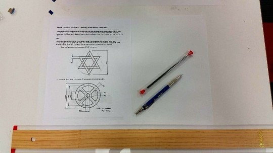
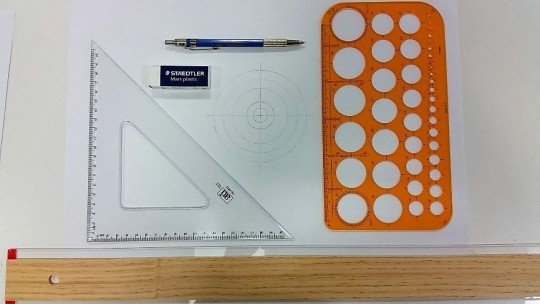
“first image of task and initial equipment used.”
(first time using a clutch pencil rather than a mechanical pencil which was sharp with a point in the beginning but gradually became blunt and being 5mm in diameter later produced thick unclear lines, how to sharpen the lead pieces is still unknown but should be looked into)
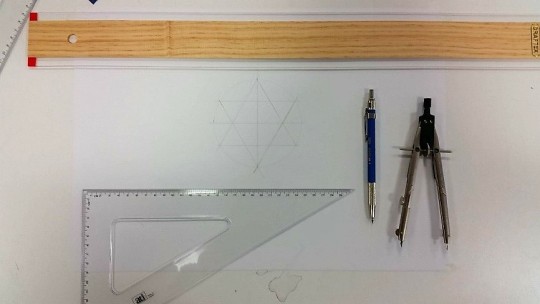
“initial construction lines for the 6 pointed star drawing, the compass was use to create the outer diameter and then with the aid of the 30/60 set square the two equilateral triangles could be drawn in.”
(the T-square should be used at all times to keep lines parallel and also perpendicular when ruling in the horizontal or vertical direction, the set squares should also be used in conjunction with this to ensure angles follow as such as well)
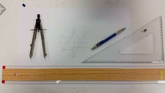
“the secondary lines to add the thickness of the star were then drawn in with the same process as above to complete the star construction lines.”
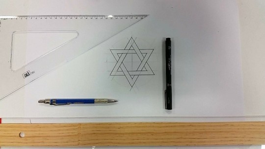
“the inking of the star itself was then completed through the use of a ruler and 0.3 felt tip pen.”
(through the process it was realised that simply using a ruler and lining up by eye was not as accurate as completing the drawing through a similar fashion as the construction lines; using the T-square and set square, another discovery was the two edge sides of the T-square and set square which allowed for inking to run smoothly and not bleed after contact with the piece)
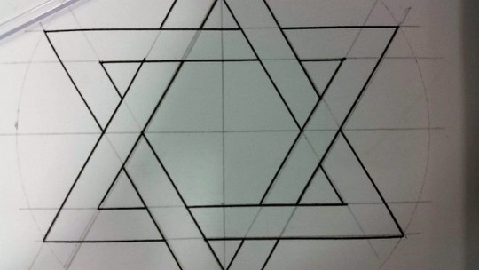
“a close up of the line quality and inking of the 6 pointed star.”
(being the first time using all the equipment in conjunction with each other there was bound to be mistakes, small instances such as inking not perfectly aligning with the construction lines and in some cases continuing past the point it was supposed to stop at degraded the quality and finish of the final piece)
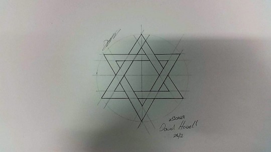
“final work signed and dated.”
“the next drawing was a wheel with a centre circle and radiused attaching members.”
(it was found that the circle template is very useful in this application rather than using a compass as it is not prone to movement and easier to use for small radii, the circle template like the set square and T-square has a flip-side that can be used later for inking, the T square was used to gauge the centre-lines of the circle)
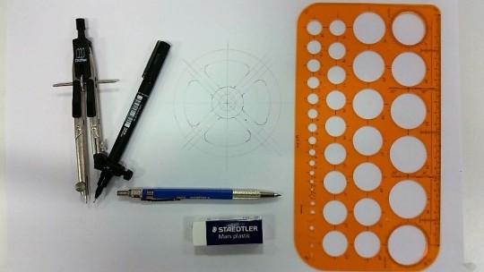
“the 45/45 set square was then used to construct the connecting members and then the circle template was used to create the radii of the joints.”
(the measurements displayed on the exercise page was initially mistaken for diameter measurements instead of radii and this lead to an incorrect construction but was quickly and easily fixed as it was drawn lightly in lead)
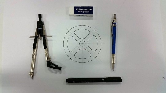
“the image was then inked using the compass and circle template.”
(the compass had a pen attachment that could be used to hold the felt tip pen for inking, however in my use of the compass on many occasions the bottom legs would move slightly by pivoting on the attachment pins)
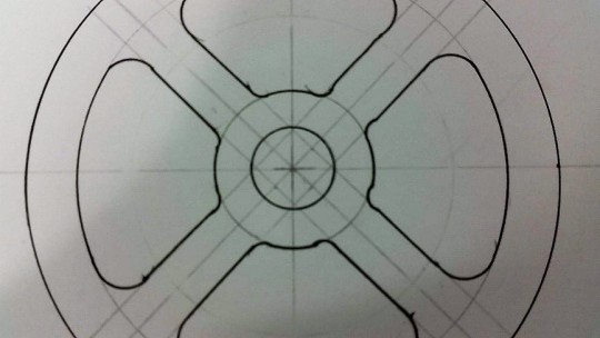
“a close up of the line quality and inking of the wheel.”
(as seen in the image the line quality is not of a high standard as some lines extend further than they were intended to be drawn, the main problem however was creating the radii of the joining members between the inner and outer circles as some bite into the inner circle, the methodology to avoid this was simply to massage the circle template around until the sections lined up)
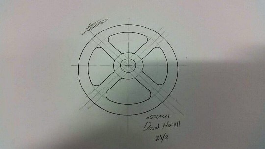
“final work signed and dated.”
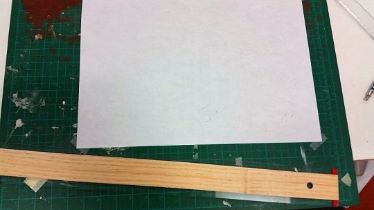
“the next task was to create tessellating objects that were to be cut out with the supplied stanley knife.”
(from the very get-go I had created a problem for myself which was sticking the page straight to the cutting mat in attempt to save time later, this was an issue as the mat moves around and makes it impossible to use the T-square effectively)
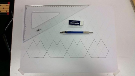
“the tessellating pieces were created by quickly running through an overlaying grid with the T-square and 30/60 set square and then the final shapes were darkened with the clutch pencil.”
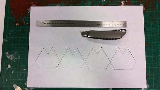
“the stanley knife was used to cut out the pieces with the metal ruler as the guide edge to keep the cuts straight.”
(the metal ruler was used as it is a more appropriate choice than the plastic equipment as they may break under the blade, or the blade may slide over)
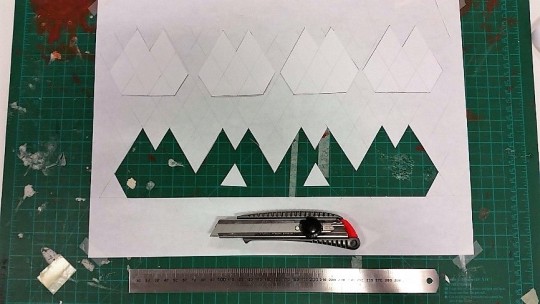
“the pieces were then removed from the paper to exhibit 4 matching and tessellating shapes.”
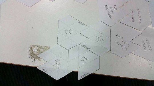
“the pieces were signed and added to the group of tessellating shapes and as seen manage to fit together quite nicely.”
Reflection Questions:
What did I have difficulty with and what complications arose? Why?
Clutch pencil going blunt- this problem occurred simply because its what pencils do as you write/draw with them and wear down the point, being 5mm in diameter the lead was leaving quite a thick line after a while however
Inking- the problem I experienced with inking was over-estimating lines and, in some cases, letting the pen contact the page for too long causing a bit of bleed
Misinterpretation of information- this was simply misinterpreting the radiused joint measurements as a diameter and therefore drawing smaller circular sections
Drawing radiused joints- the construction and inking of these radiused joints also proved to be a problem as lining up the corner lines to become tangential with the circle was difficult
Creating shortcuts to cut- this problem was simply a matter of me trying to speed up the process and rule lines on the cutting mat which didn’t allow for me to effectively use the T-square
How would I fix those complications and what would I do differently if I had my time again? Why?
Clutch pencil going blunt- after doing some research there seems to be specific tools called ‘lead pointers’ which are used to sharpen the clutch pencil leads, however I don’t see how they differ far from a regular pencil sharpener
Inking- to go about fixing this I believe it’s a matter of practice and developing better hand-eye coordination and motor skills as with inking you can’t just simply rule lines slowly or else they begin to bleed outwards
Misinterpretation of information- to fix this I should confirm with others that what I am doing is correct, however this problem shouldn’t happen often
Drawing radiused joints- to be able to accurately create these radiused joints the lecturer simply advised to massage the circle template around until it seemed fit so perhaps it is a matter of practice
Creating shortcuts to cut- solving this problem is easy, simply don’t do it again, but the lesson is don’t try to create shortcuts that only make your work harder to complete
What were some of the key things I learnt, or insights which I developed? What led to those experiences or insights?
All of the insights I developed during the studio tutorial were documented under the annotated images and it was through complications or discoveries made and shown in those images that I was able to learn key lessons/skills/techniques that I should apply into the future.
0 notes
Text
Hey everyone!
I’m David, first year Industrial Design student at UNSW and this is Communications-IDES1261 2018.
I chose to study Industrial Design as my areas of interest were in Physics, Design and Technology and Engineering, but from a young age I had always been drawn to the creative aspects of a workflow or problem. Design can be found in all aspects of our lives and growing an understanding of it, being able to communicate our own ideas, create our own solutions, and improve an overall quality of life is an amazing thing that I have a strong passion for delving into.
Can’t wait to meet you all and engage in each other’s work so we can grow into the future as designers :)
2 notes
·
View notes