Don't wanna be here? Send us removal request.
Text
Last project and days at the bootcamp
This week has been a bit more relaxed after having some good comments from the teachers and the client of the prototype that we have shown them in medium quality. I think we are working at a good pace and we do not expect any major inconveniences for now. However, we still have more tests to do and therefore more changes but I think we have a good working base that makes us feel a bit calmer than on other occasions.
On the other hand, I think we have been lucky because our client does not seem very demanding and we feel that he trusts us. We have been asked for some UX changes to offer a different approach to the user that we have already made.
Apart from this last project, you begin to be aware that we are in the last days of the course and there is a mixture of feelings. On the one hand, we are quite tired, perhaps more mentally than physically, and therefore with the desire to end, on the other hand, with the concern about the uncertainty of what will happen next and the possibilities of finding a job and also the desire to take advantage of the last moments in the best way enjoying each day the best you can.
2 notes
·
View notes
Text
wow 7thy week!
This week I undoubtedly highlight the presentation of the individual final project in front of an external jury, one of the most important and most difficult challenges of the course.
Difficult mainly because he had to take on all 8 UX / UI roles (act as UX / UI project leader, information architecture, visual design, interactive design, technical writing, usability evaluator, propotyping and research).
Once last week I had defined the conclusions of the investigation, the definition of the problem and the idea of the product, having a good base, I felt that the jump to the design of the prototype was relatively easy. But in reality it was not like that, because again I encountered other impediments. First of all with the color palette, with which I was not satisfied but finally after several tests I was able to find a much more valid one. Second, I had issues with the flow design between screens and the information architecture as I was distributing the content not in the best way from the user's point of view. After the crits session and with the help of the teaching staff I was able to improve it a lot more as well as correct some important heuristic errors.
Finally with all these improvements I was able to present a project that could be better safe but of which I am also proud. I also got some good comments and criticism from the external jury.
2 notes
·
View notes
Text
My 6th week at the bootcamp
This week I will mainly highlight one thing: the individual final work. A challenge that motivates me especially but I don't know if I am prepared as I would like to present a correctly prepared work.
In any case, I have started well, motivated because I essentially found an idea that seems good to me. Although after finishing the first phase of investigation I found myself blocked without being able to advance. Thanks to the help of the teachers, I was able to reorient the definition of the problem and start a brief creative process that allowed me to define the idea much better and therefore continue to advance.
It has been in some difficult moments because I had to handle everything by myself, be a designer, creative, product manager ... but it seems good to go through these phases and face alone these challenges that force you to grow and advance.
2 notes
·
View notes
Text
Notes from the The Case Study Factory article
Great article for any designer starting their professional career.
I fully agree with the author that the intensive method is detrimental to critical weighing (there is almost no time to breathe and therefore to think, you have to execute rather than deliberate). One of the extra efforts afterwards to advance this study method is to be creative and make really creative proposals because it is true that the competition is enormous!
In any case, all the tips in this article are very good and can be of great help.
Thanks for sharing!
0 notes
Text
Remote Contextual Inquiry
The remote contextual query seems a very interesting and a priori quite effective method to analyze the use of a software by users. In this case, technology is fully at the service of the usability observation process and provides an excellent source of information. If there is a good selection of users, both in quality and quantity, there should be no excuses to draw good conclusions and implement improvements in the software.
Regarding the session, I think it is good that there is a moderator who supervises the session, previously taking into account the objectives of the session and having a dialogue on the fly with the user to know and clearly record the reasons for their actions, their doubts, expectations, errors, misinterpretations, etc.
Of the aspects to take into account of the remote connection consultation sessions, it seems very appropriate to ask the user for images of the context where they usually find themselves when using the software, since the space and what is around it can intervene in usability. too. For example, light, noise, the number of people around you, your desk and chair, etc.
Video:
The first part of the process is crucial: user identification. and the correct selection of it. A good tip is to choose at least two people from each potential user group and / or at least 6 people in total. And a balance regarding age, gender and users or not of your product.
Another good tip is to manage your time well, dedicate just enough time to each user (2 sessions per day) and plan the sessions very well because time here also means money. Take notes immediately after the sessions, taking advantage of the fact that your thoughts are fresh. Also have time to process the data obtained.
Doing it together with another person I think is good advice to share and confront opinions of the same thing observed.
Definitely studying and properly observing the user will lead to good results to implement in the product.
I will certainly take it into account in my new project and adapt it to the needs of this one, which is yet to be defined.
0 notes
Text
Already the 5th week!
This week has been a bit more relaxed than the previous one, firstly because the work has been divided between two people and also the experience working with my partner has been fluid. We have made steady progress and on very few occasions we have had problems.
This has also allowed us time to prepare the presentation and practice, and I personally recognize that this has helped me to be more relaxed and confident in the presentation. I have confirmed once again the importance of practicing a presentation to be more confident and do it better, less nervous and dominate the scene and the voice, this is greatly appreciated by the audience.
On the other hand, I have been able to experience how complex the code is and design with it. I definitely have to learn and practice more as well as with Figma.
Finally, I highlight the one to one with my teacher, which was the first time I had a conversation with him alone and it was a pleasure. I like that he is a person who listens and gives good advice. I'm sure we'll have a good time chatting again.
Now ready for the next challenge and with the aim of presenting a good proposal!
2 notes
·
View notes
Text
My third bootcamp week :)
This week has been a total bootcamp. It was the worst for me in terms of work. As the teaching staff well knows, I had too much accumulated homework and thanks to the push / ultimatum of the teachers I took my energy to do it and I got it -I have to make a special mention to Lina who helped me with it-
On the other hand, like all my colleagues, I had to develop my individual project in parallel but giving less energy because the priority was backward homework. Then I had a feeling of frustration because I would have liked to dedicate myself much more to the project and make a better presentation. I think that my app proposal is a good business idea and that it could work well but nevertheless it is important to present it and explain it well. Anyway, I'm happy because I was able to meet both goals.
2 notes
·
View notes
Text
Crits – A reflection
My feeling is that the script is too structured and inflexible. It is true that a structure / agenda / script is necessary and above all a time limit but I have to say that I miss a little more freedom and less pressure to say something that maybe I don't know what to say at the time.
I think that in general our ability to correctly explain our proposals with the necessary detail and focus on those necessary aspects is not very good and that also prevents knowing the proposal in detail and therefore creating a consistent opinion about it.
I think that more work should be done to create a much more relaxed atmosphere and that allows communication to flow more on both sides.
0 notes
Text
iOS or Android guidelines I will have to apply in my project
I have to design a prototype of the main flow of a mobile e-learning application. In my design I am going to give preference to the IOS design patterns over those of Android. In any case, I will take into account the following aspects:
1. Tab bar:
I'm going to use a tab bar at the bottom of the screen to create a maximum of 5 shortcuts. Anyway, Android has a universal and permanent navigation bar at the bottom of the screen that affects all applications. Therefore, in the Android version this bar should be located at the top.

2. Back button:
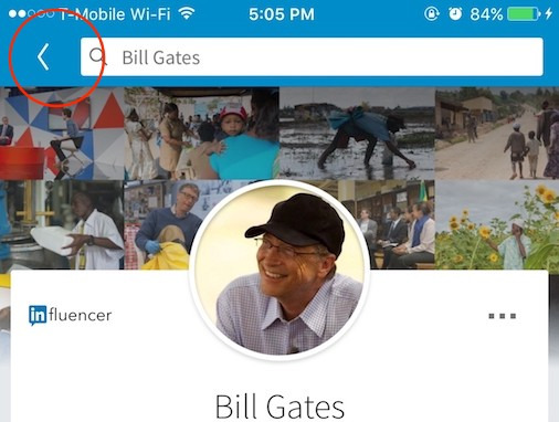
Something very similar happens with the action of going back to the previous screen. In my design I am going to put the back button in the upper left part, as required by the IOS canons, but if I made a version for Android this button does not have to be located anywhere on the screen since it is an action that it is included in the Android universal navigation bar at the bottom of the screen.

3. Hamburger button:
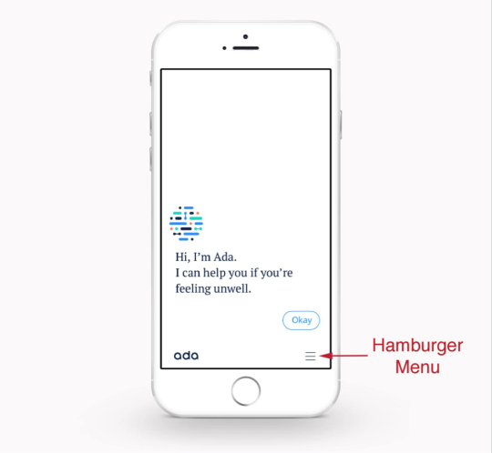
I do not rule out using it to access a secondary category of options but instead of locating it in the upper left part -where it is usually located in Android- I would put it in the lower tab bar as shown in the photo and the application does Ada and also Facebook. In the event that the information architecture requires it.

4. Typography.
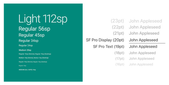
Due to my preference for using HIG, the font to use will be San Francisco. In the case of making an Android version, you could not continue using this font, and you should use another that is compatible, such as Roboto. In addition, you should take into account the body of the types since for each one you would have to use a different body since the resulting size also changes.

5. The style of the buttons:
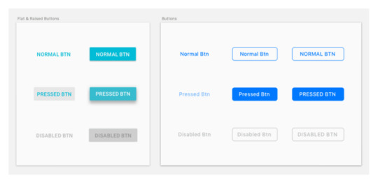
And finally, another difference between the two design guidelines is in the style of the buttons. In my case, the buttons will be using upper and lower case and inside boxes with slightly rounded edges. On the other hand, if they were for Android, they would be in capital letters and inside boxes without rounding the edges.

2 notes
·
View notes
Text
Notes about Learning to See article
Talking about learning to see the author is saying that “ you can’t expect to sell what you can’t explain.” Related to that I think it is appropriate to add that also you can expect to sell what you don't need to explain. To get a good design in terms of UI shouldn’t be necessary to explain anything to the user or buyer (client) to feel that the product has a proper design. It should be enough with the experiencie after the use to check if it is a good design or not besides the layout of course and without any explanation.
Related to Steve Jobs sentence -” [Design] is not just what it looks like and feels like. Design is how it works”- I could not agree more. I would say that the user expects a benefit from any interaction with a product, regardless of the image. A user may be very attracted to the surface but their relationship with it will last only on the basis of function.
And about Dieter Rams said -”talking about good design is as little design as possible—Less, but better—because it concentrates on the essential aspects, and the products are not burdened with non-essentials. Back to purity, back to simplicity.”- It’s increible there are too many designers not taking care of that. Maybe is a problem of emphatize or too much selffish would say but anyway design is a way of communication and should has the same rules to be a success communication: short, clear and precise and be first under the funtion and second the estethics.
0 notes
Text
Third week is gone. The time is flying!
During this week I have devoted myself almost entirely to the development of the third project -the second as a team-. It has been a challenge that motivated me especially from the beginning because I saw a very realistic situation that can happen in a professional environment. In this case, the challenge was to integrate a new feature to the Cabify app, specifically to share the payment of the service between different passengers. It was quite a challenge to act as a user center designer and to design not only something that was well integrated with the flow of the application, but also that made sense with the user's needs and was at the same time simple and intuitive. . In the team, at the beginning, we dedicated ourselves to thinking individually and later discussing the proposals of each one as a group. I think this step was key to define a starting point in the design and I think that thanks to this the body of the feature was well received by the rest of the colleagues when they judged our presentation. I am proud of the result despite having the feeling that I would have liked more time to refine the prototype further. In any case, it has been a very good experience!
2 notes
·
View notes
Text
My second week
This week was our first project working individually like the rest of my colleagues. Some exciting days wanting to create and demonstrate but also stressful at certain times and feeling the pressure to present an attractive prototype that made sense as well as well justified with the conclusions of my research.
In the first days I felt good and safe because I believed that I had a good theme and could extract a good proposal. This made me be sure of myself and a little less stressed but after finishing the survey I felt more unsure how to proceed following the research method and how to specify to reach more precise and concrete conclusions.
With some suggestions from the teachers, I felt unblocked and I was able to move forward with more confidence until the end of the project. I must admit that the part that I liked the most was the creation of the prototype and I especially value the crits sessions and usability tests.
In presenting the project to the class, I must admit that I was insecure because I had not prepared myself or had not practiced before. This has caused me a bit of frustration at not being able to explain as I would have liked. Anyway, the balance is positive.
0 notes
Text
My first week at Ironhack
First of all, I would like to highlight the team experience of the development of the first low definition prototype. I really liked the experience even though it was stressful and not at all easy. I have appreciated the quick decision-making along the way, that these decisions have been agreed upon in the team and I feel that the contribution of each one has been important and key so that the final project has obtained a good response from the classmates and teachers. I feel proud of my participation and the result. Finally, I highlight a very important aspect for me, the good atmosphere that is breathed in class. I have not had a chance to chat with everyone individually yet but the impression with everyone is very good, including the staff.
Defenitly a great start!
2 notes
·
View notes
Text
My first day at the bootcamp
My first day was very good! full of positives. Everything was very well planned in detail. I liked the general presentation of the entire school team following the philosophy of a great team using zoom -a very good solution considering the limitations-
The pace of the first day was constant but very relaxed -and grateful for this-. I also liked the explanation of the planning and the tasks that we are going to do during the course.
On the other hand, I would highlight the teacher's style. I like that he transmits passion for his work, patience, he is a good communicator, he is detailed, he has a lot of empathy -he worries about whether you have understood exactly what he is explaining- I only worry that maybe I can’t hear him always enough because the mask. Anyway I am happy with having Nevan as a teacher. Also Lina and Dani, the assistant teachers, seem always ready to help. In short, an excellent first impression!
2 notes
·
View notes
Text
My new path in UX UI
Hi! I'm going to write a little about myself so that you can get to know me a little better. I am from Barcelona and I currently live in this city but that does not mean that I was always sedentary. I like to travel and I have had longer stays in Australia, the US and the UK where I have worked or studied. My higher studies are in Audiovisual Communication and for years I was working as a Product Manager creating content for advertising, television and the internet. Later I was oriented towards sales until recently finishing my job as sales manager in a food ecommerce. I have always been very interested in design, its aesthetic part but above all the functional part with which people's lives can be improved. Precisely this side of design is the reason why I see UX and UI design so attractive and what prompted me to make the decision to make a change in my career in this field of design. Today was my first day of class at the UX / UI design bootcamp at Ironhack Barcelona school and I am very excited and excited about this course! It is sure to be a great experience!
1 note
·
View note