I'm an animator from New Jersey. Lead Character Designer on Craig of the Creek. dannyhynesportfolio.tumblr.com [email protected]
Don't wanna be here? Send us removal request.
Photo
Best blog on tumblr. Has been for years.

ISOLATED COMIC BOOK PANEL #2606 title: OFFICIAL HANDBOOK OF MARVEL UNIVERSE DELUXE EDITION #10 - P60:1 artists: ELIOT R. BROWN year: 1985
55 notes
·
View notes
Text
The background team on Craig are SO unbelievably talented...it’s a constant inspiration to see the work that they do. One of the great joys of being on this crew is getting to work alongside Cory, Katie & Santino. These concepts are especially beautiful.
The Other Side: Background Concepts
From Background Designer, Katie Wells:
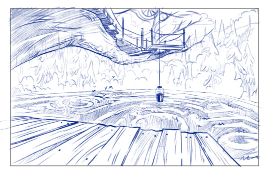
“The King on the The other side holds power over other kids by having what kids want: the best snacks and playtime equipment. So sometimes he comes across as a really friendly, generous kid.

But he also has a darker side, some kind of really scary punishment he saves for when a kid really double crosses him.The design team sat down with Ben, Matt and the writing team and sketched and talked about what the The King’s dark threat could be. We joked about a chest-deep "hole of shame” you have to stand in while kids point and laugh at you, or like, a bottomless pit you could never crawl out of. But we needed something kids could actually create. I suggested a labyrinth, because I love the myth of Theseus besting the Minotaur and escaping the Labyrinth of King Minos. It was said that the creator of the Labyrinth, an artificer named Daedalus, made it so hard to solve that when he finished building it he barely managed to get out with his life. Ben said it best: “It’s so hard to escape that by the time you make your way home you are so late for dinner you are grounded from the creek …FOREVER.” I did this drawing of a giant maze of brambles in the woods and The Maze was born.“
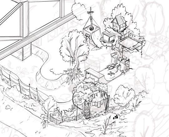
From Background Designer, Santino Lascano:
"Designing The Other Side area was fun, since we had some time to explore and go a bit crazy in pushing different ideas. I had a super rough abandoned skate park concept for the new kingdom as one. The King’s throne room was where I got to concentrate my time on, when the design team narrowed down the main area.
Initially there was an idea of TV screens everywhere, with the King’s face was broken up abstractly on each one.
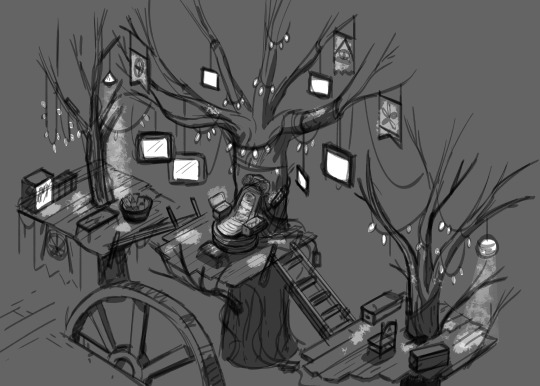
From there I liked the idea of lights and electricity being a part of the throne room, so we could have some dramatic lighting moments. I thought this was a good way to really differentiate The Other Side vs the Creek Kids’ area.”

From Lead Background Designer, Cory Fuller:
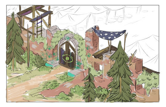
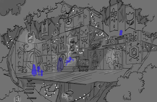
“Once the initial ideas for the Other Side were nailed down, I started working on a rough of the King’s Court, mostly trying to figure out what our kids would see as they entered through the gate. I tried to push the scale of the fort, and how the trees would play against the mill to make it feel fantastical and overwhelming.

In the final drawing I really got to develop the space, and help build the world that is the other side of the creek. A lot of brainstorming went into what materials would be used to build the stands, and what kind of things we would see in the market place. The Report Rando’s and Check Weapons stalls were added to help sell the idea that the King really controls the way these kids play, and who is welcome in his court.

1K notes
·
View notes
Text
Behind the Scenes of “Kelsey the Author”
From co-creator, Ben Levin:
“I feel so proud of this episode. It says so many things in 11 minutes. It’s about the power of DIY, the joy of making stuff, expressing yourself, and also about the risk of putting yourself out there and imposter syndrome.
The episode also stays true to one of my main hopes with the show: inspiring kids to be creative and imaginative by portraying (somewhat) grounded adventures.
Kelsey publishing her book was a story we’d kicked around a lot, but took a while to refine it. There were so many versions. For example, there was one where Kelsey was selling her books at the Trading Tree, but the concept of art as a commodity didn’t feel relatable. That’s not why we all had started making drawings and writing stories as kids. We did it because we just wanted to share these weird stories in our brains.
So we came up with this version where the plan was just to give them out at the library, and it unfolded from there.”

From Head Writer, Jeff Trammell:
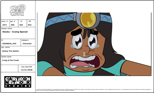
“One of the things I was really excited about for “Kelsey the Author” was the chance to further explore the relationship with Kelsey and Stacks. They’re really good friends and a lot of people are fans of their dynamic, going all the way back to “Final Book”. This was our third episode really getting to explore their friendship, so it was great getting the opportunity to show Stacks, who clearly values the opinion of Kelsey, become inspired by her. Especially considering Stacks’ reaction to Kelsey’s story is what pushes Kelsey to create copies of her book to share with other kids.”
From Supervising Character Designer, Danny Hynes:
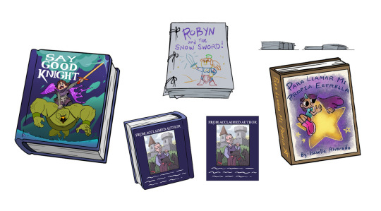
“The coolest thing (to me) about Kelsey the Author, is that in order to make an episode about creating your own DIY publishing operation, we basically had to create the drawn version of our own DIY publishing operation. Everything you would need to make a book got a design. We have stacks of paper, binder clips, glue, scored cardboard. If Kelsey needed it to make a book, we needed to make a model for it. Going through the prop folder is really satisfying for that reason. Our prop designer, Maaike, did an amazing job creating all of those miniature tools and supplies.“

From Lead Background Designer, Cory Fuller:
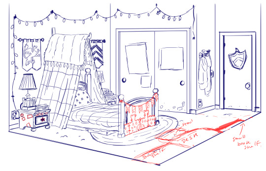
“When I was doing the concept drawings for Kelsey’s room, I wanted to show her personality coming through over top of some more “traditional” little girl elements. Things that were bought for her when she was younger that she would be expected to grow into, like her bed frame and end tables. I also wanted to chart her passion for reading by adding a variety of bookshelves. One from early childhood, followed by a regular bookshelf when when she out grew that, and additional wall shelves her dad had to put up. There’s also a pile of books on the floor that there is currently no space for.
BG designer Katie Wells did the final designs for the episode and really brought the space to life by flushing out the designs and adding her own personal touches. She came up with really fun and creative ideas for the posters on Kelsey’s wall and the titles to all her books. She created the goofy titles by spoofing her favorite fantasy books using names of her friends’ DND characters.”
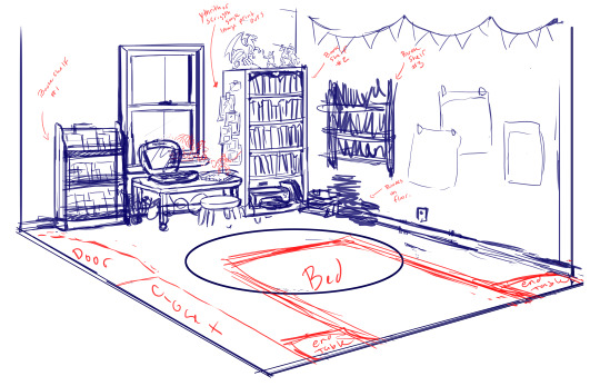


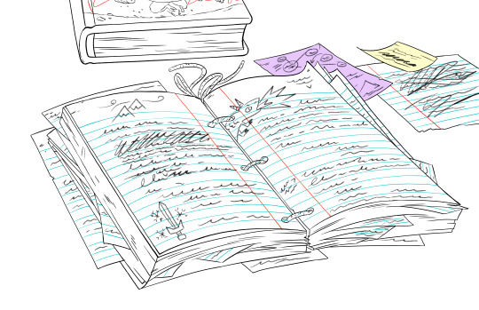
Outline by Jeff Trammell
Background designs by Cory Fuller & Katie Wells.
Character Designs by Danny Hynes, Benjamin Anders & Colin Howard
Prop Design by Maaike Scherff
Color by Carolyn Ramirez
1K notes
·
View notes
Photo
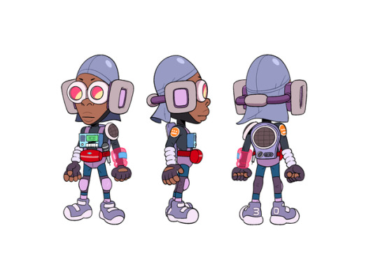
Deltron Turnaround from The Kid From 3030
Designed by Freddy Carrasco
Color by Benjamin Anders & Carolyn Ramirez
2K notes
·
View notes
Photo
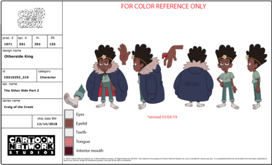


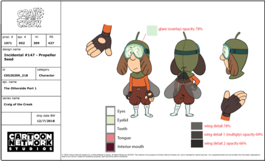


A selection of character designs from The Other Side half-hour special.
Designed by Danny Hynes and Benjamin Anders
Color by Carolyn Ramirez and Benjamin Anders
2K notes
·
View notes
Photo


some of the earliest Wildernessa drawings I did. She was a lot of fun to help develop.
656 notes
·
View notes
Note
Hey! Thanks for taking the time to answer this if you do! :), I've been a community college for a while now trying to get an AA (a couple of years than intended) with the intention of transferring to a university with an animation program. But I'd like to know. Is a degree really required? (Or certificates anything like that) to actually WORK in animation. Can you get work if you work and improve hard enough. Without college/uni?
Unless you’re working in production, if you’re making work that people like and want on their projects, then that’s all you actually need. I’ve interviewed many people for jobs and never asked or known whether they went to art school or any school. I usually ask about where they’re from, their influences, things like that, but I can’t remember a time I’ve ever asked about schooling because I don’t think it has anything to do with their work or how they’d fit into the show.
I’ve just been given their portfolio, interviewed them, seen if I want them as part of the culture we’re trying to build, maybe ask around to friends at other studios to know if they’ve worked with them, and that’s it.
Any one or two of those things can outweigh others. I hired people who don’t know anyone from other studios, this is their first job, and I loved their work! I’ve also hired people whose artwork or style choices weren’t quite in the area that I was looking for, but I know people who know them, and they assure me that the person can totally switch styles into something else and they’ll do great.
There are also a lot of different kinds of animation jobs you can get into in the industry:
Color stylist
BG Paint
BG layout
Prop designer
Character designer
3D modeler
3D texture
3D lighting
Rigging
VFX
Storyboarding
Animatic
Editing
Sound design
I seriously can’t even name all of them
The advantage of art school is the community. You’re basically given a community of people that are all in a similar standing as you and figuring everything out along with you, offering advice and friendship. The friends you make there are the people that also go into a similar field as you, so when they’re at a job somewhere else they’ll be able to say “oh I have a friend that can do that!” You can also get a bit of formal instruction which can point you in directions for your art you might not have otherwise thought to look. Personally, I also liked that school gave me structure in which to work.
That said, it’s expensive as hell, and that makes it not include a lot of people who would like and should be able to go, but are unable to afford it. Being in debt is extremely difficult and it can really mess with your life for years and years. So it’s all about balance and figuring out what’s right for you.
So again, I would say no, you do not need to go to art school for animation and you shouldn’t feel pressured to. However, if you think it would help you and you have the ability to pay for it, go for it. It’s all up to you!
356 notes
·
View notes
Note
hi there, I love your personal work on here! I'm a struggling artist trying to "make it" and I wanted to ask for character design, what is the best type of project to show in your portfolio? Would it be better to have a big cast of characters of one style to showcase consistency or multiple styles to show versatility?
Thank you! The best work is work that shows your skills...so in a way...the specific things you draw don’t matter so much. If you did 10 amazing drawings of one character and a full lineup of different characters that was only so-so, it would always be better to showcase the better drawings, even if it’s the same character over and over. So whatever turns out the best is what you should put in your portfolio! All killer, no filler.
56 notes
·
View notes
Photo


Character Designs of the Bad Moves band members from The Vulture’s Nest
Designed by Danny Hynes & Benjamin Anders
Color by Carolyn Ramirez
2K notes
·
View notes
Photo

An early turn of Craig from when we first started the show!
2K notes
·
View notes
Photo

found some plant people hiding in front of my @wei_ss_man print
131 notes
·
View notes


