Don't wanna be here? Send us removal request.
Text
Mandolorian fan art (11/5/22)

This is a fan art I did a while ago. I like the fact that the anatomy looks good mostly. However compared to the original image the mandolorian I have drawn has a bigger head that is facing directly forwards whilst the original image has his head looking slightly down.
0 notes
Text
FMP character evaluation (5/5/22)
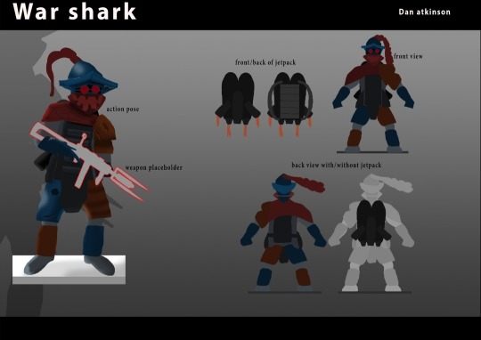
I don't think this character fits very well on a desert planet .
My FMP is set on a desert planet and this character at first glance doesn't look fit for purpose.
To improve my character design I could add sand and dirt to his armor this will immediately make him look like he lives in a sandy environment because people would see the sand and come to the conclusion that he lives in an area with lots of sand.
However this character is also meant to be out of place in the desert which is why he wears colours that completely contrast the colours of sand.
Knowing this I should probably only add small amounts of sand onto some of the armour pieces such as the helmet and shoulder armour. I could also make the goggles look more like goggles you would wear to stop sand from going into your eyes in a sandstorm.
But I will only add this changes if I have time at the end before the deadline.
0 notes
Text
Project proposal (4/5/22)
An issue with my project proposal is that it isn't that realistic this is because the supportive material I have made isn't what I stated I would be in the project proposal because I needed to meet deadlines. As I had spent too much time doing multiple things at once.
0 notes
Text
FMP game production
For my FMP I have done some of the first stages of game production. I have mainly done the planning and pre production concept art.
However I need to do more planning and research because the it was the feedback on my midway presentation. I can develop my FMP planning by researching what sells in the industry for a shooter game by viewing articles and videos.
0 notes
Text
Visual based problems (25/1/22)
A visual based problem is a problem that needs solving on softwares such as photoshop and Premier pro in order to continue working.
For example a visual based problem could be that you have accidentally hidden a layer in photoshop. it could also be something more complicated such as you have misplaced a jpeg file in Premier pro and it has messed up a frame of an animatic.
0 notes
Text
Group project reflection (research)
When researching for my group project tribal character I was looking for references so that I could convey that the character is wild. The idea was to make them look very tribal but then not have as them as hostile and evil. So I researched what made tribal people look hostile in films such as Indiana jones. And came to the conclusion that wearing bones would make a tribal person look hostile. red face paint would also create this effect so I decided to avoid those design choices and made my character wear a lot of leaves and feathers.
I watched the first part of Indiana Jones as primary research. This was to see how the tribal people walked and stood so that I could potentially use it to pose my character.
Primary research is good because its research you do yourself which could help you get a more accurate perspective in which you would draw something. Primary research could be something like making a Pinterest board, watching clips from a film or going out to take pictures of trees for an environment concept art. However primary research always takes longer than secondary research which is a disadvantage as it gives you slightly less time to meet deadlines.
Secondary research however doesn't have this problem because secondary research is research already done by other people. Examples of secondary research would be reference images or finding pictures of poisonous jungle flowers of the Internet. A disadvantage of secondary research is that it isn't as accurate as primary research as you might not get the perspective you want from somebody else's image.
0 notes
Text
EA22A:
For this homework we had to add sounds to a muted gameplay clip. I used about 20. These sound effects range from sword impact from when the character hits an enemy to music when a character uses a special attack combo. I also used other sounds such as when the character dashes forward there is a whoosh sound effect.
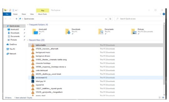
These are most of the sound effects I used besides the photoshop files. I got all of my sounds from freesound.org , cartoons inspired some of the sounds I chose such as the arrow impact sound and the sword dash sound. This was because the gameplay clip I was editing used the pixel art style which meant it wasn't to realistic. Other sounds such as the execution scream I edited with audacity as I added a bone crushing sound with the scream as it made it sound more lethal.

The final result of the homework was actually not bad as I think I chose good sound effects. However I think I can improve by making the sounds sync up more with the gameplay footage. I also should have added footsteps to the gameplay but all of the 3 audio rows were messy as you can see in the image above. This meant that I couldn't have the footsteps going on at the same time as other sound effects so I had to cut the footsteps out. So in the future I will have to organise my Premier pro audio assets much better in each row. This will also help sync the sound effects.
0 notes
Text
Group project review (6/1/22)
Today after presenting the group work we ve been working on for a month, I feel like I could have done better in the presenting. As I didn't really make eye contact and I went through my slides very quickly even though they had loads of extra information. In the end we managed to get over some of problems we had at the start. These problems included coming up with the lore which I didn't massively help with but I think my jungle character fits perfectly with it.
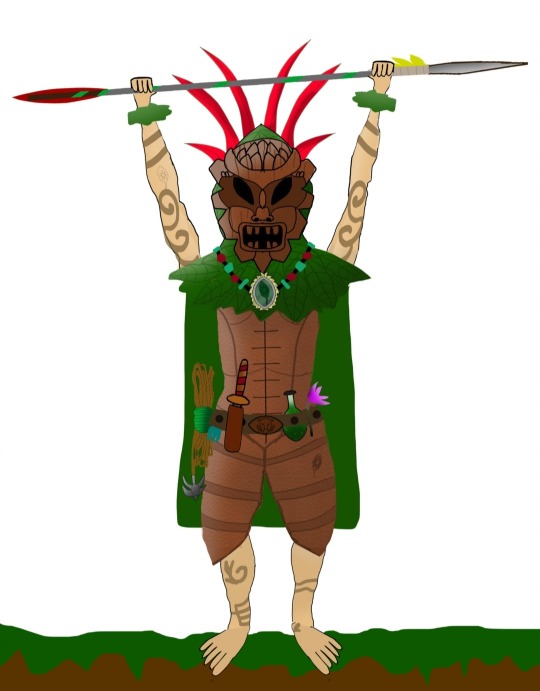
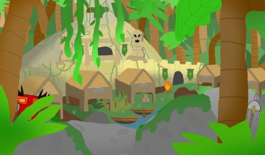
Compared to the rest of the members of my group my artwork is almost as good. However I need to improve my anatomy knowledge as Tom and chris' character look more realistic. I could also next time take pictures of myself for pose references as it worked quite well for Tom as he did his characters hands. If I did this my character will definitely look more human like.
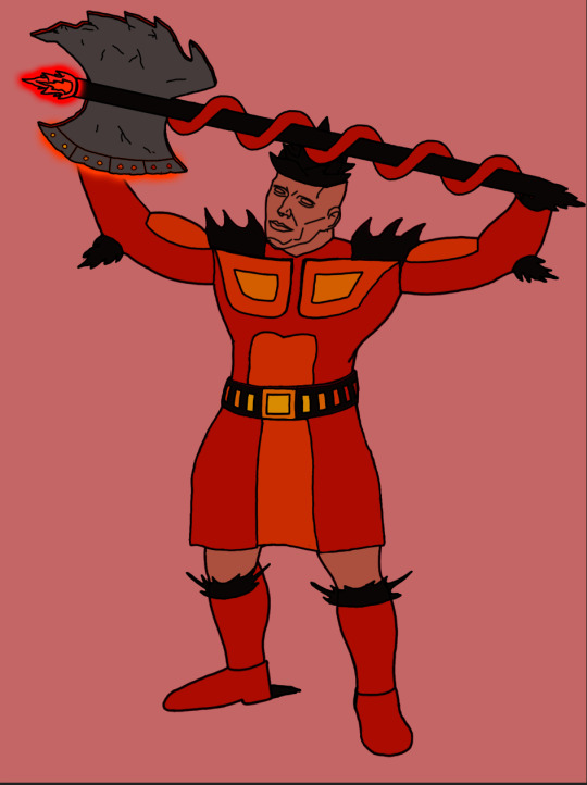
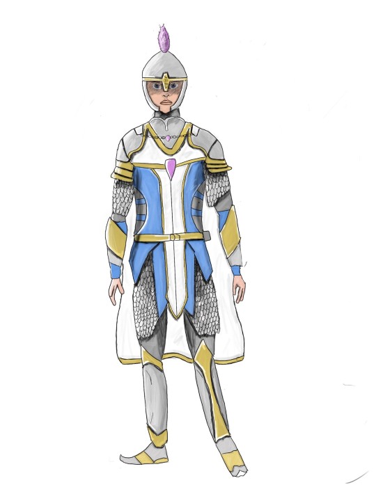
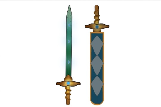
I also should have included this sword I did for Chris' water culture in the powerpoint
0 notes
Text
Observation fan art
(8/12/21) today I made a fan art on spiderman to improve my observational skills it went good because I improved my coloring skills in photoshop too. However compared to the image I was was copying the image had much better anatomy however I am already trying to improve at this because it is my smart target. I am working to improve my knowledge of anatomy by trying to draw people for at least 2 hours a week
0 notes
Text
Group project
(2/12/21) this week we worked on our next assignment it is a group project where we have to make our own culture and some concept art to go along with it such as character designs, level designs and weapon concepts. We also had to do an artifact of some kind that the culture was protecting. We decided since we had a lot of time to do them to do one culture each that are all connected to each other. I got the jungle characters which I have made a mood board using different references such as tribes and aztecs. It went quite well despite having few images It probably would have been better if had more images as I only had about 8 images. The moodboard was made with images of grohk from paladins and some tribal people from green hell as well. Compared to the rest of my groups' moodboards mine had by far the least images.
0 notes
Text
Level design
(23/11/21)
Today we continued on our level designs I managed to get the design to get to a point where it is ready to be coloured in photoshop. I need to improve my knowledge on the perspective of the room i designed because I had to redraw multiple things I could probably do this by going on YouTube and finding tutorials to help me draw in 3D. I managed to fix most of the issues I had by using what I had as a template and then drawing over it which helped improve my linework the new version of my room was also better than the old one. I now have it ready to be coloured I haven't done it yet but I have decided to go with a colour scheme of purple, blues and greens as when I was researching wizard houses concepts on Pinterest these were often chosen as they portray something being mysterious. For the actual design of the room I was kind of inspired a little bit by Harry Potter as I had floating candles in the room.
0 notes
Text
reflective journal 2
6/10/21 - today we learnt about perspectives in a natural landscape using some of the information we learnt about the colour theory. such as pallets and values. however we firstly learnt about foregrounds, middle-grounds and backgrounds to make it look like landscapes are further away we then used this to create themed landscapes within 5 minutes. Afterwards in the afternoon i created an ocean themed landscape this was very helpful at getting me better with the lasso tool.
1 note
·
View note