Don't wanna be here? Send us removal request.
Text

these are the comments that i recieved on my advert on facebook.
0 notes
Text
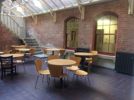
This is where we recorded our advert for freak or unique
0 notes
Text
Video production evaluation
I was asked to create an advert for my freak or unique blog post on Tumblr. I created the advert within 3 weeks although it took me a week to edit. I was asked to create this advert for my freak or unique blog on Tumblr.
Overall, I believe it went pretty well. I believe that we worked really well in all aspects of the production although I believe that we excelled in the editing phase of the production. We added all sorts of music and we cut the sound out of some pieces of the raw footage. We could’ve communicated more as we were working in a team but it worked out pretty well overall.
Throughout making this advert I have learnt how to edit using adobe premiere. Another thing I have also learnt would be how to add different music during a video. Thirdly I have also learnt how to cut out different parts of a video. This is very helpful as it allows me to just use the footage that I want to use.
Personally, I enjoyed making and editing the advert. The reason I loved doing those parts specifically would be because I love using the computers and now that I know how to edit footage, I can use this skill later on in other things like if I wanted to edit my own piece of footage for a YouTube video or something else like that.
In my opinion, I would change how I edited the footage because I don’t believe that I had enough time to edit the footage that I had. If I had more time I could’ve edited it more and this would’ve made it a lot better as I could’ve added more music and maybe even effects such as different transitions when going into a different part of the video.
0 notes
Text

this is the layout of adobe premier. the screen on the bottom left is where all your footage goes that is unedited.
the box on the top left is where all the unedited footage goes. you can edit the footage there aswell.
the box on the right is where all the edited footage goes such as cutting the image down or where you add text and the such.
the box on the bottom right is where all the sound goes. you can add and delete noise or video footage here. this is helpful as it allows you to choose where to put the videos or the music.
0 notes
Photo
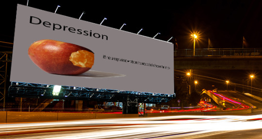
I Photo shopped my advert onto an empty billboard right next to a busy street. i had to stretch the image to make it look as if it is actually on the billboard. i had to transform the image by changing the size whilst holding control to warp it and stretch the image into the size of the billboard. After all of this it looks like the advert is actually part of the billboard as it is stretched to fit the billboard.
0 notes
Text

Advert evaluation
This project tasked us with creating an advert. For my advert, I produced a depression advert to raise awareness for this mental health issue. To make this I had to use Photoshop and edit in a piece of orange into the hole in the apple.
To do this I had to research weird photos of fruits because I wanted to make a unique advert that stands out from every other advert that has been made so far. Initially I was going to create a different advert. I would’ve needed to cut a slice of an apple out and then edit it into a human ear. It wasn’t possible for me to achieve this as I didn’t have the skills necessary to fulfil this task. So instead I decided to do this advert as it was more achievable and I could complete it in the time limit that I was set. Doing this research allowed me to find inspiration for an advert before this one came to my mind, so from my point of view, I believe that my research proved to be very beneficial.
To produce these images I had to take a picture of the props with a white backdrop. We also had to use a hot light to give ourselves enough light to take the pictures. A difficulty that I faced was the amount of time we had to take the photos. Although it was roughly 1 hour and a half it put a lot of stress on me as I have never properly used a camera before.
Some skills that I picked up on the way would be that I learned how to use some aspects of photo shop although I still need to learn how to use other tools on the software. One skill that I thought that helped me the most would be either the pen tool or the spot healing brush as these tools were key in helping me finish this advert because without these I wouldn’t have been able to even start editing together the advert. The marquee tool was very useful as well as it allowed me to cut a perfect rectangle out of any shape and use it in any way I would want to. I had to use all this tools combined to design and create this advert because if I was unable to use any of the tools on Photoshop then this advert would’ve been impossible to create.
Personally I feel like my final piece went pretty well as the purpose of the advert and the image of the apple and orange fit its purpose for the advert. So overall, I am feeling pretty happy with my final piece.
If I could do this differently, I would because at the start I had a different plan in my mind. I wanted to take an apple and cut a slice out of it and then photo shop it and then replace it with an ear and then use it to represent deaf people.
For my next assignment I need to remember to bring in enough props for the photo shoot otherwise I will be unable to take any pictures for that day and it will be a waste.
0 notes
Photo
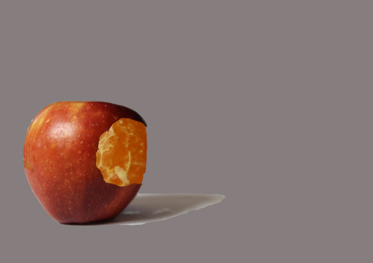
this was my final montage of the photo before i added in text and transformed it into an advert.
0 notes
Text


These adverts have a weird Idea of getting their Product across to their Audience. Although they do it in a funny way to make it possible for everyone to remember the advert which will bring back people to keep buying their products. For the first advert (tango) they use an old VHS type of font to make it look as if they are watching a VHS tape. This is useful as it gives the advert authenticity when it starts rewinding.
The second advert from Crusha has been made to be a little bit wacky and out there. It also has a ton of color to catch the eyes of younger people such as children and teens.
The third advert made by coke has been made to show that everybody loves coke. At the start of the advert, it starts with a bird’s eye view of a large park which looks like it’s in America. This would catch people’s eyes because it will make the advert look very interesting.
The fourth advert created by Midas (an American advert) has got very bright colors for the logo at the end of the advert to catch people’s eyes when they watch the advert. These colors for the logo also compliment the graphics of the advert as when the advert starts there is a glowing yellow hand which talks to a man in the car. This means that the colors compliment the graphics in the advert.
0 notes
Photo
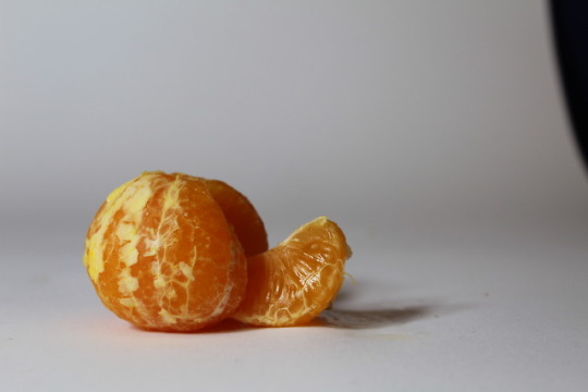
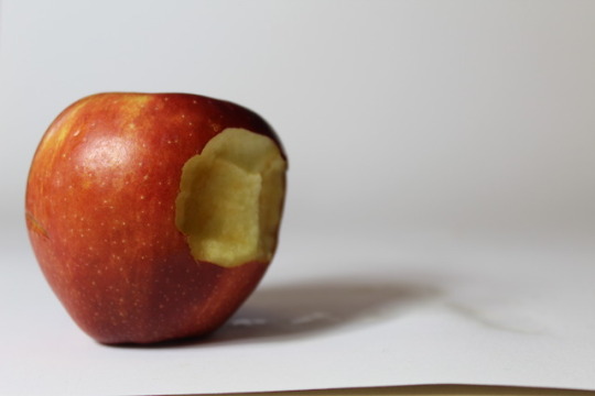
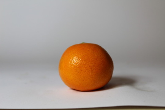
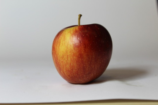
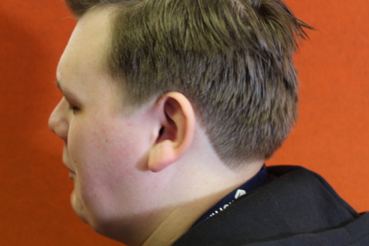
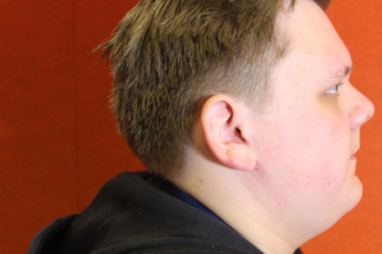
these are my final version of the images that i edited together to make my advert. these have mostly all been editing together in another photo to piece together my advert. Overall i think that the advert went pretty well.
0 notes
Text
for my photographic advert i would need a couple of apples to take photos of. then i would need an orange to take a picture of to edit it in with the apple on photo shop. i would then need to take pictures of someones ear to edit in that as well with the other props that i would be using.
0 notes
Photo
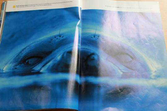
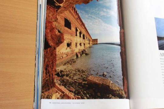
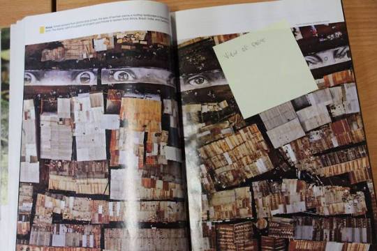
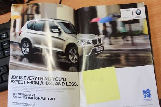
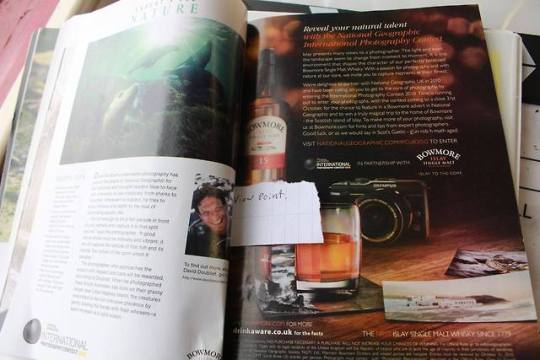
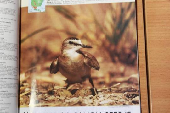
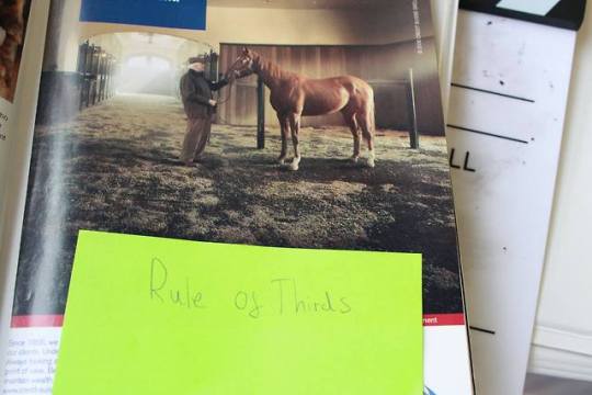
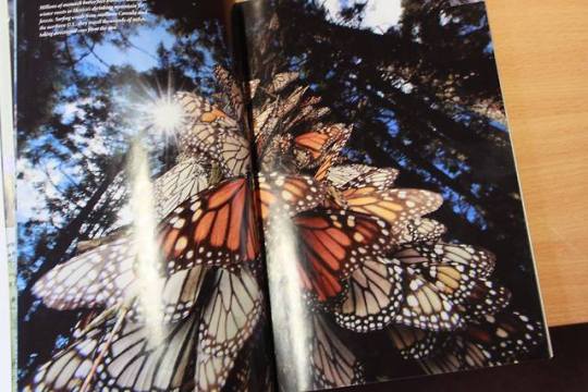
all of these photos have different composition rules. we took photos of these photos to show different compositions in these photos.
0 notes
Text

This is the area that we used to film our advert. we thought that it would be a perfect set up as we needed a cafeteria for our advert.
0 notes
Photo
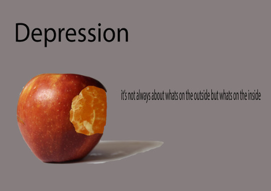
this is my poster that i made today. i feel like i could change the background to try and relate to the subject a bit more as i feel like that would make it look a lot better. to create this i had to use Photoshop. i had to use various tools such as the spot healing brush and the pen tool. these allowed me to cut away and clear up certain spots of the image that i wanted. i also had to make a background such as the grey one in this image.
Peter.L I think the message that Daniel is portraying is brilliant and the grey background emphasize the importance of the issue.
Caitlin W-B - I like the idea that Daniel came up with for his advert. It shows to everyone that depression is a reoccurring matter and it shouldn't be hidden.
Alicia- I like how the slogan fits in with the picture. I also like how the inside of the apple is an orange to show that everything is never as it seems. The positioning of the text is good.
0 notes
Photo
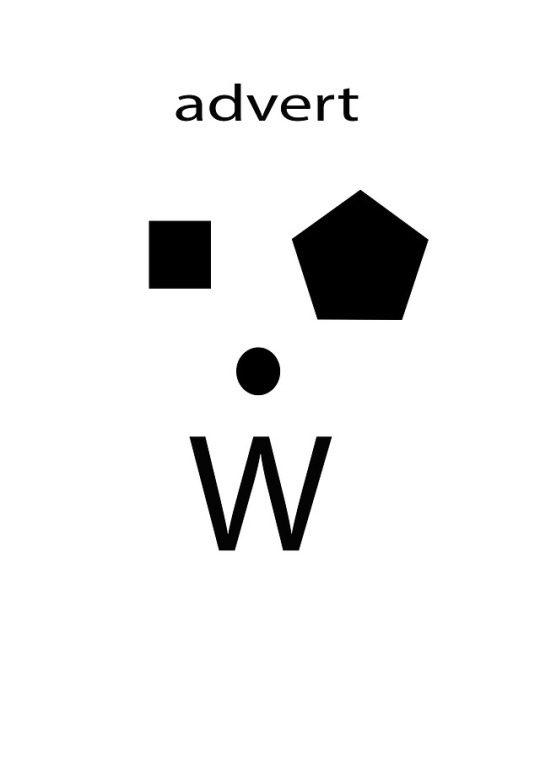


This is my composite image that i made in Owen's lesson. i did this by making a border and a grid to make it more accurate. i could use these skills in my poster design to help make things more accurate. it also helps stopping things from leaving the page.
0 notes
Text
today i have edited the photographs that i took last week of the apples, oranges and my friends ear . i edited an orange under the skin of an apple to try and show depression as ‘not everything is as it seems’. this was the quote i used on my finished product of the advert. i tried to edit a cut piece of orange and replace it with an ear but i failed doing that because i want able to edit it in properly and the quality of the ear picture was low which led me to to do the depression advert.
0 notes
Text
Photographic proposal
-props
· I will need to bring in an apple so I can photo shop it to look like an ear has been cut out of the apple. This could work perfectly so that it could be an advert to sponsor guide dogs.
-equipment
· To achieve this photograph I would need near perfect lighting. Another piece of equipment that I would need to even use the camera would be an SD card because without this I wouldn’t even be able to take pictures with the camera. After the picture has been taken then I would need to edit it on photo shop by editing out the cut off piece of apple and replacing it with an ear to represent deaf people.
-photographic considerations
· I would need to focus the image of the apple so that it doesn’t look too blurry. I could also use the rule of thirds which means that you put an object in the corner of the camera lens. I could also possibly change the depth of field and give it a shallow one so that I could write over the blurred objects in the back of the image. I would want to have a high ISO so that more light can come into the lens which allows for a much lighter image which makes it easier to see.
-editing techniques
· In photo shop I would need to use the spot healing brush to get rid of the white areas on the apple then I would need to get a picture of an ear then I would need to use the pencil tool to cut out everything that I don’t need of the image then I would use the spot healing tool to get rid of any rough edges or anything else that I don’t need. I may also need to pull an image off of the internet of a guide dog so I would need to crop that image so that I could use it on my advert.
0 notes
