Text
Fun fact, the working title for the typeface was "Times Old Style", since it was originally supposed call back to (at the time) older styles of serif type, like Plantin or Garamond, which The Times newspaper was using before. But as the design process continued more modern influences from typefaces like Baskerville and Perpetua kept popping up and so "Times Old Style" as a title didn’t fit any more. So "Times New Roman" it became. The New being in reference its more modern influences. For your consideration, the influences on Times NR in comparison:


It's been 93 years, can we stop calling Times New Roman "new" now?
277 notes
·
View notes
Text

That 3D Objects folder was a relic from a time when MS tried to get into the then-booming AR/VR business, something that has since proven to be more of an albatross than a true cashcow.

108K notes
·
View notes
Text
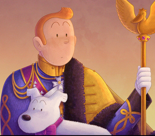
this is a follow up to the post I made months ago about Haddock in the Syldavian guard uniform
Apparently this image is too big for Tumblr somehow, I hope posting it works
4K notes
·
View notes
Text


Harley Quinn in Paradise #1 (2024)
written by CRC Payne art by Siobhan Chiffon & Cathy Le
3K notes
·
View notes
Text
it was a stroke of genius to give James T Kirk a bitchy flip phone in the 60's, truly amazing to watch him slam it shut like a pissed off socialite girl in 2000's teen shows
55K notes
·
View notes
Text
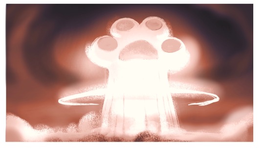
I am become boop, the destroyer of worlds.
45K notes
·
View notes


