Text
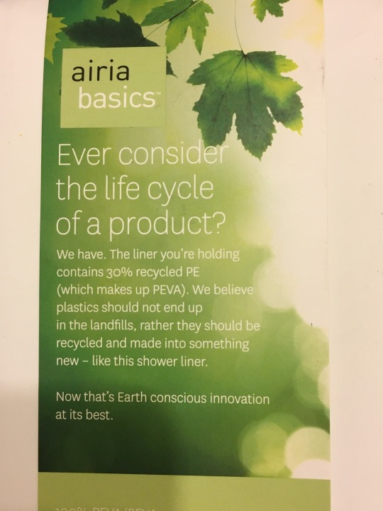

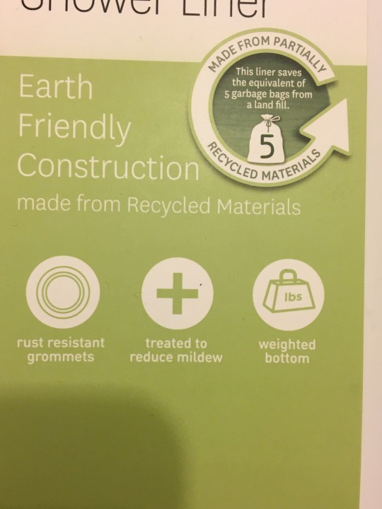


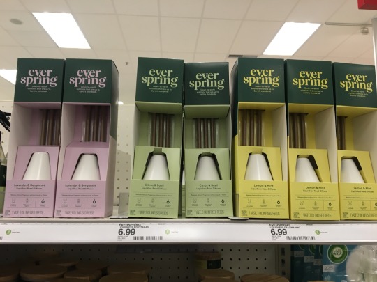
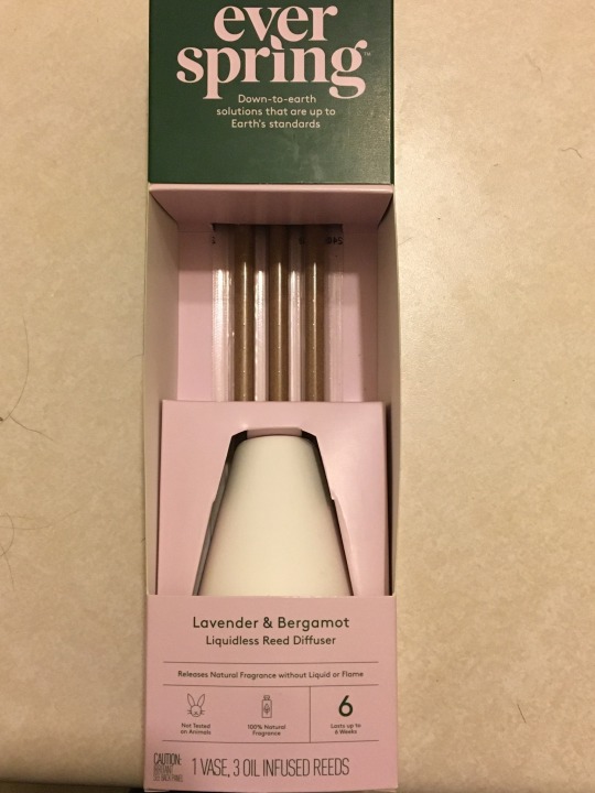
Examples of interesting packaging and details that make them stand out.
2 notes
·
View notes
Text
Garden kit inspiration
https://www.pinterest.com/cheyennecarrasco/project-1-garden-kit/
0 notes
Text
Vernacular Type (Final and Process Work)
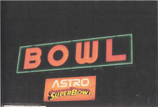
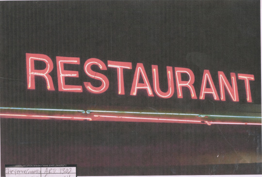
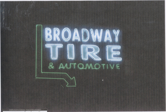
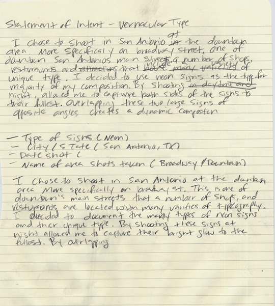
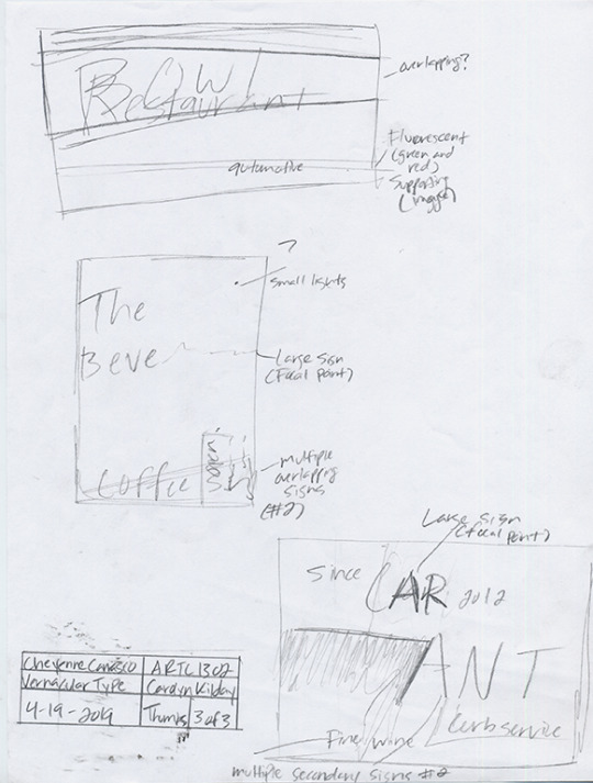
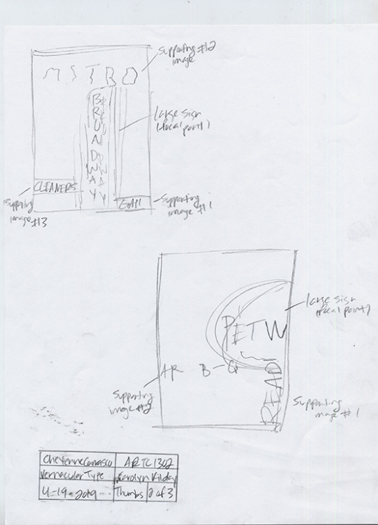
Beginning comps
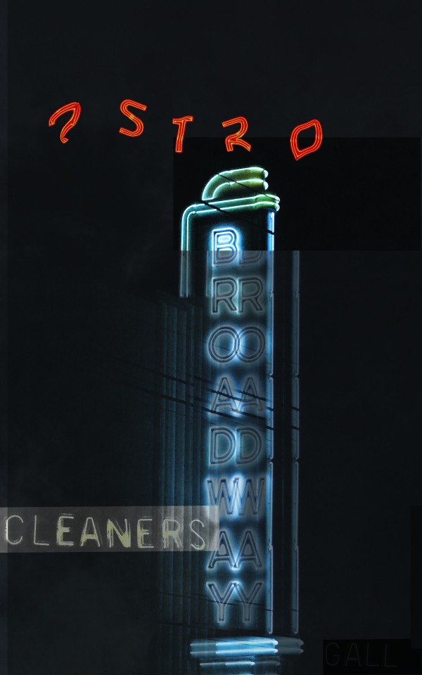
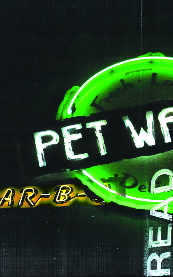
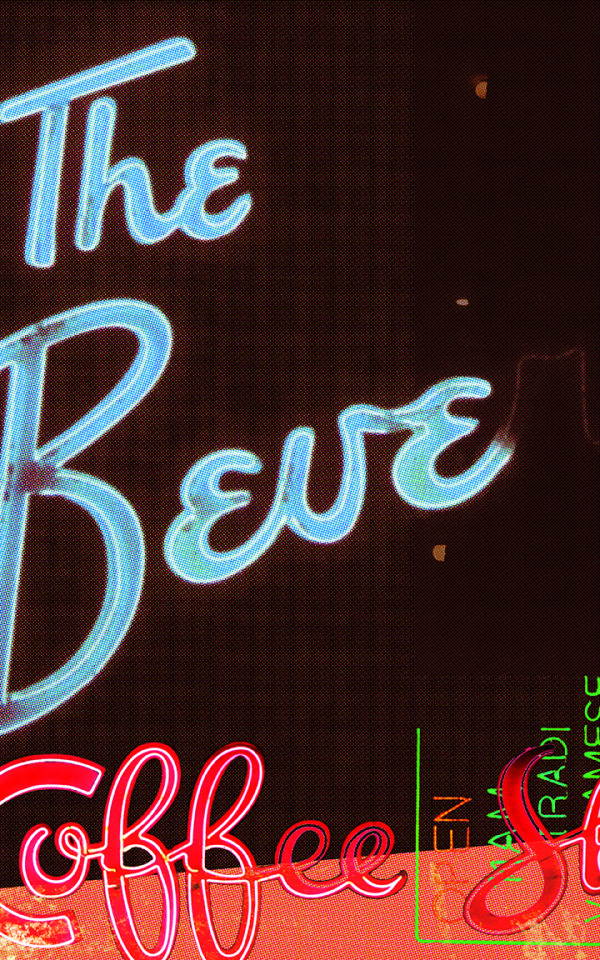
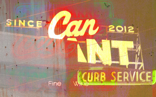
Final
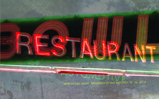
#ComDesFoundations
0 notes
Text
Opposing Forces (Final and Process Work)
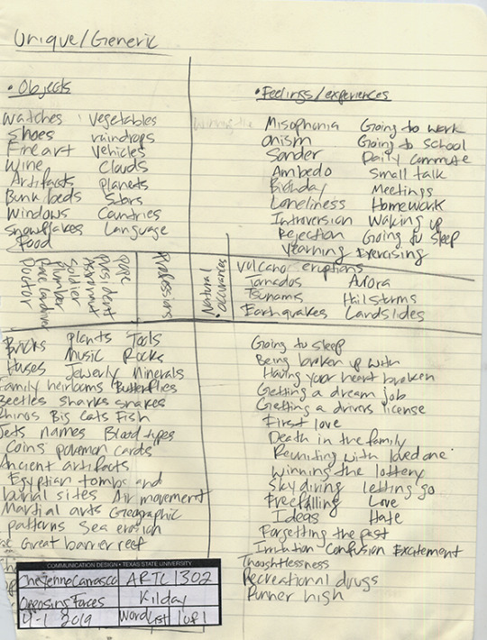
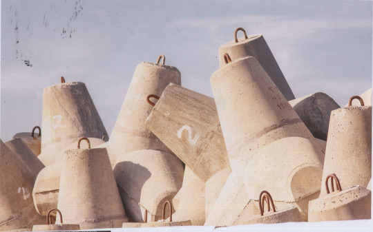
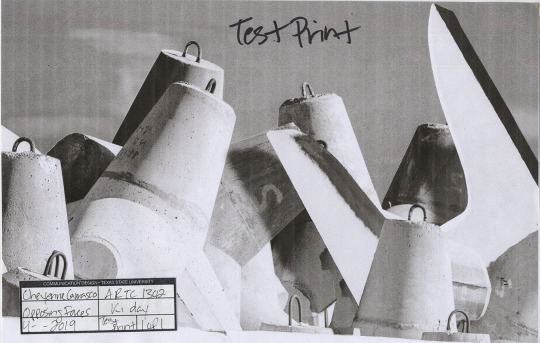
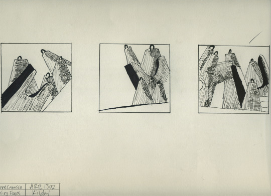

Final
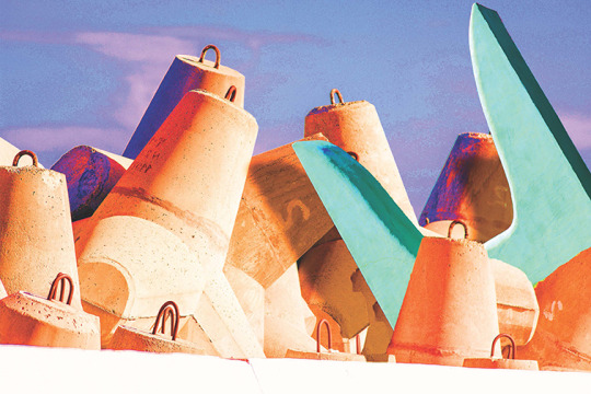
1 note
·
View note
Text
Creative Thinking and Where It Takes Us
The idea of creative thinking is a tedious process to some, and to others it is an absolute necessity. This isn’t to say the process of creative thinking isn’t necessary, it’s just that some find it more beneficial to include this process to their overall strategy and mechanics of what is involved in conceptual ideation and production. Some people like to get straight into it and start creating without much to go on and make decisions and revise as they go on. And others prefer to go step by step as they create and ideate so that each phase is thoroughly thought out and a structed and constructed idea is generated. If a designer chooses to go down this path, there are four steps that are included. Preparation, incubation, illumination, and verification.
In the preparation phase, the main goals are to identify the problem, and goals that a designer or team aim to solve and achieve. Gathering information and conducting thorough research are key to feeding the materials a designer needs to solve problems. Brainstorming as much as possible to find ensure absolute accuracy that the problem is solved, and all requests of the user and client are met. During the preparation phase, the problem is as Graham Wallas said, “investigated in all directions”. This next phase is called incubation. It has been commonly referred to as a period of unconscious processing and taking a moment to step back from the information and research gathered. The purpose of this it to intentionally let the mind wander and involuntarily let ideas and solutions slip into your brain.
During the preparation phase so many ideas are being generated so the goal during the incubation phase is to reduce the interference of these thoughts and let them marinate naturally. While the designer or creative is going about their daily activities, the contemplation of generated ideas will subconsciously and ongoingly organize themselves. After the incubation period occurs, the phase of illumination arrives. During this transfer of steps, the ideas that may have seen blurred and obscure are now clear, and the solution is developed matured. The idea that has been tumbling around in the designer’s brain is now at the moment where it all makes sense. Graphic designer Paula Scher has likened this phase to the winning alignment of a slot machine, saying, “the same kind of chance-opportunism masquerading as serendipity that fuels much scientific discovery.”
The final phase of this entire process is the verification production. This point in creative thinking entails the removal and narrowing down of all ideas that aren’t exactly the best solution for the problem. The idea is to reduce and idea to its exact form and demonstrate whether it satisfies the solutions and ideas generated in the preparation phase. The verification and preparation phase are connected in a sense that they talk to one another in a conscious and deliberate effort to test the validity of the idea and its final and reduced form. Also, during this stage Kaufman warns that, “you’re not done”, and that “some of the greatest creative ideas of all time can easily be lost because they’re not packaged right way or consumable”.
At the conclusion of this process, the designer will be able to determine of the solution is suitable for the problem that was established in the first phase. Like mentioned in the beginning, this process isn’t always a necessary tool for a designer, and it will either be a hindrance to some, or greatly beneficial to others. The main idea behind this process is that if it is followed thoroughly and thoughtfully, a viable solution will be produced and the structure behind it is solid without flaws.
Works Cited:
“The Art of Thought”
Popova, Maria. “The Art of Thought: A Pioneering 1926 Model of the Four Stages of Creativity.” Brain Pickings, 30 Jan. 2016, www.brainpickings.org/2013/08/28/the-art-of-thought-graham-wallas-stages/.
“How to Think Like a Great Graphic Designer”
“How to Think Like a Great Graphic Designer by Debbie Millman.” Goodreads, Goodreads, 30 Oct. 2007, www.goodreads.com/book/show/426289.How_to_Think_Like_a_Great_Graphic_Designer.
“The Four Stages of Creativity”
Stillman, Jessica. “The 4 Stages of Creativity.” Inc.com, Inc., 1 Oct. 2014, www.inc.com/jessica-stillman/the-4-stages-of-creativity.html.
2 notes
·
View notes
Text
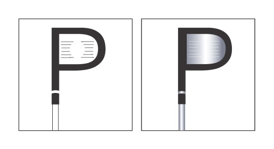
Letterforms & Objects (Final and Process work)
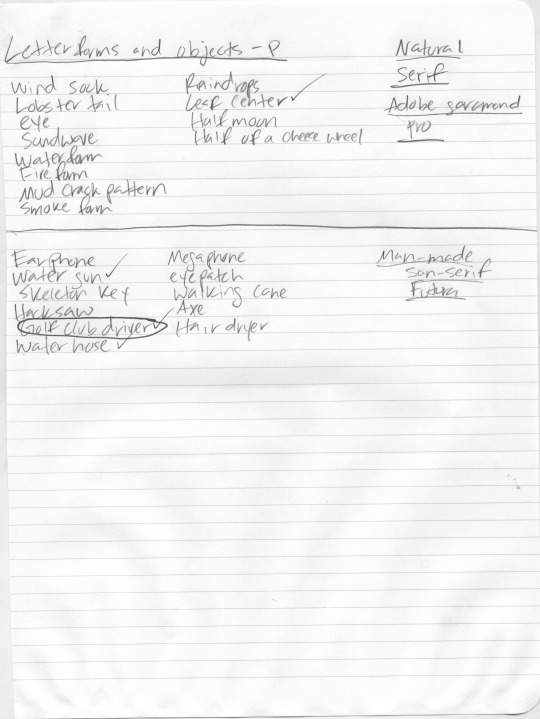
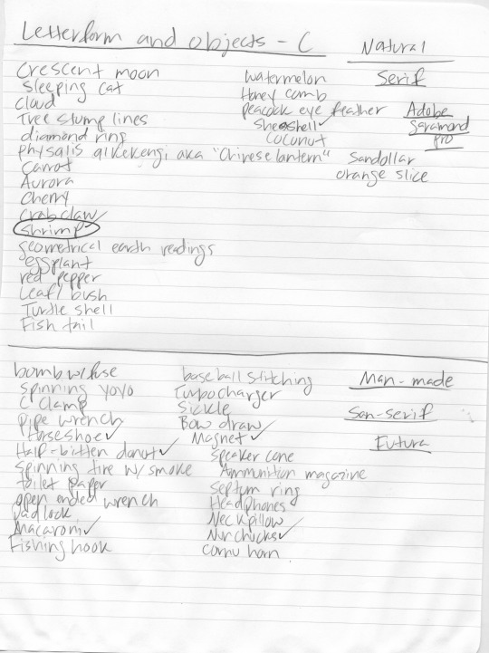
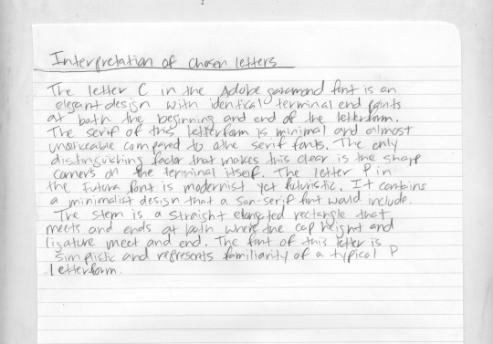
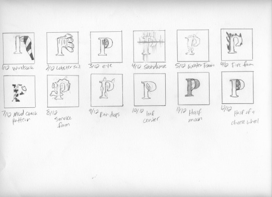
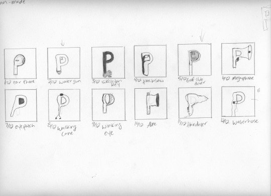
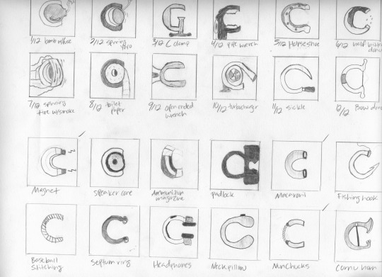
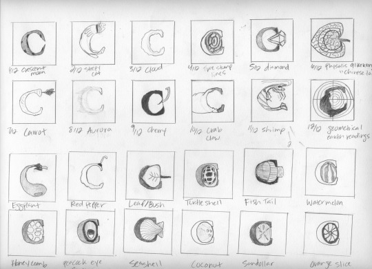
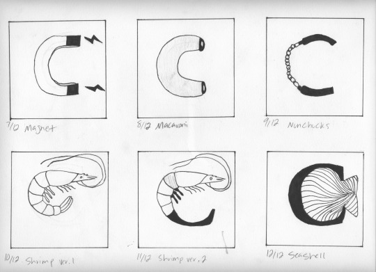
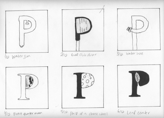
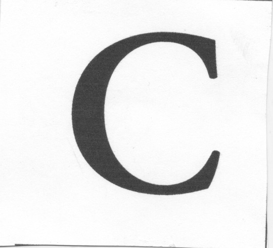
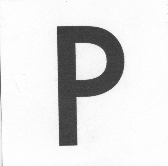
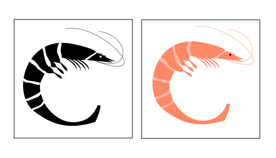
0 notes
Text
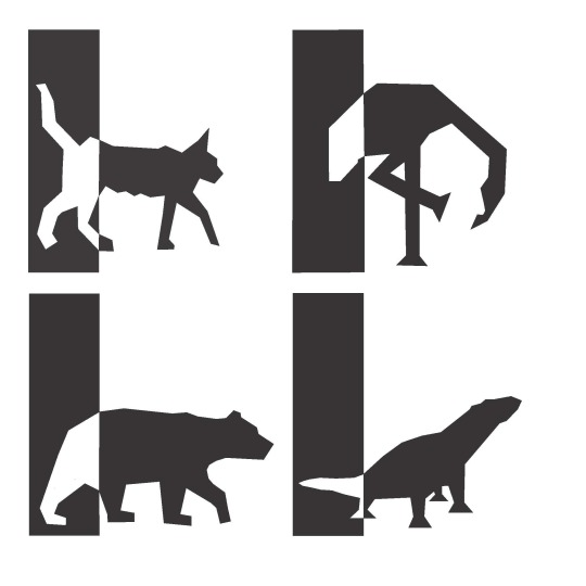
Pictogram System (Final and Process work)
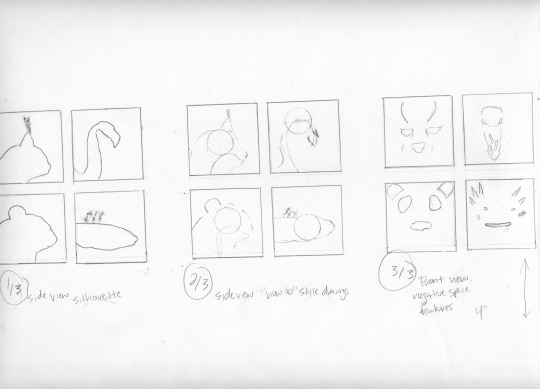
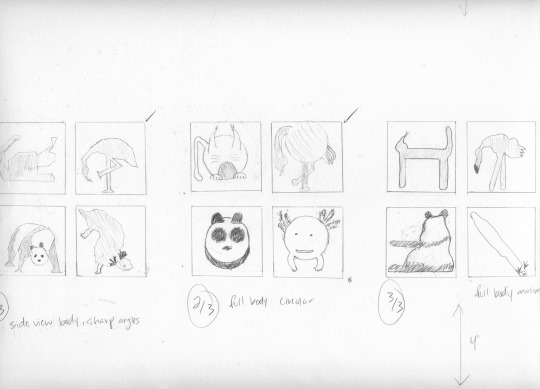
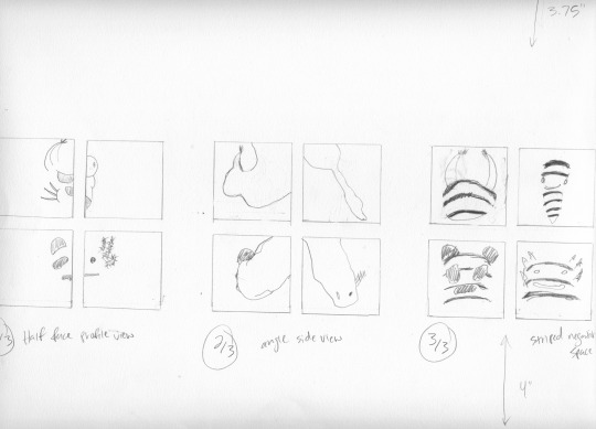
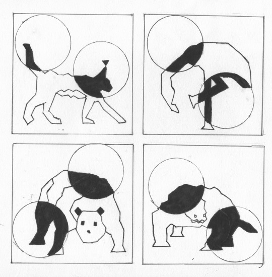
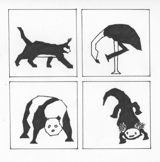
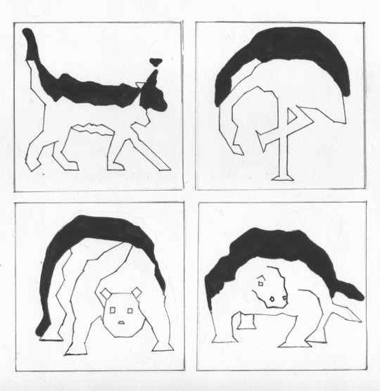
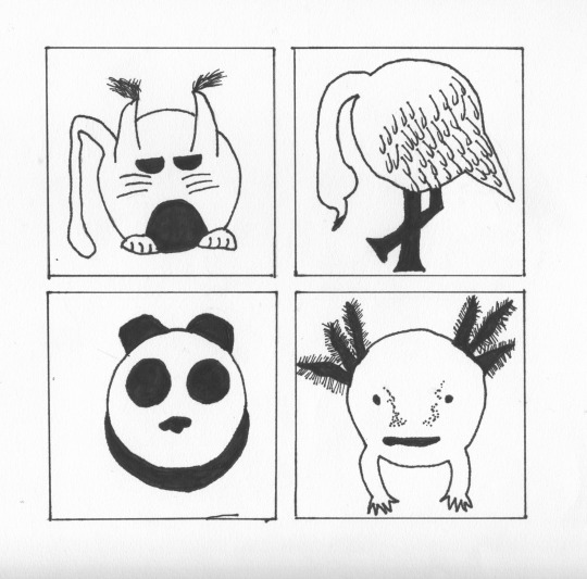
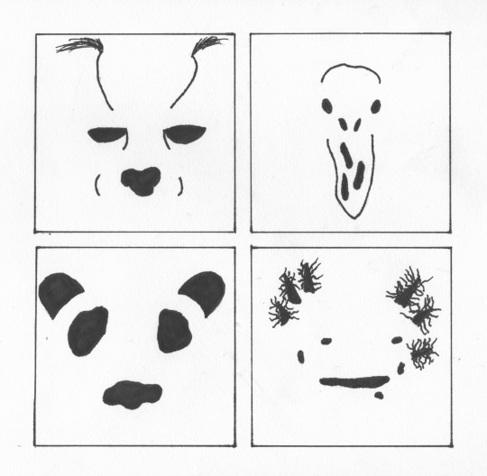
Chosen rough for final project.
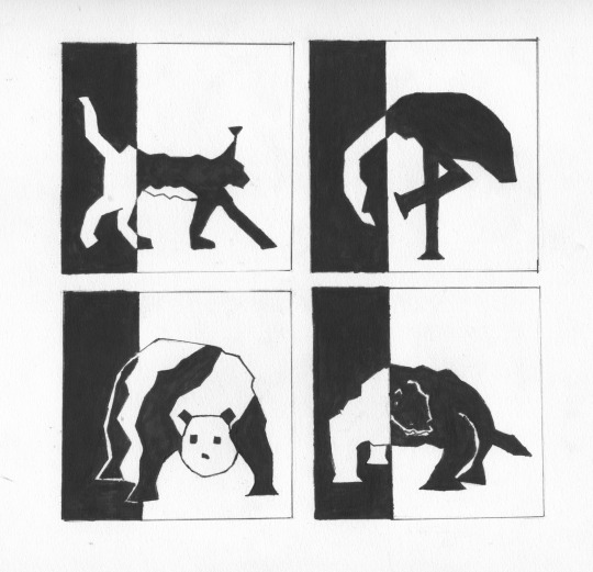
Final outcome after some revision and alterations.
0 notes
Text
By Design (Design Thinking)
Like many processes, there are always specific and experimental steps that are key to the success of a final end product. This is no different with Design Thinking. Many can argue that there is no one certain way of what the design process steps should consist of. While this is also true, the process of design thinking is intended to create a type of thinking ideology to guide ideas in the right direction. Many designers will have their own process to which a concept is created, but these are the steps that help guide designers to a flourishing project.
The beginning step includes the understanding of why you are trying to solve a problem and who it will affect and why. In this step observation is conducted of users that will be a part of this idea that is being developed. In order to get a better understanding of what an audience needs they must be able to empathize with the user’s experiences, wants, needs, and concerns. This research is very critical so that in the end a problem is solved because the issues were addressed in the beginning and now the process of problem solving can begin. I believe many interviews should be conducted so that a wide-ranging amount of information is received. This should be done in a non-judgmental way that doesn’t interfere with the opinions of users.
The process of defining and outlining the problem can now be determined by the information gathered from the first step. Once this information is taken in, the problems areas can now be assessed and the decisions that need to be made are evaluated according to where the user’s problems lie. Once the main problem is established, the challenges are solved, and ideas will begin to generate. In the step of ideation, all ideas are worthy and should be divulged to the entire team so that all aspects of the problem are covered and thought through. The prioritization of relevant ideas and the most likely to succeed should be determined so that a selective process narrows down the most promising ideas. The more ideas that are generated, the larger the scope of creativity and problem solving becomes thus leading to a greater success rate. This is best said in An Introduction to Design Thinking Process Guide, that all ideas must be generated in order to “uncover unexpected areas of exploration.”
Once multiple ideas are generated narrowed down to the most promising, the next step of creating physical prototypes begins. These prototypes should be not to scale and created with the intent of exploring all aspects and features of the project thoroughly. It is important to keep it simple at this stage so that many prototypes are created in a short amount of time so that the best end product is delivered. As stated in Design Thinking Comes of Age, models created “add a fluid dimension to the exploration of complexity, allowing for nonlinear thought when tackling nonlinear problems.”The testing stage is where a close to finished product is returned to users for feedback so that all and any changes or edits may be implemented before the final result is released. This is the step where notes should be extra carefully taken of what works and what doesn’t. Once this is recognized and refined, a product can be released without any issues.
I believe it is important to be mindful that design thinking is a non-linear process despite the model of design thinking being listed in ordered steps. These five stages are not always sequential and at times designers find it necessary to go back and forth through the design process however they see fit and the most beneficial to producing a successful design. This idea of design thinking “should not be concrete and inflexible approach to design” according to the 5 Stages in the Design Thinking Process.”
Works Cited:
“An Introduction to Design Thinking Process Guide”
https://dschoolold.stanford.edu/sandbox/groups/designresources/wiki/36873/attachments/74b3d/ModeGuideBOOTCAMP2010L.pdf
“Design Thinking Comes of Age”
https://hbr.org/2015/09/design-thinking-comes-of-age
“5 Stages in the Design Thinking Process”
https://www.interaction-design.org/literature/article/5-stages-in-the-design-thinking-process
3 notes
·
View notes
Photo
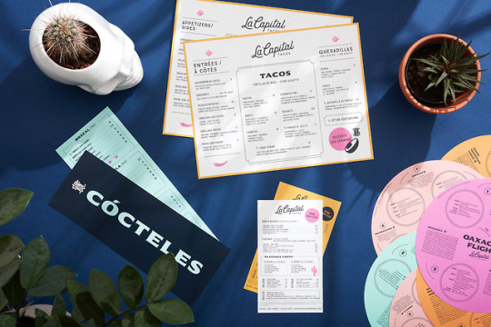

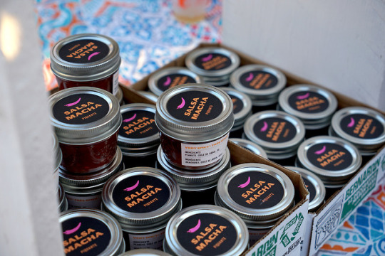
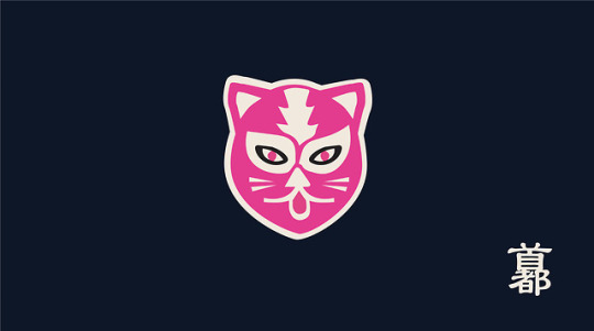
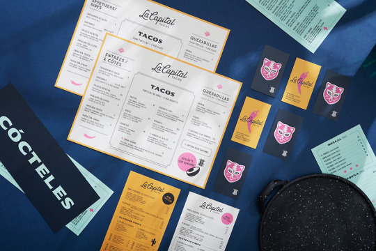
Capital Tacos
Montreal-based design studio Le Billyclub has created an identity for Capital Tacos, a trendy taco shop located in the heart of China Town, Montreal.
92 notes
·
View notes
Photo


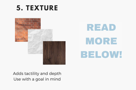

A lot of you have been asking how I go about making my graphics, i.e. how I do graphic design, so I thought I’d make a guide - or perhaps a series of guides if you would like - on how to design graphics! First off, I’d like to introduce you to the fundamental elements of graphic design, and hopefully this will help you gain a new perspective. and improve your own design skills.

Lines are structures that connect two points. They make up everything that we see, even the letters and characters we read every day. But more often than not, we take them for granted. In reality, lines are one of the most rudimentary components of graphic design, and they serve to channel ideas and emotion.
Lines can:
Organize pieces of information or elements on a page
Serve as guidelines to lead the viewer’s eye
Provide movement such as using wavy lines to represent moving water
Emphasize certain parts of the page
Set a mood, such as how straight lines evoke order and neatness while zig-zags convey excitement and tension

A shape is any two-dimensional area with a recognizable boundary. They can add interest to designs (such as in backgrounds), organize visual content, and be used to make illustrations.
Shapes exist in three categories:
Geometric shapes are regular shapes like circles and squares
Organic shapes are more freeform, such as a blob or a leaf
Abstract shapes have a recognizable form but are not exactly natural shapes, such as alphabet glyphs, spirals, and stick figures
When brought together, these shapes can form helpful illustrations that will help convey meaning to your work or add some decoration to it.
The effects achieved by the shapes are determined by its form, color, size, and other characteristics. For example, triangles often show excitement and risk, while circles are seen as eternal and often feminine.
In the example illustration below, which is one of my January wallpapers, I use triangles to convey a feeling of vivacity and excitement.

Different shapes may also be used to structure content or create a layout, making it easier for the user’s eyes to find information. This is often the case in blogs and websites.

Color can be used to make an image stand out, convey information, enhance meaning, or group things together, but how do you know what colors ‘fit’ together? When you’re starting out, you might find it easier to look for color schemes from pinterest or wherever you can find inspiration. It also helps to look for images or photographs that evoke the same vibe you’re going for, and then using a similar color scheme.
But what if you want to make a palette yourself? Learn color theory!
Before I elaborate, here’s some terminology for you:
Hue is the color itself
Value is how dark or light the color is
Saturation is the intensity of the color
Now, how do you go about making a color scheme? Here are some types of color schemes you should know about:
Monochromatic color schemes only use one hue but vary in value and saturation.
Analogous color schemes use colors adjacent to each other on the color wheel, such as red, orange, and yellow, or blues and greens.
Complementary color schemes use colors opposite each other on the color wheel. To add complexity, play with the value and saturation of these colors.
Split complementary color schemes use colors on either side of the complement.
Triadic color schemes use three colors that form an equilateral triangle on the color wheel. These are often very stark and in-your-face, so you might want to use this type of color scheme in moderation.
Tetradic color schemes use four colors that form a rectangle on the color wheel. These are more effective if one color serves as the main color and the other three colors are just accents.
When choosing a color scheme, the main thing you should keep in mind is balance. Using fewer colors means it’ll be easier to balance and thus it is less likely that the piece will appear messy and discordant.
Color has the power of evoking emotions and moods, and each hue and shade has certain connotations associated with it.
In the illustration below - which is part of my April wallpaper set - I use the color green to convey the safety and familiarity of the comfort zone. The color red, on the other hand, shows risk and danger, but it also represents the courage required to get out of the comfort zone.
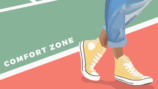
So the next time you’re thinking of what colors to use in your project, think of what kind of message you want the audience to receive.

Like the other elements we’ve discussed so far, type conveys meaning beyond what is written. Type can communicate a mood, style, vibe, or feeling. A curly or script font might appear fancy and extravagant, while a handwritten font may seem raw and playful.
Different types of fonts are also suitable for different contexts. For example, sans-serif fonts are more readable on screen while serif fonts are more readable in print. Display fonts, on the other hand, tend to be fancy and decorative, and thus should only be used for small amounts of text, like titles.
Audience and purpose also serve a role in deciding what fonts to use. Large, bubbly text is suitable for a children’s birthday party invitation but probably not for a business card.
In graphic design, different fonts are often used in tandem with each other. The main principle or rule behind this is that you should choose fonts that complement each other. Large, bold fonts should be paired with small, subtle fonts. Oftentimes, you’ll have to rely on your instincts, and that’s okay.
Remember, though, that you wouldn’t want to overwhelm your readers by using too many fonts. Stick to one or two per project. To add variation, change the weight or style of the existing fonts.
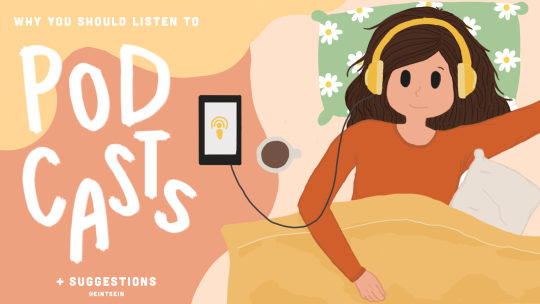
Finally, your text would be more effective if you establish some sort of visual hierarchy. This essentially means sorting out your text in order of importance, using different typefaces and fonts. This includes adding a certain weight (or boldness) or increasing the size of texts that are more significant.
In the title graphic below, the word “podcasts” is handwritten and larger than the rest of the title because that’s what I want to draw attention to, so that readers know what the post is about. My name, on the other hand, is smaller than the other texts.

Texture adds tactility and depth and can also be used to evoke a certain feel. In this graphic from my March desktop wallpaper, I used a tape texture and a paint texture to achieve a scrapbook-y vibe.

Some other common textures used in designs are foil, watercolor, and paper textures. Although there are many textures to experiment with and choose from, you should also be careful not to overwhelm your viewers with too many textures in one piece.
Lines, shapes, color, text, and texture are the five basic elements of graphic design, and by understanding how these elements work together, you’ll be able to make more effective designs.
Now, the question is, do I think deeply about all of this when I make my designs? To be honest, not really. A lot of my designs are instinctual, but knowing the theory behind what I’m doing has helped me improve those instincts, and you can do the same!
That’s all for now. Hope this helps, and let me know if you would like me to continue the series or if this brief blog post is enough. Happy designing :)
Disclaimer: I’m not a graphic designer, just a stressed-out senior who sometimes likes to design and stuff.
9K notes
·
View notes


