Manu Factum Natura – “a nature that has been manufactured”. I have been exploring how industrialisation and mass-production of material goods is destroying our ability relate to our natural environment and what this means for our humanity in the Anthropocene age. Through photography, experimental sculpture, and printmaking techniques, I have been seeking to synthesise various representations of natural objects and environments to replicate; memorialising and replacing the natural iteration long after it’s gone.
Don't wanna be here? Send us removal request.
Text

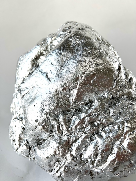

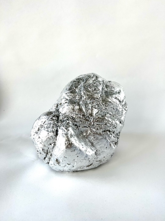
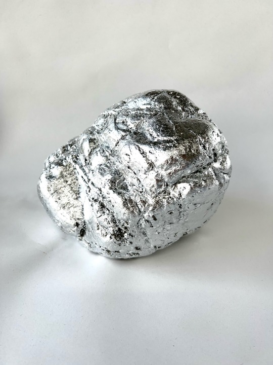
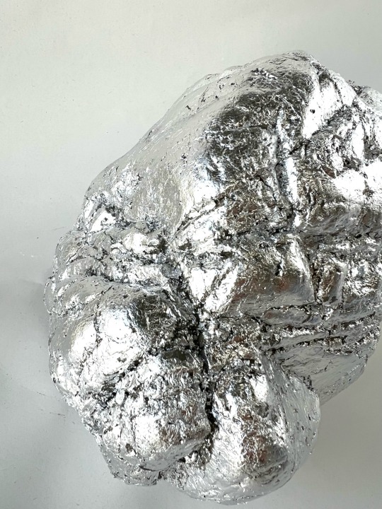
The Final Sculpture
I primed my sculpture with a coat of PVA glue, to coat it in something for the gilding fluid to sit on and before layering on sheets of aluminium leaf. Once I laid a leaf onto the rock, there was surface tension and I struggled to get the silver into all the nooks and crannies. This did irritate me because I wanted it to look like it had been cast in silver, but once I covered the whole surface area I found that it's barely noticeable because of how reflective the surface is. It's dazzling, it's obliterated.
I really like how shiny it is, it exceeded my expectation though I would have liked it better to have been able to see your own reflection in it. That would have been most ideal. But other than that, I achieved what I set to. I manufactured a rock, from start to finish. I synthesised a natural object; and obliterated it so that you can then project yourself on to it. Rich in texture and form. It's even colder to touch than the original stone, as I write this and touch both to compare - it's eery that the natural rock obtains of the ambient temperature but my cyborg rock is much colder to the touch, cold like metal. A manufactured coldness.
And there's something about the pink and the silver, the childish neon brightness of the pink and the magpie draw of the shiny silver results in this aesthetic appeal to the id (like a marketing campaign)- even though there has been a lot of intellectualising in the development, it has a baser attraction rather than a cerebral one. But once you come to understand the concept, that becomes less of the case. I am currently in the process of making four more sculptures for the final degree show, because multiples of this rock would further provide emphasis of this idea of manufacturing through replication. And displayed with the risograph background it will all become a manufactured natural scene.
0 notes
Text


The Final Riso
The 16 Risoprints of this photograph came out well; varying degrees of evenness and some technical error marks but I quite like that even a mechanical process carries these little errors and would like to embrace them as a feature of the process. I think it plays into my overarching concept as a critique on mass-manufacturing, that our turn towards mass-production is a result for our need for perfection and want for convenience - I don't believe you can have both. "If you want something done right, do it yourself." But the modern attitude is: "want something done, want someone or something else to do it."
That being said, I really do love the pointilist quality riso provides, with these markers of a ghost in the machine. I think the fluoro pink is bold and sublime, it draws the eye and is just pleasing. But also in this scale it makes me think of a neon billboard, some vision of marketing in the future like something out of Blade Runner. I suppose this whole project conveys I'm somewhat of a luddite and I think the advancement of technology is destroying humanity from the inside out so my vision of the future is some sort of cyborgian, dystopian, capitalist nightmare. I like that this print could be advertising for a holiday destination in such a future, where places of untouched natural formation are rare and desirable. Especially as the image in this is a doctored photograph, a place that doesn't exist; a utopia.
I also think that the pink works aesthetically, as it has a vibrancy and vitality that is only accentuated when paired with silver. The colour and textural elements are evenly met I think, neither overpower the other which I don't think was the case for the red where colour overtook and definitely not the case for the black where it was just texture.
0 notes
Text


After a few days, the concrete was perfectly dry and ready to be removed to reveal my cast sculpture.
The first thing I notice is how smooth the surface is! I was sure that with all the sand in its composition would give it a gritty surface texture and I was quite worried about that but fortunately its very similar to the original rock's texture.
Like the plaster, it contains a lot of air bubbles but that doesn't bother be so much because that is a natural occurrence in rock formation and is only a subtle giveaway that it's concrete.
I'm so overjoyed with how it turned out; a pure success. It's quite uncanny how much of a replica it is, I really like seeing it next to it's mother-rock and recognising all the matching details. It's kind of a strange sensation, and exactly what I wanted to achieve. I wanted to create this simulcra; a replicated version of an original made with traces of this original. But broken down, regurgitated and reshaped in the form of the original. Only to have those traces further obliterated by silver still.
0 notes
Text


After editing my final image to have an opacity of 70% and splitting it into 16 rather than 9 to have a larger overall image, I took it to Laura Bowie from the Printing Department again to try out how doable this would be.
Because there were already troublesome areas of little definition in the original 9ths, 16ths were going to mean there were more of these areas. But in theory, that could be countered by reducing the opacity. So we printed off a "bad" 16th to see how the Riso printer would cope with the lack of definition - the danger would be that the master would get clogged with ink and the paper would just stick to it.
Luckily that did not happen! Riso proved to be possible, and thus I continued with the other 15 sections in fluoro pink.
0 notes
Text


I was worried that working with cement rather than clay would detract conceptual value, but actually cement and clay are very compositionally similar. They are both elemental earth-based minerals that rely on both moisture and subsequent lack thereof to do anything.
Alan devised a recipe for me to mix:
2.5 x Scoops Cement
6 x Scoops Sand
1TBSPN PVA Glue
MIX THIS DRY before mixing in <1.5 Cups Water
Then I add it to the assembled mould, being sure to back it down between every scoopful added. This volume of mixture doesn't quite fill the mould, and that's so I can, as it dries, scoop it up the sides of the mould to fill it out a bit as well as creating a well to handle it easier.
Before this, Alan and I had a discussion about working with white sand and Snowcrete (white concrete) to create a blank canvas to work on top of. But when I researched the gilding process, the recommendation for silver was to prime a base of grey or dark blue, (cooler tones) to compliment the silver, and red or ochre are better for gold. Also the natural colours of the building sand and cement are an enjoyable contrast to the white plaster, and are more on theme as raw materials.
0 notes
Text


Once freed, I was able to peel off the latex mould from the rock. I love the inverted textures - it looks like a different type of rock, the kind that has mineral veins running through it that are much harder than the rock itself and so protrude most of it weathers away.
The plaster mould itself is a surprisingly interesting artifact with its pure obliterated whiteness and beautiful textures resulting from the process; air bubbles, saw marks and areas where two parts have been forced apart. I really wish I had started casting much sooner, because I could have really explored this much more.
As it's a multiple part mould (latex + plaster), I traced a pen line on the latex along the edge of the largest two parts of plaster so that I can reassemble the mould all in the correct configuration for casting.
0 notes
Text


Once the plaster jacket had set, I sawed through the middle of the mould but not too deep - just deep enough to drive a couple of wedges in to crack it open and free it.
0 notes
Text


So, I've been gradually coating my muse rock in layer upon layer of liquid latex, with the aim of making a mould of the surface and shape and size of the rock.
Eleven coats of cured latex later, Alan is helping me make a plaster jacket for the latex mould. Once the plaster is dry, we can crack it open and it's ready for cement casting production. I am hoping to have five sculptures for display in the show, but it's good to make more in case anything goes wrong.
0 notes
Text


After finding out how large the space is going to be, this allowed me to scale up this wall print even more and make it a grid of 4x4 A3 sections. I really want it to be as big and domineering as possible, I want it to act as a backdrop, a scene, a set, in my space. Some visual environmental context for displaying the sculptures, as well as showcasing the photographic imagery itself.
I used the library printer for this development to help determine how I feel about greyscale for the final.
It feels natural and ancient looking at it, and all the varied textures really sing and I imagine when paired with the silver sculptures there would be more of a unity because of this. Just black and white, light and shade and reflection playing together nicely.
But fluropink seems unnatural, it seems manufactured. The brightness of that pink at that scale would look like an advertising billboard. Advertising nature as a commodity - a producable, manufactured, purchasable and desirable good; the sculptures. I love the idea of the wall-mounted prints being both a natural backdrop and a marketing campaign, and a good marketing campaign consists of reflecting the consumer back at them.
0 notes
Text


This was a development from the acetate and stencil projections, to synthesise my own 2Dimensional rock representations in print.
They remind me of botanical illustrations, with that flatness and documentative situation. The print suggests to me a scientific illustrative purpose, an academic recording, like a photograph of a fossil.
Again, I wish so much to have started screen-printing earlier. It would have been so great to have done variations of this with different shapes and textures and to have a collection of prints.
However the silver printing ink is not as effective as I'd hoped it would be. I thought it would be more shimmery and play with the light better than it does, and I would have really liked that visual connection with the shiny silver sculptures.
Risograph, does seem like the logical and most conceptually strong printing choice anyway - it's blend of analogue and digital technology really speaks to me for this project.
0 notes
Text


This was my second favourite image from my photographic series, I wanted to use this for a silkscreen development to determine some autonomy over colour.
I selected this greeny blue from the tin palette for a bit of variety; it's quite a fresh, aquatic, earth-like shade that I thought could be both bold and paired down, it has cooling properties. The complete opposite to red and fluro pink.
I really love the saturation of colour, all the tone diminished but still texture and half-tone remain focal. I love the manual process of screen-printing and the ease in achieving what I struggled to with software. Sometimes the old ways are the best.
I wish I had started developing screenprints earlier, because I would have liked to have tried printing my 9 x A3 panels myself and challenging myself with scale and layering.
0 notes
Text
A further case for fluorescent pink; it's the oldest colour in the world.
Pigments found in 1.1 billion-year-old bacterial fossils found deep undergound in West Africa have proven the world's oldest pigment is bright pink.
This discovery also answered a major question about our natural history and evolution. Even though Earth is 4.6 billion-years-old, why did animal-like creatures and plants like seaweed only appear 600 million year ago?
The producer of this pink molecule was found to be a cyanobacteria, a bacteria 1000x smaller than the algae in our oceans. Like algae, this pink cyanobacteria would have been at the bottom of the foodchain, but because it was so small it was insubstantial to allow for larger creatures to evolve.
The fact that bright pink has this newfound natural significance that is pertinent to my area of research, helps inform my decision on colour. I like the dualling properties of natural pigment versus synthesised colour, I find contradictions like that very appealing and interesting to work with.
0 notes
Text


Hockney is renowned for constantly re-innovating his practice to incorporate the most contemporary forms of technology, of particular interest to me are his fax prints.
He adapted his drawing style to fit the quirks and limitations of the fax machine, and started faxing artworks to a whole host of people.
"This was the late 80s and the fact that newspaper production wasn't yet computerised didn't stop us fancying ourselves as pioneers in our Docklands eyrie. We were forging new ways in the great white heat of technology. Art for the masses by fax! Just think of the possibilities. In theory, Hockney could deliver a limitless number of copies of his work. Every reader could have one. The fax paper was heat-sensitive and the images would fade. They would be worth nothing except for the pleasure they would give by putting his pictures into the hands of the many rather than the few."
The beauty of these artifacts are their novel means of production and ephemeral longevity.
Using the library printer adds a similar sort of character to my photograph, and allows me to create one much larger overall image myself than if I were to take it to a professional printer. Risograph lends a unique dotted print quality with an antiquity similar to that of a fax. And like Hockney and his technologies, I'm very taken by the its capabilities and aesthetic potential. For his fax prints, he had to use opaque grey paint to render halftone in his portraits. For my rocky photograph, I have to increase contrast and decrease opacity to ensure that the risograph printer can read and process my image. I too, am at the mercy of the medium. It's digital technology meets printmaking meets magic.
Hockney's attitude towards giving these images to the many via this means, just reaffirms and inspires me further to include and edition of zines for my show. This will allow visitors to be a part of the work by taking an image for themselves. They're only worth the paper they're printed out on and the joy brought when one covets an object, and hopefully when they gaze at the image they will feel something.
0 notes
Text

Artist: Hamish Fulton born 1946
Medium: Photograph, black and white, on paper and transfer lettering
Dimensions Image: 1372 × 1099 mm
I like Fulton's large-scale meditative odes to nature's majesty, that results from his walking, as is his practice. He carefully attaches words to contextualise his image, though it doesn't explain everything. He chooses his words wisely to maybe pose more questions than they answer with their potential double and ambiguous meaning, and leaves the viewer to contemplate their significance.
Visually, the black and white textural image serves as a document, a real representation of his vision and thoughts in a time and place where he was the only person on the beach having those thoughts and vision.
5 notes
·
View notes
Text
"A popular theory is that it began at the start of the Industrial Revolution of the 1800s, when human activity had a great impact on carbon and methane in Earth’s atmosphere. Others think that the beginning of the Anthropocene should be 1945. This is when humans tested the first atomic bomb, and then dropped atomic bombs on Hiroshima and Nagasaki, Japan. The resulting radioactive particles were detected in soil samples globally.
In 2016, the Anthropocene Working Group agreed that the Anthropocene is different from the Holocene, and began in the year 1950 when the Great Acceleration, a dramatic increase in human activity affecting the planet, took off."
I'm interested in humanity's shift from harmony to hostility towards our natural environment. The tipping point at which we became less or not at all concerned with the natural balance and order that enabled us to thrive as a species in the first place. Or is this the logical conclusion for an advancing species with a brutal nature?
0 notes
Text

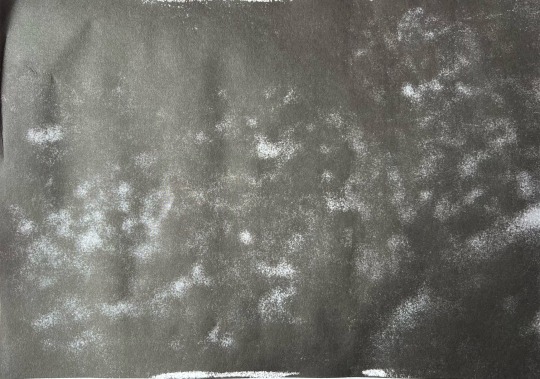

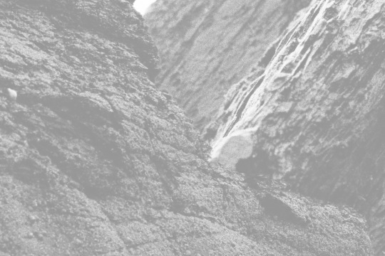
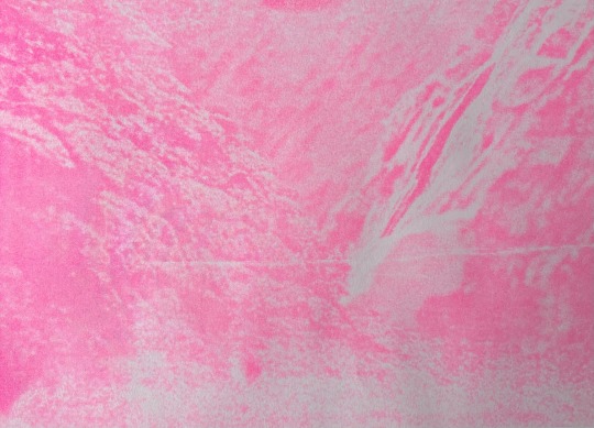

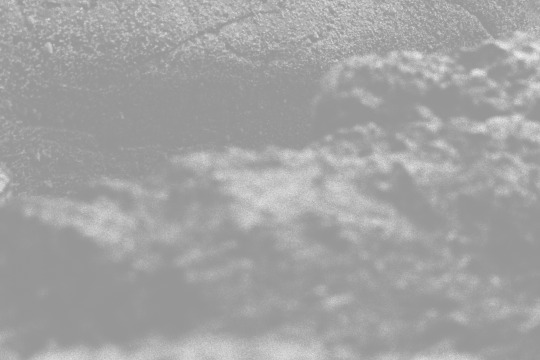

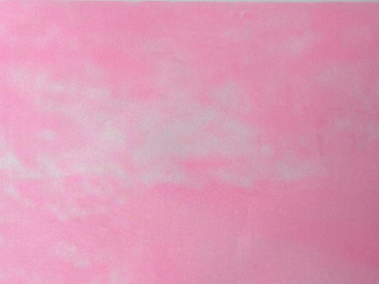
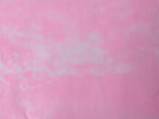
I met up with Laura Bowie to trial and troubleshoot turning my photograph into printed risograph panels.
Because the image has a lot of midtones and areas saturated with darkness, the risoprinter may have difficulty translating the image into print. We did a couple of tries of what Laura thought would be the worst culprits, and compared the print to the digital image and it was quite interesting what was and wasn't picked up. The first one we did in black barely showed any distinguishing detail from the original image and basically made some up. So Laura suggested decreasing the opacity of each image to 70% in editing so as to avoid oversaturation of ink in the risoprinter, and to give it a chance to pick up those textures.
Areas that have a balance of light and dark work better because of differentiation, so we then tested another section with lighter bits and it was far more successful. True to image, but not as bold as the digital because of the limitations of riso and incompatibility of the photograph for this technique. There are ways around this though, what we will be trying next is increasing the contrast in my images to increase that differentiation, my only worry is veering off into Pop Art territory again so I'll need to be wary of how it reads.
I also still haven't decided between fluro pink, black, or red.
The black would accentuate the texture most optimally and would be quite forboding at that scale. It's neutral, and maybe best at denoting the sense of natural power and deep time. The tiny dotted texture riso lends would also be better perceived.
The red is powerful and bold, and gives that Socialist, anti-capitalist presence. It has that wow-factor, but in order to get that red I can only use the digital printer.
The fluorescent pink is also bold but could maybe be conceptually confusing. That pink is most like one of the colours picked out from the tin-can palette and so it's on-theme from that perspective. I also quite like that it's almost a synthesised colour in the sense that you have blue low frequency light waves on one end of the visible light spectrum and high frequency red lightwaves on the opposite end, and you have you combine these two to get a bright magenta.
I still can't decide what will be the right choice for printing.
0 notes
Text

As per my experiments with acetates on the projector, layering two landscapes over each-other to create a new landscape that doesn't exist in real life. This photograph is a representation of a place that does not materially exist. It's a geographical synthesis. A manufactured natural environment.
This will be the image for my final large scale wall-print. I am undecided on what colour could be the final, and also whether or not I will do it as a risograph.
I really do like the red, but that is tricky to achieve the shade I want with risograph. This leaves me to choose one of the colours from my palette, of which the pink can be achieved with a fluro pink in the riso printer whereas the other colours would also be difficult to mix. I could also do it in black and which could be a nice way to accentuate the textures which could be a striking pairing with the silver sculptures in the show.
The best I can do is try them all out and see how they look in the flesh and then decide.
0 notes