Text
Final Outcome
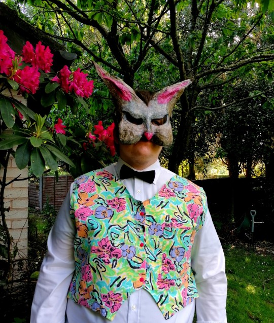
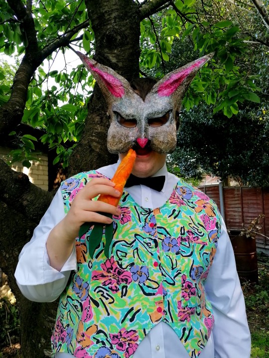
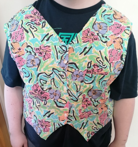
The final outcome that I had made for this project was a Pop Art themed waistcoat for the character Rabbit from The Wind in the Willows, this piece was part of a full costume which I had created using only second hand or borrowed clothing and materials. When I had completed my Rabbit costume and mask, I decided to have a photoshoot with my model. I paired the waistcoat with a black bow tie, a white long sleeved shirt, black trousers, black shoes, my handmade Rabbit mask and a Pop Art style carrot prop which was made out of felt. I chose to use a garden for the backdrop for these photographs as The Wind in the Willows is set in a woodland area in the countryside. I found some pink flowers in the garden that matched the waistcoat and mask, this added a very nice background to the photos. I am very happy with my final outcome, I think that the waistcoat represents the Pop Art style really well, this project has helped me to understand the key features of a character and how important it is to look at the facial expressons and body shapes of a person/animal so that you can use them within a costume to add a personality and more of a realistic appearance to the character.
0 notes
Text
Creating The Waistcoat
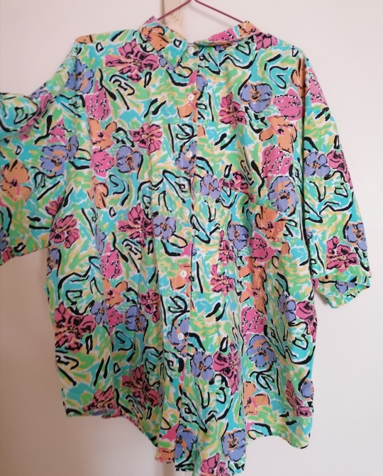
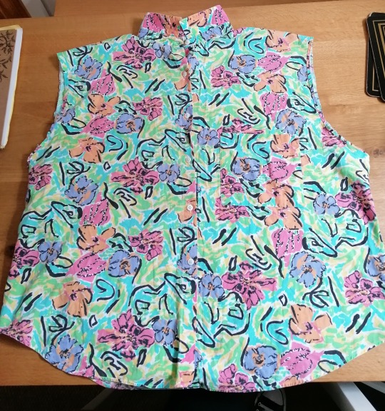
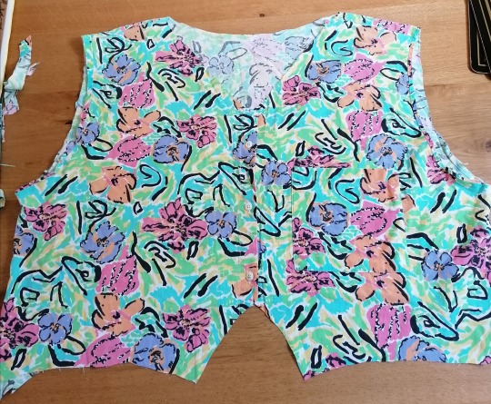
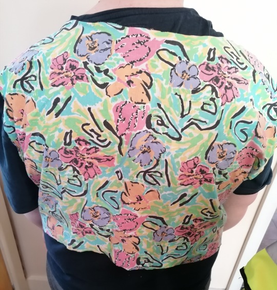
When I started the making process for the waistcoat, I was originally going to use a waistcoat pattern which I had made using my models measurments, however the pattern pieces did not fit onto the shirt fabric that I wanted to use. As an alternative, I decided to turn the shirt into a waistcoat instead as it fit the model comfortably. I started off by removing both of the sleeves using fabric scizzors, I then measured up and marked out where I wanted the v-neck to go making sure that it was placed in the centre of the garment. I cut out the shirt collar and then cut around the markings that I had made to create the v shape. The next step was to make the length of the shirt shorter and add the bottom points/edges that are usually found on traditional waistcoats. I asked my model to try the waistcoat on incase I needed to make any alterations.The next part of the making process involved sewing the seams together around the armholes, the neckline and bottom edges. Once I had completed the waistcoat, I decided to use a decorative stich setting on my sewing machine to add more detail to the pocket, I did this using orange thread, I also painted the buttons pink to match the pink flowers that are on the waistcoat.
1 note
·
View note
Text
Creating A Calico Waistcoat Mock-Up
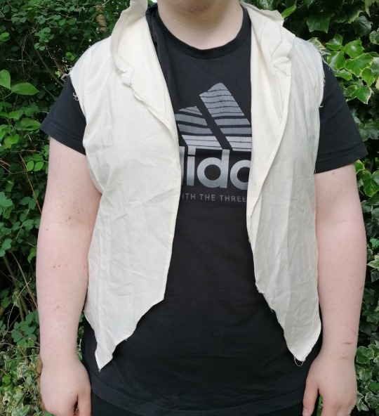
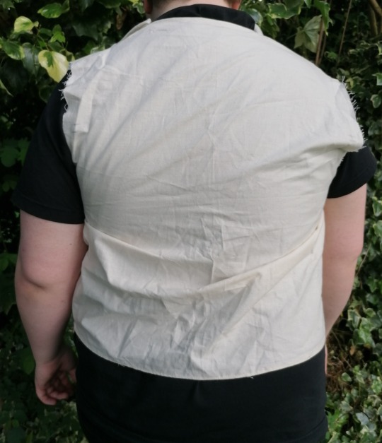
When I had completed my initial and final designs for the Rabbit Cosume, I decided to create a calico waistcoat mock-up that combined different elements of each design, this enabled me to experiment and practice using different collars, lengths and shapes before I created my final piece. I started this mock-up by creating a waistcoat pattern, this was made using my models measurments. I wanted to see what a collar would look like on the waistcoat so I decided to include one on this mock-up waistcoat. Once I had roughly sewn together the front section to the back peice of fabric, I then asked the model to try the calico mock-up on so that I could see if there were any alterations or changes I needed to make. The waistcoat was a bit tight on the model when the front sections were put together, so I noted down that I needed to make the front panels wider so that they would fasten up on the finished waistcoat I also decided that I didnt like how the collar looked and I prefered the v-neck shape that I had drawn out on my final design.
#Waistcoat#Mock-Up#Rabbit#Costume#Calico#Practice#Experimentation#Model#Fitting#CalicoMock-Up#CostumeDesign
0 notes
Text
Final Design
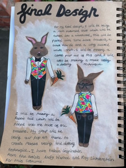
For my final costume design, I used a lot of my inital design ideas and then added some new features and alterations to certain parts of the garment. Some of the changes that I made were adding a v-neck to the waistcoat instead of a collar, changing the pink bow tie to a black bow tie, including a pocket, adding a rabbit tail to the trousers, adjusting the mask so that it ties at the back and making the shoes more plain. I think that my design reflects the Pop Art theme really well, I wanted to limit the areas of the costume that had bright coloured fabric so that the colours would not clash and distract the audience from the story when watching the performance. I decided to only use bright colours on the waistcoat and the carrot prop so that they would stand out against the plain shirt and trousers, this technique added a “Pop” of colour effect to the costume.
0 notes
Text
Initial Designs
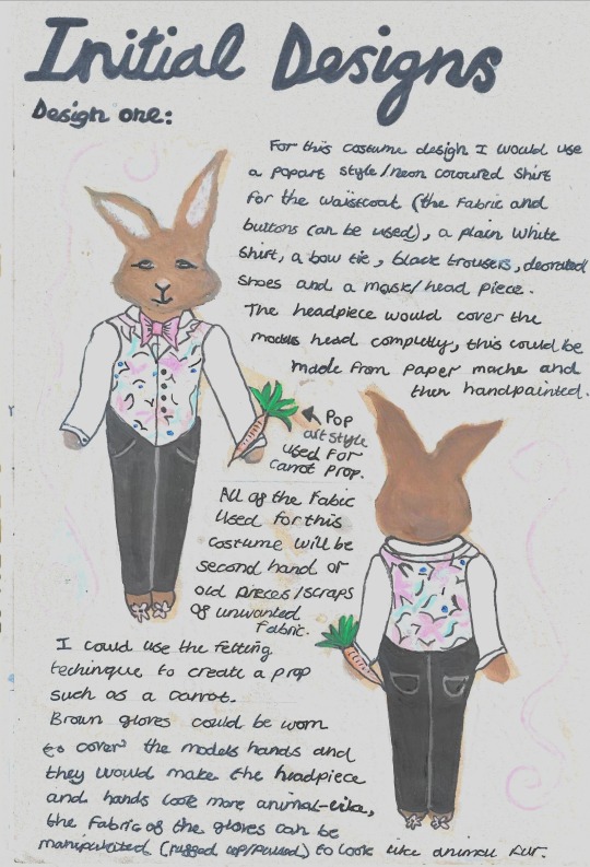
This photograph shows one of my initial costume design ideas for the character Rabbit from The Wind in the Willows. The costume includes a Pop Art style waistcoat, a long sleeved white shirt, a pink bow tie, a pair of black trousers, brown shoes with Pop Art detailing, a carrot prop and a rabbit headpiece/mask. For this illustration I have used acrylic paint and a black fine liner pen, the paint allowed me to add shadows and highlights to the design which created more of a realistic look and the fine liner was really useful when adding in key features and details within different parts of the costume. In my design, I have tryed to recreate the body and face shapes found on a Rabbit, the main features include rounded cheeks, long ears, large/wide thighs and curved/rounded paws. By including the features of a Rabbit in my costume, I am able to create more of a realistic look as well as turning the model/actor into a non-human looking character.
0 notes
Text
Character Outline
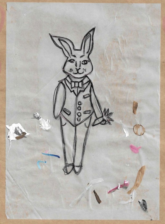
Before I created my initial and final costume design sketches, I decided to sketch out a rough outline of what I thought the character Rabbit from The Wind in the Willows looked like.The drawing was done on a piece of tracing paper using a black biro pen. This outline was used as a base layer for all of the illustrations that I did, I traced the outline onto a sketchbook page and then experimented with different shapes and colours using acrylic paint. By creating and using a character outline, I have been able to keep the proportions of the character the same within all of my illustrations, I have also saved a lot of time by tracing over the sketch rather than having to redraw the same outline repeatedly. For each design, I made slight adjustments which included changing the bow tie to a regular tie and altering the colors or fabrics of the waistcoat, the purpose of this was to see what style I liked the best and which one I wanted to use for my final costume design.
#CharacterOutline#Experimentation#Rabbit#TheWindintheWillows#CostumeDesign#DesignIdeas#Sketch#Outline#Drawing
0 notes
Text
Sourcing Fabric
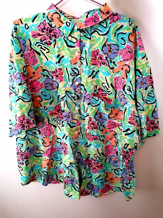
I will be designing and creating a costume for the character Rabbit from The Wind in the willows, this will be made using a Pop Art theme and I will be working within a small group to develop ideas and research before we each make the costumes for our selected characters. I will be using a budget of £25 to purchase any fabrics or accessories that I need, everything that I use to create this costume will be second hand or unwanted clothes from family members. I have recently purchased a vintage neon patterned shirt from Ebay using £16 from my budget, I am considering using the fabric from this shirt to create my waistcoat and then any excess material can then be used up on other parts of the costume. Even though this purchase has used up the majority of my budget, I am very happy with the colour and print of the fabric and I am certain that I will get a lot of use out it. Any extra additions to my costume will mostly be second hand clothes from family and friends, I have £9 of my budget left which I will use to buy any accessories if needed.
#sourcingFabric#Costume#Designing#TheWindintheWillows#PopArt#Waistcoat#Budgeting#Neon#Shirt#Colourful#Fabric
0 notes
Text
Taking A Closer Look At Handmade Waistcoats
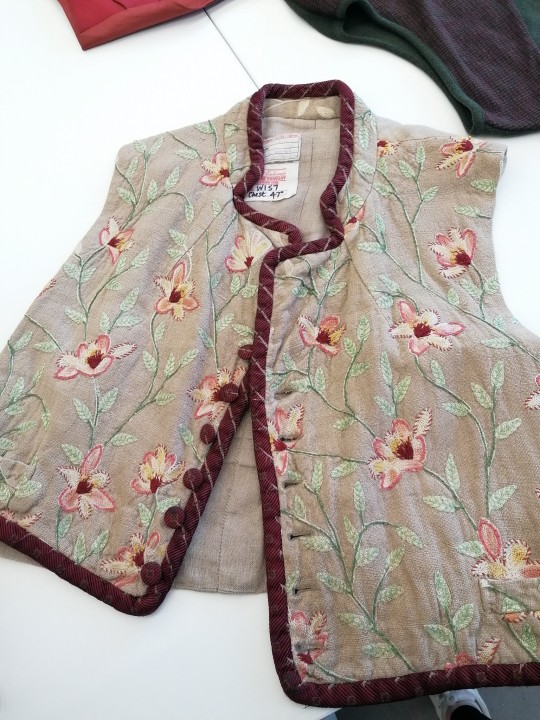
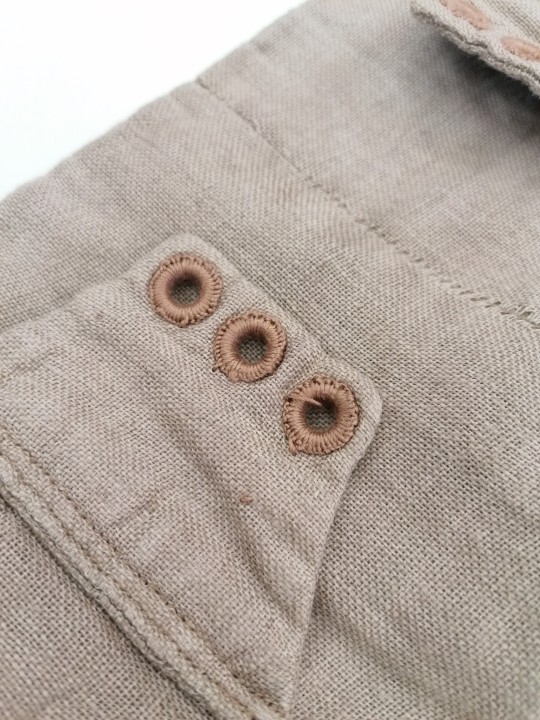
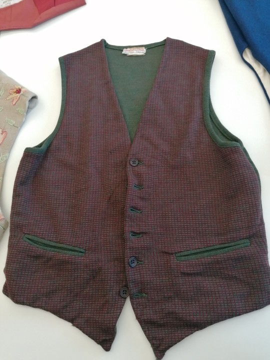
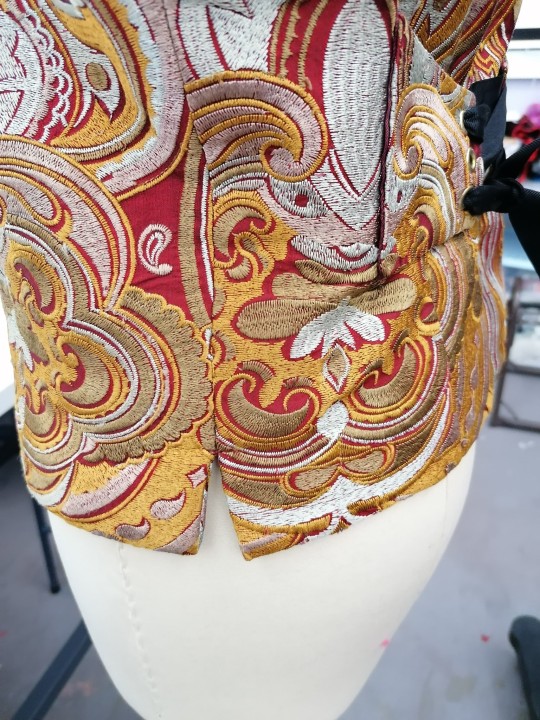
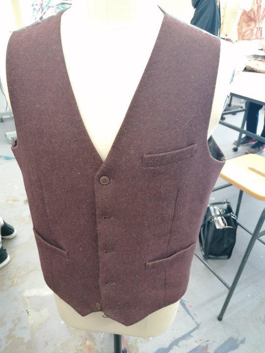
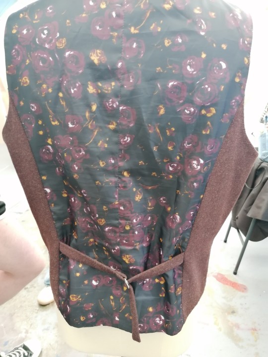
Today I had a look at some handmade waistcoats which were all done in a variety of different styles and fabrics, this really helped me to think about the structure of a waistcoat and how i could alter the basic/common waistcoat shape and style by changing the length, adding pockets, including embelishment or embroidary, having an the fastening put on an angle, side slits and lace up back ajustments. I have taken some photographs of certain parts of the waistcoats that I liked and thought were unique, I am considering using some of these techniques for my final piece so these photographs will be really helpful when I want to refer back to them during my making process.
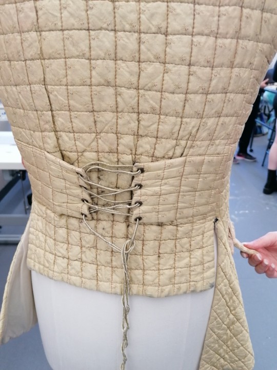
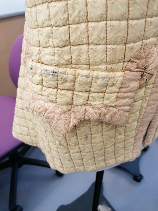
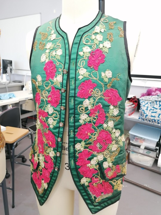
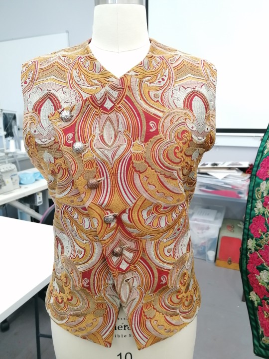
0 notes
Text
Exploring Bankfield Museum In Halifax
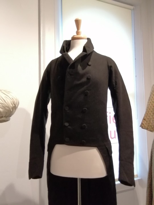
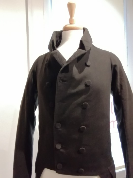
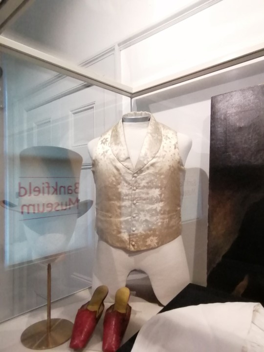
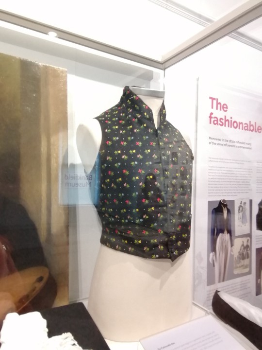
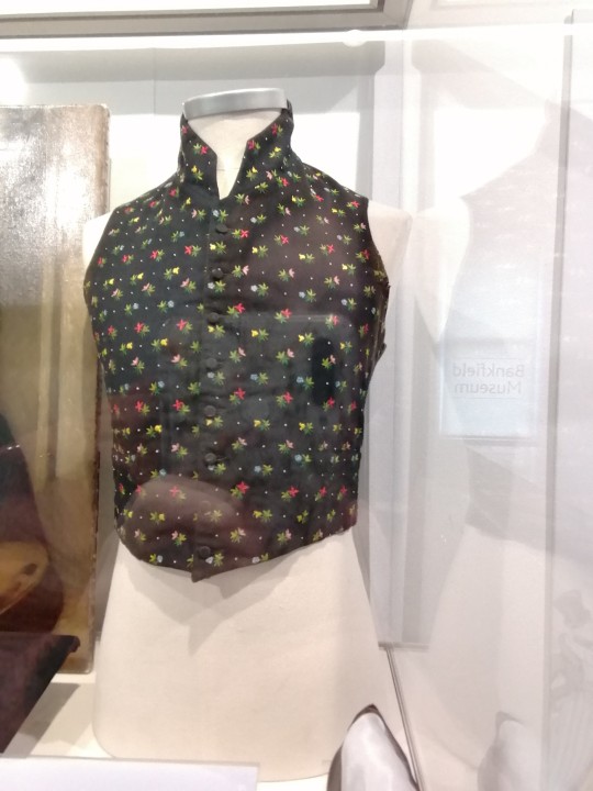
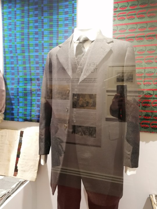
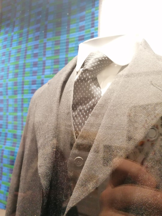
Recently, I attended a trip to Bankfield Museum which is located in Halifax, West Yorkshire. During this trip I was able to gather lots of visual research for my current modules Communication And Realisation and Establishing Professional Practice. I have taken photographs of mens jackets and waistcoats from different time periods to have a look at the different styles, silhouettes, colours, fastenings and patterns as this will give me inspiration and ideas for my own waistcoat which I will be making as part of my final outcome for both of my current modules. The waistcoat that I will be making will be created using a Pop Art style/theme, during this trip I found a waistcoat that had a colourful pattern on it that resembled Pop Art this helped me to think about different fabrics that I could use and how I could effectivly incorporate the Pop Art style into my work, I also liked the idea of having a long row of buttons running down the centre of the waistcoat as a fastening as this makes the overall peice look more sophisticated and smart.
0 notes
Text
Emoji Randomizer Task - Gestural Drawings
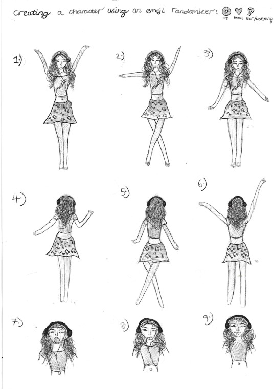
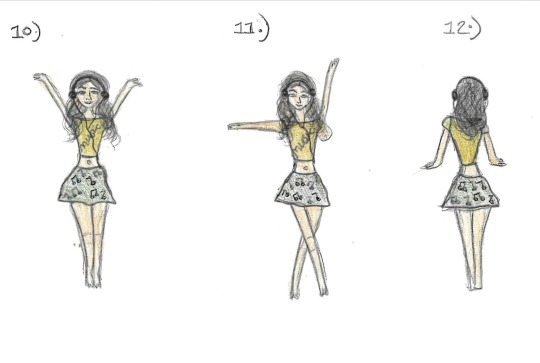
I have used the gestural drawing technique for this task to create a total of twelve drawings, three of these were developed further using colour. The character that I have created was inspired by the three emoji's selected from an emoji randomizer which were the listening/ear emoji, the heart and a CD. I have drawn a female character who loves listening to music and always has her headphones on wherever she goes. I have included a variety of different dancing poses to show how the music helps her to express herself and the colours of the emoji's were used within her outfit.
I have used a black biro pen for all of my character illustrations however i have also experimented with the combination of black biro pen and coloured pencils in my final three developed drawings.
I have enjoyed this task as it has allowed me to think on the spot and use my creativity to come up with a character from scratch, however I think that my drawings could have been improved by trying something different and maybe creating a non-human type of character from the emojis that I was given.
3 notes
·
View notes
Text
Facial Expression Drawings
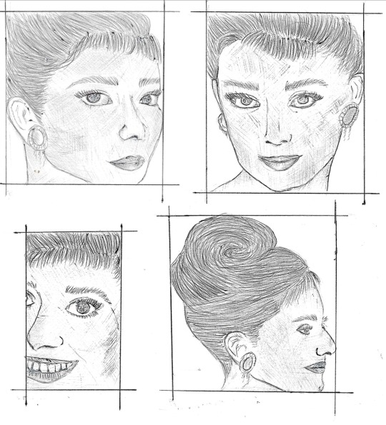
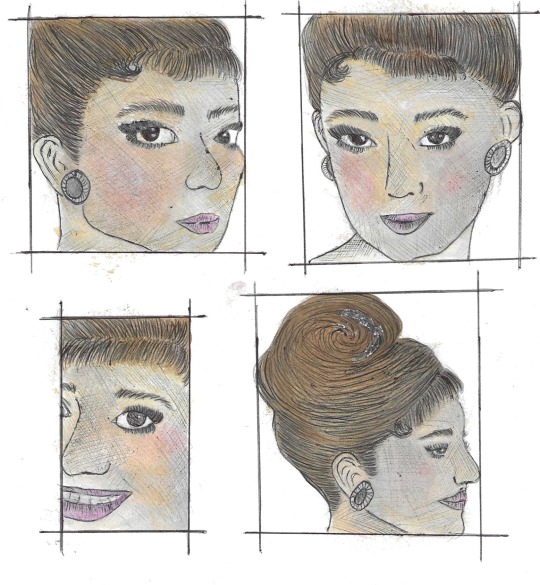
For this weeks task I was asked to choose a character from a book, film or TV show and create twelve facial expression drawings, I chose to focus this task on the character Holly Golightly from the film Breakfast At Tiffanys.
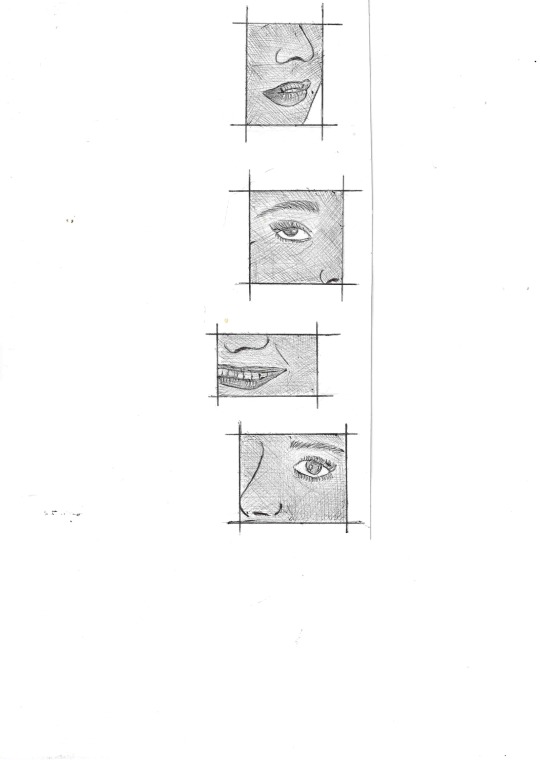
For all of my character sketches I decided to use the gestural drawing technique, I think that this is a very quick and effective way of captuing the key details of a character. The first four drawings show Holly as being sad, happy, exited and relaxed. I have developed these illustrations further by using watercolour to add extra detail and colour in the second lot of illustrations, this helped bring the character to life as well as adding more detail to the sketches. The final four drawings are close ups of the characters lips, eyes, mouth and nose, the purpose of these drawings was to focus on the different key features of a face.
All of my sketches were done using different sized boxes/grids, this helped me to section off different angles and areas of the face so that I could allow myself to only fill the blank space within that area. I have also experimented with zooming in and out on certain parts of the face, this allowed me to practice drawing facial features on a larger scale focusing on certain key details.
I think that this task has given me more confidence when drawing the facial features of a character as this was something that I have previously struggled to do, I would like to practice this particular part of character illustration more as it is an important part of costume design which helps you to bring a character to life.
#Holly Golightly#Sketches#Illustrations#Drawings#FacialExpressions#CharacterIllustrations#BreakfastAtTiffany's
0 notes
Text
Quick Sketches & Gestural Drawings
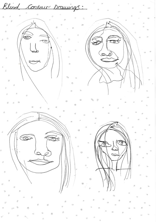
This weeks illustration task was to experiment with blind contour, continuous lines and gestural drawings. I have used black biro pen for all of these illustrations.
Blind Contour Drawings: To create these drawings I looked at a photograph of myself and tryed to draw out what I could see without looking at the paper or what I was doing, I attempted this method four times creating completely different looks for each one. I didnt particularly like this drawing style as it didnt allow me to create an accuarate reperesentation of a character or person however, I think that it is still a fun and unique way of drawing. Continuous Line Drawings: For this group of drawings I kept my pen on the paper until the illustration was finished, this resulted in a continuous line drawing. I focused these illustrations on my family and tryed to capture as much detail as I possibly could. Gestural Drawings: For this set of drawings, I used a time limit which ranged from 1-10 minutes. A lot of quick and rough lines were used to create the basic character outline. I took inspiration from a photograph of my grandad for these illustrations, focusing on his posture and body shape.
By experimenting with all of these quick drawing techniques I have learnt that sometimes simplicity can be more effective than including lots of detail, I paticularly liked the gestural drawings technique and I am planning on using this style of illustration again for future projects.
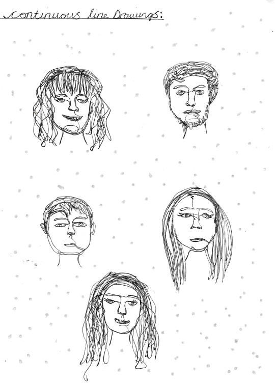
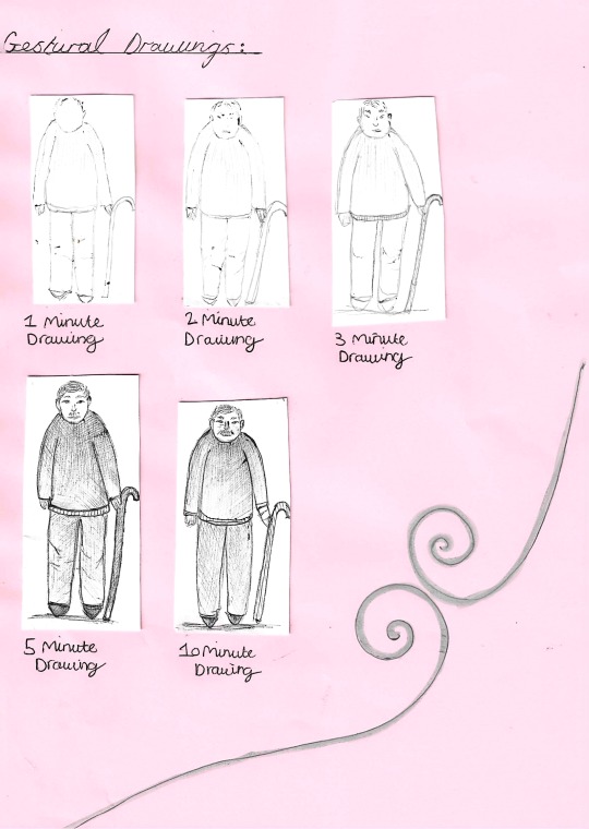
#GesturalDrawings#Illustrations#QuickSketches#BiroDrawings#ContinuousLineDrawings#BlindContourDrawings
0 notes
Text
Character Collage Illustrations
This week I have created three different collages which have each been inspired by two randomly picked words. For all three of my character illustrations I have used a combination of watercolour, pencil, magazine collage, mettalic markers and coloured biro pens.
Design 1: For my first character collage illustration i decided to use the words Modern and Pixie. I sketched out a rough outline of a pixie, then using magazine cut outs I added modern day items/fashion accessories to the illustration including sunglasses, a handbag and boots.
Design 2: This design was inspired by the two words Organic and Floral. The top of the dress represents a flower which has been turned upside down to create a skirt shape, this rests above some hand drawn flower patterns.
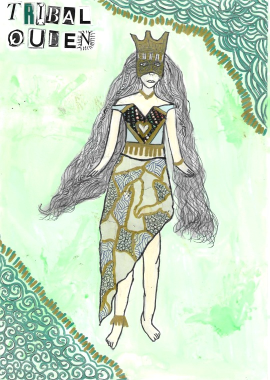
Design 3: For my final design, I used the words Tribal and Queen. I have created an outfit that combines the wealth of a queen with clothing made up of natural materials similar to what people from a tribe would wear. The skirt was made using ripped up scraps of magazine paper with added patterns drawn on by hand.
I have enjoyed experimenting with collage, My favrouite design sketch from this task was the Modern Pixie, I really like the effect of using different patterns from magazine cut outs to create clothing, I also like how I have added a variety of different accessories to create more of a modern look. If I was to improve on anything with this technique it would be to use collage within the backgroud to create a setting for the character.
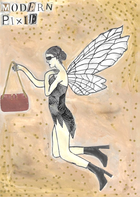
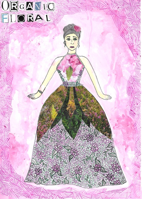
0 notes
Text
Character Illustration & Interpretation
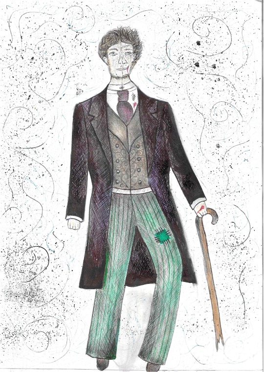
This week I was asked to create an illustration of any character from Literature, I chose to focus my work on Dr Jekyll and Mr Hyde from the book 'The Strange Case Of Dr Jekyll & Mr Hyde' by Robert Louis Stevenson.
I have used a combination of pencil, coloured biro pens and watercolor.
On the left side of the drawing is Dr Jekyll a wealthy, respected and well dressed man who cares about his appearance and on the right side of the illustration is his evil alter ego Mr Hyde, he is wearing ripped and blood stained clothes. I took inspiration from the quote "He gives a strong feeling of deformity" (Stevenson, 2012) as this made me visulise a man who has some kind of disability that altered the way he would walk making him look as though he wasn't human, I have created this look/effect for Mr Hyde by giving him a deformed leg and walking stick.
I added some paint splatters and hand drawn swerls to the background to resemble the fog in the streets of London, this was where the book was set during the first chapter.
1 note
·
View note