
Statistics
We looked inside some of the posts by corydoncafe and here's what we found interesting.
Average Info
Notes Per Post
303K
Likes Per Post
148K
Reblog Per Post
155K
Reply Per Post
212
Time Between Posts
2 months
Number of Posts By Type
Text
3
Photo
13
Note
1
Last Seen Tumblr Blogs


Fun Fact
28.6 is the average number of monthly visits per US mobile user.

Text
So the other night during D&D, I had the sudden thoughts that:
1) Binary files are 1s and 0s
2) Knitting has knit stitches and purl stitches
You could represent binary data in knitting, as a pattern of knits and purls…
You can knit Doom.
However, after crunching some more numbers:
The compressed Doom installer binary is 2.93 MB. Assuming you are using sock weight yarn, with 7 stitches per inch, results in knitted doom being…
3322 square feet
Factoring it out…302 people, each knitting a relatively reasonable 11 square feet, could knit Doom.
285K notes
·
View notes
Photo


Red Things,
Green Things,
Blue Things,
BLACK!
Trying to keep busy in my home office during a long un-productive Zoom meeting.
6 notes
·
View notes


Photo


One of those rare Nana Mouskouri albums where she sheds her signature black-framed glasses. She is around 42 years of age here. Over the years she has produced over 200 albums in over 12 different languages.
6 notes
·
View notes
Photo
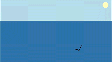
Draw an iceberg and see how it will float > here
1K notes
·
View notes


Photo


Art club theme “stoic”. Cheers!
8 notes
·
View notes
Photo

Just tooling around with moving gifs, cheers.
3 notes
·
View notes
Photo


Today’s art club theme is “delicious”.
7 notes
·
View notes
Photo

Yep! I think I’ve got it! Close enough, and I am pretty happy with the results, cheers!
5 notes
·
View notes
Photo


Oh, yeah, getting closer! :) Will have to clean up the image a bunch.
3 notes
·
View notes
Photo

Maybe a bit closer, lots of stuff to fix though on this gif. :(
2 notes
·
View notes
Photo

Not quite the effect I was hoping for....
3 notes
·
View notes
Note
Tutorial and or tips in color studies?
Hi there! Sorry to keep you waiting on this ask!
I do have another post about landscape painting which overlaps slightly with this. But here I’ll talk specifically about the observational color studies I like to do. Other artists might have different ways of approaching them (and I still have a lot to learn myself), but these are some of the ideas I’ve found useful.
1. Don’t seek perfectionObservational color studies are just that – studies. Sketches. Note-taking to reference later. They’re not supposed to be complete paintings, so you shouldn’t feel pressured to make them “perfect”. I like posting them sometimes (and hopefully you like seeing them) but there are TONS of messy, scribbly studies I haven’t posted anywhere. They’re primarily a tool to help me learn, and if messy studies help me learn, so be it!
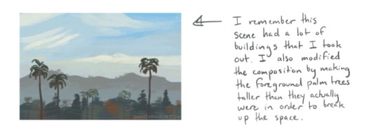
2. Simplify your shapesSo how do you avoid getting overwhelmed and lost in the details? Focus on the BIG IDEA. Decide what is most important to include in the study and leave out everything else. Start with big shapes, and add details at the very end, if you have time. Personally, I’m often interested in the sky and the color clouds become when light passes through. So I might make the study about the clouds and ignore buildings/details on the ground. or I’ll add only a very simple ground plane. Other times, I’ll rearrange a composition to include all the important information (like making an object bigger or smaller, or bringing two objects closer together).
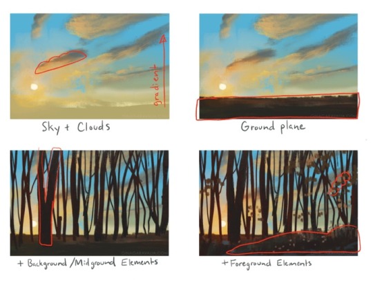
3. Step by stepIt helps to find a good workflow, especially when you have to quickly prioritize what information to include. This is relevant especially when you’re painting something like a sunset, when the light changes RAPIDLY and you’ll have only 3, 4, 5 minutes to put your colors down. For me, this usually means I build my study from background to foreground: sky, clouds, ground plane, background shapes, foreground shapes. Since I work on iPad Pro, I also keep those parts separated out into layers. In the case of those quick sunset studies, I also observe the parts I haven’t painted yet in case the lighting changes enough that I’ll need to work from memory.
4. Some fundamentals to keep in mind:
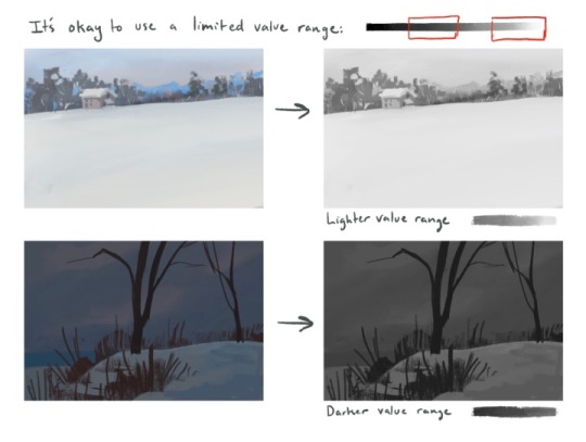
Value structure: Even though these are color studies, value plays a major role in the colors you’re observing. Pay attention to the difference in value between subjects. Sometimes this can solve color-related problems when your study seems “off” somehow. (For example, maybe that sky isn’t as light as you think it is? A darker value might mean painting a more vibrant color.)
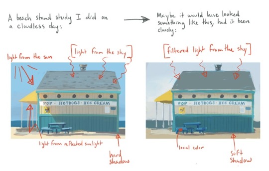
Lighting setup: Identify the different light sources in the environment. Is it cloudy and overcast? Sunny? Are you indoors, with multiple different light sources? A little study about lighting theory can really help you know what colors to look for in different lighting conditions. For example, in overcast light, you’ll see more of the objects’ local color, while in bright sunlight you’ll see a strong direct light (the sun), blue diffused light on shadows and top-facing planes (from the blue sky), and a warm bounce light (from sunlight reflecting off the ground). Will forever recommend James Gurney’s book “Color and Light” for help learning this.
Materials: Different materials reflect light sources in different ways. Being aware of how light passes through or reflects off different materials can help you understand the colors you’re seeing.
5. Going beyondAs you become more comfortable making observational studies, the more you might wish to push them even further by not just copying from life but communicating a feeling. A few ways you might accomplish this:
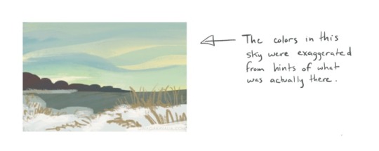
Exaggerate your colors. Suppose you see a hint of color you wouldn’t normally expect to find, such as notes of purpose or red near the horizon of an otherwise blue sky. Try making it brighter/bolder than you really see it. Bump up the saturation, maybe. This is a delicate balance, as you don’t want to exaggerate to the point where the colors become garish. But putting emphasis in certain places can remind yourself, or show whoever’s looking at your study, that you found certain details interesting.
Think about mood. A color script from an animated film follows the emotional beats of the story. As you’re making your studies, consider: how does this moment feel to me? Take a cloudy scene, for instance. Is it cold and miserable? Windy, full of movement and energy? Calm? Dark and ominous? A moment of anticipation or hope with the clouds about the break apart? Each of those conveys a completely different mood. So you might decide upon one and push your color palette to support that idea.
Don’t just copy: communicate. This last one is a bit of an abstract idea I need an example to explain:
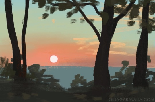
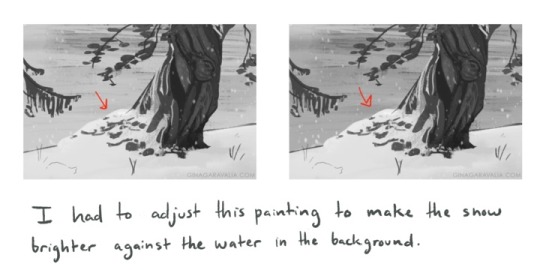
This sunset study here gave me difficulty because it involved not just color but the properties of light. The sun didn’t actually appear white to me - it appeared a bright red/pink color, glowing brighter than the sky around it. But that wasn’t something I could reproduce, because if I only painted the color, it wouldn’t appear glowing and would blend into the rest of the sky. Instead, I had to think critically: how do I communicate the brightness of this sun? In the end, I opted to make the sun white, with the color I actually observed the sun to be surrounding it.
On my Instagram, I’ve posted a lot of process videos to accompany my studies, if that interests anyone! They’re always second image on the studies’ posts.
I hope you find these thoughts helpful!
11K notes
·
View notes
Photo


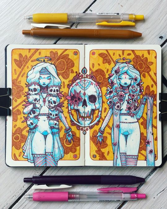
Skull, today’s Art Club theme.
4 notes
·
View notes