Text
Final Evaluation
I think through the production of my title sequence, it was very useful to look back at the research I had produced and worked on in the earlier stages. The research into the actual story itself was very important as it allowed me to gain extra knowledge that I would then be able to utilise in my work. Alongside this, the research into title sequences helped to inform my decisions as far as which style I wanted to produce my title sequence in (Animation, Stop motion, Film). I feel the motivation for the production came from the sense of freedom and almost unknowingness which was produced by working with a stop motion style. I had not worked in this style before, only when I was much younger. I had a good general idea of how it worked and what components were important but did not fully know what to expect from producing something with so many variables and such a (arguably) limited time structure.
My project cycled through a range of ideas at first, I wasn’t sure which style I wanted to work in and also I wasn’t totally sure on which storyboard I wanted to take forward. The stop motion production was produced when I had a very clear visual idea in mind. I think the process of manually editing through each individual image to make the lighting consistent was the biggest change as this was extremely time consuming and developed the quality of the overall outcome massively (as shown in blog posts). I was originally going to produce the outcome as an animation but decided against it. As well as this, I found myself hand-painting the tones I wanted to use rather than buying pre-coloured paper to use. I developed my music to accompany the visuals, working on producing my own was useful to appreciate the level it requires to produce traditional Chinese music. I developed on the audio a lot through research as well as trial and error.
Throughout this second half of the unit, I think I have managed my time quite well. The unit itself was very short and fast paced which required me to keep on top of my work and blog. I am happy with the outcome, it was one of the most time-consuming pieces of work I have produced as of this year. I feel the thought of working on the stop motion was quite daunting knowing the amount of time it took to produce a small body of visual work.
The feedback from this unit gave me the confidence I required to go forward with my ideas. I was tentative in the earlier tutorial sessions showing storyboards and sharing ideas however they were all met with constructive criticism and motivational responses. I am pleased I decided to take the concept of stop motion forward as it was a good experience. I worked on my process book quite regularly and found I needed to ask quite a few questions to allow me to maintain my motivation with that.
I think the stop motion video needed some more practice in terms of detailing and also lighting practice. It would have been useful to produce a test run of the animation to avoid any issues when shooting the final version, however this would have simply taken me far too long and stopped me from being able to produce the remaining work to a good enough standard. I also feel I need to work on the design of a process book. I think over the summer break, I will be looking into design a lot and seeing what types of designs work for a process book, taking that inspiration into second year as I understand it is a key part of a successful process book.
From this unit, I have learnt about stop motion, I have also learnt that shooting a test version almost always benefits the production of a video or animation. As well as this, I have learnt a lot of useful information about process books and what equates to the production of a successful one. I think the most important thing I have learnt from this unit is that maintaining a time plan is extremely useful, checking the rough time plan to keep on track and also making my own helped me to avoid stress and maintain a calm head throughout the unit.
feel the final outcome could benefit from further balanced lighting and also more frames. Although the title sequence worked off around 350-400 frames, having 700-750 frames would have made for a much smoother stop motion overall. Alongside this, the visuals were not overly exciting. Looking back at it, I might have enjoyed a film title sequence more.
0 notes
Video
tumblr
This introduction to PremierPro was useful. It showed us the very basic skills which would potentially become important in future work. I produced my video in a slightly different style to what was shown on screen in the induction. I wanted to create a more ‘patchwork’ style, it was just a shame there were not enough video clips to properly develop on this. I found the program to be easy enough to use, relatively similar to AfterEffects in layout and details, just with video rather than digital image. See above, the outcome of the session. I would definitely like to continue using PremierPro for later works as I enjoyed working in this style of media a lot.
0 notes
Video
tumblr
Here is my final edition of my title sequence. I took the previous version to show at our final critique and was told to fade out the ending title as the image fades out to give a cleaner look. I did that and made no other changes. I am pretty pleased with the final outcome as stop motion is something I’ve never really attempted before. The lighting is as maintained as it could be however it would’ve been nice to have more consistent lighting throughout the shooting process but this error was due to the camera.
0 notes
Video
tumblr
Addition of music to my animation. I feel this addition helped to fill the missing piece to my title sequence. I cycled through a range of different options however this is the one that ended up fitting best.
I also altered the colour and lighting very very subtly, this helped but I feel it was not overly noticeable.
0 notes
Text
Updating Music Selection
Moving on from the previous choice, having trialed it within my animation I found it did not fit very effectively and so decided to go in search of a new alternative to replace the prior version. Below is the replacement music: https://www.youtube.com/watch?v=T8SaaNlkNW4

I chose this as I found a 30 section of it that managed to fit nicely with my animation. The introduction, build-up and ending work effectively with the visuals of my video. I think this would have been a lot easier had I made my own music, however leading on from the trials on a previous post, it can be assured I would not have been able to produce anything of high enough quality to couple with the animation.

0 notes
Audio
This, admittedly awful sound is my attempt at producing a tune that somewhat resembled traditional Chinese music. The program I used was GarageBand, which had options for tradition world instruments. I had looked at what instruments were used within traditional music and all four of these instruments became available to me to use. I did have to use my laptop keyboard as I do not have a plug-in keyboard readily available to me, so I had to improvise.

The Erhu, Guzheng, Koto and Pipa were all part of a ‘world instruments’ pack that was free to download. I was impressed by this so thought it would an opportunity missed to not trial them out and try and create something of my own in the style of traditional Chinese music. I did struggle at first but after around half an hour to 40 minutes of trial and error, I produced something that was somewhat legible.
I will not be using this in my final outcome, instead I will be using pre-made audio from a professional recording of traditional Chinese music.
It was fun to try this out and experiment with it since i had the time to do so, however I don’t think it would be possible to create something anywhere close to that of the genuine sound.
Having looked at traditional music for inspiration, I came across this: https://www.youtube.com/watch?v=ssjYy9H7dVM

Which was a short, lively instrumental track in the style I was trying to create. This is the style I will be searching for to import into my own title sequence.
0 notes
Video
tumblr
This is my edited version of the stop motion video. It is scaled to fit a 16:9 ratio as I wasn’t able to shoot directly to the correct aspect ratio. Luckily, the image does not get lost at any point because of the aspect ratio.
I am pleased with this version so far, I know myself how many hours have gone into such a short piece for a somewhat interesting outcome. Doing this animation has allowed me to appreciate the time it would have taken stop motion artists to create even just an opening title sequence, let alone an entire stop motion based film/video.
The lighting is never going to be absolutely perfect throughout due to the issues I have come across during the shooting process but I am happy with how evenly balanced the lighting is throughout the title sequence.
I added a title ‘The Chinese story of creation’ for the last 5 seconds of the sequence, it fades in so is fully there for over 3 seconds. I also had the title translated to traditional Chinese, seen above the english type, in red. I thought I would add this to draw in on the Chinese influences throughout the sequence.
The next step for this video is the addition of audio, I want to add either a recording of wind or a traditional Chinese melody to accompany the video. I think the music would be more fitting as it would tie in to the basic premise of the story, being a Chinese creation story.
I plan to research into traditional Chinese instruments and also the music itself. I may also attempt to create my own version using GarageBand on my laptop.
0 notes
Text
Here is the raw shoot, before having to edit through each individual image to correct the lighting so to match with all the others. I was happy with this, looking back through it gave me quite a satisfying feeling - it is visible on the recording how much the lighting flickers between shots, so it had to be changed.
Moving forward, I will be altering this to run to 30 seconds rather than the current 23~ seconds. I will be doing this by looping certain areas of the sequence. I am excited to take this to the next development point, where I am working on Premier Pro to create a 30 second title sequence outcome.
Side note - ignore the audio, couldn’t get rid of it!
0 notes
Text
Technical Difficulties with the Shooting Process
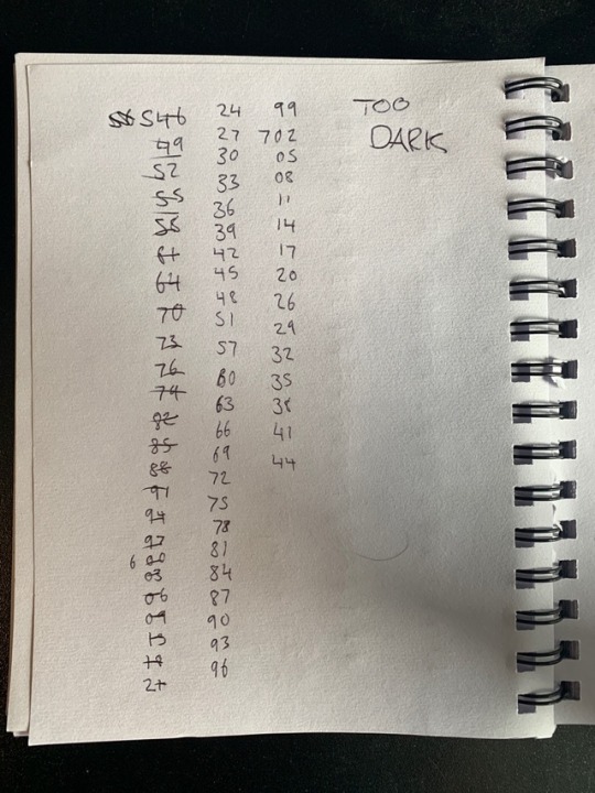
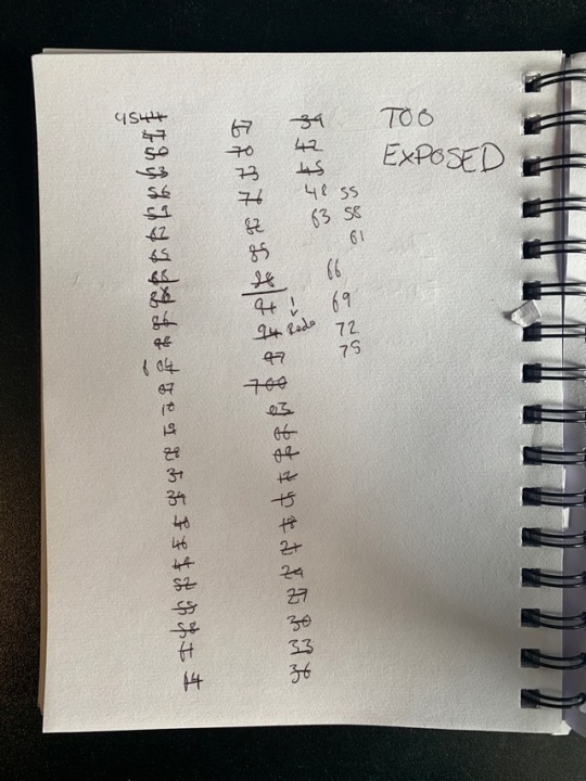
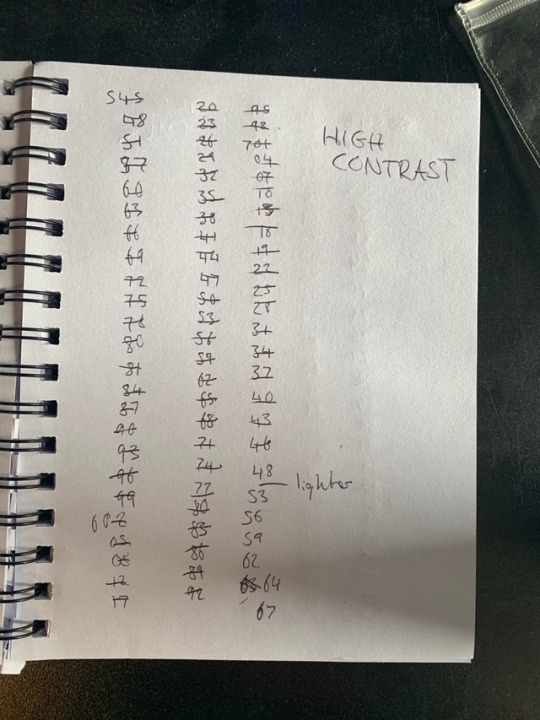
Having shot the base stop motion sequence, I then looked back through the images the day afterwards. When I looked back through them I found the camera has, for some unknown reason, shot in a sequence of three different exposures/lighting levels. The first shot would be over exposed, the second would be good lighting but very high contrast and the third of the trio would be really dark and under exposed. This was strange because the stop motion had been shot inside, under artificial lighting with no natural lighting being able to affect the shots. The camera is the only thing I can see to be the issue, I am happy I realised this but clearly when I did, it was then too late to reshoot the entirety of the stop motion.
You can see the original shoot running through on the camera screen in a separate post.
I decided to continue on with the title sequence, but this required me to manually go through each image individually, note down which shot needed what alteration and then list it down. See below, the three lists of image numbers that were then edited to match as best I could.
I found this process to be honestly painful, I would have hoped the camera would have maintained equal lighting throughout the entire shooting process. This would have allowed me to save a half a day’s worth of working time.
The images were eventually edited through and all crossed off, the outcome (in a separate post) shows a much more evenly lit title sequence that I am a lot more happy with.
0 notes
Text
Shooting the stop motion title sequence
Using hired equipment, I shot the entire stop motion title sequence within the space of around 6 hours. I feel it would have taken a lot less time, should I have been more experienced with the overall process. The equipment I hired out was useful, especially the Manfrotto tripod which was critical. I researched into what sort of lens is best for shooting stop motion videos, the result I go was what made me choose to hire out an 18-70mm lens. This prime lens gave me a great amount of scope for shooting at close range and at a distance. I knew I wanted to avoid using a fixed lens as I needed to get the distancing from the paper exactly right and this would have made the entire process a lot more difficult.
The camera body I hired was a Nikon D7000, which is a relatively new body. I chose a Nikon over a Canon due to the similar interface and layout to my own Nikon DSLR, looking back on it I wish I had used a Canon to give me a potentially more reliable shoot.
See below, shots of the layout and how I was shooting my title sequence. Once I had the camera set to the correct focus depth, using auto focus, I switched it to manual focus to maintain the same depth throughout the entire shooting process.
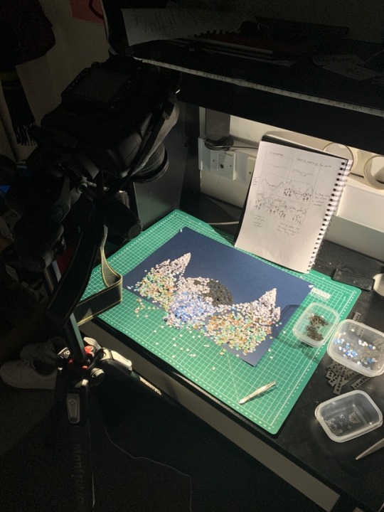
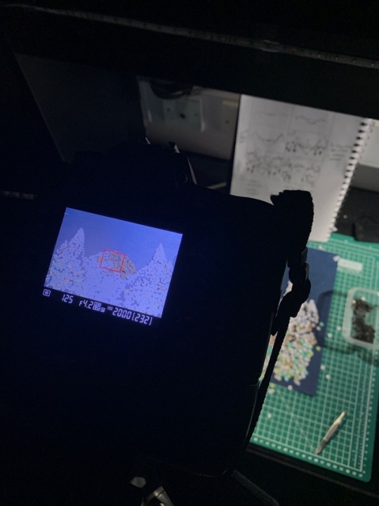
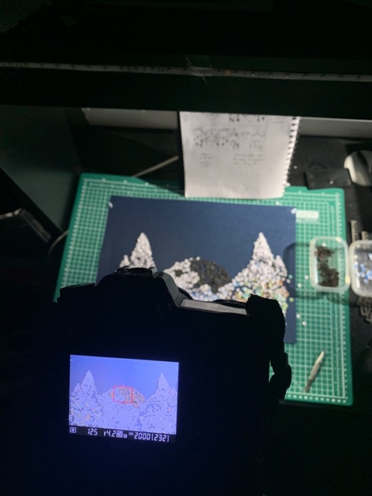
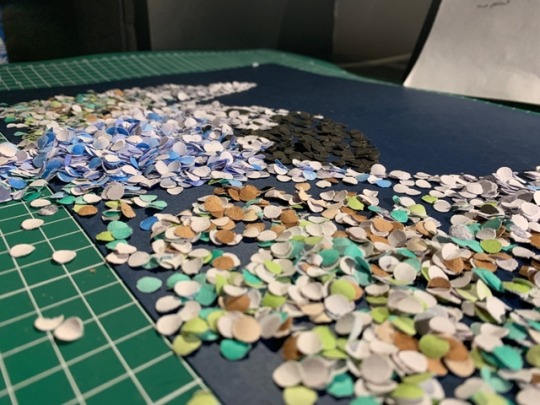
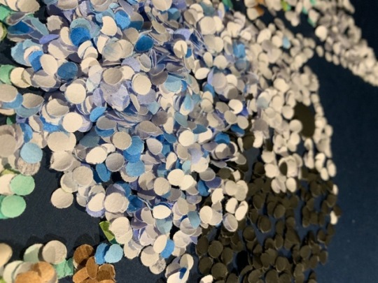
The visuals themselves were layered quite a lot to give a sense of depth. I liked looking at the pieces closer up, it showed a really nice depth of tones and colours.
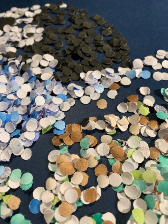
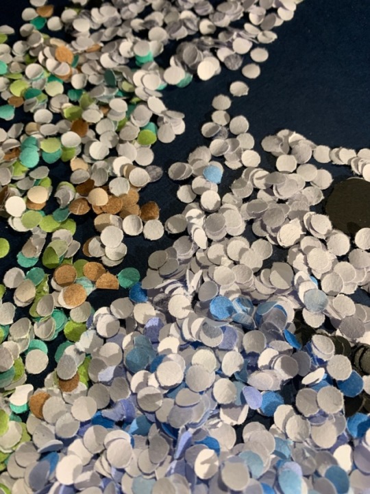
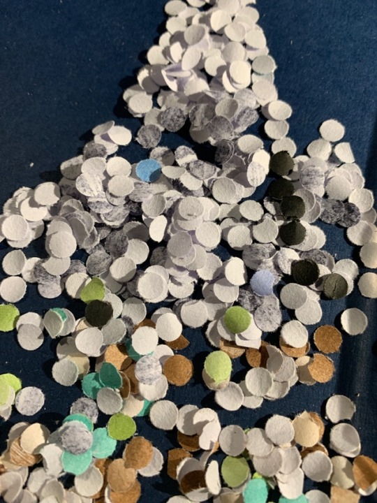
0 notes
Text
Stamping circles for stop motion
I looked/researched online for the best places to buy coloured paper, it gave results like WHSmith and Asda. I visited both and the range of colours were not very broad, also the tonal range was essentially non-existent. I decided to abandon the idea of buying coloured paper and instead thought to use watercolours to paint plain paper to produce the tones that I wanted for my title sequence.
I created a few sheets of each. A range of browns, greens and blues. I also created grey tones using a sharpie and used both plain black and plain white paper. The process was relatively straight forward and I found it to be quite relaxing, by the end of it I was left with around 9 sheets of water-coloured paper in a wide range of tones that looked a lot more natural than those in the shops.
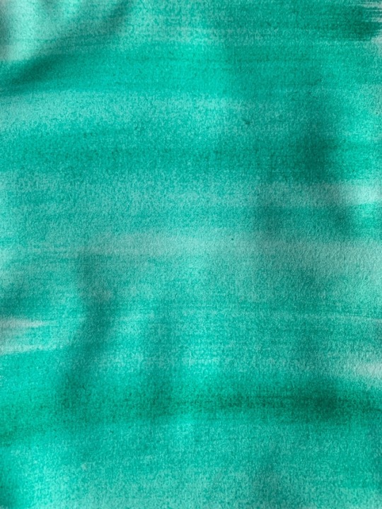
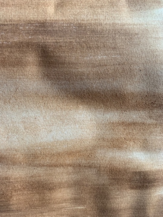
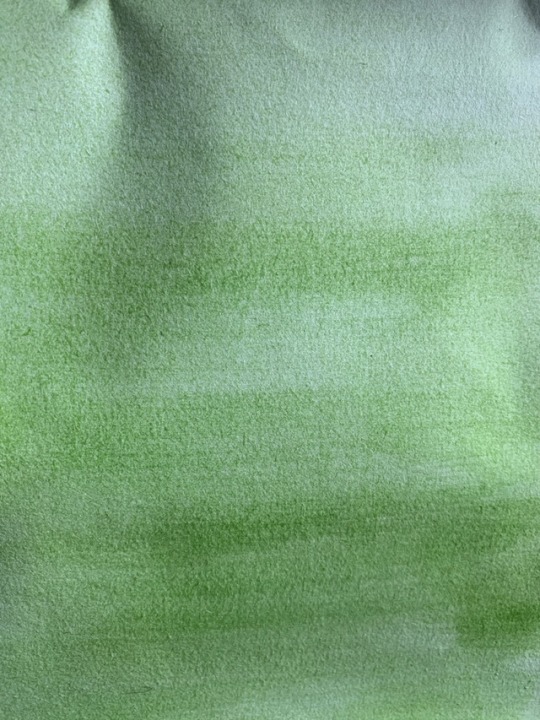
I proceeded to cut long strips of the coloured paper and began stamp out holes using a hole punch. The reason for the use of a hole punch was to created hundreds of perfect circles. These circles can be seen as representing the Yin Yang symbol, I thought this tied together the medium to the story very effectively and was a nice touch. The idea of creation coming from the Yin Yang was implemented into my own work, which was ‘created’ again by hundreds of tiny Yin Yang symbols.
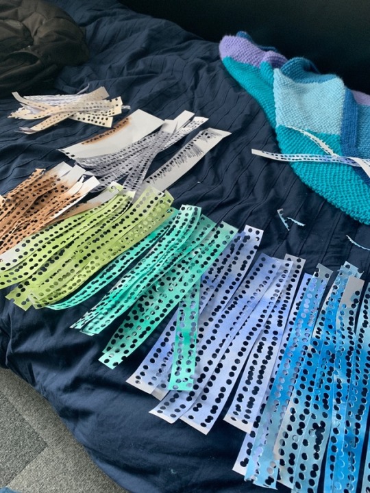
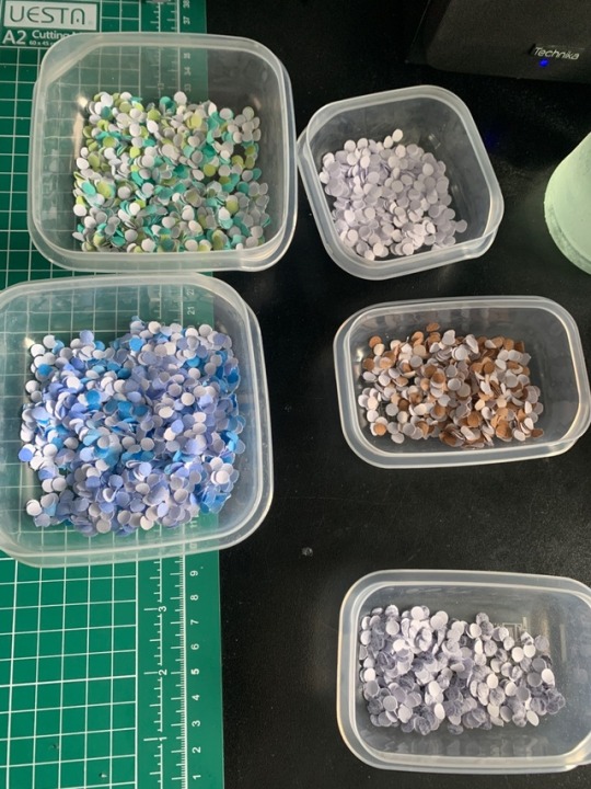
By the end of the stamping process, I had a wide range of tones and colours which I placed into individual tubs to keep them separated. I found this to be a very effective way of keeping them separate whilst I was using them during the shooting process. My favourite set of tones are the greens and blues because they give off the exact kind of natural tones I was hoping for, really pushing a feeling of water and land.
0 notes
Text
Storyboard ideas
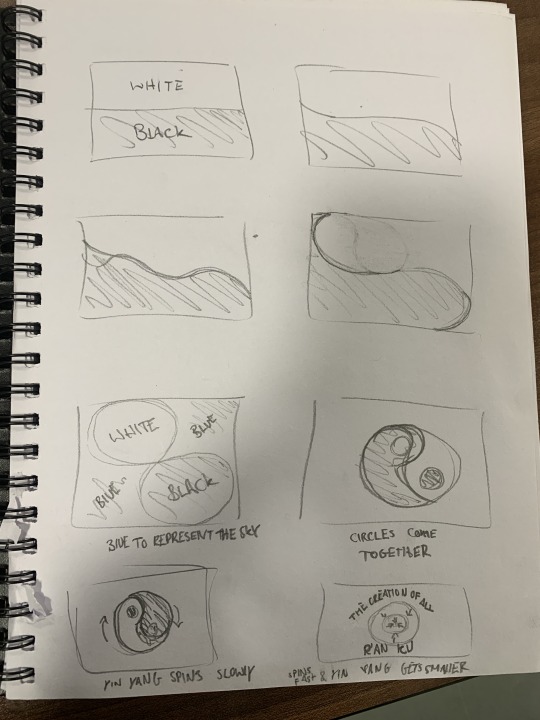
Below are some story board ideas, there are a range of approaches. From these storyboards, i could approach the title sequence from either a stop motion or animation point of view.
The first storyboard was based totally around the idea of a yin yang symbol being created. The lines curve and bend to create shapes and eventually blend into a circle showing the yin yang. The symbol would then begin to spin and get smaller as a title appears around the area.
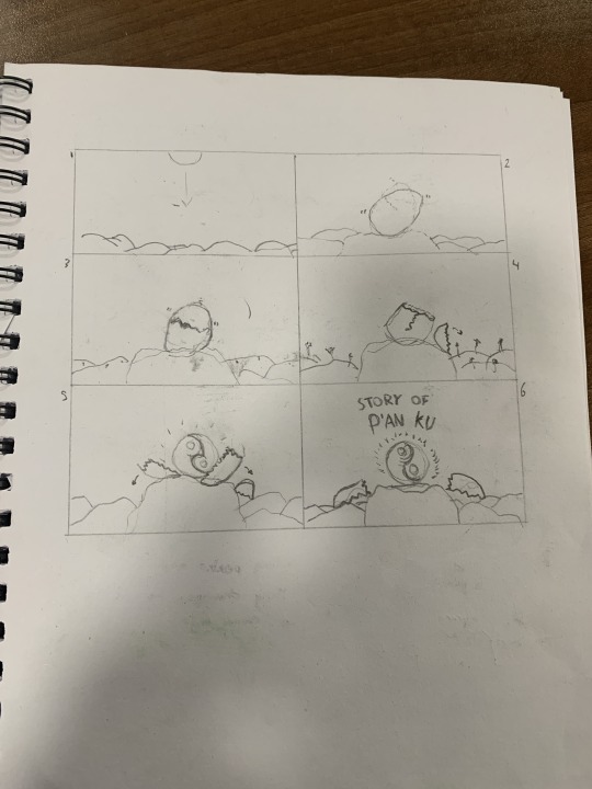
The next two show the visual of Pan’gu falling from the sky in his ‘cosmic egg’, the first shows the egg to reveal the yin yang symbol. I chose to do this because the cosmic egg was explained to be the yin yang symbol in the story research I did. I like the idea of this, it is very simplistic, much like some of the references I had looked into.
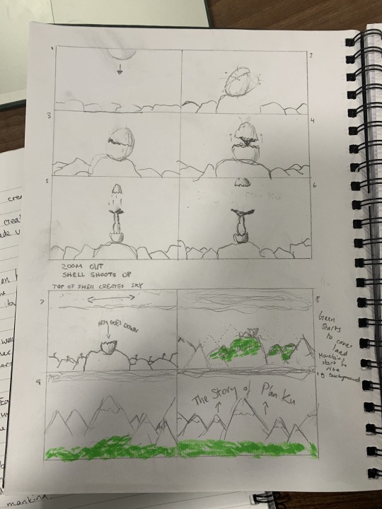
This version of the idea above is a lot more developed, showing an egg falling and landing. The egg cracks revealing a hand and arm coming out from inside, this being Pan’gu. The arm would shoot up quickly with the top half of the egg shell to show the creation of the sky. The shell ‘lid’ would then expand across to create a visual sky. The arm would then come down back into the body of the shell and as this happens, greenery and life begins to form and build on the landscape which is also being created. I chose this approach because it does not give too much of the story line away and it is quite interesting and captivating. The issues I have with this idea are the time limit, fitting all of this visual information into a short 30 second burst would be challenging.
This final storyboard was probably my favourite, it draws in on a specific area of the story:

i wanted the visuals to work off of the idea of land and life being formed. The simplicity would tie in nicely at the beginning through a basic line, which would bend in and out to create a wave formation which would slowly begin to form mountains and valleys. The valley would fill with water to create a river flowing through. As this is happening, the mountains would become snow-topped and the land below would grow rich in earth tones like green and brown to illustrate life.
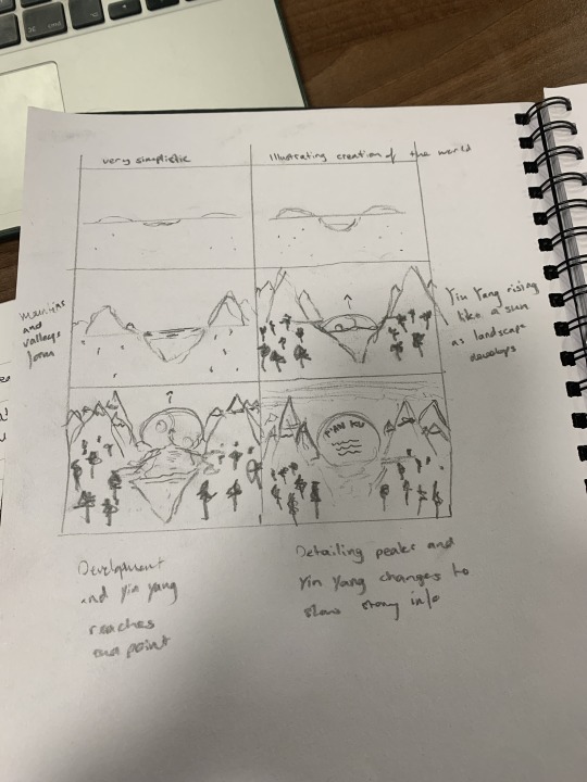
This is probably my favourite idea and i think I will be taking this one forward to work on. I feel it has a good balance of simplicity and developed detail as the story goes on. The storyboard does not give a lot away, it just shows the formation of land and life, no real details to the story other than the rising Yin Yang in the background. I like the idea of including one key standout feature within the title sequence, the Yin Yang.
0 notes
Text
Researching into ideas for the Title Sequence
The title sequence could be approached from any respect. I think the main areas I want to explore are animation, stop motion and perhaps film. Stop motion and film being two areas I have not ever properly looked into in my work, I feel they may be a bit more exciting/more stressful than creating an animation. However, I feel with the vast range of skills i have developed in the tech sessions with Scott, creating an animation could potentially be the most efficient/ enjoyable experience.
I think I want to step out of my comfort zone a little. I will try to create an animation however I feel either film or stop motion will be the route I decide to take for the final outcome.
Animation
With animation, I felt most at home and most comfortable. I think the use of Scott’s sessions have allowed me to grasp the essential skills to create a multitude of animation in a range of styles. I looked at a few animation title sequences to give me some ideas as to what I should be aiming for, should I decided to take this route.
The first example I looked at was quite nostalgic, it was the opening title sequence for Monsters Inc.: https://www.youtube.com/watch?v=FCfv5P8GXU4


I decided to look at Monsters Inc. as I remember the opening title’s to be very exciting and colourful. The animation style is upbeat and lively with a rhythm to the movement of each object. The timing is matched to the upbeat music which runs throughout the entire title sequence, making it very enjoyable to watch and listen through. The points I can take away from this animation would be, music, timing and colour being very important. I think another feature of a strong animation is to make it unique, as this one is. The title sequence does not give the storyline away, it focuses on one key item that runs throughout the movie which are the doors. I will keep this in mind when creating my own storyboard.
Another animation I looked at was the opening title sequence to Ratatouille: https://www.youtube.com/watch?v=FCfv5P8GXU4


Like Monsters Inc. I also remember Ratatouille as a nostalgic movie, the opening title sequence again being something that was very memorable. There was a lot of action even in these flat animations. Much like the Monsters Inc. sequence, Ratatouille uses a range of colour and movement. There is of course a massive jump between what I am able to achieve when compared to the level to which these title sequences are produced, however it is inspiring to see and understand the skills and techniques used. Ratatouille is a good example of why music is important, this title sequence has typically french music running throughout it, this is something I will hope to take into consideration in my own work. Whether it is music or a recording, it will be a big consideration to what is actually to be used in the final outcome.
Film
The first film title sequence I looked at was Napoleon Dynamite (https://www.youtube.com/watch?v=z-gjywJN6tA), this is a notoriously famous sequence so I thought it would be worth researching into to see why exactly it works so well.

The title sequence is very clever, it works off very well known visuals of everyday items like foods, stationary and cards. Each scene of the opening title is filmed on a still tripod, the movement comes from the hands revealing items which have names and opening credits on. I am a big fan of this opening sequence, even though i have not actually watched the film itself. I would be interested to try and take inspiration from this idea and employ a similar style to my own story. What makes this impressive is how unique and endearing it is, the simplicity is key in this title sequence.
I also decided to look at the opening title sequence of Touch of Evil(1958) (https://www.youtube.com/watch?v=rSsfLfG7BSA), as this has one of the most notorious title sequences of any film to date.


This title sequence works off a single rolling shot running the span of the entire 2 and a half minute sequence. The key memorable parts of this title sequence are the guitar riff at the beginning and at the end, alongside the continuous filming of one scene. Although it is only one scene, there is a lot going on whilst the camera moves around following the car. I think this sequence works well because there is a sense of tension.
Stop Motion
I researched into a range of different styles of stop motion, my initial idea was to use a collage style to create my moving images so I looked into work that drew in on the same ideas. This is a stop motion title sequence to the Movie ‘300′: https://www.youtube.com/watch?v=f8OqNdNpRnQ. I found this to be very interesting to watch as the scale of some of the paper used helped to move the stop motion from a set position. I liked how they also incorporated a ‘bloody’ effect using sauce or something similar.

The things I did not like about this stop motion were the use of tone/colour as I thought it was quite dull having a brown background. Alongside this, I also did not like the way they had used printed text, I think in my own work I will mix media by creating a photography based stop motion with digital type.
Another video I looked at was the ‘American Horror Story’ title sequence remade into a stop motion version: https://vimeo.com/175645078
I found this to be a little more interesting than the ‘300′ stop motion based purely on the addition of sound. It was interesting to see how much of a difference audio could make to a video, making it instantly more watchable and exciting. The use of audio can help to set a certain mood to the overall piece, this is something I will definitely have to consider in my own work.

0 notes
Text
Researching into the Story of Pan’gu
‘Pangu (simplified Chinese: 盘古; traditional Chinese: 盤古; pinyin: Pángǔ; Wade–Giles: P'an-ku) is the first living being and the creator of all in some versions of Chinese mythology.’
Having read the story of creation provided, the next step was to look into the visuals already relating to this ancient story. I think this was important to do because it allowed me to then take influences from historic references and apply this to my own work.

See above, this is Pan’gu - the first living being and creator of all.
I was not overly surprised by the appearance of this character, he was also illustrated in a generic style which is stereotypically Chinese. The character is holding the Yin Yang symbol which ties into the story.
In the story, Pan’gu pushes the lighter half of the yin yang upwards to create the sky whilst the darker half remains and creates the ground. The yin yang actually represents the ‘cosmic egg’ Pan’gu comes out from. I want to include one or both of these key points of interest in my title sequence.
Pan’gu was essentially a giant, he lifted the sky for 18,000 years, raising by 3 metres every day. This distance was what Chinese people believed to be the distance between the earth and the sky.
From the story, it reads that Pan’gu created rivers, mountains and valleys before dying. The fleas on his body then became the human race.
I think the features I want to pick out from the story are the more visual, landscape aspects. The valleys, mountains and rivers are all very insightful to creating a scene and I feel this could allow me to create a strong title sequence without giving too much away.
I am not sure if I want to include Pan’gu as I feel this might be too revealing for the title sequence however I may try to give references to him at some point. As for the Yin Yang/cosmic egg, I think this should be included as it helps to determine which Chinese creation story is being shown, since there are such a range.
0 notes
Text
Creating a Title Sequence
For this new project, I was interested to try something new I had not yet attempted during my first year. The project required us to choose from a list of stories and create a title sequence for it as if it had become a show. The sequence needed to be exactly 30 seconds and could be approached in any chosen way.
I chose to do the Chinese creation story, which is one of many stories in Chinese culture talking about the creation of the world. This story being used for this project was about Yin Yang and Pan’ku.
I decided to research into the origins of the story and also visual art that already supported it. I then followed this up by brainstorming some different approaches I could take to create my title sequence. (See later posts)
I found this story to be the most intriguing because it was the shortest of the story selection. I think this made me want to feel a little more challenged because having such a short story made it harder for me to think of a title sequence without giving away the entire story.
0 notes
Text
Editorial DesignMood board
https://pin.it/vmimgtaucxnygq
I found this moodboard to help with the development of my work, having not properly produced an editorial style booklet before, I deemed it necessary to do this. I took inspiration from a few of the designs in the moodboard, pushing my own design ideas onto them.
0 notes
Text
Foliage Imagery Mood board
https://pin.it/wofymgygizdk33
This moodboard helped me to gain inspiration for the style of imagery I wanted to include in my editorial design. I took the idea of foliage from the overwhelming theme of nature in the transcript. It made sense to push my editorial imagery down this route.
0 notes