Text
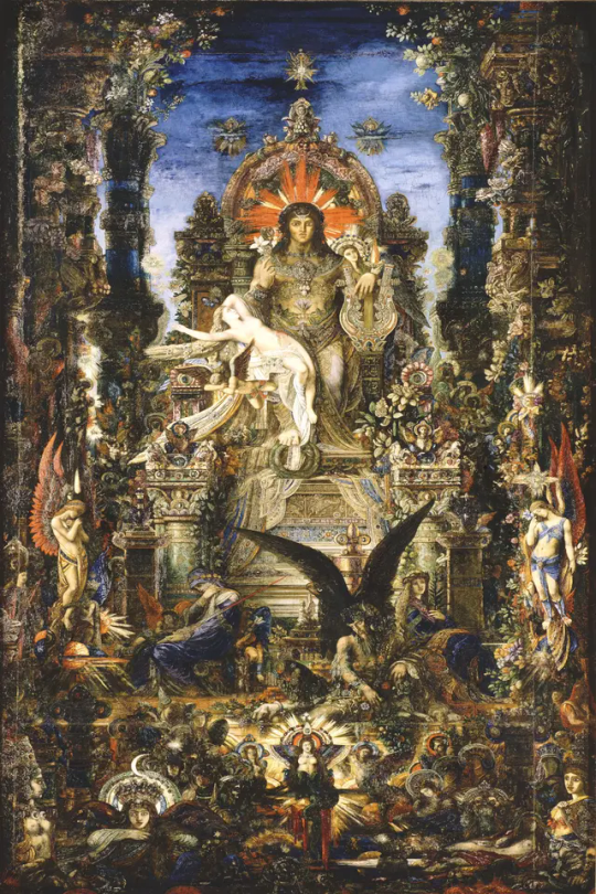
Jupiter and Semele. Gustave Moreau. Oil on canvas. 1895
Blog #10
Prominent example of symbolism in art history. The painting itself is extremely lush, busy, and architecturally inspired. It depicts the fable of the affair between Jupiter, or Zeus, and a mortal woman, Semele. All around are depicitons of Gods from different cultures and folklore from an extension of Greek mythology to figures of Christianity. Jupiter is adorned with jewels and gold to represent his overwhelming power. He is painted un even in scale to Semele to convey his power as King of Gods. Composition wise, there is hardly an area on canvas that is not filled. This calls back to religious paintings of heaven in which many bodies are gathered around. I like how the tone is very authoritarian as if Jupiter is commanding both the Gods and the individuals who view the painting as well. His eyes are large and locked in to higher wisdom, as if he is aware of the events in the painting.
0 notes
Text

Wataru Itou. Castle On the Ocean. Papercraft.
Blog Post #9
This week I found something that I think is really cool.
I was bored in class and started folding origami and then I got the idea to start looking into complex paper craft for my blog post this week. The paper city was made by Japanese student Wataru Itou and took over 4 years of work. It cannot be considered "traditional origami" because it is not made with a single sheet of paper, but instead many intricate clippings that have been folded and glued together by hand. The installation is complete with electrical lights, a working train, a rollercoaster and a Ferris wheel. It is located at a unique location as well- Umihotaru- a service area in the middle of the ocean, right between Tokyo City and Chiba Prefecture. What I personally love most about this piece are the electrical lights because they can change the entire vibe of the installation with either warm or cool tones. I've also seen pictures where they light it with muliti-color combinations like purple, red, and green. Some sources state that the colors change for special occasions such as New Years, Valentine’s Day, or Christmas! The texture of the paper medium is also noteworthy. I like how some angles show a 2D flatness while other areas are more textured where light can shine through. It really is a testament to the artists craftsmanship. I would love to see this in person someday, I can't imagine the magical feeling while watching the train circle it.
I don't know if it's cheating this week since I know we only need one photo, but, I've included extras because there isn't just one angle to view this thing to capture the complex details.
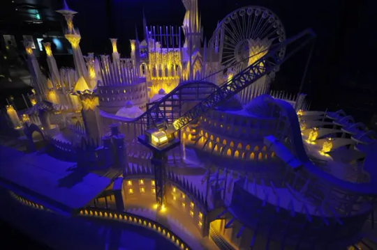


Here is an additional link to view more photos.
0 notes
Text

Dancing Lady. Film. 1933. Directed by Robert Z. Leonard
Blog #8
This still is from the 1933 film Dancing Lady starring Joan Crawford and Clark Gable. This scene is from the end credits. There so so much I like about the composition of this photograph, although it doesn't do the moving parts of the scene justice. The photo is noted by its use of shadow and balance of color. The black and white film in which this is shot translates an engaging contrast between the simultaneous moving ring on the bottom of the merry-go-round as well as the mirrored cone in the center that they circle. There is both circular and triangular composition present in the photograph which balances the image and draws the eye towards the center. The women in the mirror point vertically near the center while the women on horses circle around. It is a very busy image that is better viewed with all of its constant moving parts.
I particularly like this image. Through the archive I've been building, I noticed a theme in circus concepts and big tops and carousels that draw me in and inspire my own creativity.
Below is a link to an Instagram account where you can view a short clip with its moving parts. It is extremely well-balanced and engaging to watch.
0 notes
Text
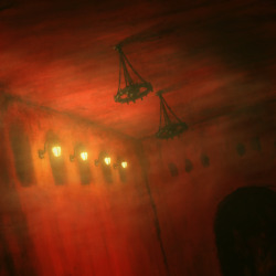
Suguru Tanaka. Untitled. 2020
Blog post #7
Suguru Tanaka is a living artist who creates eerie and surreal paintings. Many people compare this art to Zdzisław Beksiński, the Polish nightmare artist. Although these artists are similar, they cannot be compared. Suguru Tanaka mainly uses red colors and hardly works with any other color besides the yellow lighting showcased in many other works. When showcasing a strong monotonous color like red, lighting helps break up the ubiquity and creates the mysterious environment of the paintings. It is a skilled practice to create such depth with very minimal color. This particular painting is one of many I added to my archive as this strange world is something I'm highly captured by. In this painting, the contrast between shape and form of the arches and the (available knowledge of chandeliers) disrupts direction. Working with the color, these elements create an almost hostile environment. The sharp angles of the building that face us directly disrupts the flow of the painting showing there is almost no way out, through or forward, except through the darkness in the arches that lurk on the edges. The work seems almost alive and breathing. There is no definite way one can turn the painting to make logical sense, truly tapping into a subconscious nightmare realm with inescapable, harsh, colors, and illogical rooms.
0 notes
Text

#6
One of my favorite images from the color walk. I took this in the JCM gallery upstairs from our classroom. It’s not exactly a “color” but I was very intrigued by the shadows casted and the full greyscale displayed. I’m not sure if it was intentional or not to place the light this way to cast the shadows through the book, but it was very symbolic for me as well. It’s like how people say an artists work will outlive them- like a shadow over their life that is larger than themselves. There are about 15 different colors on the greyscale in this photo and ever since I took it in the context of color identification I couldn’t stop thinking about it. I noticed I was drawn a lot towards shadows and reflections for this color walk. It was very smart to think about the camera obscura as well before moving to this module because I do feel like I gained a lot of perspective on how to view things.
I put a filter over this image to make the colors more distinct.
0 notes
Text
#5
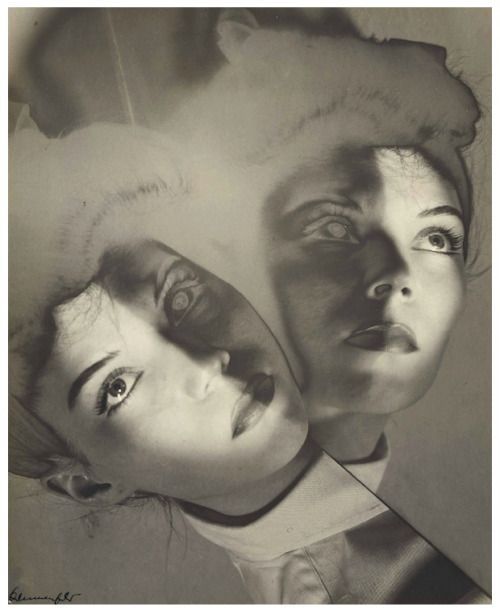
Erwin Blumenfeld. Maroua Motherwell, New York , ca. 1941–1943
"When the old world collapsed. I was there, playing my own personal part in it all; it was ugly, stupid and life threatening," Blumenfeld (in his autobiography) Eye to I: The Autobiography of a Photographer.
Erwin Blumenfeld was born in Berlin to Jewish free-thinking parents. His work as a photographer took him to both Amsterdam and Paris where he would do freelance work for both Vogue and Harpers Bazaar. He lived in Paris during the outbreak of WWII where he was put in a French internment camp and endured throughout the war until he was able to flee to New York in 1941.
Erwin Blumenfeld holds an exhibition in the Jewish Museum of Belgium for his sustained artistry. He was mainly interested in subjects of death and women, but he was also an expert in laboratory work and experimented with photographic techniques such as distortion, multiple exposure, photo montage, and solarization. Although he is most known as a fashion photographer, his work is surreal and engaging.
This piece is particularly striking for me. What captures me first is the color which looks almost like an x-ray, perhaps through solarization processes to change the color and add a collage effect. The composition includes one figure looking up while the other is looking not directly at the camera, but at something maybe slightly in the distance. Blumenfeld's use of distortion around the top of the composition works with the symmetry to create a singular movement, like what the subject was viewing behind the camera moved with her line of sight. I also like the use of negative space.
1 note
·
View note
Text

#4
"Tragicomica" the San Palo shop of Gualtiero Dall’Osto is the oldest and most renowned mask shop, and is a symbol of art and beauty in Venice. Although mostly associated with the Venetian festival of Carnival where aristocrats would dress up in opulent costumes and wear the handcrafted masks, there was a brief period in which they completely disappeared.
“Carnival is a very ancient tradition here in Venice, but it was a tradition that disappeared with the coming of Napolean, with the Industrial Revolution, then with the two World Wars. It never happened again. Masks disappeared completely from Venice."- Tobia Dall’Osto
The handcrafted paper machet process is entirely archival, alive through students, choreographers, scenographers, including Tobia Dall'Osto's father, who started retaking the tradition; looking at the books, what was the mask, and how it was made. The tradition can be traced back over a thousand years to the Middle Ages and now, through archival work and the artisans of Venice, Carnival remains a festival of international recognition.
0 notes
Text
#3
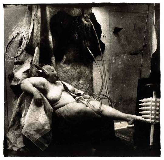
Joel-Peter Witkin, Sanitarium. 1983
Joel-Peter Witkin is an American photographer mainly inspired by the themes of death and religion. His photographs feature the bodies of cadavers, severely disabled people, or trans and intersex individuals. He incorporates a range of people with unique physical features and presents them in an artistic and elevated manner, sometimes incorporating nudity, to showcase the absurdity of death, and social isolation due to physical disfigurement. The themes of his work contrast each other to create a grotesque, yet visually striking image that reflects an unseen reality that is simultaneously foreign and familiar.
Joel-Peter Witkin mainly recalls a traumatizing moment from his childhood in which he viewed the decapitation of a young girl. This incident could have inspired his fascination with the macabre.
"It happened on a Sunday when my mother was escorting my twin brother and me down the steps of the tenement where we lived. We were going to church. While walking down the hallway to the entrance of the building, we heard an incredible crash mixed with screaming and cries for help. The accident involved three cars, all with families in them. Somehow, in the confusion, I was no longer holding my mother's hand. At the place where I stood at the curb, I could see something rolling from one of the overturned cars. It stopped at the curb where I stood. It was the head of a little girl. I bent down to touch the face, to speak to it – but before I could touch it someone carried me away."
1 note
·
View note
Text
#2
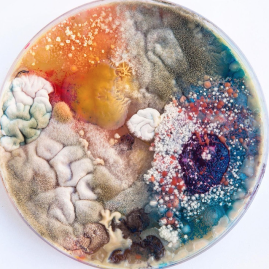
Plesen, Dasha. Photograph. September 11, 2020.
Dasha Plesen is a Moscow based bio-artist. She describes her inticate process as a "kitchen" where she cooks and feeds her cultures which grow into intricate little worlds of mold and bacteria. On her website, https://dashaplesen.com/#about-artist one can read her artist statement to gain more persepctive of her focus within the intersections of art and science. She states, "I want to undergo the idea of medium as the key point, because it affects the way how we explore art – it's immediately triggering your associations, experience, tastes, ego, as I believe that everything we see is a reflection of inside – so and art becomes a literal mirror, where we can see the truly us." Her mold art becomes an almost poetic representation of, as she puts it "quantum entanglement", which creates fractal-like, chaotic, yet predetermined shapes mirroring our own world, the same bacteria which forms our own reality.
Her art really speaks to me becuase the intersection of art and science is a subject im highly interested in. This kind of work makes sense to me and I appreciate the metaphor of her cultures being a "reflection of inside." Ive always thought myself that the expansive universe is infinately contained in a single cell. It represents a kind of "as above so below" effect in which we can view infinate possibility- of both the universe and microbiology- on a petri dish. To me this work/medium invokes a very poetic feeling.
below is a link to the artists instagram page where she frequently posts her cultures and processes in detail.
https://www.instagram.com/dashaplesen/
0 notes
Text

Martin, John. Pandemonium, 1841. Oil on canvas, 123x184cm.
Blog post 1
John Martin is best known for his landscape paintings depicting the apocalypse. The work above, Pandemonium, refers to the first book of John Milton's epic poem Paradise Lost in which "Pandemonium, the palace of Satan, rises suddenly built out of the deep." However, the term does not describe the palace of Satan, or a physical place, but is used to describe the army of demons commanded by Satan. In Martin's work, a greek-like heroine figure is the concentrated focal point of the painting, representing Satan commanding his new army in hell. It can be inferred that Martin was deeply involved with the invocations of Paradise Lost through his depiction of Satan as an Achillian hero fighting against the rigid rules and restrictions of Heaven, similar to Milton's characterization of Satan in the epic.
I read Paradise Lost in an English class last semester and was deeply inspired by the humanization of Satan as a prideful figure who wasn't scared to use his free will given to him by God. It is a poem that deeply inspires me and is invoked in Martin's work. There is something about the heroine figure of Satan that aligns perfectly with Milton's characterization in the poem, coupled with the nightmarish detail of the landscape and the descriptions of a new palace forming that mirrors man in his duality that invokes feelings of both peace and chaos for me personally.
1 note
·
View note