Don't wanna be here? Send us removal request.
Photo

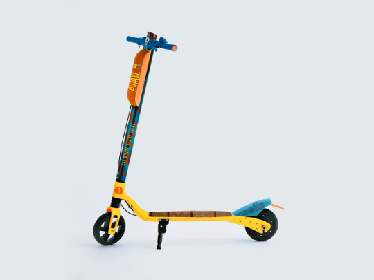
Project 3 Ambient Advertising, Conceptual Strategies, Awake Chocolate
0 notes
Photo

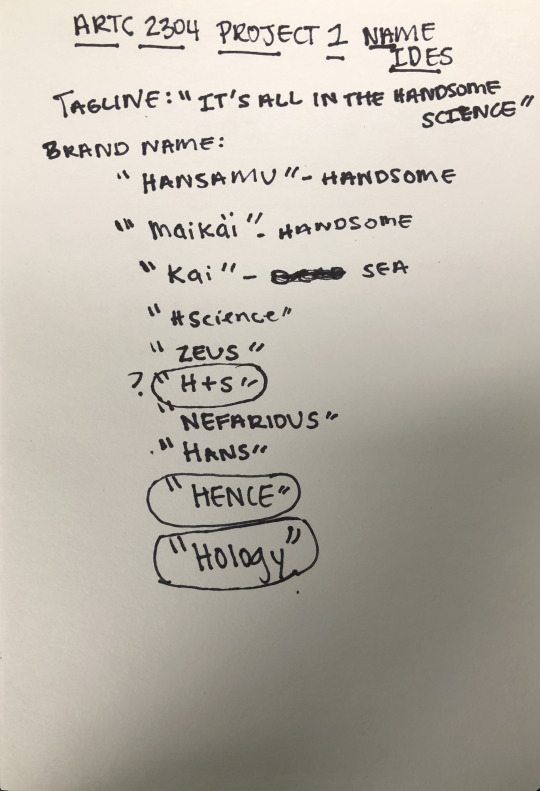
Packaging Design Project 2, Conceptual Strategies, #Hology
0 notes
Text
ARTC 2304 Project 1
Project: Men's hair conditioner & beard mask box
Identify | What do I already Know?
-- A men's hair care subscription box.
-- Items include conditioner/ beard wash off hair mask
-- All items created from natural salts from the dead sea.
-- The client is men around the world
-- The problem is the want for men to actually purchase the product
-- The opportunity is with a beard kit and growth serum infused within the product, men with beard bald spots will reach for it
-- Opportunity for product expansion
Audience | Who am I talking to?
-- The age group would target 18-65
-- The gender this product would target would be men
-- These boxes are located E-Commerce style, all will be available online
-- Economic status would be an affordable monthly subscription
-- Their values would include just getting the job done easy, fast, and effective
-- Most men are uneducated about the importance of conditioning and grooming
-- A quick and easy fix to dry damaged hair and beard
-- They would see the product as fixing beard balding spots along with thinning hair in scalp
Personality | What image do I want to project?
-- I want to evoke an emotion of want for self-care
-- I want to use a tone of empowerment for your hair
-- Young, Hip, Minimal, Playful identity
Research | What are the unknowns?
-- Larger haircare brands such as redken, tresemme, L'oreal
-- The competitors message is strong beautiful hair
-- My products strength is the target is directly for men and focused on men's hair care rather than general hair care
-- Weaknesses include- men are much harder to reach for good hair care
Requirements | What are the parameters?
-- Deadlines not established yet
-- Long Term Goal to create a larger line of mens hair products
-- Short term goals include getting men more interested in hair care
Results | What are the final expectations?
-- The goal is to establish a successful men's hair care line to get them more involved with good hair.
-- The expected end product includes an online box for hair and beard care that informs men on the importance of hair care without feeling unmanly
Creative Brief | Determine the overall goal.
Identify- Men's Hair and Beard care online box.
Audience- Young Men Targets
Personality- A sense of empowerment in men for good hair care
Research- Strength of more focused target, stronger product. Weakness, men are harder to reach for good hair care
Requirements- Long and Short term goals of getting men more involved with their hair
Results- Men around the world with good hair and beard care, helping them live happy hair lives.
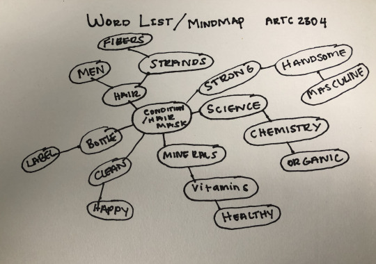
Word List:
Men
Dead Sea
Minerals
Salts
Hair
Vitamins
Healthy
Strong
Handsome
Science
Organic
Subscription
Mask
Shampoo
Conditioner
Water
Trendy
Hip
Young
Powerful
Cool
Edgy
Minimal
Fresh
Clean
Intense
Long
Color
Strand
Beard
Bristle
Fiber
Chemistry
Brown
Black
Straight
Curly
Short
Mood Board: https://pin.it/nivs4xopjpcxv5
Value Proposition
Our- Subscription men's conditioner and beard mask
Helps- Men have strong handsome hair and beards
Who-Want to have conditioned hair and beards
By- Applying the products daily for a month
Unlike- Others where "conditioning" is targeted more for women


FINALS


1 note
·
View note
Photo

Opposing Forces
“Personality Disorders”
0 notes
Text
Design Thinking

Design thinking is a systematic process of thinking that allows the designer to develop innovative solutions by exploring various concepts. It allows the designer to approach the solution more creatively and broadly than to focus on just one idea, which may not be the best option for the client. There are different approaches and methods that can be used to achieve this conceptual result. The three most common across all studies are the “key strategic aspects of systems approach, framing, and firsts principles.” This allows the designer to develop a solution concept that meets the framework and meets the criteria leading to more originality.
In the book ‘Design Thinking” by Nigel Cross, he mentions how “everyone can be creative and design”. Design is all around us and we use design to do a lot of things in our everyday life. So how is it that design is still complex? Well because we can design something that has been done before but the goal is how can we create something that hasn’t been made before, that communicates the message and satisfies the fundamental criteria that the client has set. As a designer starts on a new project it may be an unconscious habit to immediately jump right into our first idea. Yet, Cross states how “designing is difficult to conduct by the purely internal mental process, there is a cognitive limit as it is best to interact with an external representation.”
In order to successfully reach the design’s full potential, it is important to put different responses down on paper than working from your head. One should “develop ideas through sketches, drawings, and models in order to explore and understand around the building up of ideas.” Even a completely new design can be achieved through this process by taking different details from each piece to create a new solution together. With this purpose in mind, the three strategic approaches allow the designer’s final concept reach its full potential. First, it is the systems approach which was implemented by innovative designers themselves. It is important to think about the solution as a system and “how they relate to one another.” If not so, there will be a spotlight in a certain piece that may create an unbalanced presentation. I agree the challenge is finding a visual relationship between the components. This unity can be achieved through a similar style, fonts, interaction and so on. Next, the framing approach is how the concept can be explored from a certain perspective. Cross mentions how in this situation the problem arises from the design requirements but influenced by their personal motivations. A great example he gave was how “creativity is often stimulated when there is a conflict to solve” and I couldn’t agree more. I feel as if I am best at designing when I have been given or gave myself a task to meet than when just doing it for fun. Lastly the approach of first principles. Where you create a solution out of the functionality of the ideas you have and have created in the past. What, how and would it work at all are questions you can ask beforehand. With this being said, everybody can reach their creative potential by following these approaches good designers undertake.
Soures:
img: wig.bapala.org
Design Thinking: Undertanding HOw Designers Think and Work by Nigel Cross
2 notes
·
View notes
Text
Pictograms
The intent of this project is to create a cohesive visual system of design through zoo animals. Iconic minimalistic zoo animal designs were used. The overall outcome of the design piece is strong and has heavy line-work to create an impactful icon. The design is created symmetrically and the faces are outlined in a heavier point stroke. The system is created to be consisted to work as a team based on the overall design and stroke of the animals.
0 notes
Text
Letterforms and Objects
The object used in this piece is frozen ice. The cohesiveness of the actually F in frozen and my initial F helped me create a strong visual balance of the letter and the object. The typeface of the letterform is kept obvious to help the viewer identify the letter. A heavy line weight was used to help create a stronger and more impactful design. The color scheme used and gradient creates a strong contrast between the black and white F and the colored F for flexible and effective usage.
The object used in this piece is a rocket. I used a variance of shapes to create a balanced symmetrical rocket merged with a san serif R. The typeface is kept in the design to help the audience with the readability of the R. The color used in this design is a gradient of complimentary colors for contrast and for a much stronger design.
0 notes
Text
Design is seen everyday throughout our lives. Whether it’s hierarchy on a poster for a concert we’ve been dying to go to, to a sign helping us understand the risks of a heart attack. Effective communication through design is necessary and substantial to our society. Design has the power to create a systematic way of thinking and visual innovation. As humans we set the trend for visual aesthetics that become followed throughout the years that create innovative and effective design. Human-Centered design is used by many designers and is a very effective practice of design that creates a beneficial user experience. As stated in the IDEO article of their approach on Human-Centered design “It starts with getting to know the people we’re designing for. Without them, we wouldn’t know what to design, how it should work, or why it matters. From there we build, test, and iterate until we get it right.” Humans are the reasons we design. Without humans, design is no longer necessary. The idea of design comes from humans and their visual identities. We all think differently and our backgrounds affect the way we see and think visually. As a designer it is our job to take that design concept and make it a reality for the client and or targeted audience. All design starts from an Idea or a thought produced by a human, which is then surveyed and targeted to create the most effective design concept, and finally the design is created by the designer to be impactful. Once again as stated, Human-Centered design starts with the human. Most of Human-Centered design is used for product marketing, health, and public information systems. Design has evolved and through the years and has become more human centered. User experience plays an important role by helping the designer understand what is best and most effective according to the targeted audience. This can easily be done by surveying and simulation. For example, take a recently designed app for retired patients. Your targeted audience would be adults around 65 and up. By allowing simulation of the app helps the designer understand what is most effective to this particular audience. This creates a great user experience for these retirees and the designer accomplished human-centered design.
1 note
·
View note


